A tourism logo needs to be fairly universal if it's going to promote a country or city in various parts of the world. Sometimes countries will choose a graphic mark that can overcome language barriers or several lockups with text that can be changed for different markets. But very often, the English version of the country's name is used as an international default.
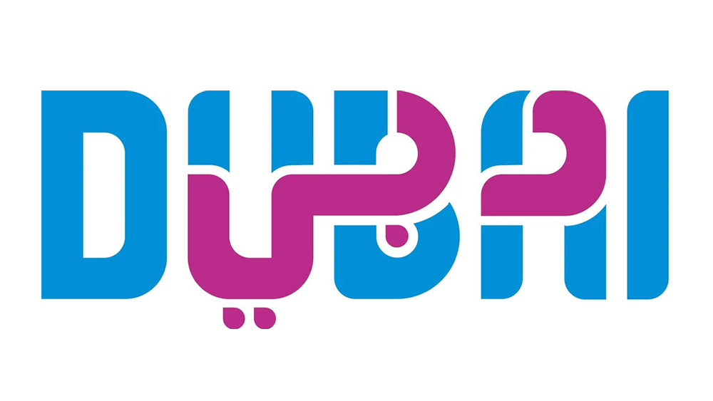
Dubai rather ingeniously came up with a different solution: a logo that depicts the emirate's name in both the Roman alphabet and Arabic script. But people aren't sure if it works (see our pick of the best typographic logos for more inspiration).
Dubai’s official logo has the city’s name written in both english and arabic from r/DesignPorn
As commenters note in the post on Reddit above, Dubai has the same name in many European languages. Its logo shows this name in blue but overlays the word for Dubai in Arabic script in a way that fits the contours of the design. The result is a logo that speaks to readers in a large part of the world, from the Americas to the Middle East and beyond.
It makes sense for Dubai to seek a logo with maximum international appeal since tourism is an important economic motor and there are also many international residents in the emirate. Some have suggested that it's the flexibility of Arabic calligraphy that makes it so adaptable to this kind of idea – although some have noted that Indian movie titles sometimes do something similar.
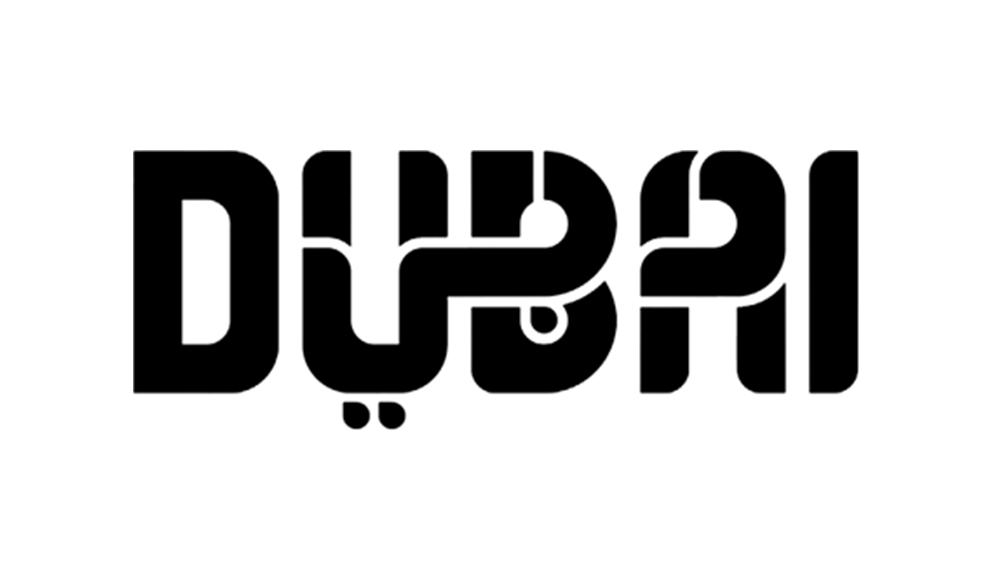
But while many people think the concept is clever, not everyone is convinced by the execution. Some people aren't digging the colour palette, which has been compared to Baskin-Robins, while others think that overlaying the two scripts makes both of them difficult to read. The logo has been used in different colours, but legibility is an issue with all of them – something that's also been a criticism of Elon Musk's new xAI logo.