We all have different problems to solve when it comes to decorating our homes, but one concern is universal: none of us want to create a space that feels unhappy.
So how can we prevent a room from feeling miserable? According to color psychology in interior design, the colors you choose will impact the mood of your space more than any other factor. "Color, because of its emotional effect upon us, is largely responsible for the atmosphere of a home," writes Professor Vijaya Lakshmi V in her paper, Psychological Effects of Colour in the Journal of Biotechnology & Bioinformatics Research. "It is capable of soothing or irritating, cheering or depressing, charming or boring, welcoming or repelling."
Sometimes, our reactions to certain colors are subjective. "We can have a strong negative reaction to a color if it’s tied to an unhappy memory, sometimes, just seeing it can stir up those emotions all over again," says Karen Haller, color psychology expert and author of The Little Book of Colour.
However, color psychology also teaches us that certain shades risk evoking sad feelings more than others. "Colors can sap our energy just as much as they can lift it," Karen says. "A dull, lifeless grey, for some, feels like a sky that never clears, draining out any warmth and joy. I know that’s how I feel around gray."
To find out more, we speak to design experts about which shades to be wary of — and which feel-good hues to choose instead.
1. Baby Blue
"Blue can be an example of a color that, if used in a wrong shade could make a room feel cold, distant and might contribute to an unhappy atmosphere," says interior designer Róisín Lafferty. With its cool undertones, baby blue is one example of a blue that can evoke sadness, she explains.
"However, when used in the right shades, blue can actually create the opposite effect and make a space feel inviting and peaceful," Róisín says. Take the azure blue in the design above, for example. Azure has yellow undertones, making it one of the warmer blues on the color wheel. The vibrancy of the color also gives it a happy, welcoming feel.
That’s not to say only bright blues can have a positive effect. "Muted blue or powder blue are calming and serene, creating a tranquil environment and uplifting vibe when used thoughtfully," the interior designer adds.
Choosing colors that go with light blue in warmer tones will also prevent it feeling like an unhappy color. In the design above, the creamy-beige hue and natural texture of the wood help to warm the azure. "By balancing the right tones, blue can evoke calmness and warmth," says Róisín.
2. Chartreuse Green
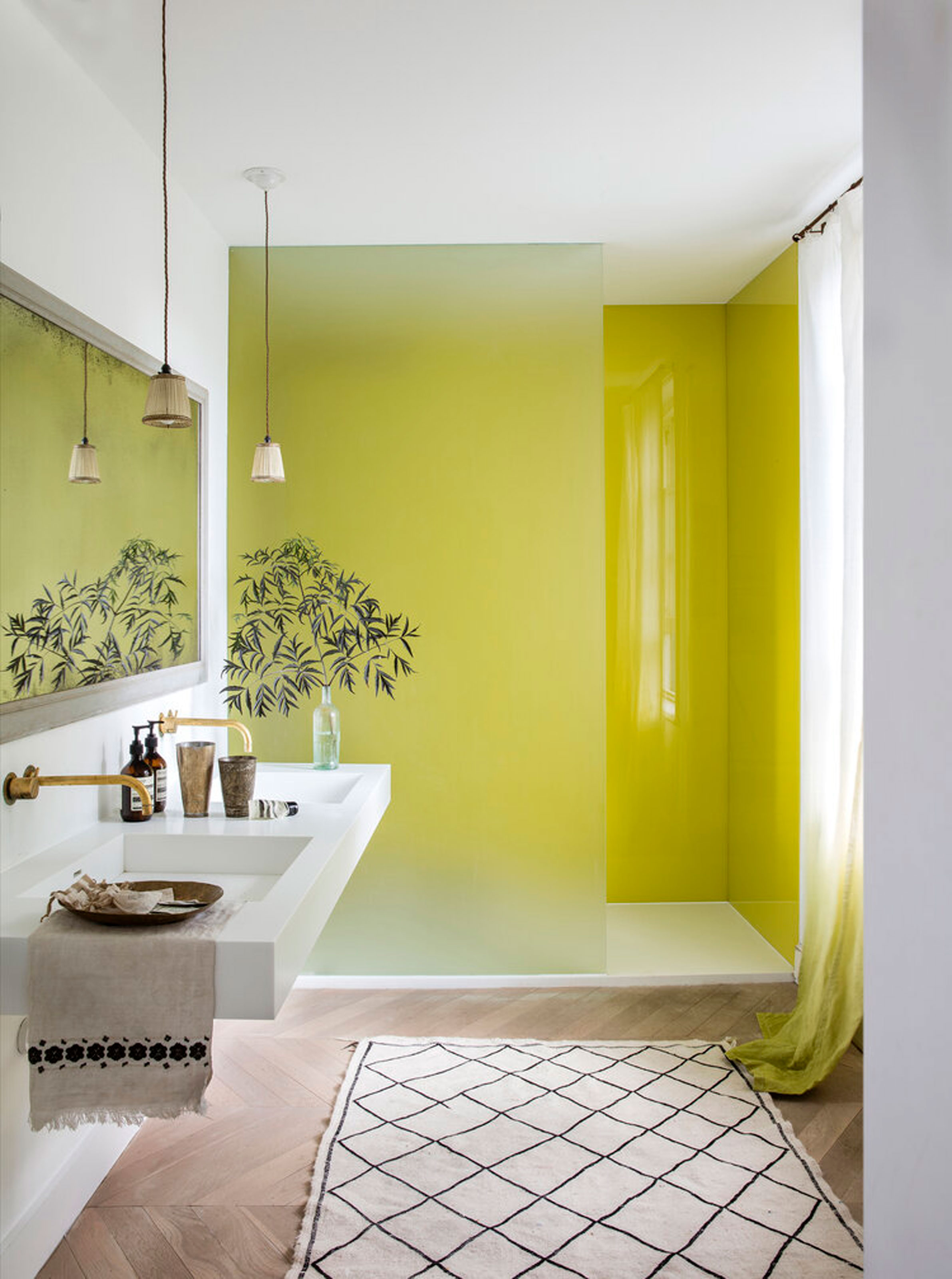
An unusual choice, chartreuse can make a room feel bold and modern when handled with care, but it can also feel like an unhappy color. It all comes down to choosing the right shade.
"Chartreuse can make people look sickly, so it's important to make a chartreuse room more towards a 'yellow' version of the colorway, which makes it happier and cheerier," says Garrow Kedigian, founder and principal designer at his eponymous studio.
Indeed, color psychology warns against greener yellows. "The darker and more neutralized yellows and greenish yellows are associated with sickness, disease, indecency, cowardice, jealousy, envy, deceit and treachery," writes Professor Lakshmi V.
In fact, no matter which color you are working with, steering towards yellower versions of the hue is a great rule of thumb. "In home decoration yellow is indispensable, because more than any other color it gives the effect of light," writes Professor Lakshmi V.
3. Slate Gray
In some ways gray is the most obviously unhappy shade, which Professor Lakshmi V claims "has no particular character of its own." It is "subject to dullness; giving an impression of monotony," she writes, "associated with retirement, sadness, modesty and indifference. It has negative effects like lack of confidence, dampness, depression, hibernation, and lack of energy."
That’s a lot of reasons to avoid decorating with gray. However, the color psychology expert also notes that light grays can "seem gentle and serene" and dark grays can be "dignified and restrained."
Plus, once again, the undertone can make all the difference. A cooler gray-like slate, with its blue undertones, will be the most likely to evoke feelings of sadness. Warmer grays, on the other hand, can actually be cozy when treated right.
Take the greige walls in the living room above by Andrea Goldman Design for example, a shade that balances gray with beige to create a neutral that’s both calming and cozy.
"We avoid using millennial grays with cool undertones, as they can feel stark and lifeless, causing people to feel unhappy," says Andrea Goldman. "Instead, we select grays with lighter tones and more warmth to them so that they feel bright and fresh while still being neutral. Benjamin Moore’s Silver Satin (OC-26) is a go to for striking this balance."
4. Mud Brown

Brown is another color that can drag on your mood in the wrong hue. In fact, brown has a mix of positive and negative associations, so while sometimes it can feel uplifting, sometimes it feels like an unhappy color. "It suggests seriousness, warmth, nature, earthiness, reliability and support," according to Professor Lakshmi V. "It also has some negative qualities like lack of humor, heaviness, and lack of sophistication. It is reminiscent of autumn, harvest and decay."
A heavy shade like mud brown will be most likely to bring out the color’s humorless side. Meanwhile, a warm, earthy shade of brown like cinnamon or even the trending Mocha Mousse, Pantone’s Color of the Year for 2025, can have a grounding and calming effect.
Take the above bathroom design by Róisín Lafferty, which pairs aubergine-brown with matching marble tones to create a comforting color drenching look.
5. Pistachio Green
"Some shades of pistachio green, like the Sprucestone we used in Carmín, can feel muted or melancholic when used alone, without the balance of vibrant or warm tones," says Maye Ruiz, founder of Maye Interiors. "However, in a space like Carmín [above], where bold and playful colors dominate the atmosphere, this green serves as a mixer, bringing balance and preventing the energy of the space from becoming overwhelming. Its role is not to take center stage but to soften and enhance, allowing the bolder colors to shine in greater harmony." Thankfully, there are lots of uplifting colors that go with pistachio.
According to color psychology, green is the perfect choice when it comes to creating balance. "Compared to the other colors, green is relatively neutral in its emotional effect, tending to be more passive than active," writes Professor Lakshmi V. "Being in the center of the spectrum, it is the color of balance — a more important concept than many people realize."
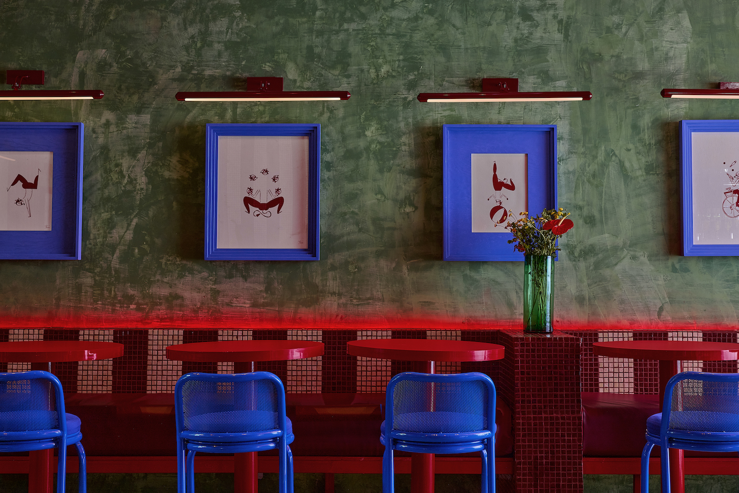
6. True Black
As the color of mourning and darkness, it’s no surprise that decorating with black can easily feel like depressing colors. So what does color psychology say?
"Black is essentially an absence of light, since no wavelengths are reflected and it can therefore be menacing; many people are afraid of the dark," says Professor Lakshmi V. Among black’s (many) negative associations are ‘evil’, ‘old age’, and ‘gloom’ according to the professor. Yet it can also be a "solid, reliable color, and most people find it quietly supportive," she says.
In the design by Róisín Lafferty above, the black cladding benefits from the natural textures in wood, softening the color. Plus, by injecting pops of contrasting red and green in the furnishings, the designer balances the ‘quietly supportive’ black with a more positive energy. It shows how black can help create a sophisticated and upbeat space when balanced with other elements.
7. Bright White
If you thought decorating with white was a safe bet, think again — it's a prime offender on the unhappy color list. "Many people opt for bright white in a room to create a sense of space, but this can sometimes result in a cold, uninviting feel," says Ruth Mottershead, Creative Director at Little Greene.
A more mood-enhancing choice could be an off-white with warm undertones. "Consider a neutral-warm white such as “Silent White” [pictured], an off-white shade that brings a yellow-based warmth to any area of the home," says Ruth. "It will look great on a ceiling or used across all walls in a room for added dimension."
Layering different whites together, as per the image above, can help to create a soft and comforting look. Combining different textures also prevents white from feeling stark, clinical, and depressing. Yes, even white can be cozy when it’s treated the right way.
From dismal grey to sunny yellow, color psychology can tell us which hues are happier than others. But as our designers illustrate, with clever layering, use of texture and looking for warm, yellow undertones, you can prevent even the most sombre shades from feeling like unhappy colors.
FAQs
What Is the Angriest Color?
Color psychology experts and designers tend to agree that red is the angriest color on the wheel. "Generally, intense, highly-saturated reds, such as scarlet or fire-engine red, can be overstimulating, potentially causing agitation and even anger and may be best avoided in large amounts in a room," says Jessica Davis, Senior Designer at ROAM Interior Design. "However, when used in small amounts and strategically placed, they can bring a fun and energizing pop of color to a scheme. Darker or more subtle shades of red can also be a great alternative."
Vijaya Lakshmi V (2023) Psychological Effects of Colour. Journal of Biotechnology & Bioinformatics Research. SRC/JBBR-160. DOI: doi.org/10.47363/JBBR/2023 (5)157J Biotechnol Bioinforma Res, 2023, Volume 5(2): 2-2