Spring is just around the corner, and along with the many joys the changing season brings after the long winter months, decorating with a spring-inspired color palette is one of our favorites.
Reflecting the colors that begin to emerge in the natural world, spring color ideas have much to offer our homes, and it's not just about pastel shades, but uplifting mid-tones and even neutrals.
To serve you up with some seasonal room color ideas, we asked interior designers for their favorite colors to decorate with for spring, which we've rounded up below.
1. Lavender
Floral-inspired colors are strongly associated with springtime, so it's no surprise to see them listed as favorites among designers. From the best lavender paints to adding this soothing hue with fresh flowers, there are many ways to bring this color into your home.
'Spring to me is about the rebirth of color in my gardens – my favorite place to be,' says interior designer Gray Walker of Gray Walker Interiors. 'I gravitate to shades of lavender used in the most feminine way. I think that is why my own bedroom and closet are flirty florals in shades of lilacs. I want to celebrate my love of flowers and my gardens all year long. Canary yellow is my go-to color to create a powerful juxtaposition with lavender. This color combination is classic and bold.'
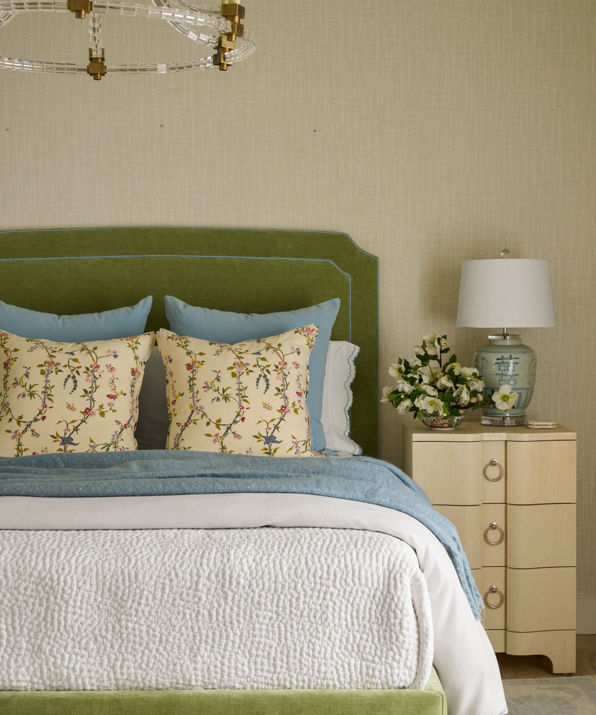
2. Soft green
'Soft green is our favorite spring color – it’s fresh, versatile, and brings the outdoors in,' says interior designer Sarah Hargrave, owner of The Collective, who incorporated this spring-like color into this relaxing bedroom. 'It pairs beautifully with neutrals like off-white or taupe and adds a calming, organic touch to any space.'
'For spring, we love incorporating soft green through wallpaper, upholstery, or accessories like vases and throw pillows. Layer it with textures like woven baskets or linen curtains to create a light, airy feel that celebrates the season,' adds Sarah.
Designer Meredith Ellis of Meredith Ellis Design also enjoys decorating with green during the spring months, adding: 'Green is always a favorite but particularly in the spring months. There are a million shades of green, but my current favorite is pistachio green. I love to pair green with different shades of blue, particularly peacock blue or 'teal' blues and white. It feels fresh and modern.'
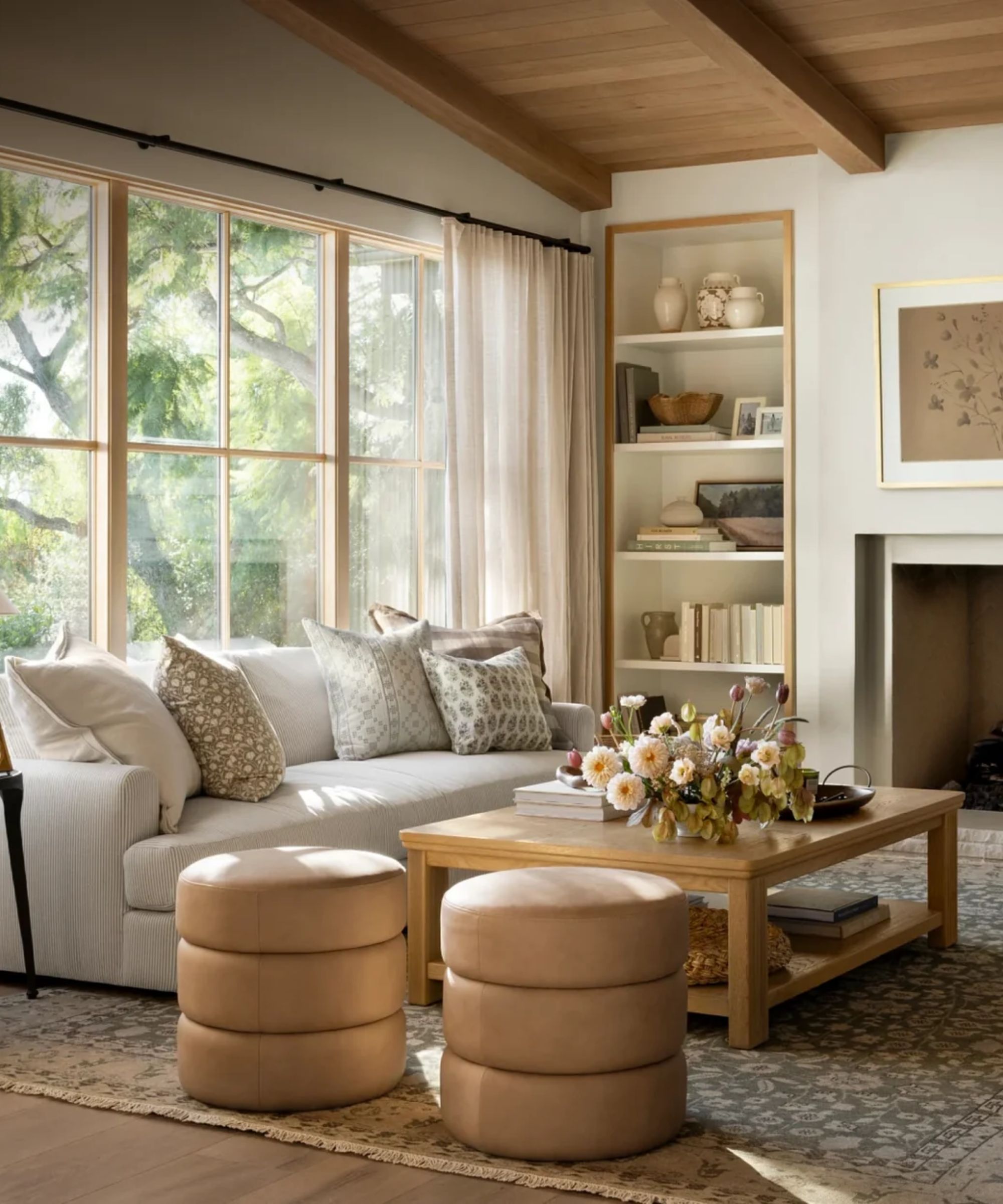
3. Light blue
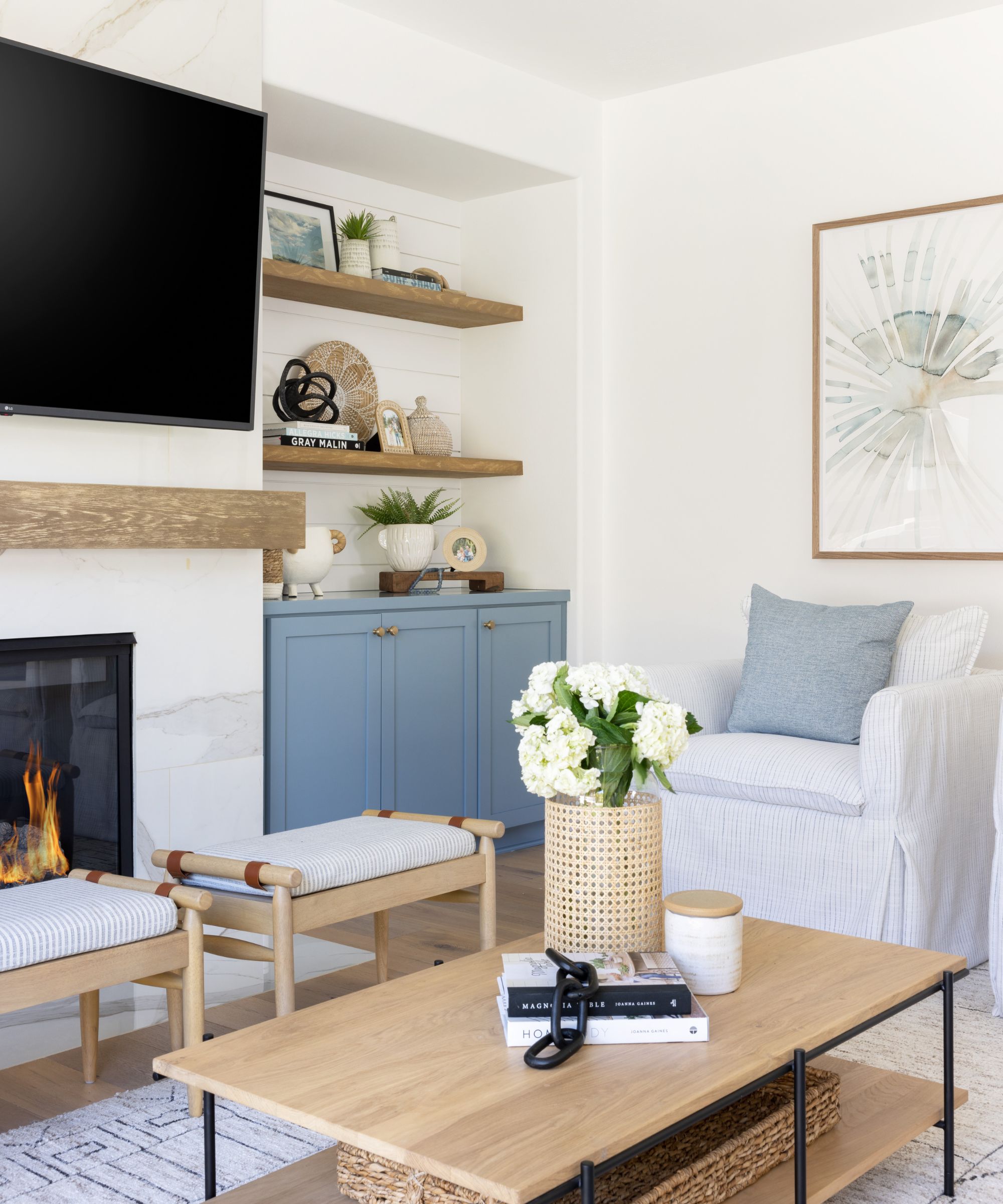
'Like a breath of fresh air, lighter blues are the perfect touch to help bring the magic of a spring day into your home,' says interior designer Marcia Bryan of Bryan Design Group. 'Some of the best ways to incorporate a springtime blue is in cabinetry, artwork, and fabrics. Incorporating blue is sure to give a sense of newness reminiscent of spring.'
Below, Marcia explains why light blue made the perfect addition to this calming living room: 'We transformed our clients’ open-concept indoor-outdoor style of living by sprinkling fresh blues in their pillows and artwork and made a statement with their blue cabinetry. Not all clients are ready to dive in to color drench their cabinets, but lucky for us our clients trusted the processes and fell in love with their blue cabinets.'
While this color scheme feels perfectly aligned with springtime, it's timeless enough to transition into the summer months and beyond, so you don't need to worry about it feeling too seasonal.
4. Pink
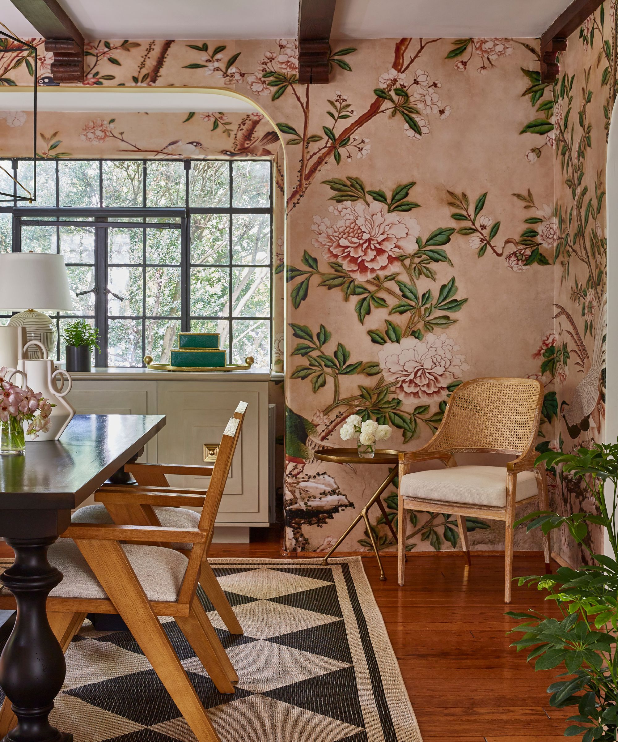
If there's ever a time to decorate with pink then it's during the spring. This gentle, warming color can create a soft and sophisticated interior scheme that nods to the changing seasons.
'We love designing with pinks and corals in sophisticated tones such as mauve, blush, dusty rose, lavender, and salmon,' says designer Lina Galvao of Curated Nest Interiors. 'These tones tend to be easier on the eye, serving as a blush of color versus a pop. This spring palette works well in spaces with sculptural furniture pieces or with significant architectural value, where the overall space is working together and no one color dominates.'
In this family room, soft pink is used through the wallpaper, adding a point of interest without overwhelming the space and offering a fairly neutral palette to design everything else around. 'While it can be difficult to design with more muted or specific tones, the coral to pink family tends to feel warm, cozy, and easy to digest for most people,' explains Lina.
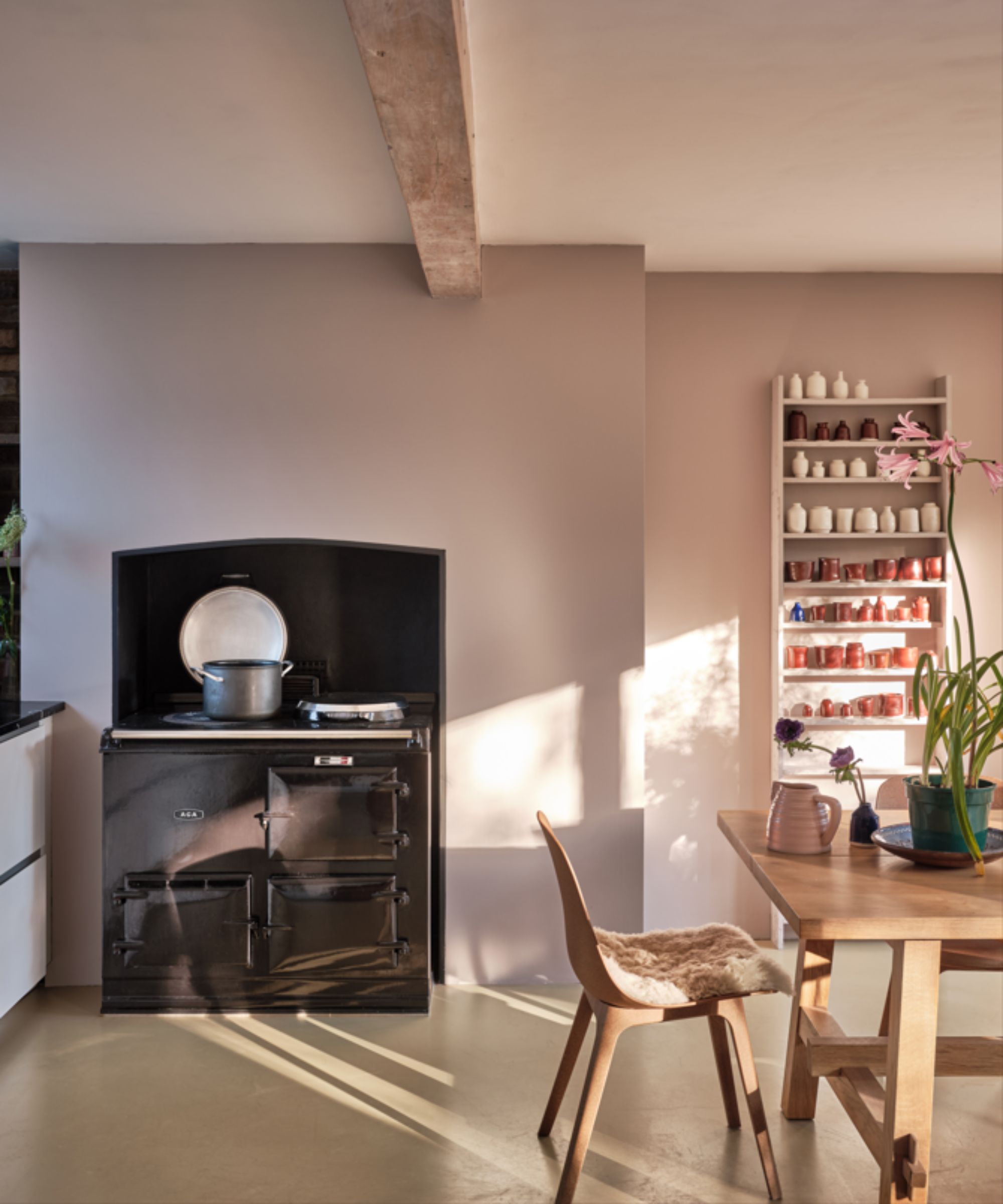
5. Yellow
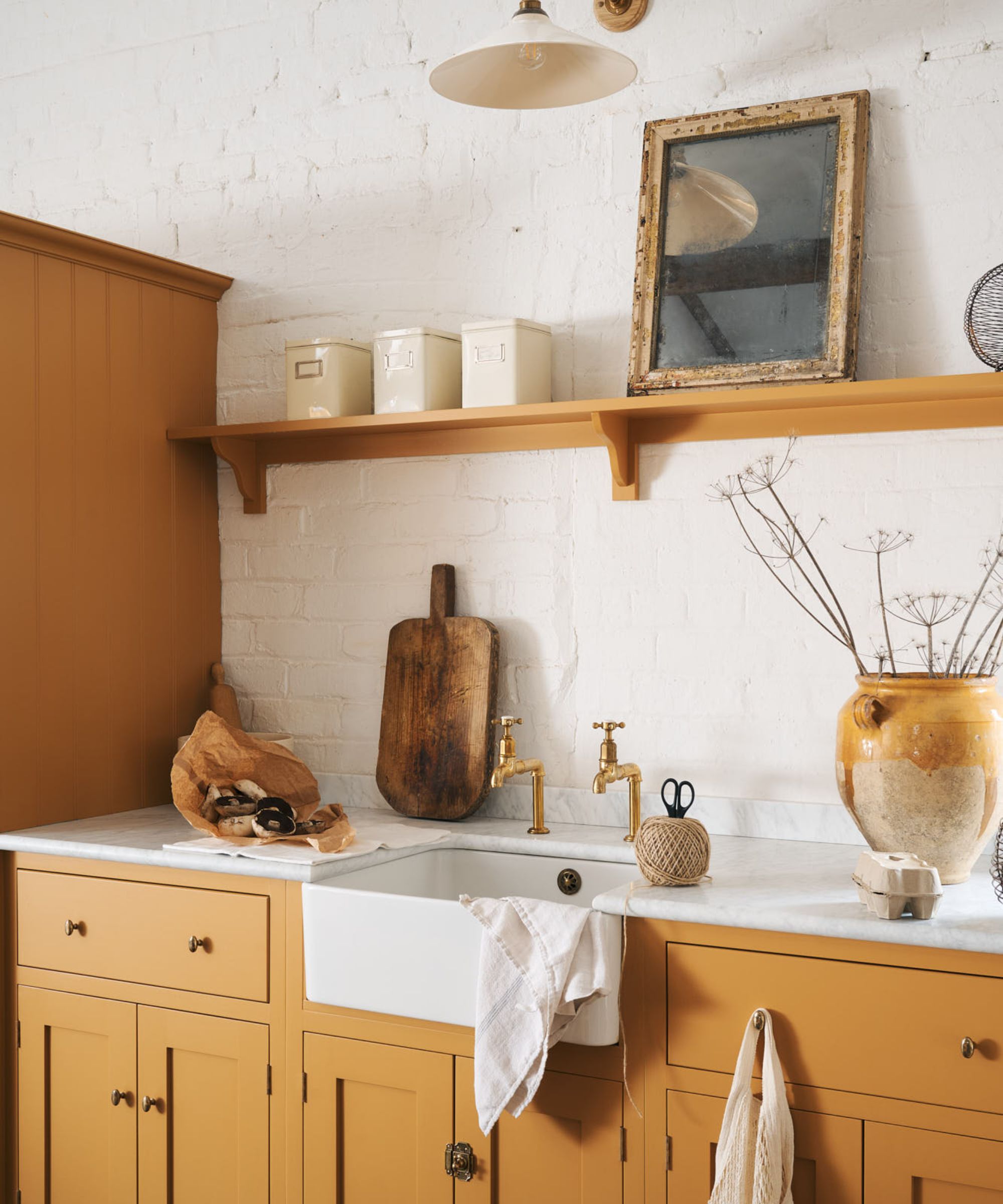
'There’s something about a sunshiny yellow tone that screams out springtime – I love using these uplifting warm tones to bring warmth into a space,' says interior designer Jenny Luck.
'They also complement the new sunlight coming through, something that we all look forward to during the winter months. A tip for getting it just right is to pair it back a little bit when selecting the colors and not go too strong with the undertones,' Jenny adds.
One of the most on-trend and grown-up ways to embrace yellow room ideas is buttery yellow tones which feel vintage-inspired and present a more muted appearance than bright yellow, much like the kitchen cabinet color in this kitchen by deVOL Kitchens.
6. Light neutrals
Lastly, color choices for spring can equally take on a more understated form by decorating with neutrals. Neutral hues can refresh your space, offering a light and airy feel for the changing seasons, while offering plenty of longevity for year-long appeal.
'I always love to work with light and airy colors for spring – neutrals like dove gray, ecru, and cream, and elevated pastels like rose, lavender, peace, muted sage, and ice blue,' says interior designer Kathy Kuo. 'I always let the beauty of nature in the springtime inspire my design work, regardless of the season, but spring is certainly one of my favorite times.'
From using the best neutral paints to incorporating delicate neutrals through smaller decor touches, these timeless colors are a great way to create a calming feel in your home for spring.
Which of these spring-inspired colors is your favorite? Whether you want to fully embrace the spring months with uplifting pastel tones or go for something slightly less obvious, there's no better time of year to bring color into your home.