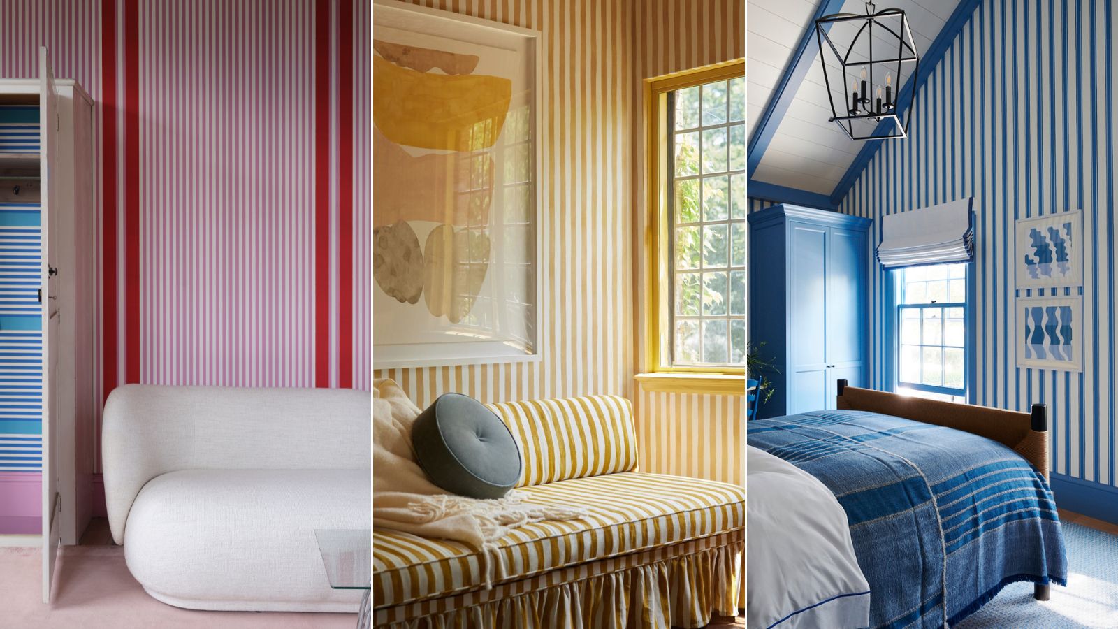
Stripes have long been incorporated into interiors. From nautical styles to more whimsical and playful looks, there's always been a place for stripes in the home. They're (surprisingly) neutral and tend to look good in most spaces, adding interest with their bold color and striking pattern.
We witnessed stripes having a moment in 2024 and it seems the design trend continues this year with designers opting for an even more pronounced look. Taking its name from the pattern-drenching trend, the 'stripe-drenched' look is similarly impactful and bold. While it's not for everyone, there are many variations of the style but the full-force, large-scale stripe look has turned our heads and impressed us with its potency.
Speaking with design experts, we've got the scoop the stripe-drenching trend and discovered designers' favorite ways to decorate with stripes in their projects.
1. Try perfectly matched stripes
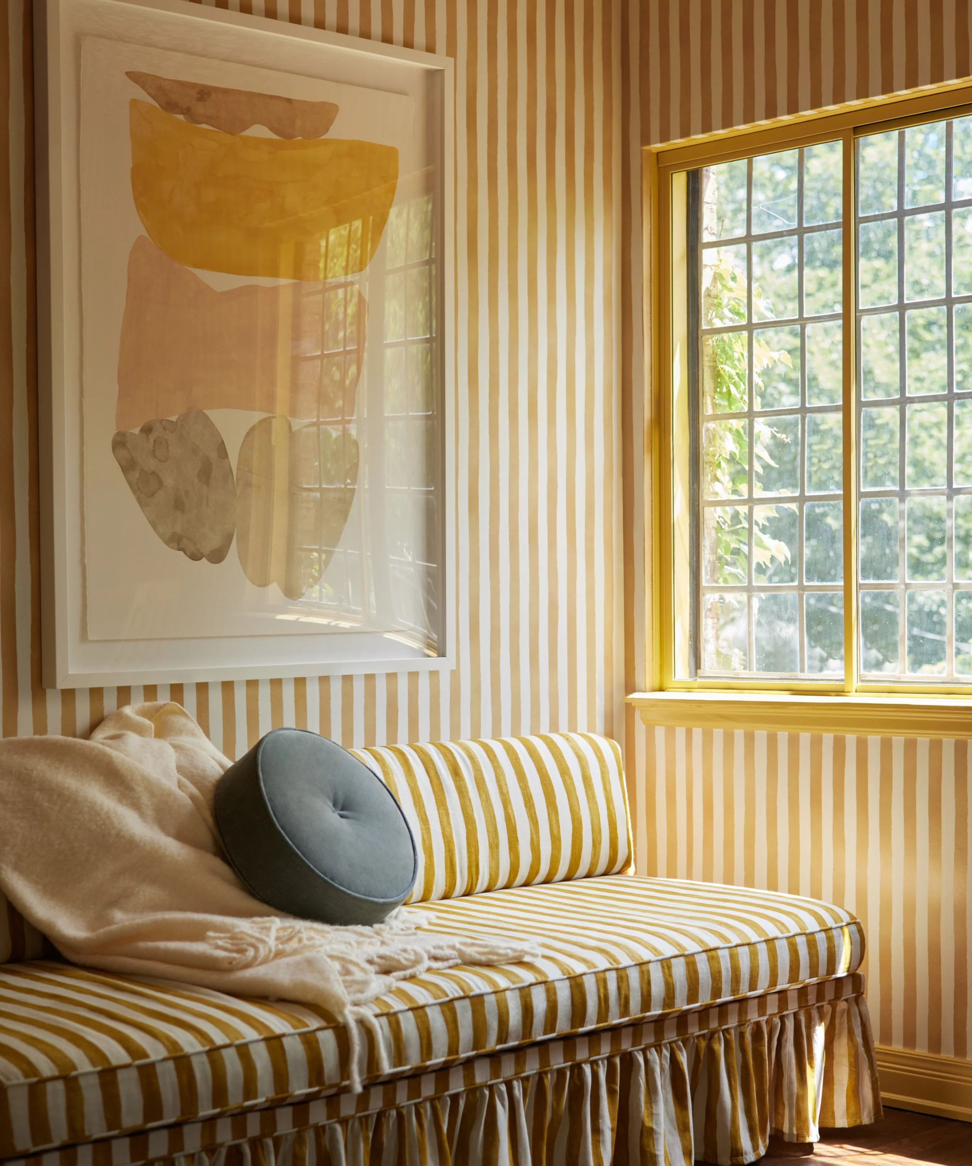
Meticulously matched stripes are an impressive look. This type of stripe-drenching is best described as a head-to-toe look, where an interior is entirely doused in coordinating stripes, much like the pattern-drenching trend.
The room designed by Lulu & Georgia showcases the look best, where the sofa has been upholstered and skirted in a print that perfectly matches the wallpaper. It's undoubtedly a big statement and a bit of a design risk (that we aren't all willing to take) but you've got to admire the bravery of the stripe-drench look and its one-of-a-kind distinctiveness.
If you're braving the stripe-drench style, the key is to consider the details. Stripes are (of course) crucial in this look, but the smaller accompaniments will tie the overall look together and make the room look coordinated. Consider highlighting smaller areas by matching them to the stripes, like painting the window frame with the same paint shade.
Another way of creating a unified look is to bring in contrasting decor that complements and enhances the room. The hard part is finding a coordinating wallpaper and upholstery fabric, but once you've sourced these, the rest is easy.
2. Vary the stripe directions
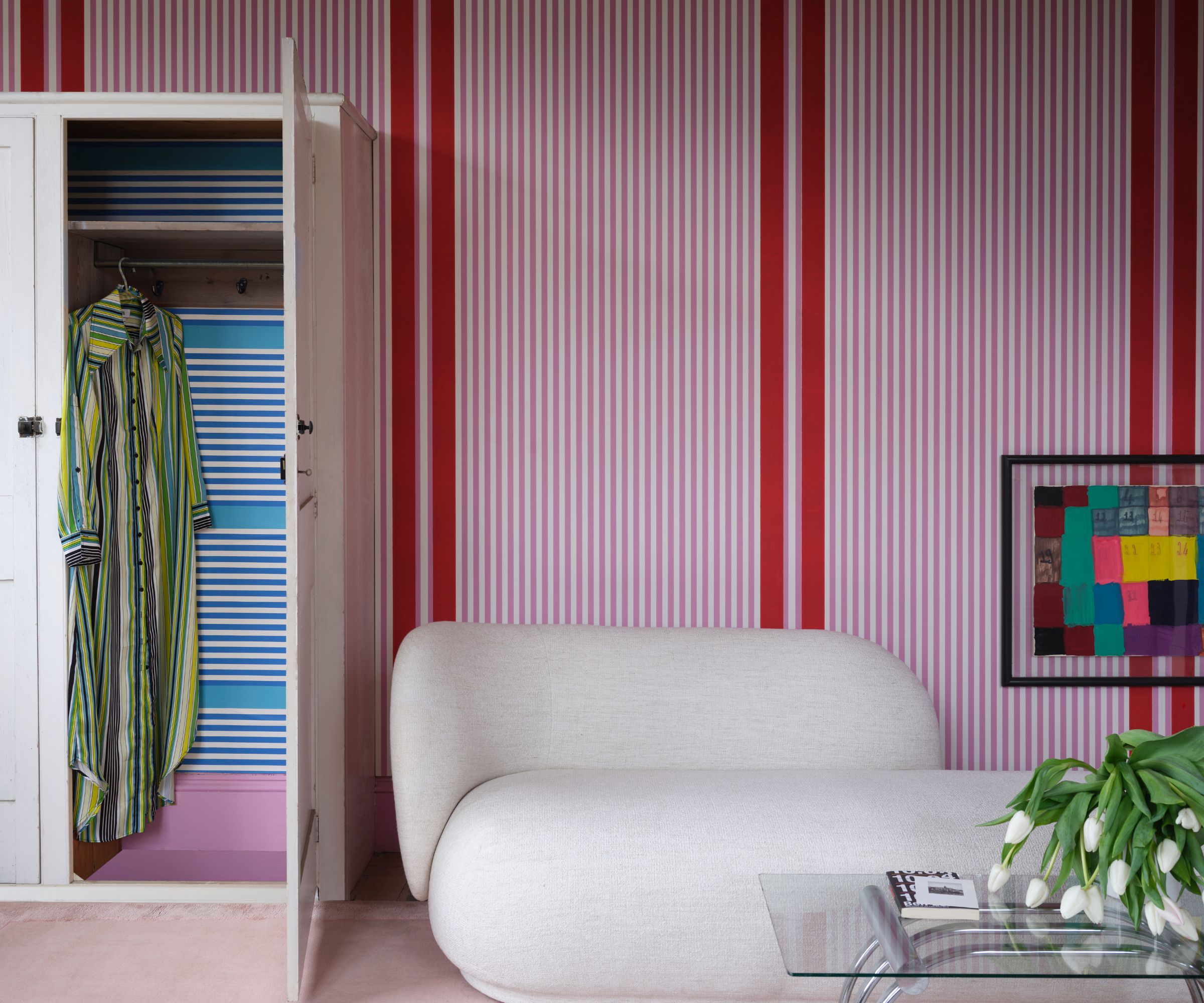
A variation of the stripe-drench is cohesive clashing which involves pairing multiple stripe patterns together in one room. Cohesive is the important part of this term as you want your stripes to harmonize side-by-side while appearing intentionally clashed.
The key to creating a contrasting stripe look is choosing two patterns that have both differences and similarities. The crucial part of this look by Farrow & Ball is the intentional use of contrasting wallpapers, that clash in color and stripe direction but are very similar in pattern.
Patrick O'Donnell, Brand Ambassador at Farrow & Ball explains that, 'Stripes can change the dynamics in a room. Be as delicate or as bold as you dare. We have seen braver choices, almost to the point of happy clashing.'
3. Go for a classic look with heritage stripes
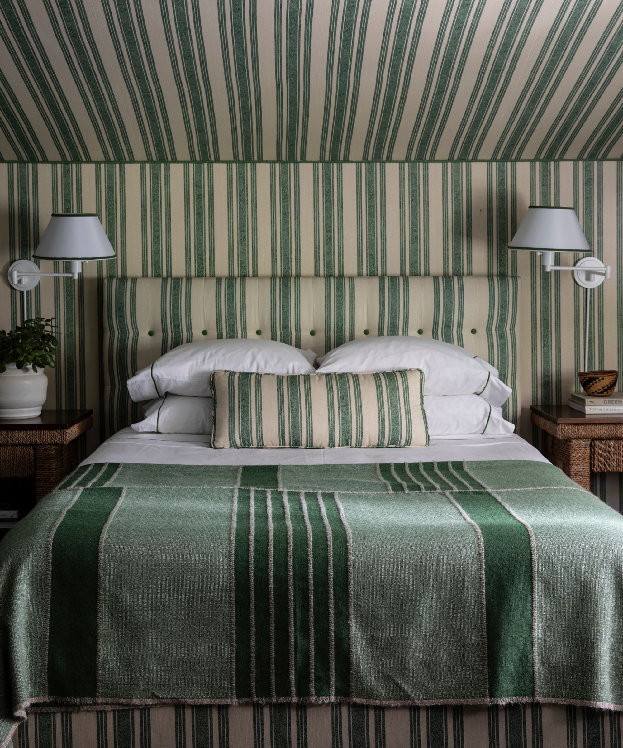
Although stripe-drenched is a current trend, there are many examples of striped interiors that are totally timeless. You can often find them in historic buildings as they 'highlight architectural nuances such as curves and angles,' says Carol Miller, trend and color expert at York Wallcoverings.
Mark D. Sikes is known for his love of stripes. He almost always incorporates striped print in his designs and credits this to its versatility and timelessness. He describes the pattern as, 'classic, tailored, easy on the eye, and universally beloved. Everyone likes them – women, men, young and old. I like stripes best when rooms are “stripe-drenched” – placing one stripe on everything.'
Stripes are often synonymous with classic heritage style. They can be preppy and expensive looking but also bring a sense of coziness and comfort despite their often loud connotations. 'There is heritage and familiar warmth in the use of stripes that help tell the story of any room,' adds Carol.
Creating a classic striped space is all about choosing a color scheme with two tones. The heritage stripe interior is white or cream and is paired with a blue, green, or red. Acknowledging the latter color, the decor is color-matched to tie the space together and create a unified look.
Classic in print, the blue tented stripe from Farrow & Ball is perfect for creating a heritage style interior that's still on-trend.
Matching your furnishings to your walls is what stripe-drenching is all about. This striped pillow cover from Pottery Barn is a perfect piece to go alongside your blue and white walls.
Why not match your cushion to your curtains? This pair of linen curtains is finished in the same fabric, making it so easy to try the stripe-drenched look at home.
4. Pair different stripe widths
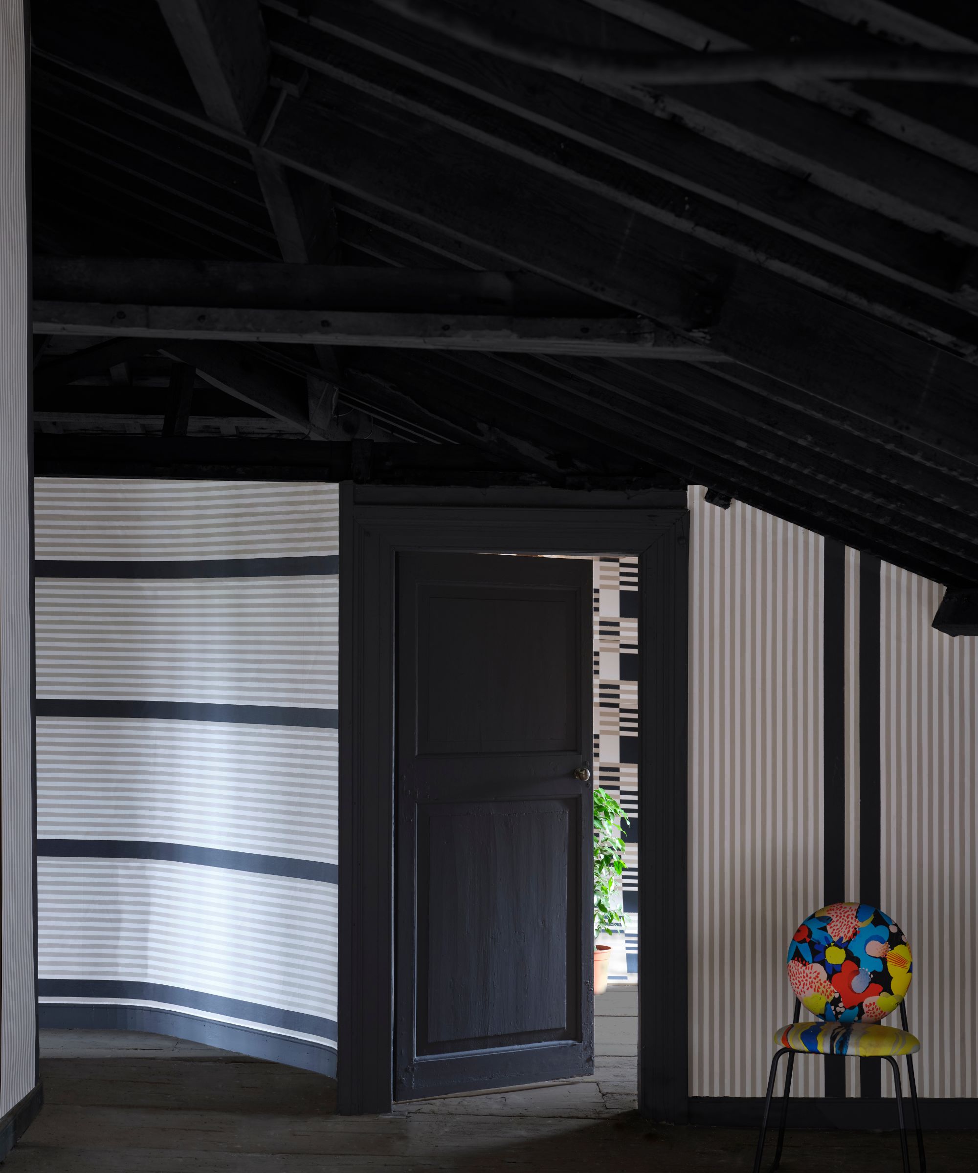
We've seen looks with varied stripe directions, but stripe width is just as important when creating a 'drenched' look. Combining stripe patterns in varying widths is a great way to create drama through layering the print.
'Combining thick and thin stripes creates a dynamic, layered look that adds visual interest. The boldness of thick stripes draws attention, while the thinner stripes help balance the contrast, bringing a sense of rhythm and harmony to the pattern.' says Hannah Reach, Brand Manager at WallPops
When designing a space with stripes in mind, establish a shared color palette and then incorporate your striped wallpaper, furnishings, and decor. This will ensure the room is not overwhelmed and feels cohesive yet quirky.
Hannah gives a great example of this look, saying, 'For instance, if your walls feature bold red and white awning stripes, balance them with pinstripes or hairline stripes in coordinating red or white tones for upholstery, curtains, or artwork.'
5. Create texture with tiled stripes
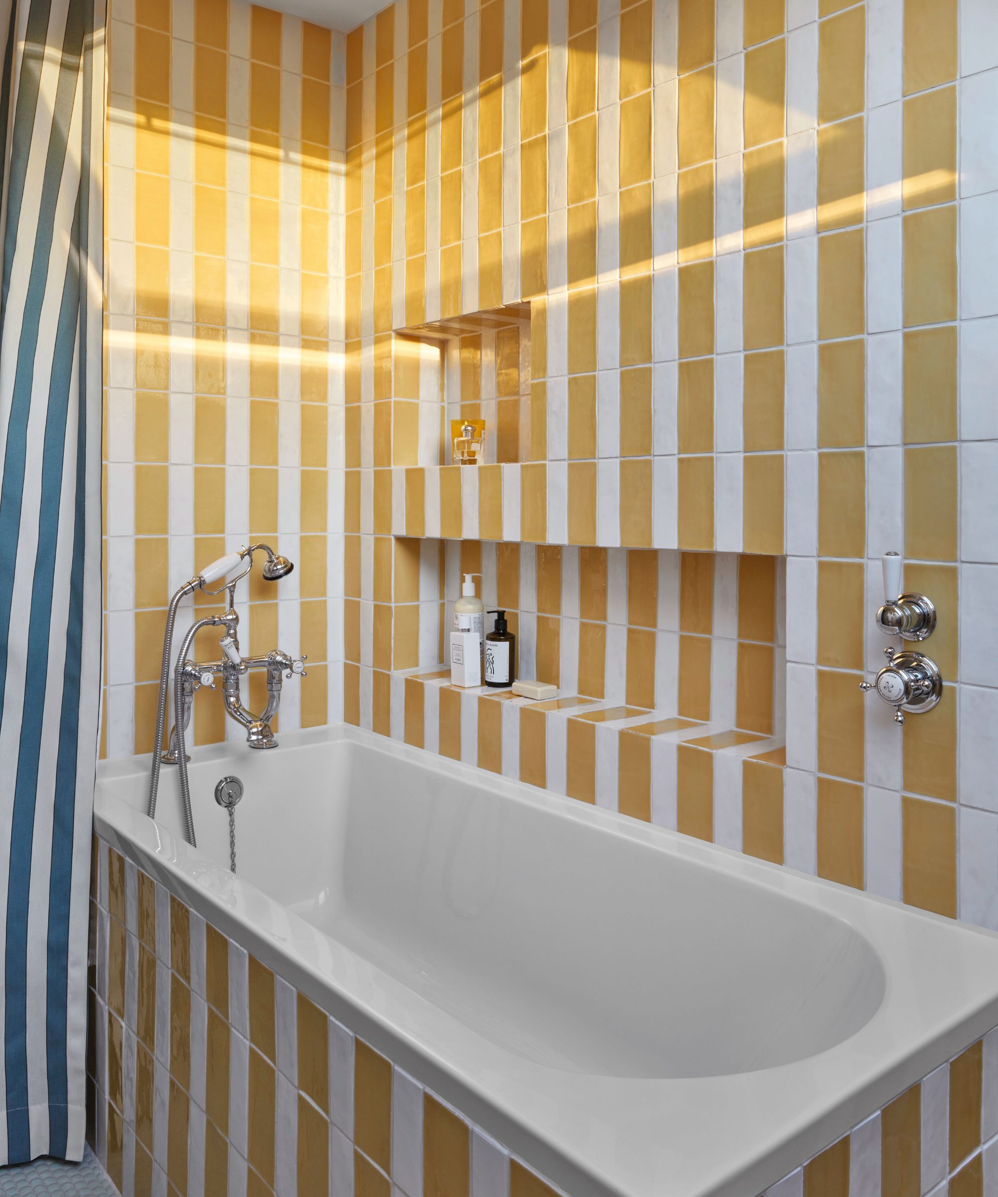
Although stripe drenching is usually achieved with paint ideas or wallpaper, other materials can create a stripe pattern on your walls. If you're fully committed to the stripe look and want to make a statement, tiles are a less common yet equally effective method of drenching your space in stripes.
Albeit being a more permanent choice, tiled stripes are dramatically bold in scale and size, making them great for smaller or more secondary spaces. Fully drenched stripes are a big statement so incorporating them in a small room will still create impact and prevent the risk in your bigger communal rooms.
Noz Nozawa likes to use stripe drenching in smaller rooms like the bathroom. She says, 'I love to start by adding patterns to the walls and/or ceiling – the largest surfaces of a space. Stripes are a timeless, "safe" pattern for folks who want more from their surfaces than solids because you can limit a whole room to just two colors (if your stripes are alternating colors) and still pack in plenty of boldness.'
We often see tiling in the bathroom, like the image above where the room has been tiled head-to-toe in uniform yellow and white stripes. Lauren Stephens has added a blue and white vertical striped shower curtain to unite the scheme.
Stripe-drenching is undoubtedly bold but we love the bravery of designers who have approached this style head-on and committed to the stripe. There are various ways to douse your space in stripes but with these expert tips to guide you, drenching your home in this iconic pattern has never been easier.


