Hello and welcome to another edition of The Crunch!
In this week’s newsletter we have charts on the rental crisis in Australia, the decline in travellers to the US, how to stop the spread of measles, South Korean bushfires, and how to design a urinal that doesn’t splash.
But first … some colourful correlations
The Coalition has run a wave of ads claiming the teal independents – who are not a political party – “ally” with the Greens on votes in parliament. As with many things, the reality is far more complicated than this.
Nick took a look at the voting records of the teals, major parties and other independents throughout the 47th parliament with a series of correlation charts.
In other political news, the Guardian Australia poll averaging model now shows Labor ahead on a two-party-preferred basis after a series of positive polls this month. Josh also drew a One Big Chart to show wages haven’t kept up with the rising cost of many essentials over the last three years.
Four charts from the fortnight
***
1. How to solve a problem like Maria measles
It’s been a few years since viral charts on flatting the Covid curve, but the New York Times is back with a great interactive looking at vaccination rates and the spread of measles.
We really recommend playing around with the vaccination chart a bit to get a feeling for how effective vaccination is about all of us working together, rather than just individual protection.
***
2. Can anyone afford to live, really?
Last we checked the ABC has published at least three data stories about Australia’s rental crisis in the past two weeks – and they’re all bangers. Our favourite, though, is this one comparing skyrocketing rents across five capital cities.
The headline “Where in Sydney can you afford to rent?” does feel a bit like a trick question.
***
3. Who benefits from an American brain drain?
The own goals in the US look set to continue, so the Economist has asked what country would benefit the most from an American brain drain. While we’re not sure about seeing arch-rivals New Zealand do so well, it’s kind of nice seeing Australia near the top of rankings that aren’t just alphabetic.
***
4. Explaining South Korea’s deadliest wildfires
Coming from Australia, we’ve made and seen our fair share of bushfire maps. This one from Reuters is one of the best – especially the satellite transition at the end of it.
There are also some great visuals and explanation in this story of how wind and topography feed bushfires. Special mention to another Reuters piece on how North Korea is helping Russia in its war on Ukraine.
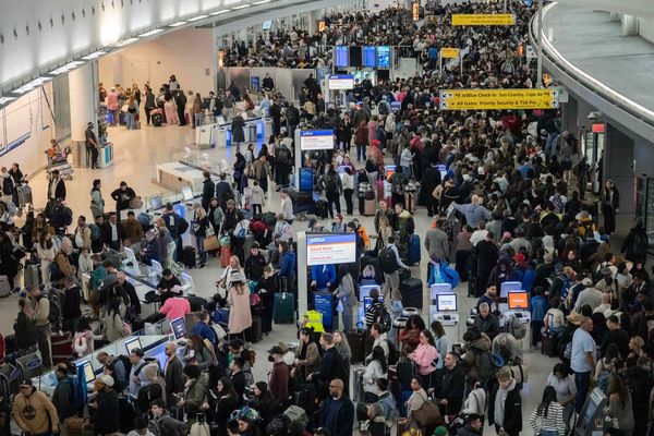
Spotlight on US tourism … or the lack of it
The Financial Times showed how European travellers are now avoiding the US ($)
Nick and Elias published this story about the decline in Australian tourists to America
The ABC also covered the same topic
Bloomberg charted it by region ($)
Off the Charts
OK we’re going to flat out admit that we don’t have the mathematical chops to understand what’s going on here. Researchers have used physics and differential equations to fix an age-old problem – urinal splashback. But even if you don’t get the maths, just look at those curves.
Sign up
Enjoying The Crunch? If you like what you see and think you might know someone else who would enjoy it, please forward this email or send them a link to the sign up page.