There’s no denying a fresh coat of paint is an easy way to transform a space. Picking what particular shade of paint you’re going to use, however? Well, that’s another story. With hundreds of thousands of hues to choose from, it’s easy to get overwhelmed. Even narrowing it down to 'olive green' isn't quite enough — but the good news is the shade is on high-rotation with a lot of designers.
'Olive green has hints of yellow and brown to make it just off, in the right way, from a true green paint,' explains Liz Goldberg, founder and creative director of CAROLYNLEONA. 'It has a dusty undertone which is our favorite way to add a color with sophistication. An olive green shade like Sherwin Williams' 'Pewter Green' also changes from day to night, adding just the right amount of drama.'
So, to help you save some time — and hopefully your sanity — we’ve asked the experts for you for their best green paint colors for an on-trend olive look. When it comes to their designs, these are the shades and brands the design experts reach for time and time again.
1. ‘Nitty Gritty’ by Portola Paints
I knew it was going to be a good day the day I stumbled upon an Instagram reel about Nate Berkus’ favorite color. The interior designer took to the social channel earlier this year, shutting down claims that he doesn’t like color. He does. But the kind of color he reaches for tends to be ‘sort of muddy, a non-color that’s a little bit softer, a little bit deeper, maybe even a little bit moodier,’ he explained.
His favorite? ‘Nitty Gritty’ by Portola Paints. Described on the website as ‘a smoky, dusted green with cool undertones,’ I’d comfortably classify this shade as an olive green, particularly when used in the Roman Clay plaster finish.
2. 'Dark Olive' by Benjamin Moore
'Benjamin Moore's 'Dark Olive' has become a staple for me after using it in my last house's kitchen, and has quickly become a favorite of my clients too,' says Kate Marker, principal designer and owner of Kate Marker Interiors.
Described by the paint brand as a 'dark, muted' olive green, 'Dark Olive' carries a certain elegance to it, as has the ability to ground a space, balance out other softer finishes, and create a feeling of indoor-outdoor connection.
'Dark Olive' is also interior designer Liz Goldberg's favorite shade, other than Sherwin Williams' 'Pewter Green'. 'It's a bit lighter while adding earthiness to a space,' she says.
Price: from $55.99
Description: A dark, muted green that infuses a space with equal amounts earthiness and elegance.
3. ‘Crooked River’ by Sherwin Williams
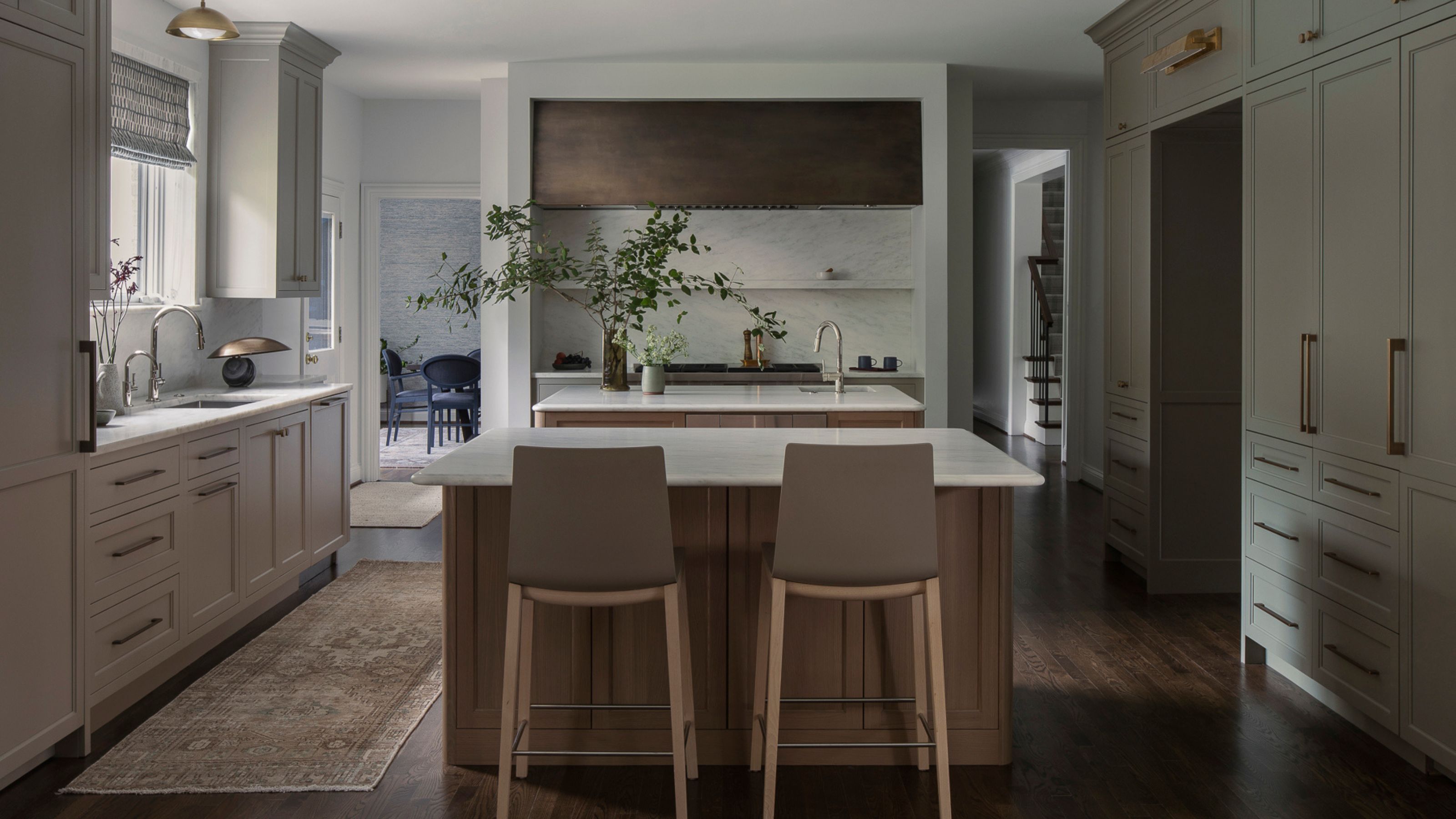
Lauren Sweet-Schuler, the founder and principal of Missouri-based design firm Studio Sweet-Schuler, says she’s always been drawn to ‘complicated’ colors.
‘To us, that means muddy, hard-to-define colors,’ she elaborates. And it seems that ‘Crooked River’ by Sherwin Williams, an earthy browny-green that the paint brand classifies as neutral, hits the spot.
When she saw how well the paint sample paired with other finishes, including warmer tones, white oaks and brass, she couldn’t wait to incorporate olive green kitchen cabinets into her next project, seen above.
4. 'Evergreen Fog' by Sherwin Williams
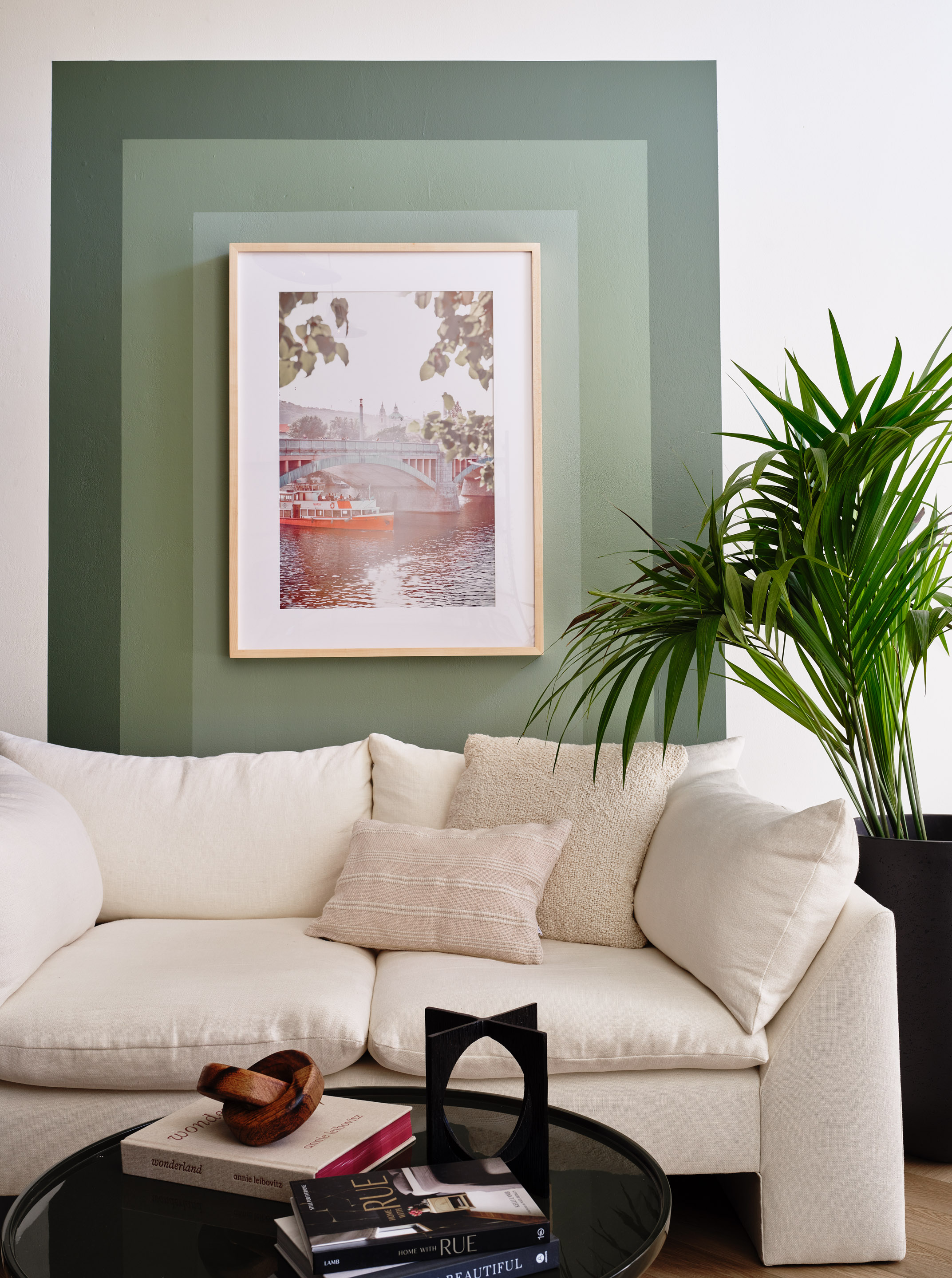
As an interior designer and trained artist, Susie Novak of Susie Novak Interiors has always found herself drawn to colors, and particularly rich earth tones. 'They create an effect that transforms the room into more of an atmosphere rather than a white box,' she says.
When it comes to olive green, she's used a range of shades in her projects. In the living room above, she created a feature wall mural with Benjamin Moore's 'Lush', 'High Park' and 'Herb Bouquet' paints.
But when pressed for her favorite, Susie went with Sherwin Williams' 'Evergreen Fog'. 'Its a stunning earthy greyish green that's a perfect mid-tone shade for walls, trim or even furniture,' she says.
Price: from $55.99/gallon
Description: Subtle blue undertones create a rich, comforting green that evokes the rainforest after a strong summer rain.
Price: from $55.99/gallon
Description: Gray undertones lend a sophisticated touch to this herbaceous green.
Price: from $55.99/gallon
Description: A moody sage green with malleable gray undertones.
5. 'Mediterranean Olive' by Benjamin Moore
'We love 'Mediterranean Olive' by Benjamin Moore,' says Dan Mazzarini, the principal and creative director of Manhattan-based design studio BHDM. 'We've used this paint color on both walls and millwork, and in different sheens. The color is bold - this is not for the timid.'
Dan particularly likes using olive green in his projects because of how it works in a variety of different intensities — from bright to muted — depending on the look you're trying to achieve. He also notes how it complements chrome metals, which are back in fashion right now.