Good graphic design can be timeless, but there are inevitably design trends that come and go – or come and stay well beyond their sell-by date. A graphic style that may feel fresh initially and work in a certain context can soon become tired once it starts to appear everywhere.
So are there any current graphic design trends that we meed to move on from? That's the subject of a debate over on Reddit right now, and designers have plenty of suggestions (also see our own roundup of graphic design trends).
graphicdesigning from r/GraphicDesigning/comments/1j4gipr/whats_one_outdated_graphic_design_trend_you_wish
Unsurprisingly, the use of AI is one graphic design trend a lot of designers say they would like to see the back off (tell that to Volvo, which just made a whole AI advert). On the other hand, one designer comments on the Reddit post that they would like to see it continue "because I've tacked on 20%-40% to my rate by telling clients I'm organic and they won't be getting anything made by AI."
Another trend that comes in for criticism is "making everything faded, dirty and blurring photos." We've probably all seen culprits here, and it could even be a reaction against AI in part. There's been a trend in the past couple of years of intentionally making things look less polished in a bid to show more authenticity and spontaneity. Sometimes it works, but it can easily be overdone. "In general, I don't like "filter" design. Just slapping on a filter and calling it a day," the same designer adds.
At the same time, some people are tired of minimalism. "Ultra-clean simplicity for everything. Every logo and font doesn’t need to look like it’s for a tech company," Hannibal Barca writes. That complaint extends to typography, where several people complain about the ubiquitous use of Helvetica, Futura and Gill Sans in wordmarks and display fonts.
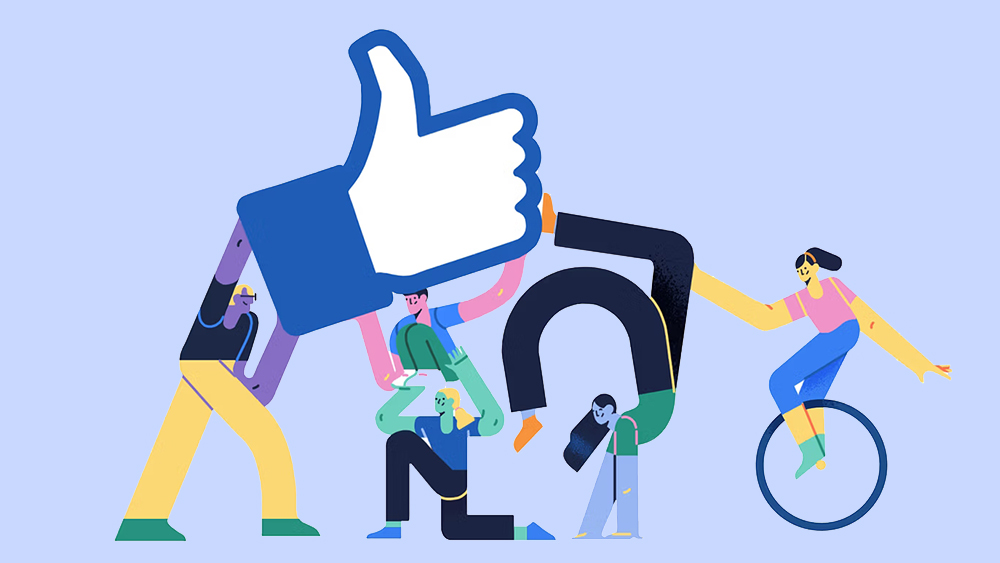
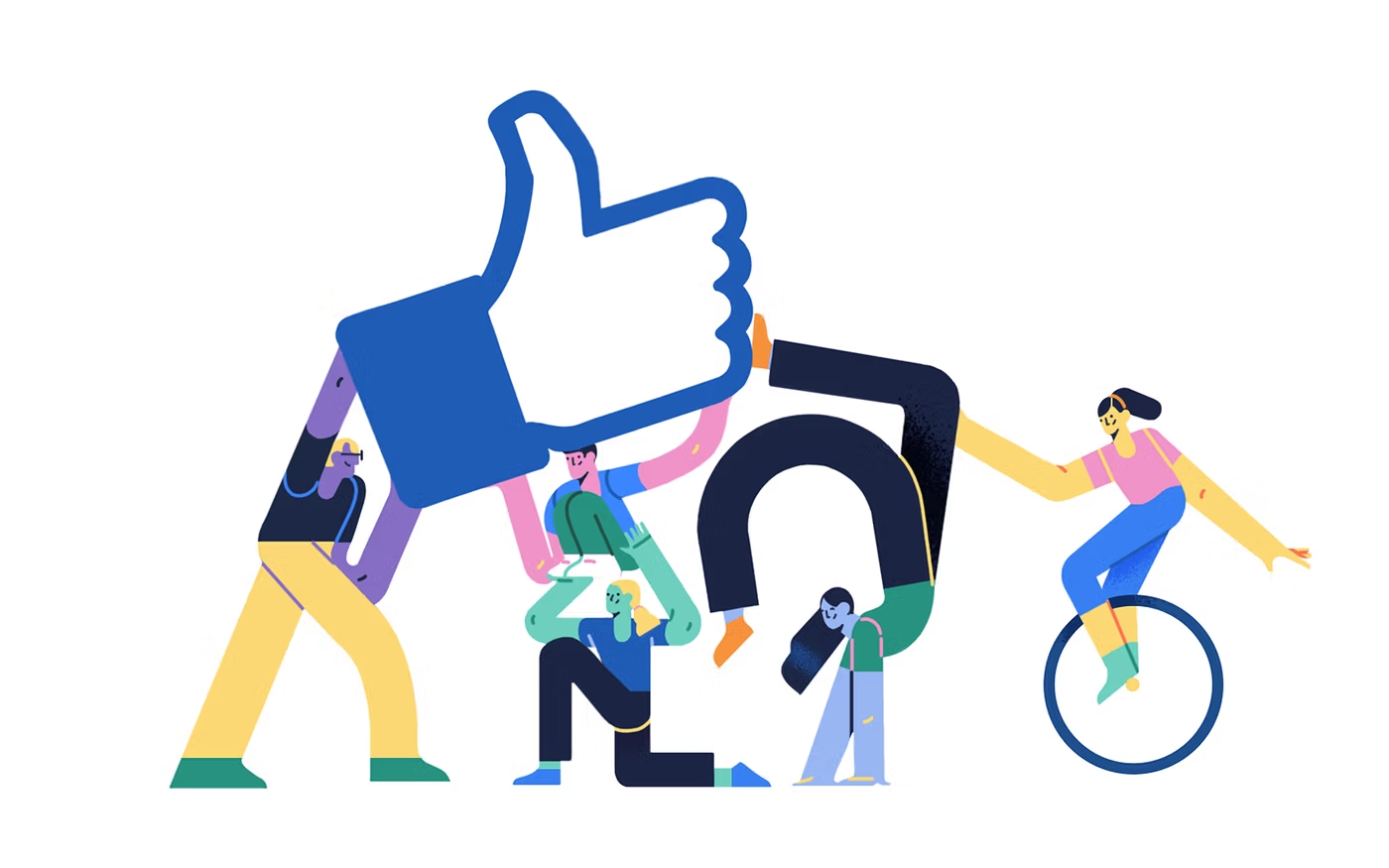
Corporate Memphis and globohomo illustration also gets a mention. We actually declared corporate Memphis dead back in 2023. Well, sometimes we can be a bit premature. Close on its heels comes the related style of alegria art with its flat colors and odd proportions. Pay attention, Celtic FC!
Meaning 'joy' in Spanish, the term alegria was first used for this style by the agency Buck when it designed a new illustration system for Facebook back in 2017. Since then just about every other tech company has started using it, followed by companies in plenty of other sectors. There's a whole subreddit dedicated to trashing the alegria trend, which many see as bland, soulless, generic and infantilising. But perhaps even Facebook will turn its back on alegria after changing the Messenger logo recently.
What graphic design trend would you like to see disappear? Let us know in the comments. If you're inspired to do something different, check out our picks of the best graphic design software and the best laptops for graphic design.