It would appear we are well and truly out of our winter hibernation, and the joie de vivre that springtime so reliably brings often gets us in the mood for refreshing many areas of our lives. Now that the tulips and magnolias are in full swing, many of us feel like reviving our homes with a seriously thorough declutter, a refresh of soft furnishings, and the latest color trends.
If you’re considering several room color ideas, April is the opportune moment to search for inspiration and start experimenting with paint swatches in different rooms. ‘April is genuinely one of my favourite months to draw inspiration from!’ says UK-based interior designer Sean Symington. ‘It's that moment when everything feels fresh and full of potential. New greens are an absolute favourite, there's nothing quite like bringing this verdant energy indoors after the dormancy of winter.’
Here, we shine a light on six beautiful colors that you may have otherwise overlooked. I am charmed by these six colors, and I am sure you will be too.
1. Butter yellow
Decorating with yellow has gained significant attention in the design world recently, we’re not talking about ostentatious canary yellows, but the less flamboyant, subdued, hazier yellows. There is something eminently comfortable about butter yellows, and they work beautifully in a myriad of rooms. They look warming and comforting in a bedroom, dining room, sitting room, and in a kitchen, it is the quintessence of the English country ideal.
‘Yellow is another spectacular April color—not the bold summer yellow, but those softer, more delicate tones we see in primroses,’ explains Sean Symington. ‘This gentle yellow, paired with those fresh greens, creates a combination that embodies the season's spirit of renewal. Pairing these tones with coral and a complementary blue creates this gorgeous tension that feels both fresh and grounded.’
We round-up our favorite Benjamin Moore butter yellow paints in our dedicated feature.
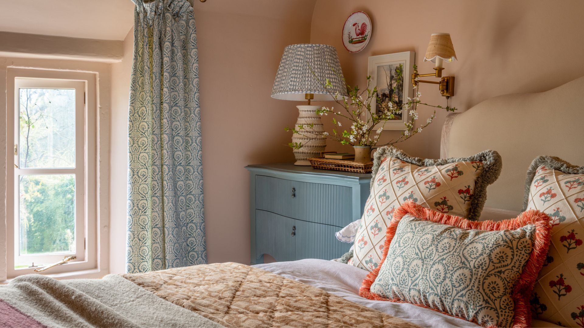
2. Coral
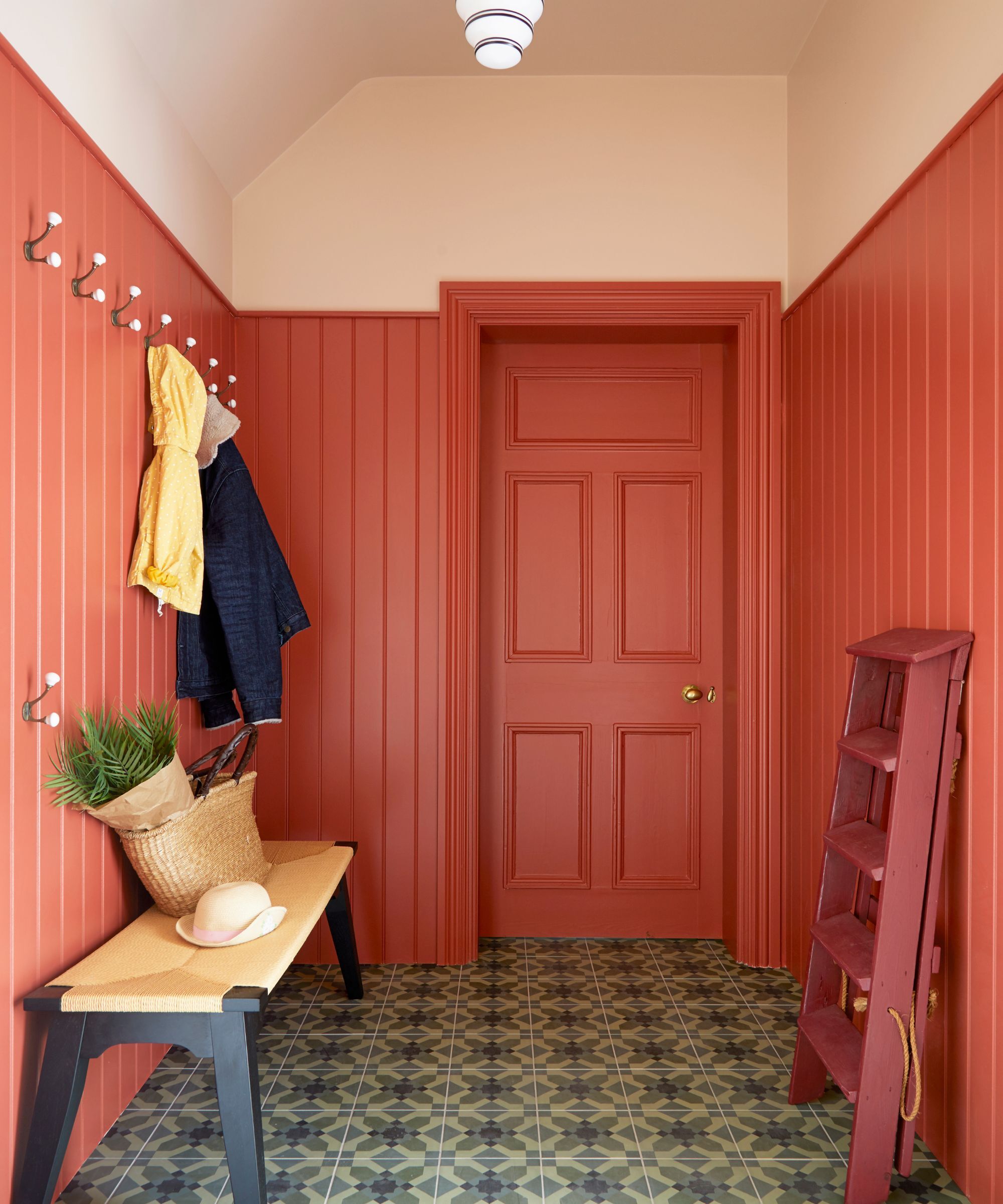
Coral is an unashamedly joyous color and is definitely one to add to your home's palette if you are in search of a color that will inject serious quantities of energy and optimism, but without the headache-inducing intensity of full-tilt neon.
The key to picking a coral paint like an interiors pro is checking the undertone; for example, Farrow and Ball’s Red Earth is a pleasingly earthy coral with a warm red undertone, which is a little more subdued and laid-back, whereas Farrow & Ball’s Charlotte’s Locks has a noticeable orange undertone, which is a sprightly, effervescent color that enlivens a space, rather than calming it.
‘Coral red with an orange undertone is a wonderfully bright, uplifting color to introduce into the home, especially during Spring,’ explains UK-based interior designer Fiona Duke. ‘Having endured months of dark nights and hibernation, we can use colors like this to feel positive and joyous as we embrace the lighter, warmer days.’Coral works beautifully with creamy warm-toned off-white paints. ‘The coral red pops perfectly against the backdrop of a softer, dusty rose undertone,’ explains Fiona. A great pairing for coral is a hushed pale pink; try Farrow & Ball Scallop for a match made in heaven.
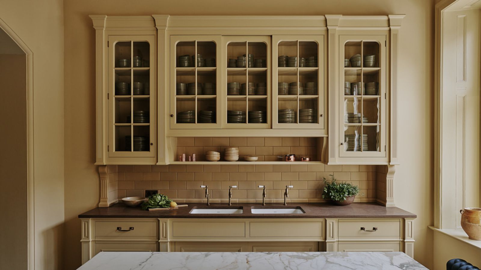
3. Moleskin browns
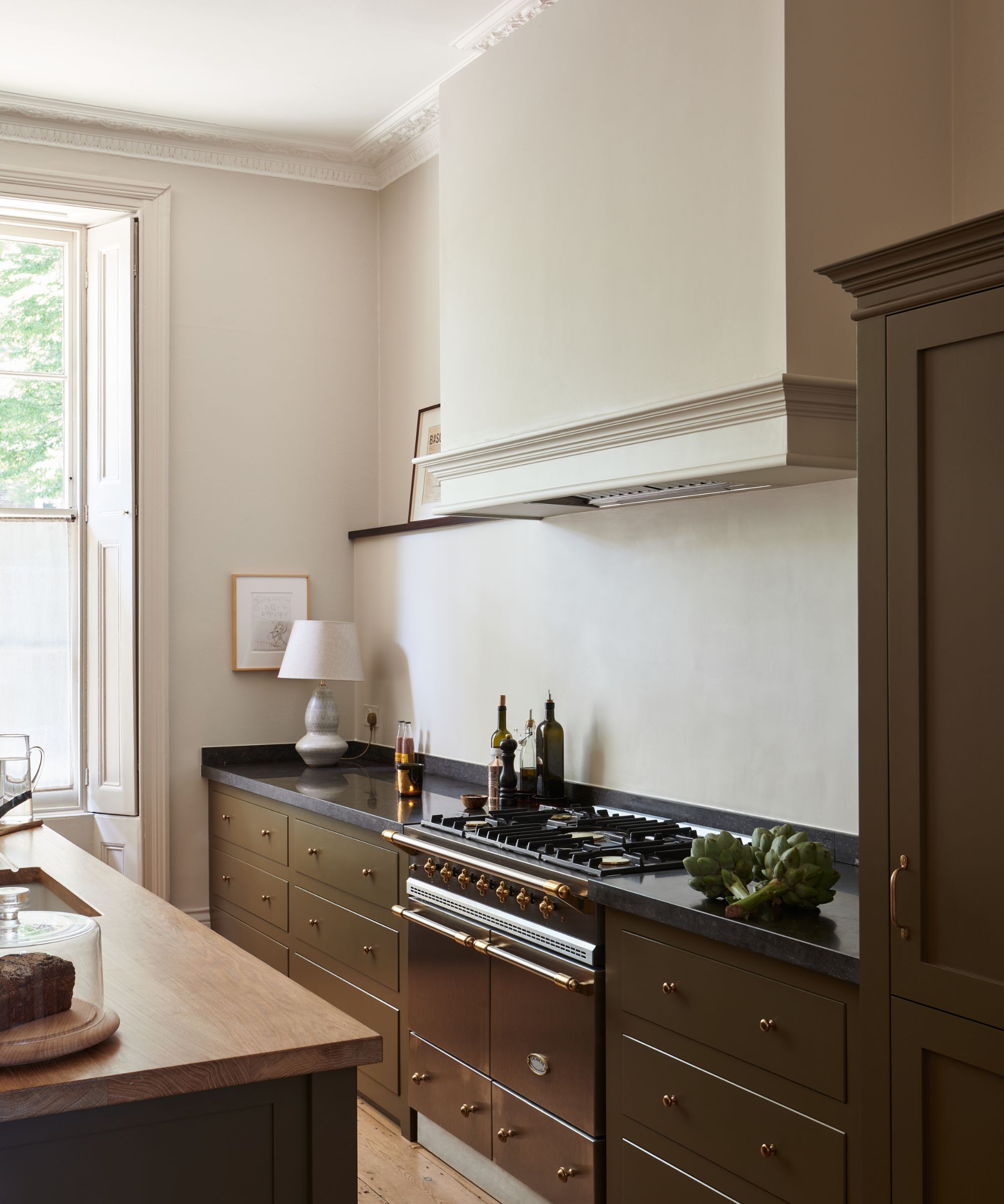
There are hundreds of brown paint colors in a wide spectrum of shades, from reddish tobacco shades to rich, deep chocolate hues. If, like me, you find yourself always attempting to avoid the quotidian drabness of greige, but sometimes need a neutral backdrop color that doesn’t dominate or overwhelm a space, consider the slightly fairer but still wonderfully pigmented fawn-colored hues. They’re less dramatic than a deep brown but are full of traditional character and still do what browns do best—enhance the intimacy of a small space without making it feel claustrophobic.
‘Muddy greeny brown is a color that has been coming to our attention in recent months,’ explains Helen Parker, Creative Director of deVOL. ‘A soft minky brown-grey is a wonderfully chic color to pick for kitchen cupboards. It feels less harsh than regular grey and works well in both contemporary or more period interiors as it is so easy to combine with rich dark reds and greens or more muted pinks and browns.’
4. Barely there pink
If you’re seeing clear signs it is time to repaint a wall but want to stick to a trusty neutral paint, it's worth considering whether the neutral you once chose does its level best to flatter the room it’s in. When looking for a neutral, it can be hard to wade through the many grey-ish iterations, many of which can feel desperately uninspiring and achromatic. A barely-there, gentle pink has been regarded many times as a new failsafe neutral, especially adept at creating a nurturing, soft space that doesn’t lose its neutrality and light-reflecting abilities.
Everyone is already obsessed with Farrow and Ball Scallop, and it might just be my favourite neutral paint on the market. It has the faintest whisper of a delicate pink—but it's worlds apart from a saccharine, overly feminine pink paint.
‘Pale pinks remind me of all the Japanese magnolias blooming about, and April’s weeping cherry trees,’ says Jen Bienvenu of J. Bienvenu Interiors. This gentle color can be found in abundance at this time of year, but it can be hard to find paint colors that truly pull this off. Farrow and Ball Tailor Tack, Julie’s Dream by Little Greene, and Clerkenwell by Mylands are all exquisite examples of this hue.
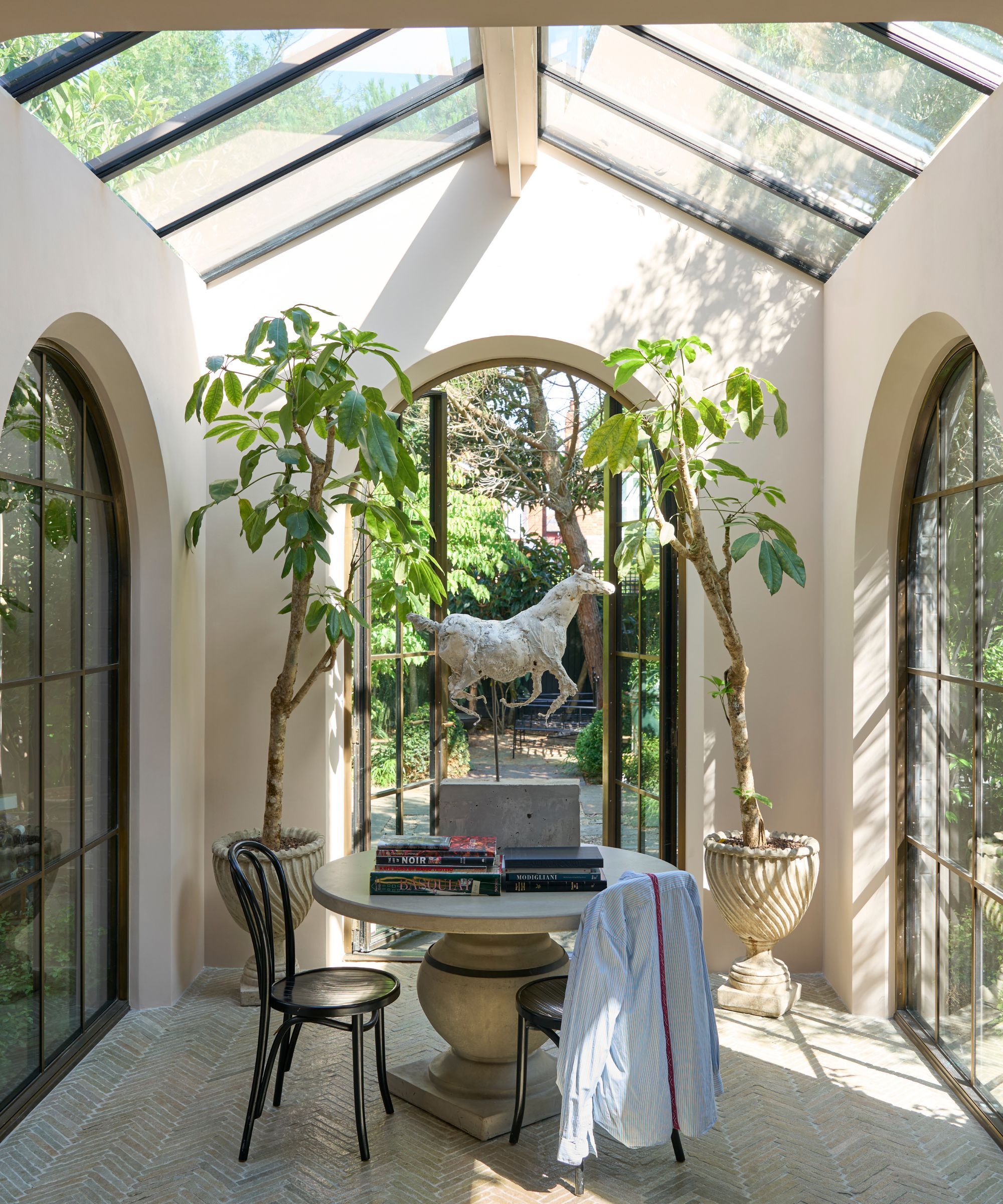
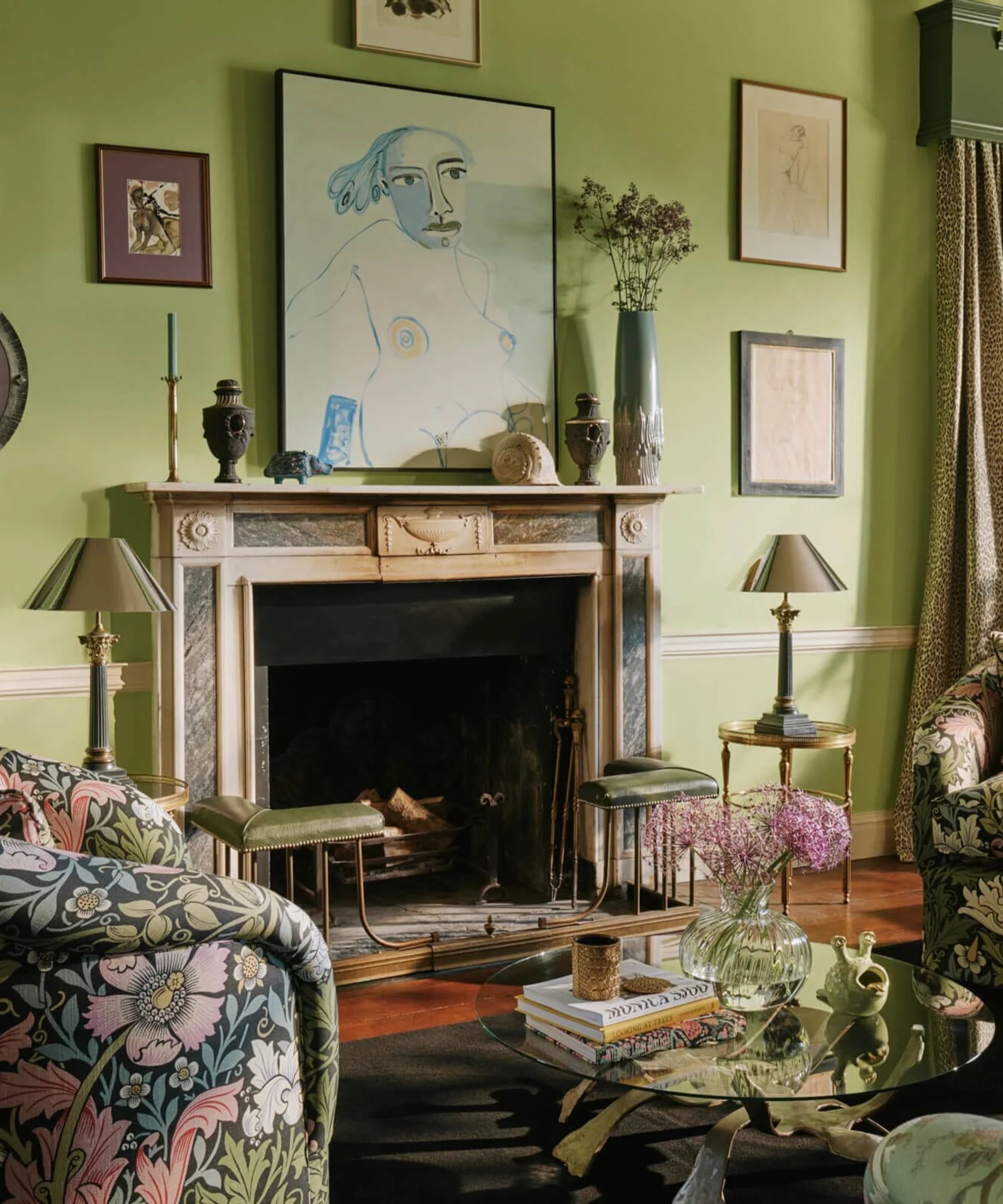
5. Fresh greens
If you’re keen on an elevated, design-led interior that transcends ephemeral paint trends, you may find yourself erring on the side of caution and selecting safe colors to keep things pared back, classic, and not risk them falling out of fashion. This is a useful maxim, but it can lead you to creating an interior scheme that looks worryingly similar to everyone else's.
Bright, ebullient greens are a great alternative to play-it-safe sage green or minty, pale pastel green paint, and I, for one, am more struck by its possibilities than its limitations.
‘Green is the color of life—it connects us instinctively to the natural world, making it a grounding yet revitalising choice for the sitting room,’ explains Chloe Vince, Senior Decorating Consultant at House of Hackney. ‘We adore vivid and vibrant greens for their ability to breathe energy and elegance into a space while still offering a sense of calm.
‘PETUNIA, from our Art of Nature collection featured in this room, evokes the lushness of an English garden, creating an atmosphere that feels both timeless and refreshingly modern. It's the perfect backdrop for eclectic art, richly patterned textiles, and those soulful details that make a house a home.’
6. Colbalt blue
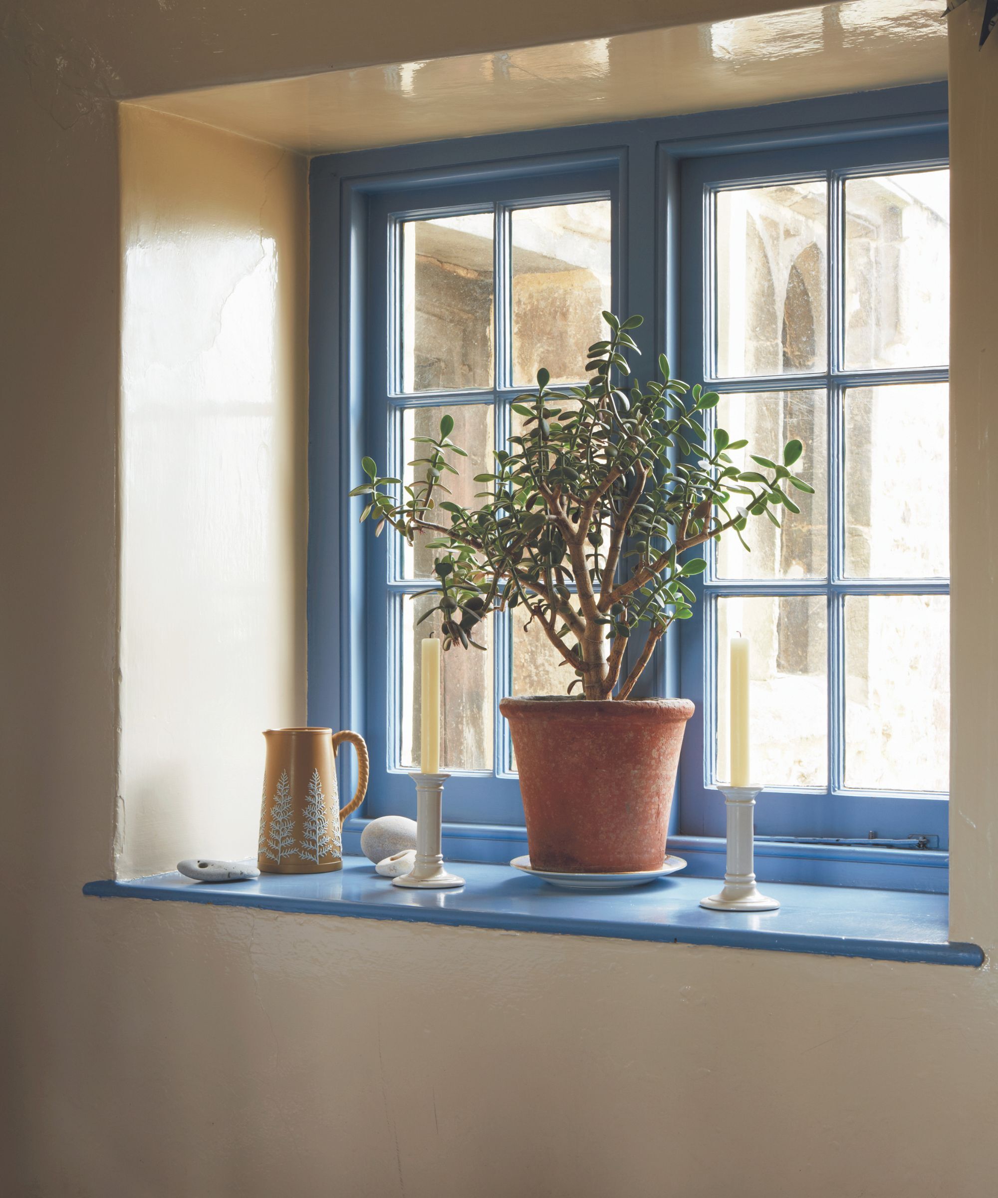
Blue paint might be one of the most versatile paint colors, but bright and bold cobalt blue, admittedly, is less adaptable. If this is where you switch off because cobalt blue sounds entirely too aggressive a color to take seriously in grown-up, sophisticated interiors, let me reassure you.
If you love easy-to-use bold colors, ensure to add this color to your decorating wishlist. For blue room ideas in south-facing rooms, this color is extremely lively, but a little more subdued in rooms deprived of natural light.
That said, you can count on these ultramarine and electric blue shades to enliven a room and stimulate and energize those inside it, so it's a great option for social rooms, party rooms, dynamic work spaces or on exterior walls - particularly outdoor eating areas as it is said to help deter flies. It is especially magnificent when used on woodwork, like internal or external doors, woodwork, and trims, and adds a wonderful layer of visual interest.
April is not only the month we’re all compiling our spring cleaning list, but this month offers fertile ground to refresh and update your interiors by drawing inspiration from the abundance of the natural world around you, from pollen yellows to zesty lime greens.
Be sure to add fistfuls of fresh flowers to vases around your home (if they don’t set you sneezing) and consider refreshing your wallpaper, curtains, or throws as part of your Spring decor ideas.