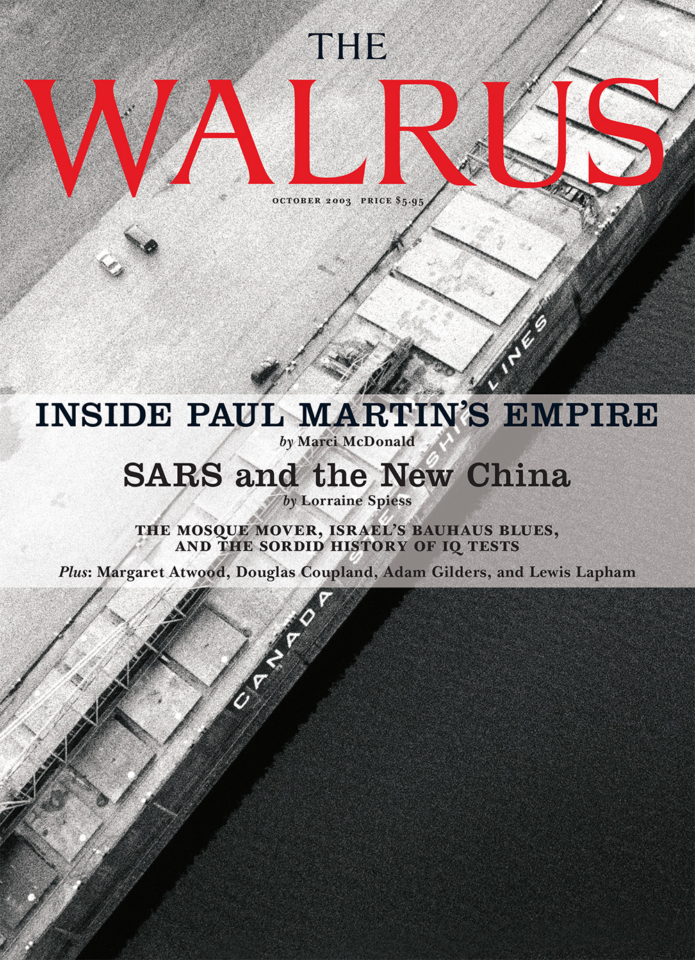
October 2003
Photography by Eamon Mac Mahon
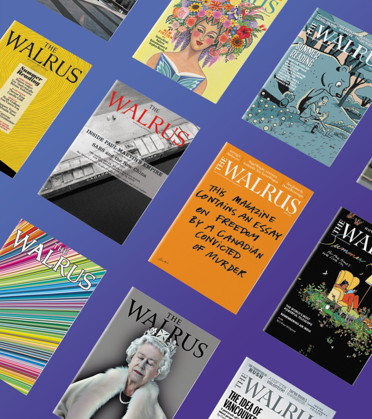
Jason Logan: We tried hundreds of options for that first issue cover. My initial favourite was a photo of a New Yorker magazine crumpled into a ball and lying on a sidewalk, with the word “Walrus” overtop. We thought it would, at the very least, get reactions. Instead, there was a major essay about Paul Martin’s ties to the shipping industry, but we struggled with how to turn that into an evocative cover. We commissioned Eamon Mac Mahon, whose portfolio featured aerial photography and who had a friend who owned a bush plane. Mac Mahon took on the assignment like a secret mission. While hanging out of the passenger side of the plane, he photographed some of the ships that Martin owned or operated or was dubiously involved with. We ended up using a shot of a vessel in the waters somewhere around Hamilton. A Great Lake ship full of iron ore bound for the Atlantic sat diagonally across the cover of the first issue of The Walrus like a no-smoking sign. A beautiful negation.
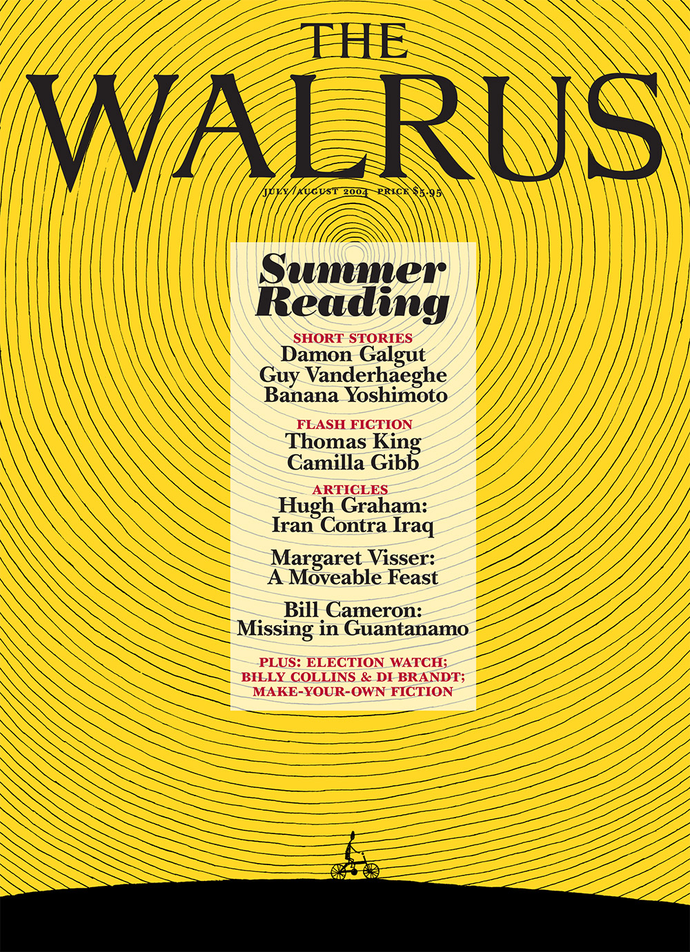
July/August 2004
Illustration by Richard Hahn
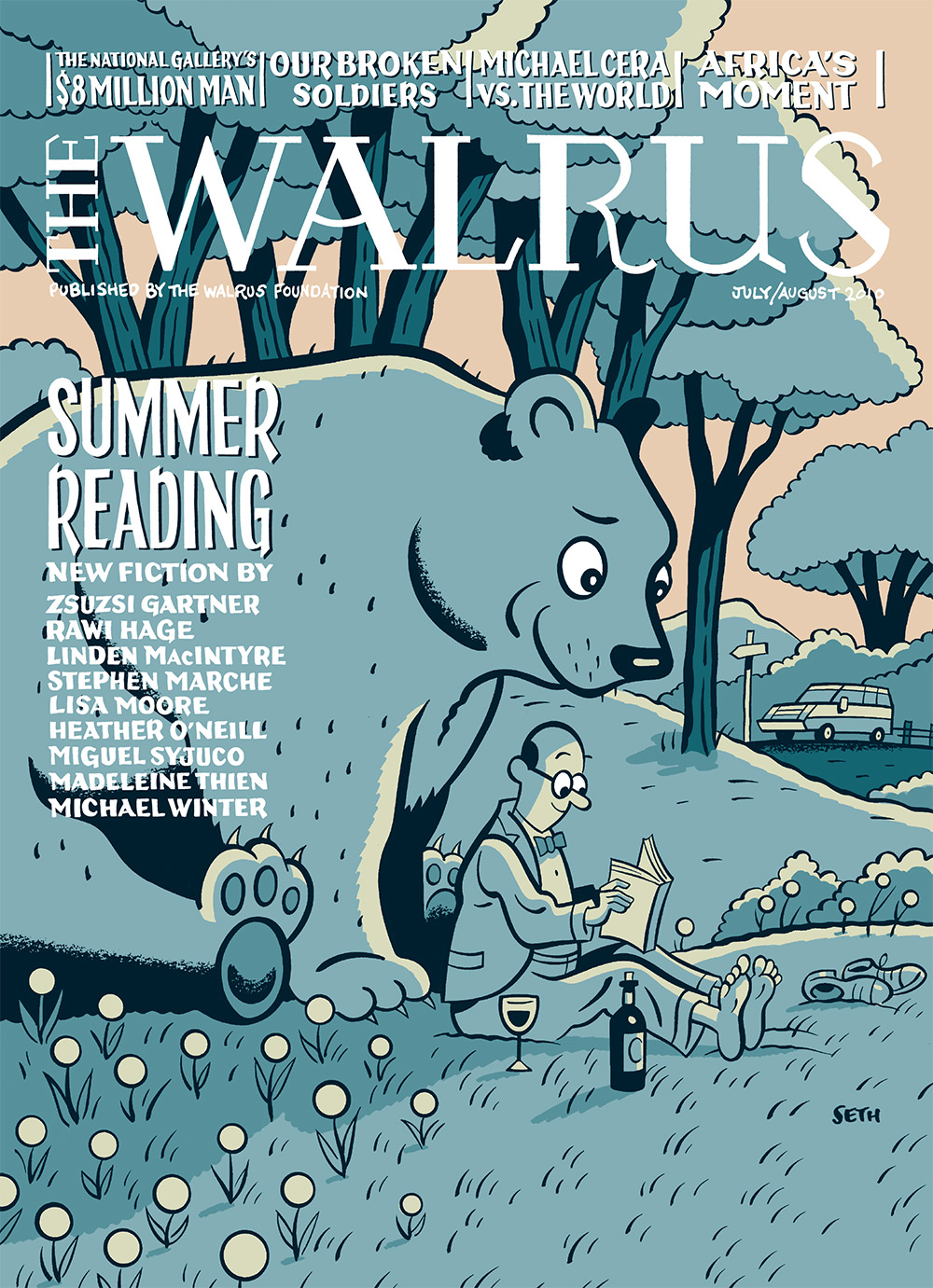
July/August 2010
Illustration by Seth

July/August 2014
Illustration by Roxanna Bikadoroff
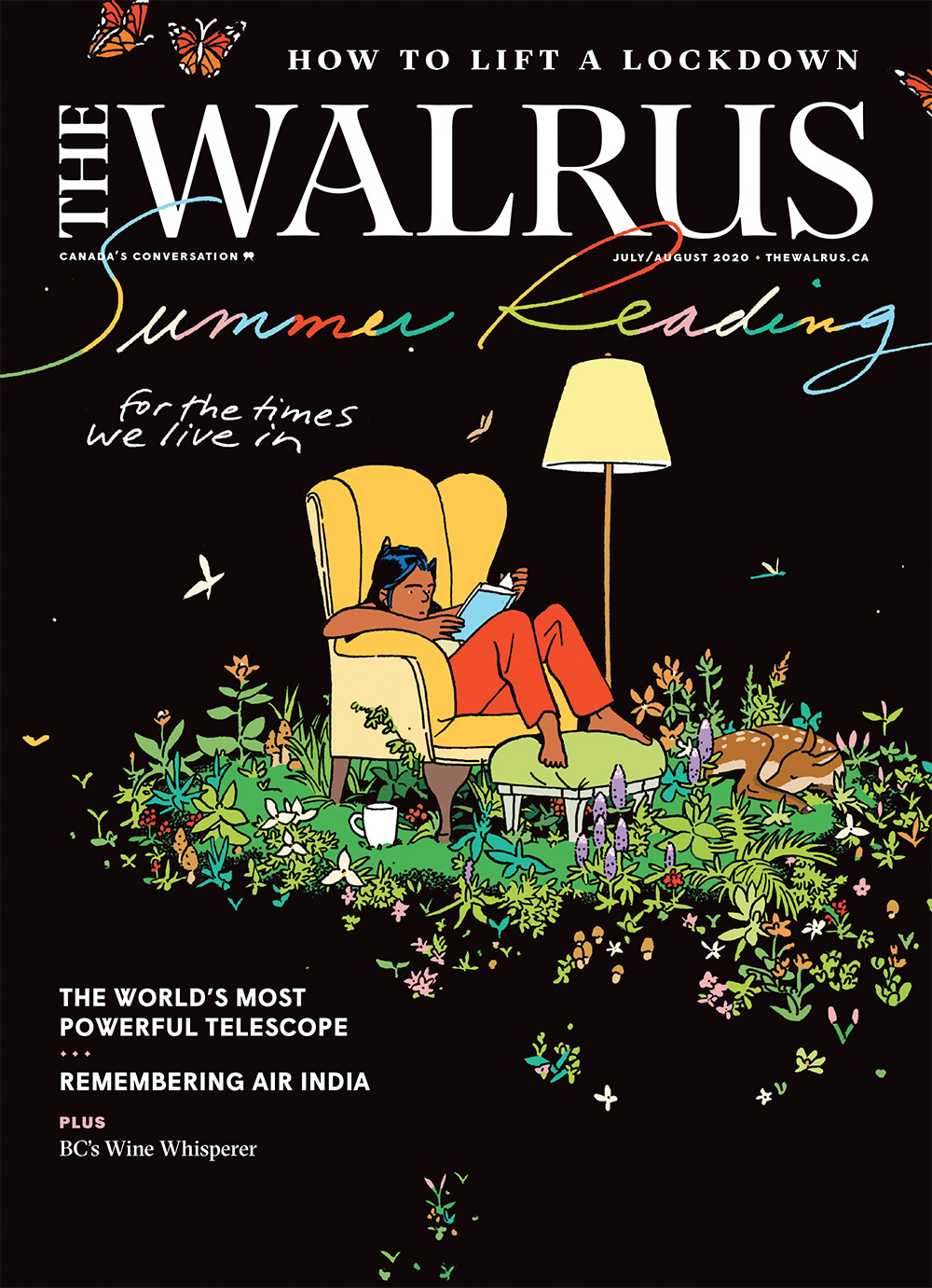
July/August 2020
Illustration by Jillian Tamaki
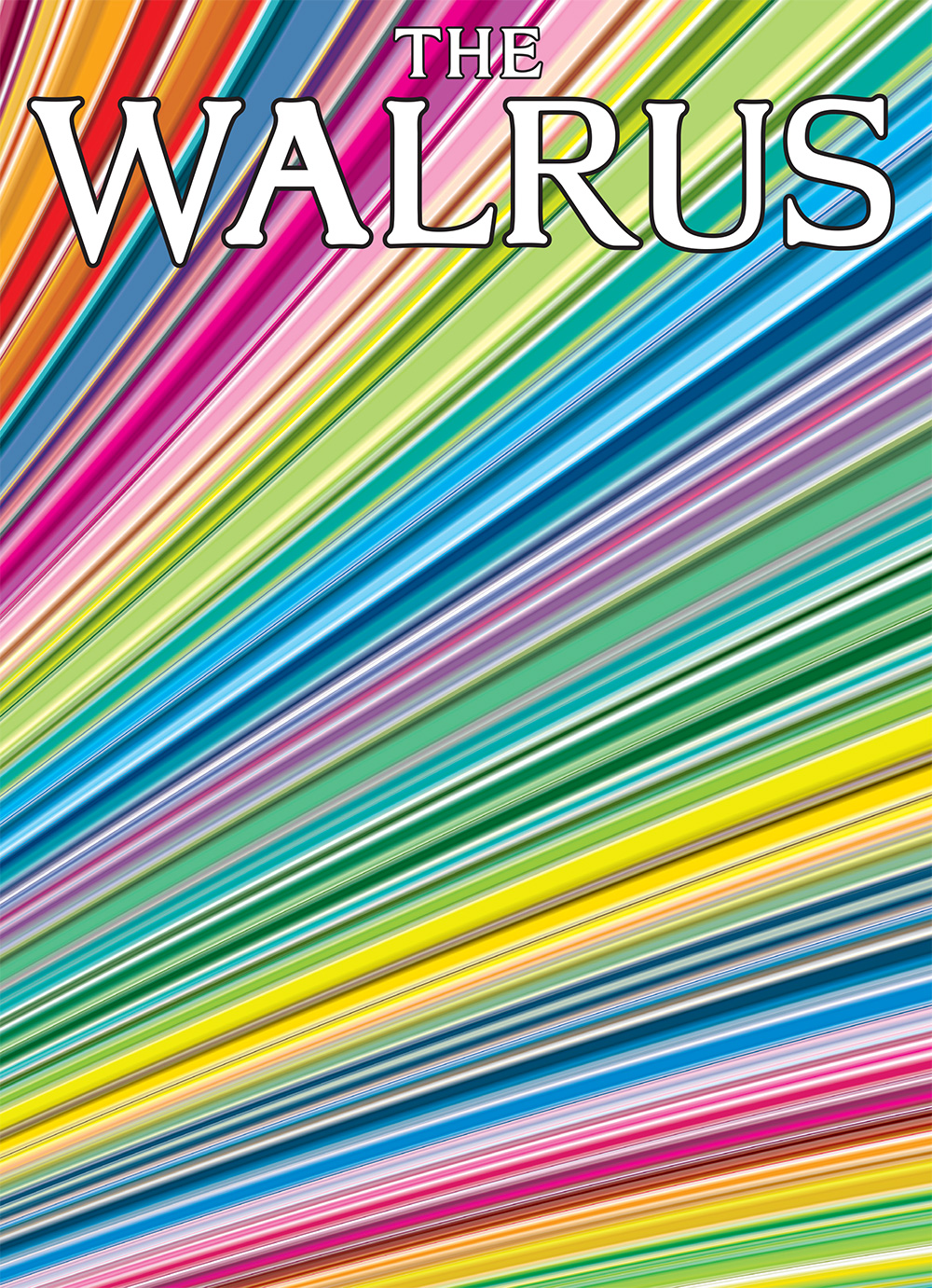
December 2006/January 2007
Illustration by Bruce Mau
Antonio de Luca: In 2007, the media industry was facing more and more compromises as budgets were falling globally. The subprime mortgage crash was looming. It was an odd time for The Walrus to decide to do a piece on the theme of optimism. The team discussed who would be great to explore it while also considering its relevance beyond Canada. Designer Bruce Mau agreed to do the cover and the feature theme. We had scheduled a twenty-minute meet-and-greet at his office in downtown Toronto, but we ended up talking about our shared sciatic pain for over two hours while lounging on the floor with large pillows. Feeling concerned that we were straying away from the theme of optimism, I impulsively exclaimed, “Hey Bruce, what about this cover?” He paused, moving his hands like a magician: “What about . . . colour!” I replied, “Perfect,” and left. A week later, this piece arrived.
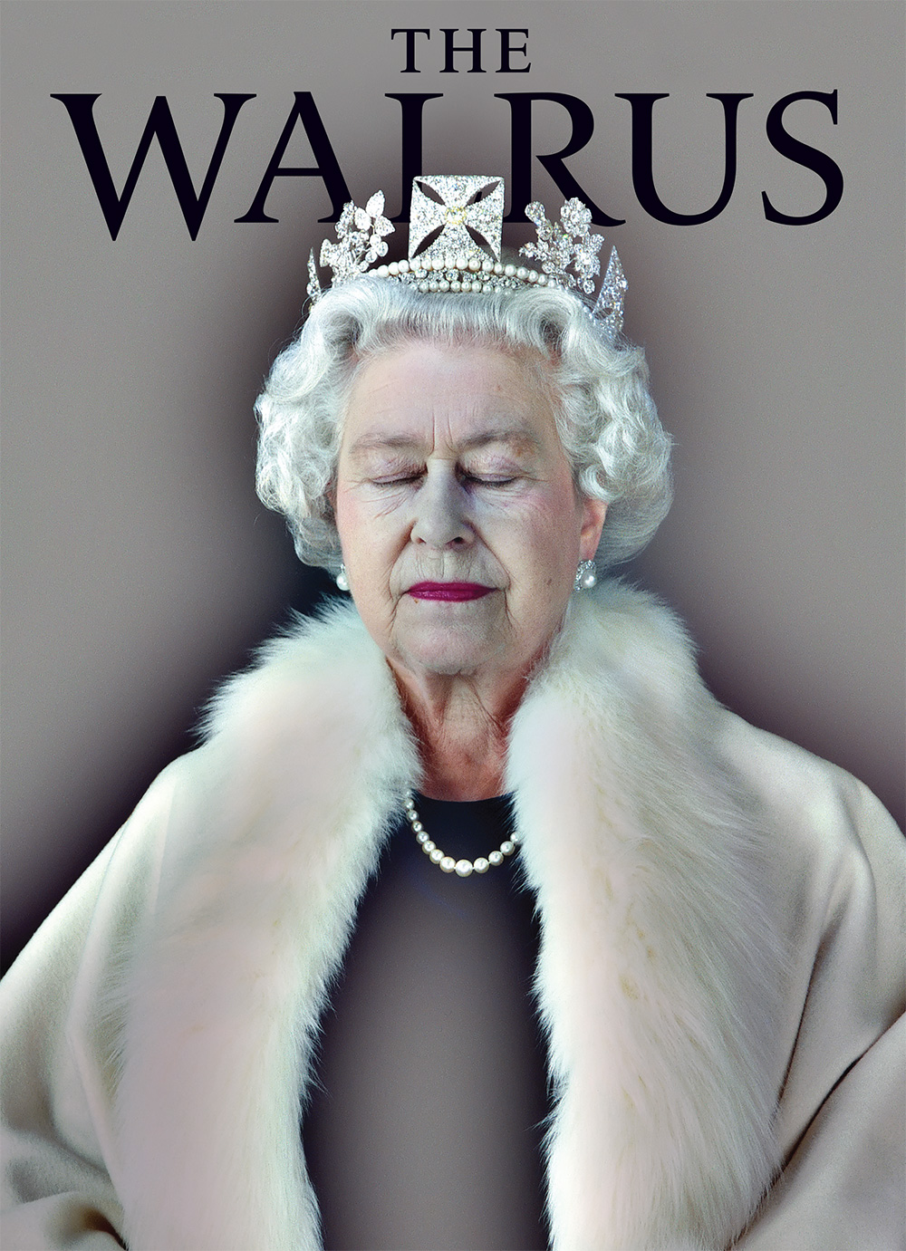
December 2007
Photography by Chris Levine
Jason Logan: I was the founding art director of The Walrus and Antonio de Luca the creative director. We always tried to strike a balance between making a cover that felt serious enough to the editors, summing up the issue or its most important stories, while also making the cover we really wanted: something with impact, where the art felt as powerful as the writing. But one of my favourite covers was one I didn’t work on. When I saw the cover that featured a fine art photograph of Queen Elizabeth II, I loved it. It felt bold and strange and attention grabbing in a way that I wish the covers from my era had been. And there was no story in the issue about the queen—just a graphic cover on the edge of understanding. I would say it had impact.
March 2010
Photography by Grant Harder
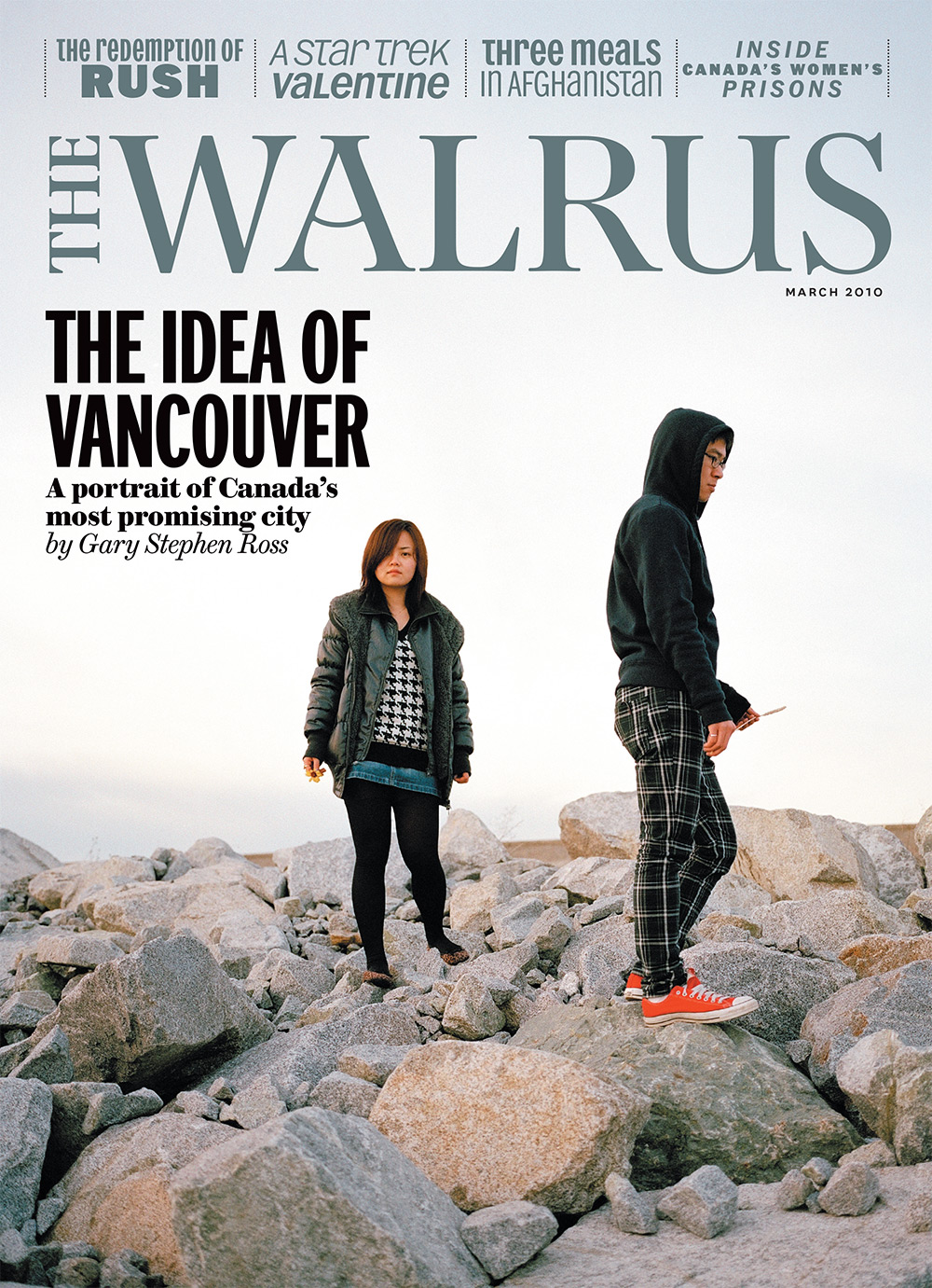
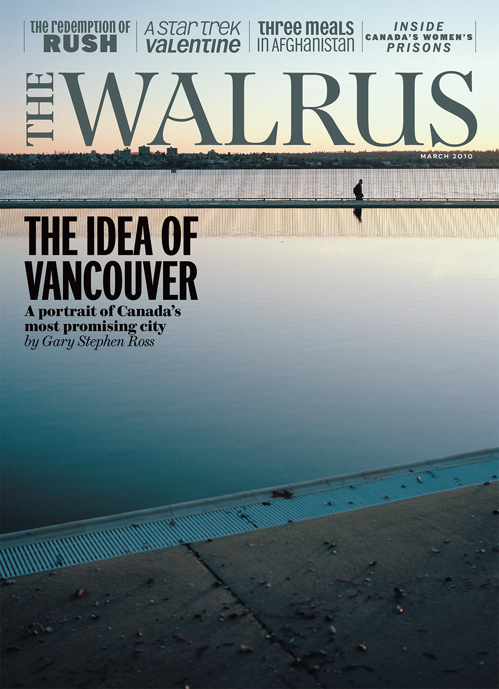
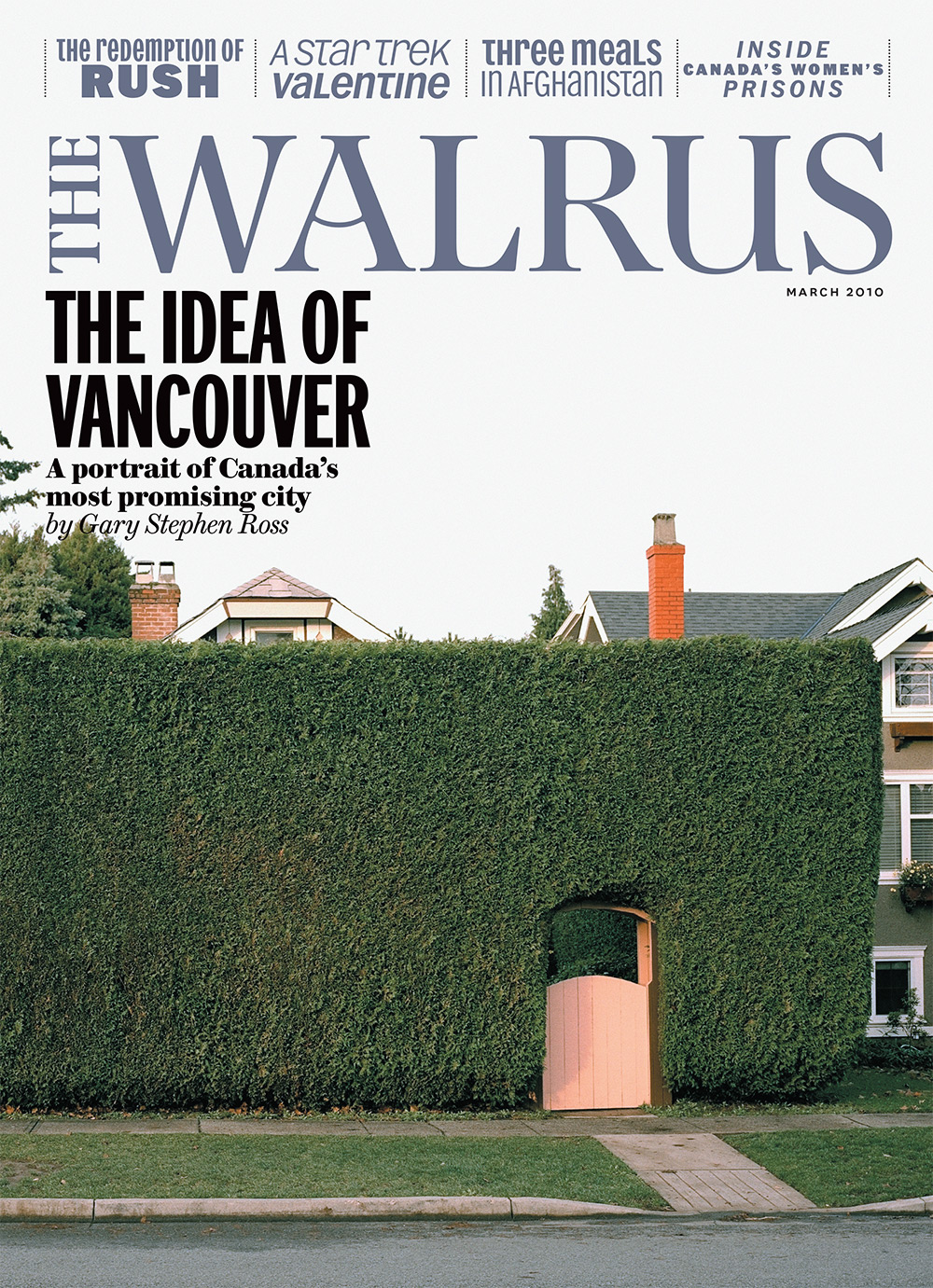
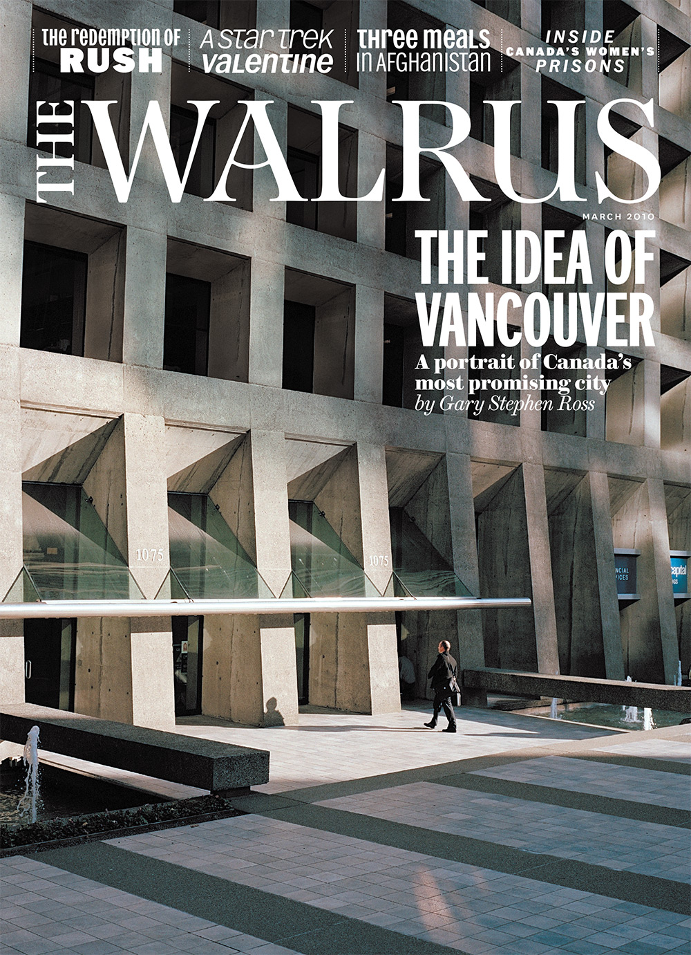
Brian Morgan: In advance of the 2010 Winter Olympics, we commissioned Grant Harder for a photo essay to accompany an article about Vancouver. Both were to be portraits of the city on the cusp of a transformation: If Expo 86 had rewritten the city, what would happen after the Olympics came to town? When the thousands of international visitors arrived, what would they find? Harder had shot the city from several locations, from Richmond to the North Shore and everywhere in between. In the end, we had more brilliant options than we knew what to do with. Alongside the article, where we had the space to run several photos, the dictates of narrative, pacing, text, and variation gave us a method of winnowing. But the cover was a quandary: there were so many possibilities. And we wanted to do something special. It was the Olympics, after all. Because magazine covers are printed four to a sheet, why not, we asked, print four different covers? The solution, while hardly novel, is also not common, but it takes advantage of the printing process itself and answers one facet of the question “Why print?” The result was a set of covers in which each was meaningful on its own while also being a reflection or refraction of a larger, more solid image of Vancouver than could be shown as a standalone.
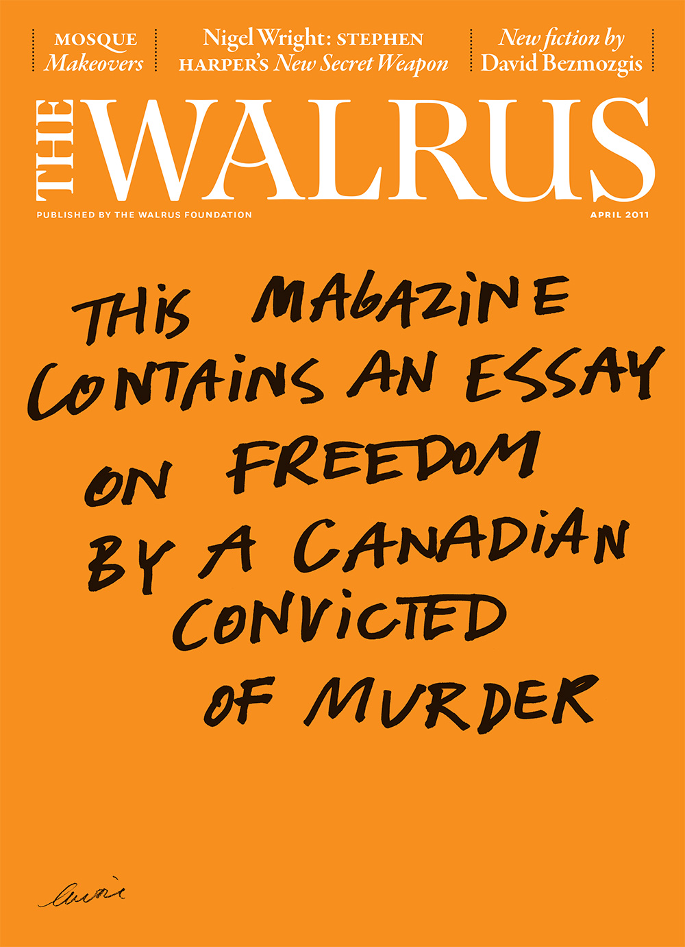
April 2011
Illustration by Mathieu Lavoie
Brian Morgan: This cover was a difficult brief. Canadians can be quite conservative when it comes to criminal justice, so sympathy for this particular author might have been hard to draw on. A direct approach seemed best. When I took over from Antonio, the brief was to sell the story, not the magazine, and I have to say I struggled. The magazine had established what I felt was the perfect image, where the stories in the issue were one reason to buy the magazine while the connection of the cover with the moment was another. I thought what we’d found here was right for us: to be blunt and honest in the display and art. The cover answered the question “Why are you running this?” very directly and, as such, treated the reader as an editorial equal.
