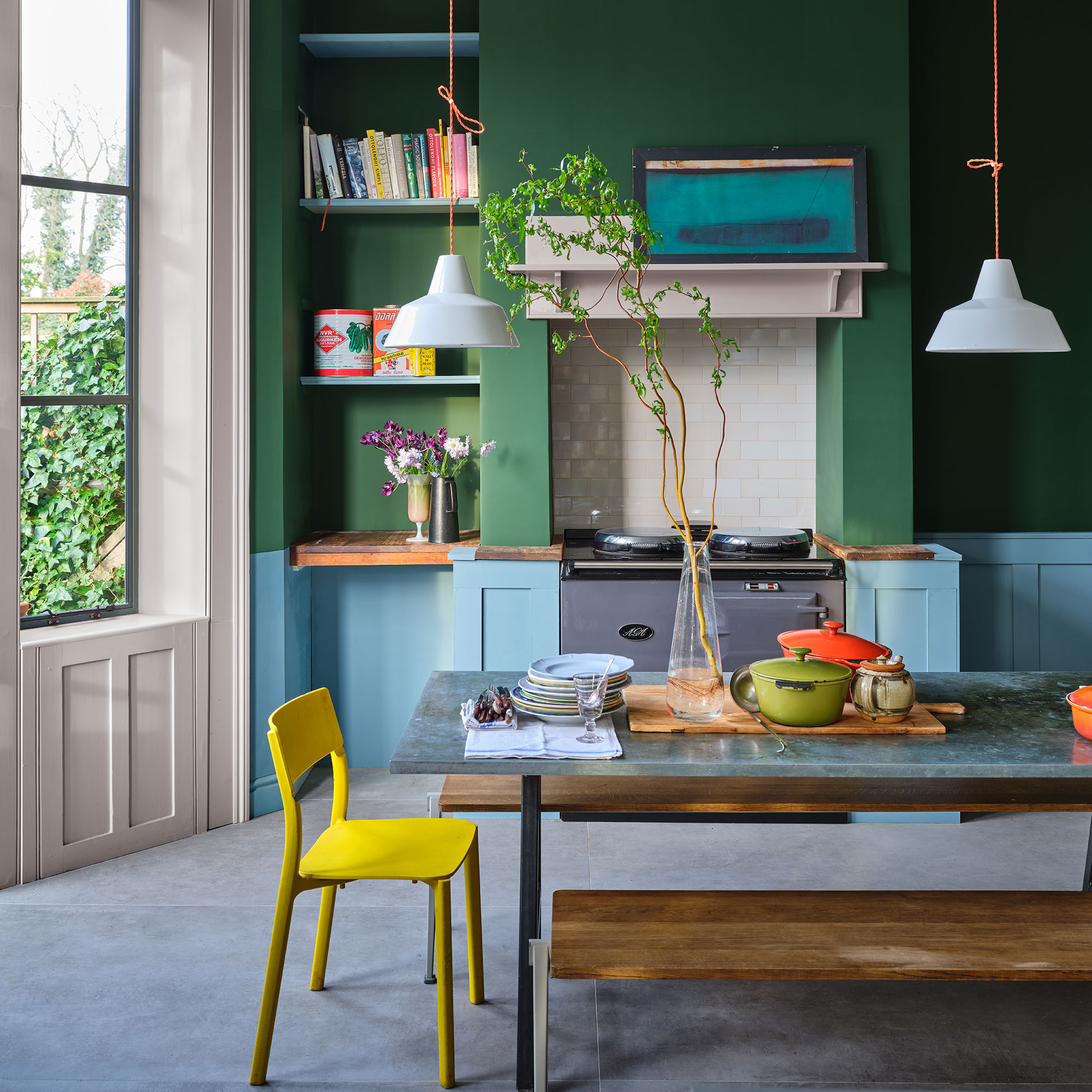
Farrow & Ball are arguably one of the most lust-worthy brands on the market when it comes to paint ideas, with many of us familiar with some of their most popular colours.
Downpipe- a moody, dark grey, Railings- a trendy bluey black, Elephants Breath- a warm, contemporary and oh-so-easy to use grey and Wimborne White, a slightly off white, are just some of the more well-know shades, used in abundance in homes across the country.
Their main collection features just 132 colours (it's a one in, one out kind of situation), which compared to some other paint brands is a reasonably concise and curated offering. But aside from the colours we've all heard of, what about the other gems hiding among their more popular siblings? Are we missing out by sticking to the 'classics'?
We wanted to discover some of the lesser-known Farrow & Ball colours that some of the industry's top interior experts love to use, to inspire your next decor project, and show some love to some of the colours that might not be getting the attention that they deserve!
Read on to reveal why these stunning lesser-known Farrow & Ball colours might just become your new favourites, and let your house stand out from the crowd.
1. Studio Green
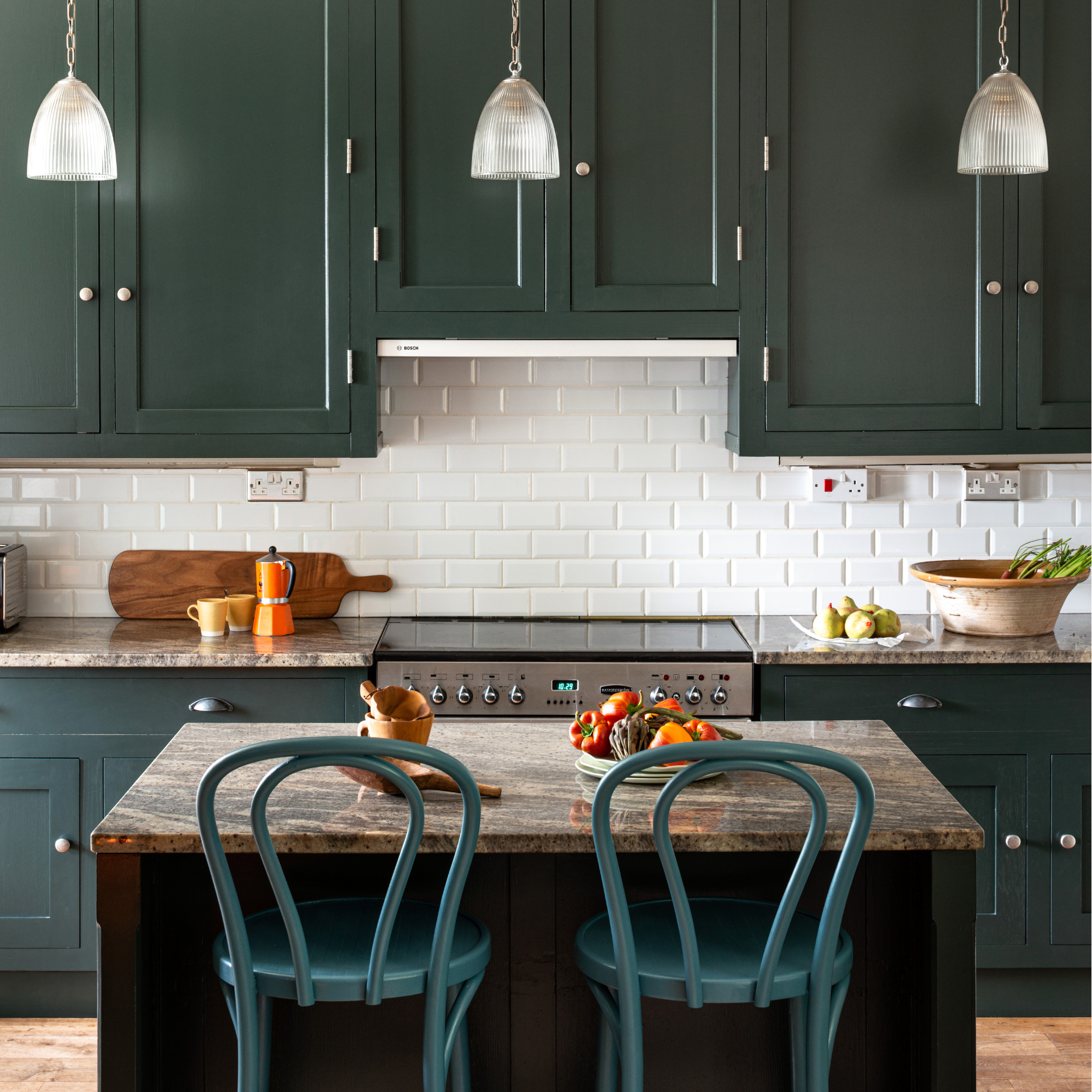
First up on our list of lesser-known Farrow & Ball colours is a truly transformative shade.
Katerina Tchevytchalova, Director & Interior Designer at K'Arte Design comments, 'I tend to gravitate to paints that might not be what you would initially expect in that room. For example, Studio Green is a deep, rich green that might not be an obvious choice for kitchens, but it works beautifully to tie in warm, earthy tones found throughout a home.'
'It’s surprisingly versatile, pairing effortlessly with worktops, hardware, and timber finishes. What makes it truly special is its uniqueness - it’s unusual yet timeless, creating a look that the eye never tires of.'
If you're looking for green kitchen ideas, Studio Green could be the perfect choice to take your space from tired to timeless with just a lick of paint.
2. Setting Plaster
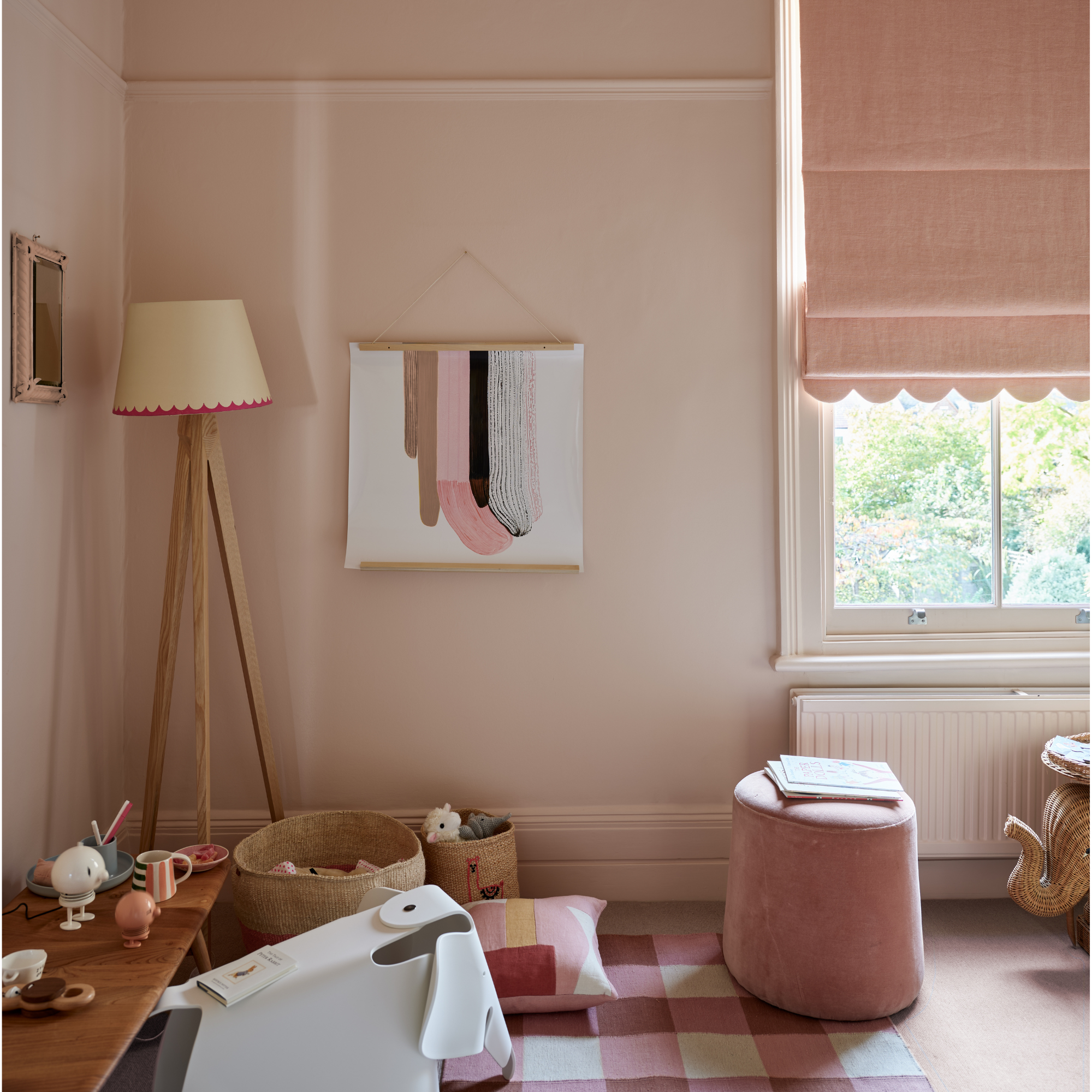
'One of my absolute favourites of the lesser-known Farrow & Ball colours has to be Setting Plaster, explains Gemma Gear, Interior Stylist & Creative, at Thats So Gemma.
'It’s so versatile and has an amazing chameleon effect, changing shade depending on the light in the room. It’s a pinky-neutral shade that works beautifully with so many other colours'.
'I’ve gone all out by colour drenching my guest bedroom in Setting Plaster, and I honestly love how it transforms throughout the day. In the sunny mornings, it feels warm and glowy, really bringing out those soft pink undertones. Then, by the afternoon, it takes on a more muted, cooler vibe, which makes the room feel super cosy and calm.'
Pink is forever one of the most popular paint trends and it's easy to see why as this versatile hue has some many guises. There is no space it doesn't work, from bathrooms to bedrooms, walls to ceilings and even front doors!
Another shade of pink that Farrow & Ball is more well known for is Sulking Room Pink. A grown-up, dusky shade, knowing how to decorate with Sulking Room Pink will create a space that is coveted by all that visit.
3. Cooking Apple Green
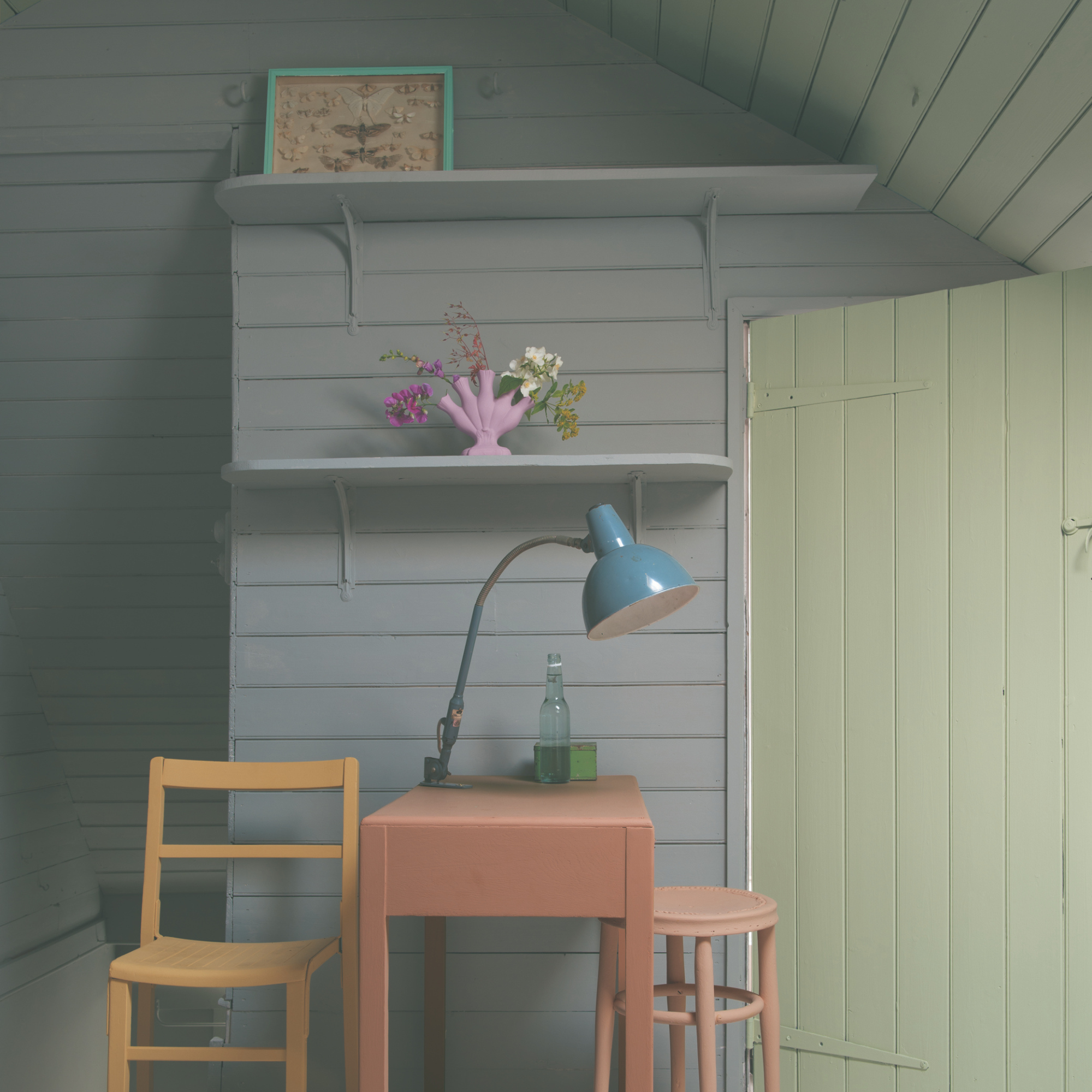
'If you’re looking to bring more colour to your walls but still want something that feels neutral, then I'd highly recommend trying Cooking Apple Green,' advises Gemma.
'It’s such a warm, fresh shade of green that works with any style and adds a lovely natural feel to your space.'
Lisa Dawson, Interior Stylist and Author adds, 'I've used Farrow & Ball paint many times in my home over the last few decades. My first foray (around 20 years ago) was Cooking Apple Green, a soft, clean green that was perfect for my kitchen cabinet ideas. I teamed it with Shaded White and painted almost my entire downstairs in the same warm tone, loving the contrast with the white ceilings and original wooden doors of our 1930's home.'
4. Red Earth

Moving on to a couple of the more vivid lesser-known Farrow & Ball colours, Esme Amberg, Head of Design at The Roost reveals, 'My current favourite Farrow & Ball combination is a very autumnal and moody choice full of character. Red Earth and Mahogany complement each other beautifully, and the combination creates a bold yet moody and warm feel.'
'I recently used Red Earth on the upper part of the walls with Mahogany below the dado and on the woodwork. It works beautifully in hallways to create a striking, sophisticated look as you step into the house.'
While knowing how to decorate with red is not always an easy one, this warm shade is perfect for adopting the colour-drenching paint trend and will cocoon you in a comforting colour.
5. Beverly
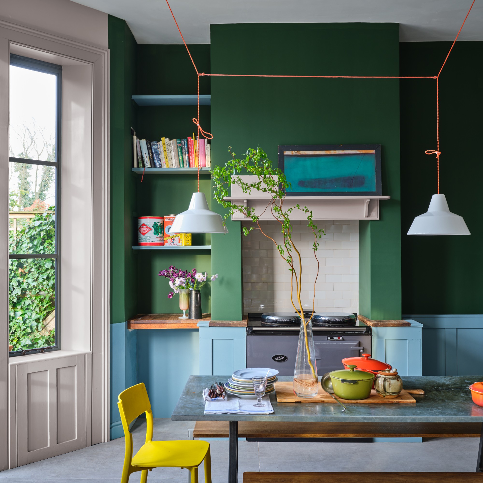
'One of the other lesser-known Farrow & Ball colours that I love is Beverly,' continues Esme. 'A great, fun and playful green, which is commonly used in ambience filled dining spaces or snugs, but it’s perfect for playrooms too!'
'Lively and characterful, the deep green shade will add a splash of colour to your space and is a great canvas for layering brighter accessories and patterns to inspire creativity.'
If you're searching for colours that go with green, look to what undertones your chosen green has, and try to either match or contrast with these.
6. Tallow
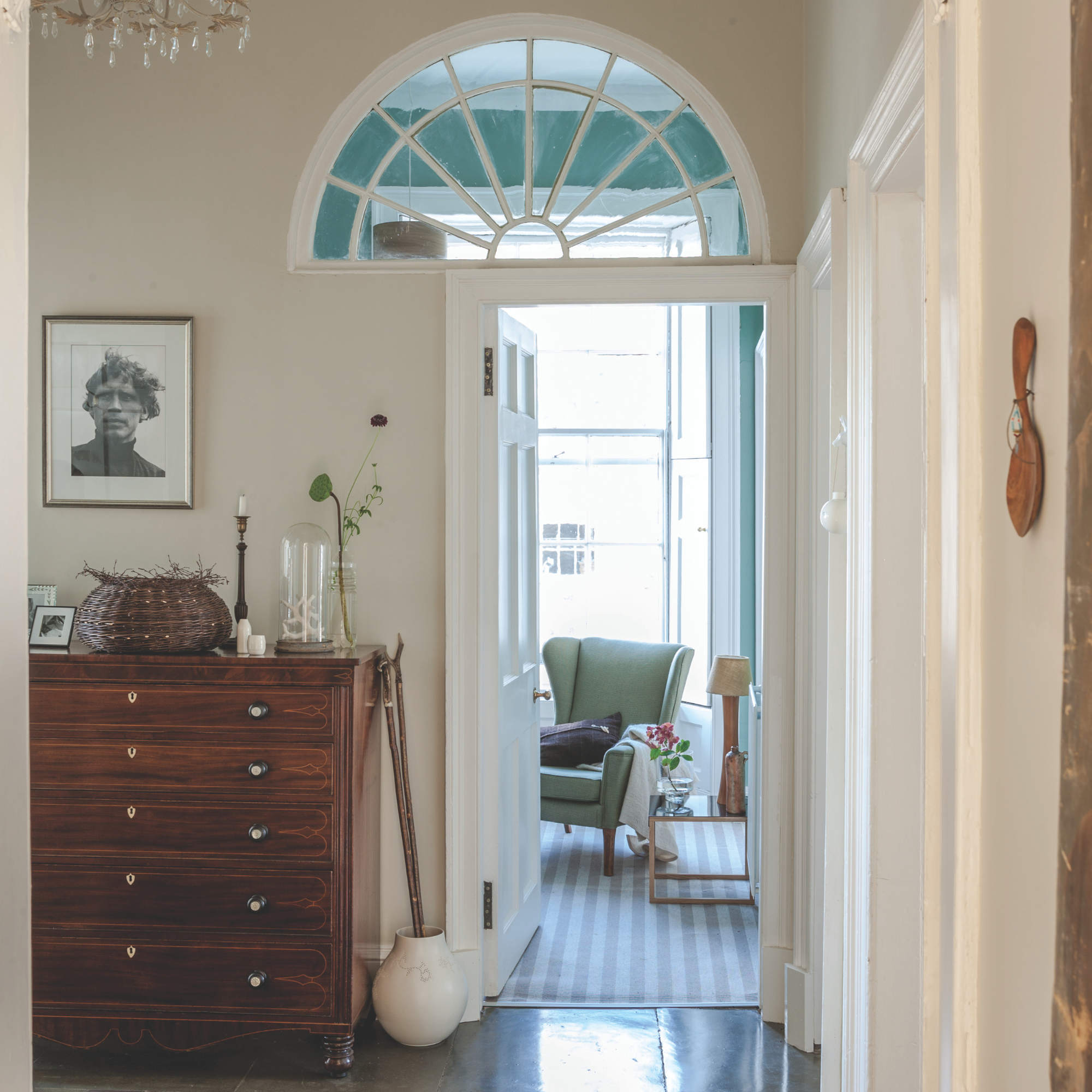
'My last favourite lesser-known Farrow & Ball colours is Tallow,' explains Esme.
'Whilst bright yellows are everywhere, I am loving this muted shade. A very subtle and warm cream with yellow undertones that is perfect for bringing some subtle colour to dark spaces or for decorating north facing rooms to help maintain a feeling of warmth.'
'Speaking of bright yellow - this is a great colour to put alongside Tallow for maximum sunshine vibes!' she suggests.
7. Dix Blue
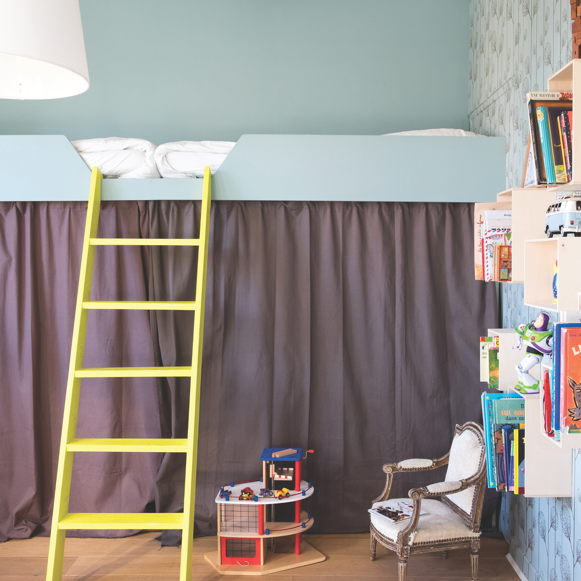
Susan Venn, Interior Designer and Founder of Susan Venn Interior Design has a few favourites when it comes to her choice of lesser-known Farrow & Ball colours.
'My first is Dix Blue is a warm green-blue that is easy to live with, but has a much more energetic feel to it. It looks gorgeous against all wood tones. We have used it in guest bedrooms but it's also great for children's rooms.'
'Next is Light Blue. It's a fresh colour but still has so much warmth. It changes from blue to green depending on the light and is a lovely colour to add subtle drama to a hallway. It looks stunning against warmer red tone accents.'
'Finally, Pigeon is a much sludgier grey green tone which works beautifully in period properties. It looks great in darker spaces and looks equally stunning paired with blue grey on the woodwork.'
8. Vert de Terre
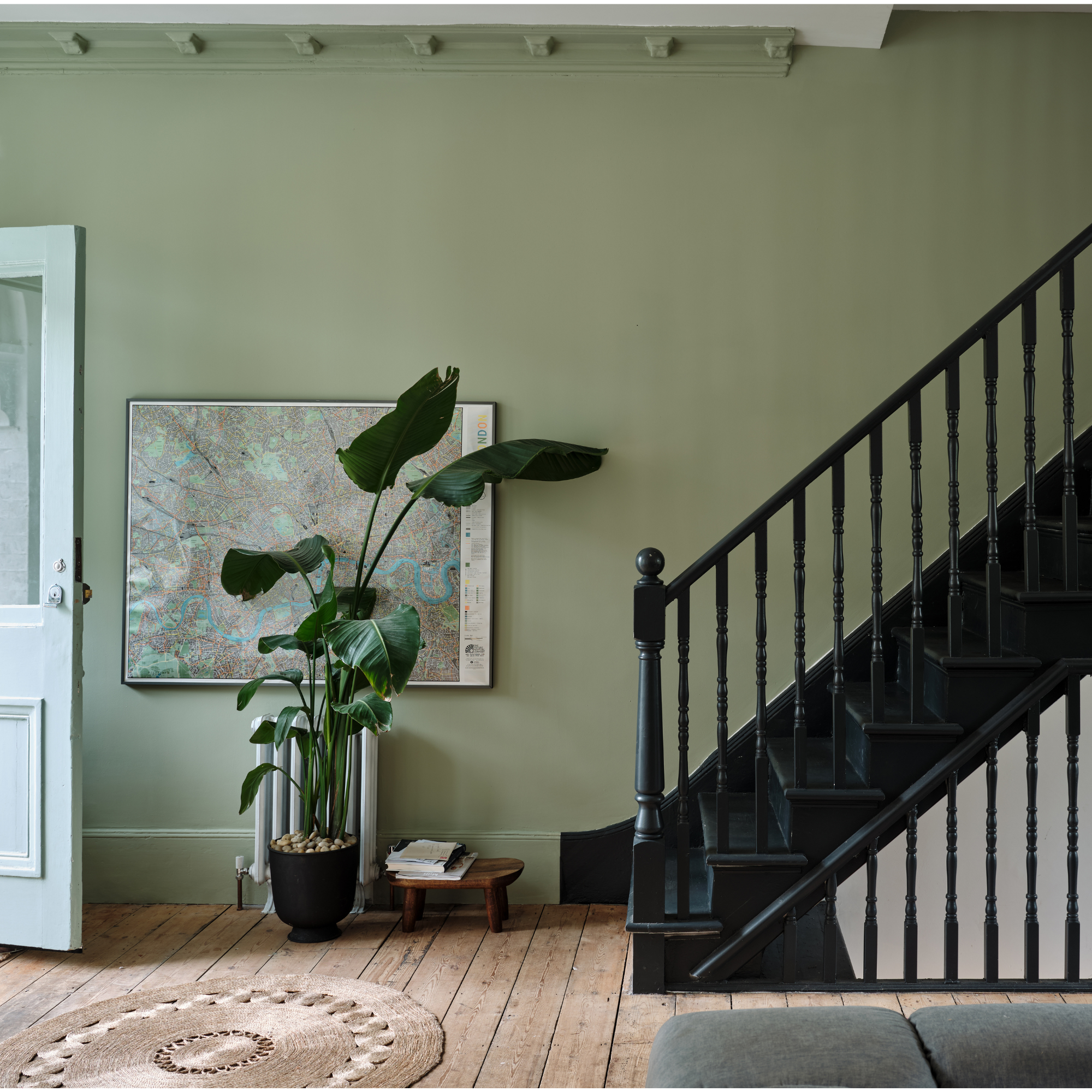
Continuing with our list of interior experts favourite paint colours, and more specifically, their favourite lesser-known Farrow & Ball colours, Reena Simon, Designer, Author & Stylist comments. 'I often gravitate towards colours like Vert de Terre, a soft, earthy green that brings a sense of balance and connection to nature, or Shaded White, a warm off-white that feels both grounding and sophisticated. These shades work beautifully in living spaces and bedrooms, where mood and atmosphere are key.'
'In my book Scandi Rustic, I talk about the importance of colour in evoking feelings of calm and continuity. When paired with natural textures, such as linen, polished concrete, or raw wood, these colours take on a sensorial quality, creating spaces that feel restorative and inviting.'
9. Bone
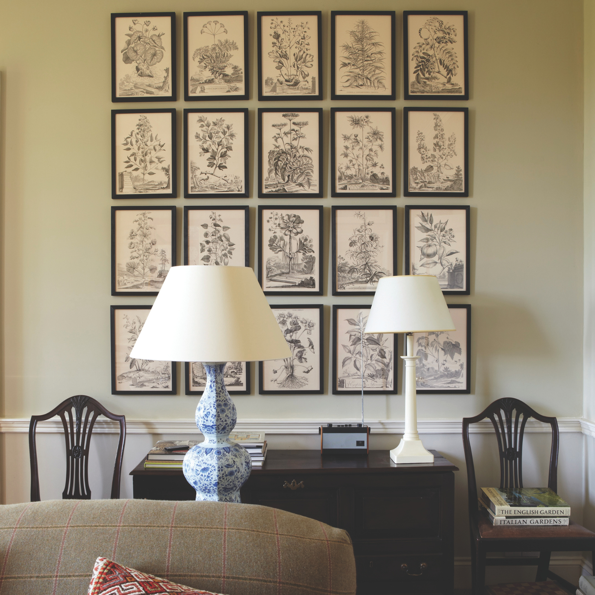
'For a truly transformative effect, I suggest layering tones like Shadow White or Bone,' continues Reena.
'These softer neutrals create subtle depth without overwhelming a room and act as a perfect backdrop for personal details and tactile elements like jute rugs or wool throws.'
'Farrow & Ball’s less conventional shades encourage us to think beyond trends and embrace colours that speak to us personally, helping to design homes that feel timeless, serene, and uniquely ours.'
10. Calamine
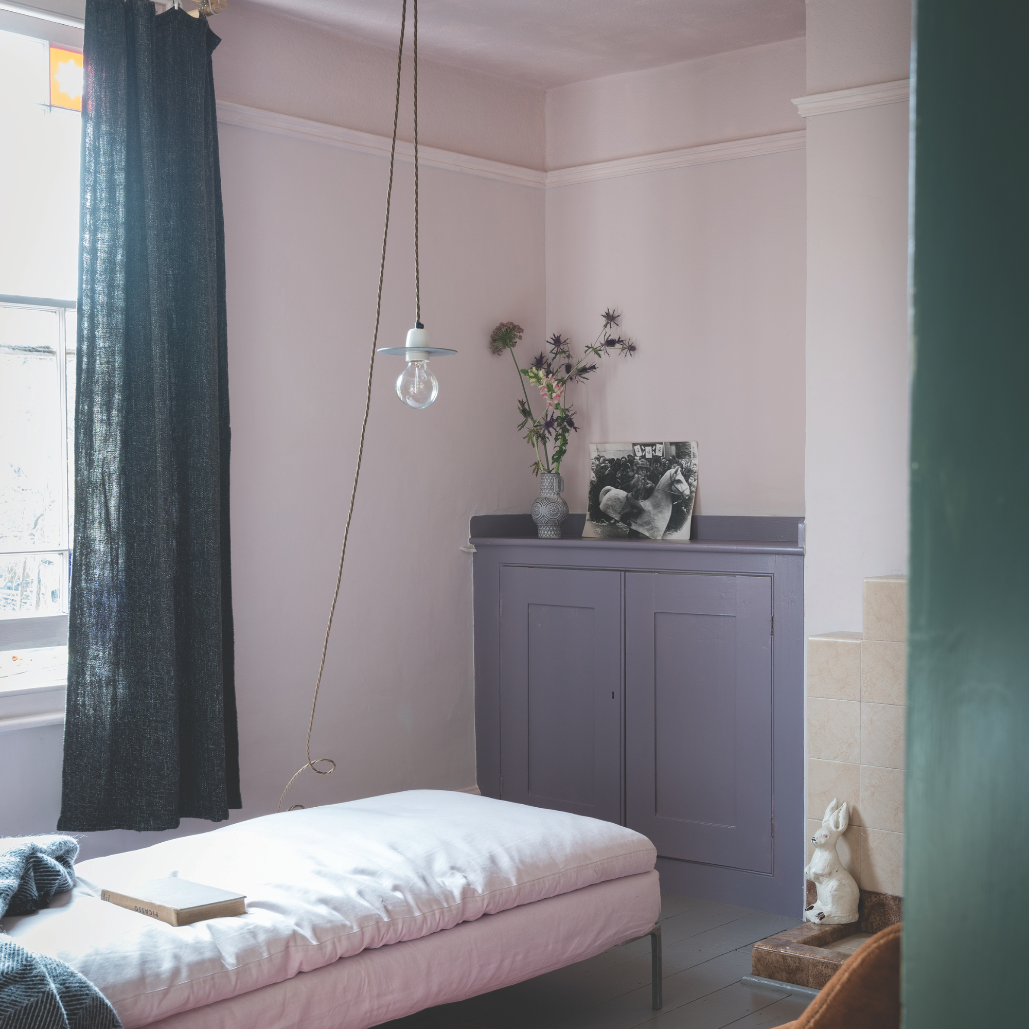
'When we moved to a Victorian period property, for my daughters bedroom, I choose Calamine,' explains Lisa. 'I LOVED this shade, as it was not too pink, warm and subtle.'
'I decorated the living room in Cornforth White (featuring strong grey tones) which worked perfectly in the light, bright living space,' she continues.
'As someone who veers towards lighter shades, the array of Farrow & Ball whites has always worked well for me. Most recently, I used Salt from the Wearstler collaboration in our cloakroom, a sharp bright white that I teamed with Hazy from the same collection, a super muted blue.'
'Some of my top tips when it comes to choosing Farrow & Ball colours are firstly, use the F&B online colour pairing suggestions if you're worried about contrast. Secondly, you can also work with their colour cards - you can invest in the large colour fan which gives you a really good idea of tones without having to buy samples immediately. It's really helpful to work out if the shades you're leaning towards will work in your space.'
FAQS
What is Farrow and Ball’s best-selling colour?
'Last year our best selling colours were Hague Blue, our best-selling blue, our best-selling green was Green Smoke and our best-selling pink was Setting Plaster, explains Charlotte Cosby, Head of Creative at Farrow & Ball.
'We only ever have 132 colours in our signature collection, so each and every one has to really earn its place.'
'Joa, our brilliant Colour Curator, is the one who works with me to create new colour collections. When new colours are added, others are retired to our Archive where they are still available for purchase. We also offer collections, such as Carte Blanche, which we created alongside Christopher John Rogers.'
What Farrow and Ball colour is a warm white?
While the best white paint will all look different depending on the room size, which way it faces and how much natural light there is, Patrick O'Donnell, Brand Ambassador at Farrow & Ball comments, 'Often, particularly in a north-facing room, a clean white will feel too chilly. Instead, consider whites that have underlying red or yellow notes through them such as Pointing or the more nuanced Joa’s White with its mellow red notes.'
So could any of these colours become your new fav?


