Ask any football fan, and they’ll probably tell you that their favourite logo in the sport is the one worn by the club they support. The best logos and badges form a huge part of the connection between club and supporter. They’re worn on shirts, printed on posters and flags, and even tattooed on fans, and are an invaluable aspect of a supporter’s relationship and bond with their club.
The iconic badges of teams like Barcelona, Real Madrid, Manchester United, Liverpool and Arsenal are recognised around the world, as are national football team logos like those from England and Brazil.
Which football logos are the best, however? While everyone will have their own opinions, I’ve chosen 10 here for reasons including their use of colour and shape, the way they’re simultaneously classic and modern, and the incorporation of local and regional identity.
With so many teams to choose from, I’ve limited myself to the UK here – but I’ve not stayed in the Premier League because there are so many great logos elsewhere. Here are the best UK football logos, in no particular order.
01. Crystal Palace
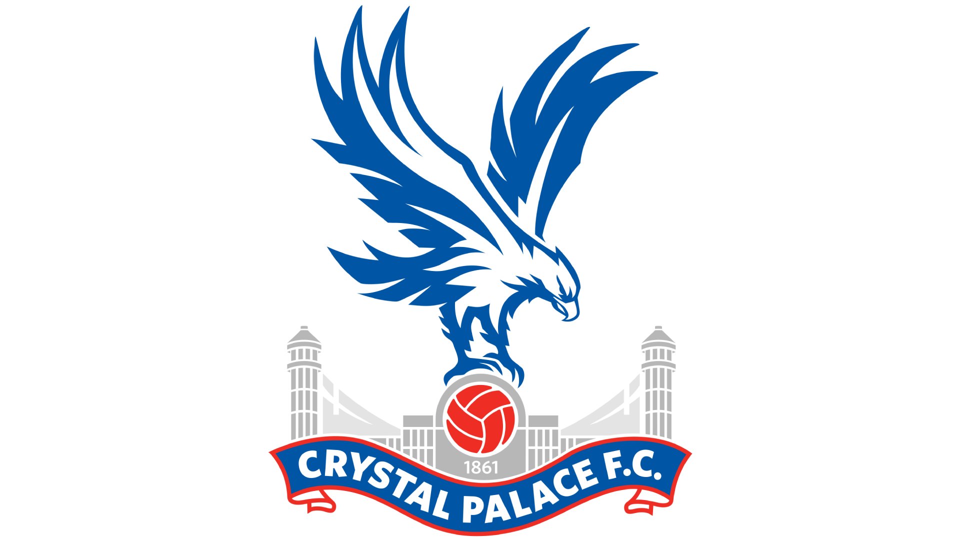
Crystal Palace boast one of the smartest badges in the Premier League. The Eagles, known as such due to the eagle that’s been the focal point of their logo since 1973, were inspired by the similarly avian logo of Portuguese giants Benfica.
They’ve updated the badge a handful of times over the years to keep it looking fresh, but it’s arguably in the best shape it’s been in right now. It makes expert use of the club’s red and blue colours with a cool blue eagle, a red football, and smart lettering on a ribbon that makes use of both colours.
02. Newcastle United
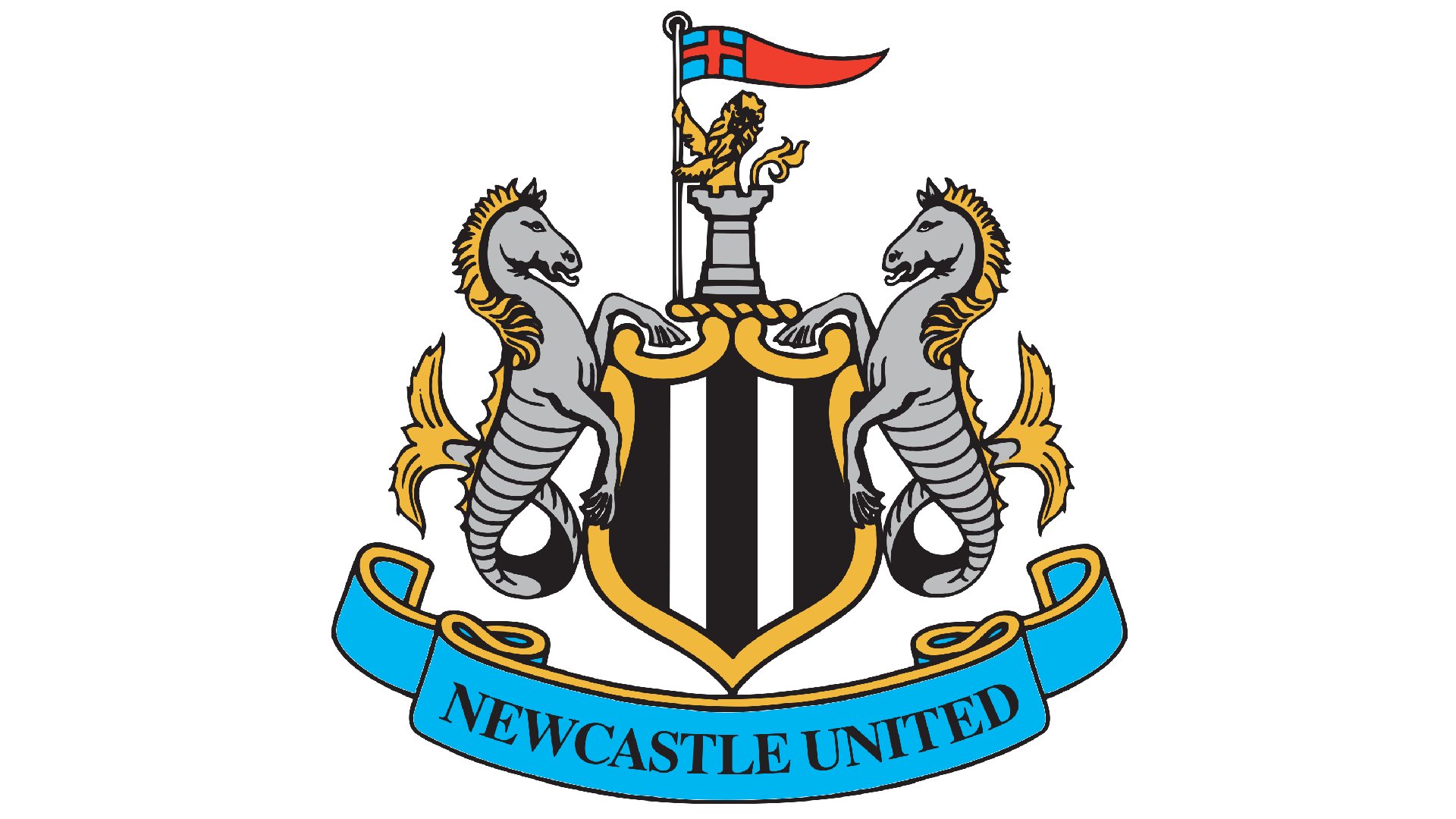
How many football logos incorporate seahorses? The aquarium staple is a symbol of the city, also appearing on the city’s coat of arms, and serves as a reminder that Newcastle is a port city on the coast.
There’s a castle, too, to represent the city’s keep, and lots of gold and grey to give a timeless, almost regal feel. With football such a global sport, and the club owned by Saudi Arabia’s Public Investment Fund, their badge is a real connection to the team’s local heritage.
03. Arsenal
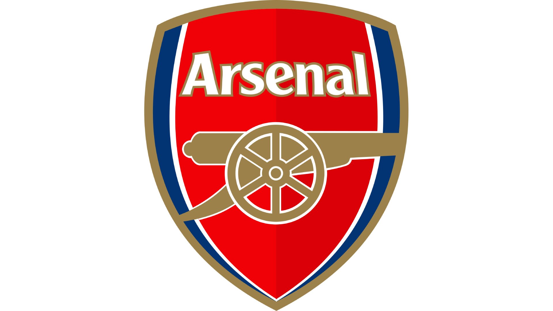
Arsenal’s current crest has been used since 2002, and is one of the most recognisable around – it’s seen them become the only team to go unbeaten in the Premier League for an entire season and it’s been sported by stars including Thierry Henry, Mesut Ozil and Bukayo Saka over the past couple of decades.
It’s not too complex – and was even criticised for not being traditional enough when it was announced – but features Arsenal’s famous cannon, the bright red we associate with the club, and a slick, curved shape. It’s classy.
04. Nottingham Forest
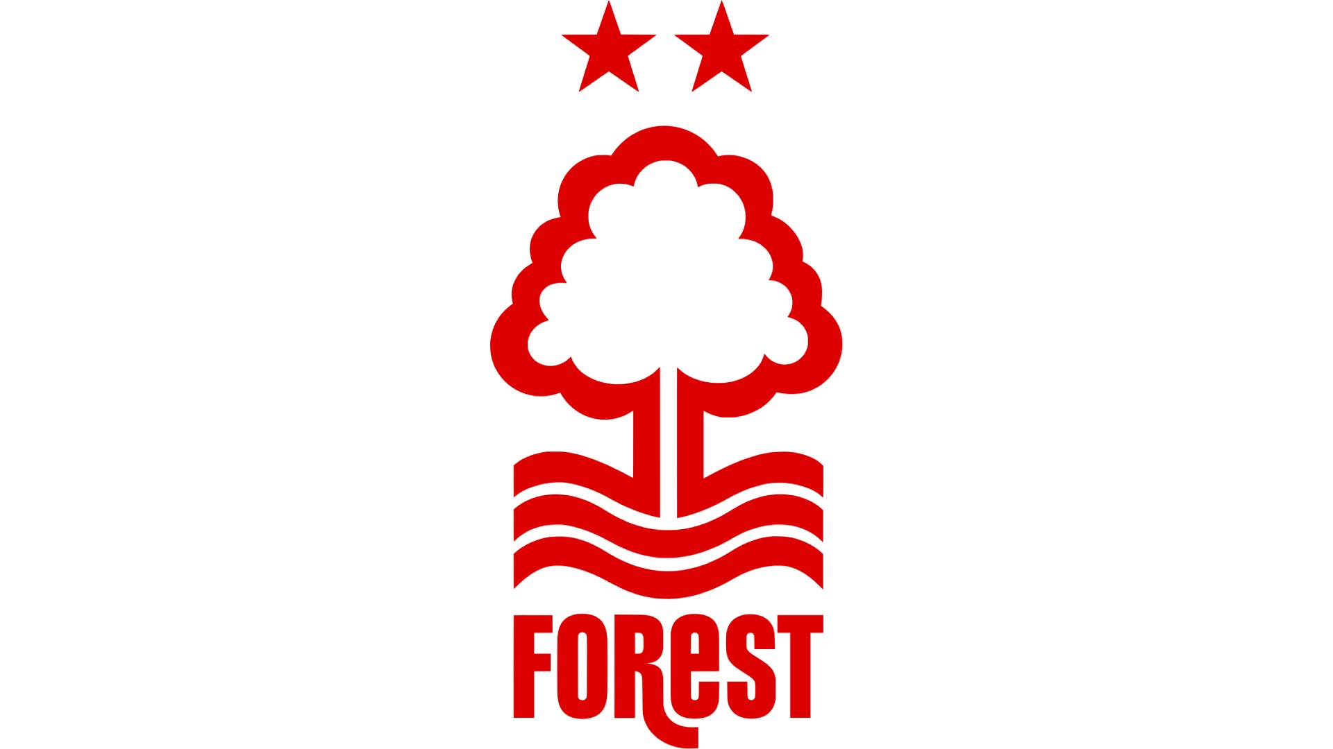
Nottingham Forest have been red – originally known as Garibaldi red – since they were founded in 1865, so it’s to be expected that it’d be the main colour of their logo. Their current badge was introduced in 1974 after a local graphic design lecturer won a competition to design it, and it’s stood the test of time ever since.
The ‘Tricky Tree’ represents Sherwood Forest, famously associated with the legendary Robin Hood, and the two stars above it represent the club’s two European Cup victories in 1979 and 1980 – of course added to the original design later on. The mix of upper- and lower-case lettering in ‘Forest’ below works, too, adding a touch of character.
05. Wolverhampton Wanderers
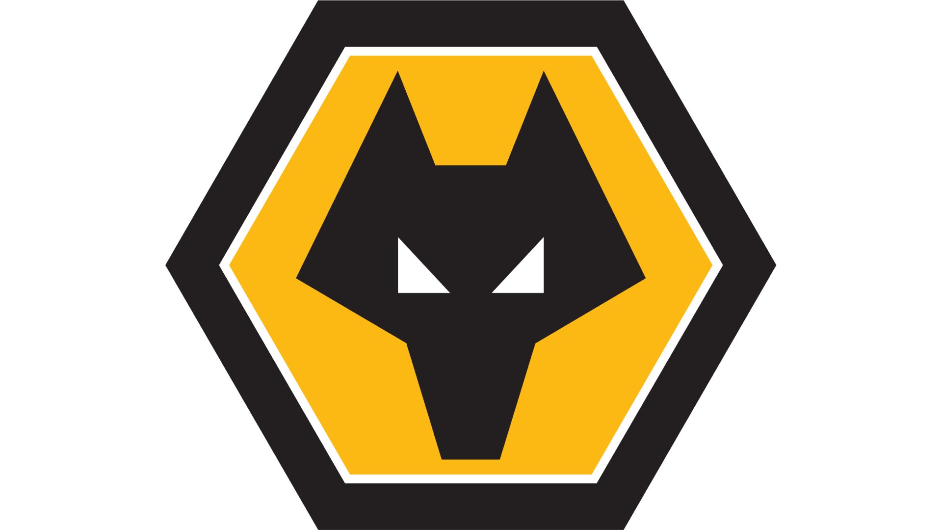
Wolves’ logo isn’t too unlike Salford’s, except it features a wolf rather than a lion. The front-facing wolf first made an appearance on the club’s badge in 1979, and there were a couple of different designs until 2002, when the wolf was given a pentagonal gold background with a white rim and a black border.
The design is instantly recognisable and is stripped back and easy to look at without being too boring. It’s a marked improvement on the pre-1979 logos, too, which had side-facing wolves and are reminiscent of the Slazenger logo.
06. Blackburn Rovers
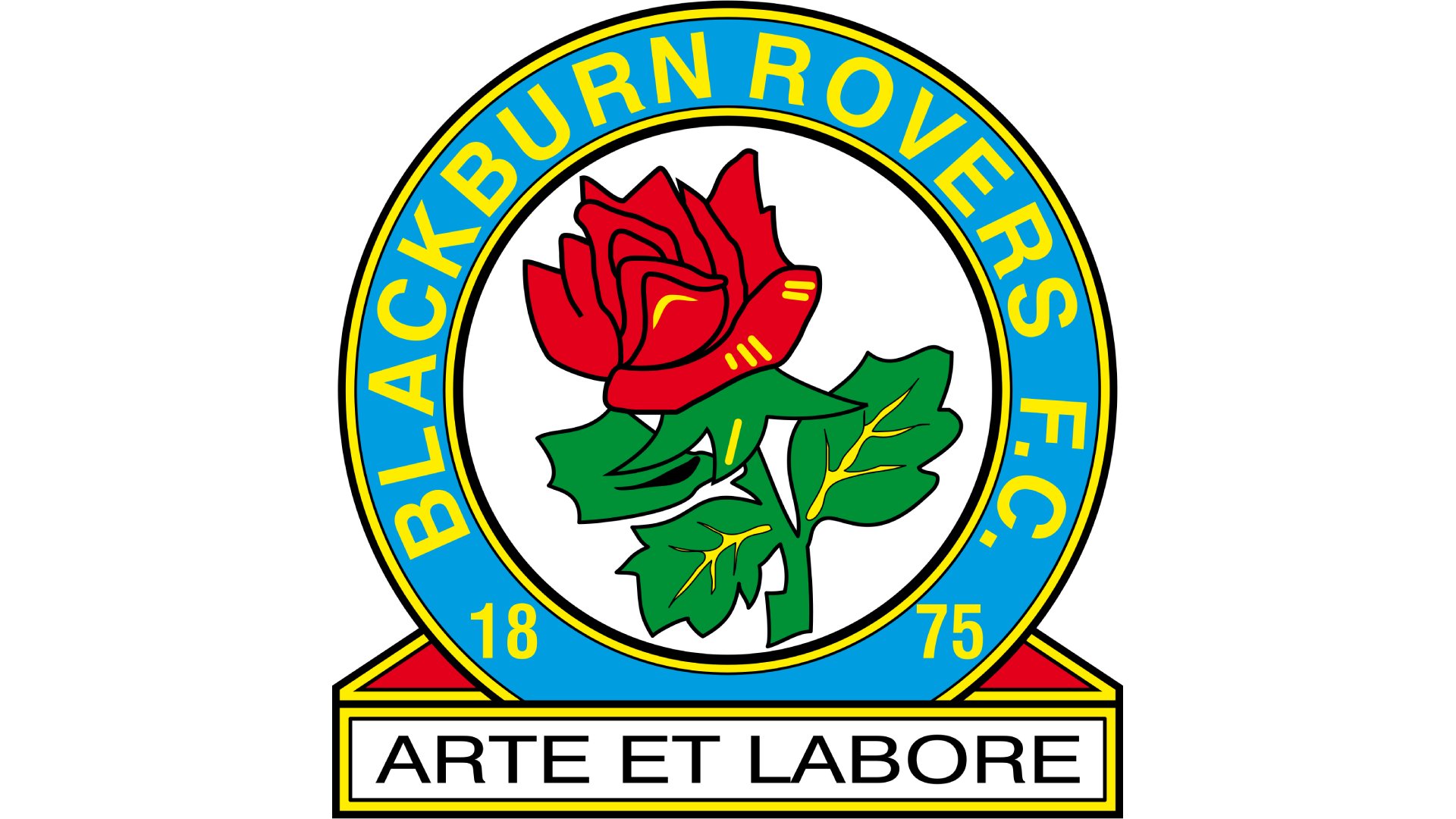
In the modern game, supporters love a badge that keeps plenty of local identity in there, and that’s what Blackburn Rovers have done. They last changed their badge in 1989, but kept the Lancashire Rose to remain close to their roots.
It’s a colourful design with plenty of red, blue, green and yellow, and incorporates the club’s motto, “Arte Et Labore” or “by skill and hard labour,” which is the town’s motto too, at the bottom. 1875, the year the club was founded, is in there too, and the circular design looks modern and timeless in equal measure.
07. Birmingham City
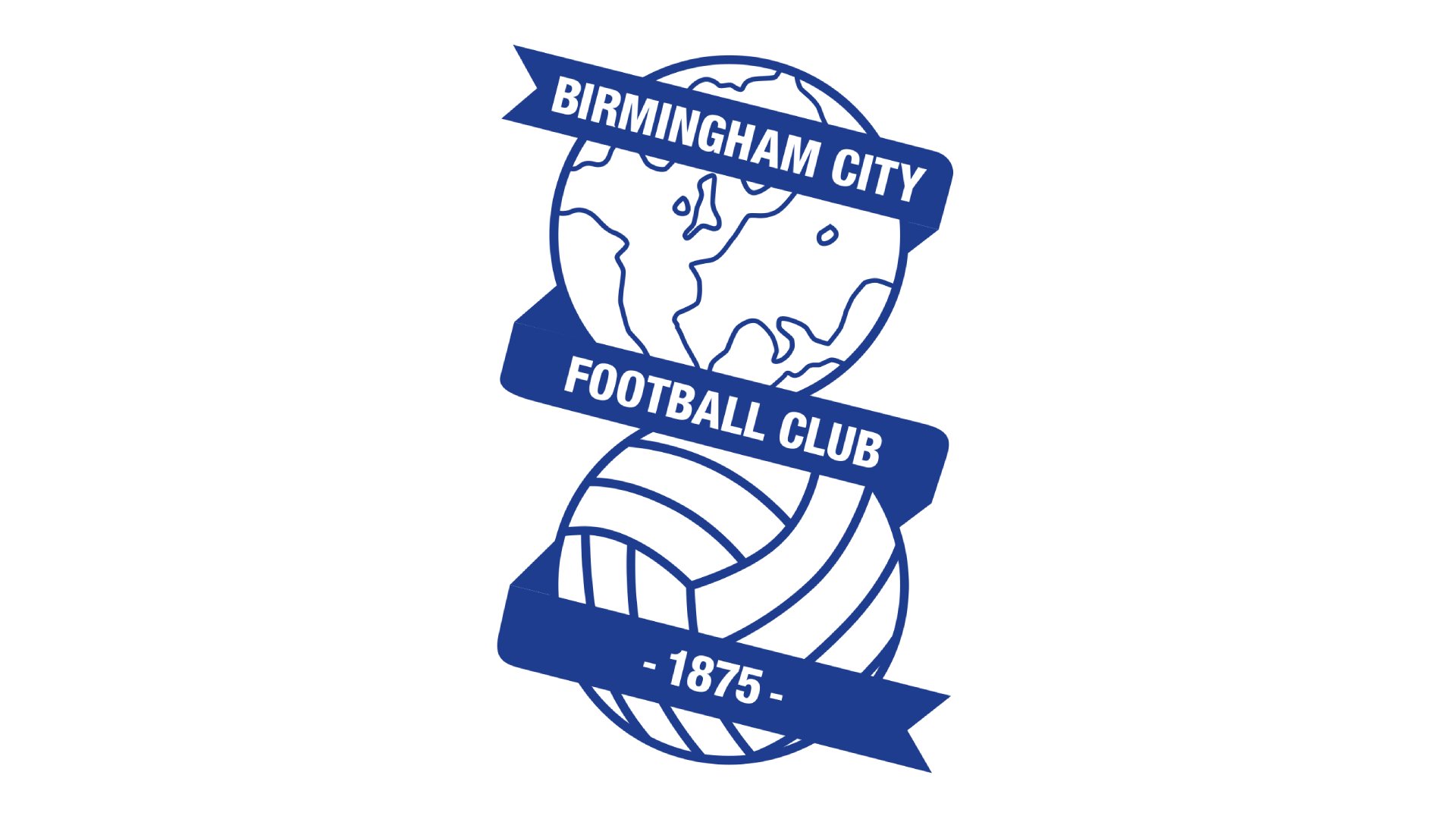
This instantly recognisable logo can divide opinion, but this Birmingham supporter feels it warrants inclusion for its originality. Like the Forest logo, it was a competition winner in the 1970s, but this one opts for a line-drawn globe, which sits on top of a football.
A classy blue ribbon runs in a zig-zag over the two circles, giving the name of the club and the year it was founded in smart block capitals. In an era of roundel logos and increased simplification, football fans can instantly tell this logo by even just the silhouette.
08. Salford City
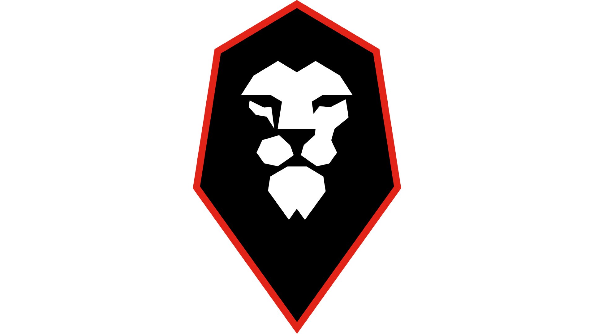
Salford City changed its logo in 2014, the same year it was taken over by a group of former Manchester United players. It's not too unlike Wolves', except it features a lion rather than a fox. Whereas the logo used to feature a more traditional rampant lion, the lion in the current logo is facing forward and much more minimalist – but extremely eye-catching.
The lion’s white face is surrounded by a black mane, which in turn is surrounded by a hexagonal red border. The shape is said to replicate the shape of the hull of the ships in Salford’s docks, too, so there’s a nod to the location and its history.
09. Wrexham
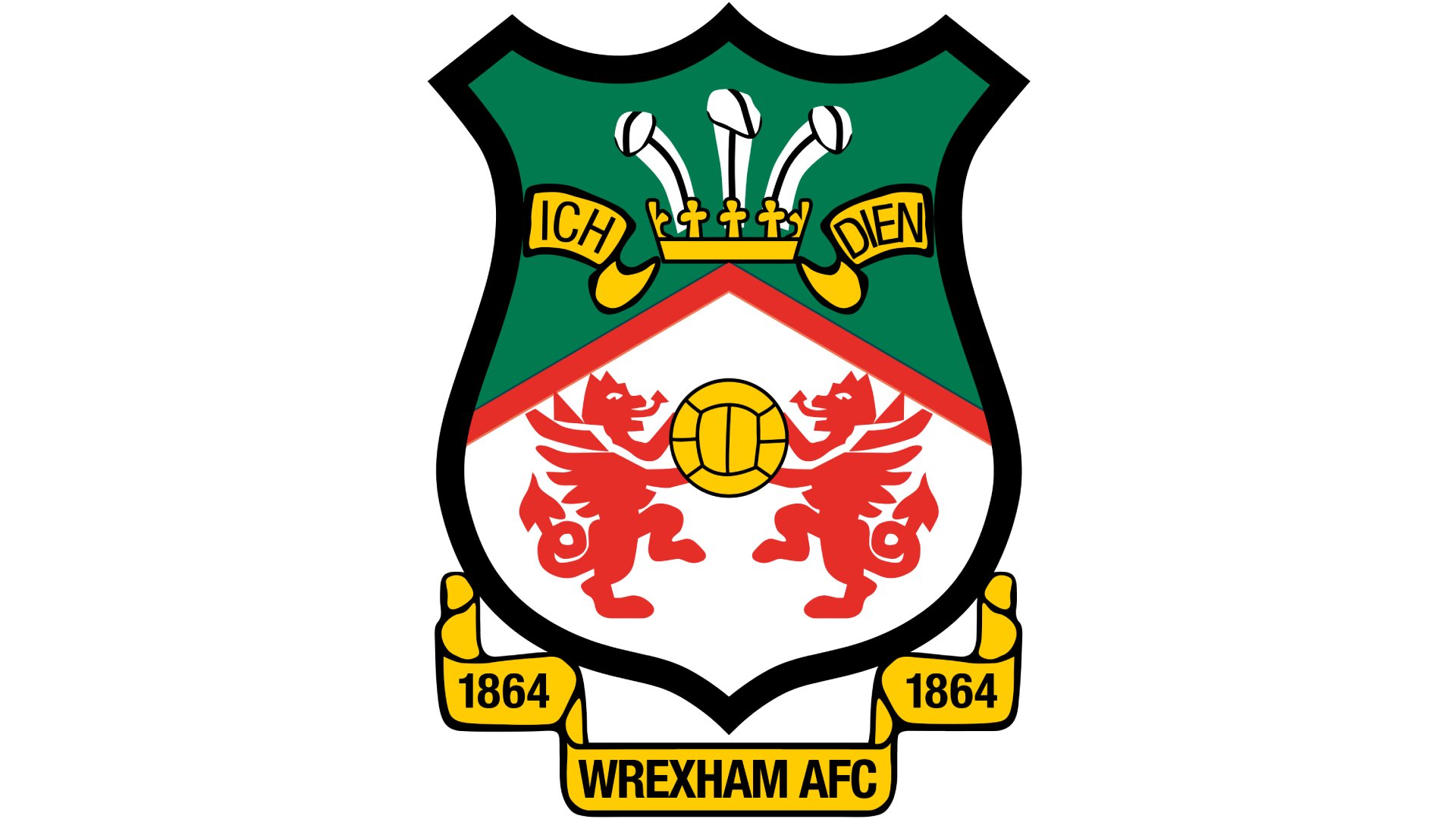
Wrexham might play in the English league system, but the city is located over the border in Wales, and for the 1973-74 season the club changed their badge to one that really reflects their Welsh roots.
There are three feathers at the top of the badge and two red dragons – the national symbol of Wales – facing inwards at each other closer to the logo’s centre. The top of the badge is green while the bottom is white, combining with the red dragon to incorporate all of the Welsh national colours. It’s one of the more classic-looking badges still in use, but it works really well.
10. Barrow
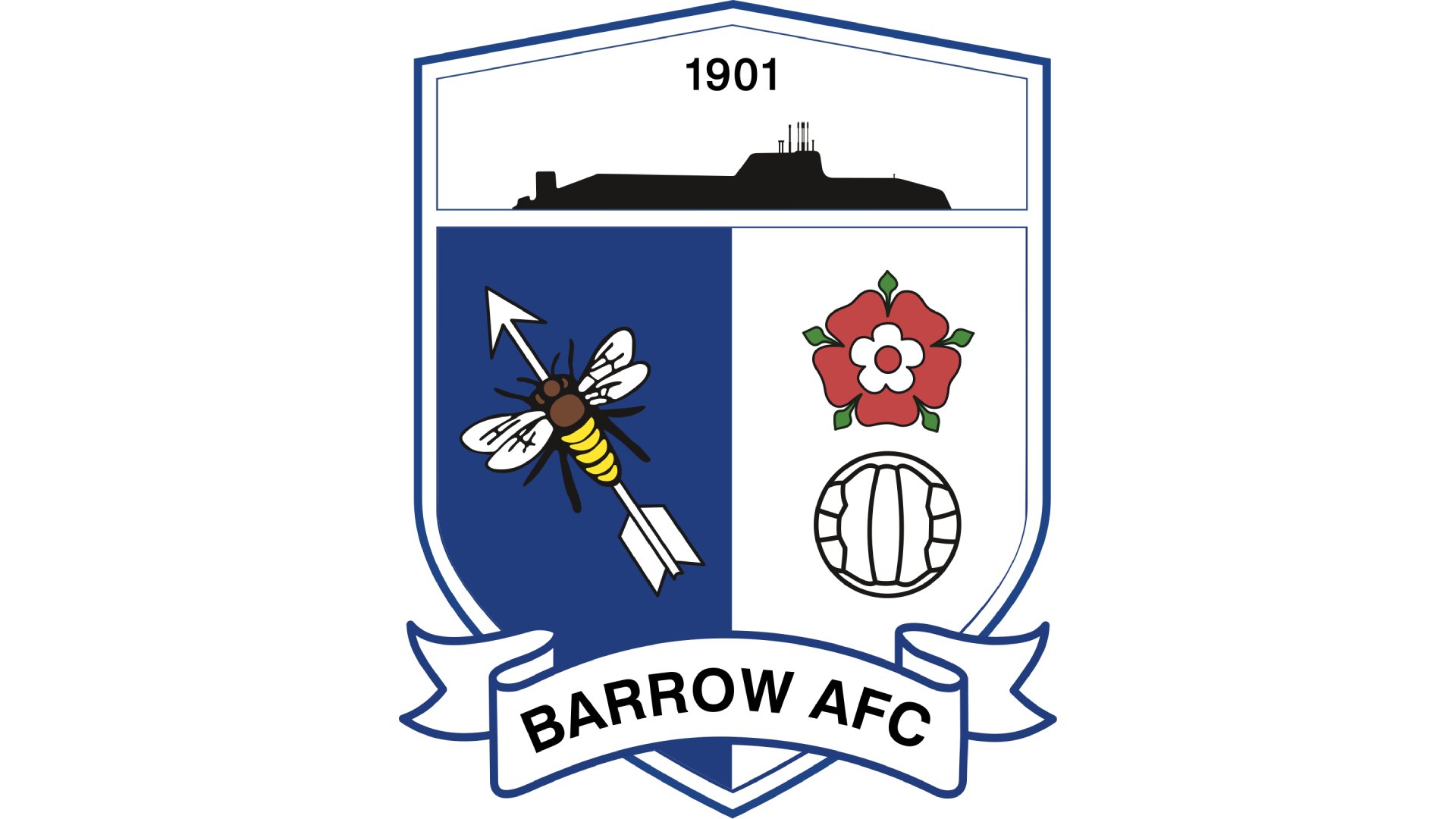
Barrow are another team to keep a traditional logo, and theirs is based on the coat of arms of Barrow-in-Furness. At the top is a submarine – the town has launched submarines for the Royal Navy since 1901 – while just under is an arrow with a bee on it (get it?) for a fun play on words.
Opposite is a red rose, symbolising Barrow’s historic place in Lancashire, as well as a football. The colours of blue and white have been used by the club for over a century, so it’s only fitting that they’d play a focal role in the logo too. There’s quite a lot going on here, but it’s effective in the way it comes together.