Despite disruption in the tech space, with mobile-first design and social media becoming increasingly important for brands, print ads still held their own in the 2010s – from deliberate ad fails with pre-defaced billboards and reactive PR stunts answering negative sentiment on social media, to bold, text-led posters and provocative imagery.
So let’s jump in. Here are 11 of the best ads of the decade (many of which are arguably among the best print ads of all time) from my conversations with ad industry folk, designers and educators. For more inspiration, take a look at our roundup of the best billboard ads ever.
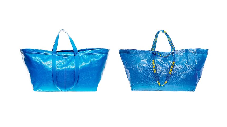
Ikea – ‘The original’
“In a world that moves at the speed of social, even print ads need to be timely and topical to catch people’s attention. Back in 2017, an Ikea ad, parodying Balenciaga did just that. Balenciaga had just released a $2,145 blue bag that looked suspiciously similar to Ikea’s iconic Frakta shopping bag,” says Mike Perry, founder and creative director of New York-based creative agency Tavern.
The likeness was impossible to ignore. However, “if it rustles, it’s real”, Ikea says. The tongue-in-cheek advert from the Swedish home furnishings store presented both versions of the big blue bag together, along with advice on how to identify the original from the “copy”.
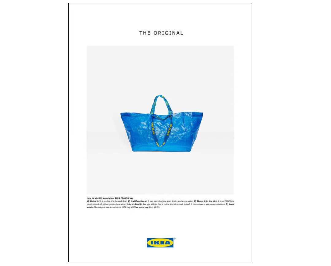
“Springing into action, the Ikea marketing team and their agency, Acne, quickly arranged a fashion shoot with photographer, Anders Kylberg to create a simple ad playfully portraying the simple blue Ikea bag as a fashion icon. The result was a delightful ‘IYKYK’ moment connecting with fans at the intersection of high fashion and low-priced home basics.”
The Guardian – ‘We’ve got enemies in higher places’
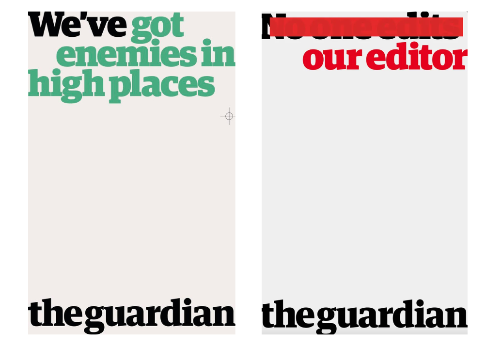
This next provocative print campaign, created by BBH in 2016 for the Guardian, is a top choice for the decade for Ciara Stonley, a creative at agency syn. Given that almost all other major news outlets are owned by shareholders who may influence content, the campaign focuses on the fact that the paper asks questions that others can’t.
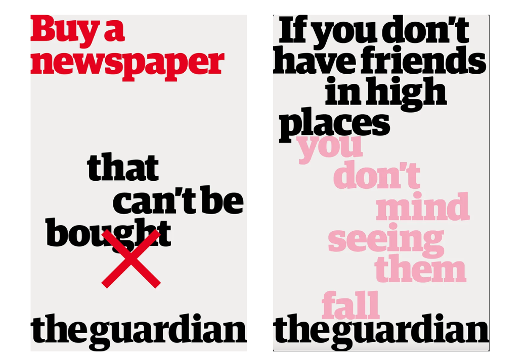
“The Guardian’s campaign celebrating their independence features a series of provocative lines, written in the iconic and instantly recognisable Guardian Egyptian Bold font. The limited colour palette, confident composition, and illustrative use of the text creates an overall eye catching ad,” Ciara says. “It is heavily graphic, resulting in a completely clear and unapologetic message; in my opinion, everything that makes up the perfect printed ad.”
Go Compare – ‘Saving the Nation’
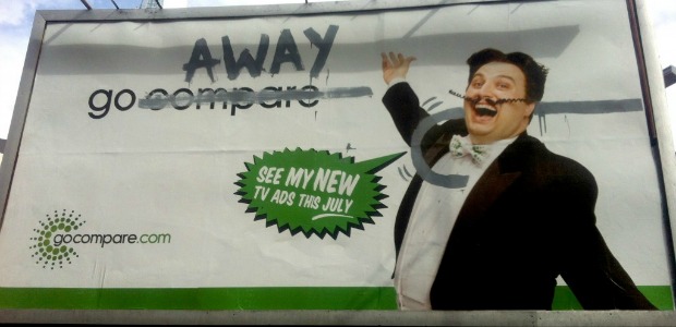
These bold, pre-faced billboards caused quite a stir across socials in 2012. Created by agency Dare, for insurance comparison site GoCompare, the agency jumped on the public’s dislike of the brand’s curly-moustache opera singer character, Gio Compario. The campaign staged a great example of an “accidental fail” campaign, says Laura Jordan Bambach, founder and chief creative officer at agency Uncharted, former president of D&AD, author, lecturer and multi-titled creative.
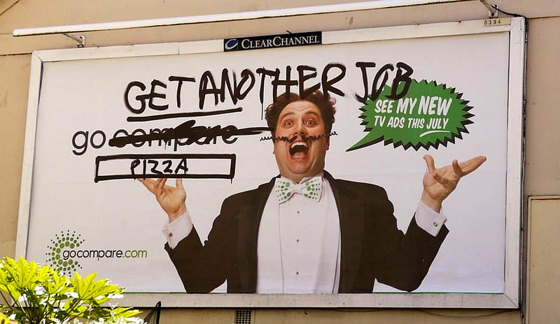
“These kinds of ads are so much more common now, but back then we really did have the nation laughing at the naughty taggers destroying the ads for real,” she says. “I love a good fail ad … Droga brought the GoCompare man back the following year I think, but it felt great to kill him temporarily.”
Stabilo – ‘Highlighting the remarkable’
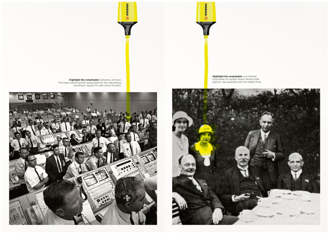
In this next ad from 2018, stationery brand Stabilo turned a promo for a highlighter pen into a push for female empowerment. “A great strapline – ‘highlighting the remarkable’,” says designer Mike Roberts. “This ad series highlights influential women in the background with great storytelling, while showing the product in action.”
“Stabilo have been successful in creating a history book-esque feel to this ad campaign, which sheds light on the contributions women have made throughout history despite being overlooked,” says Ciara. “It effectively uses black-and-white imagery against the iconic Stabilo yellow, with small print to educate the viewer as well as use this colourway and composition to guide the viewer’s eye to the focal point of the ad. It confidently utilises an analogue process in order to convey a significant message.”
KFC – ‘FCK’
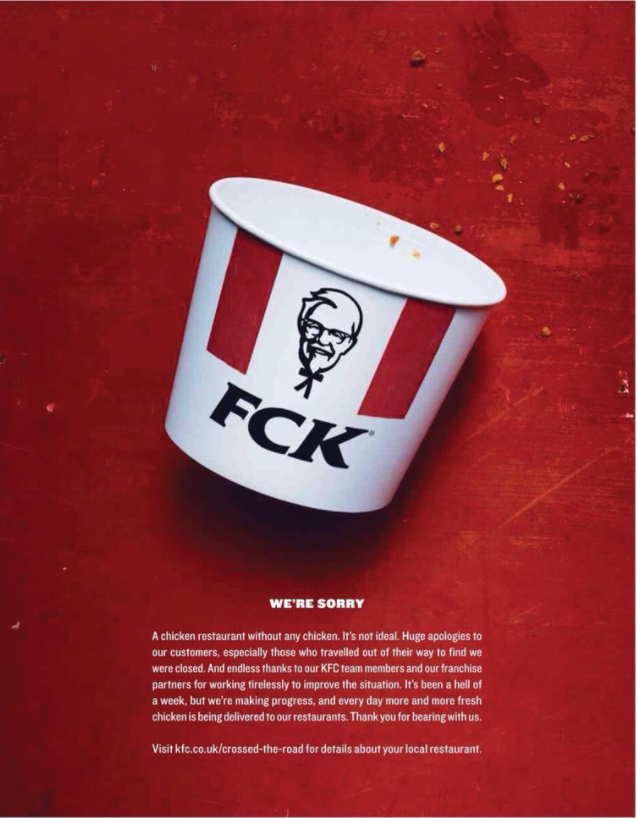
“In February 2018, all KFC joints in the UK faced a shut-down as they were completely out of chicken due to some problem with a new supply partner,” says Dave Buonaguidi, ad expert, author of Blah! Blah! Blah!: Memories and advice from one of British advertising's mavericks, and printmaker known as Real Hackney Dave. “Very rarely can brands turn a disaster into a positive. This is perfection.”
The fast-food chain and its agency, Mother, claimed victory, despite the supply issues faced and subsequent negative sentiment raging across socials. Hailed as a masterclass in crisis PR management, a week after the debacle, and once 700 of the 900 UK stores had reopened, the campaign aimed to rebuild public confidence with this plea for forgiveness.
Hans Brinker Hotel – ‘It can’t get any worse’
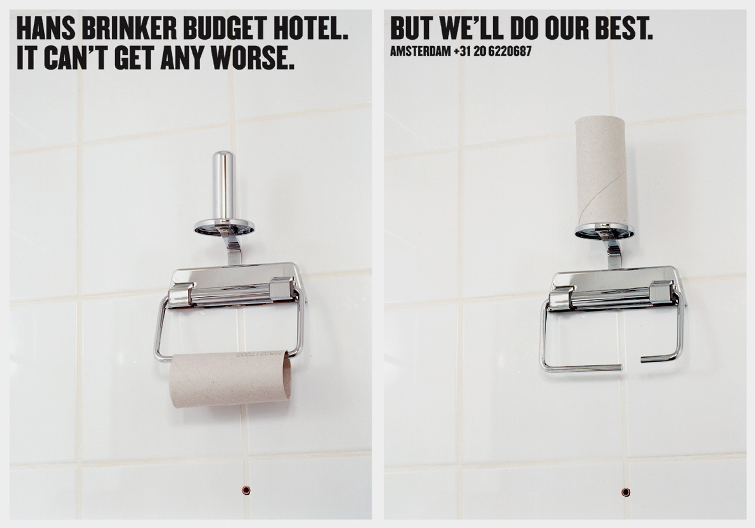
“KesselsKramer is my favourite creative business of all time. Part publisher, part advertiser, part art gallery – I still aspire to do what they do,” says Laura Jordan Bambach, of the creators of this next campaign for Hans Brinker budget hotels in the Netherlands. The campaign first launched in 1996, with later iterations running through 2015, which she calls it “groundbreaking work”.
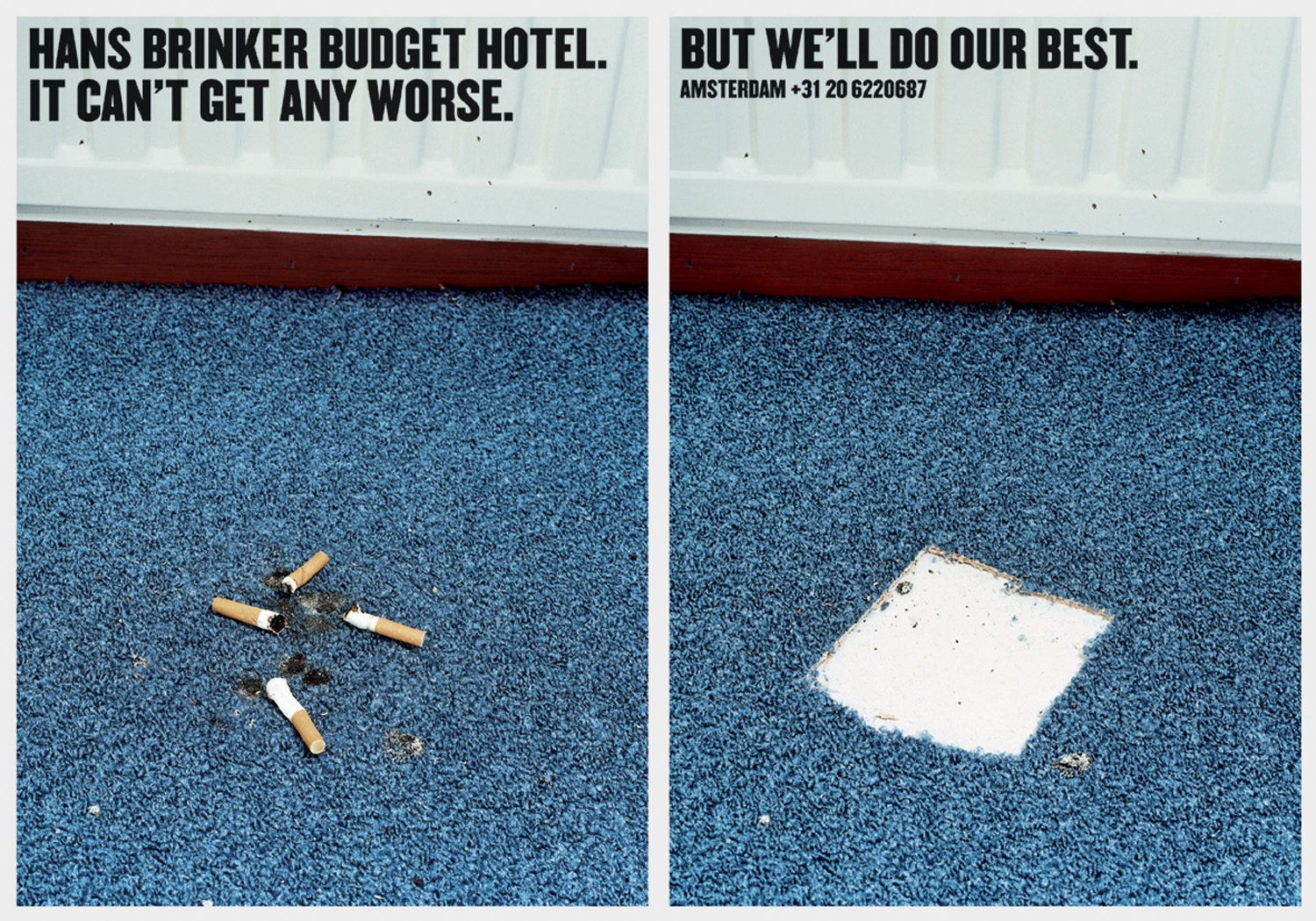
“From mini OOH flags in dog poo, to making a benefit of one sheet left on the bog roll and cigarettes on the carpet, this deserves an award for the quality of the work and the longevity of the relationship,” Laura says. “A bit like Mother with KFC and IKEA, it’s always great. There are only so many ways of selling a really rubbish budget hotel – I think Kessleskramer has consistently done the best of them.”
Nike – ‘Find your greatness’
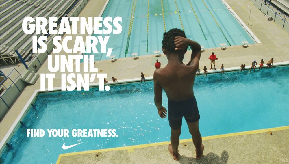
“This is one of my all time favourite campaigns from Nike. I love how simple yet powerful the ad is. The design is clean, with minimal text and the empty pool, making the message feel pure and universal,” says London-based designer Laura Foley, of the ad, created by Wieden+Kennedy in 2012.
“It really brings across the idea that greatness is something personal, it’s about your own journey, not comparing yourself to others. The muted tones also really help keep the focus on the boy. And the Nike Swoosh? It's perfectly placed, fitting in seamlessly without taking away from the image,” Laura adds. “The typography, as always with Nike, is sleek and bold. The sans serif font keeps it modern and simple, with the slogan being big enough to make an impact but not overpowering the visual of the boy. It's such a great balance between the design elements and the message.”
Heinz – ‘Pass the Heinz’
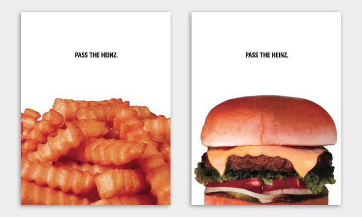
“I always like ads that promote a product that you don't see on the ad!” says Thierry Brunfaut, creative director and founding partner at Base Design. “It was also so clever in linking it with the Don Draper [and his fictional ad pitch in the TV series Mad Man]. Brilliant. And super well executed.”
Created by David The Agency in 2017, it was, in part, a PR stunt, leaning into pop culture with a campaign that originated from a television show. The bold, simple imagery, minimal copy and abundant white space worked brilliantly in the print and poster ads including a huge Times Square billboard.
Dixons – 'Sandals/Middle England/Piers'
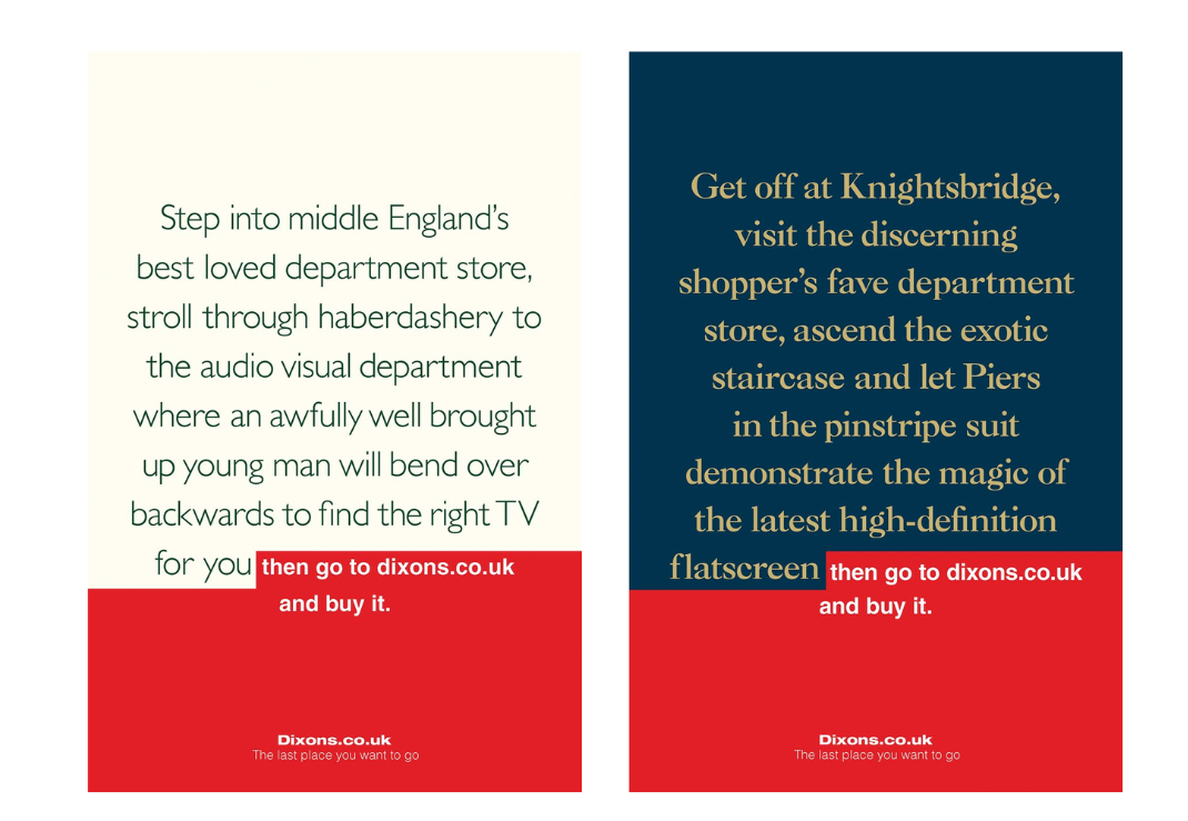
“What can I say, this is still used as the pinnacle of long-dwell-time OOH,” says Laura Jordan Bambach of this next ad for Dixons, created by M&C Saatchi in 2010. Encouraging shoppers to go and view products freely on the high street – with a nod to luxury stores in their design – but then heading to Dixons online to purchase them (at a better price), along with the self-aware tagline, ‘The last place you want to go’.
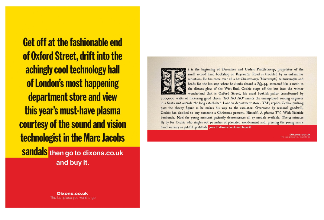
“I remember these on the tube and being overwhelmed with joy,” Laura says. “Simple. Genius. Super effective. A great example of when very talented people come together and play to their strengths.”
Spotify – ‘Wrapped Stats’
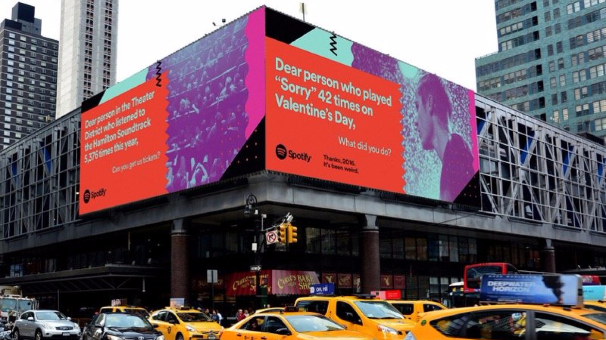
“Spotify’s OOH campaigns, where they highlight user-generated data points, are a great example of how to transform seemingly unremarkable data to tell super clever, relatable stories,” says YanYan Zhang, partner of brand design at VSA Partners, of the Spotify’s Wrapped Stats billboard ads.
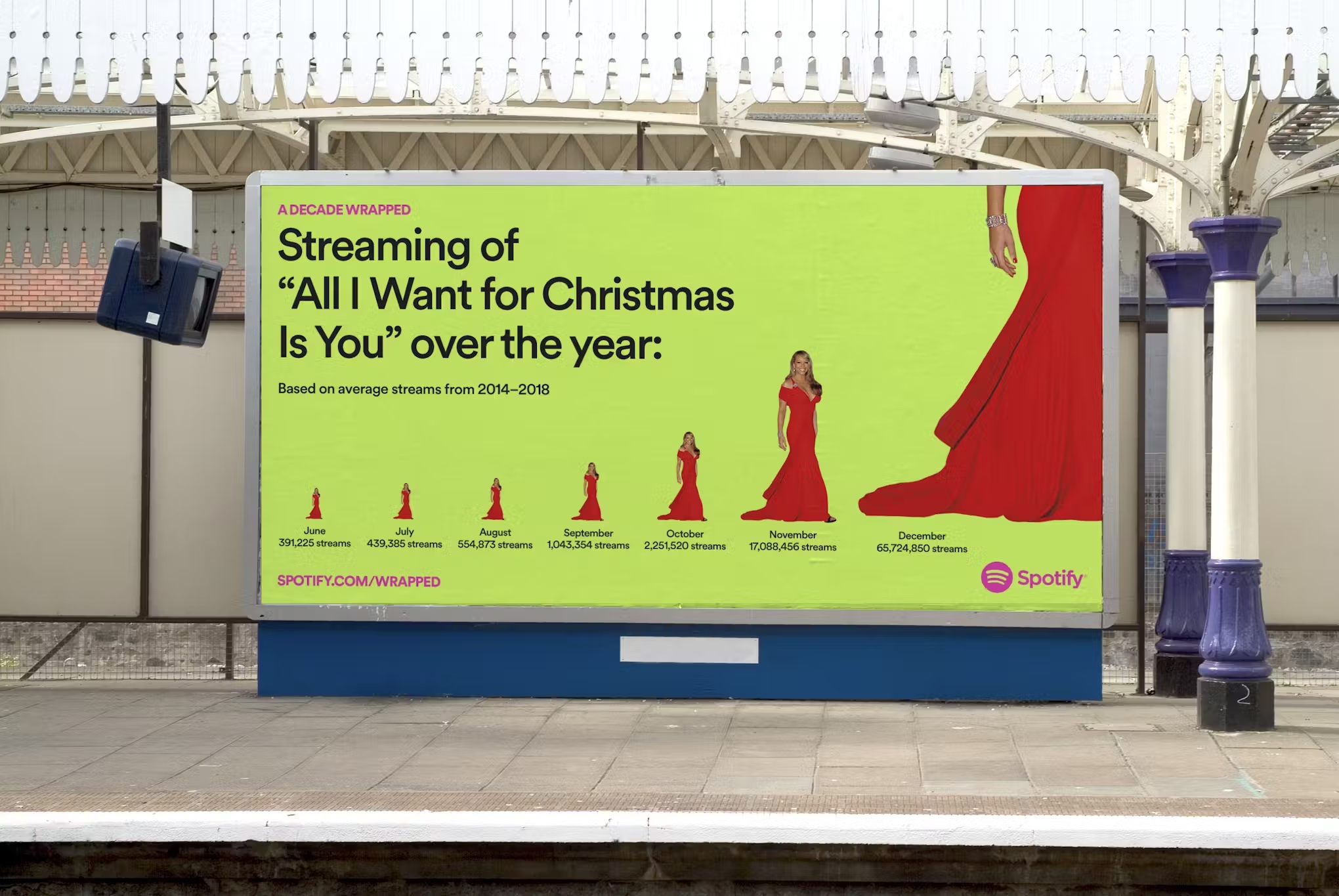
From the colourful data-driven annual campaign, YanYan highlights the 2016 Justin Bieber billboard – with a shout out to the person who listened to his track ‘Sorry’ 42 times on Valentine’s day – and the Mariah Carey, ‘'All I Want for Christmas is You' billboard from 2019. Overall, Spotify Wrapped has transcended marketing and has now become an annual cultural event, which along with the billboards themselves, has seen praise for its shareability and compelling, recognisable visuals.
28 Too Many – ‘Anti-FGM campaign’
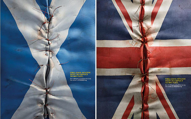
“I remember when these came out at World Cup time. So powerful. They caused such a stir IRL when they launched, with people calling them disgusting. So many complaints,” says says Laura Jordan Bambach. The provocative anti-female genital mutilation (FGM)* campaign, created by Ogilvy & Mather London in 2014, aimed to boost awareness across the UK of the practice, which happens beyond just Africa and the Middle East.
“For something as grotesque as FGM, these beautifully crafted and powerful posters shouldn’t be the things we’re banning. The point couldn’t be clearer, the work more darkly beautiful, awful, captivating,” Laura says. “I’m a massive fan of creating an abject response in work – drawing you in to spit you out. This is perfect.”