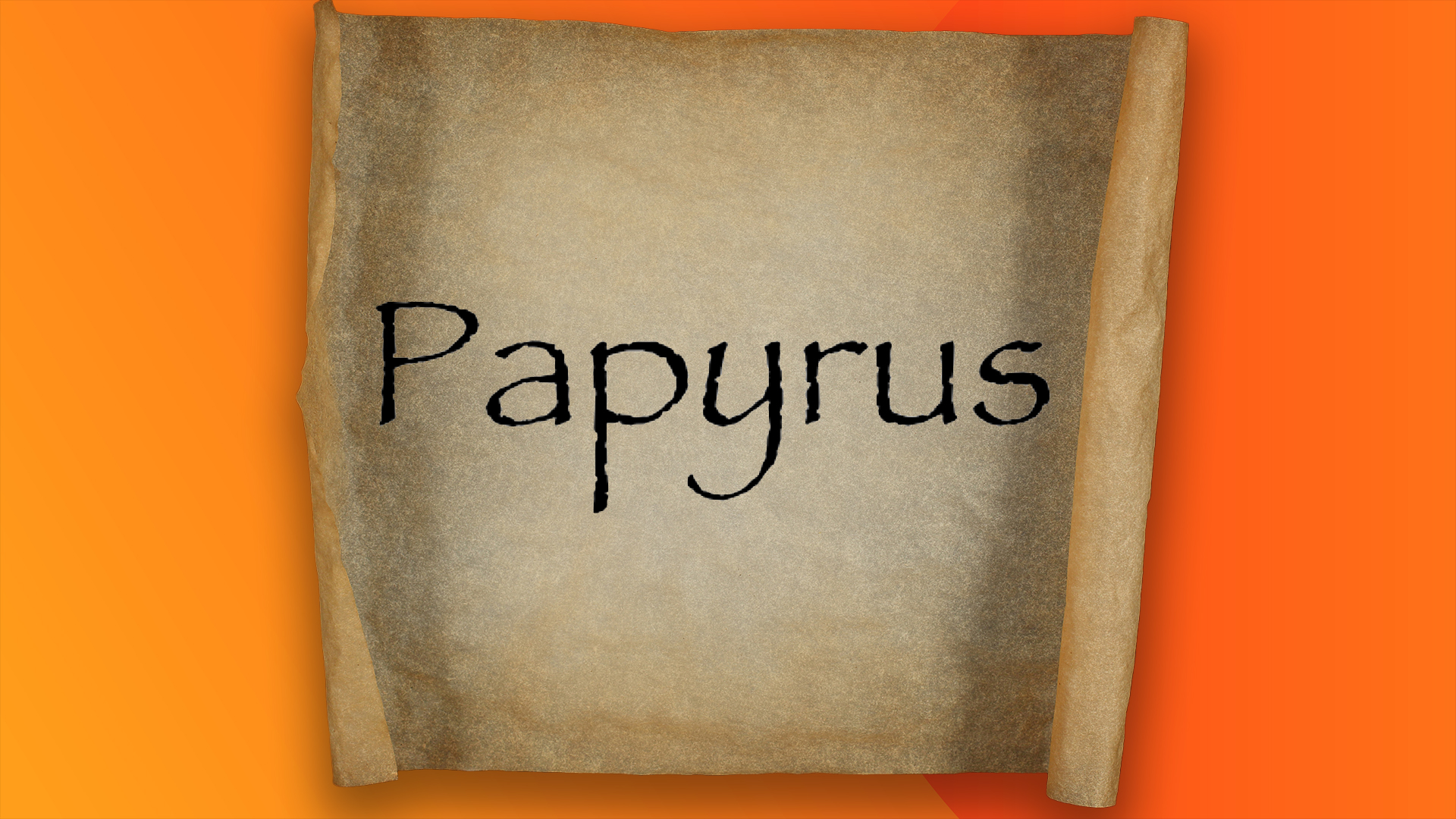
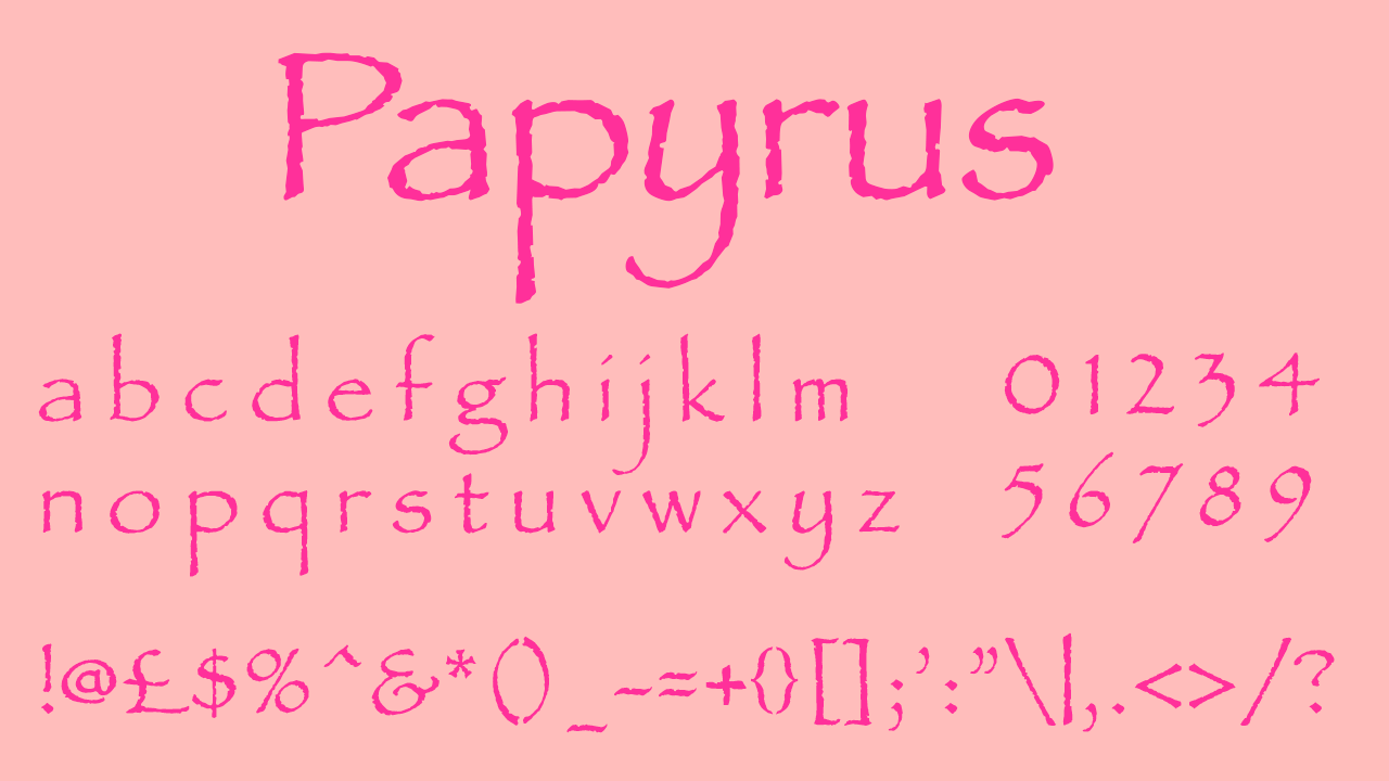
For many designers there are a handful of blacklisted fonts that will never get to grace a creative project – many for good reason. Whether it's an outdated design or simply just terrible typography, these condemned fonts have fallen out of fashion, and none is quite so revered as humble Papyrus.
While it might be one of the most iconic script fonts, Papyrus has experienced the peaks and dips of popularity, leading it to become one of the most infamous typefaces in the modern creative sphere. Whether you love it or loathe it, the influence of Papyrus can't be ignored, but that can't (and won't) stop designers from roasting it any chance they can get.
Taking to the r/graphic_design subreddit, user u/Mazortex asked "What do you think when you see this font?", inviting creatives to share their opinion of the ever-divisive Papyrus. A flood of comments soon hit the thread, with many quick to share their unflattering associations.
"Shakira merch. Off-brand teas. Hookah bars," one commenter responded. "90s Christian Rock bands," another chimed in, while one designer claimed it was " The worst font next to Comic Sans".
For others, it evoked a more visceral response. "It's part of the greasy spoon cafe starter pack here in Ireland: Sticky floor; Plastic tablecloth with dried on lumps of ketchup; Black flecks on all fried food from constantly reusing the same burnt oil; Powerful aroma from bathroom due to some decades old unaddressed plumbing issue; Cheap cutlery that gives every meal a metallic aftertaste; Laminated A4 sheet which serves as a menu - title, items and allergens list all set in Papyrus," another user added.
One of the most common Papyrus associations is, of course, the Avatar logo (that still haunts actor Ryan Gosling to this day, as seen above). Many on the subreddit agreed that internet memes had killed the font's unique appeal, while others claimed the font was severely overplayed, losing its charm over time. "For probably 20 years I've thought 'That's a cool font, I wish I could use it sometime without it looking stupid', but I never can, it's totally useless. I just did a project on ancient Egypt and still couldn't find a place for it!" one commenter reflected.
Despite its unsavoury connotations, I can't help but feel a little sorry for ol' Papyrus. Admittedly, it's not as universal as other fonts like Helvetica and Futura, but I stand by the fact that it has its own unique charm. Recently, we've seen Comic Sans fall back into favour, and I only wish the same for Papyrus. Justice for our frumpy font friend – while it might not make it into our designs, may it live on in our hearts.