We don't expect politicians to be great graphic designers. They're a multi-skilled bunch as it is, able to confidently shift from running the health service to overseeing defence, trade or agriculture from one day to the next (you come to Creative Bloq for biting politic satire, right?).
Design requirements are among the things that the big parties have enormous campaign budgets for. But here's a promotional flyer that I can entirely believe perennial senate candidate Robin Ficker designed all by himself. And it's quite something (he could start by reading some of the best graphic design books).
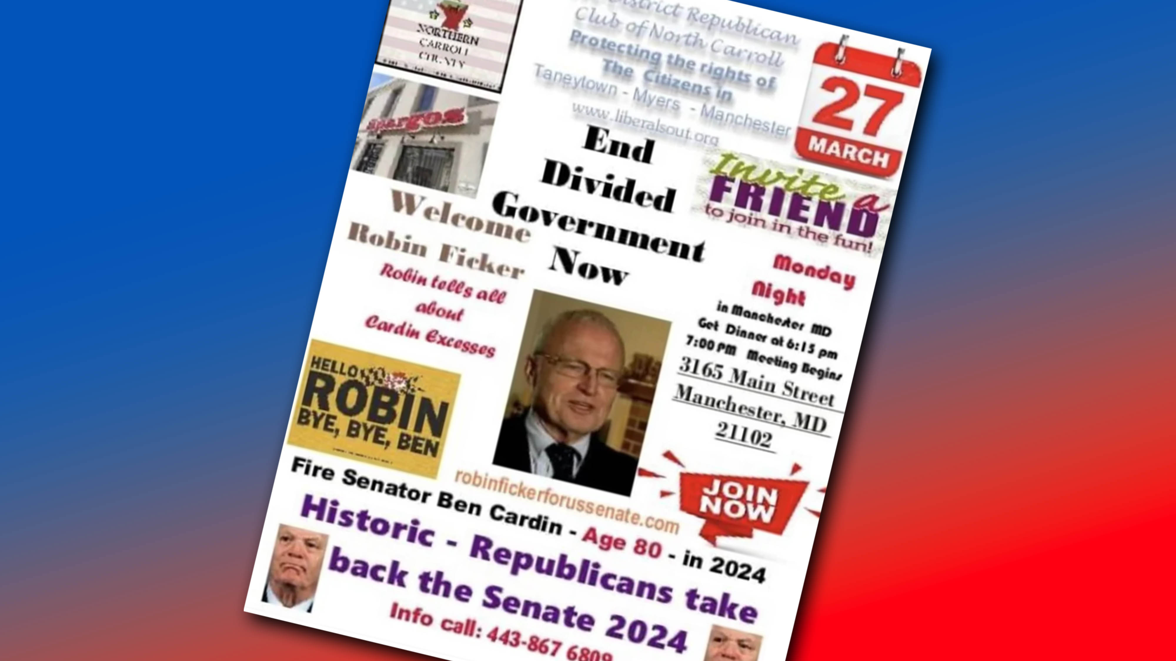
Real Politician in Maryland’s Real Fundraiser Flyer from r/CrappyDesign
Shared on Reddit to much incredulity, the Maryland Republican's flyer is perhaps the single most chaotic piece of graphic design I've seen. There's so much going on that It looks something like a cross between a ransom note and a GeoCities website from 1998.
The incredible visual composition features around a dozen fonts, bizarre kerning and lopsided centring and justification, pieces of contact information scatted around in a way that makes it feel like it's been intentionally hidden, clipart-style stickers, a graphic that looks like it's been cut out from a flyer for a very bad nightclub with a 2-for-1 offer. Oh, and there are not one but two low-res photos of (I think) rival sitting senator Ben Cardin – just to add some symmetry.
For anyone who can't believe it can be real, here's the original post from Instagram above. Once you get over the flyer design and manage to digest the content, it gets even better. Ficker's one argument against his political opponent is Cardin's age. That's despite the fact that Flicker himself is actually a few months older.
"It's so noisy I feel like I'm just looking at meaningless static," one person wrote on Reddit. "No use of Comic Sans. I can’t take this guy seriously," someone else complained. "If elected, I promise more fonts per Maryland citizen than any of my opponents!," someone else suggested as a manifesto promise.
But some aren't sure the flyer is the design disaster it might seem. "Unironically so bad it’s good, it’s getting him more attention than a regular flyer would," one person argued. "I think this layout is pretty on brand for the candidate and some of his intended audience," someone else said. Still, we'd suggest he at least use Photoshop rather than MS Paint (see the best Adobe prices below).
Read more: