We recently caught up with animator Jason Chan P.L. who took us through his sketchbooks. He's previously worked on Adam Sandler's Leo, but when not animating or creating illustrators for children's books such as Hilda's Book of Beasts, Jason loves to take to the streets with a sketchbook and watercolours to paint and draw what he finds.
Below Jason offers some quick tips and advice he's learned while sketching and painting into sketchbooks. If you want to try this for yourself, read our guide to the best sketchbooks for artists. If you're a digital artist you can try the advice below too, using one of the best iPads for drawing.
For more advice and inspiration, watch James Gurney paint a watercolour scene or read our tutorial for digital plein air painting using Procreate on an iPad, by Mike McCain. For more insights into going digital, read our guide to the best iPad for drawing (I use a sixth gen, M2 iPad Pro). Now, read Jason Chan P.L.'s tips for urban sketchbooking.
1. Starting pencil sketches

I start with pencils for the initial sketch. I try to keep it under 30 minutes so I don't overwork it.
2. Adding base colours
Then I block in the base colours and lighting with loose washes. I like it when the pigments mix on the paper.
3. Making use of glazes
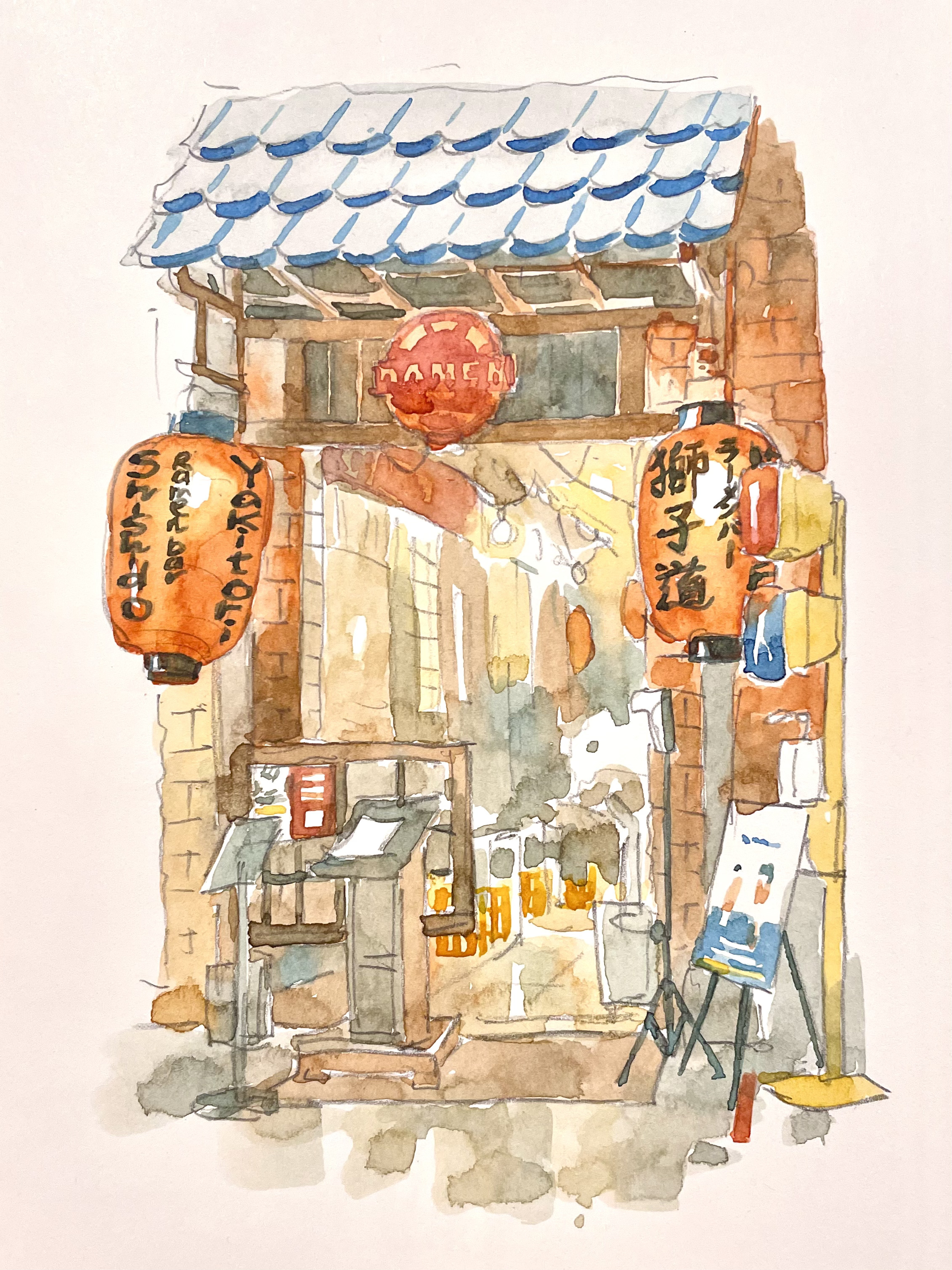
I proceed with glazing to increase the darker values and introduce other pigments that I missed in the first wash.
4. Focusing on shadows
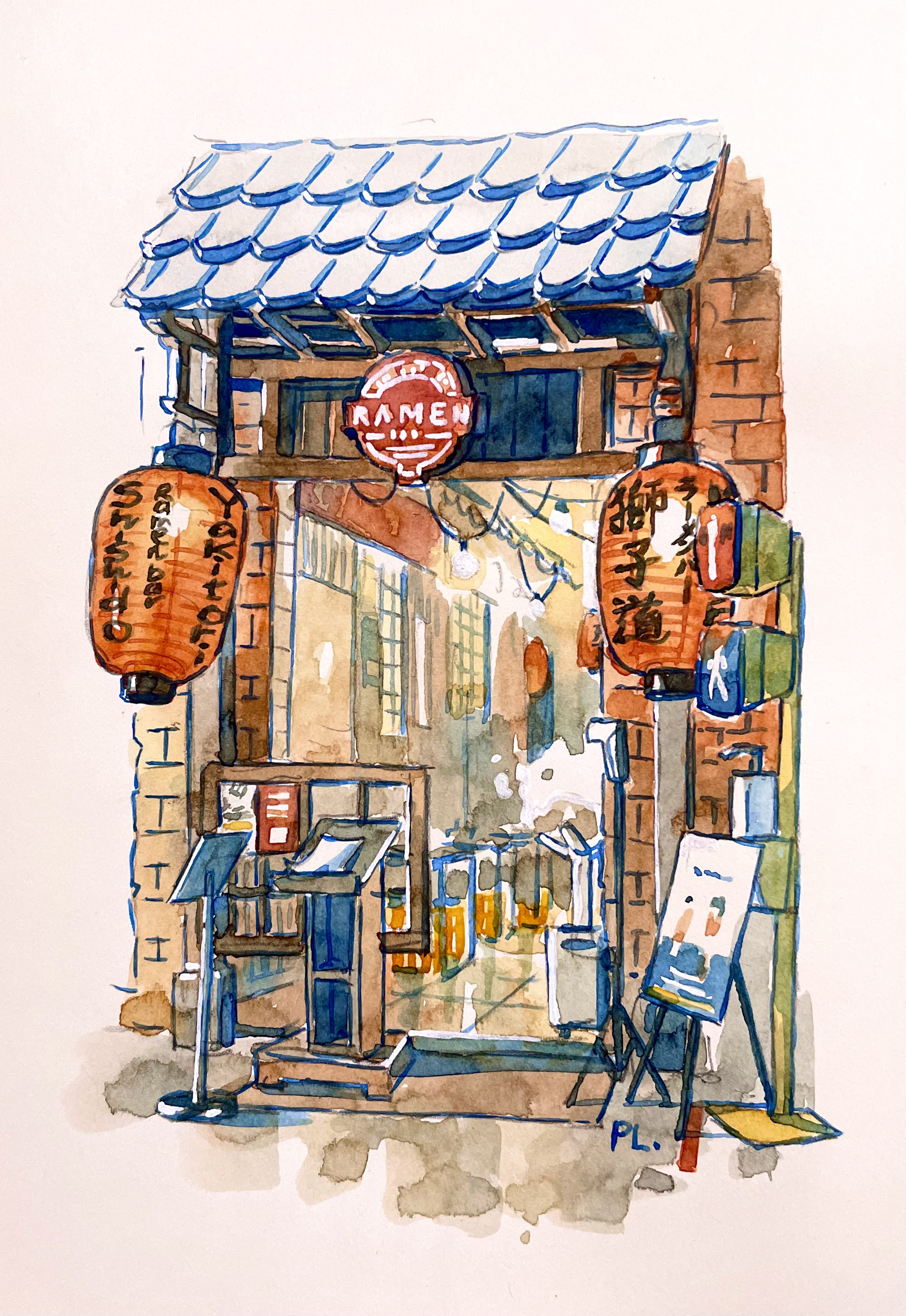
Finally, I focus on shadows and line colouring. This is when everything begins to really pop out! I usually choose cool blues for shadows. However, when it comes to interiors and there is no strong sunlight, I opt for a warm blue. I establish a soft overall light with a wet-on-wet wash.
This is the best technique to make a scene bright. I also leave some areas with the white of the paper peeking through to get the brightest light. I sometimes add shadows that do not exist to push contrast and volume. I then use brownish colours for my final line art. It helps create a warmer, softer finish than black lines.