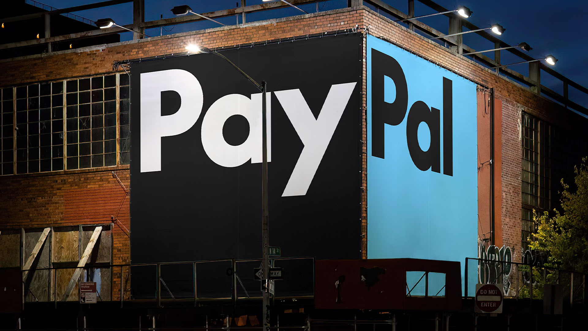
After twenty-five years of pioneering the digital payment world, PayPal has unveiled a new brand identity in its boldest revamp yet. The clean new look is a striking evolution that reinforces the brand's authority – a contemporary reimagining that combines class with minimalist sophistication.
Across Creative Bloq's Typography Week, we've already seen some stunning design inspiration, diving into typographic design's rich heritage and exciting future. PayPal's striking logo evolution is a prime example of how one of the most iconic fonts in famous logos can be expertly reimagined as a fresh and authoritative brand identity with a timeless appeal.
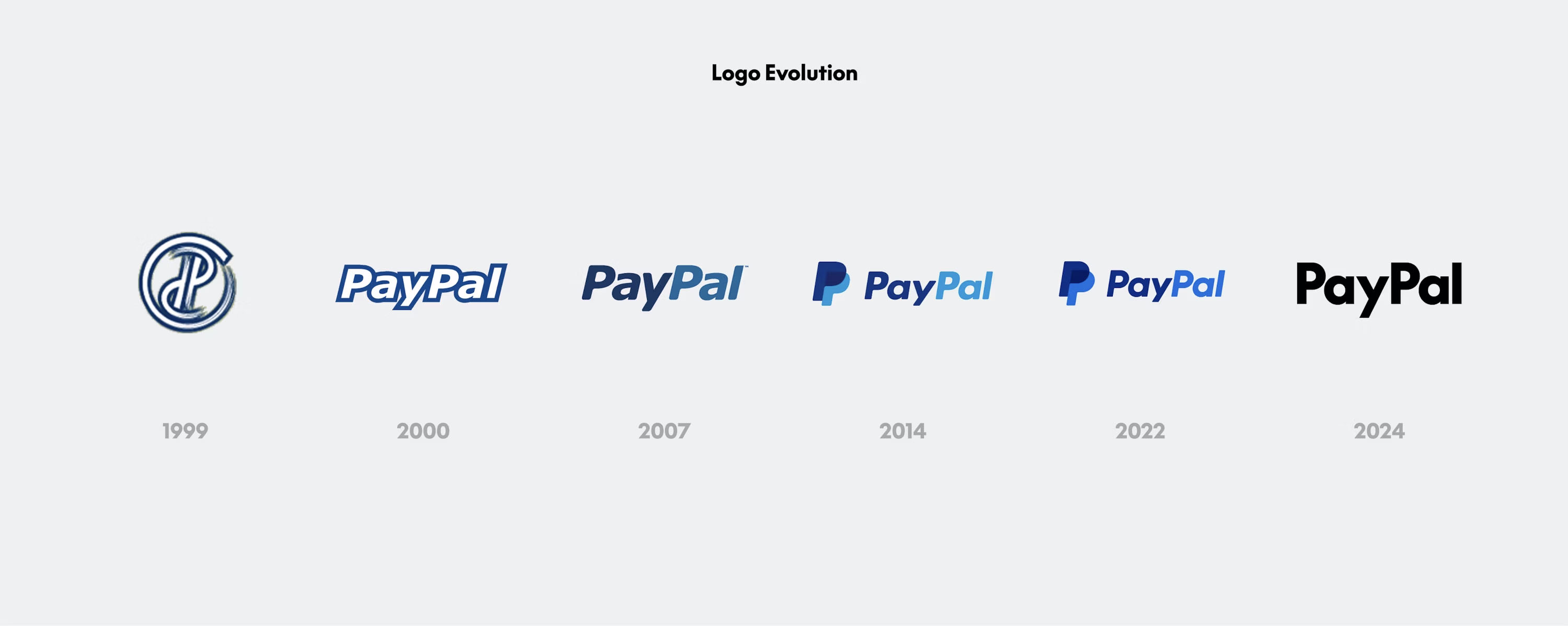
Created by global design firm, Pentagram, PayPal's new visual identity centres around the platform as a universal and accessible tool for users. By refining its existing identity with a concise colour palette and redrawn monogram design, the new look has an elevated appeal that embraces a more corporate aesthetic without feeling overly sterile or conventional. While the angle of the monogram's layered 'P' remains the same, the dated curves have been sharpened for a more contemporary look.
The bold new logo design is a dramatic departure from PayPal's design history which has adopted an italicised look since 2000. Now existing as a seperate motif from the brand's monogram, the wordmark logo has an authoritative identity of its own. The custom typeface PayPal Pro is a modified version of LL Supreme – a contemporary redesign of the iconic Futura font by Lineto Type Foundry. The sleek sans serif gives the wordmark a timeless appeal that embraces typographic heritage while punctuating the design with a unique contemporary flair.
After twenty-five years of italicised font and fintech blue, it's refreshing to see PayPal taking its identity in a sleeker, more refined direction. While the changes might seem subtle, the new visual identity presents itself as a thoughtful and considered redesign that elevates PayPal's identity without losing the iconic design markers of its existing identity.
For more typographic inspiration, take a look at the history of fonts in branding – from the birth of print to the digital age. As we look to the future, check out how AI is changing typography design according to industry experts and why it doesn't necessarily spell the end for creativity.