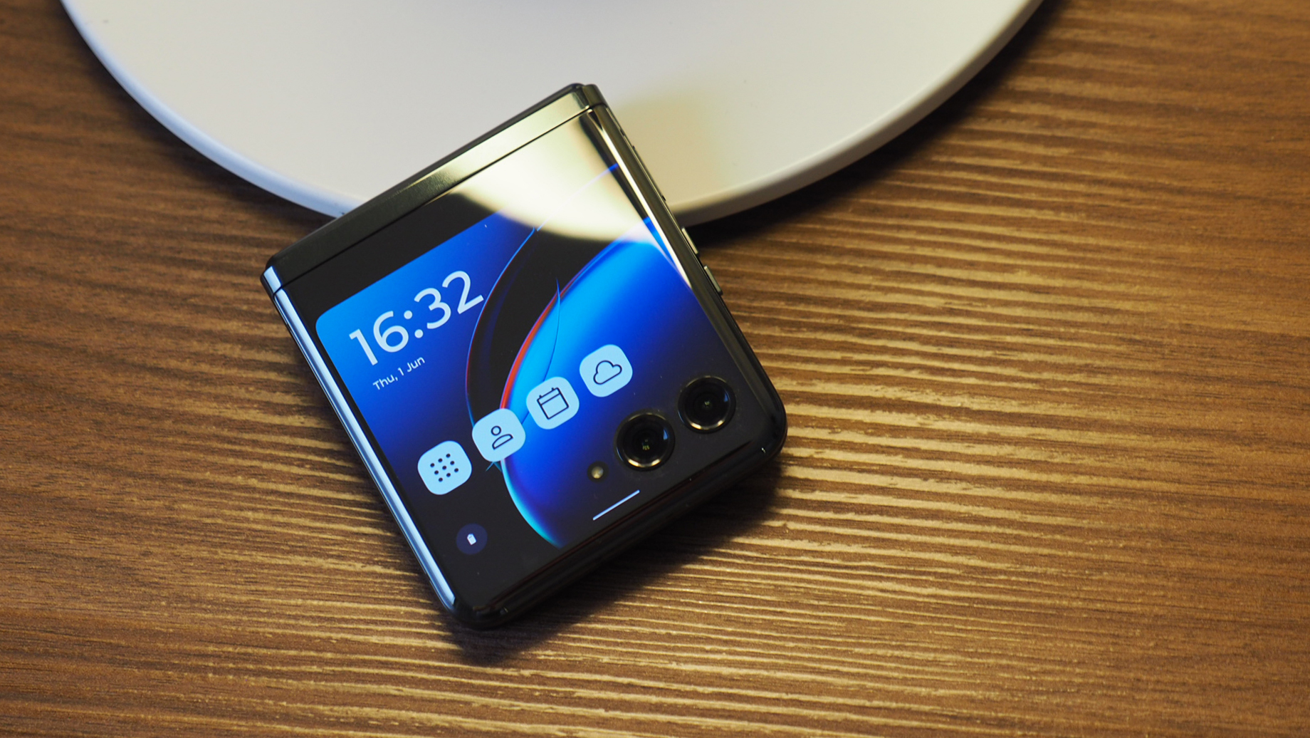
When it comes to flip phones, while Motorola has a strong claim thanks to its Razr series, it's Samsung's Galaxy Z Flip 4 that's the star of the, um, galaxy. So can Motorola's 2023 flagship foldable, the Razr 40 Ultra (or Razr+ in the US), cause a supernova and shake things up?
In terms of specification there's a key feature that'll help you gravitate towards the Razr 40 Ultra: it's got the biggest cover display (the external screen in its folded format) of any flip phone on the market, at 3.6-inches. That's a big deal – and when I first tried the Razr 40 Ultra I declared it the best I'd tried.
I'm now two weeks into living with the Razr 40 Ultra as my own, and when it comes to the best folding phones I think Motorola has played a strong hand. But as I'll get to in this review, has having a two-display phone really changed my world?
Motorola Razr 40 Ultra / Razr+: Price & release date
The Motorola Razr 40 Ultra is available now, priced at £1,049 in the UK and AU$1,499 in Australia. Its equivalent, the Motorola Razr+, will arrive on 23 June in the USA with a $999 asking price. Many carriers will offer contract deals, of course, as you can see from the shopping widget embedded above.
For context, the Razr 40 Ultra actually sits slightly above the Samsung Galaxy Z Flip 4's at-launch asking price, which was then £999. As typically occurs over the course of time, the Samsung offering has further decreased. Motorola does also make a smaller-screen Razr 40 (sans 'Ultra'), though, which is £799 and highly competitive, so there are alternatives that are cheaper.
Motorola Razr 40 Ultra review: What's new?
'What isn't new?' might be the better question to ask here, as the Motorola Razr 40 Ultra is a radically reconsidered device. While I've loved the Razr since its 2018 reintroduction, the older design was more in honour of the original 2003 device.
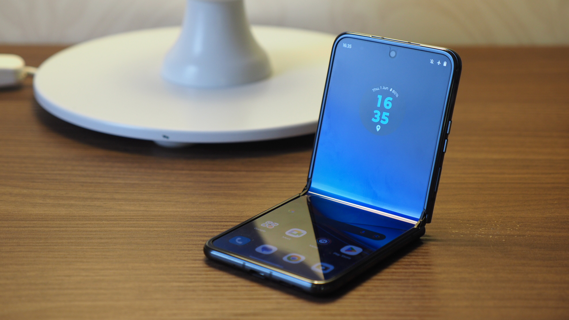
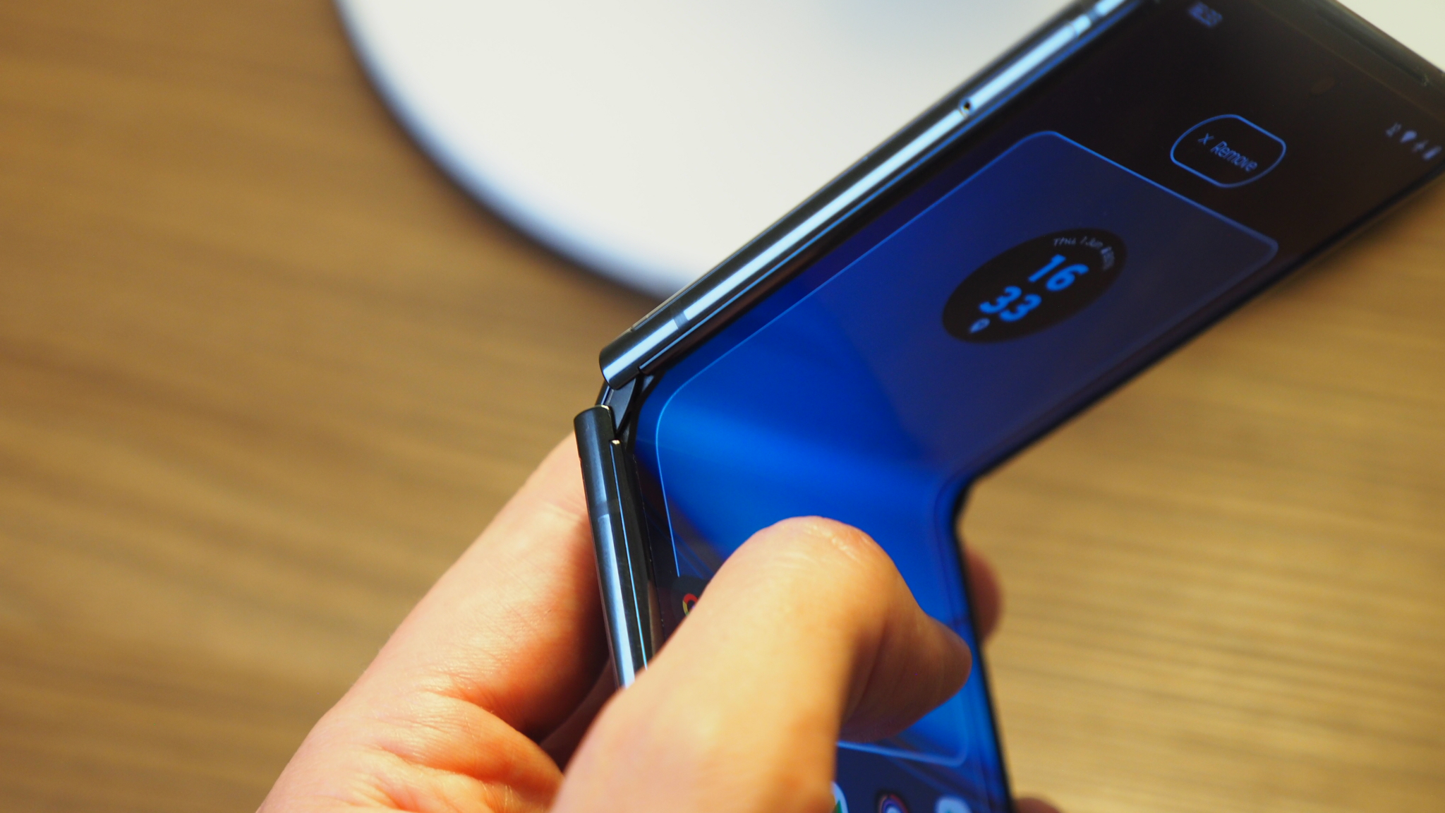
In 2023, some 20 years on, it's all changed: the Razr 40 Ultra has a new hinge design, meaning a no-gap fold in the closed position; the interior display, with its punch-hole camera, now has much smaller bezel than before; while the whole screen's implementation in the design means less screen edge exposure – it's just a more solidly built device.
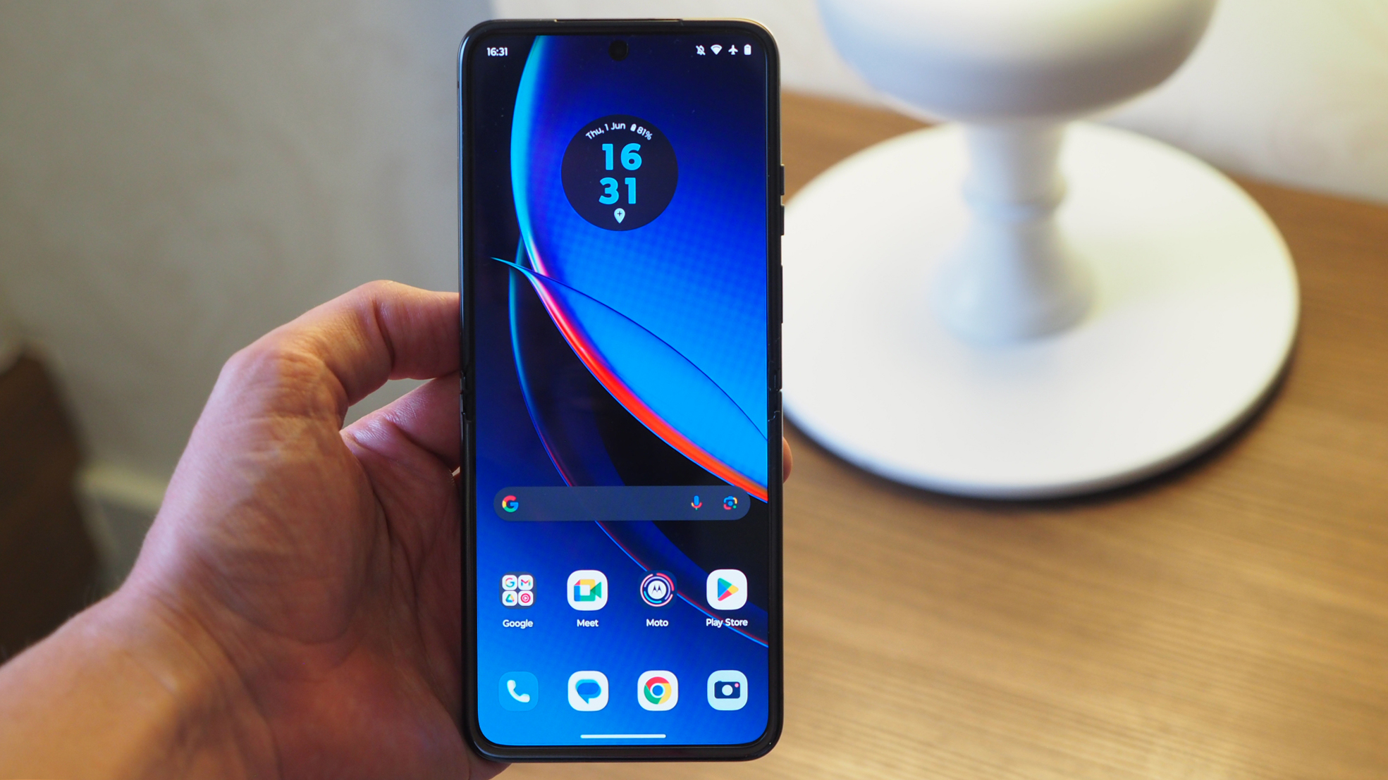
As an update to 2022's Razr release, the new 2023 Razr 40 Ultra ups the internal and external screen sizes (from 6.7- to 6.9-inches; and 2.7- to 3.6-inches, respectively). That means more screen real-estate no matter how you use the latest Razr. And compared to the Galaxy Z Flip 4, with its 6.7-inch internal and 1.9-inch external displays, that's a big step up.
Elsewhere the Razr 40 Ultra adds wireless charging for the first time in the series, offers IP52 weather-resistance, and while the cameras actually drop in resolution, the battery increases. I've put together a quick-glance comparison table below to summarise the specs of the older and newer Razr models:
Motorola Razr 40 Ultra review: Design & Displays
Clamshell folding phone designs are a distinctive proposition: folded up, the Razr 40 Ultra's boxier form reveals two large camera lenses cutting into its front 3.6-inch cover display. But that cover display is so large, and so eminently usable, that you may not need to open this phone so often – I've really enjoyed using any Android app I wish in full on the front screen (many with caveats, of course, given the scale).
When you do flip it open, however, the 6.9-inch display with its 20:9 aspect ratio is a glorious delivery of pOLED (that being plastic-coated OLED, essential in a folding design). Well, it is at first. As I've always found with folding phone designs, there's still no way around some of the caveats and pitfalls of these panels.
Namely, I'm talking about a duo of issues: the unavoidable 'crease', where the panel folds across its centre; and the reflective nature of pOLED – not to mention its sheer hunger for fingerprint smears here, that further distort the enjoyment of the panel. Not that my enjoyment was so marred I wanted to move out of the phone – I've been using this Razr for over two weeks intentionally, to really get a feel for living with it.
The cover display is an interestingly arranged prospect; a miniature window onto Android that's neatly 'divided' into the main of the display area, using the smaller space to the side of the camera lenses to accommodate notification badges and battery life monitoring.
You can swipe down for the standard notifications shade, or left and right through panels, just as you can in Android. The panels are a little different, though, with each of the (up to) five in total being for specific quick-access reasons.
The 'Home' panel is the only standard, non-movable one out of the lot. But you can add an additional four, from Google News, to Apps (where you can select up to six only), Google Calendar, Google Weather, Google Fit, Contacts, and Gaming. It's possible to rearrange the order of these as you please, or swap one for another (Home excluded, of course).

As there's ample screen real-estate across that 3.6-inch panel, I've sometimes found myself playing Candy Crush (guilty pleasure) on the cover display, and while it's inevitably tiny, it's still entirely functional. Replying to emails. Glancing at other notifications. It all feels like having a wearable, just without the, you know, wearing part.
Not everything is perfect, though, as while Android and apps can adapt for this screen really well by default, some are just less functional. Open WhatsApp and the keyboard is so massive it's hard to see what you're typing. But it is easy to glance through your messages – besides, flip the device open to the main screen when you see something you want to take action on, and the app in use will automatically appear in full-screen format. Magic stuff.
Overall it's the most integrated and thought-out cover display I've seen in a clamshell foldable to date. While I find that genuinely functional, fun and useful, however, I still don't find it essential. A 'normal' phone, minus the folding functionality, would cover this for me. So I think this aspect will come down to your habits and how constantly on your phone you are.
Motorola Razr 40 Ultra review: Performance & Battery
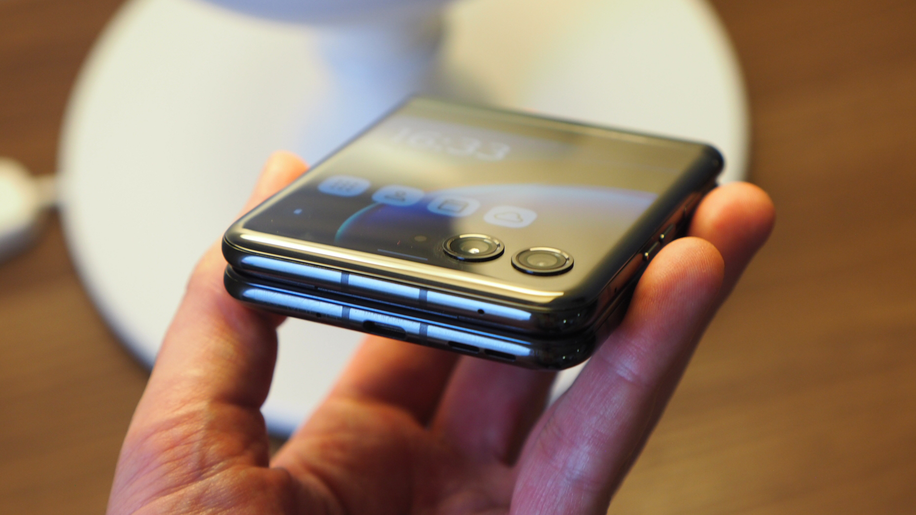
As you can see from the quick-glance spec table I've provided further up page, the Razr 40 Ultra uses the Qualcomm Snapdragon 8+ Gen 1 chip inside. I did wonder why this was the choice, given it's now a step behind Snapdragon 8 Gen 2. In terms of raw speed there's not going to be a huge difference, but there are some differences in how this chip is implemented here.
It's all down to the form-factor of this clamshell design, but based on my testing there's clearly throttling going on that's particularly bothersome for ongoing demand scenarios. I loaded up Mighty Doom, for example, a gory mobile shooter from Bethesda, and that runs perfectly fine for its initial few minutes. But some levels in and there's a clear frame-rate drop, animations are a little stuttery and that's because the CPU is throttled to prevent overheating.
That's a bit at odds with the purpose of having a 'plus' system-on-chip design in my mind, not to mention the Razr's 165Hz main display isn't going to make the very best of that high refresh rate for the most demanding and sustained play sessions. Yes, it'll see your Twitter stream scroll smoothly, and your emails, but this isn't really a power phone for power users. It's a fashionable folding phone instead.
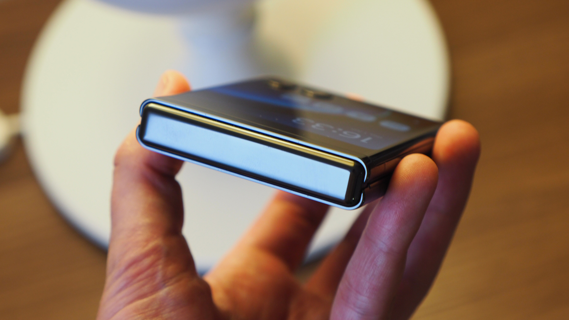
The extents put in to prevent overheating make sense, though, especially when you consider there's only a 3800mAh battery capacity here – which really isn't all that much by today's standards. To my surprise, however, I've easily been able to get through a normal day with the Razr 40 Ultra. Sure, I might be into the final 15-20% stage after 14-15 hours of use, but that's without making any concessions to my typical use.
There are exceptions though: when I've been using the Motorola as a hotspot, as one example, the battery takes a bigger hit than I'd like. In addition, when wirelessly connected to Android Auto, and wirelessly charging on an in-car charging pad, the phone got seriously hot and was draining battery life faster than it was refilling it (no surprise, given the slow 5W wireless charging option – I've stuck to wired only ever since). So it's not fool-proof in its functionality, but for most users it'll tick all the necessary boxes of functionality and longevity.
Motorola Razr 40 Ultra review: Cameras
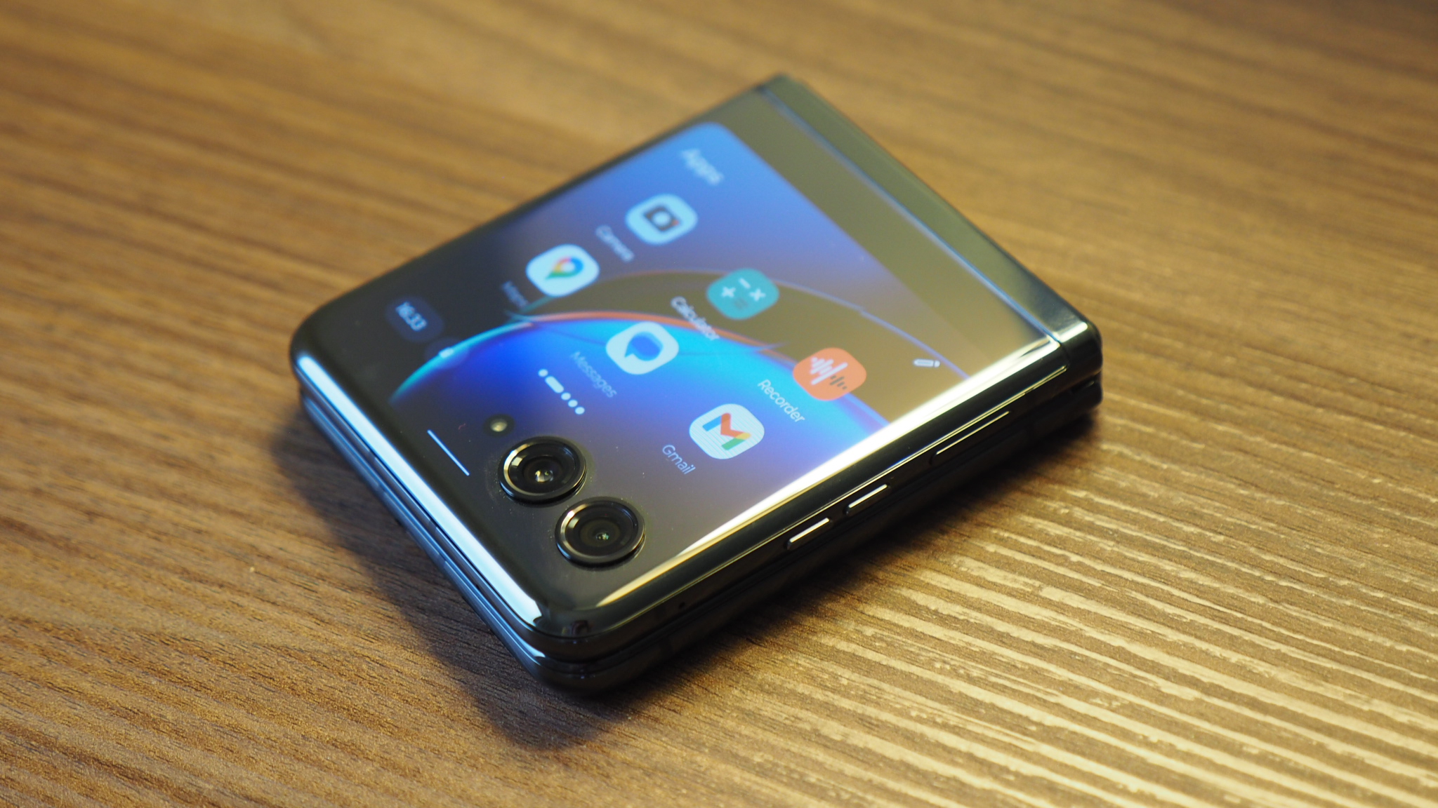
When it comes to cameras I was surprised to see that Motorola has moved away from the 50-megapixel offering in the older Razr model and instead opted for much lower-resolution snappers in the Razr 40 Ultra. The pair of lenses is a 12-megapixel main, positioned next to a 13-megapixel wide-angle (the interior punch-hole selfie camera is the highest-resolution of them all, at 32MP).
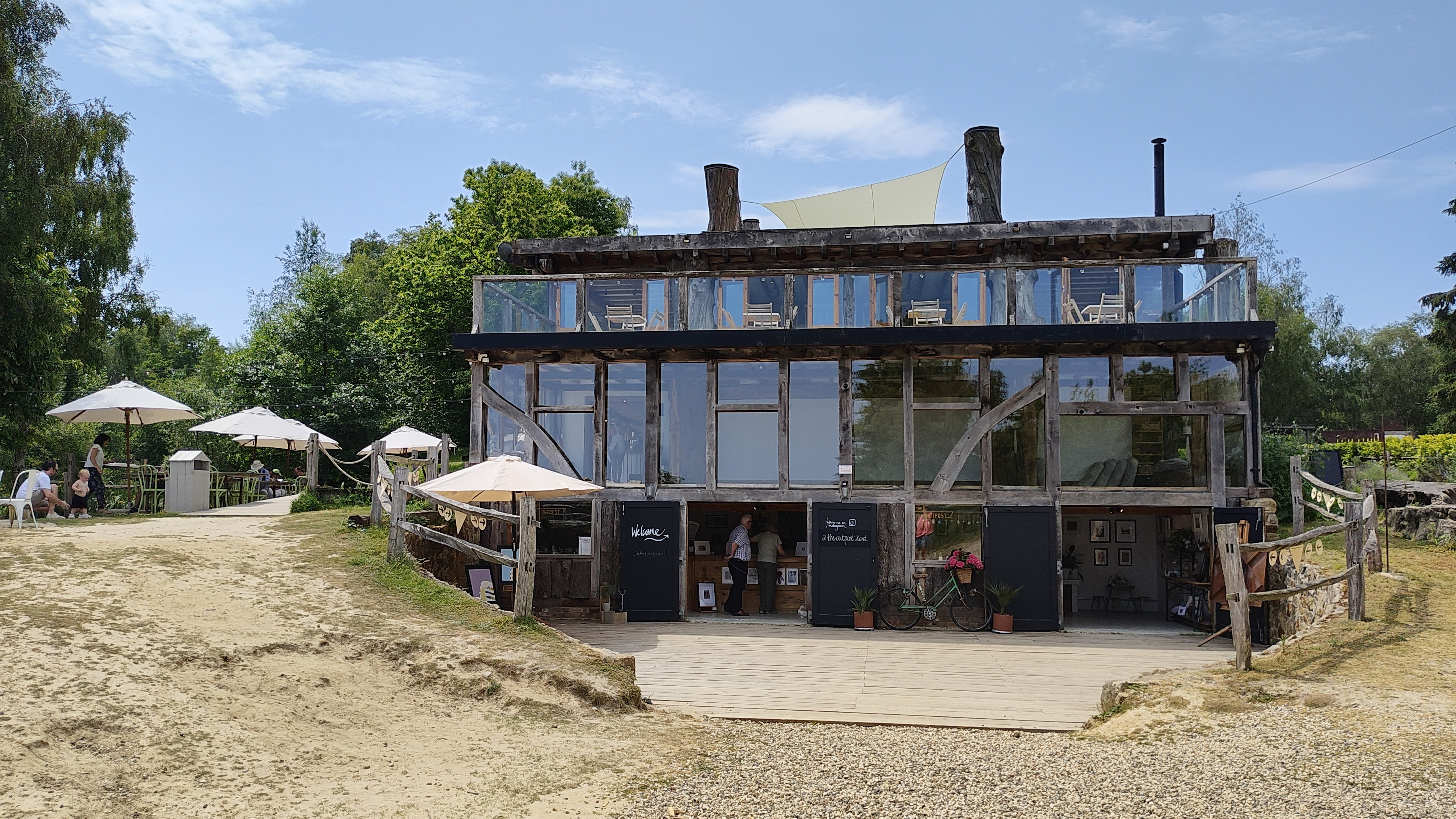
Now I'll say this: resolution isn't everything. There's a lot to be said for processing, for optical quality, for in-app features, for autofocus speed and usability. And the Razr 40 Ultra gets by just fine. It's not going to win any awards either, mind, but it can take well-balanced, well-exposed images, as you can see from my gallery selection below.



In a folding phone of this type there has to be an acceptance for the kind of technology that can feasibly be on offer too. While the likes of the Xiaomi 13 Pro offers a massive main sensor and amazing optical image stabilisation, there's just not the physical space for the Razr to feature that. Well, not in a design this well considered anyway, it'd turn into a giant brick otherwise.
There are some playful additional features that the Ultra can offer though: as the fold can be firmly positioned anywhere from around 45-degrees to an upright 90-degrees and beyond, you can hold the device like an old-skool camcorder, or even position it on a flat surface to take a gesture-controlled selfie. The cover display can be used as a live viewfinder and it can even automatically detect faces and adjust the framing live. So there are some specific benefits to the format that help this flip-phone to stand out.
Motorola Razr 40 Ultra review: Verdict
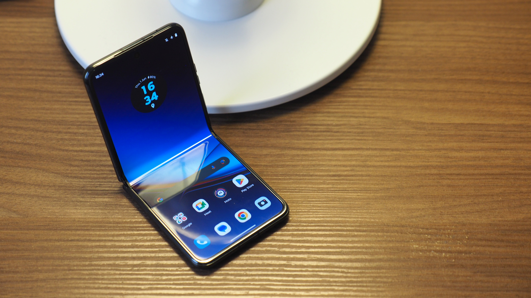
If you're in the market for a clamshell foldable then Motorola has created a shining new star in the Razr 40 Ultra – knocking even the Samsung Galaxy Z Flip 4 out of orbit. I've been very impressed with this flip-phone during my ongoing two weeks of use.
That said, the Razr 40 Ultra suffers the same downsides as any other foldable: the screen crease, the fingerprint smearing, and reflective nature of a pOLED display. However, with this Motorola there's also processor throttling and, in certain scenarios, heat issues that can cause the (otherwise decent) battery life to bomb.
Credit where it's due though: the way Motorola has created a genuinely functional yet fun cover display, thanks to that dominant 3.6-inch scale, is what puts this flip-phone worlds apart from the competition. Your move, Samsung.
Also consider
If you want a clamshell foldable with the biggest and most responsive screen than Motorola wins. But if you'd like something cheaper to fill your flip-phone boots then the Samsung Galazy Z Flip 4 is an obvious alternative that's still mighty impressive, just that it features a much smaller cover display.


