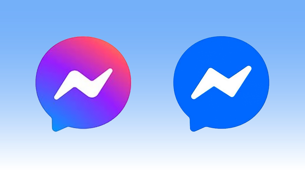
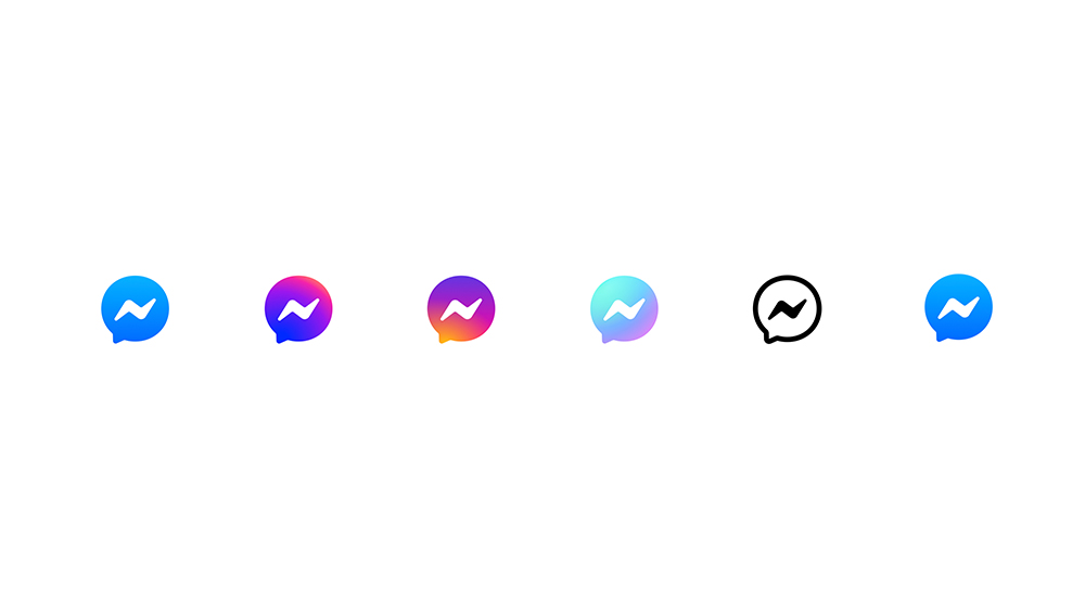
Back in 2020, Meta announced proudly that "nothing's changed, everything’s changed" when it replaced the blue Facebook Messenger logo with a series of redesigns sporting purple and pink gradients. Four years on, now nothing has changed for real.
Meta has baffled Messenger users by rowing back on the much publicised logo redesign and reverting to the previous blue palette. It's offered no explanation for the change, but people have already reached their own conclusions about the reverse rebrand.
In January, Mark Zuckerberg announced that Facebook's token commitment to standards and moderation was now "out of touch with mainstream discourse" and that he had decided to get rid of fact checkers and replace them with community notes. Because we all know how well that has worked on X.
Zuck was instantly accused of bowing down to Donald Trump – or simply of taking advantage of the change of administration to lower Facebook's standards and costs. We can't say whether Zuckerberg's decision to join the "anti-woke" party is also responsible for Messenger going back to a less vibrant and more conservative logo design, but the timing means that users are inevitably reading the rebrand in that way.
"100% did it because the last one was very close to trans pride colors. Just like they removed all trans and pink/ white/ blue themes from messenger last month," one user writes over on Reddit. "Honestly that was my first thought. 'The gradient might imply we like trans people and bring der pumpkinfurher against us. We must comply', another person says.
Others have linked the decision to revert to a blue colour palette to Zuckerberg's much-mocked suggestion that corporate America needed more "masculine energy”.
There's also some debate about how the rebrand will be read longer term. Blue is often considered to communicate trust – which Meta could do with earning more of as it pushes its Meta AI tools in Messenger. But some suggest the change will have the opposite effect. "This is a company going backwards to their 'old ways'," one person suggested on Reddit.
There is a more innocent potential explanation. The Facebook Messenger logo was redesigned to incorporate a more vibrant gradient at a time when Meta was merging it with Instagram's messenger so users could access the same messages across both platforms. But Meta abandoned that much-hyped plan at the end of 2023 with no explanation. If there's no longer a plan to add more cross-functionality between Instagram and Messenger, it could make sense to 'demerge' their branding.
The problem is that since people have become used to the 2021 logo, the old design now looks "basic". "It feels so bland – like an artifact from 2016 in my home screen," one person complains.
For more logo design news, see the controversial new Green Party of Canada logo.