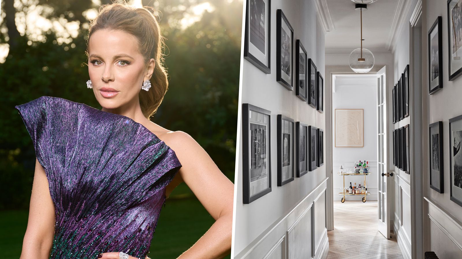
Far removed from the starkness of the past – today's pared-back designs equal relaxed not sterile. This blissfully simple approach to design is the key to success for Kate Beckinsale's masterfully minimalist entry hall.
Calm and serene, Kate Beckinsale's home might be devoid of ornamentation and color, but it is by no means dull or dated. In fact, the minimalist movement is everywhere on social media and when it comes to interior design in the modern age, less can often mean more.
In this busy modern world, having a restful sanctuary to return to has never been more important, so it’s no wonder that homeowners are turning to the principles of minimalist living and creating stripped-back spaces perfect for switching off, unwinding, or, even using as your very own catwalk à la Kate.
From the 1930s to the late 1960s, in the aftermath of the war, sprung a new interest in space and a desire for interiors that welcomed a stillness into the home – which led to the creation of a new look. Enter minimalism and modernism.
This new aesthetic, influenced by muted color schemes, clean lines, and modern materials, gave rise to iconic designs, and it was during this time period that many homeowners started turning their sanctuaries into utilitarian, quiet spaces with an aim to calm the mind and soothe the soul.
With a minimal profile and restrained aesthetic, Kate Beckinsale's home defines this period of minimal Scandinavian design. Now, many years after its introduction, it is an interior design trend that is still popular in modern homes up and down the US.
Individualistic in looks and high on style, this space may seem simple to design, but perfecting a pared-back look takes some serious design know-how.
Creating a minimalist space that also exudes luxurious comfort can be a hard balance to strike, but with careful consideration, it can be achieved.
Minimalism itself is rooted in the principle of ridding your home of clutter and chaos. It is about harnessing the power of a 'clean' space that is limited to just a handful of key pieces and meaningful items. This design philosophy also centers around a sustainable and more efficient way of living. Therefore, only invest in items that are good quality, and will last long-term.
‘Modern homes are becoming more obviously functional – with little or no decorative detailing,' says Keith Atkins, Design Space London. 'Instead, their style derives from simple, architectural lines, the sheer quality of the engineering and the materials used.’
Minimalist rooms are all about maximizing the feeling of space. When decorating, 'it is important to consider the spaces you leave empty just as much as the spaces you fill,' says Simon Temprell, interior design manager at Neptune. 'Try to avoid lots of small objects and instead concentrate on more considered items that have presence and form.'
In this home, rather than furniture, Kate Beckinsale adorns her walls with photographs and art – something with meaning that will never tire or date.
Another fundamental element when curating a minimal home is the chosen color palette. All-white will always look smart and clean. Decorating with white is a minimalistic choice that requires an element of bravery, as it requires careful editing and a strong design eye.
However, this type of interior can also appear ‘flat’ if you don’t introduce texture and subtle tonal variety. But put together carefully, it’s a great way to enhance a minimalistic living room.
Tone and texture are important. Remember that the most successful minimal interiors combine occasional movement and depth with tactile pieces to create a warm and inviting minimal scheme. Here, that 'warm' element can be seen in the casual flecks of gold on the picture frames.
Shop Kate Beckinsale's look
Creating a minimalist home is a lovely considered look that isn't too difficult to recreate in your own home. Shop a curated edit of our favorite buys to replicate this look.


