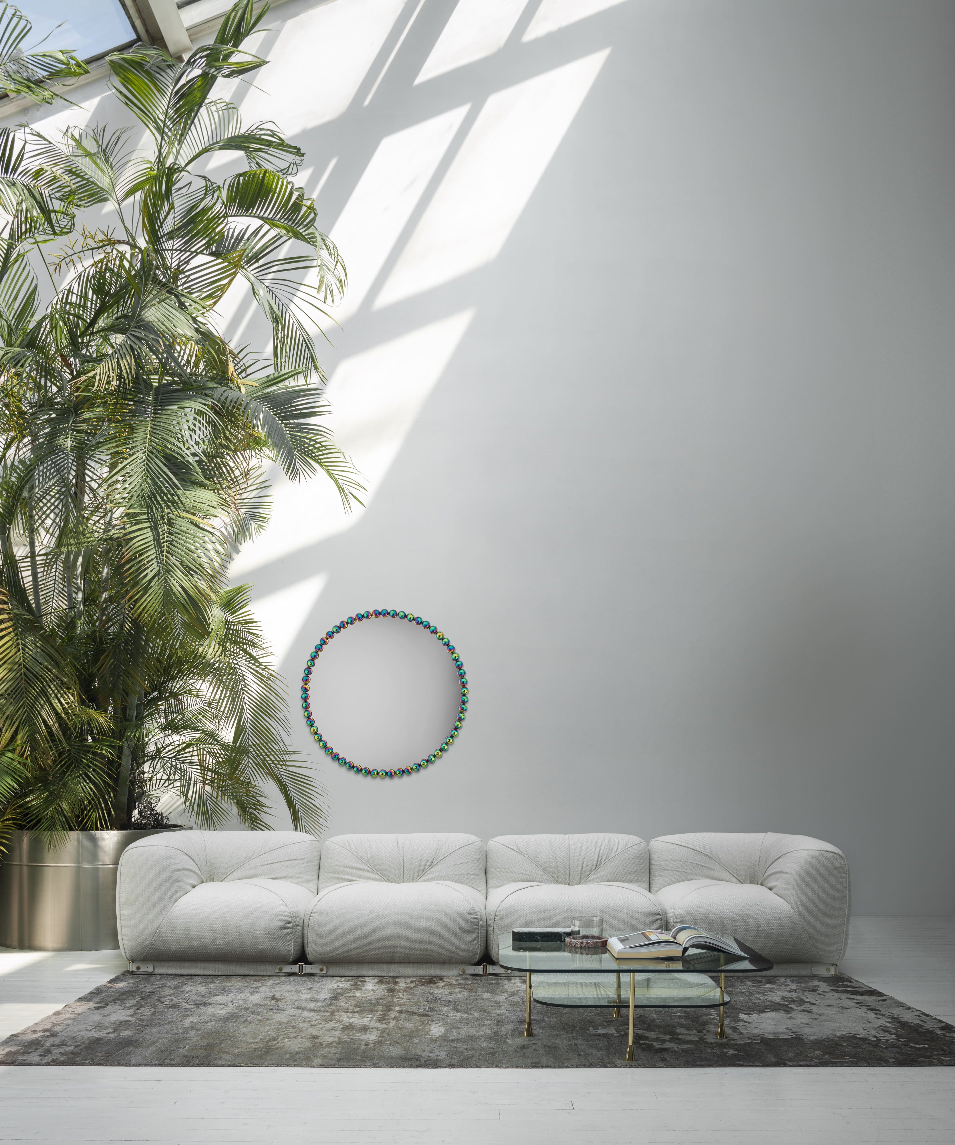
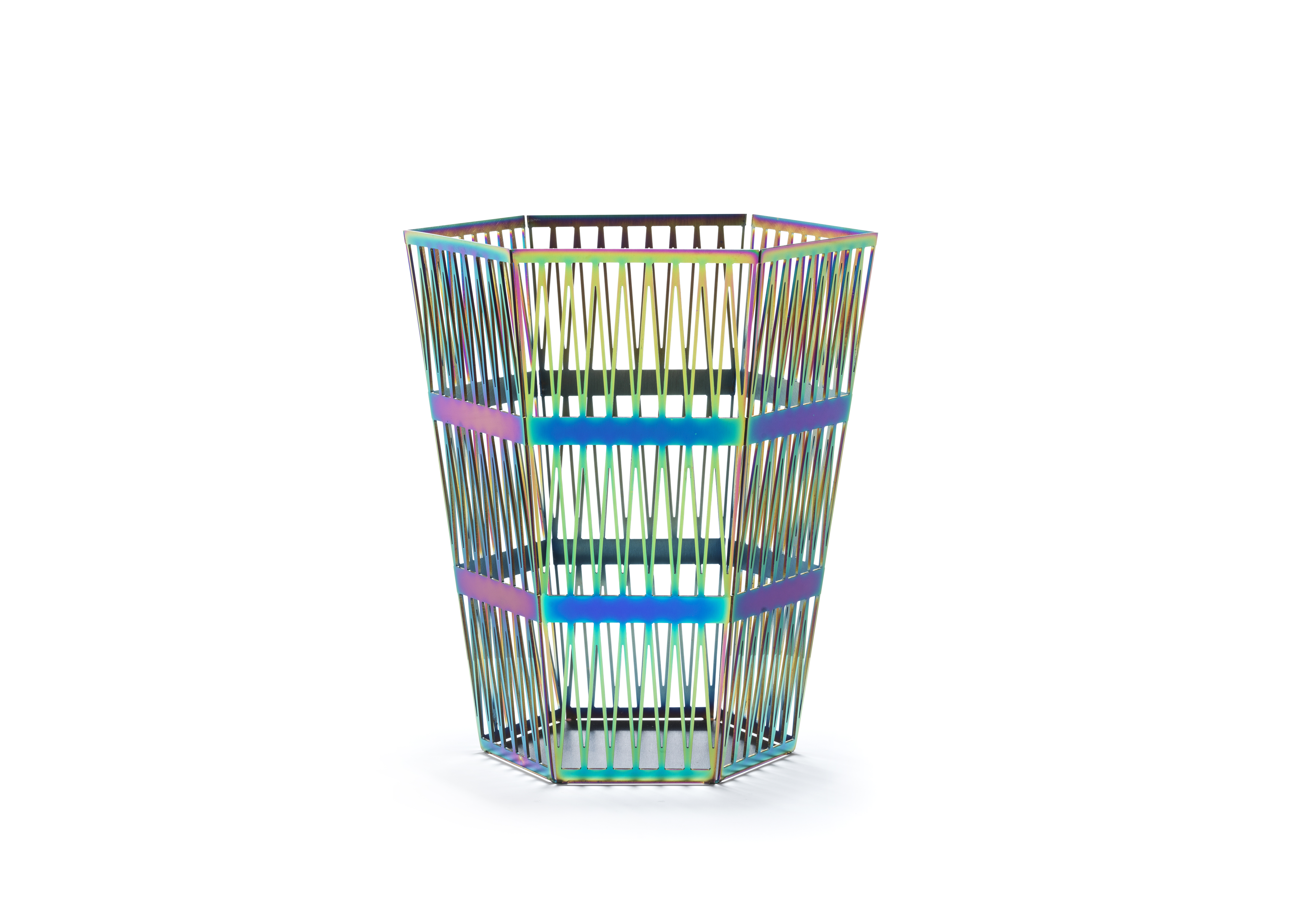
At Salone del Mobile 2025, inside a postmodern domus conceived by architect Lucia Valzelli, Italian design house Ghidini1961 debuted something surreal: Candy. A shimmering, multicolor, multidimensional metal finish that looks like the material embodiment of a mood ring — or what space-age futurists in the 1960s might have imagined furniture would look like in the future. Bright oranges, blues, purples, and greens shimmer in constant flux — somewhere between chrome and illusion.
At first glance, Candy could be mistaken for polished brass. But iridescence is mutable — shifting with the light, the angle, the room. This interior design trend is a living surface: one-of-a-kind, not just by SKU but by moment.
Candy wasn’t alone. Across Milan Design Week, iridescence emerged as a finish to watch for its abrupt disruption to the often static nature of interiors. “Iridescence speaks to the growing desire for dynamism in design,” says Giuseppe Ghidini, VP of sales and marketing at Ghidini1961. “The appeal lies in its ability to transform spaces — bringing a sense of movement, fluidity, and surprise to furniture and decor.”
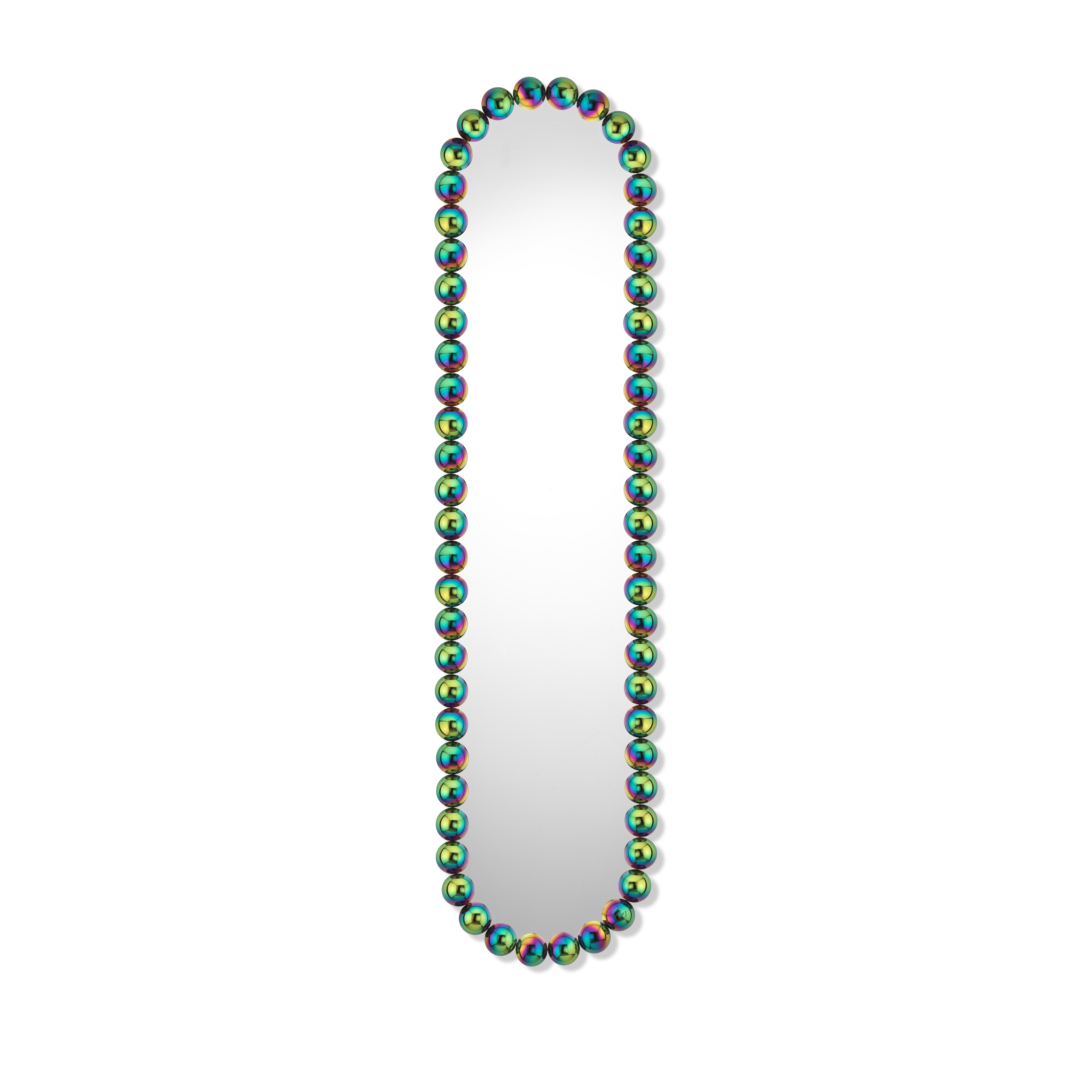
While chrome skews sharp and brass leans traditional, iridescence occupies a stranger, softer space.
According to the team at Artemest, its “ever-evolving effect allows for a broader spectrum of color integration, making it feel both futuristic and organic at the same time.”
In other words: it has range.
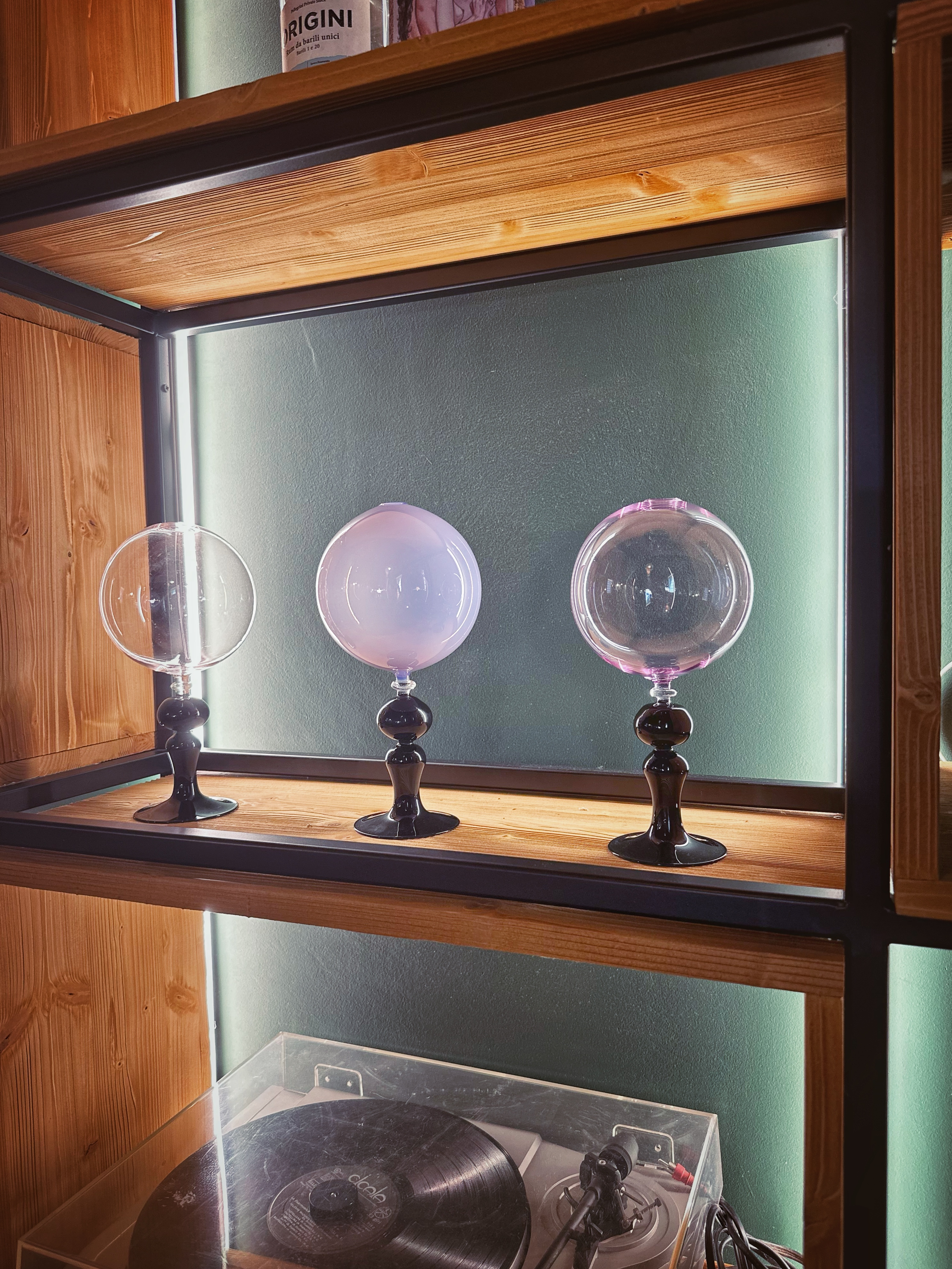
Beyond aesthetics, though, this next-gen finish reflects a broader shift across categories — a rejection of minimalism’s flat uniformity in favor of expressive, one-of-a-kind color stories.
Gen Alpha, for instance, doesn’t want Millennial Pink. They want every color — at once. That preference is already well-documented in sectors like beauty, where rainbow branding is the new shorthand for relevance.
If maximalism is the mood, iridescence might be the interior design equivalent.
“In 2025, we expect to see more experimentation with light-reactive surfaces, high-tech coatings, and finishes that bring movement to still objects,” Giuseppe adds. While Candy is a metal finish, he predicts similar executions in glass, fabric, and beyond.
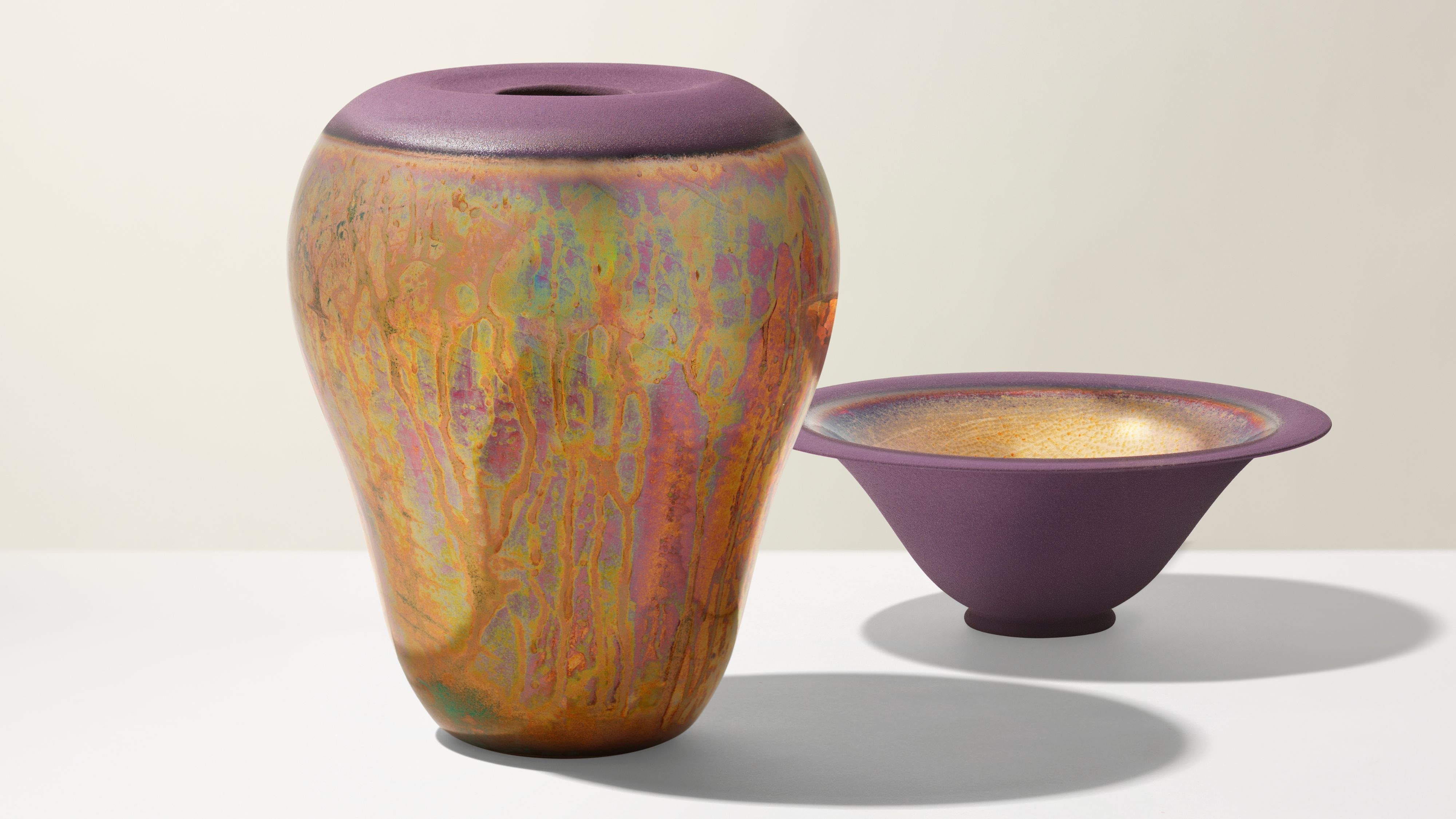
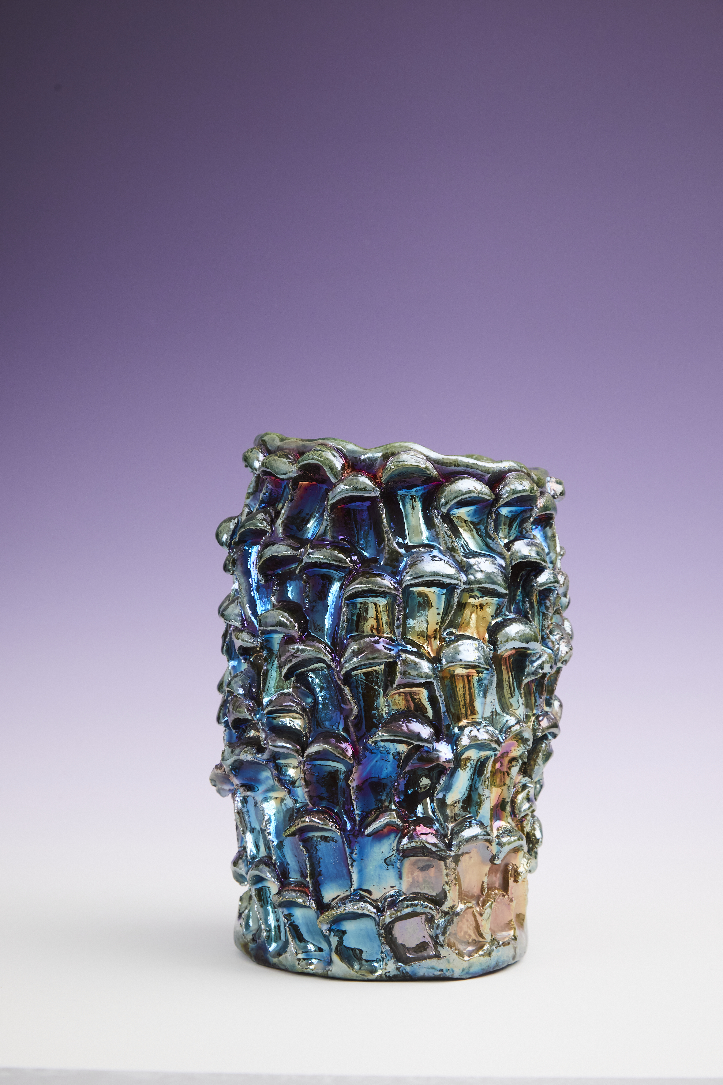
That future may already be here. On art-forward platforms like Artemest, pieces such as the Luci in Piazzetta a Caprivase by Nino Basso for Design Center 1991 reflect the same impulse.
“This ceramic piece, crafted using the raku technique, has a mesmerizing polychrome finish that shifts beautifully between vibrant and muted hues,” the team explains. “The raku process enhances its unpredictability — each piece becomes a unique fusion of fire, glaze, and texture, echoing the organic nature of iridescence itself.”
While finishes like chrome and brushed steel remain mainstays, iridescence offers what they can’t: surprise. And, perhaps more importantly, personality. In a design era defined by customization and individual expression, materials can’t just sit quietly.
“At Ghidini1961, we see a future where materials are no longer just static components but elements that engage and react to their environment,” says Giuseppe.
Iridescence isn’t just about shine. It’s about surfaces that shift — that do something. If the material world is softening at the edges, finishes like Candy might just be leading the way.
There’s something almost alchemical about this candleholder — the fluted lines, the antique shape, the eerie shimmer of iridescence that feels like the result of some beautiful chemical reaction. As if it’s weathered an aesthetic storm and emerged more enchanting. Place it on glass, lacquer, or mirrored surfaces and let it do its thing.
The GIANA sconce by Mitzi offers a subtler take on iridescence, with a jellyfish-like glow that feels otherworldly. It’s an easy entry point for minimalists: ethereal, airy, and just translucent enough to catch the light and cast a little spell across your wall.
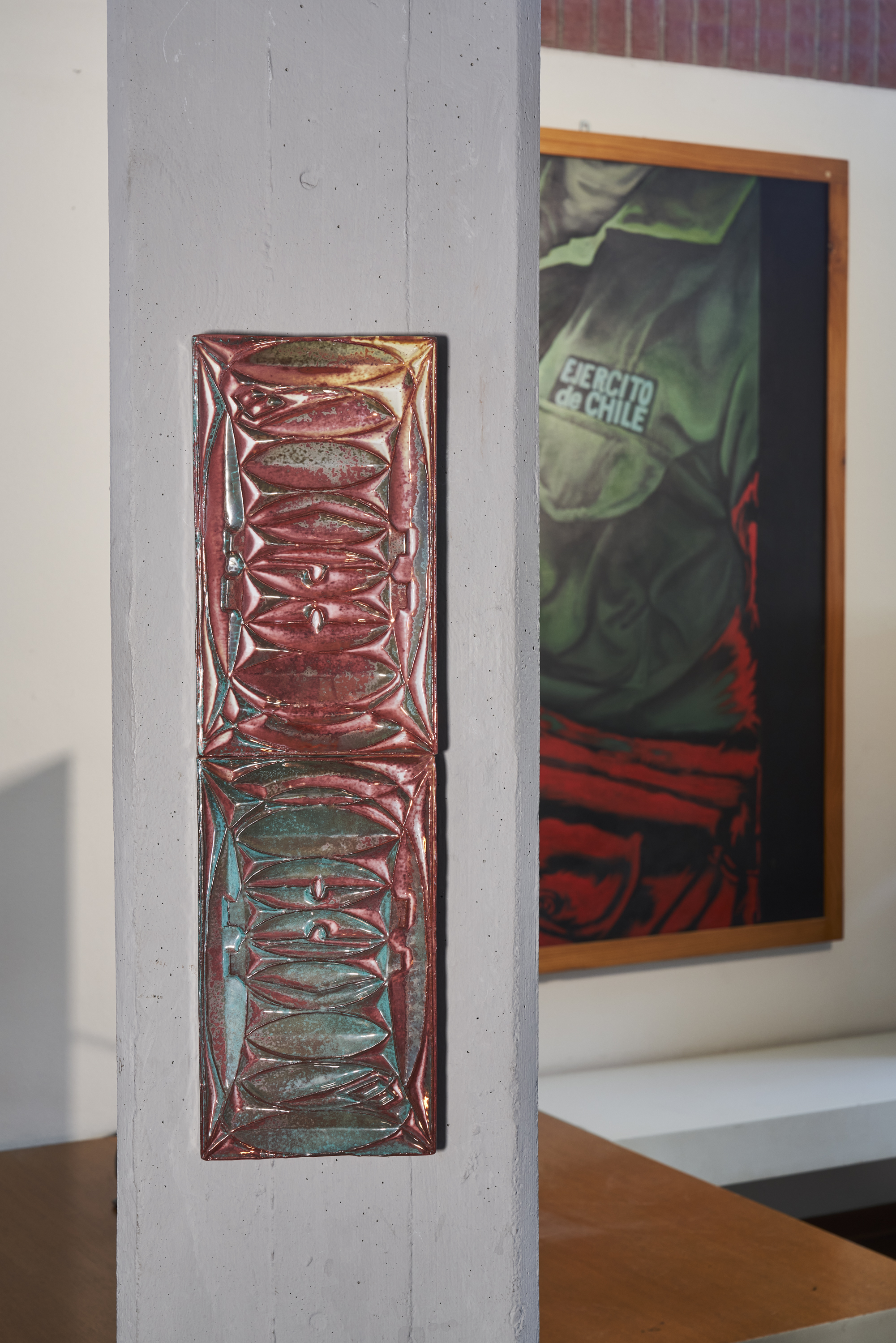
What does one do with an iridescent tile? The team at Artemest suggests using it as the focal point. Its natural pairing is with neutral palettes, but it can also pop against deeper, moody tones or heavily textured surfaces — chrome works too, when used sparingly. Think sleek table legs or hardware.
Noon & Moon’s set of six wine glasses looks like it belongs in an enchanted kingdom or a fantasy film. Each is hand-blown and completely unique, with charmingly imperfect swirls and bubbles. One-of-a-kind by design — and maybe the ultimate gift for your favorite Aquarius.
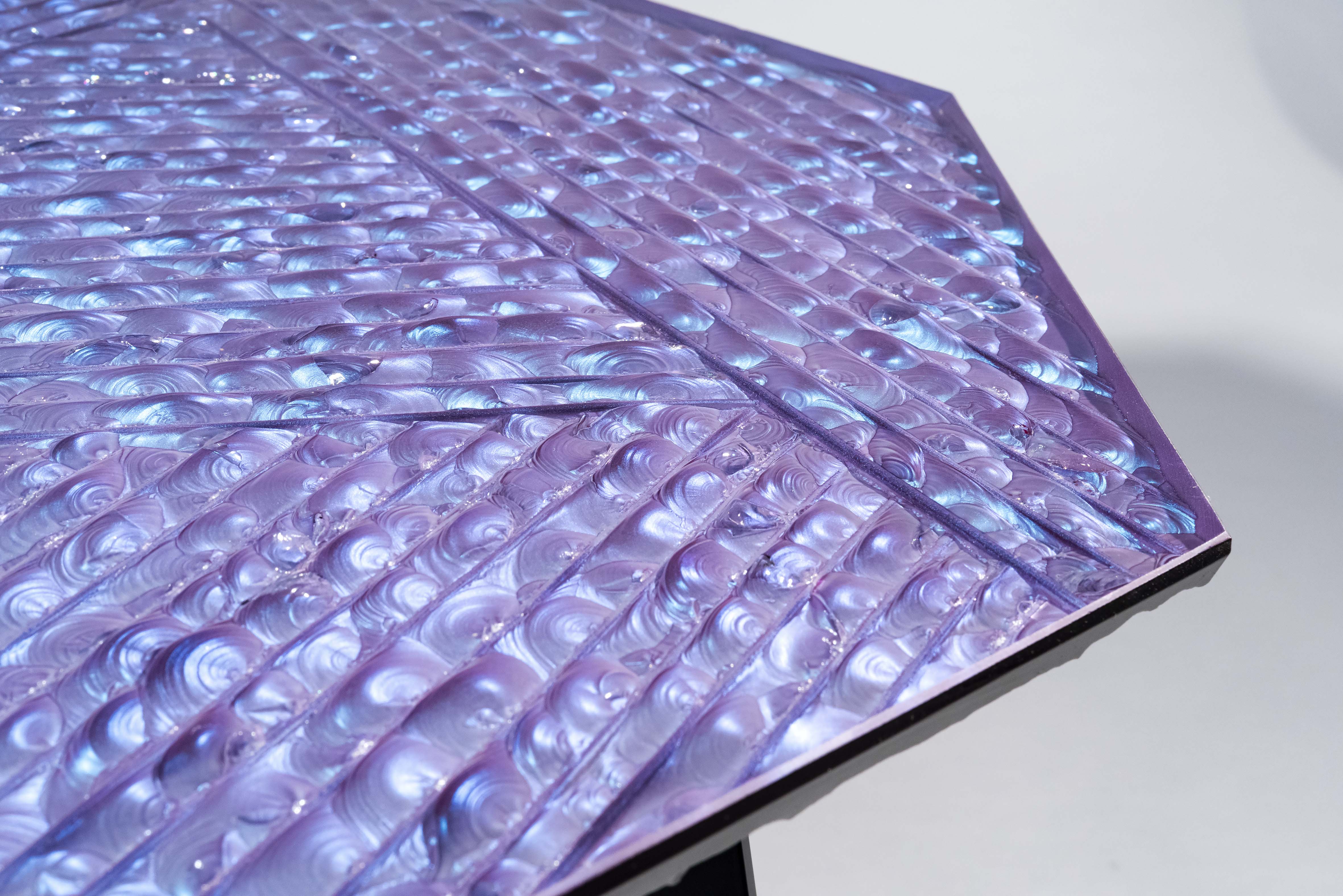
The North Light table by new-to-the-scene furniture maker Adrenalina draws from aurora borealis skies, capturing the surreal shift between blue, lilac, and green — hues that suggest constant motion, even when the table’s standing still. Style with opposites on the color wheel — say, a saturated orange vase next to an opalescent tile — or keep it classic with a sharp chrome detail.
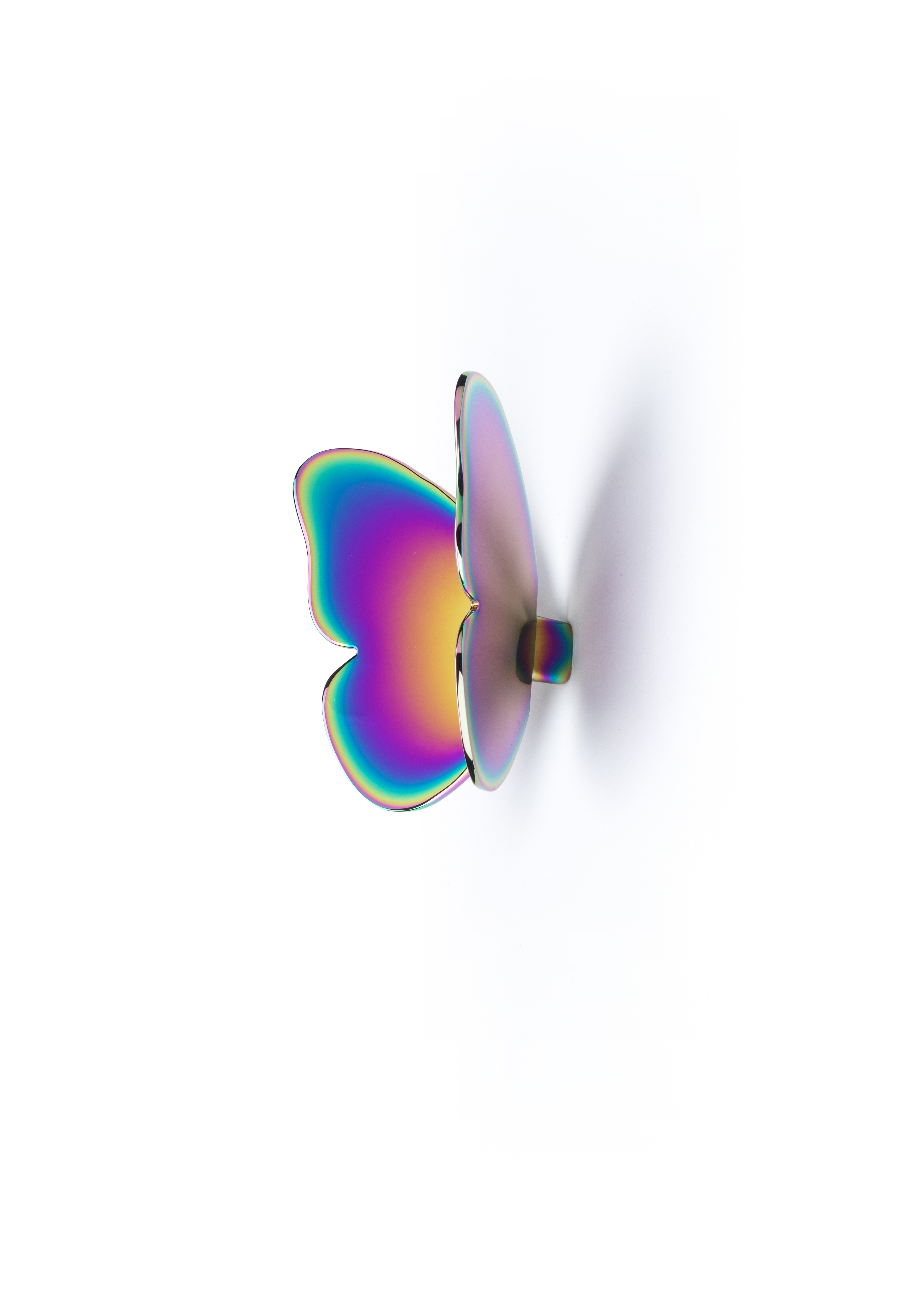
Baccarat earns its wings. Modeled after a butterfly in flight, this modern crystal is a symbol of transformation — and in this iridescent iteration, it becomes a supercharged visual metaphor for hope, brightness, and change. Pretty and poetic, it invites you to welcome a little whimsy into to the everyday.
On a budget? Colorful, transparent acrylic furniture delivers a similarly ethereal effect — minus the splurge.


