The way we decorate with neutrals is ever-evolving. While once grey was the go-to, it's since been beige tones that have become more commonplace. However, there's a dramatic change in tone underway.
We're now seeing darker, moodier browns come to the forefront - an evolution of the warm neutral color trend that's a little more impactful and a little less vanilla for some tastes.
This dark brown color is also surprisingly versatile. Depending on what you pair it with, it can easily switch from sophisticated to playful, traditional to modern. Here's how interior designers are choosing colors that go with brown, to serve as inspiration for your next color palette.
1. Tonal browns
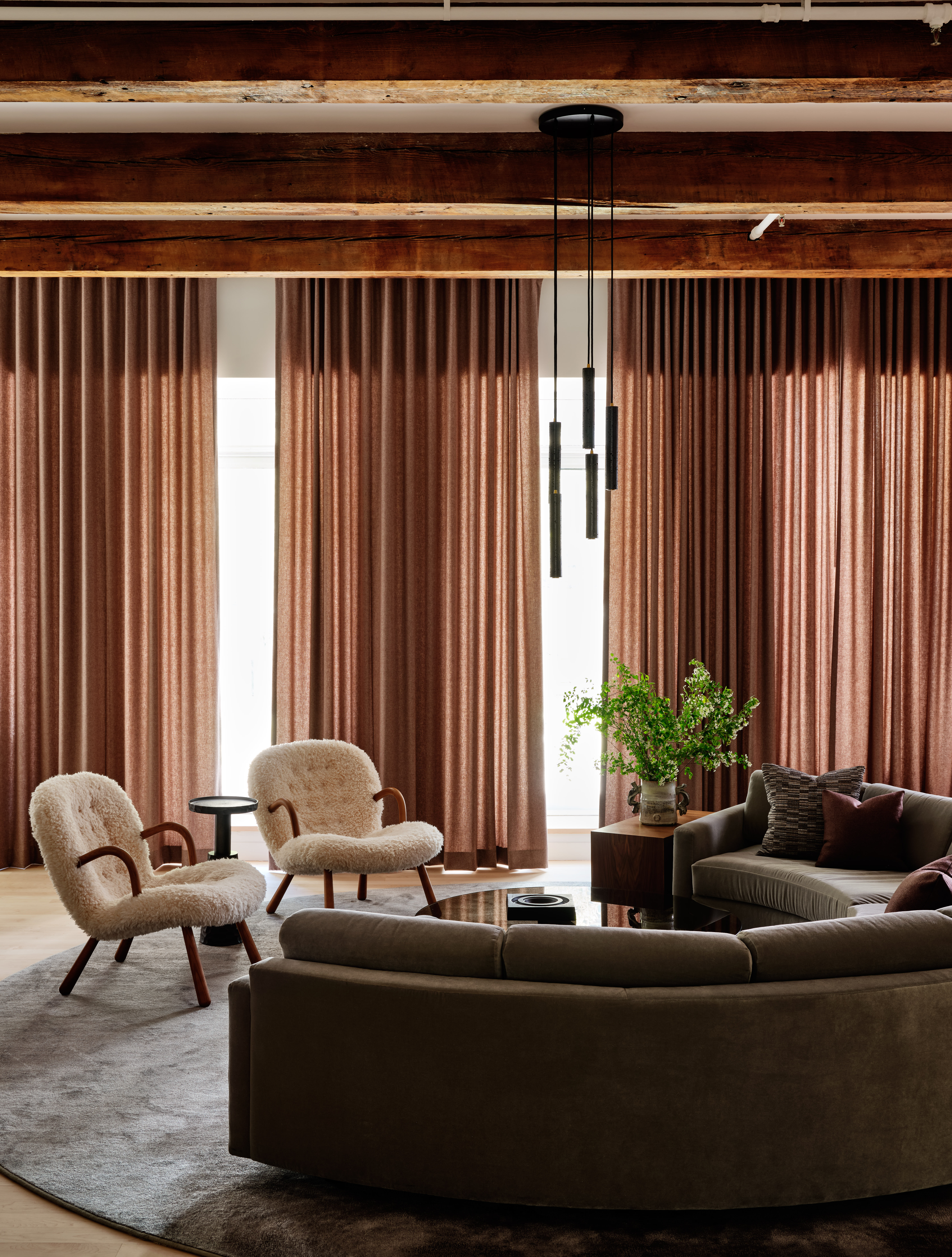
For an easy way to make dark brown feel sophisticated and elegant, try using it in a monochromatic color scheme with other shades of brown. This living room by Studio Todd Raymond is a perfect example, balancing a darker, grey-toned brown of the couch with a lighter, warmer brown for the window treatments.
'We stick to the basics by ensuring a space has a well-balanced mix of textures and tones,' Todd Raymond, founder of the interior designer studio, explains. 'Brown is really just wonderful and a favorite of ours to use -- dark brown goes well with something milder or even with a grey undertone. We tend to reference mushroom colors in our palettes, and they all work well together in a monochromatic scheme as long as there is a mix of textures.'
2. Khaki green
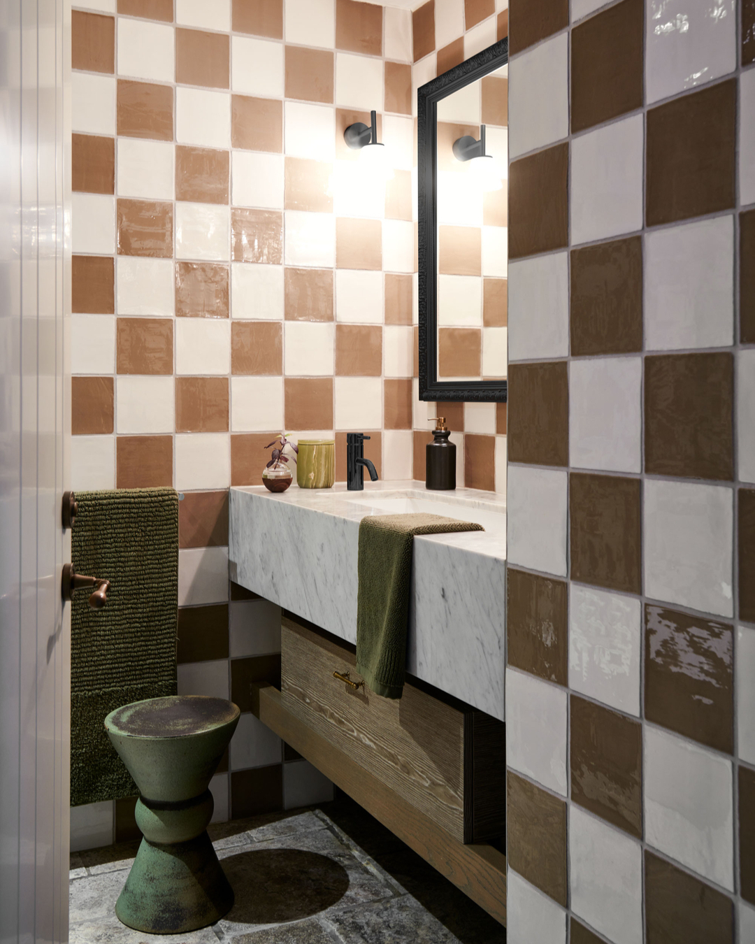
Dark greens, like khaki, work in a similar way as other browns for an easy, cohesive scheme. As a color that goes with dark brown, it's also one that keeps things feeling modern and sophisticated.
For designer Nicholas Kaiko, it was the right bathroom color combination to elevate his space. 'In my bathroom, I kept the original tiles because they were still in great shape and had a lot of character,' the designer, founder of Kaiko Designs, explains. 'The update was more about bringing in new fixtures, lighting, and accessories to freshen things up. The green and brown color scheme is something you might not expect for a bathroom, and that's exactly why I love it. These colors make the space feel warm and earthy. It’s a little oasis.'
3. Pink
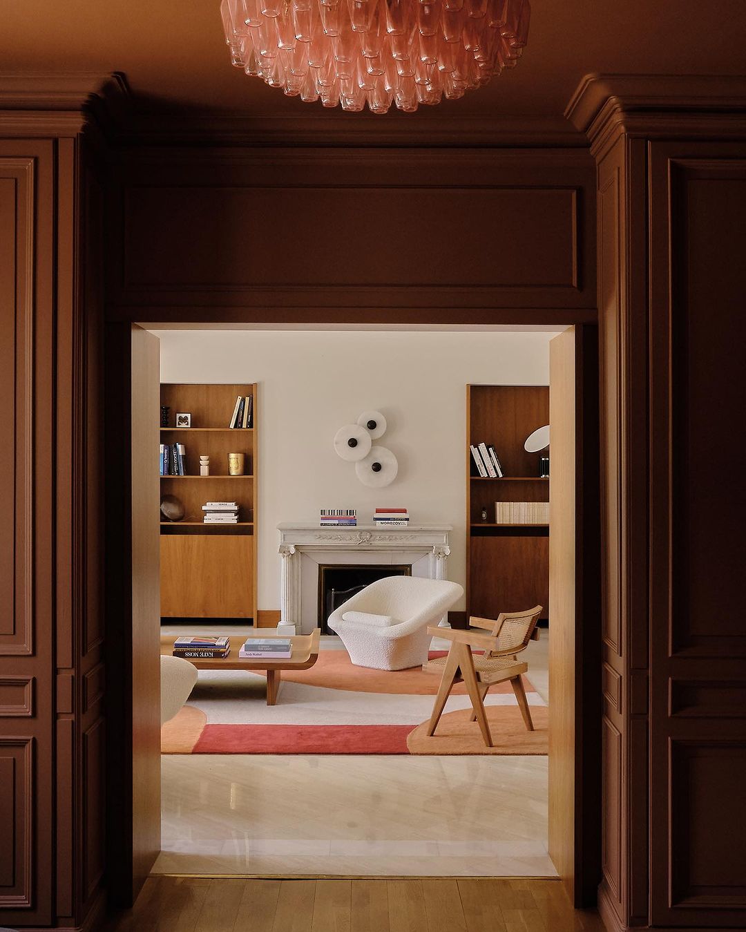
Where khaki green is the cooler version of an analogous color scheme for brown, soft pinks, oranges and reds take this color palette onto the warmer side of the spectrum.
In this modern home designed by Luca Madani and Samantha Hauvette of Hauvette Madani, a dark brown-painted foyer is teamed with a light pink chandelier that almost takes on qualities of a neutral in this color-drenched room.
In the living room beyond, a rug with soft oranges and reds proves these shades also work brilliantly with the dark brown color in this vestibule. In isolation, this palette might feel surprisingly colorful, but united by the dark brown, it feels grown-up and co-ordinated.
4. Yellow
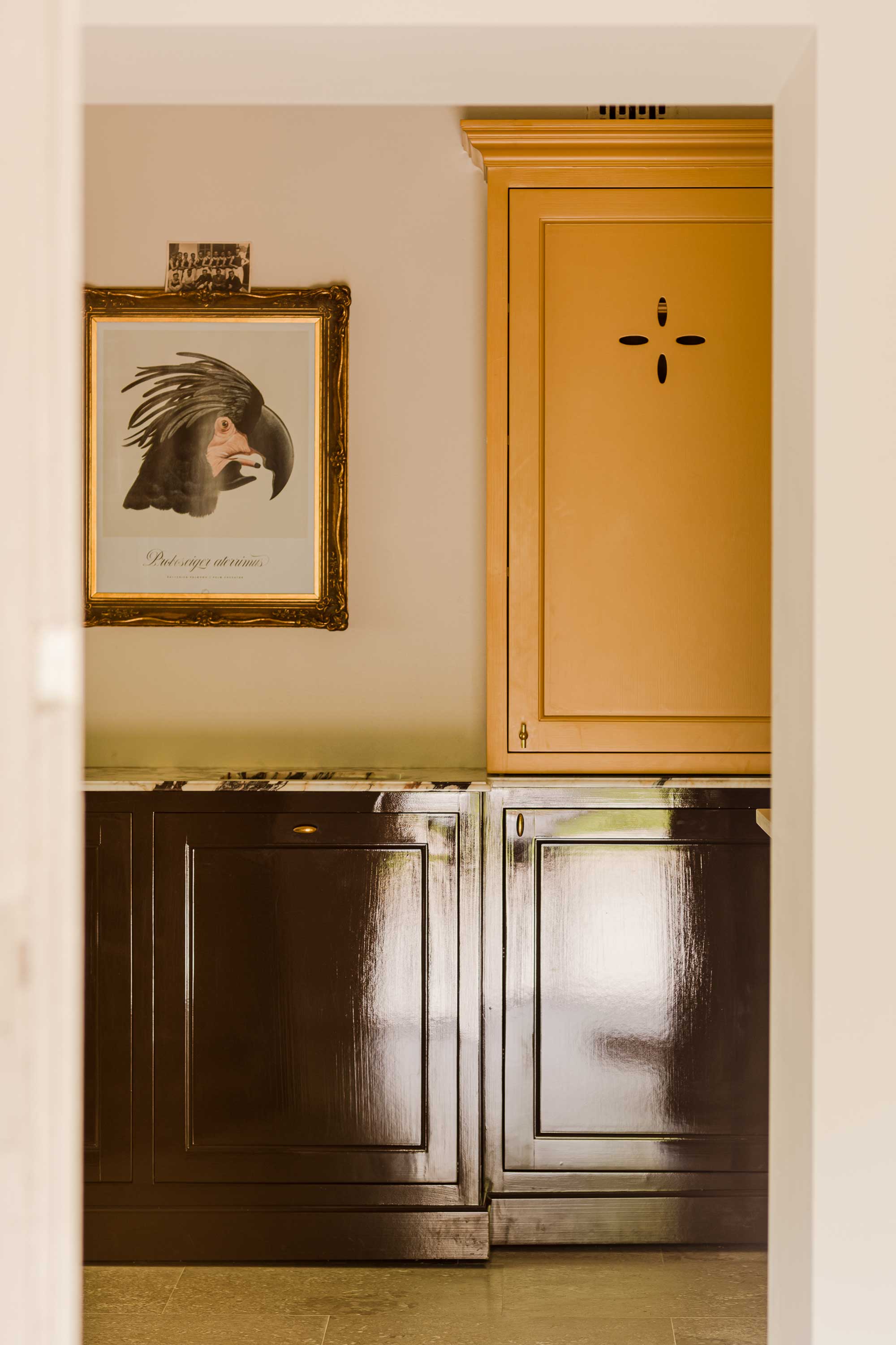
Yellow makes for a bold contrast with dark brown in comparison. The two colors offer different energies in a space, but in combination, brown is a color that goes with yellow which can really enrich the shade.
In this kitchen, designed by Marta Chrapka of Colombe Studio, a rich, egg-yolk yellow is paired with an almost-purple dark brown. 'With this combination I wanted to refer to historical furniture but at the same time give it a contemporary look,' Marta explains. 'The colors used are a historical reference - derived from natural pigments were used in the 19th century, but putting them together and using full gloss as a finish for lower cabinets is more modern.'
It's a combination that emboldens each color, according to the designer. 'I have the impression that the colors enhance each other's intensity, making them seem more vivid than separately,' Marta says.
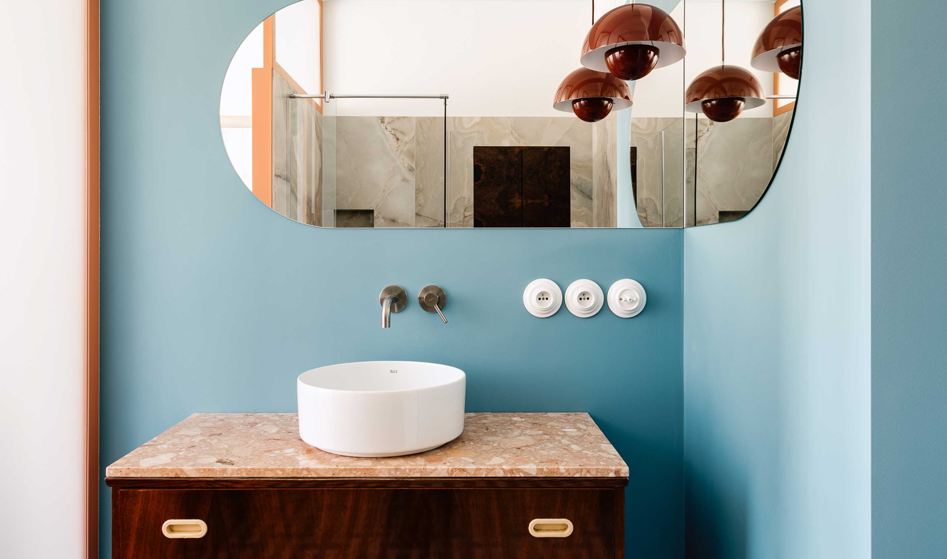
5. Light blue
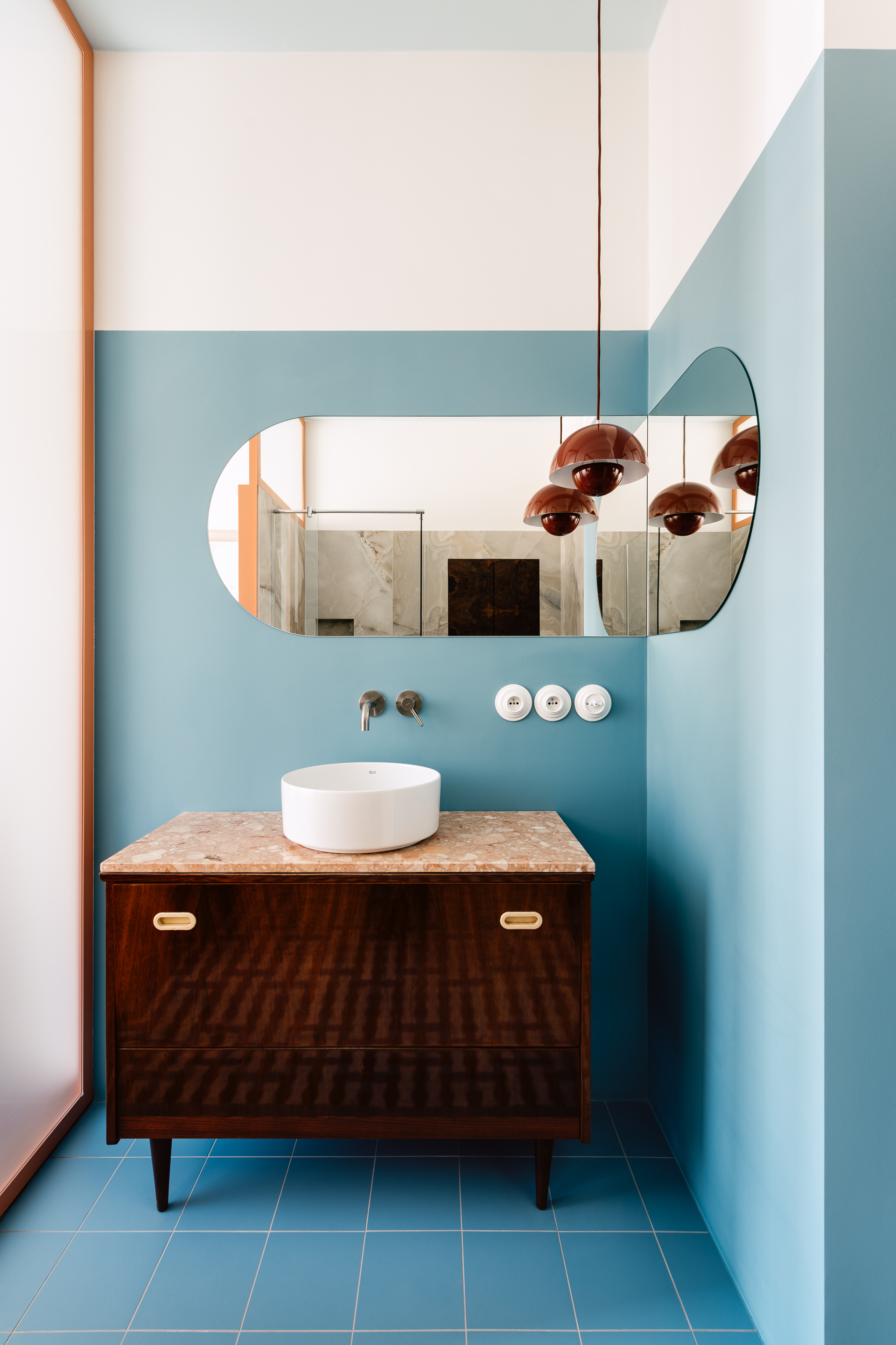
Light blue is perhaps an unexpected pairing for dark brown, but it's a contrast that designers who have a more playful approach to color are using for modern palettes.
Near polar opposites, they're the perfect balancing act. Light blue has become a shortcut for joyous color schemes that feel fresh and contemporary, while dark brown has a little more gravity and seriousness. In combination, they feel a little more elevated than a pure pastel color palette, yet a little edgier than an all-neutral space.
In this project by Polish design studio Mistovia, light blue and brown are used in abundance, especially in the bathroom. 'The pastel color palette was supposed to constitute a delicate background for the older elements, and creating a cozy interior was our main goal,' says designer Marcin Czopek.
It's a room that goes to show, like all of these color combinations, that dark brown is far from a one-dimensional shade. It's a color that has scope to make a room feel elevated and interesting.