
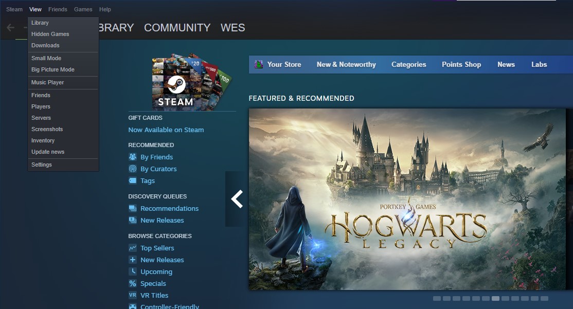
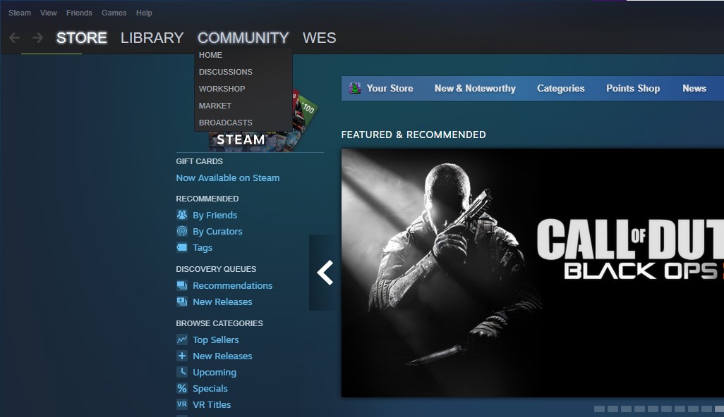
Valve debuted some sizable changes to the Steam UI in the beta client last week, including an overhaul of the in-game overlay and a much-needed rework of the screenshot manager. There are also some less dramatic tweaks, like a bolder (and underlined!) font treatment for the big store/library/community menu buttons. But I've been using Steam practically every day for so many years, even those small changes feel earth-shaking. This may sound ridiculous, but I just can't get used to the new drop-downs that pop up when you click those menus.
Am I the only one who feels like something's off with the menus now? In theory I like that they're now a little bit bigger, making the text easier to read and click on my 1440p monitor. But the new, lighter gray highlights how flat they look, and how dated that design feels now.
Minimalist rectangles were the style du jour when Windows 8 debuted a decade ago, but designers have since gravitated back towards rounded edges and translucency. Valve doesn't have to follow that trend—I don't think anyone would say Steam has ever really been a stylish piece of software—but the new menus highlight how much of a mishmash the current design is. Valve has gradually infused Steam with more color, giving the store and library a blue-and-dark-gray aesthetic, which the old menus matched. Now the new ones are bigger and brighter and feel like they belong to a slightly different app.
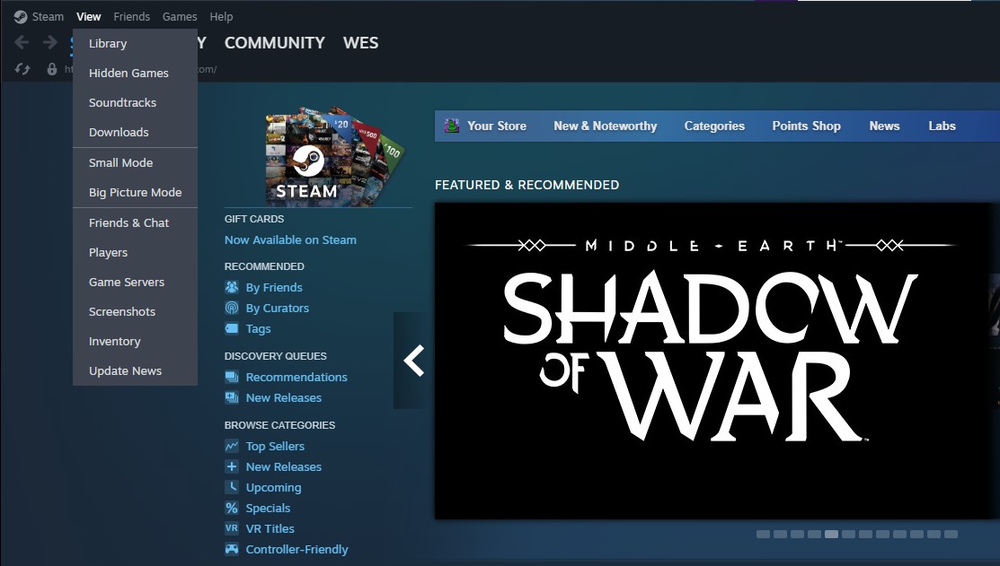
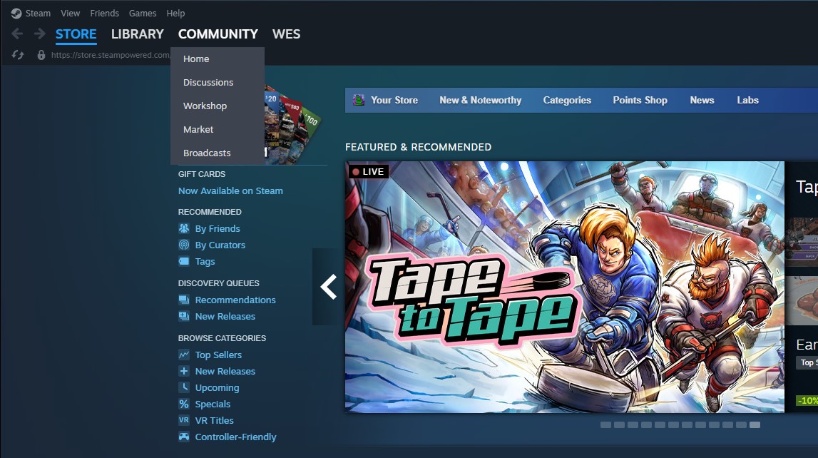
Just look at the discrepancy between the size of the top menu row text and the drop-downs, for example. The drop-down text looks huge by comparison! We've got a Volkswagen-stuffed-with-clowns situation on our hands here.
In terms of usability, which is what matters most here, the new menus are an upgrade. And since the UI changes are currently in Steam's beta client, maybe Valve will refine them a bit in the coming weeks. Other parts of the Steam library UI use translucency, so I think it could work well here, too. Or maybe a dash of blue sprinkled in?
Considering what a pleasant experience the more compact version of Steam is to use on the Steam Deck, I'm glad to see some new features and changes trickling out for the desktop client. I think the Deckified Big Picture Mode is a real improvement, so I'm clearly not completely scared of change. But those drop-downs are just weirding me out, man.