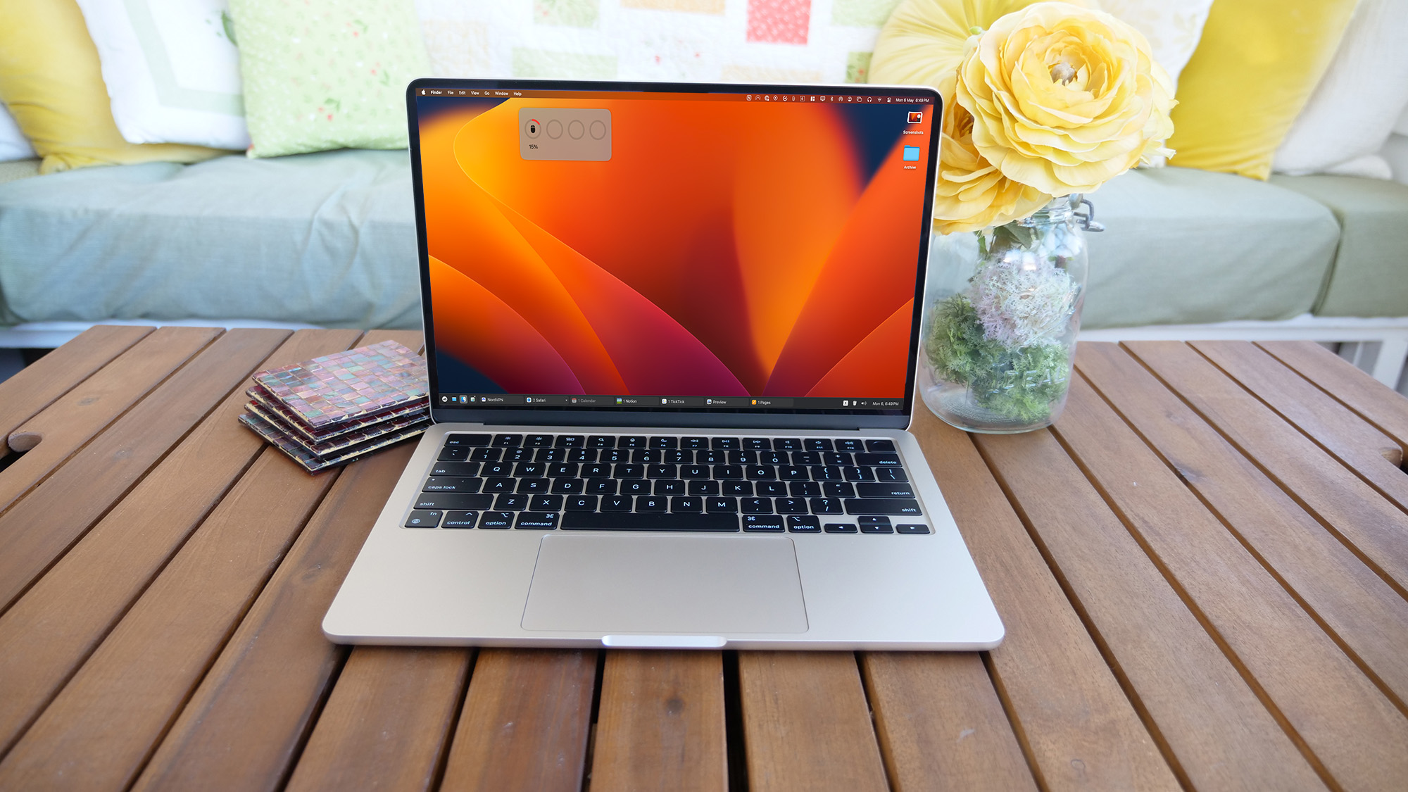
It’s been close to half a decade since I switched to macOS from Windows. Yet, I still haven’t gotten used to the dock. Its function feels too limiting to me, despite being the centerpiece of desktop multitasking. Clicking an app, for example, oddly brings all of its open windows into focus; I can’t view window thumbnails either to recall what I was doing in a messy workspace; It wastes precious screen real estate on its flanks. So I turned to the last resort: replicate the Windows taskbar on my Mac.
With the help of an app called “uBar,” I replaced my Mac’s dock with a Windows-style taskbar on the bottom. It not only looks like the taskbar you’d have on a PC but also brings over most of its functions, including the ability to hover over apps to glance at their active windows, progress bars for entertainment apps like Apple Music and Finder data transfers, a dropdown of essentials shortcuts on one edge and a calendar on the other, the list goes on. Plus, like a Windows taskbar, it takes advantage of the screen’s entire width instead of anchoring in the center.
Bringing the best part of Windows to my MacBook
Over the last couple of weeks, the uBar has felt like a natural extension and a long-overdue upgrade to macOS’s multitasking. No longer do I have to go through an extra right-click each time I want to launch a specific open window of a program instead of bringing all of them into focus in one go. This may seem like nitpicking and too minor of an inconvenience to fix but in a workspace with dozens of windows, it can be a lifesaver to have an option to quickly hover and peek at an app’s windows. The only way to sort of do this on the Mac’s dock is to minimize windows in their space, which can become messy and hard to keep track of.
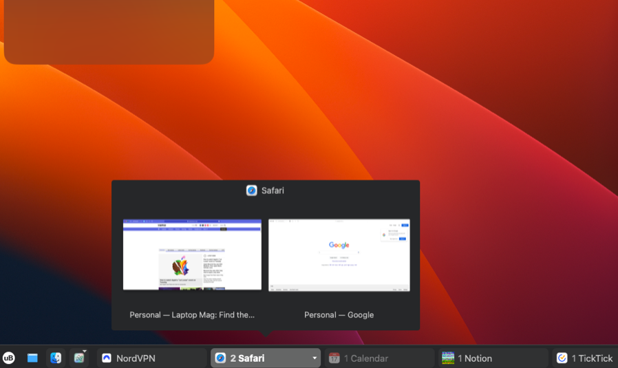
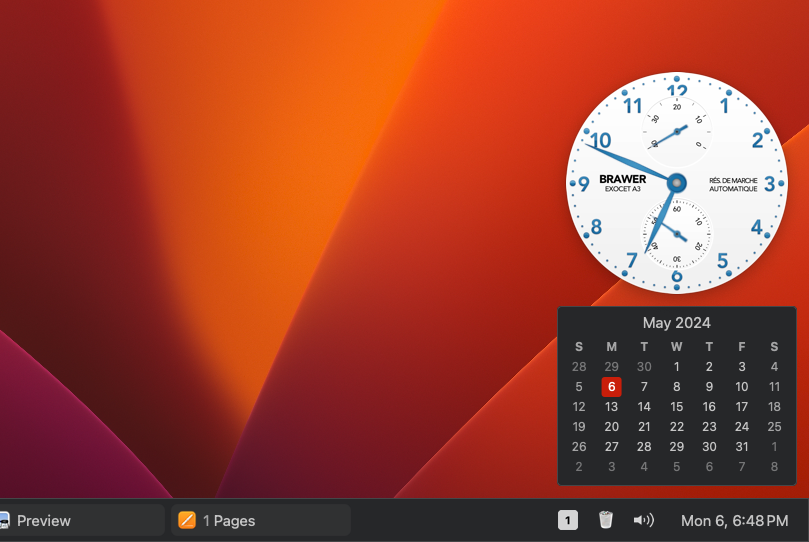
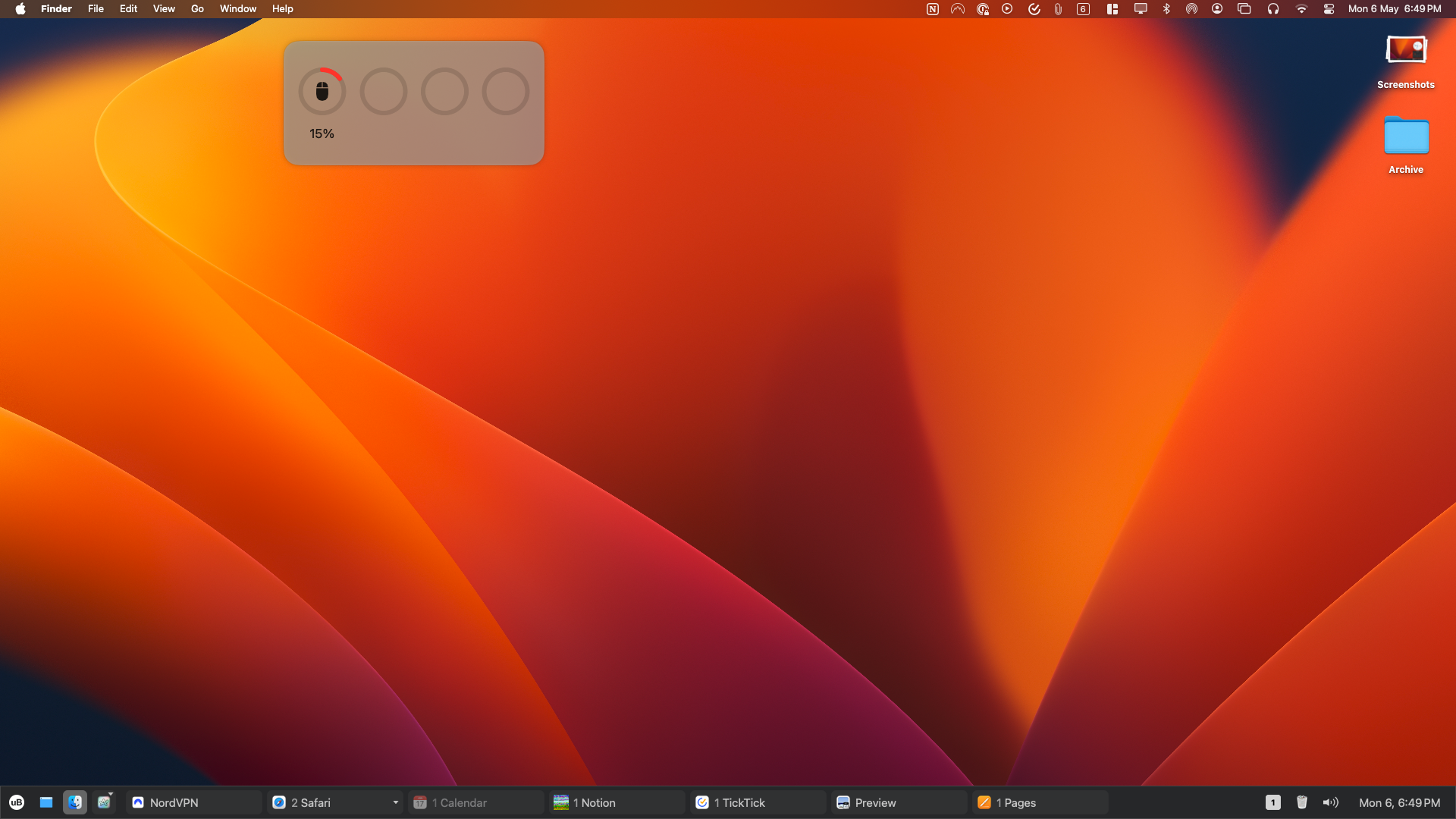
Another little uBar function I’ve found surprisingly useful is the option to hide apps with no active windows, from the taskbar. The macOS dock, in comparison, continues to show the app icon even after you’ve pressed the red close button. With uBar I save precious screen real estate and it doesn’t give the illusion that the app is still live.
I also like that uBar differentiates your pinned and temporary apps by minimizing the former in its icon on the left and showing the latter in an extended form with its window’s title on the right. If you often end up juggling between several apps, you can just set uBar to show only the icons.
In another break from the traditions of macOS, the appearance of uBar is highly customizable. You can pick from a handful of preset themes or build your own by selecting the shade of each major element. It also supports multiple monitors and there’s a little dropdown menu on the taskbar that lets you instantly switch between your desktops.
How to try uBar and other macOS multitasking tools yourself
uBar is free to try for two weeks, after which you’ll have to pay a one-time $30 fee. If you are looking to save a couple of bucks, you can also download an app simply called “Taskbar.” It costs $25 and lacks many of uBar’s advanced abilities like hiding the default dock altogether.
The dock is part of the many multitasking features Apple hasn’t updated in ages, unlike Windows, which has made it a breeze in recent releases. Though the rest of my Mac experience has been positive, I’ve found myself over time gradually relying on a banquet of third-party tools to replicate some of Windows’ best multitasking features.
Magnet, for example, lets you snap app windows to your screen’s edges to instantly resize them in a split-screen layout. Smooze, similarly, gets you automated scrolling and allows you to set up a host of neat mouse gestures.


