Farrow & Ball made 'Pigeon' cool way before Sarah Jessica Parker was seen holding a handbag shaped like the bird while filming the latest season of Sex in the City. The blue-green-gray paint color may divide as to the best way to describe it, but most will agree it's a truly versatile and reliable shade for almost any space in your home; a perennial favorite when it comes to interior decorating.
With green, blue and gray undertones, Farrow & Ball's 'Pigeon' often beguiles, changing colors depending on the specific room orientation and even time of the day. But that's all part of its charm. North-facing rooms will bring out its gray tones, while a sun-drenched space will enhance the underlying green.
Regardless, it's become one of the best Farrow & Ball paint colors since it first launched back in 1991 (as one of the brand's original 57 shades), finding itself right at home in modern, maximalist and even cozy cottage-style interiors alike. Still not convinced? In this article, I've deep-dived on the shade, speaking with the experts to uncover its true color, the best places to use it in, the shades that complement it, and I've even pulled inspiration straight out of interior designer's portfolios. I've found the best finishes to use depending on your project, and even spoke with a Livingetc editor who selected the shade in her own home. For everything you need (and want) to know about Farrow & Ball's 'Pigeon', scroll on.
Overview: Farrow & Ball 'Pigeon'
Description: This "cozy and nostalgic" blue-gray paint color was named after the bird often seen on the streets of London.
Undertones: A green/gray/blue hybrid.
Best For: Mudrooms, Kitchens, Darker Spaces
Finish Options: Dead flat, Modern Eggshell, Full Gloss, Exterior, etc
Surfaces: Walls, ceilings, wood, metal
"'Pigeon' is a crowd-pleaser that injects personality into smaller spaces like home offices, bathrooms, cloakrooms, utility rooms and porches, while making larger spaces feel cozy," says interior styling consultant Jane Lee. "Put it with natural wood, white linen, sheepskin and leave for an ultra-relaxing Scandi-style bedroom or living room."
What color is Farrow & Ball's 'Pigeon'?
Is Farrow & Ball's 'Pigeon' green or blue? It's one of the most commonly asked (and searched for) question. In truth, it's a bit of both. "'Pigeon' is such an interesting shade, the perfect blue-green-gray mix that looks completely different depending on light and context," says Livingetc's global brand director, who selected the shade for her own home. "I used it on a small, ground-floor room in a mews house — color drenching (so over the walls, skirting and ceiling) — and it created an inviting space which changed atmosphere depending on the time of day."
"Whether it has more of a tinge of blue, gray or green is the subject of heated debate," adds interior stylist Jane Lee. "It really depends on the amount of natural light that's bouncing around the space. I think of it as a strong blue-gray with a touch of green about it."
To settle the debate, we asked Patrick O'Donnell, a color consultant and ambassador for Farrow & Ball. He says: "Definitely green but not in the classic sense. It’s a deep mid-to-dark drab green/gray, but the color shifts depending on how light falls on it."
So it shall henceforth be agreed that 'Pigeon' is one of the best green paints, not blue or gray.
What are the undertones of 'Pigeon' by Farrow & Ball?
As previously explained, 'Pigeon' has a unique mix of blue, gray and green undertones. "It's a green-gray hybrid," says Patrick. "Not too sharp and not your traditional verdant kind of green."
But perhaps more noteworthy is it's LRV, or Light Reflective Value. Patrick explains this as "the difference between colors" and notes how knowing this about the paint colors you use can help define boundaries within a room and create contrast.
It also helps inform how to incorporate lighting into a space. "The LRV for 'Pigeon' is 31.89," says Patrick. "With a low LRV, you may want to consider that the space will require adequate lighting to accommodate this."
How to use Farrow & Ball 'Pigeon' in your home
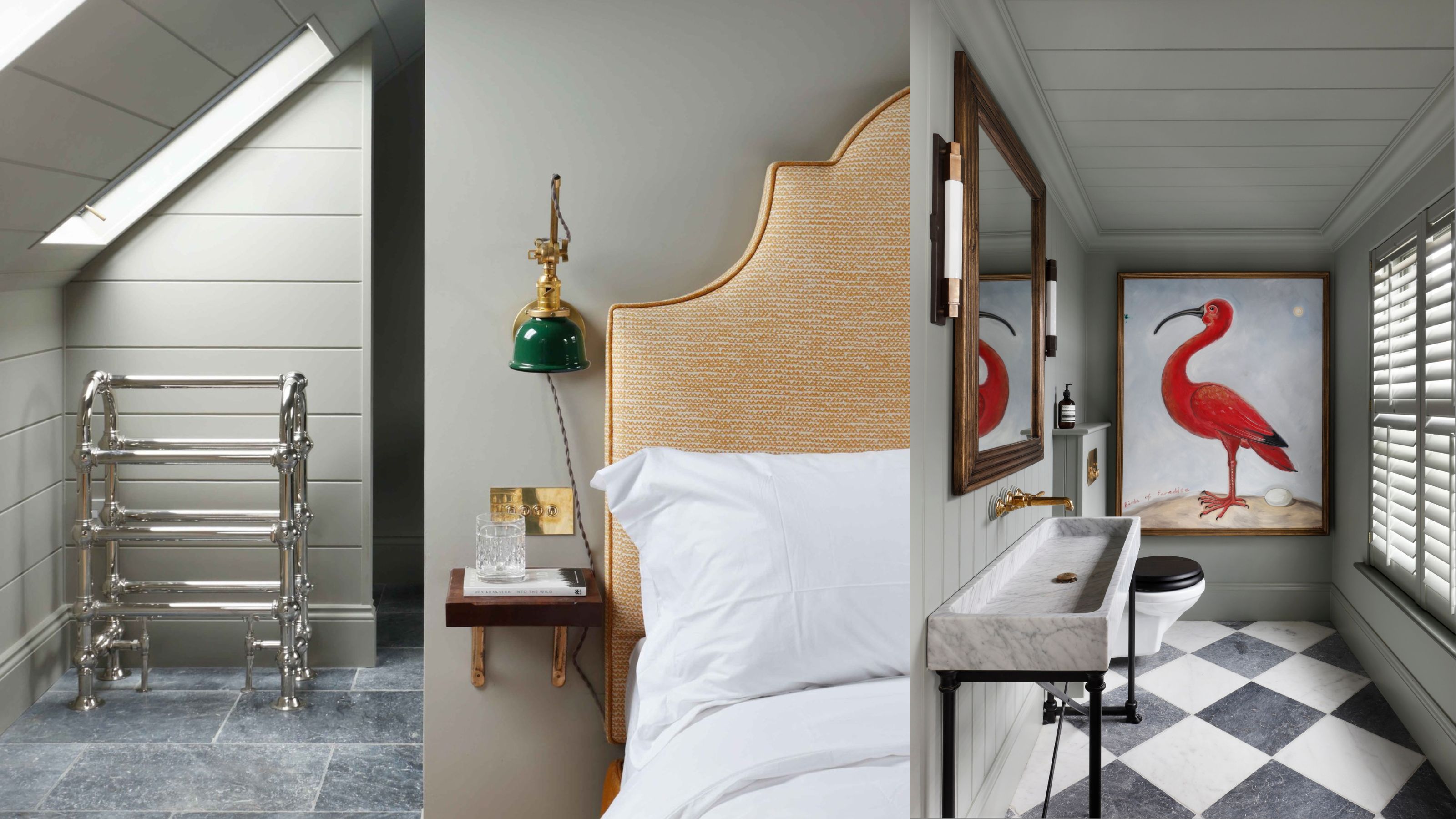
1. Create a "wraparound" effect in bedrooms
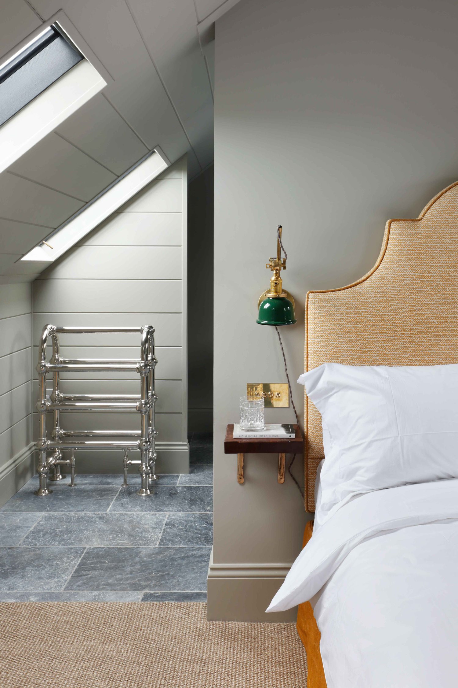
When it comes to painting awkwardly-shaped rooms, color drenching can help make the space feel more cohesive. 'Pigeon' is the perfect modern neutral to use, as it's a restful shade that won't overwhelm the space. Case in point: this small bedroom by HÁM Interiors.
"We like to paint the ceiling, walls and skirting in the same hue as it stops awkward visual breaks and enhances architectural details in an understated way," says Tom Cox, the family-run studio's co-founder. "We like to look at the pigment and depth of color in a paint. Too often a shade will have too much gray or brown as an undertone, which can be challenging when layering a scheme and adding furniture. For us, Farrow & Ball's 'Pigeon' has just the right mineral balance, it gives a space a calm and muted quality."
2. Emphasize your wainscoting details
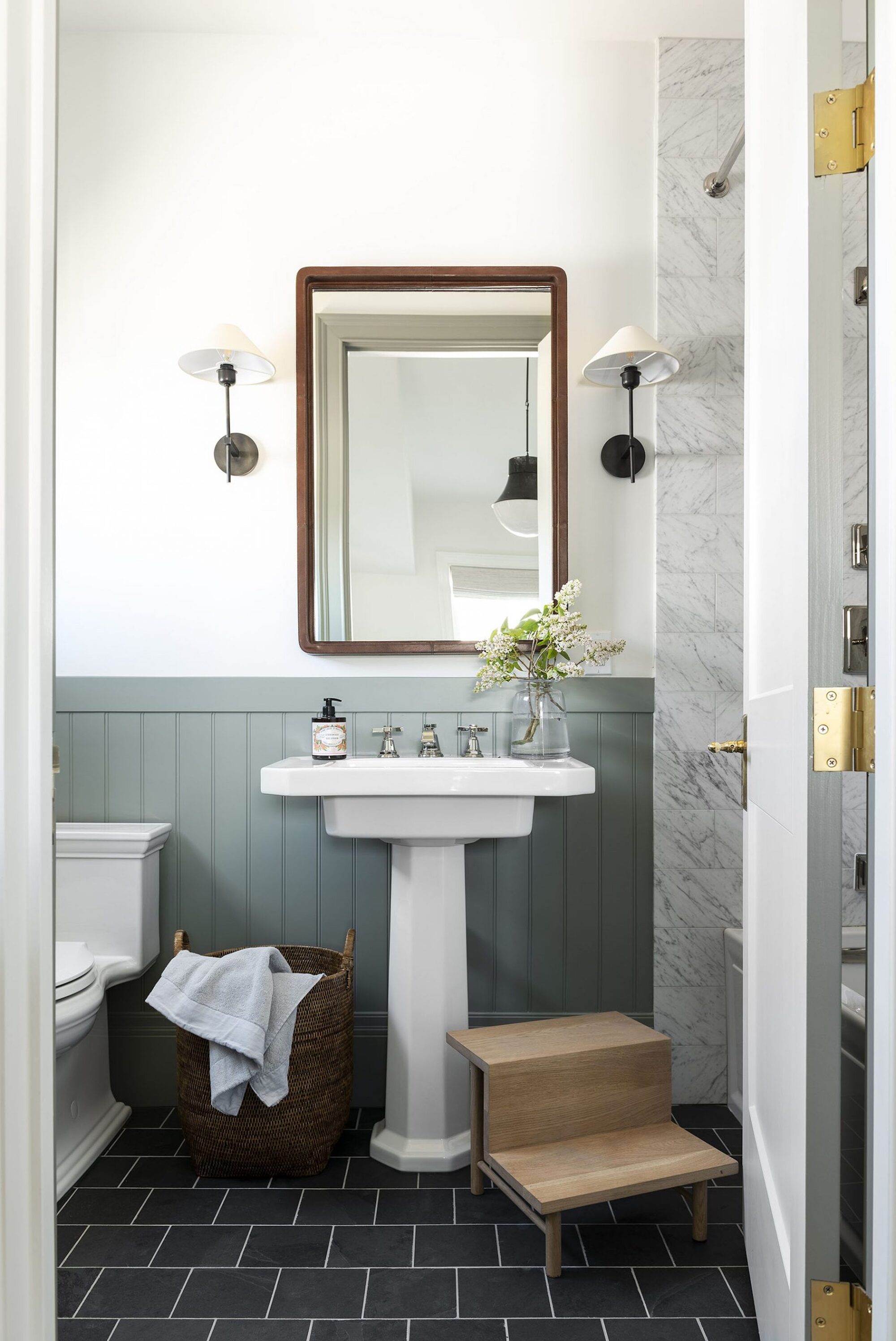
Looking for Farrow & Ball 'Pigeon' bathroom ideas? Look no further than the bathroom from interior designer and Studio McGee's chief creative officer, Shea McGee's own home. She specified the blue-green shade in a matte finish on the beadboard wainscoting because of how versatile it is, and has shared that she was drawn to it for this space because of how its cool tones contrast with the warm wood and woven textures in the space.
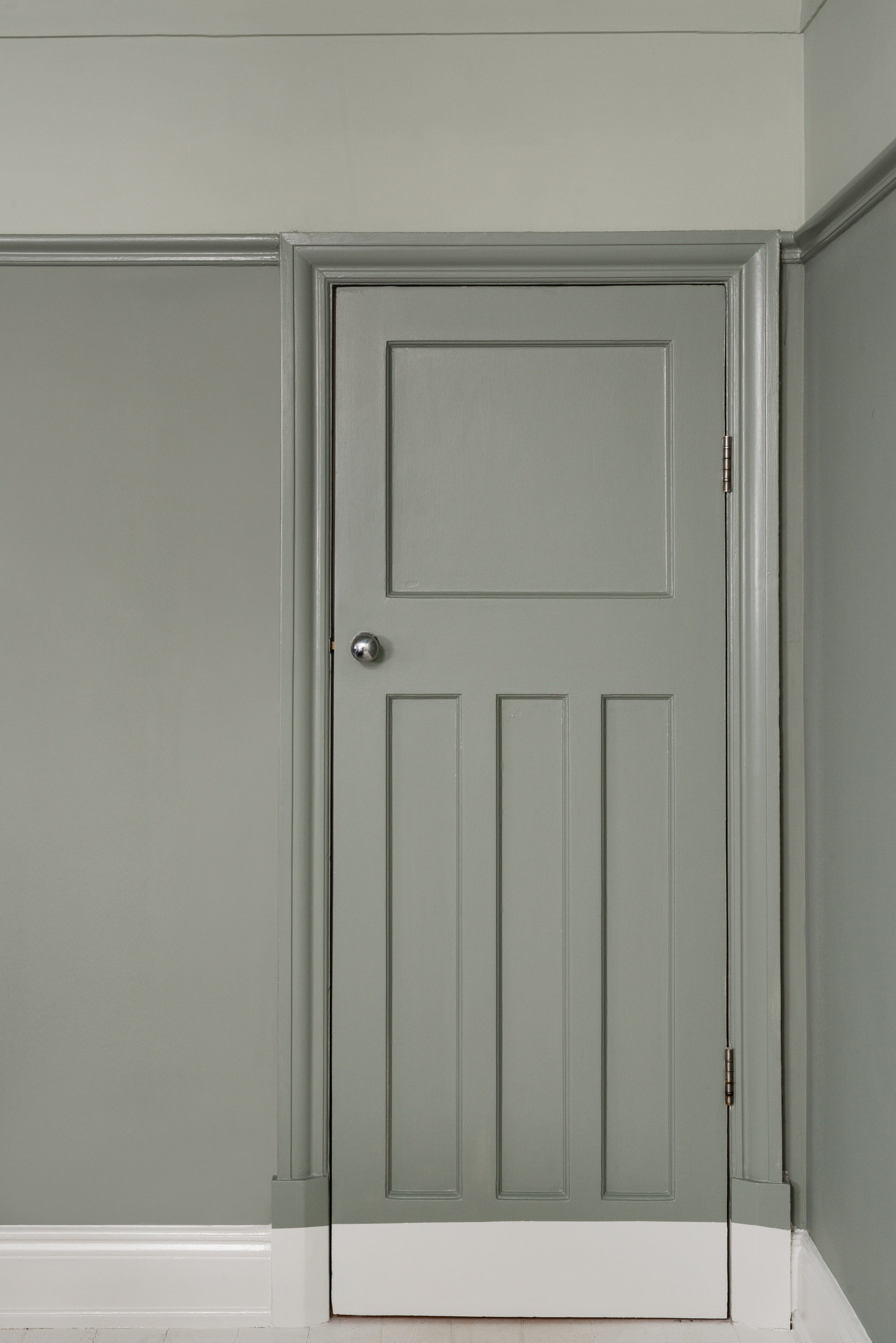
3. Subtly enhance your trims
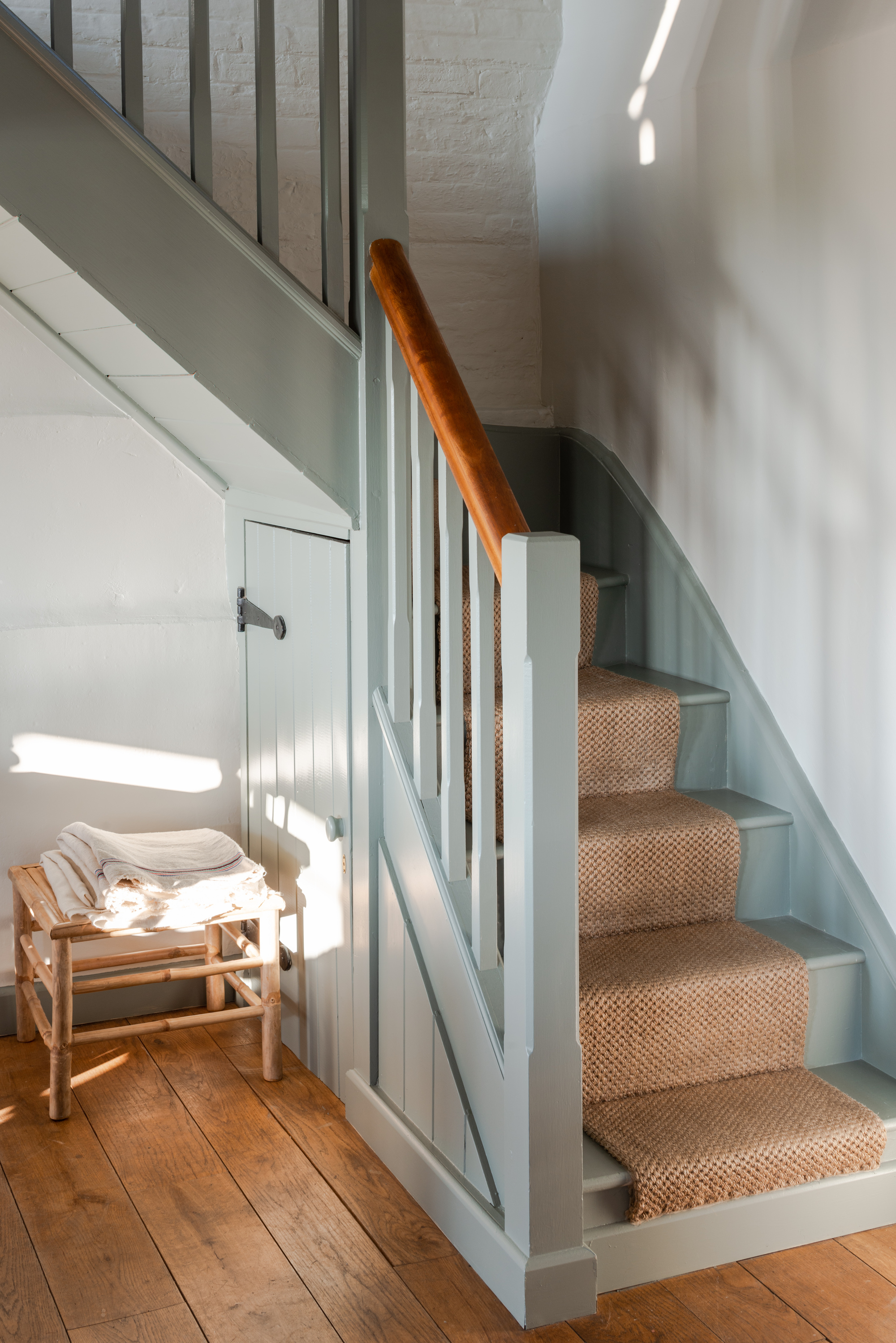
Painted staircases in unexpected colors are a clever way to make a more functional thing in your home feel more architectural and fitting for the space. "'Pigeon' is a great color to introduce on your woodwork, such as skirting, stairs and door frames, when you use a neutral on all your surrounding walls," says Charlotte Cosby, creative director at Farrow & Ball. "This technique highlights accents within the room without being too overpowering and provides a step into color-blocking for anyone venturing into using color for the first time."
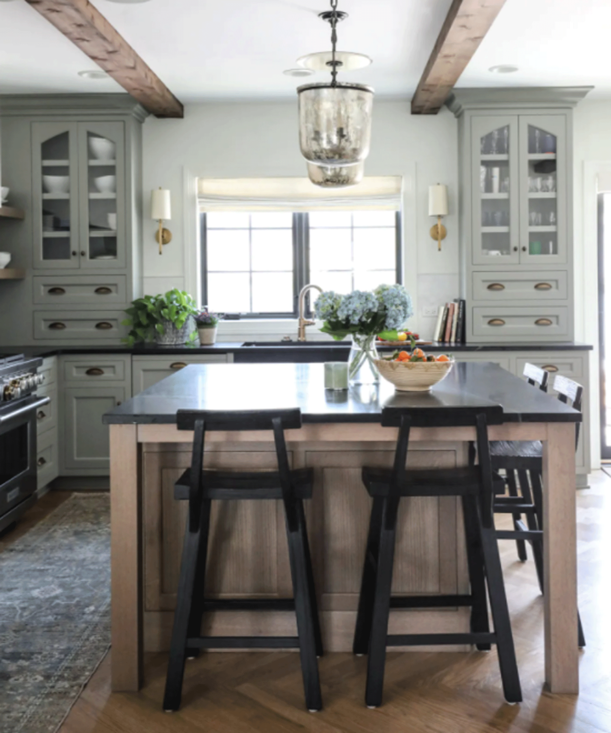
4. Use as an alternative to 'safe' kitchen colors
'Pigeon' is also an ideal kitchen color idea as it brings a feeling of tranquility to what can be a busy space, without sticking to a 'safe' color like white or gray. "'Pigeon' provides people with a sense of calm and optimism, and when you have a busy lifestyle, your home is your sanctuary," says Charlotte Cosby. "This color is associated with nature — using this shade is the perfect way to introduce a slice of the outside, inside, whilst creating a relaxing environment. A great alternative to gray for kitchen walls — working with an array of surfaces and textures — creating something that feels cosseting and timeless."
For an even more seamless and unified look, consider painting the walls and cabinetry all in the same color. Not only will this emphasize a sense of cohesion, but it can also trick the eye into thinking the space it bigger than it actually is.
5. Incorporate as a wallpaper
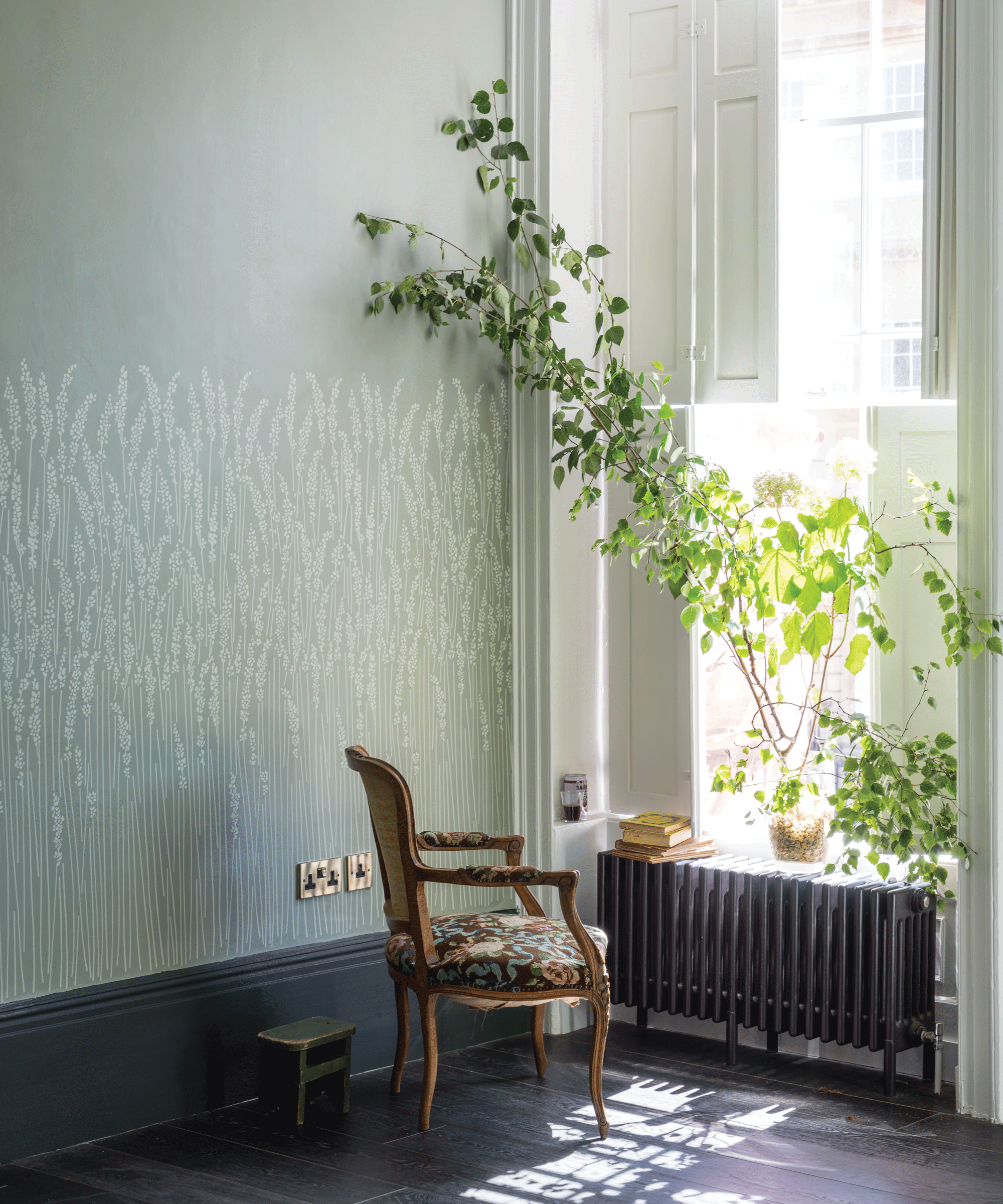
For a bit more pizzazz in your space, you could even incorporate Farrow & Ball's 'Pigeon' shade through the brand's various wallpaper designs. "We print all of our wallpapers using our water-based paint, and 'Pigeon' is a popular ground color for many of our designs," says Charlotte.
The 'Feather Grass' style is a particularly versatile wallpaper idea, working in a number of spaces around the home, but particularly in more open spaces like living and dining rooms, where the pattern borders your seating and makes you feel like you're immersed in nature all year round.
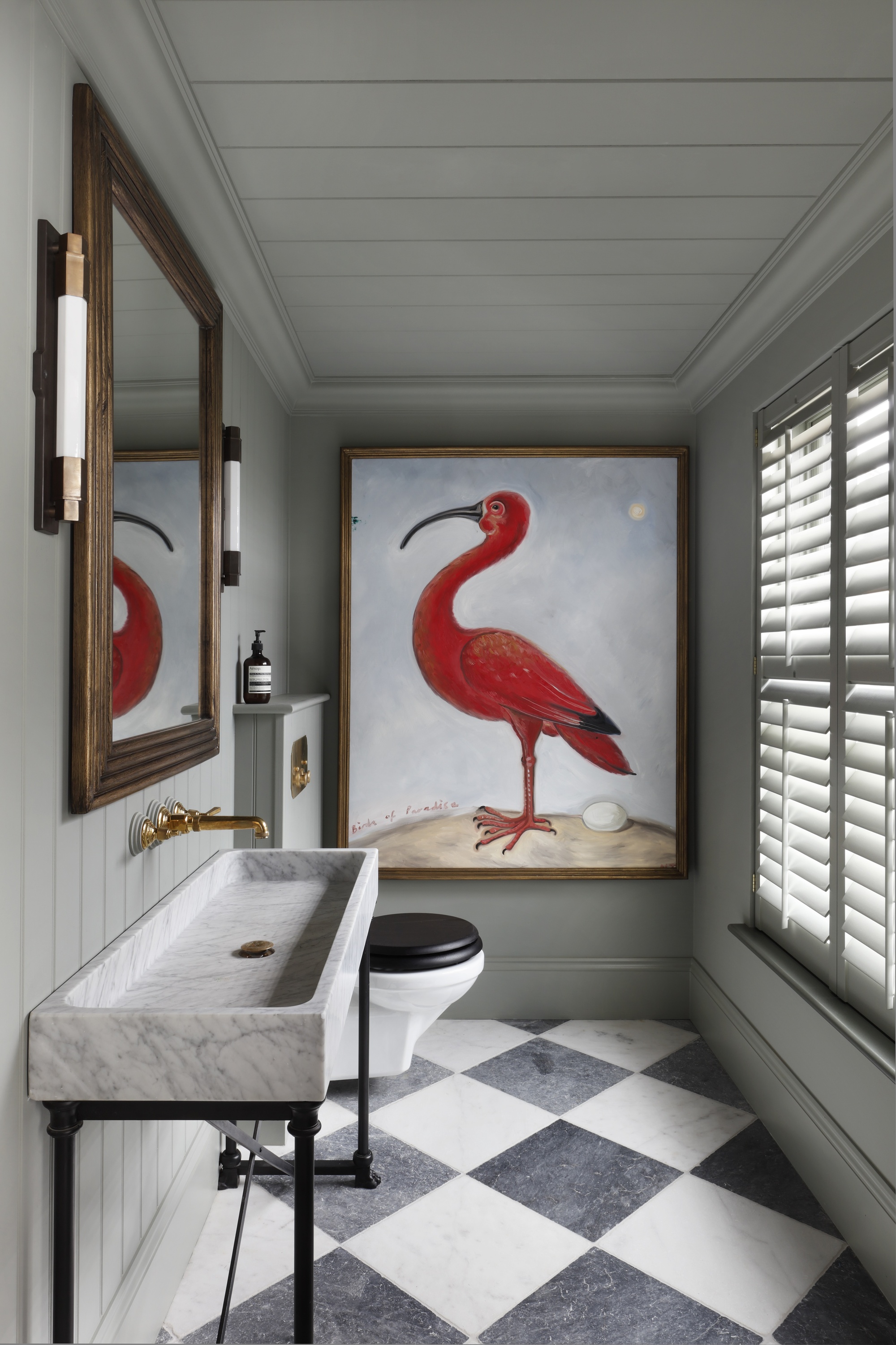
6. Make it the backdrop for art
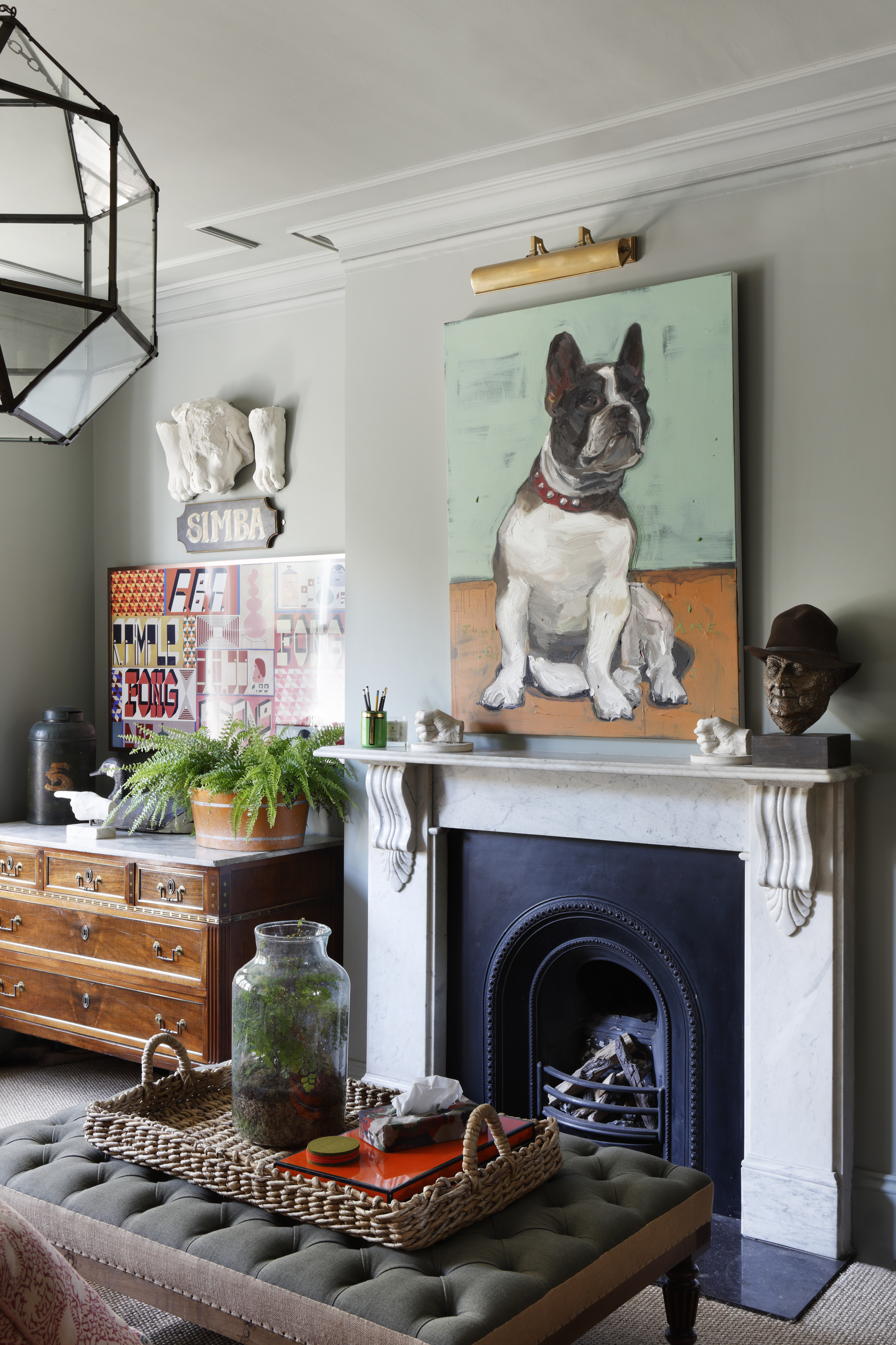
One of the biggest draws of 'Pigeon' is its versatility. It works across various rooms in the home as well as aesthetic styles — from modern and minimalist to more eclectic and colorful. While it has a strong presence in its own right, it is also subtle enough to let other elements in the room take center stage.
The gray undertones in particular mean it is the ideal wall paint color to support bursts of color and a softer alternative to shades of white, which can have a harsher contrast. "'Pigeon' is an ideal backdrop to artwork," says Charlotte, as seen in the eclectic living room above (designed by HÁM Interiors) where the subtle shade helps make the gallery wall of artwork sing.
7. Color-block with other greens
Adding depth into a design increases the visual interest, and a clever way to do this is by color-blocking walls in darker or lighter shades of similar hues. In this living room, 'Pigeon' has been paired with Farrow & Ball's 'Mizzle' — a soft gray-green.
"What I love about this color is how versatile it is," says interior designer Enass Mahmoud, the founder of Studio Enass. "You are able to layer this color with soft blues and pastel colors but also add some warmth by including dark rich tones such as moss or teal green."
Price: $146
Description: 'A soft green grey is named after West Country evening skies.'
8. Use it on your exterior
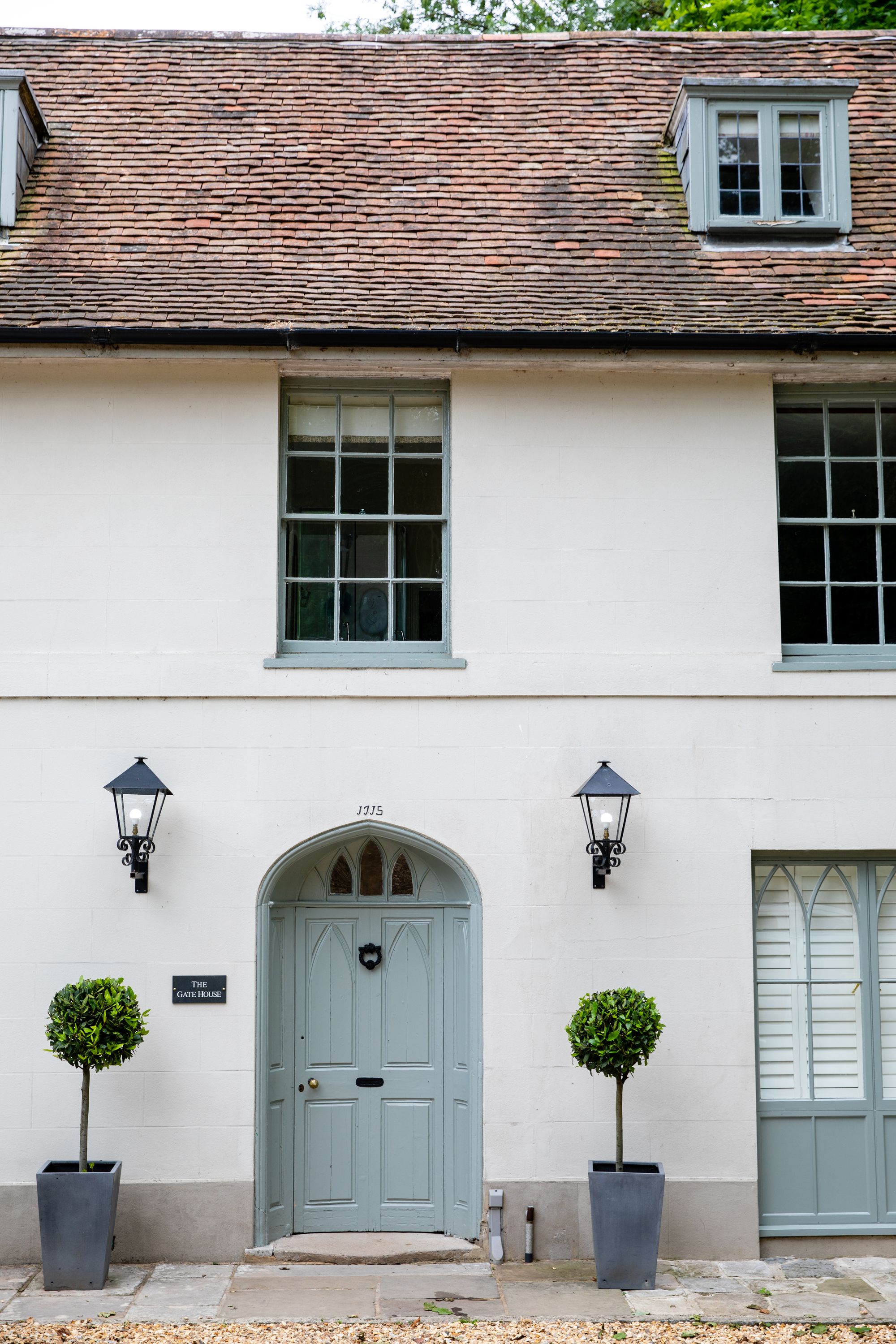
But 'Pigeon' doesn't just work for your interiors. It's soothing shade works well on surfaces outside. "It makes for a great exterior woodwork color, and feels a little more contemporary than the classic sage green often seen," says Patrick O'Donnell.
On the house shown above, the front door and window trims have been painted in 'Pigeon', making the architectural features pop against the white facade, without being too bold or colorful.
9. Create a cocooning reading nook
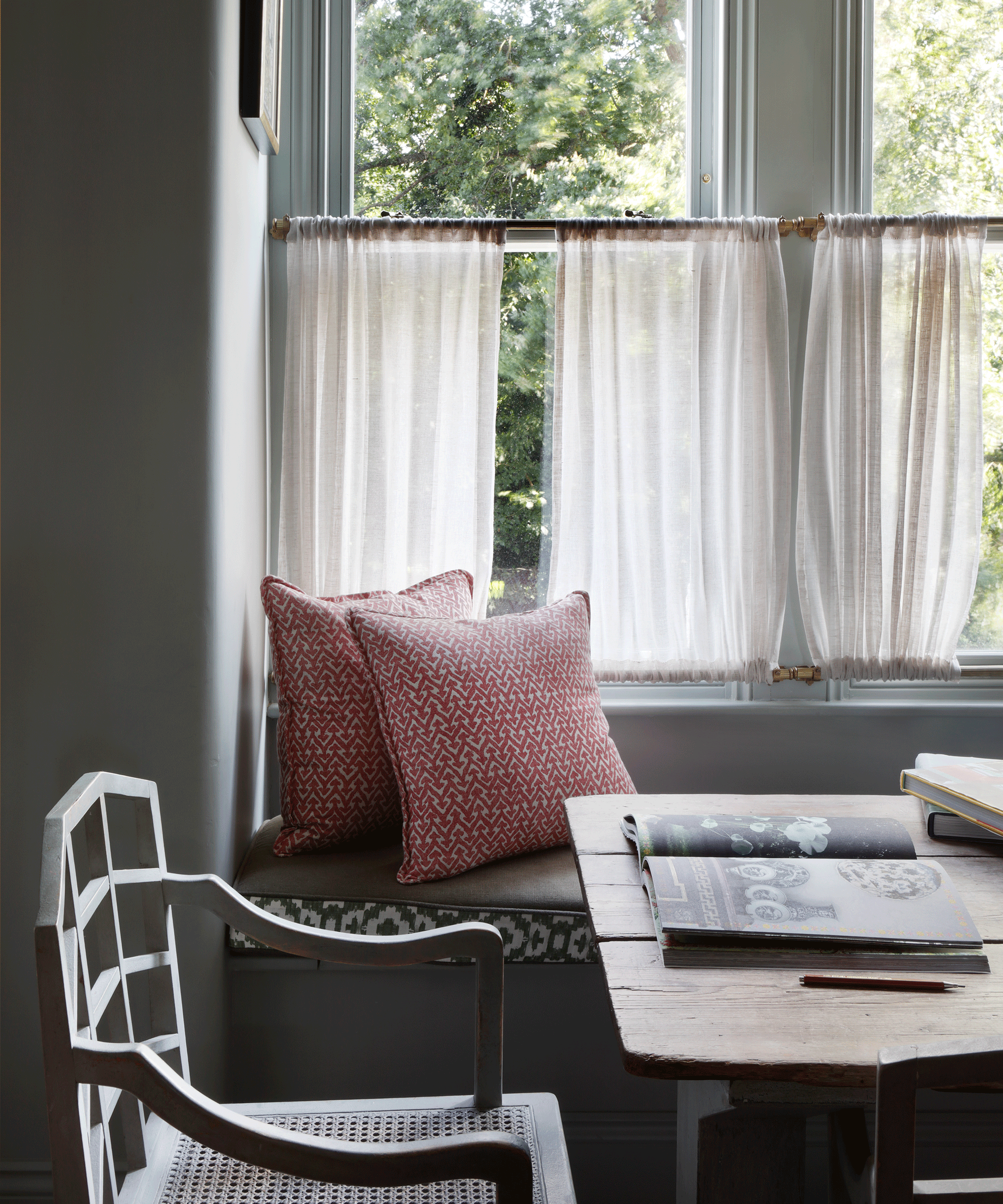
It is often a temptation to paint smaller spaces in brighter and lighter shades of white to make them appear larger, but leaning into the proportions and giving them an enveloping feel can actually provide more impact. In this nook, designed by HÁM Interiors, 'Pigeon' walls help to create a warm and contemplative corner, while a pop of unexpected red in the raspberry patterned cushion energizes the space.
"'Pigeon' is one of our go-to greens from the Farrow & Ball palette," says Angela Simpson, a co-founder of interior design studio Simpson & Voyle. "Its warm tone and period pigmentation works for any space and more importantly, any scale of room. Soothing on the eye, it has tremendous character, bringing both a sense of nature and elegance. Pigeon is like the trusty, loyal friend everyone needs in their life!"
10. Complement it with wood tones
If you have wooden features throughout your home, 'Pigeon' is the perfect color choice to enhance them and inject a more contemporary feel to your space. This is one of the reasons its the first pick for US-based studio Park and Oak Interior Design, founded by Christina Samatas and Renee DiSanto.
"The ideal blend of not-quite-green and not-quite gray, we often turn to Farrow & Ball 'Pigeon' as a nearly-neutral for those still wanting a little pop of color," they say. "Its saturation level is the perfect complement for the wood tones we love, and also plays nicely with other shades we choose frequently, like navy blue and rust. Try is for cabinetry or as a backdrop with neutral furnishings. We love its versatility in almost any room, for any application."
Farrow & Ball 'Pigeon' Color Match
It's hard to find a direct color match for Farrow & Ball's 'Pigeon' because the color itself is difficult to pinpoint. In different lights and different settings it will appear similar to different shades. Farrow & Ball's 'Card Room Green' shade comes quite close, though it's a much more gray-green, with less of the blue undertones.
In terms of other paint brands, Behr's 'Hunter's Hollow' seems to be the best color match to 'Pigeon', though the most accurate way of determining this would be to use paint samples in your space. To help, I've added some side-by-side comparisons below.
Farrow & Ball's 'Pigeon' effortlessly blends blue-gray-green undertones to create a muddy and nostalgic shade.
Behr's Hunter's Hollow shade lives in the brand's gray color family, but feels slightly more rich and saturated in color.
Sometimes blue, sometimes gray, sometimes green, 'Pigeon' seems to be a perfect balance of the three shades.
While another common comparison for 'Pigeon', Benjamin Moore's Heather Gray is lighter and leans more sage green.
Farrow & Ball describe 'Pigeon' as "a strong blue gray" that feels softer than more contemporary grays.
Meanwhile, their Card Room Green is described as "a dark gray green" shade that's "unapologetic in its strength".
Farrow & Ball 'Pigeon' Complementary Colors
As a nearly-neutral, there are a range of colors that complement Farrow & Ball's 'Pigeon', says interior stylist Jane Lee. "Team with the lighter 'Slipper Satin' by Farrow & Ball, or if you're embracing the trend for brown color palettes, you can pair 'Pigeon' with 'Old White' and 'Salon Drab'," she adds.
Farrow & Ball's own Patrick O'Donnell says 'Pigeon' has "its own tonal family of 'Cromarty', 'Mizzle' and 'Blue Gray' but works beautifully with the 'Timeless Neutral family too, including 'School House White', 'Shadow White', 'Shaded White' and 'Drop Cloth'."
For something a bit different, Patrick says, "It also looks rather smart when teamed with the steel blue-gray of 'Inchyra Blue' on your trim, and pairs rather well with our archived 'Broccoli Brown'."
On their website, Farrow & Ball also suggest a few complementary color schemes for 'Pigeon' which include using 'Picture Gallery Red' as an accent color, with 'Dimpse' on your trims.
The Best Farrow & Ball 'Pigeon' Finishes
Farrow & Ball conveniently offer their 'Pigeon' shade in a range of different paint finishes, meaning you can find the perfect sheen to suit your specific project. Below, I've included a quick guide, but remember, there are no rules here, so mix and match as you please.
Walls, woodwork & metal: dead flat
Kitchen walls & ceilings: modern emulsion
Ceilings: estate emulsion
Bathroom walls & ceilings: modern emulsion
Interior woodwork: modern eggshell
Interior flooring: modern eggshell
Front door & woodwork: full gloss
Exterior metals: exterior eggshell
Exterior walls: exterior masonry
Traditional plasterwork: casein distemper
Intricate moldings: soft distemper
So there you have 'Pigeon' by Farrow & Ball, in all its green and gray and blue glory. It's easy to see why this muted yet complex color is one of the brand's most popular shades, working its way into any style and onto any surface.
Hopefully you now feel like you have a solid grasp on the color, and know how to pick the perfect finish, how to complement it, and use it creatively in your space. So, the next step is to get yourself a sample pot and start swatching.