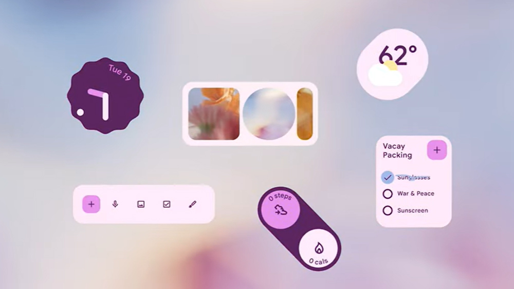
Google's latest design language Material You offered a major contrast to its predecessor Material Design. Released for Android 12 in 2021, the 'you' in the name was very apt. Taking colours from the wallpaper section of a smartphone, it's a highly personalised design language that gives users a lot of control.
Now we've been given an insight into how the tech giant went about creating the design language in a series of four two-minute documentaries that reveal some farout inspirations and early concepts like a lock screen with full-screen clocks and oversized buttons (if you're starting out in UI design yourself, see our pick of the best UI design tools).
Making Material You reveals how Google went about revolutionising its previous minimalist, uniform approach to its design language to create an "an adaptive, personal, and expressive future for design.” The narrator in once video reveals that the team found themselves "choking on our own rules. So we loosened up."
That invovled challenging some of the traditional tenets of UI design around consistency. “Does everything have to be exactly the same?" the narrator asks. "Every door knob isn’t the same, but people still manage to get in and out of all sorts of rooms… Similarly, do apps need to look exactly the same or can a system leave room for something unexpected?”
The second video of the series reveals that Google's team couldn't decide on a colour palette because everyone had different opinions. So it started to question if it was necessary to design "as if everyone sees colour the same way". Instead, it sought a way to "ship a designer with every phone", designing colours as a set of relationships so people could choose the colours they wanted, not only the ones the design team liked.
Google did something we recommend in our UX design course, which is to step back and think big – big as in "never-in-a-million-years-will-we-actually-make-these" kind of ideas. They "tossed what we thought we knew about clean, simple modern design," and allowed themselves to bring ideas from anywhere, taking influences as diverse as octopus skin and leaf textures to colour combinations that wouldn't normally work.
The result was an approach that holds that rather than 'form follows function', 'form follows feeling.' "There’s a structure, but it’s not rigid,” Google reflects in the last video, comparing its UI to 'laying down a beat' rather than laying down rules. “We can go big, and wonky, and wavy, and we don’t have to fit each idea into a formula… it’s structure, not a straightjacket."
The videos are short, but they're a fascinating window into the though process behind Google's design language. For more on the topic, see our ultimate guide to UI design.