
Futuristic architecture mesmerises and inspires. From structures designed to show us what the future might look like, to ones that experiment with challenging our senses - building design has never shied away from expressive, innovative, subversive forms. Modernist architecture, after all, looked pretty futuristic when it first emerged in the 20th century, its clean, sometimes dystopian brutalist architecture and occasionally cruise-ship streamlined volumes indicating a path into what the built environment might look like in years to come. In more recent times, parametric design has also been hailed as the way to imagine the future - and today, versions of sustainable architecture explorations offer yet another different path and meaning of what represents futuristic building now.
21 examples of futuristic architecture from across the globe
Morpheus hotel, Macau, by Zaha Hadid Architects (ZHA)
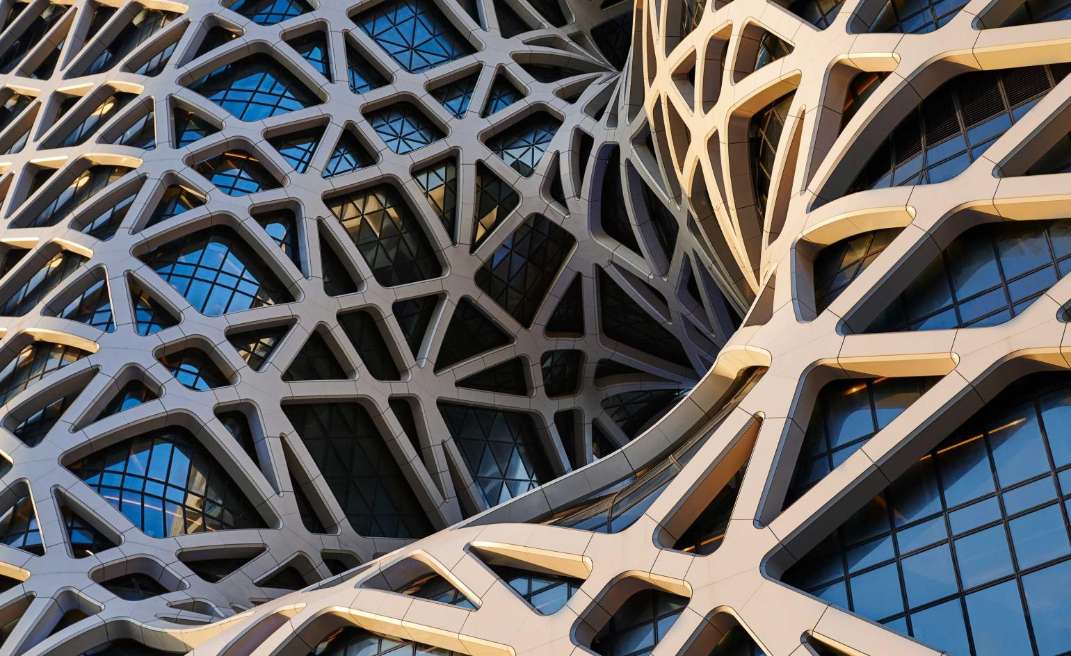
Designed by Zaha Hadid Architects, the 150,000 sq m, 40 storey flagship Morpheus hotel in Macau is the final chapter of Melco Resorts and Entertainment’s sprawling City of Dreams resort development, combining casino gaming, shopping and four other hotels located on the Cotai Strip. The unconventional monolithic structure features a freeform exoskeleton that rises from ground level, wrapping around a pair of towers and a cathedral-like central atrium to create a gargantuan block punctuated by three undulating voids that reflect the figure eight. Inside, three futuristic sky bridges connect the main circulation cores while providing vertigo-inducing communal dining and lounge spaces.
Goetheanum, Switzerland, by Rudolf Steiner
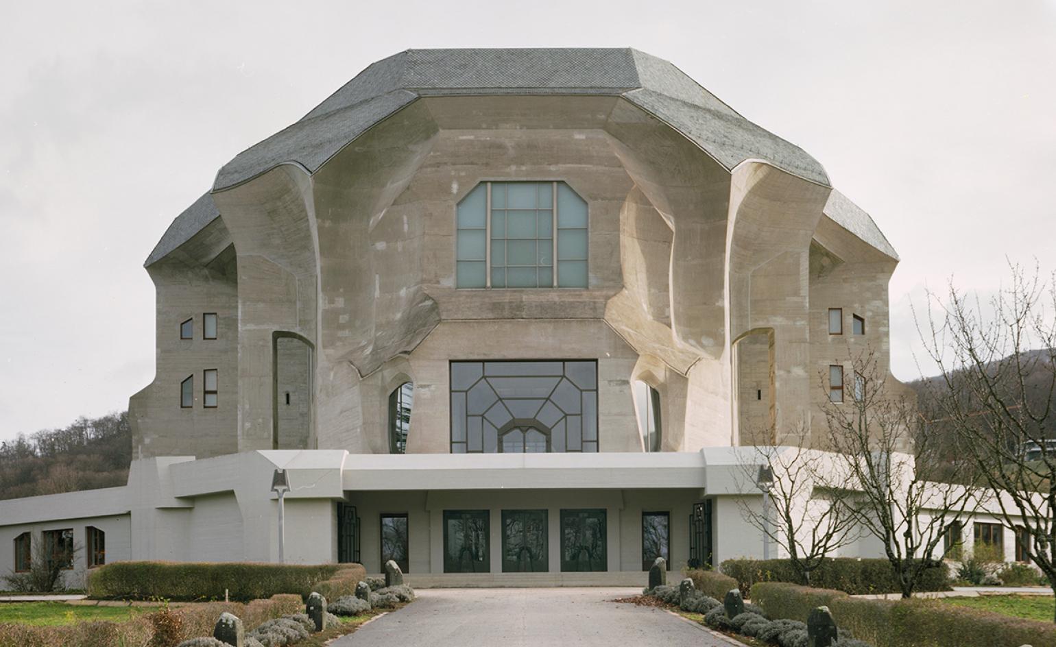
When Austrian architect and thinker Rudolf Steiner developed his philosophy of Anthroposophy in Germany at the turn of the 20th century, he soon came to require a place from which to spread its teachings of spirituality and science. Named after German writer Johann Wolfgang von Goethe, whose works Steiner studied and revered, the Goetheanum was therefore born for this purpose on the rising slopes of the Jura Mountains overlooking the town of Dornach, Switzerland. One of the largest reinforced concrete buildings of its time, the Goetheanum has an enigmatic design that combines the charismatic volume of Gaudí, with the zeal of an Orthodox onion dome and the command of a Brutalist masterpiece.
TECLA by Mario Cucinella Architects with WASP
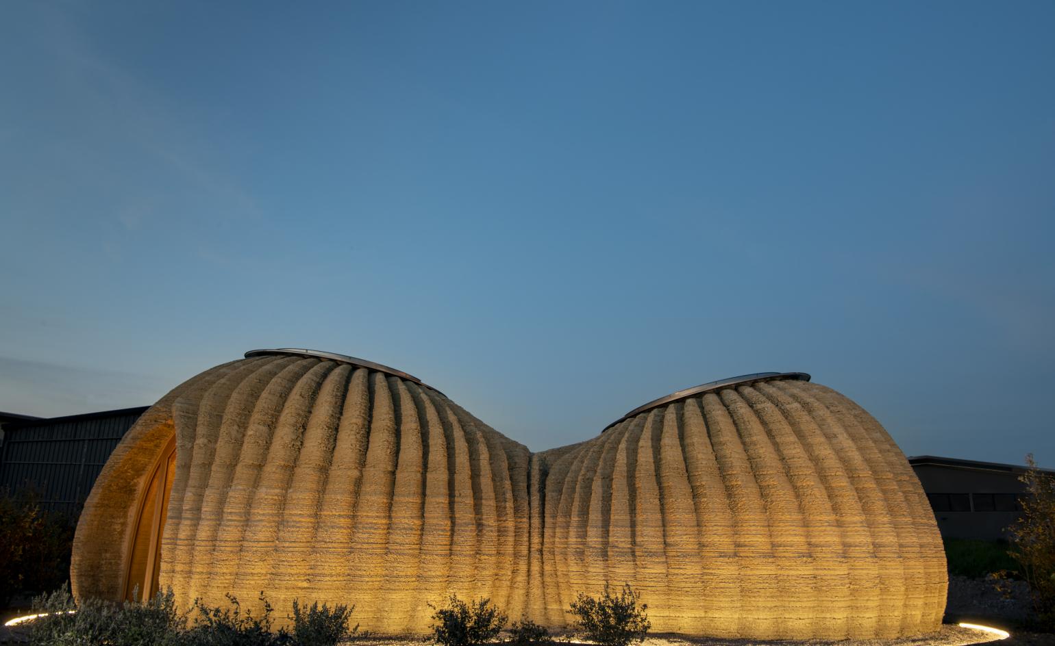
Mario Cucinella Architects has built the world’s very first 3D printed house made entirely from raw earth. Named ‘Tecla’, and built in collaboration with specialists in the field WASP, the structure demonstrates the point where natural materials meet technology and has just been unveiled in Italy’s Massa Lombarda region, near the city of Ravenna. ‘Adopted from one of Italo Calvino’s Imaginary Cities, one that is forever taking shape, the name ‘Tecla’ evokes the strong link between past and future combining the materiality and spirit of timeless ancient dwellings with the 21st-century world of high-tech production,’ say the architects.
Suspension House, California, by Fougeron Architects
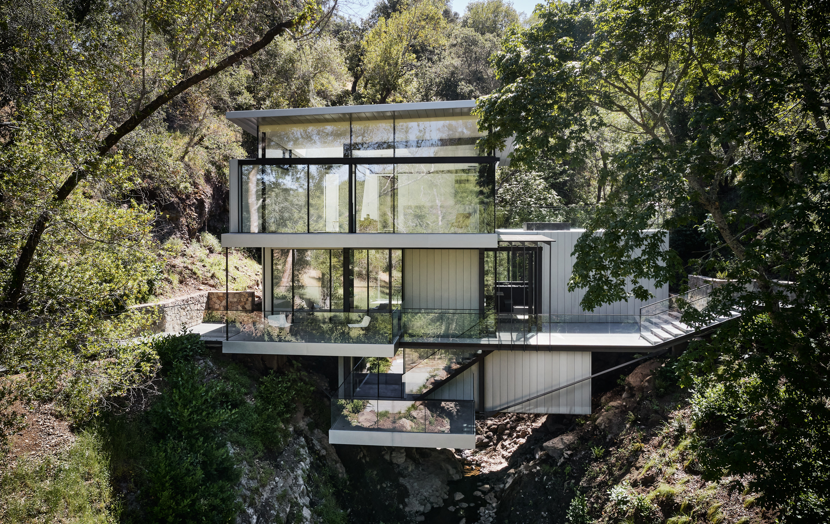
The Suspension House is one of those rare architectural statements that only comes along once in a generation. The combination of site, vision, and skill is so often squandered, but San Francisco-based architect Anne Fougeron has translated her clients’ desires into spectacular reality, respecting the wildness of the site without compromising on the clarity of the design. The existing house occupies the kind of site that is not only rare but actually forbidden (California no longer allows homes to be built across a creek), so Fougeron and her team had to make the most of the opportunity. The original house had to be retrofitted with new structure to support the load of the new additions, all while touching only lightly on the ground.
Shapeshifter House, Nevada, USA by OPA
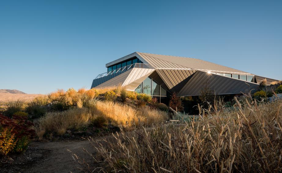
‘The American desert has a history of being understood as a place of lack, emptiness, or otherness', says San Francisco-based architect Luke Ogrydziak. ‘Framed as a barren wasteland, a kind of “no place”, the desert has been appointed the perfect test site, a place for all genres of experimentation – military, scientific, and social.' That's exactly what intrigued Ogrydziak and his partner Zoe Prillinger, of architecture studio OPA, when they started working on their latest project, a single family house for a creative couple in a residential suburb of Reno. ‘Enduringly mercurial, [the desert] is a sandbox that changes forms to fit the imaginations of the user, a space of ambivalence and uncertainty', Ogrydziak continues. The house, fittingly entitled Shapeshifter House, is situated in the desert landscape of Nevada, and at the same time draws on this soft, sandy topography, which heavily influenced its striking, origami-like forms.
Mathematics gallery at the London Science Musuem, by Zaha Hadid Architects
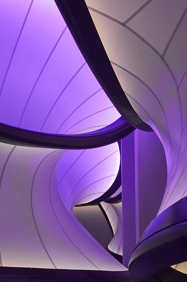
‘Mathematics: The Winton Gallery’ is a permanent public exhibition designed by Zaha Hadid Architects for the Science Museum in London. Inspired by aerodynamics – with the revolutionary Handley Page ‘Gugnunc’ aeroplane soaring through its midst – the gallery architecture descends down onto the displays, its swooping voluminous curves wrapping up the objects into a convincing case history on how mathematics is the pivot of our human world.
The gallery was designed around 100 artefacts selected from the science, technology, engineering and mathematics collections at the museum. A symmetrical pod-like structure made of fabric with a frame of powder-coated aluminium engulfs existing columns in the gallery, creating a central seating area and folding itself around display cases all lit by a soft and unearthly glow, which fades from yellow to pink to light purple.
Eppich House, West Vancouver, Canada, by Arthur Erickson
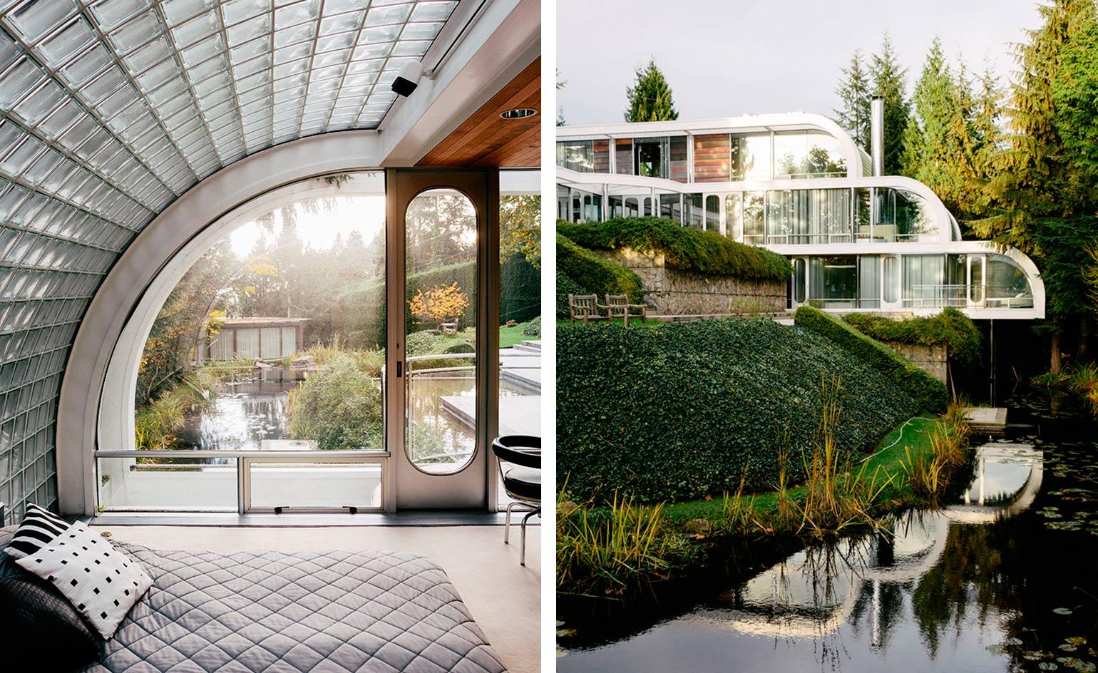
The Arthur Erickson-designed Eppich House, created with his long-time collaborator Nick Milkovich, is both time capsule and design beacon. The house is a modernist classic, built for a steel manufacturer and his family, but it is far removed from its more rectilinear relations, such as Mies van der Rohe’s Farnsworth House. Its curvilinear lines and response to the site are much more Frank Lloyd Wright than Mies – a late 1970s equivalent to Fallingwater that took a decade to complete, with owner Hugo Eppich acting as general contractor.
Everything inside the house, including the curved steel furniture, was custom-designed by Erickson and his partner Francisco Kripacz, and manufactured by Eppich’s Ebco Industries. ‘Steel is different in nature than concrete,’ said the late Erickson of the house. ‘It’s a malleable material, like plastic. I wanted to show its plasticity by taking I-beams and curving them.’ But more than anything, this house is a device to bring the outside in. Chrome-plated, polished steel columns, extensive glazing and water elements reflect and refract the surrounding greenery, creating a translucent residential cocoon.
DUO, Singapore, by Büro Ole Scheeren
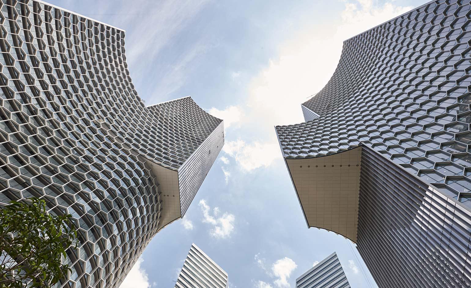
Büro Ole Scheeren’s DUO is sheathed with a honeycombed grid of hexagons – a pattern Scheeren used with great effect on his first Singaporean project at the Interlace - the striking silhouette of the twin-towered mixed-used development more than holds its own against its senior neighbours including IM Pei’s majestic Gateway Towers, Paul Rudolph’s griddled Concourse, and DP Architects’ Golden Mile Complex found along Singapore’s Beach Road.
University of Iowa’s Visual Arts Building, by Steven Holl
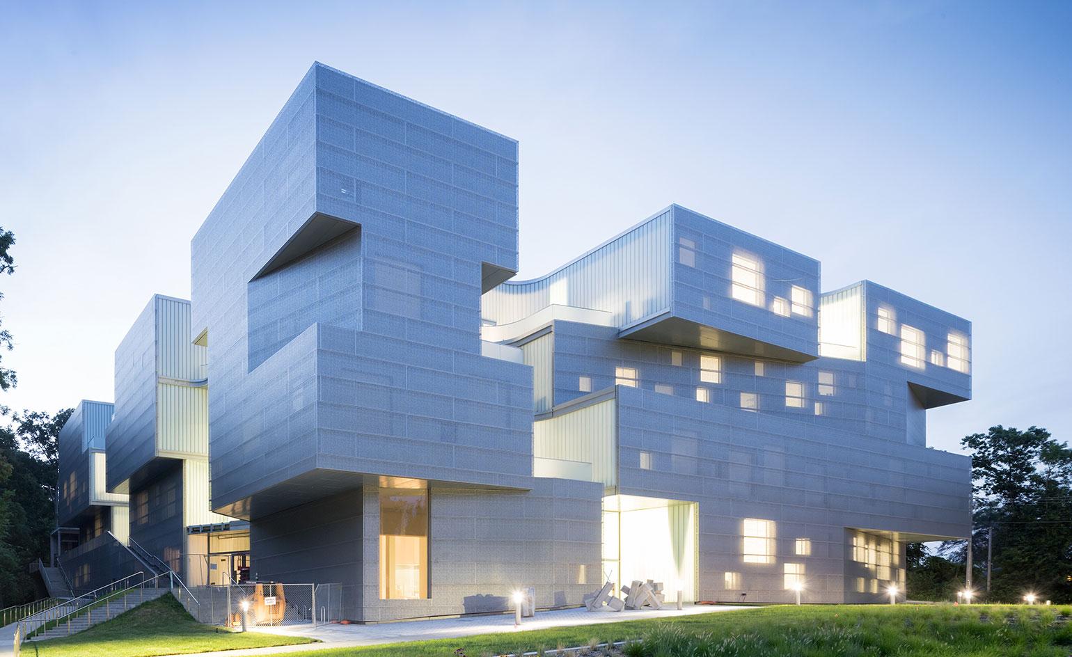
The University of Iowa Visual Arts Building is a strong three-dimensional composition of stacked concrete-frame boxes that creates a carefully articulated façade of interlinked volumes, as well as seven courtyards. These, together with several minimalist square openings that dot the façades, ensure plenty of natural light and ventilation inside, bringing sunlight deep into the structure’s generous floorplates. The perforated Rheinzink (zinc) cladding also works to this end. At the same time, its pattern adds texture to the external appearance and lends the building its cool, steely grey hue.
Yangzhou bookstore, Yangzhou, China
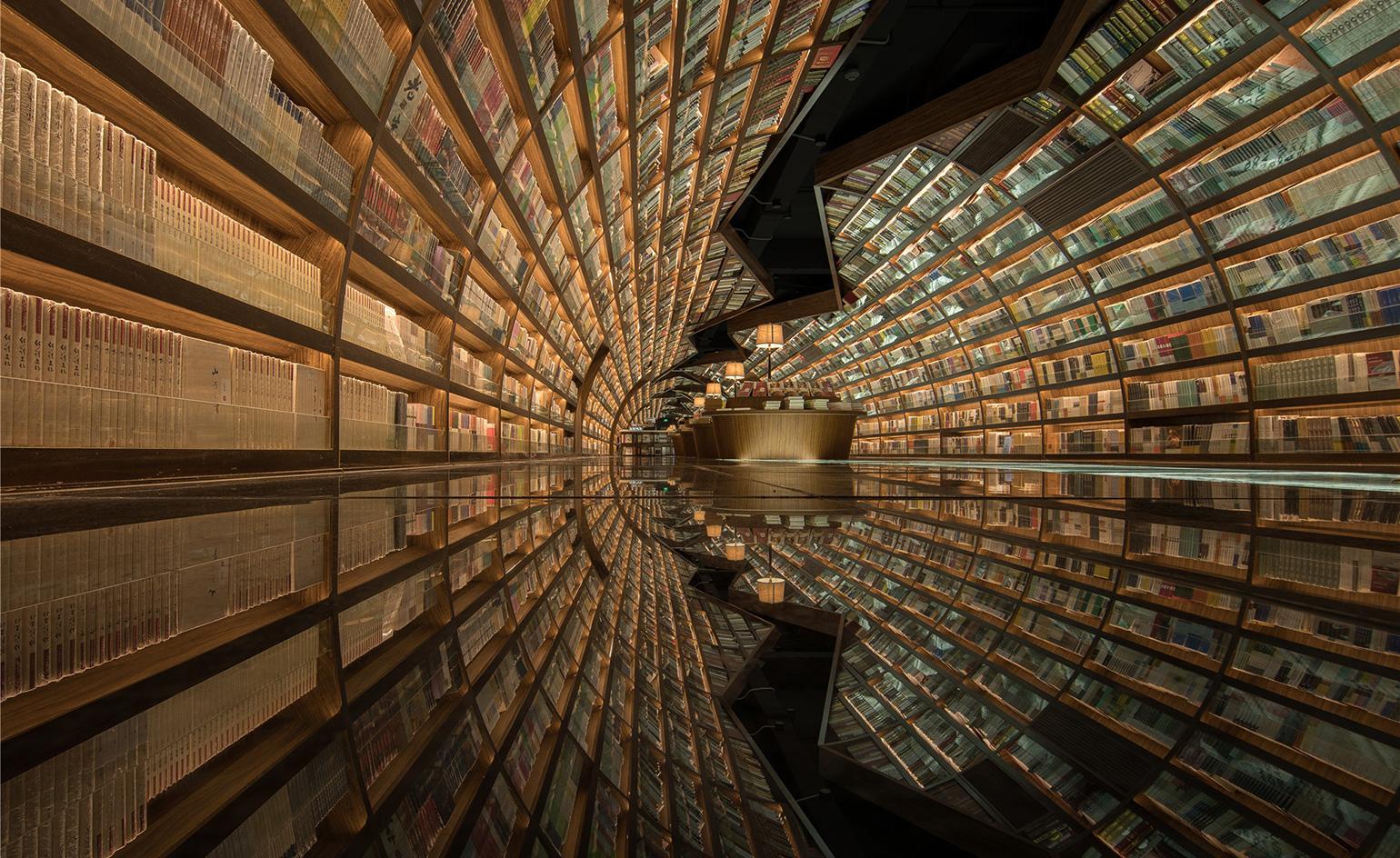
At this Yangzhou bookshop an optical illusion turns an ordinary, rectangular room into a cylindrical tunnel. Created by Shanghai-based studio XL-Muse for book retailers Zhongshuge, a black mirrored floor paired with two walls of arched shelving helps to create a seemingly never-ending funnel of books. The design is inspired by the rich cultural heritage of Yangzhou, said to be a historical gathering place for literati and poets. The lead designer Li Xiang took inspiration from a verse in the classic Chinese romance novel A Dream of Red Mansions, by Cao Xueqin, which is thought to refer to the area in which the shop now stands. Visitors are supposed to flow with the river, swept along by the black mirrored floor, deeper into the bookshop and ‘into the vast ocean of knowledge,’ explains Xiang.
EUR Convention Hall and Hotel/The Cloud, Rome, Italy, by Studio Fuksas
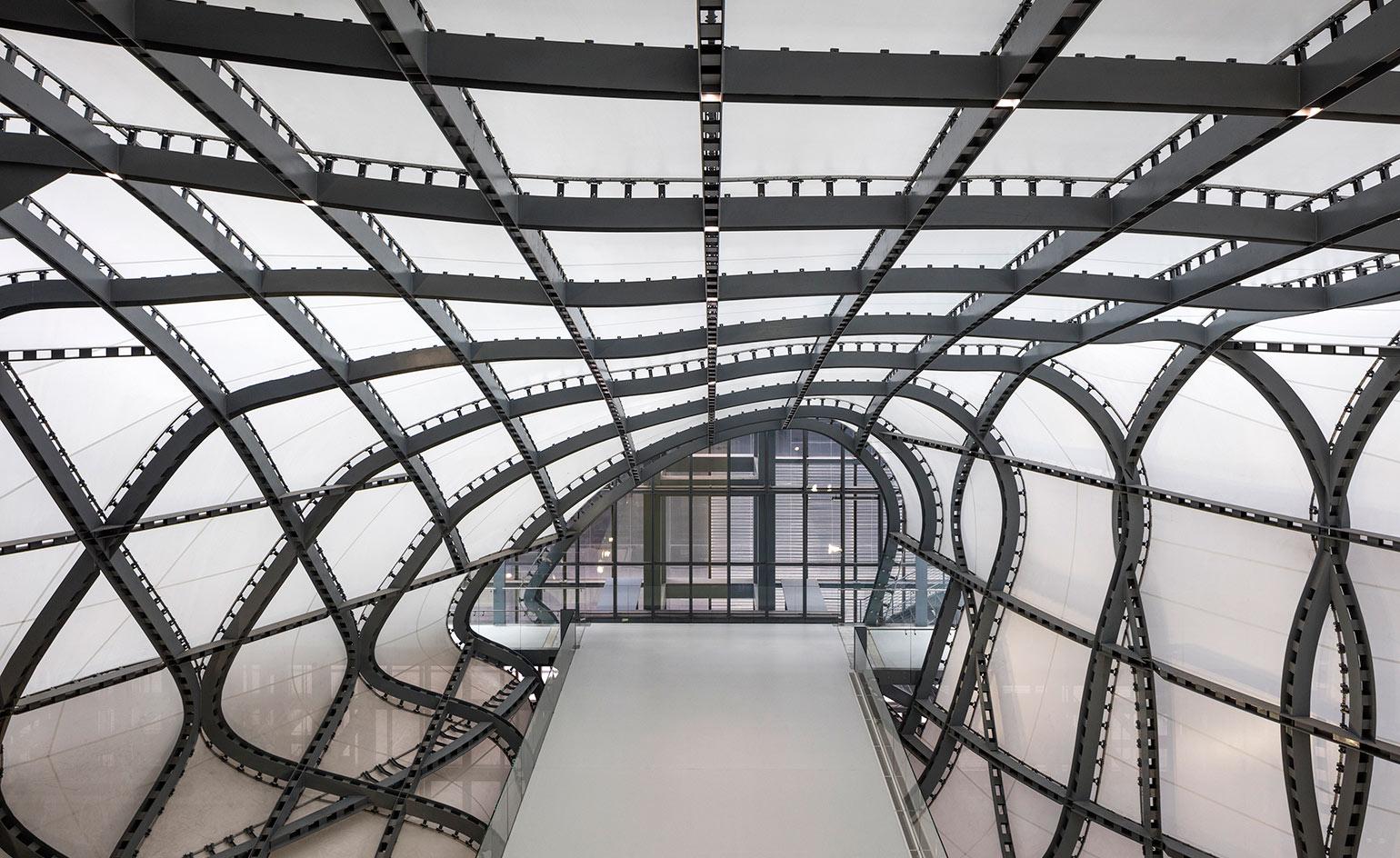
This eco-friendly complex is a mammoth of a project, comprising everything from auditoria, exhibition spaces and a hotel, to 55,000 sq m of public space, and bringing together trade and tourism in the Eternal City. Located in Rome’s business district of EUR, the centre is divided into three distinct architectural concepts, explain the architects: the basement, the Theca and Cloud, and the Blade. These respectively host the main foyer, information point and congress and exhibition hall; the glass and metal clad public space for conferences, exhibitions and large-scale events, as well as an auditorium; and the 439-room hotel.
The Cloud in particular is one of the complex’s most eye-catching design gestures. Its cocoon-like form sits hovering over the public areas, made of highly advanced membrane fibreglass and flame-retardant silicone. High-tech applications also extend to the building’s environmental strategies, which include a natural ventilation system, a rainwater harvesting system and photovoltaic panels.
Colorado Springs’ Air Force Academy, US, SOM
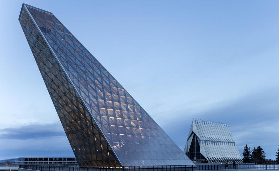
The Center for Character and Leadership Development (CCLD) is an addition to SOM’s 1954 design of Colorado Springs’ Air Force Academy. The building is a symbolic yet practical structure totals 46,000 sq ft and is a critical meeting point between public and cadet areas of the site, acting as a nexus due to its select location by different sectors of the building which are each designated to professors, cadets, important visitors and the public.
The building contains a forum, a flexible working space, collaboration conference and seminar rooms, along with a library, offices and an honour board room where important matters concerning the Cadet Honor Code are held. A 105 ft skylight looms over the CCLD’s visitors casting natural light into the depths of the building. The glass structure was designed to align with the position of the North Star, to the signify the Academy’s guiding values. An architectural and engineering marvel, the dynamic structure is composed from Architecturally Exposed Structural Steel (AESS), and exists without any embellishment or ornamentation, its sleek connections working in aesthetic harmony with SOM’s refined and pared-back design.
Sheats Goldstein house, Los Angeles, by John Lautner
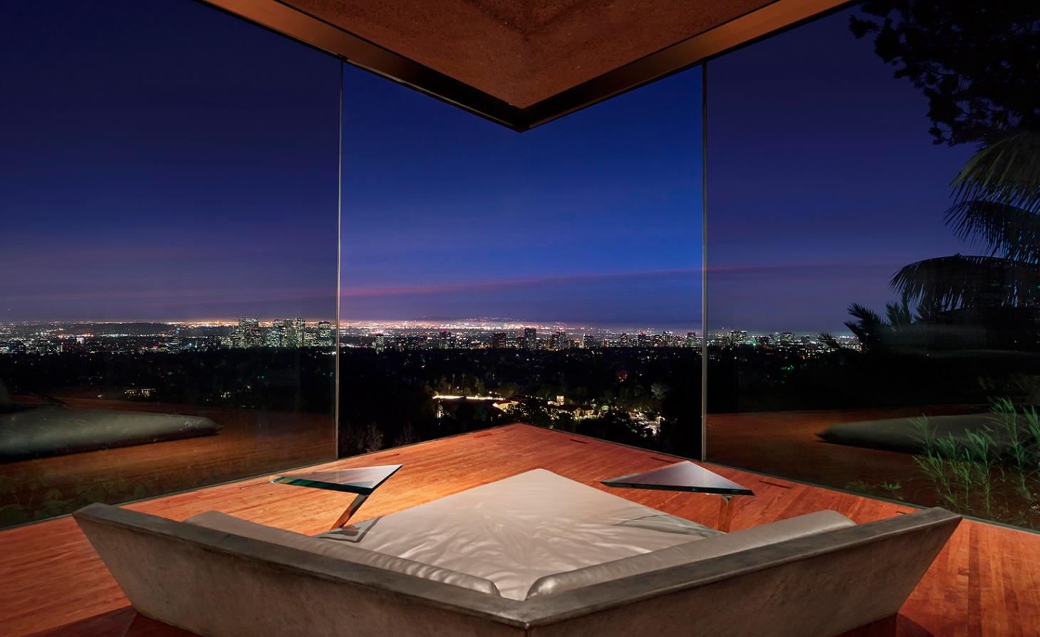
With its sloping angles and clam-shell-like structure that boast striking views of Los Angeles, the Sheats Goldstein residence was designed by architect John Lautner in the early 1960s, and immortalised in pop culture through films like The Big Lebowski and fashion shoots by legends like Herb Ritts, Helmut Newton and Michel Comte (as well as ads for Jimmy Choo). The house’s owner – businessman and fashion/basketball aficionado James F Goldstein – has ensured that the house will be experienced for generations to come by donating the residence to LACMA. Pictured here, interiors and custom furniture at the house.
Origami House, Kuwait, by AGi Architects
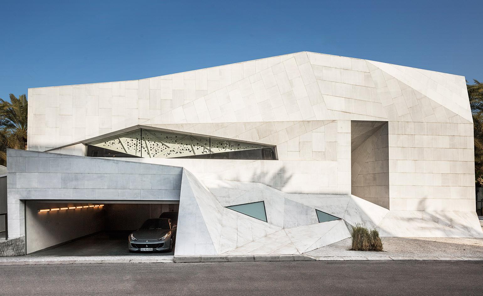
This house gained its nickname the Origami House owing to its resemblance to a large piece of grey paper that has been bent and folded into shape. The 1,300 sq m home is formed from reinforced concrete and a lot of stainless steel, which was used to make the doors, balconies and some of the windows. Middle Eastern and Islamic architectural styles can be observed all over the house – in the use of mashrabiya latticework in the screens, for example, through which the sun dapples the interior space. The internal spaces are organised around a central courtyard, where a concrete pool provides a focal point.
The Mercedes Benz Stadium, Atlanta, by HOK
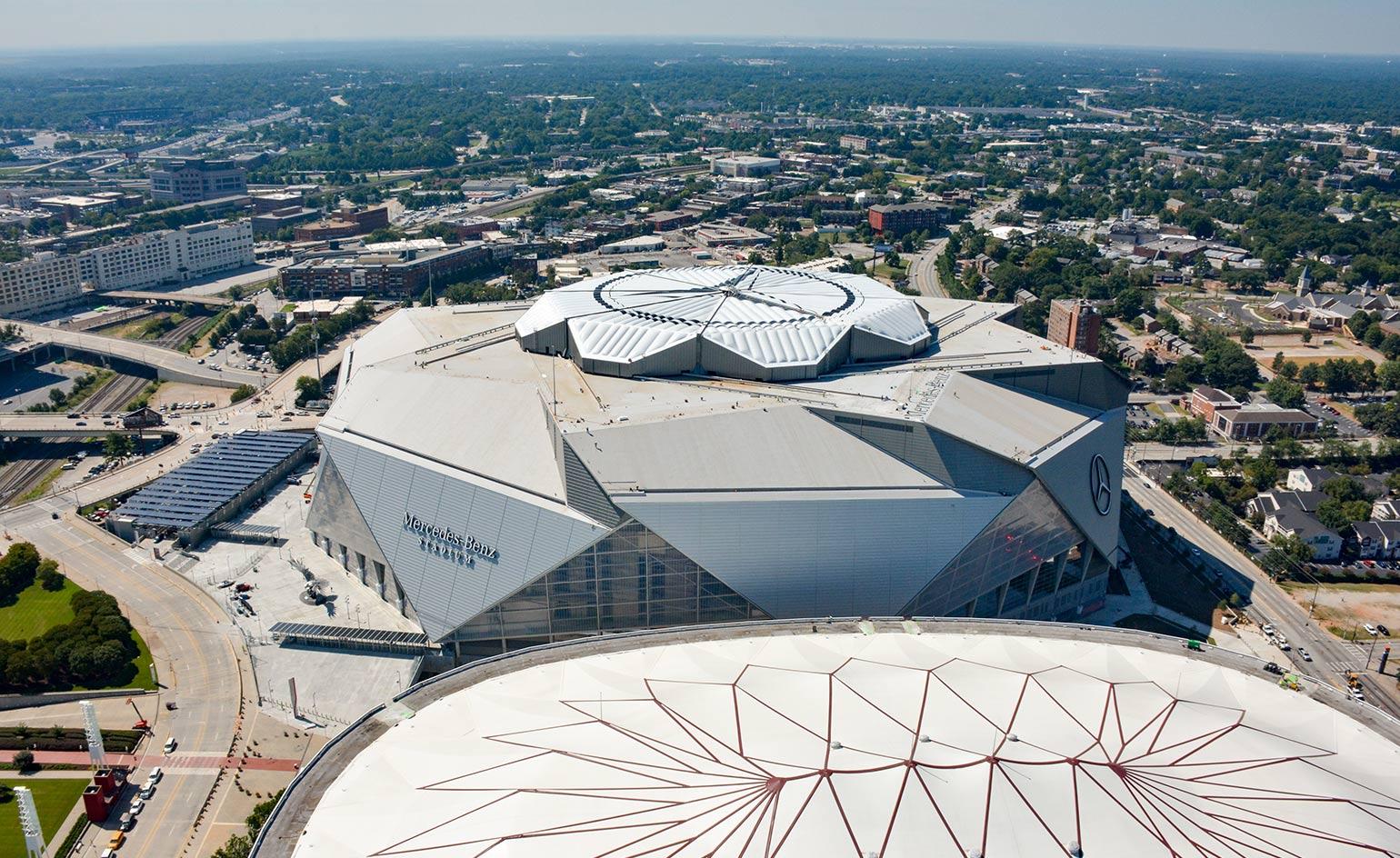
Home to the Atlanta Falcons football team and Atlanta United FC soccer team and located just next to Atlanta’s Georgia Dome on the western edge of Downtown, the Mercedes Benz Stadium is notable for its ‘Ocular Roof’, which features eight ETFE-clad petals that slide past each other simultaneously on steel trusses, simulating an opening flower or camera aperture, and eliciting more than a few gaping expressions. The apparatus – emblazoned, of course, with the Mercedes-Benz logo – can open or close in about ten minutes. The roof’s lightweight ETFE membrane allows natural light to filter inside. The rest of the stadium contains eight triangular steel and glass sections whose angular sides echo the logo of the Atlanta Falcons, and create a stunning imprint on the Atlanta skyline.
The CoFuFun station plaza, Tenri, Japan, by Nendo
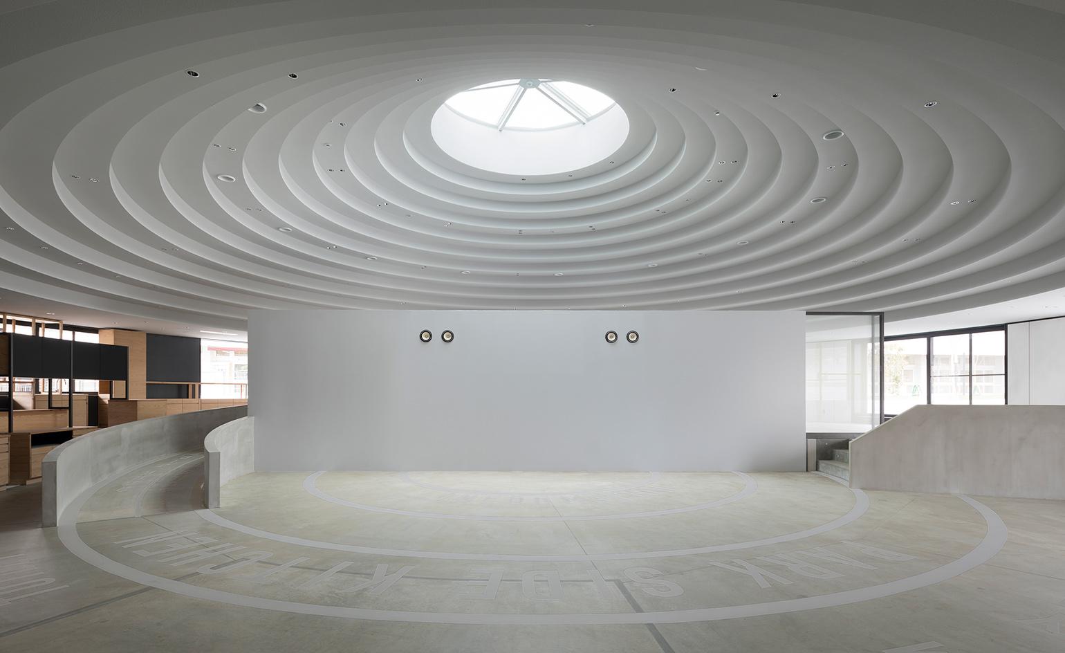
The CoFuFun station plaza at Tenri Station in Japan, designed by Nendo, is an upbeat urban intervention and a new community hub for Tenri City in Nara prefecture. The 6000 sq m plaza features a series of white circular structures, that serve as multi-functional pavilions hosting a café, shops, information kiosk, bike rental, a play area, an outdoor stage and a meeting area. The orbiting concrete forms are also historically informed, referencing ancient Japanese burial structures ’cofun,’ common to Nara which can be found dotted around the mountainous area surrounding the city.
La Seine Musicale, Paris, France, by Shigeru Ban and Jean de Gastines
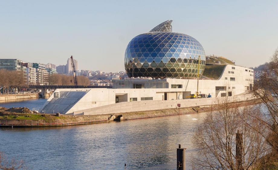
Designed by Shigeru Ban and Jean de Gastines, La Seine Musicale on Île Seguin is an icon of the 21st century and a gateway to west Paris. The most striking feature of La Seine Musicale is the egg-shaped auditorium made of glass and a lattice of timber laminate from a woven spruce wood and accessorised with a dynamic 800 sq m sail of photovoltaic cells, which shields this core from direct sunlight. This agile and entirely solar-powered form is mounted on rails and follows the path of the sun at 15 minute intervals as it progresses, supplying the auditorium with energy.
A warm and organic interior contrasts the technology-inspired futuristic outer-shell. Designed to bring audiences closer to musicians, a gentle terrace of seating holds a capacity of 1,150 people. The Grand Lobby, pictured, is a covered ‘street’ that progresses through the heart of La Seine Musicale and out the other side. This was a route planned by Jean Nouvel, when he set out his masterplan for the Île Seguin in 2010 – a complex task for the long and narrow 2.35 hectare site.
Centro Botin, Santander, Spain, by Renzo Piano
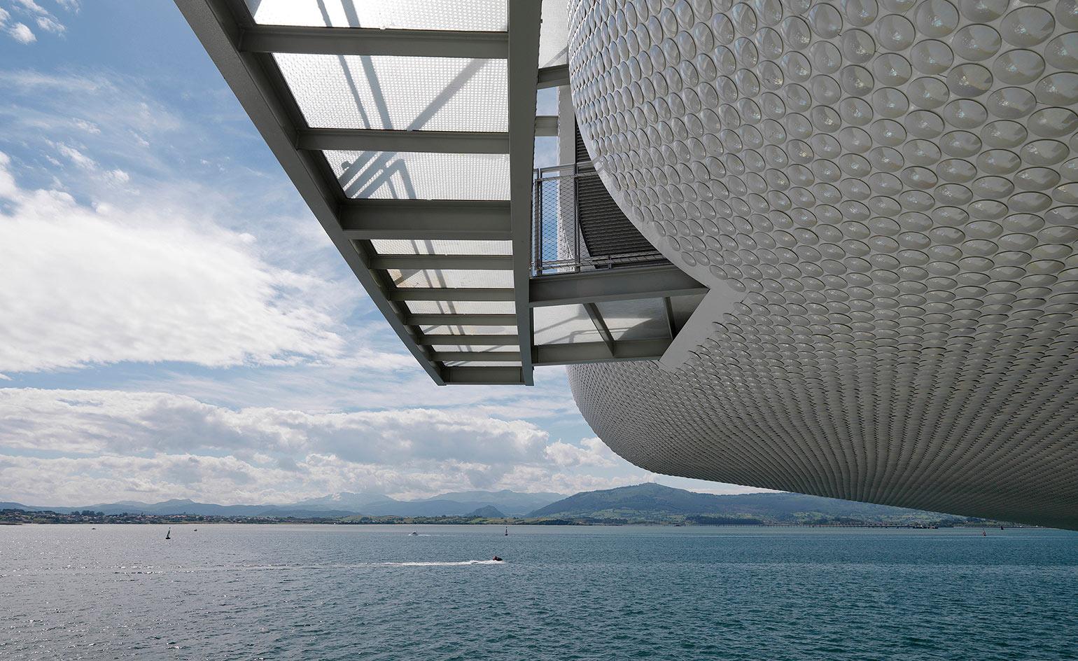
The bulky tank shaped building of Centro Botin is covered in the 280,000 pearly, circular ceramic tiles. Like the scales of a fish, the surface effervesces in the sunlight, absorbing reflections from the sea. The volume of the building has been sliced neatly down the centre, and opened up to reveal two façades of glass (which allow floods of light into the gallery and auditorium spaces inside). These two volumes were hoisted up onto slim stilts and a fully glazed ground floor restaurant, café and shop.
Piano moved the circulation to the exterior, so the volumes are accessible and connected by light walkways and staircases of steel and glass. The submarine-style building quotes the industrial waterfront economy of the city, which originated as a Roman port settlement, and now is a major cruise ship terminal. Driving down the S-10 road into the city, from the rocky and green countryside of Cantabria, Santander’s urban identity is defined by the warehouses, tanks and containers of the fishing and ship building industries that line the waterfront.
Exhibition road Quarter, V&A , London, UK, by AL_A
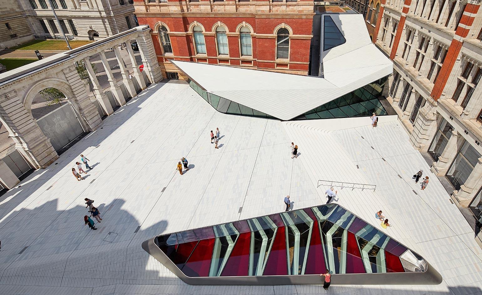
A sleek new ‘quarter’ designed by AL_A, led by Amanda Levete, for London’s Victoria & Albert Museum includes a huge performance space, art handling units, a cargo entrance and a modern courtyard entrance, which smoothly ensconces a café and shop into its porcelain-tiled midst, and guides visitors to the new entrance hall. With the open contemporary courtyard, the museum hopes to interest new audiences into the space which includes a futuristic-looking metallic oculus, and a sweeping aluminium extension that glides between the existing Grade I building.
This is just the tip of the iceberg. Eighteen metres below ground is where the rest of the story plays out; the 11,100 sq m column-less Sainsbury Gallery – which stretches 38m in length – will be a new venue for live music and ‘performance’. In a spirit of renewal and evolution of the much-loved museum, Levete weaves sensitive references to its heritage throughout her contemporary design. The 11,000 handmade porcelain tiles that coat the courtyard in a luminous surface were inspired by the collections.
Molecure Pharmacy, Taichung, Taiwan, by Waterfrom Design
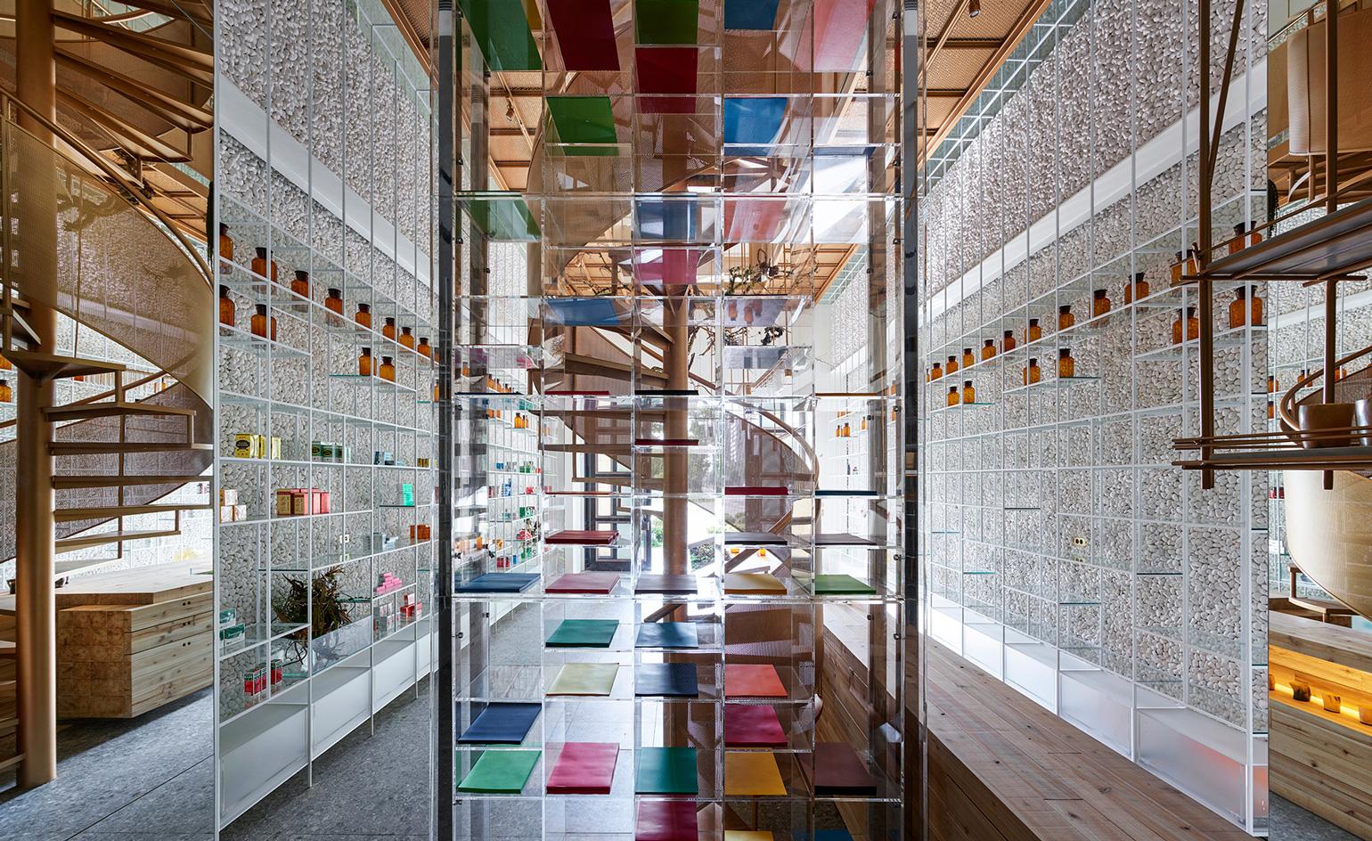
A combination of natural and man-made materials were selected for the interiors of this pharmacy in contrast to the often unwelcoming, sterile composition of pharmacies. Molecure Pharmacy in Taichung, Taiwan, has been designed with a modern holistic concept in mind. Designed by local architecture practice Waterfrom Design, the interior design encourages an ambience that endorses a healthy state of mind.
The open dispensing area known as the ‘green laboratory’ features a large counter, the base made from the trunk of a century-old tree. The walls are decorated with white beach pebbles and lined with floor-to-ceiling metal and lightweight glass modular-systems. Display cases are stocked in abundance with attractive remedial products and antique medicine bottles and a bronzed spiral staircase stands in the centre of the store, cleverly imitating the double-helix structure of a DNA molecule.
Innovation lab for China Resources Group, Huizhou, China, by Aim Architecture
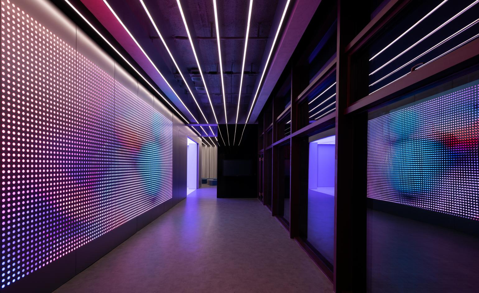
Design and technology often go hand-in-hand, and never more so than in the places where great ideas begin: science labs. Shanghai-based studio Aim Architecture combined these factors for the innovation lab for China Resources Group, one of China’s largest industrial conglomerates. The space, set within an existing building where it occupies a fairly compact 700 sq m within a single floor, is situated in the Chinese city of Huizhou, which is part of the Pearl River Delta River industrial region.
There is an all-white, aluminium-clad, futuristic interior data hub; a room filled with partition screens and movable whiteboards for creative workshops; and several meeting and presentation areas of varying sizes that are defined by fabric curtains. The interior lighting is embedded within the acoustic ceiling panels, becoming an ornament in itself and defining the space with its strong linearity. A strong palette contrasted with colour blocking in black or white in certain areas creates a varied experience and different atmospheres, bringing a sense of diversity and generosity to this relatively modest-sized interior.

.jpg?w=600)


