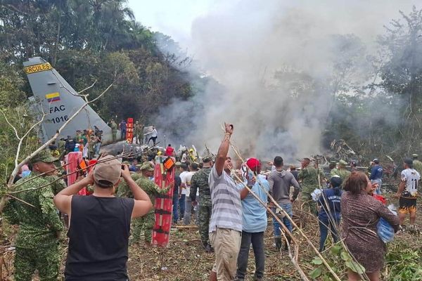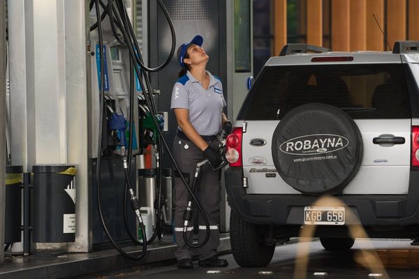
Open a British newspaper as a heatwave looms and you’ll likely see headlines about the unprecedented nature of the upcoming heat, the cost to lives and livelihoods, and even deaths caused by the extreme heat. But accompanying the same story you are also likely to see images of people having fun in the sun – kids splashing in city fountains, crowded beaches, blue seas, azure skies and holiday happiness.
How the media communicates about climate breakdown reflects and shapes how societies engage with the issue. Behind every picture that makes it into the news is a person mirroring and perpetuating how society thinks about climate breakdown. Images are a key part of any media communication: they are often vivid and colourful, drawing readers in and helping them to remember a story.
They also shape news production: compelling visuals help stories rise up the media agenda. Think about the image of the man blocking a line of tanks in Beijing’s Tiananmen Square, a young girl fleeing her village after being burned by napalm in the Vietnam war, smoke billowing from the twin towers. These images become part of our collective psyche – through them we remember the power of protest, the horror of war, and the moments everything changed. Images of the climate crisis can hold the same power, something the Guardian recognised in its sector-leading 2019 editorial decision to rethink the images accompanying climate stories.
Our new research, led by the University of Exeter, highlights a distinct problem with how the European media visually represents news of extreme heat. We examined media coverage from the UK, the Netherlands, France and Germany during the summer of 2019. Importantly, we only included news stories that mentioned both the keywords “heatwave” and “climate change”, reasoning that if we were to see responsible and accurate reporting of heatwave risks, it would be in coverage that at least alluded to the increasing risk of heatwaves becoming longer, more frequent and more intense under climate breakdown.
We found two distinct themes in visual coverage. The first used images of “fun in the sun” that depicted heatwaves as something enjoyable. In all four countries, the majority of these images showed people having a good time in or by water. This was particularly prominent in the UK, perhaps saying something about how British culture narrates the experience of very hot weather in our historically mild climate.
The second theme we found was “the idea of heat”, depicted through red and orange colours, which are (in western cultures) commonly associated with heat or danger. People were largely absent from this visual discourse in photos such as generic stock photographs of thermometers against a blindingly hot sun. When people were pictured, they were depersonalised by silhouetting them against the sun so their faces were not visible.
Across all four countries, there was a mismatch between the text of the articles and the accompanying visuals. While the headlines and image captions proclaimed news of unprecedented heat, vulnerable people and even deaths, the photos featured were those “fun in the sun” holiday snaps.
This is problematic in two ways. First, by displacing concerns of vulnerability, it marginalises the experiences of those vulnerable to heatwaves: older people, young children and babies, people with pre-existing health conditions, and people living in poor-quality housing are all more at risk from extreme heat.
Second, there is a difference between northern Europeans looking forward to a “normal” period of sunny, settled, summer weather (I know – I wish for this after a long and often drearily rainy Devon winter) and articles which may, to a greater or lesser extent, appear to be welcoming the prospect of a much hotter, climate-changed future. Whether extreme heat events are visualised through photos of people on beaches or are excluding people completely, we are missing an opportunity to imagine a more resilient future.
News media can picture heatwave visuals differently, though. The Dutch outlet Algemeen Dagblad produced visual stories of the reality of living with extreme heat. When they pictured a young family, they weren’t queueing for an ice-cream on a benign sunny day, but at home in front of a fan, looking visibly uncomfortable.
Other pictures depicted the solutions many have called for, in images of an air-conditioned community space opened up to local, older residents to help them cope with the heat; and in a grey, concrete city thoroughfare given new life through an urban greening project, reducing the urban heat island effect.
The recent coverage of the Indian subcontinent heatwave showed compelling visual portrayals of everyday life during a heatwave: struggling outdoor labourers, buckling roads, people seeking shade and water. All these images show that “fun in the sun” is not an inevitable way to illustrate extreme heat.
We want to be clear that this isn’t a call to the media to redact all images of people enjoying the beach on a hot day, but an overabundance of these types of images (especially attached to a news story about heatwave risks) tells only a limited part of the story.
Not everyone is having fun during heatwaves superpowered by climate breakdown – for vulnerable people they can be deadly. Fortunately, there are signs of progress as editors, journalists, suppliers of stock and editorial photography, and society more widely, start to think critically about the images used to visually represent extreme heat. News media and social scientists can work together to tell the full story of extreme weather.
Saffron O’Neill is an associate professor in geography at the University of Exeter


