People are always falling out with brands, whether it is about ethical behaviour, product changes, or failure to match the competition. But as Airbnb found out last month, hell hath no fury like a public that does not like your new logo.
Airbnb introduced its "Bêlo" logo to symbolise a new era for the business. So far it has received a torrent of criticism, jibes and memes, including comparisons to Automation Anywhere's logo, a vagina and the chin of Peter Griffin from Family Guy. Following in the wake of Airbnb's logo backlash, fellow internet brand Foursquare unveiled its new logo on Instagram last week, also receiving negative comments about its design.

Social media has opened the floor to the consumer, meaning if a brand does something people dislike, they will rapidly hear about it. But when it comes to a new logo design, why do they inspire such ire?
"People love brands and logos are visual shorthand for the emotional connection people feel towards that brand," explains Chris Campbell, executive creative director for Interbrand Group, North America. "It is great that consumers do get excited and emotional about changes to logos, and it is wonderful that technology has enabled the consumer base to have a dialogue about design," he says.
While most of the time the heckles die down and people accept the new logo, there are also a handful of examples over the years that have had a negative impact on the respective brands.
Tropicana
At the start of 2009, PepsiCo's juice brand unveiled redesigned packaging, which saw it drop the well-recognised straw-in-orange logo in favour of a more simple design. One of the main criticisms was that the packaging was too generic and did not have strong brand recognition. Sales of the Tropicana Pure Premium line plummeted a reported 20% in just under two months before it reverted to the original logo.

Gap
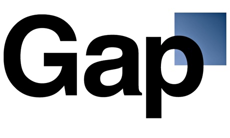
In 2010 Gap launched a new logo design out of the blue – quite literally – ditching the white text in blue box it had for 20 years prior and replacing it with black text linking into a small blue box. A social media backlash ensued – not only from design aficionados who objected to the use of Helvetica – over its overly corporate looking design. The retailer responded by crowdsourcing new logo ideas on social media before swiftly reverting to the original one a week later. Gap's North America president at the time Marka Hansen, admitted in a post that the "outpouring of comments" showed the company "did not go about this in the right way".

JC Penney
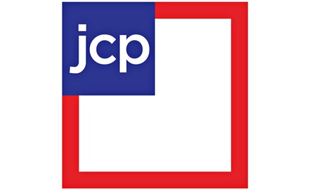
JC Penney is another retailer that experimented with a box design for a new logo, but unlike Gap its U-turn, was much slower. In October last year the US retailer, which has changed its logo on several occasions in the past, decided to revert to its original logo – one of the many changes made to the struggling business undoing the work of ex-CEO Ron Johnson during his tenure. The logo U-turn was accompanied by an apology ad, asking customers to "come back". Charles Rashall, president and founder at BrandAdvisors, which created the logo, hit back at the brand's decision to scrap it. Writing for AdAge, he said, "using the old logo isn't going to magically restore confidence among customers who felt abandoned or at minimum unclear about what JC Penney was trying to become."

While it is not possible to please everyone, how can a brand ensure that new logo backlash does not escalate into brand damage that could hurt the bottom line?
Have a genuine reason to change your logo
Whether it is a change of leadership, new strategic direction or preparation for an IPO, brands should only change their logo when there is a compelling business reason. "It is important to ask, is this a change of symbol or symbol of change? Don't change it because it has been around for a long time," says Christopher Lehmann, executive creative director, Landor.
Craft a detailed communications plan
When a logo change is in order, brands must ensure they tell their customers the story behind it. Get employees on board and have an implementation plan in place. Since it is inevitable that some people will dislike the new logo, have a proactive – rather than reactive – communications strategy, ready to respond to them directly. Connie Birdsall, senior partner, creative director at Lippincott, suggests responding to negative criticism by explaining the strategy directly to core customers so they can share the message on behalf of the brand.
Be prepared to ride out the storm
In most cases the backlash will die down and people will accept the logo change, meaning brands should, for the most part, tough it out. "Social media has made us all of us feel like we are in the driver seat when it comes to brands. On social media people love to have an opinion but sometimes it is just noise," says Lehmann.
But he says it is important to keeping listening to the feedback, measuring the negative sentiment against the positive and "differentiate meaningful conversations about the logo against people ripping into stuff for the sake of it and other people jumping on the wagon".
Birdsall agrees: "It you are making a change for a specific strategic reasons, you should stick to your guns and believe in it. Gap didn't keep going forward, but the world would have recovered and moved on by now."
Sarah Shearman is a freelance journalist writing about the intersection of technology, innovation and culture.
• This article was amended on Friday 1 August to include Foursquare's new logo
Read more stories like this:
• Beyond billboards: brands turn to the city itself as a new creative canvas
To get weekly news analysis, job alerts and event notifications direct to your inbox, sign up free for Media Network membership.
All Guardian Media Network content is editorially independent except for pieces labelled 'Advertisement feature'. Find out more here.


