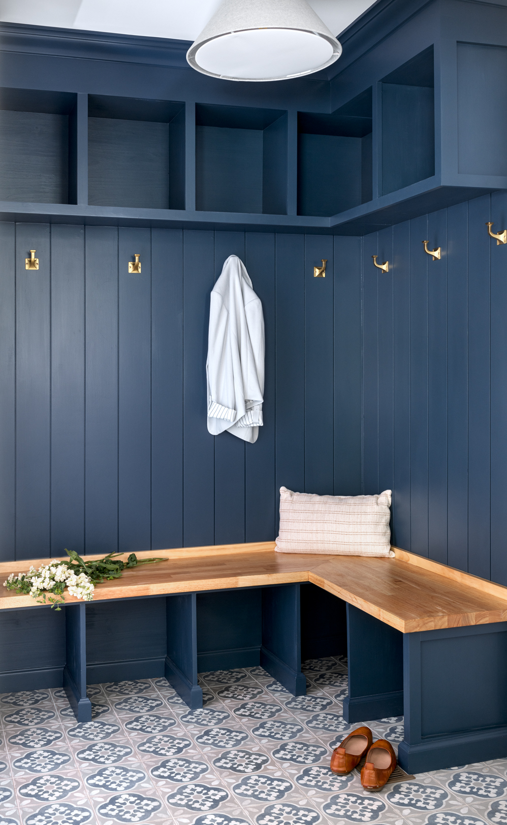
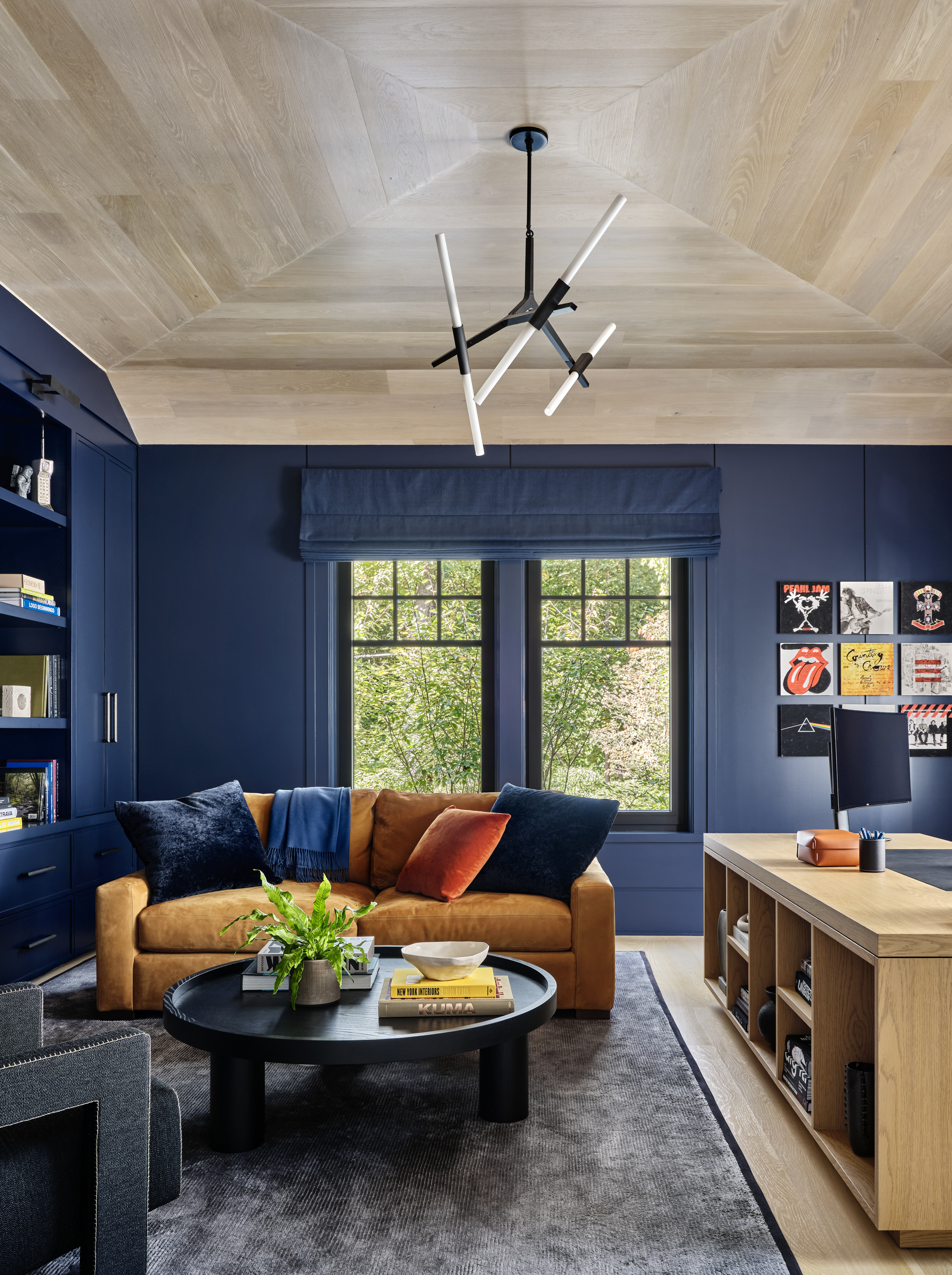
While it may seem intimidating at first, navy blue is actually one of the best, most versatile colors you could choose for your home. Paired with the right partner, it has the power to elevate and enrich your space with its depth and sophistication while still proving bright and open. It's warm but not too much so, and it plays incredibly well with others — there are plenty of colors that go with navy blue.
"Navy blue is really a neutral, in its own way," says Ksenya Malina of New York interior design studio Time & Place Interiors. "It provides depth and tone while pairing flexibly with many other colors." You can use it for "core pieces of furniture like the sofa" or add to it kitchen cabinetry. And "if you have a dark room with little natural light, saturating it in a dark navy gives the space more depth." In other words, decorating with navy is much easier than you may think.
But what are the colors that go with navy blue best? Well, the list of possibilities certainly goes beyond those listed below, but we've found 12 fail-safe and expert-recommended pairings for you to get started with. And don't worry, we're updating this list regularly to make sure it always reflects what's trending in design. Here's our 2025 picks.
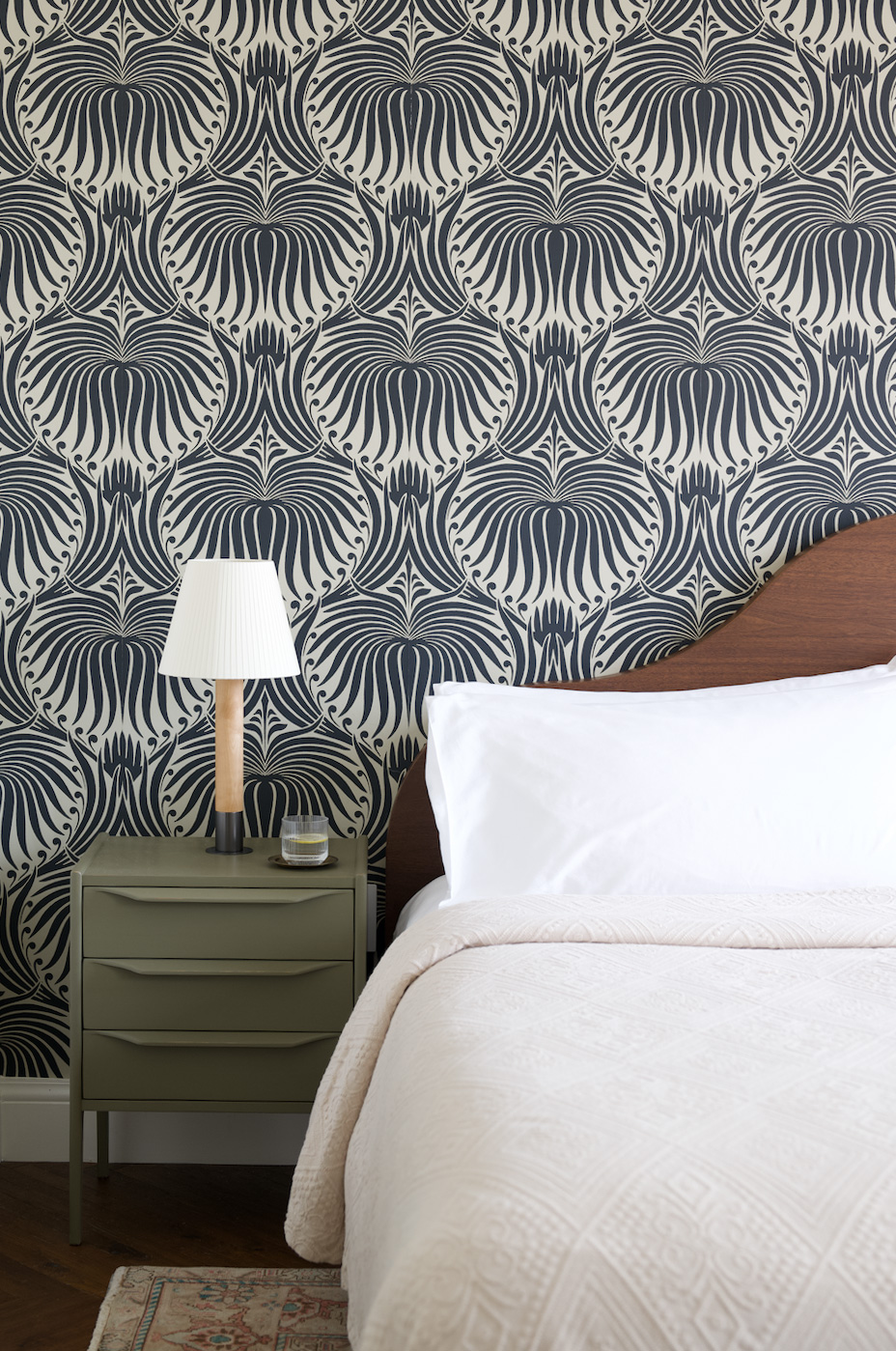
1. Olive Green
Olive and sage green were perhaps the most popular colors of 2023 and 2024. You have no doubt seen these calming, nature-inspired shades on cabinets and inside kitchens in every magazine and on every website (including Livingetc), most commonly paired with white. But don't get it twisted — navy blue is a color that goes with olive green, too.
"Navy blue and olive green together create a sense of depth and nature-inspired luxury," explains Laetitia Laurent, founder and principal at Laure Nell Interiors. "ln my projects, I often work with these two shades in bedrooms or living areas where I want to invoke a sense of tranquility but with layers of color. It’s a pairing that feels grounded yet refined — subtle but with plenty of visual interest."
Olive is a rich earthy, green that brings a natural feel to both contemporary and traditional interiors. The cool undertones bring a calming feel to any space.
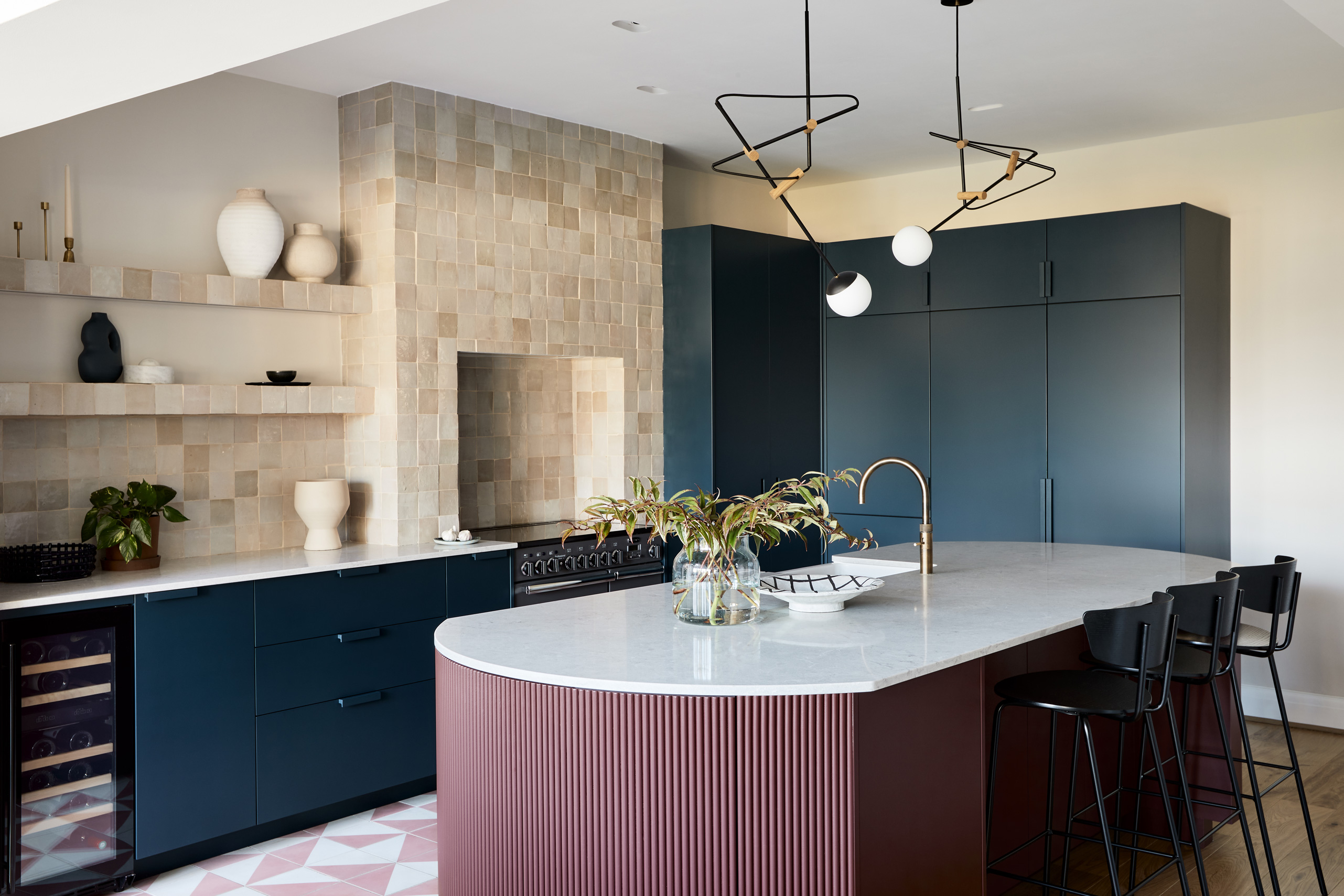
2. Cognac
Cognac is a rich, decadent liquor, so think of the color as evoking the same vibe. Paired with something as sophisticated as navy, you have an elegant partnership that's as elevated as your favorite drink. It's a brown-y, reddy, tan color that's sort of hard to define, but it brings balance in interior design when paired with its opposite at the same color value, navy blue.
"A luxurious and opulent duo, navy and cognac create a striking contrast that feels both rich and inviting," says Alykhan Velji of Aly Velji Designs. "Think deep velvet upholstery, buttery leather accents, and layered textures to enhance the depth of this bold colorway."
Cognac is a deep, rich color with intense, terracotta red tones. This colour creates a warm, cozy and sophisticated feel.
3. Light Pink
Perhaps not the most obvious choice, but navy blue is indeed a color that goes with blush pink — especially if you're going for more of a light, bright, and softer vibe.
"There’s a certain magic when you mix the strength of navy with the softness of blush pink," Laetitia says. "The two create this unexpected balance that’s both bold and subtle. In my projects, I’ll sometimes use a deep navy backdrop with touches of soft pink accents in pillows or artwork. It adds this wonderful pop without competing with the richness of navy."
Ana Cvetkovic of Rowhome Design agrees: "I love pairing masculine navy blue with feminine light pink. These colors are a dynamic duo due to their contrast."
This dusty pink color, with its subtle darker tones, creates a soothing effect. Light pinks like this add a soft blush to your space.
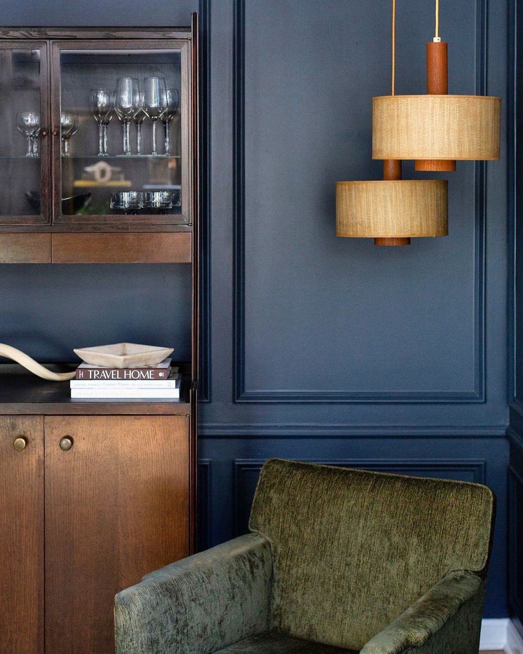
4. Sage Green
You might question whether blue and green go together in interior design, but it's a color combination designers love right now. Both colors can hold their own, but seeing as they are "next to each other on the color wheel and both seen represented in nature ... they are [a] very pleasing and acceptable pairing for our eyes," explains Alexandra Peck, owner and principal at Alexandra Peck Design.
In the case of this duo, "the blue-gray tones of sage green make it a soothing counterpart to navy," adds Livingetc global brand director Sarah Spiteri. "It can also help lighten a navy space without as stark a contrast as whites or creams. Deep greens in similarly cool, more desaturated tones can also work well with navy, particularly in patterning that may lean towards a more historical or traditional aesthetic."
This muted, green tone adds a soft, earthy wash of color. The quiet effect of Sage Green allows it to seamlessly blend with other shades.
5. White
As we know, white paint goes with, well, everything. So of course it's one of the colors that go with navy blue. Done right, the combination of these two shades creates a strong tonal juxtaposition between dark and light — potentially the perfect balance between something rich and deep and something lively and expansive.
But be careful, warns Kelly Neely of Kelly Neely Interiors: "This combo can go nautical" if not done properly, so "opt for an additional pop of color to balance that."
This soothing, creamy, white bring out the more natural enhancements that white paint colours add to a space. The warm, yellow undertones counteract the harsh, clinical feel some white paints can bring.
6. Ochre
Ochre is a mustardy color that can range anywhere from yellow to deep, burnt orange to brown — but for today, let's focus on that mustard tone. Both navy and ochre are jewel tones with a similar depth and richness, but they still "play strongly off of each other, offering a juxtaposition of cool and warmth," says Ksenya.
Alykhan of Aly Velji Designs also considers mustard to be one of the colors that go with navy blue. "A bold and charismatic pairing, navy and mustard provide high contrast while remaining effortlessly stylish," he tells Livingetc of decorating with yellow in this deep, rich shade. "The warmth of mustard offsets navy’s depth, creating a dynamic and sophisticated color story ideal for modern and eclectic spaces alike."
Ochre yellow shades add a warm pop of color without creating a harsh effect. The softness of this tone highlights the earthy characteristics of the color.
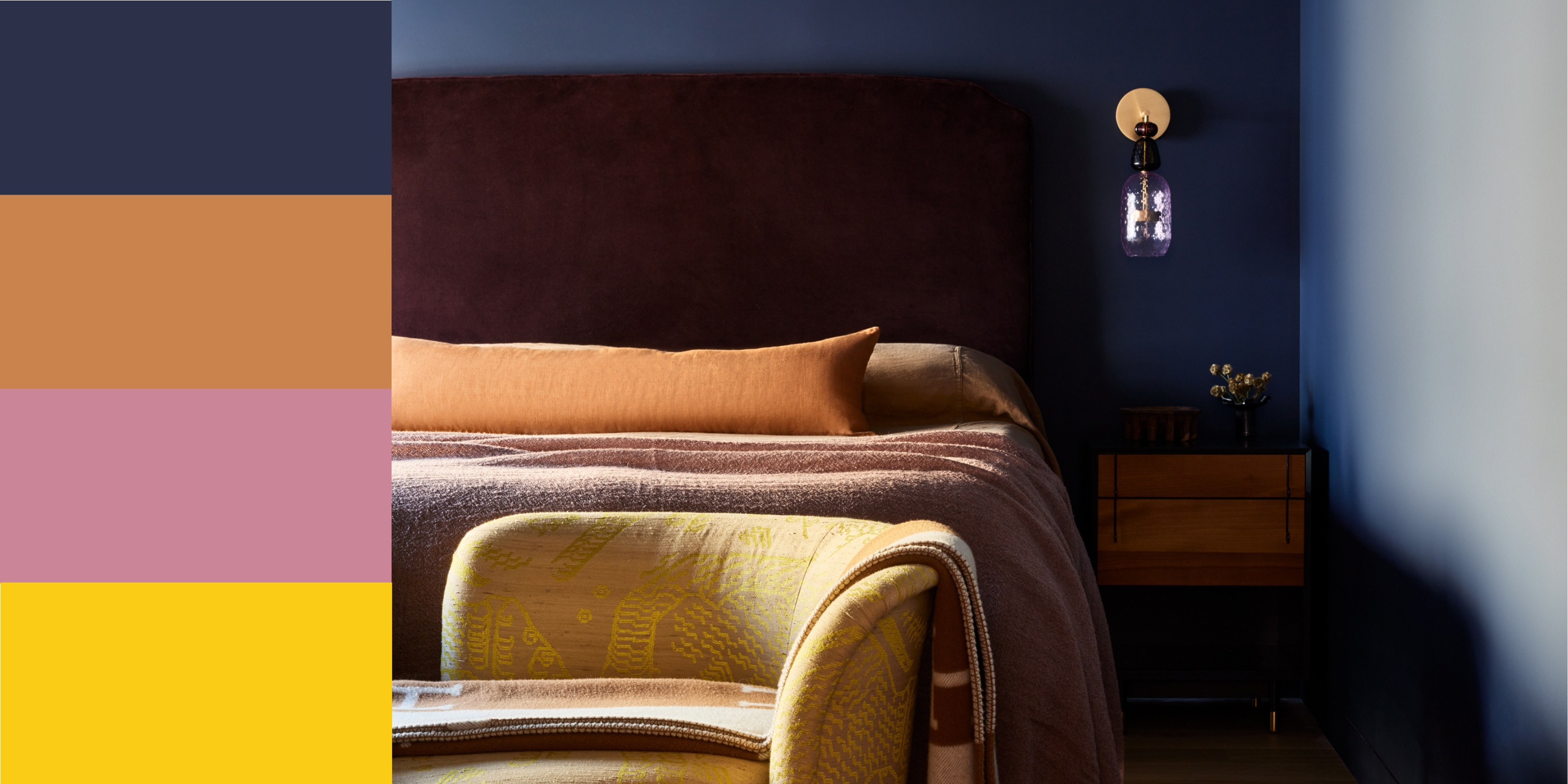
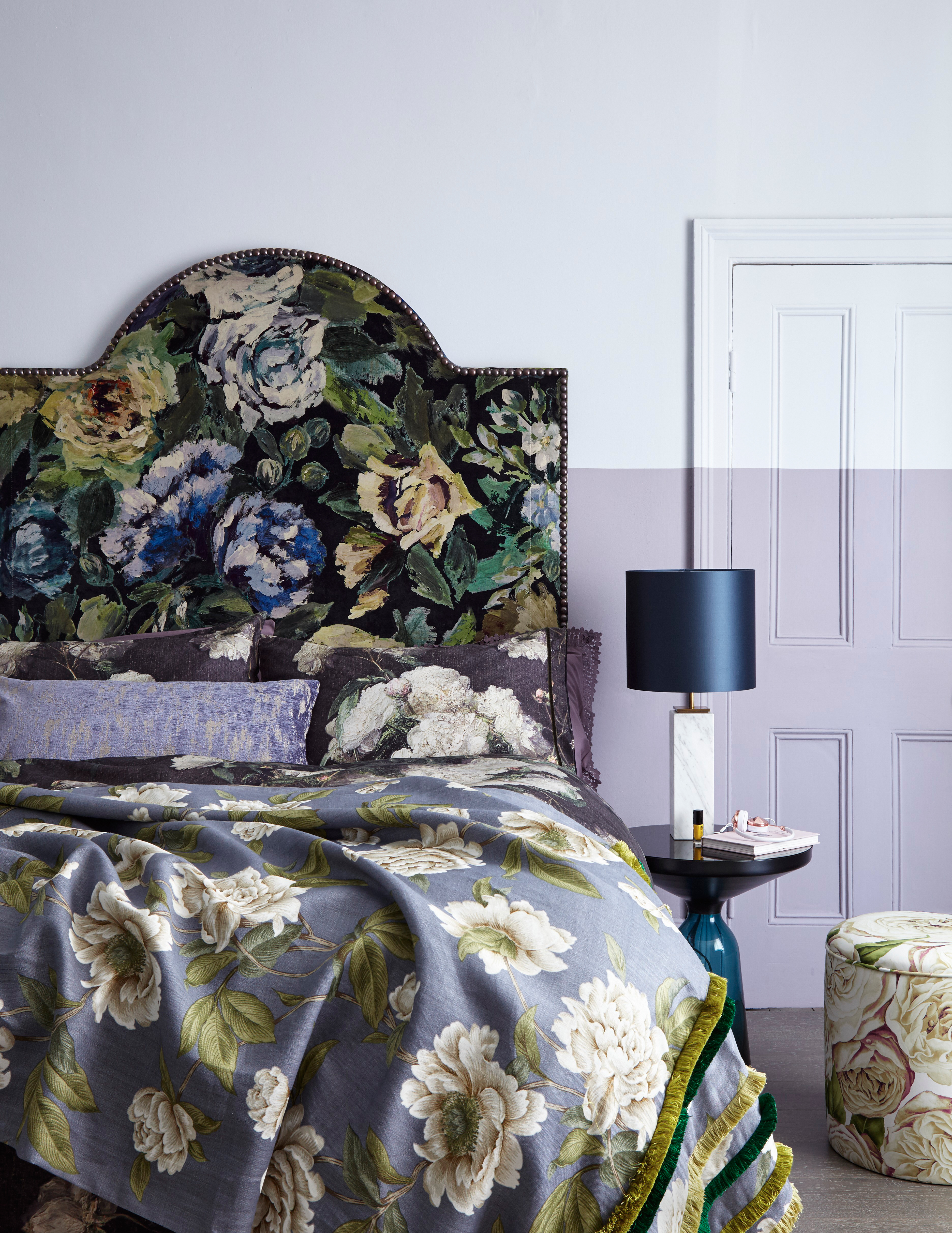
7. Purple
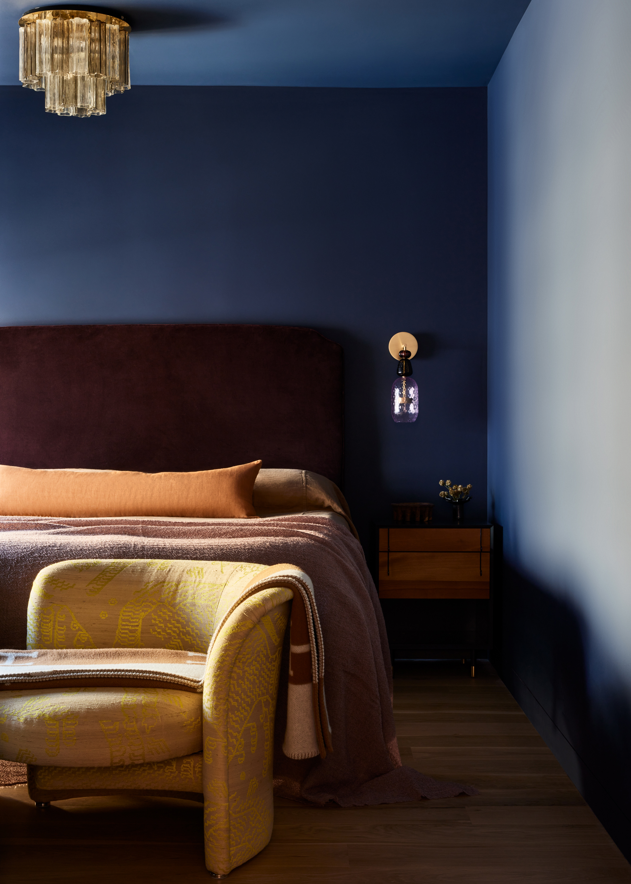
Believe it or not, navy blue is also a color that goes with purple — together, they strike the most soothing, comforting, and warm visual.
"Navy, being a deep and dark color, exudes a calming ambiance," says Kashi Shikunova, director at Yam Studios. "To maintain balance, I find it works particularly well with deep purple or lilac shade. Its pink undertones complement the navy perfectly by adding warmth. The lighter shade of lilac contributes to the overall sense of tranquillity, creating a harmonious combination that feels soothing."
In the case of the purple bedroom above, the color palette was "selected to elicit slumber and relaxation," explain designers Corey Kingston and Liza Curtiss, principals of Le Whit. "The dark blue of the walls allows the deep purple upholstered headboard, the blush-colored bedding, and the warm accents to co-exist without too much visual upset."
This purple has a subtle hint of gray, creating a softer shade and overall feel. The mid lilac tone elevates this purple shade, giving it an expensive quality.
8. Dark/Mauve Pink
We've already established that navy blue is a color that goes with pink, but we mentioned light pink, not a dark, mauvy pink. And you guessed it, navy blue also works with the latter, as well.
This combination was called out in particular by Ksenya, who says the "feminine but subtle mauve creates a smooth contrast against a masculine navy, while keeping saturation toned down."
The warm, richness of this deep, mauvy pink create and elegant feel to the space. Combined with the red undertones, this pink shade feels soft yet sophisticated.
9. Teal

Teal is another color that goes with navy blue. Paired together, they create a soothing tone-on-tone effect. With this, you can achieve the color-drenching look that is popular right now, while adding an extra hit of dimension with another shade of the color in question.
Both of these shades are considered "cool colors on the blue spectrum, but one is deep and serious while the other has levity and a surprise of saturation," Ksenya says. That's what makes it work.
For some added fun decorating with teal and navy blue, you can also add other more contrasting shades into the mix, as seen in the living space above, with primary hits of yellow, green, and red thrown in.
This full, teal color adds a rich splash of colour without being overpowering. The blue-green undertones balance together well, creating this beautiful shade.
10. Gray
Navy and gray as a pairing is not unlike navy and white in its composition, but it is a bit moodier and warmer than the former. Especially when paired with pops of color like red and yellow, decorating with gray and these accent colors makes for an excellent modern palette.
"Understated yet refined, navy and gray form a cool, tailored palette that is perfect for those who prefer a more restrained approach to color," Alykhan explains. "This combination offers versatility and a timeless elegance, making it a fail-safe choice for contemporary interiors."
This calming, light grey shade will complement any colour seamlessly. The subtle cool tones and quiet nature of the shade means it won't dull the space.
11. Yellow
While ochre/mustard yellow work well with navy, so does a traditional, sunshine yellow. As is the case with white, you must be careful this doesn't skew too nautical, unless of course, that is your intention. If not, blending in other shades and colors can help with this.
The resulting combination, however, is "playful and energetic," Alykhan explains, making for an excellent option for "children's spaces or eclectic interiors." Overall, navy is a color that goes with yellow that "strikes the right balance between boldness and approachability, infusing any room with personality."
This bright yellow shade provides a pop of colour without being harsh, thanks to the softer orange and yellow undertones. Daisy Chain adds a fun, modern feel to any interior.
12. Lavender
Lilac and lavender are very calming hues, and as such, need something darker to ground them and give them a less saccharine effect. But the good news is that plenty of colors go with lavender, including navy blue, which has the same cool undertones but stands to gain some softness from its pastel counterpart.
"I’ve always been lavender skeptical, perhaps because I’m insecure in my masculinity?" says designer Jonathan Adler. "Well, I’m insecure no more! Lavender is the pastel du jour and I am obsessed with it. It feels dreamy and floaty and surreal. And lavender plays well with others — navy, chocolate brown, taupe, and white."
This stunning pastel shade creates a soft and elegant wash of colour to any room. The lilac tone infuses the overall colour, creating a gentle effect.
FAQs
Should I Use Navy Blue With Lighter Colors?
The best part about navy blue is how versatile it is. As demonstrated above, there are plenty of colors that go with navy blue, it adds depth and dimension, and its dark color is great for disguising stains and marks in high-traffic areas. Still, though, there are some considerations to keep in mind.
"It's important to consider the space if you're looking to use navy blue as a paint color," Kelly Neely tells us. "If it's a small space or if you have lower ceilings, opt for the full room to be the same color — walls, trim, and ceiling. If you have taller ceilings or the room is larger, navy on the walls and a lighter color on the trim and ceiling works well."
If paint feels too permanent, however, take a page out of Chloe Judge's book, an interior designer at Mackenzie Collier Interiors who recommends incorporating navy blue using "textural elements and décor pieces."
What Colors Should I Avoid Pairing With Navy Blue?
Generally speaking, there are plenty of colors that go with navy blue — but there are still a few colors experts suggest you avoid in pairings. It's not that you can't blend navy blue with these shades, but you should just take extra care to ensure your design scheme isn't looking wonky if you do.
Take navy and red, for example. Done improperly, this can easily skew nautical or overly patriotic, Kelly explains. "Opt for an additional pop of color in these schemes" to avoid this.
Black is also a good one to steer clear of. "There’s something about the pairing that just looks 'off' because the hues are so similar," Ana Cvetkovic advises. "Instead of combining navy with black, use navy instead of black in spaces that need darker, grounding elements."
And finally, maybe avoid bright, bold neons or overly vibrant shades if you're working with a darker, richer shade like navy. A pairing like this tends to clash and feel "overwhelming," Barrett Oswald, principal designer at Barrett Oswald Designs adds. "We prefer pairing navy with white for a classic, crisp and timeless style, or with jewel tones for a richer and bold aesthetic."
Overall, consider decorating with navy the next time you reach for something as simple as white or gray — this versatile shade could deepen the feel of your room to create a payoff that's really special. And if you need more inspiration, our edit of navy bedroom ideas should certainly help (wink, wink).