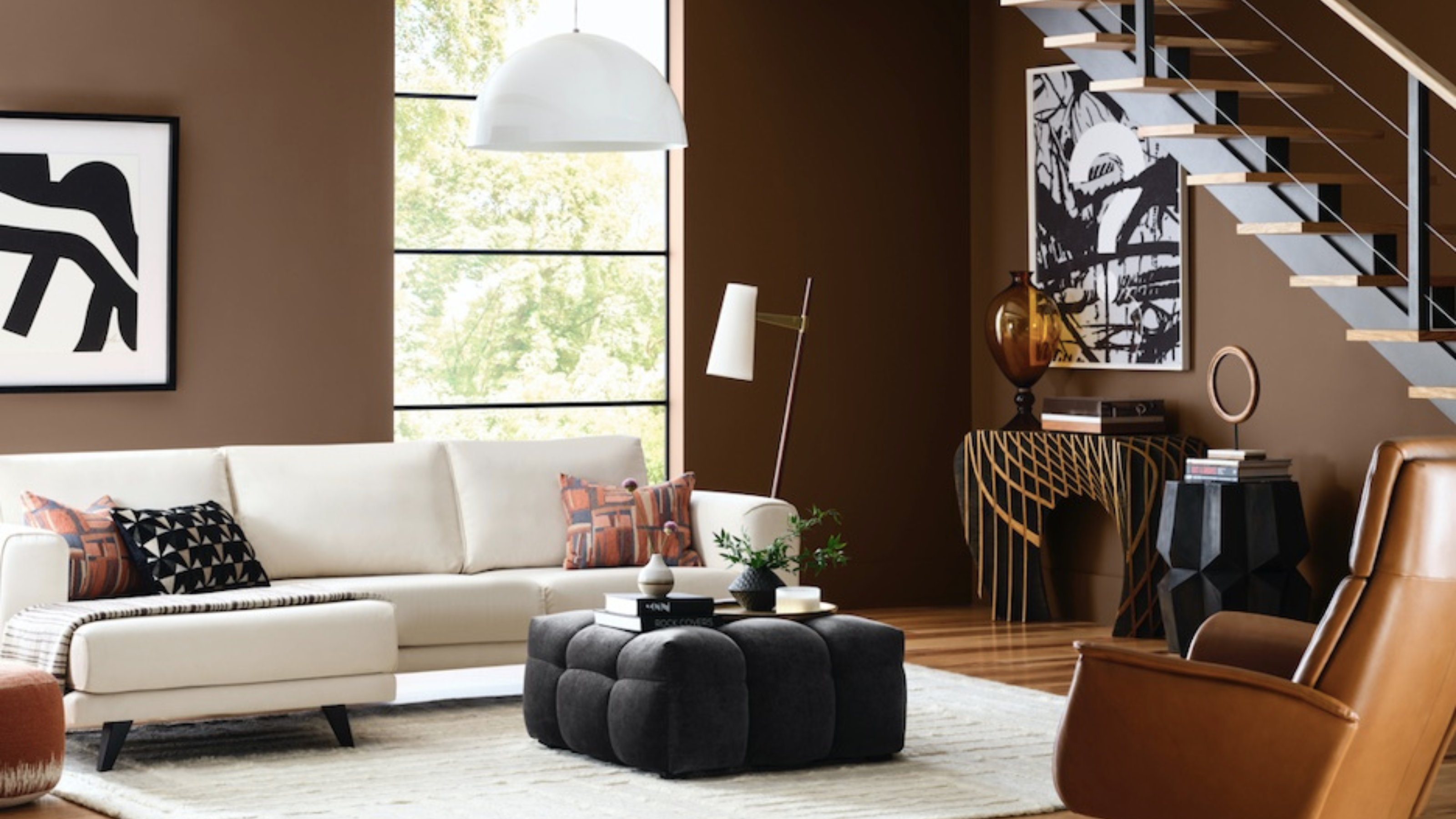
The end of the year brings a plethora of delights to look forward to. Of course, we’ve got Christmas and New Years, but there’s another occasion that gets design lovers buzzing with festive spirit; the announcement of Pantone's Color of the Year — one of the last predictions to be released. And like all good celebrations, the anticipation is arguably as exciting as the event itself. Picking your favorite, casting your bets... this is the interior design Super Bowl.
Interestingly, color trend forecasting as we know it can be traced back to World War I, when The Textile Color Card Association of America set out to predict which shades would be the most favored in the upcoming year, so as to ensure that the most popular fashions could be produced on home soil.
These days, almost every paint brand (and even some other unexpected players — hello, IKEA) like to get involved, casting their prediction for the color trends that will be everywhere for the year ahead. And though it can get confusing with so many different shades selected, it's worth paying attention, as it will likely have a huge influence on the way you decorate and design over the next 12 months.
To make it as easy as possible to follow, we've brought all of the Color of the Year announcements into one place, so you can see what shades should be on your radar right now.
What is Pantone's color of the year?
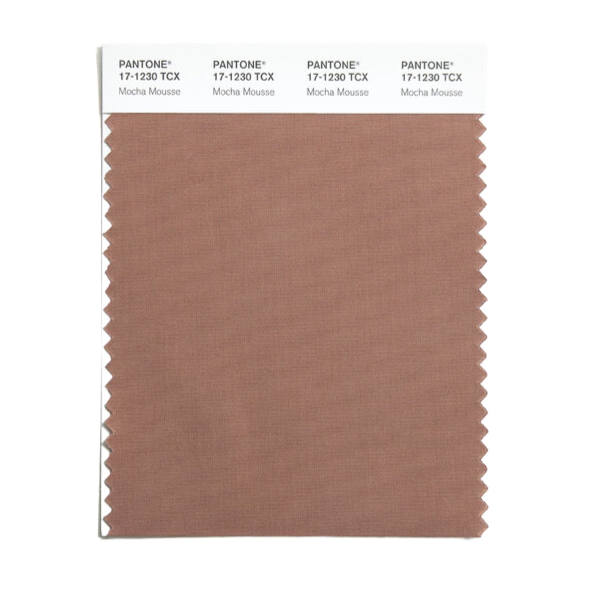
Each year, the brilliant minds at the Pantone Color Industry come together to collaboratively determine the shade they deem worthy of their coveted ‘color of the year’ title. No light decision, the Pantone team search far and wide to gather the evidence they’ll use to support their choice, considering social attitudes, emerging technological advances, political atmosphere and more. Interestingly, they don't look at what's currently popular, but rather select a shade that reflects what they feel the world needs.
This year's shade, 'Mocha Mousse', is a reflection of the overwhelming need for comfort felt across the globe. After a year tainted by conflict and political turmoil, a uniting desire for warmth, support, and solace has defined the overwhelming cultural attitude for the year. And what could be more comforting than a warm, rich chocolate dessert?
Both the shade itself and its accompanying name evoke the idea of comfort. A fluffy cloud of coffee and chocolate, an afternoon pick-me-up to bring a smile to your face. The shade embodies the idea of the "little treat", the essential desire for a sweet something to help soothe the soul after the unending chaos of everyday life.
Pantone's executive director Leatrice Eiseman explains how the decision was "underpinned by our desire for every day pleasures, PANTONE 17-1230 Mocha Mousse expresses a level of thoughtful indulgence. Sophisticated and lush, yet at the same time an unpretentious classic, PANTONE 17-1230 Mocha Mousse extends our perceptions of the browns from being humble and grounded to embrace aspirational and luxe."
Neutral, genderless and unpretentious, this is a color designed to be appreciated by all. We're predicting a lot more brown living room ideas on our moodboards this year.
1. Benjamin Moore — Cinnamon Slate
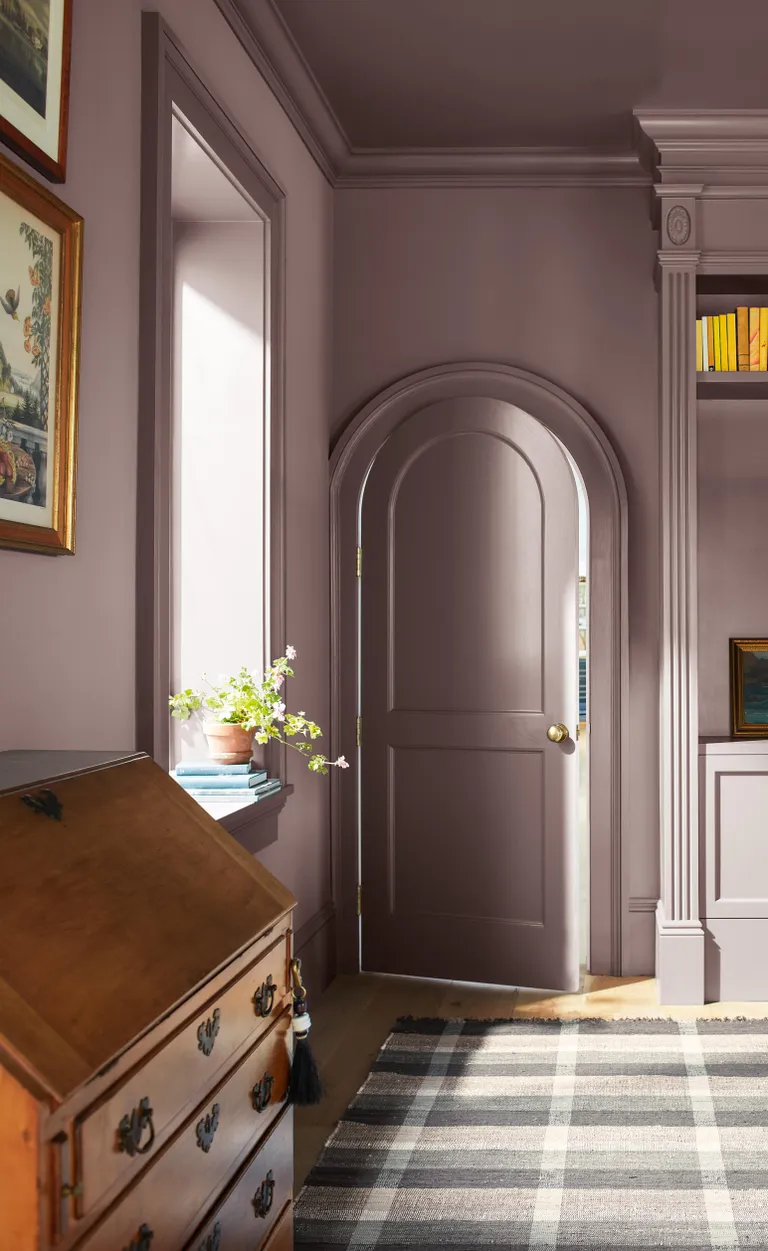
Sticking to the comforting, warm shades, Benjamin Moore selected the delightful 'Cinnamon Slate' as their color of the year. A delicate, plum-toned brown, this color introduces a sophisticated warmth to any room. While deeper in tone than Pantone's 'Mocha Mousse', this shade evokes similar feelings of relaxation and comfort.
Benjamin Moore color expert, Helen Shaw, shared "As we looked at the transition of trends over the past few years, the idea of quietly colorful hues came to the forefront." 'Cinnamon Slate' perfectly reflects this idea of the "quietly colorful", this muted purple tone straddles the line between neutral and daring.
Helen describes this shade as "a delicate mix of heathered plum and velvety brown. It is adaptable, yet distinct, it brings a soothing familiarity and balance to any design."
Alongside their color of the year, Benjamin Moore announced a tonal palette to accompany Cinnamon Slate, with a selection of 10 different complementary colors. The palette consists of a combination of warm neutrals and green-toned grays, making for an earthy and warm color story.
2. Sherwin Williams — Capsule Collection
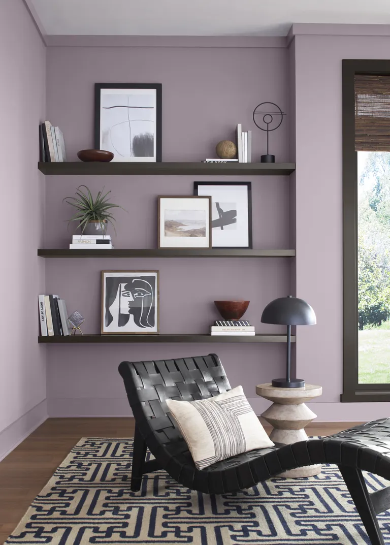
We are always on board for a ‘more-is-more’ attitude, so we were definitely not complaining when heritage paint brand Sherwin-Williams announced that they would be foregoing the ‘color of the year’ trend for an entire color palette instead. Unless you’re big on the monochromatic look, it's unlikely you’ll ever be decorating your whole home with only one color, which is why we love that Sherwin-Williams has provided us with nine different shades to work with.
"It shows the typical homeowner how a designer might coordinate trending colors and use them in a space," explains color director Sue Wadden.
Applying the same philosophy towards trends, but expanding the outlook has resulted in a helpful guide to the colors that will be dominating, and what shades they best pair with. This year's palette begins with a base of warm, neutral browns, punctuated by unexpected pops of color, like the zingy yellow shade Chartreuse (our favorite), or the powdery lilac Mauve Finery.
"These colors are reimagined timeless shades that we hope will push people to understand how to creatively style the core, trend-forward colors we have curated in this capsule," says Sue.
3. Glidden — Purple Basil

Purple, red, and brown tones are the biggest emerging theme of 2025, with Glidden announcing Purple Basil (PPG1046-7), a warm true purple, as its chosen shade for the year ahead.
In a year where lavender tones have been used as a grounding shade to pair with neutrals, it seems only right that our decorating habits would evolve to incorporate darker purples. But far from the delicate qualities of lilacs or lavender, this rich plum tone feels sophisticated and elegant, encouraging a bolder use of purple tones throughout the home. And with so many colors that go with purple, the opportunities for pairings are endless.
“So many people start their color selection journey looking at bold hues, but ultimately settle for a more expected or muted color,” says Ashley McCollum, PPG color expert at Glidden brand. “This year we are encouraging these ‘color chip daydreamers,’ as we call them, to put aside trepidation about what the neighbors will think or potential resale value. For 2025, purple isn’t just permitted, it is encouraged.”
4. Graham & Brown — Elderton
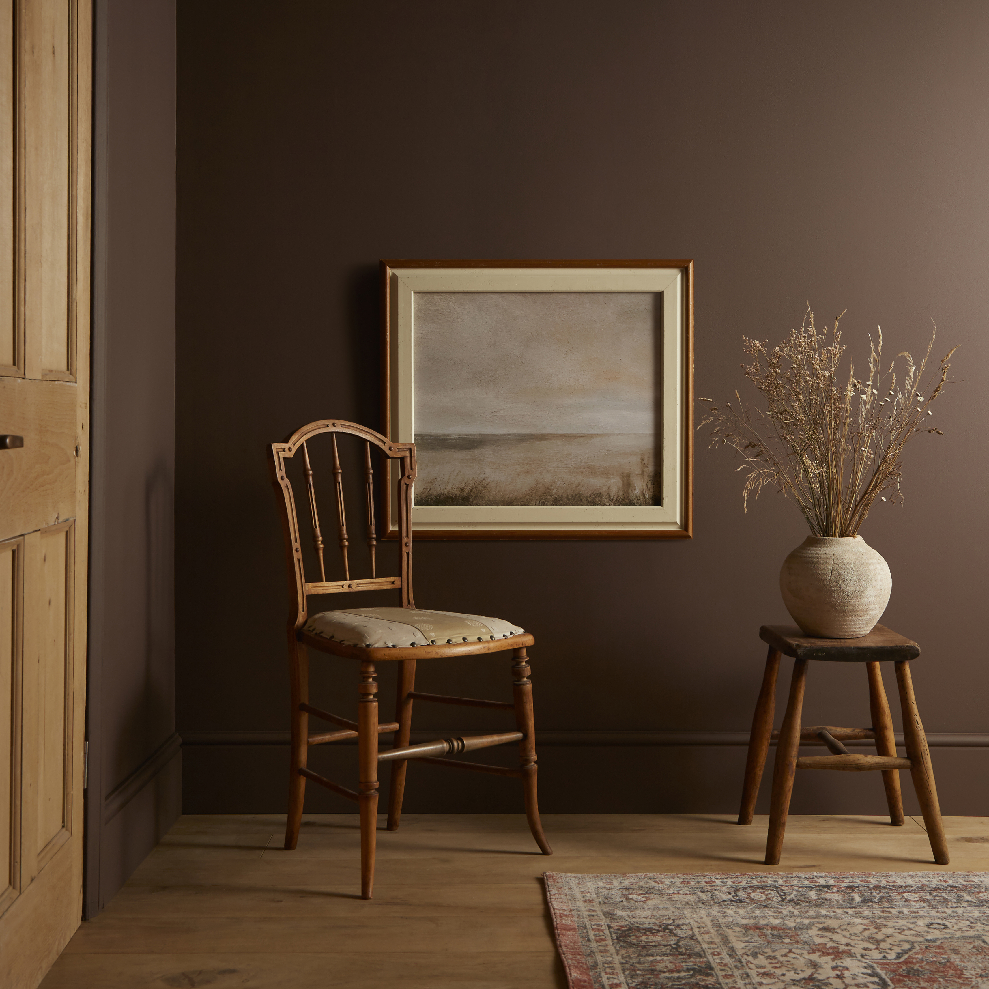
As always, Graham & Brown has announced their Color of the Year for 2025 alongside an annual wallpaper specially selected to complement the chosen shade. This year the color is Elderton, a rich true brown which joins a healthy assortment of other dark, moody hues announced already this year.
"Elderton is a chameleon color that can be sophisticated yet cozy depending on the mood of the space it's in," says Graham & Brown's Head Stylist and Trend Specialist, Paula Taylor. "The inviting and stable color creates a welcoming partnership between all of nature's shades, from sage to terracotta."
Whether you want to add drama to a contemporary space or honor a period property with this heritage shade, the versatility of Elderton is one of its biggest assets. It's also a shade that won't age, unlike the more saturated tones that have dominated this past year. This return to a reliable neutral for decorating in 2025 represents our need for stability, a feeling achieved through the use of earthy paint colors and timeless interior design.
5. Behr — Rumors
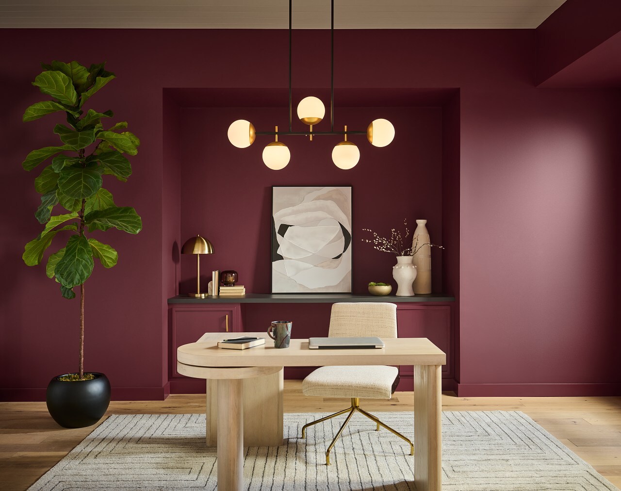
Behr is always ahead of the game when it comes to color trends. Historically, the brand has trodden its own path when it comes to color of the year announcements with shades that have veered from the more common themes. This year, however, Behr's color of the year 2025 cements deep reds as a popular choice among painting pros, and we're certainly happy about it.
Rumors is a deep and dynamic eggplant purple that oozes comfort and feels seriously sophisticated on walls. We're sure this regal shade will be a popular pick for decorating with jewel tones, and it looks especially elegant when used for color drenching. In a year that's been dominated by bold, head-turning colors (like the "unexpected red" trend) an equally eye-catching and saturated shade like this one feels so natural for 2025.
"We're seeing people embrace color like never before," explains Erika Woelfel, Vice President of Color and Creative Services at Behr Paint Company. "Rumors is a modern take on the timeless red that creates an energetic appeal to make a lasting statement in a stunning way."
6. Valspar — Encore
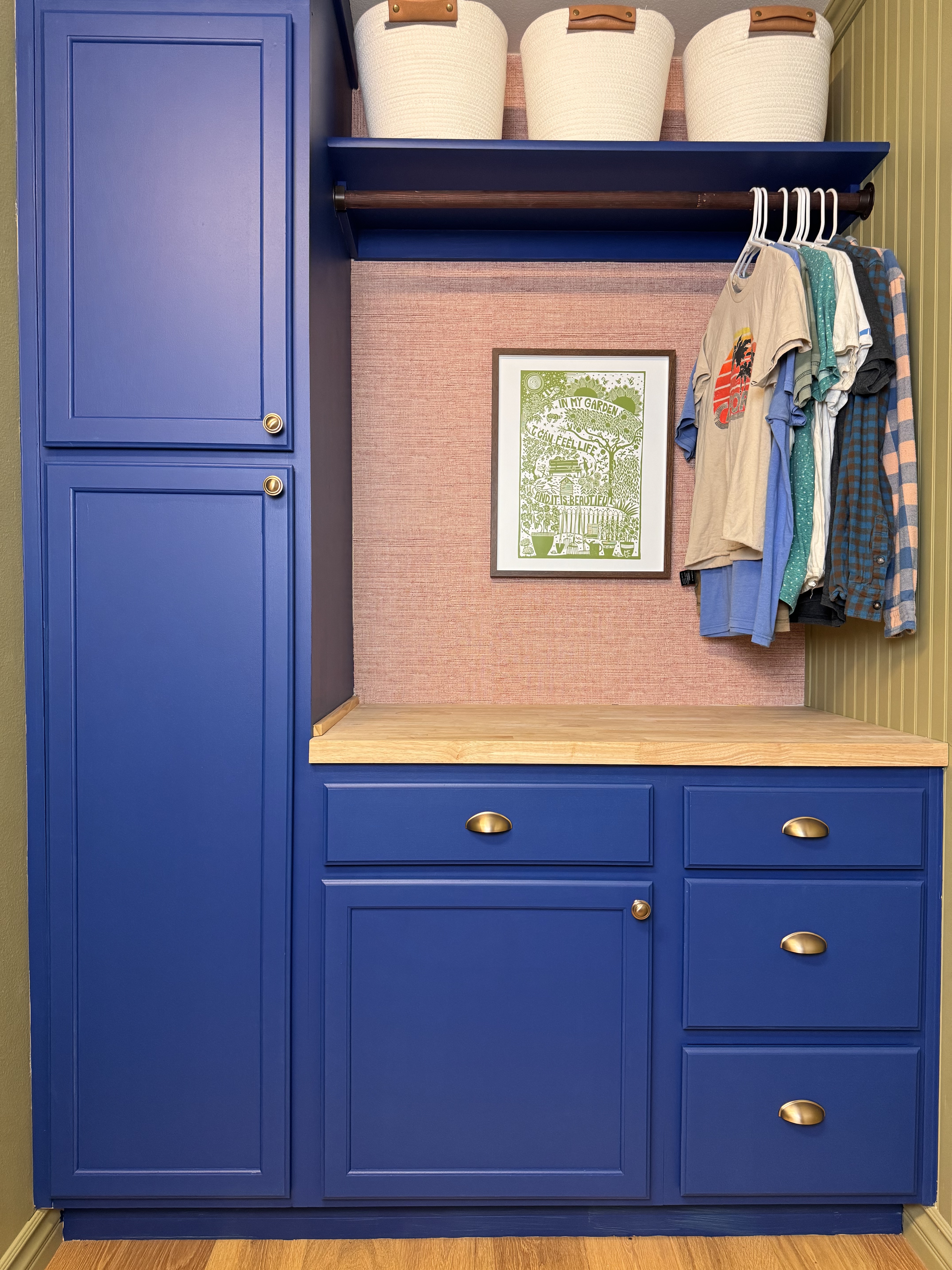
Speaking of bold color, saturated color, Valspar's color of the year for 2025 embodies just that. Announced last month, Encore 8002-45G is a punchy primary blue that's deep, inviting, and energetic.
This choice is hardly surprising considering the current decorating climate. Blues have dominated our paint ideas this past 12 months (Vaslpar even named Renew Blue their color of the year for 2024) and with trends like bold trim proving so popular lately, pops of surprising, saturated color are on everyone's radar.
Despite its boldness, it's easier to integrate this shade into your home than you might think. "Encore is a color for any space or application," says Sue Kim, director of color marketing at Valspar. "It's an ideal backdrop to ground a room, leaving space for spirited pops of complementary colors."
7. Dutch Boy — Mapped Blue
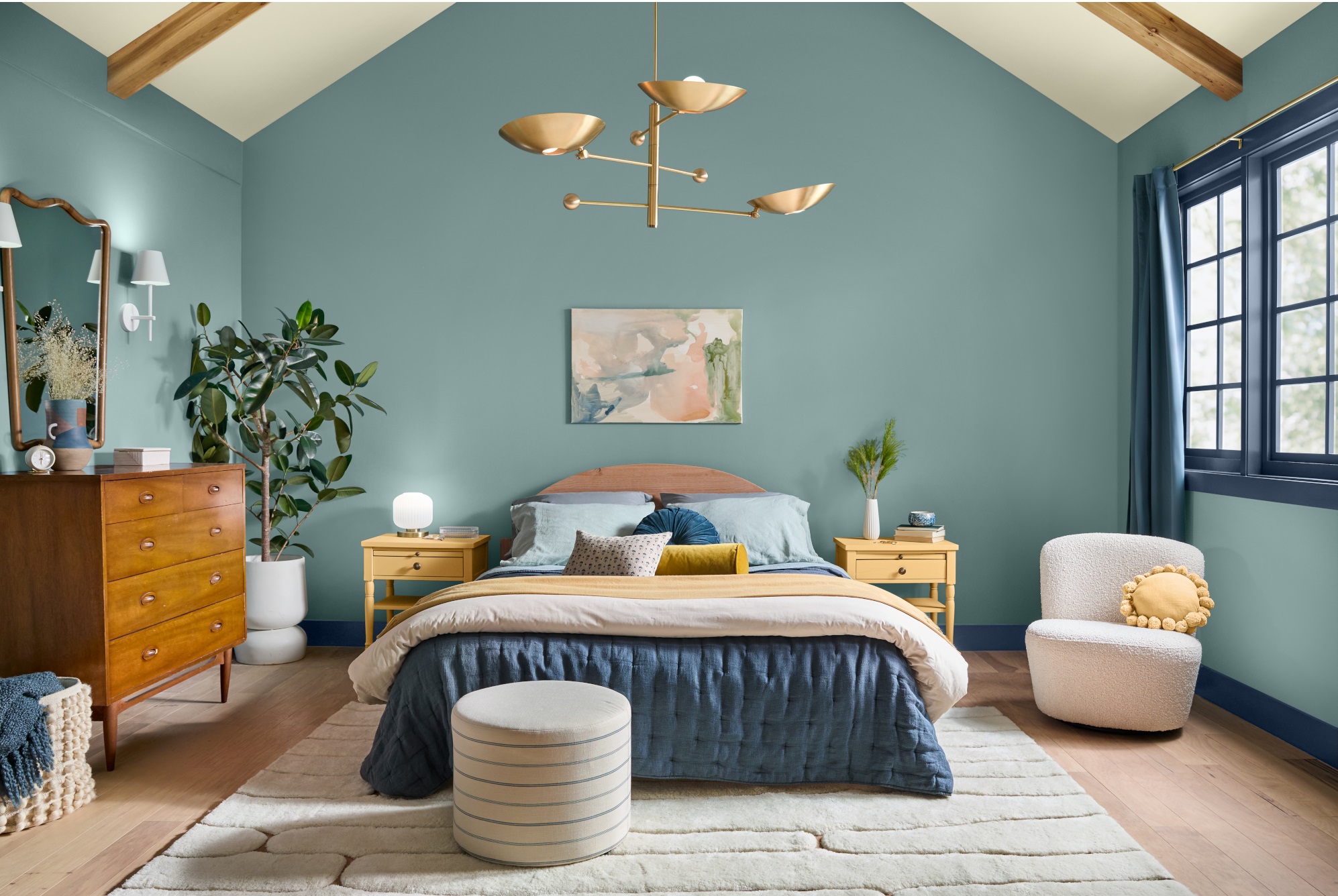
Promoting wellness was key to Dutch Boy's color plans for the year ahead. Following on from this year's key trends, they recently announced Mapped Blue - a calming and serene mid blue - as their color of the year for 2025. Subtle yellow undertones give this shade a dependable foundation and an uplifting feel meaning this versatile shade works virtually anywhere in the home.
“Our 2025 Color of the Year, Mapped Blue, is more than just a trend: it’s a reflection of changing consumer values,” stated Lisbeth Parada, Color Marketing Manager for Dutch Boy Paints. “We’re seeing a significant shift, particularly among Millennials and Gen Zs, toward products that offer durability, functionality and timeless aesthetics. Mapped Blue answers this call, providing a classic yet modern charm that can adapt to various design styles and stand the test of time.” This is sure to become a light blue paint color that designers love.
8. HGTV Home by Sherwin-Williams — Quietude
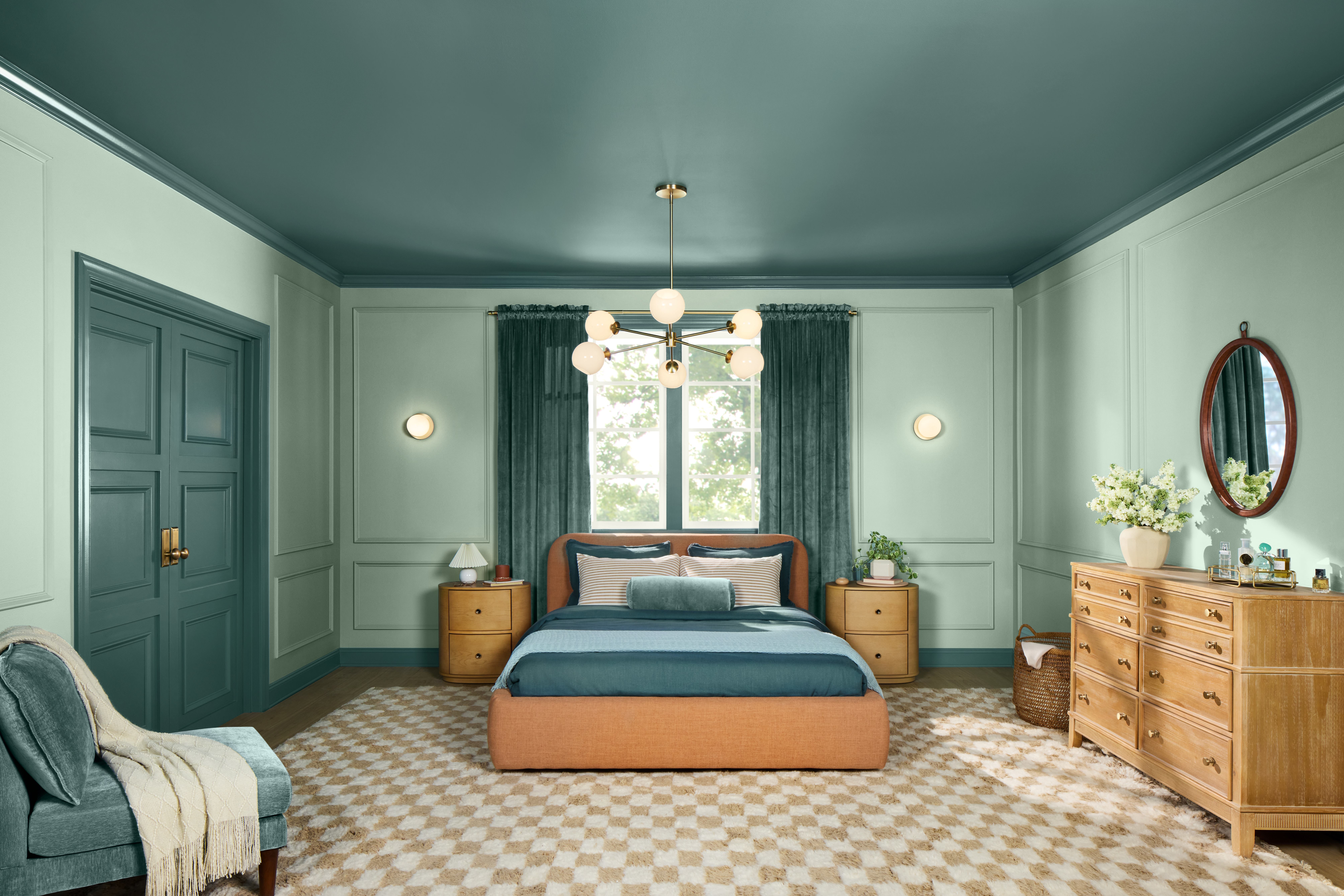
Blues and greens have dominated recent trends, and Quietude by HGTV Home by Sherwin-Williams combines them both. Defined as "a soft sage with a whisper of blue influence" by Ashley Banbury, Color Marketing Manager at HGTV Home by Sherwin-Williams, it's a light and airy color that we're sure to be seeing a lot more of next year.
"A lot of individuals are wanting to slow down and have a space in their home where they can disengage from social media or work, and relax their mind," says Ashley. "I think there's also a shift happening that leans more towards those watery blues and greens, rather than gray neutrals."
The best light blue paints mimic natural elements like ocean waves, and the bright yet subdued hue of Quietude embodies that serenity. Try it in a bedroom or a bathroom for a truly relaxing feel.
9. Minwax — Violet
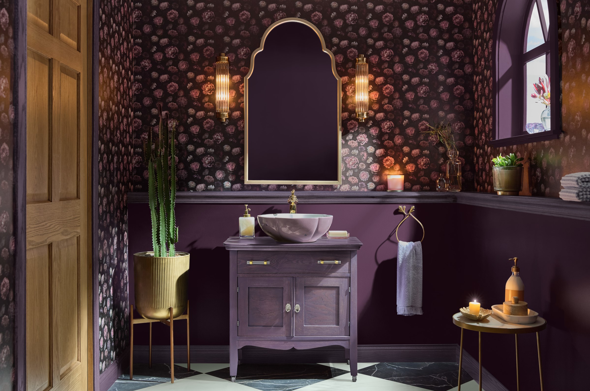
Minwax is the leading brand of wood stains and its color of the year for 2025 signals a bold new era of home design where self-expression takes center stage. As the name suggests, Violet is a true purple that feels regal and elegant and makes it easy to decorate with color on any surface. Inspired by cultural movements like cafécore and the rise of book communities, it infuses spaces with an old-timey feel that's cozy and sophisticated.
"Deeper, more saturated colors can serve as compelling alternatives to timeless shades,” explains Lisbeth Parada, Minwax's Color & Design Lead. “Violet, when paired with natural wood tones, creates a striking contrast that feels both classic and contemporary. From subtle color accents to bold statements with color drenching, this versatile shade offers homeowners countless ways to infuse depth and character into any space.”
10. C2 — Raku
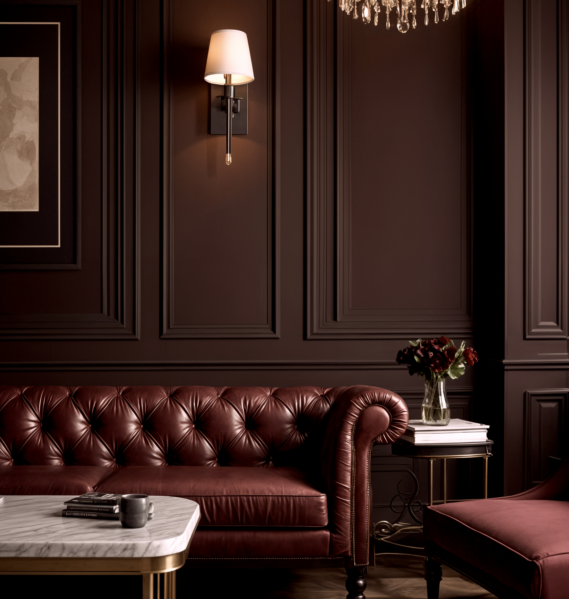
If you prefer a more earthy, neutral tone, C2's color of the year is a rich mahogany that's versatile and grounding. By definition, Raku is a brownish red, but C2's Paint Color and Design Specialist says it has a "chameleon-like quality", meaning it picks up the tones of the surrounding colors and materials depending on your room's lighting. This makes it easy to create a color palette around the shade, opening opportunities for so many versatile uses around the home.
"C2 Raku encourages you to create balance but in a sophisticated way, and create spaces where you can unwind from the fast pace of life and technology, pause, take a breath, and reflect," says Philippa Radon at C2. "Rooted in the concept of Yin and Yang, Raku harmonizes tradition with contemporary style. It becomes the connection between the emotional and the experiential, providing a way to embrace balance and enjoy life’s more meaningful moments - the ones that nurture our souls in order to meet our days with strength and positivity."
