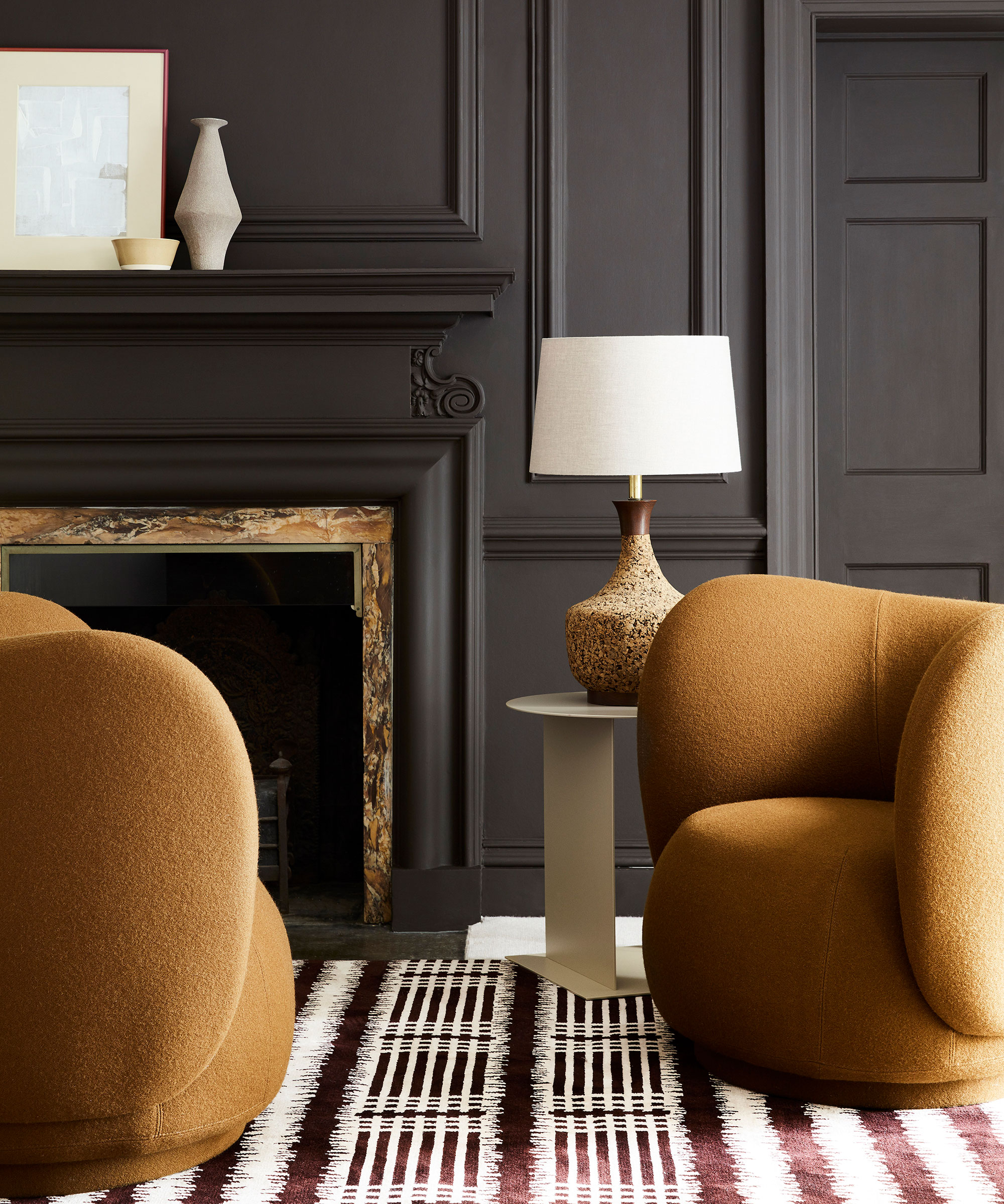
Amongst all the chatter and buzz about 'quiet luxury' and decorating with beige, there is another subtle yet alluring color that is slowly easing into our color consciousness – ochre.
A highly-pigmented yellow, ochre will add depth to a neutral scheme and drama to a darker one. It is time to invite this earthy amber in, just as celebrity interior designer Jake Arnold has done in John Legend and Chrissy Teigen's Beverly Hills property.
With the rise of Gen Z yellow as a color of choice for statement accessories and oh-so-now soft furnishings, it was only a matter of time before we turned out attention to using a variant of this most vibrant of hues to decorate our homes, alongside popular beige, sand, and taupe colors.
Mood-lifting and warm, ochre brings energy, confidence, and optimism to an otherwise predominantly beige space. It can be used anywhere in the home but is particularly effective in busy spaces, such as living rooms and kitchens, or north-facing rooms that lack light. Read on to find out more about this versatile hue.
Take a look beyond ochre's outdated color connotations and you discover that, actually, it has a decorative history that stretches way, way back. 'It is a natural pigment, dug directly from the ground and present in every culture and civilization,' explains Annie Sloan, color and paint expert. 'Ochre is the older of orange pigments,' agrees Dominic Myland, CEO of Mylands.
‘To decorate with yellow or ochre, you need to think of it as the “neutral” in the scheme; as a foil to set off other colors, not to overpower everything else,' says Susan Deliss, textile designer and interior decorator. 'Avoid anything that says canary or banana and go for something that sets off the architecture or warms up a cooler space.’
In Chrissy Teigen and John Legend's home, above, designer Jake Arnold, who has a penchant for decorating with subtle, earthy tones, used ochre to add a jewel-like burst of energy to the dining area in this open-plan living room.
In a conversation with Architectural Digest, Jake Arnold admits that 'his clients spurred him to expand his aesthetic lexicon into somewhat unfamiliar territory.' The use of ochre fulfills their vision, while also playing into Arnold's more familiar design sensibilities.

If decorating with ochre, either as a whole house color scheme or on large-scale furniture is too daunting for you, why not try decorating with this jewel-like hue in smaller doses?
‘Ochre is a great accent color for those that are less bold – use it as piping, fringing on cushions and through your pictures.' says Emma Deterding, founder, of Kelling Designs. 'It always looks great with beige, browns, and grays, giving them a real pop. Put a yellow into a stack of anything from plates to cushions and it will give it all a lift. A pop of ochre will always cheer up any scheme.’


