Boring brand manuals and design libraries are a dime a dozen, but every so often we come across a brand style guide that looks a million bucks. And Cash App's new brand design portal is on the money.
The Dropbox brand website set the standard high recently. Now Digital wallet provider Cash App has risen to the challenge with an engagingly dynamic presentation of its brand assets and guidelines that puts staid style guides to shame.
Cash App's been responsible for some inelegant branding in the past. The rebrand of the Visa Cash App RB Formula One Team was hard to swallow. But its new brand guidelines websiteis a delight. Really. Rarely have I seen a brand portal that's actually fun to read and explore.
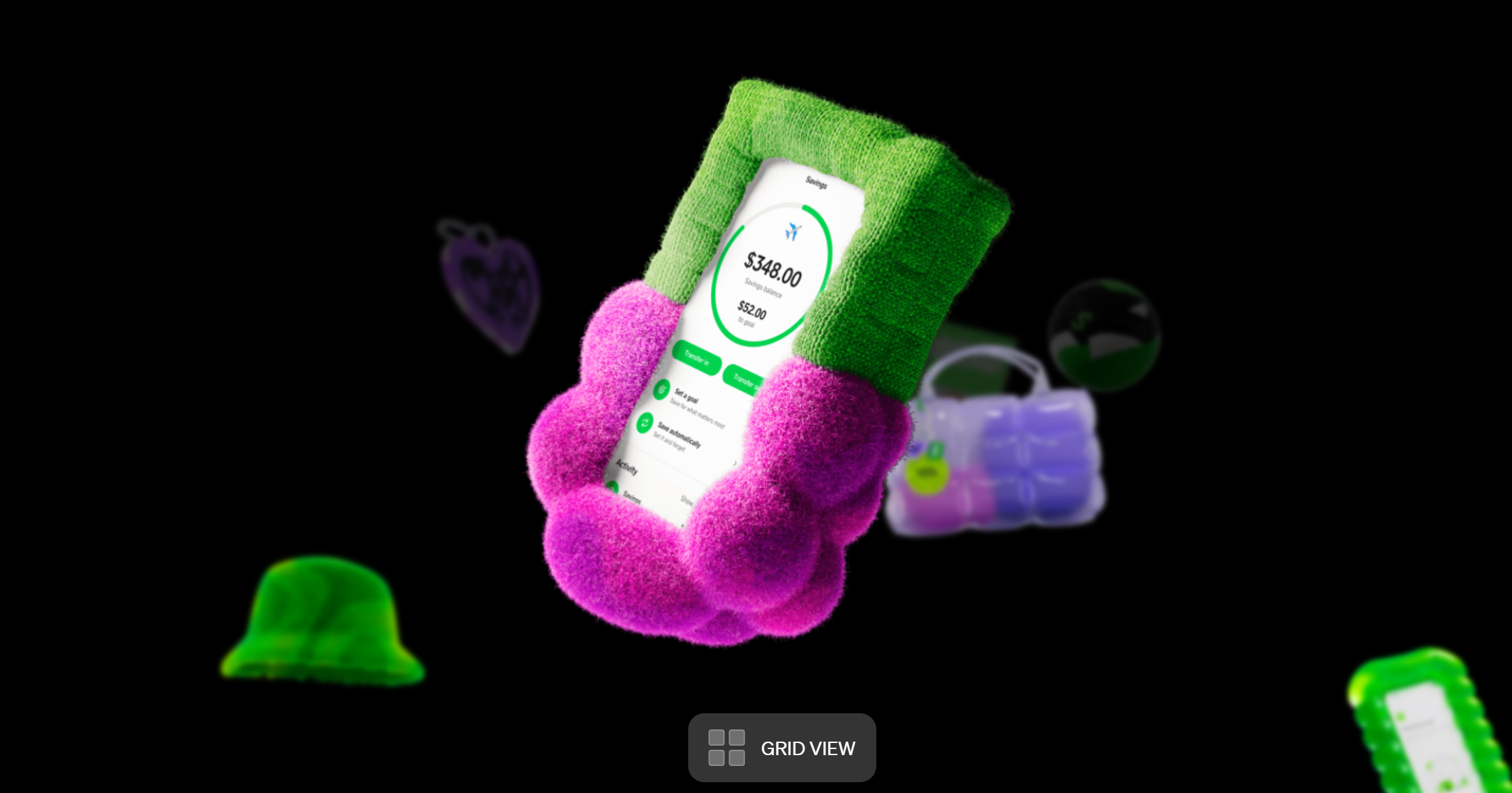
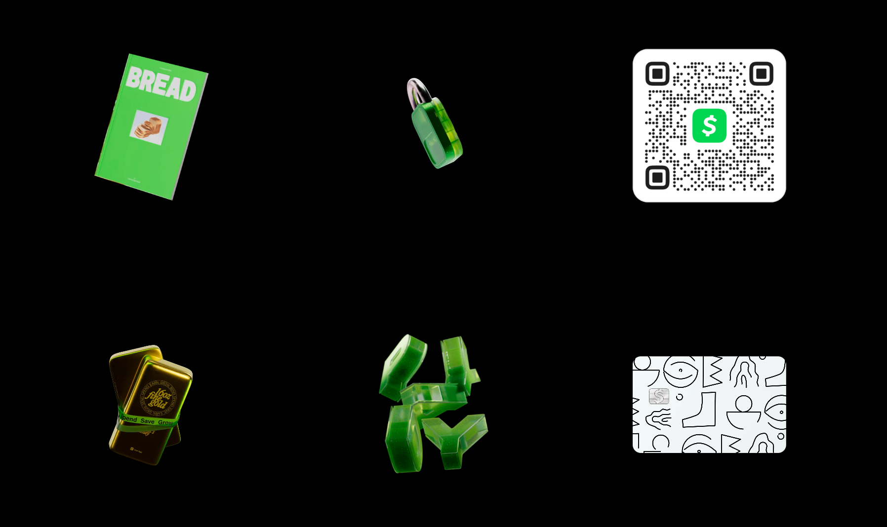
As you'd expect, the sites sets out all the information designers and partners need in terms of logos, color palettes, typography, illustration style and even motion principles. The specifications are as precise as they need to be but they're presented in an engaging way, and designer are left a lot of room to... well, design.
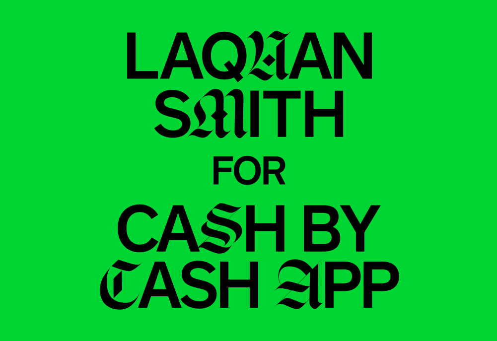
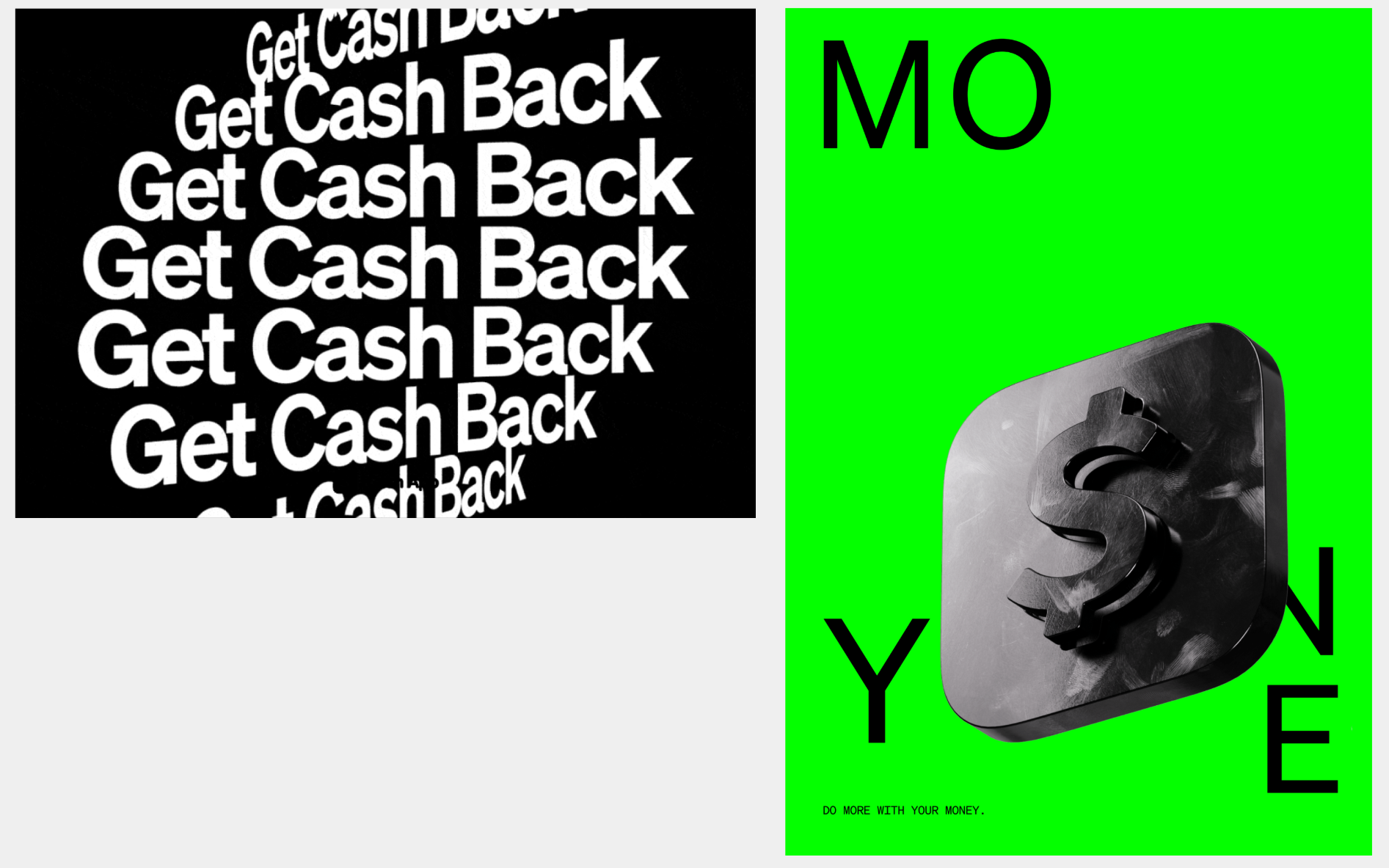
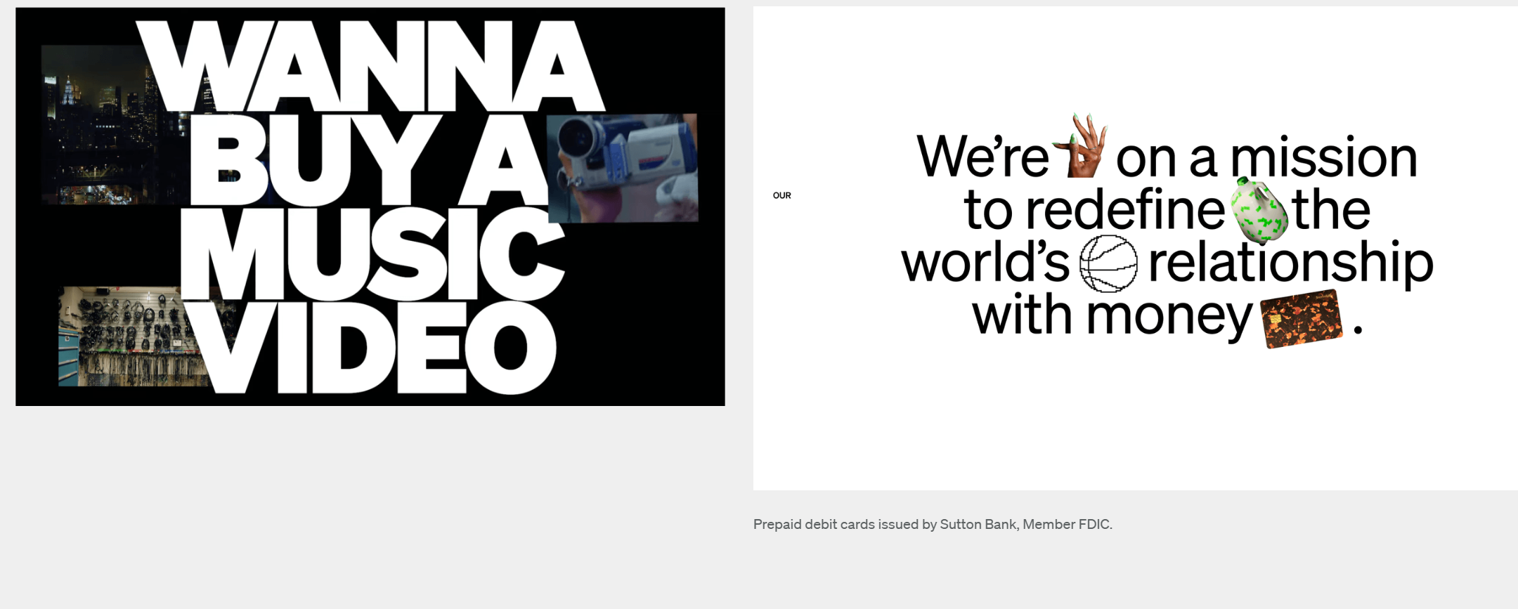
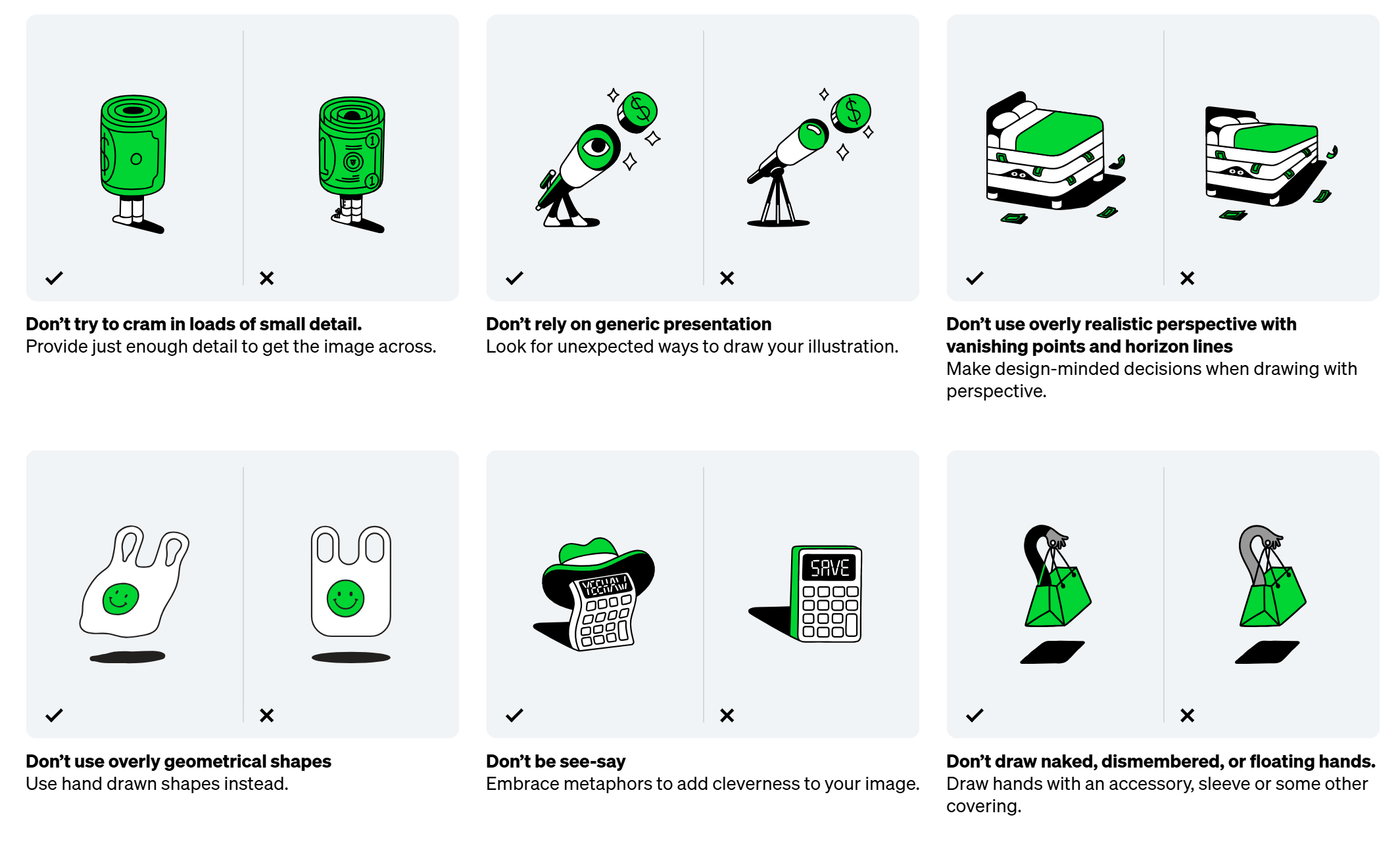
Cash App is accompanying the recent trend for brands to break the rules a little. It allows some freedom in the application of its typeface Cash Sans and even encourages experimentation and novelty. Illustration features prominently in the portal’s guidelines, with so many 2D and 3D icons that they look like collectible assets in a video game. Designers are encouraged to create icons that use metaphor and charm rather than literal representations.
Excited to unveil my latest project with @indexstd & Cash App 🔥➡️ https://t.co/tf1zttNTjrI had the opportunity to develop 6 custom, draggable and scrollable navigation systems to showcase Cash App's visual assets and an infinite grid with physics-based interactions 🥵 pic.twitter.com/cQM5cmAEn0February 25, 2025
Motion design is also an important element of the brand identity. The portal uses motion a lot itself, allowing the user to explore icons by zooming in and out of a grid where they float and turn. The guidelines note that the brand's motion style blends “bold confidence” with “playful levity". Presumably aiming at the latter, it appears that the brand has buried a very retro icon in there as an Easter Egg.
I found the easter egg 😆 pic.twitter.com/HTzkQBnVK4February 26, 2025
For more branding news, don't miss the debate about the new Facebook Messenger logo (or rather the old logo).


.jpg?w=600)
