When it comes to trends for kitchen cabinetry, we're seeing designers take these elements in one of two directions. One the one side of the coin, cabinets are becoming more discreet, disguised into a space in a way that makes the functional nature of your kitchen hidden from view - creating more minimalist kitchen spaces. On the other hand, cabinetry has become more decorative, with so many more choices now available than your basic slab or Shaker style door.
While these modern kitchen ideas may seem at odds to each other, they both achieve the same end goal - they make these kitchens look and feel expensive. If you're looking to elevate kitchen cabinets when planning a remodel, this is what interior designers say you should do.
1. Consider "invisible" kitchen storage

If you're remodeling a kitchen and are wondering how to make the space look always clean, neat and organized, a great way to do so is with concealed storage, that has a seamless exterior. By blending all the cabinets together in a single material, you can make the room look elevated and sophisticated.
'In all kitchen designs our number 1 focus is beauty and storage, and this kitchen holds both,' say Veronica Martin and Carrie Stinson, founders of Two Fold Interiors. 'This kitchen was designed as a quiet backdrop for the main family room with a place for everything behind closed doors. The cabinets conceal multiple working zones for kitchen prep, storage, and a concealed bar. Then in the evening when all is quiet in the house, the doors are closed, and it becomes a beautiful full height wall of white oak panels.'
2. Opt for multiple islands

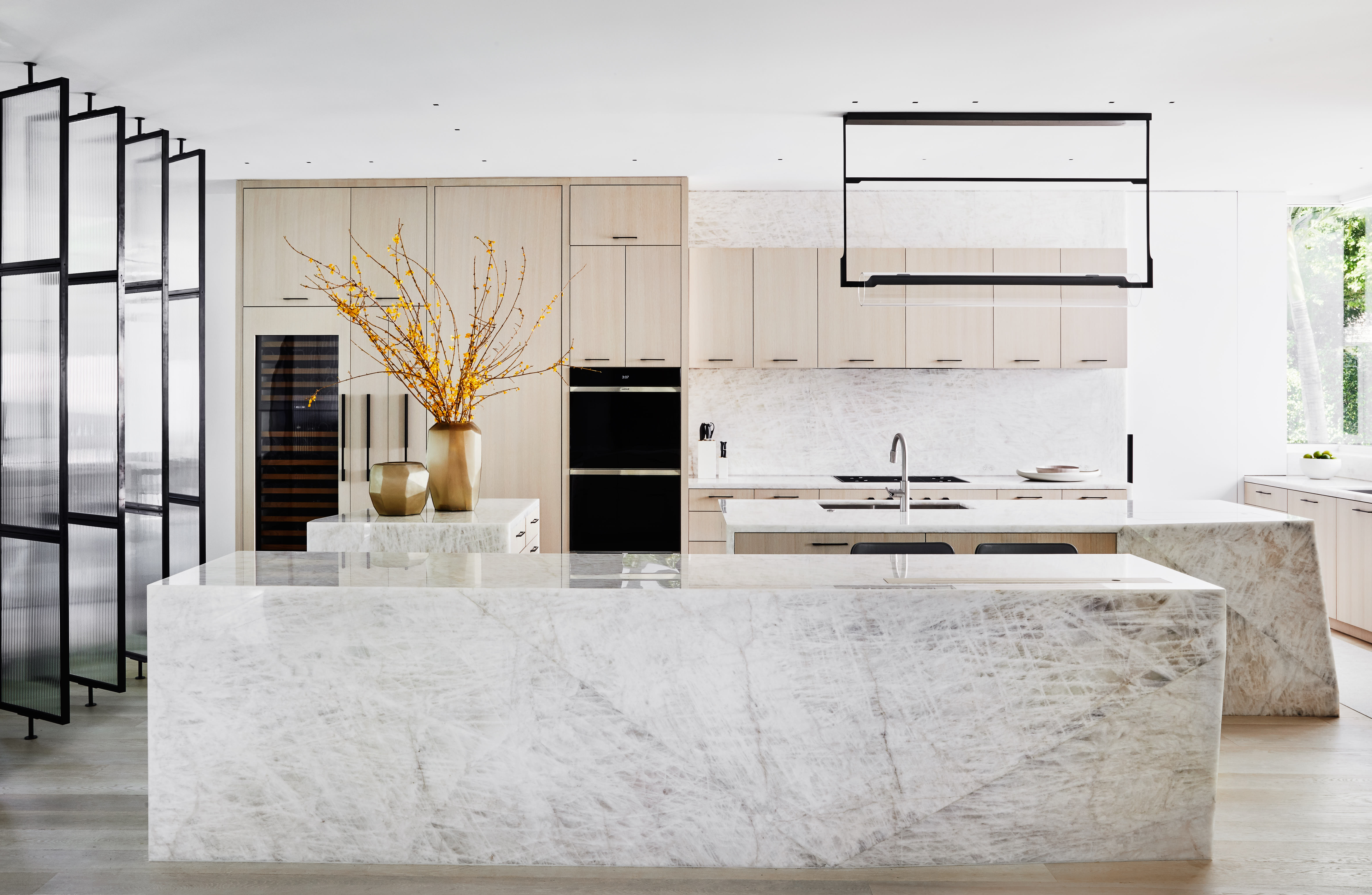
Not only do kitchen islands create a centerpiece for your space, and offer extra prepping, chopping, or cooking space, but they also offer more storage opportunities. If you have a large enough kitchen, consider multiple islands that will give the room a grand look, and allow you to store several supplies and miscellaneous things inside them.
'In this project, storage solutions were developed hand in hand for how the client both cooks and entertains in their home,' says Zachary Helmers, associate principal at Workshop APD. 'The configuration of the multiple islands includes multiple zones with each island having its unique primary function. The island with the sink is conceived as a standard chef’s kitchen, providing a large sink and access to cooking utensils, pots & pans, and spices. The smaller island acts as a repository for groceries when coming into the kitchen while also storing the silverware and plates. Last, the island in the foreground is purely meant for entertaining. It conceals a wine/beverage fridge, icemaker, bar tools, and liquor storage, with support of an integrated ice trough for drinks in the island behind.'
Do remember, if you are choosing multiple islands, consider a unified material for all of them. Marble or textured wood can look smart, giving the room an expensive flair.
3. Choose the right finish

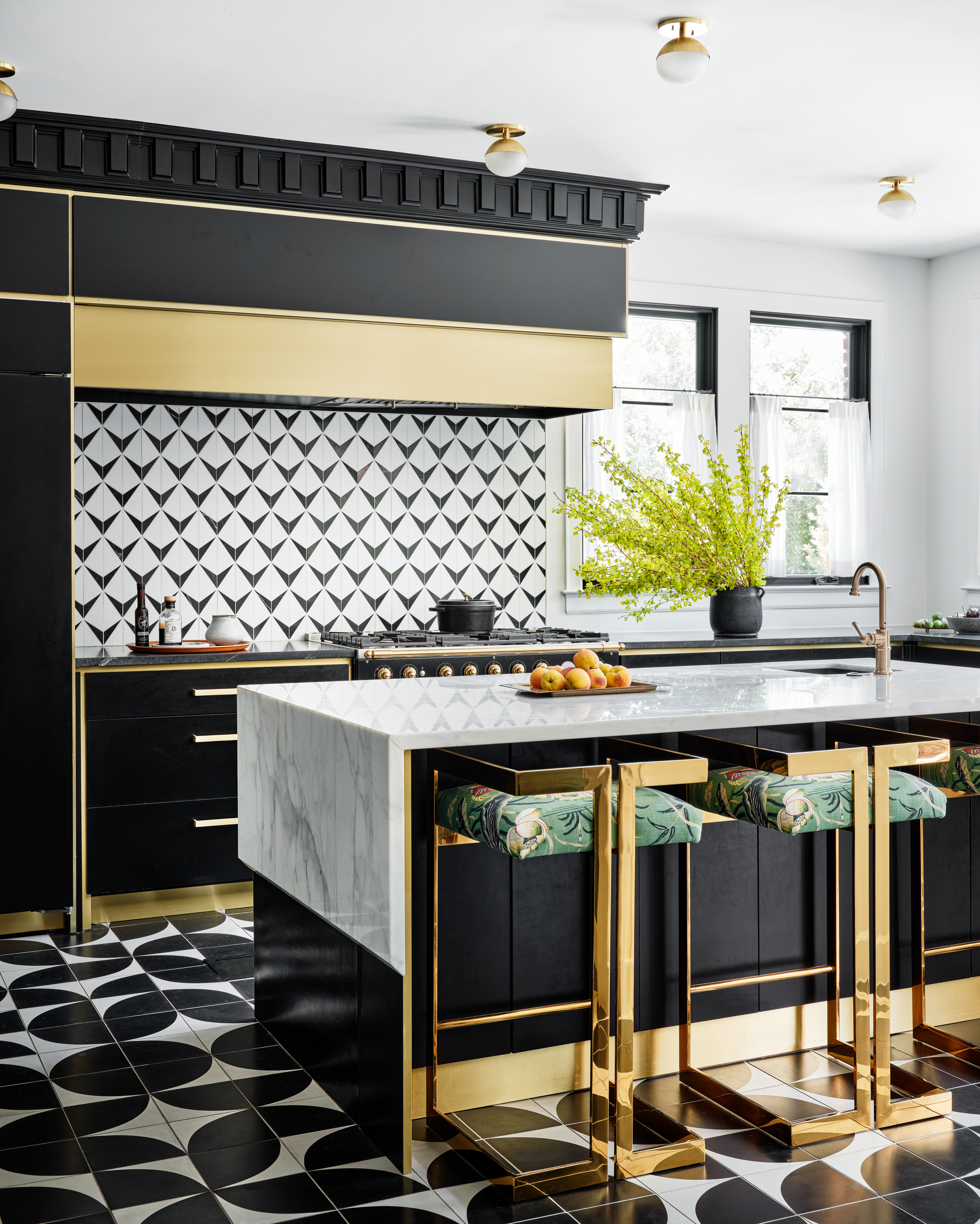
'Creating that wow factor in a kitchen is all about the materials you use and the finishes,' says Katie Paulsen, interior designer at Maestri Studio. 'Are you using matte or glossy for your paint sheens and your metal finishes? Are you utilizing honed or polished textures with your countertops and tiles?'
'The cabinets in this kitchen are lacquered in the paint color 6989 Domino from Sherwin Williams,' Katie adds. 'It has a flattening additive in the paint finish to give a matte sheen that will never be marked up, making it perfect for drawers that will constantly be handled. Black and white color combinations are of the utmost classic color duos, and we choose to accent them with gold for a bold, luxe look that elevates the space.'
4. Go for backlit cabinets

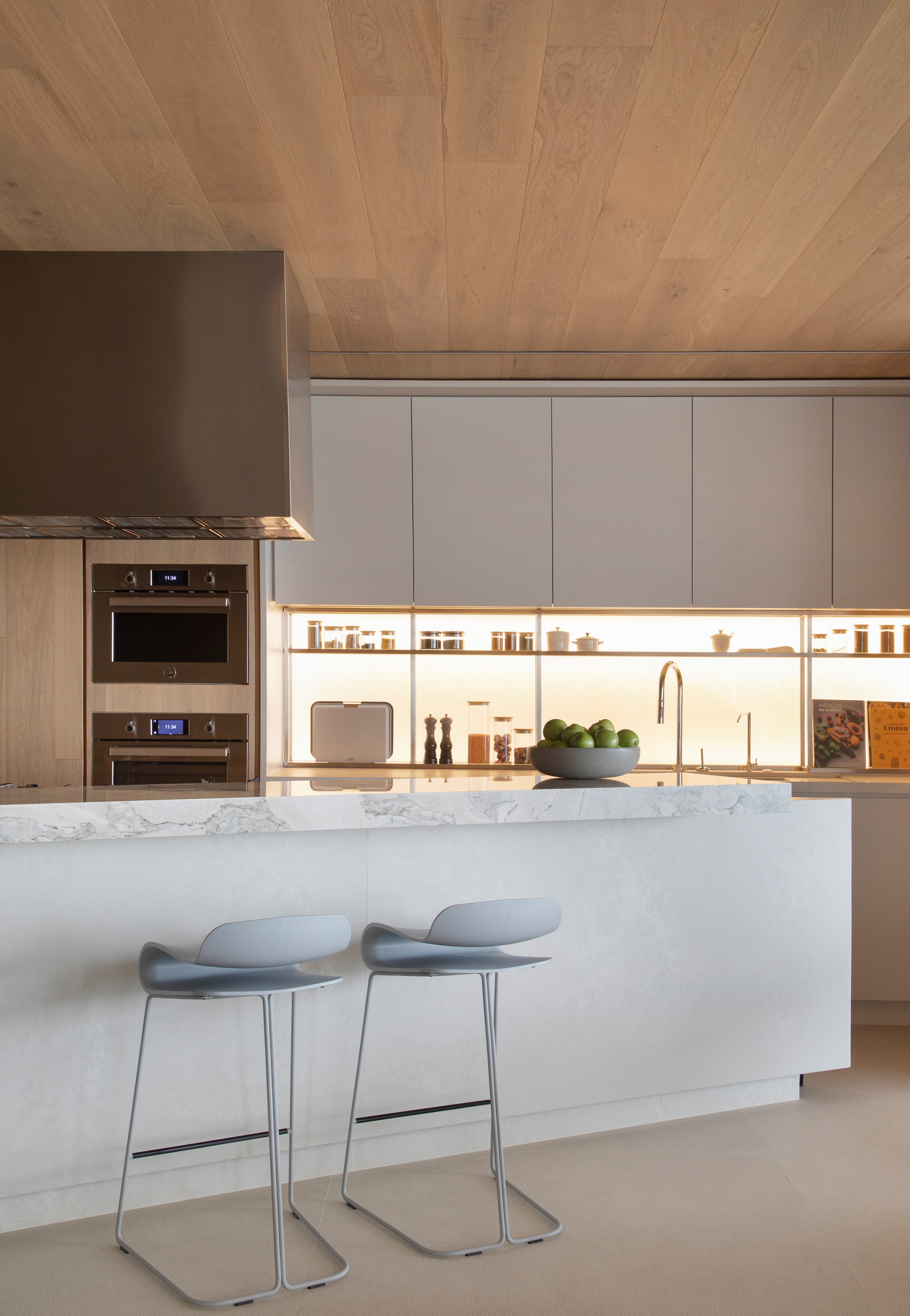
Let your kitchen storage be a feature, and the focal point in this room with kitchen cabinet lighting. With a backlit cabinet, you can give an elegant touch to the room, and display your best kitchen decor, as in this home designed by Brazil-based NJ+ Architects.
'We wanted to make this apartment a second home for our clients, even though they don't live in the city anymore,' says Nildo José Virgínia Lopes, co-founder of NJ+ Architects. 'It was important that they felt that this apartment was also a home, and we did this through the generous layout and planning of internal spaces. We used neutral and natural materials, mainly wood for the kitchen, and lit up the cabinets for a warm feel.'
One thing to note is the switches for your kitchen cabinets. Make sure these are easily accessible but not out on display. Hide them behind or under the cupboard, and if possible install a dimmer as well.
5. Choose textured doors

'One of the biggest tips I always share with my clients is to be inspired by nature, particularly when it comes to the finishes of large-scale architectural elements, like cabinets or flooring,' says New York Brownstone interior designer Jarret Yoshida. 'In particular, wood in natural colors and finishes is a winner that evokes luxury, nature, and calmness on a scale.'
In this kitchen designed by Noa Santos, the fluted wooden kitchen cabinets add movement and extra dimension to the space. The Taj Mahal quartzite adds layering and a touch of glam to the room. The muted flooring allows all the other organic elements to shine.
To further add glamor to the cabinets, consider brass or silver handles that add a touch of color to the otherwise neutral space.
6. Go for bespoke corner cabinets

A great way to use your kitchen's dead space is with corner kitchen cabinets. In fact, choose a bespoke design that works well with the overall look of the home, and adds extra functionality to the room while hiding an ignored spot.
'This kitchen was entirely bespoke which allowed us to utilize every nook and cranny,' says Ng Feathers, designer at The Stylesmiths. 'Behind the wall is actually a staircase that wraps up into the mezzanine above so the wall housing the Euro laundry (washer, dryer, space for a laundry hamper and cleaning supplies) behind full height doors has a sloped ceiling. We used bifold pocket doors to allow our client to access the washer and dryer more easily and used shelves above for additional storage. The smallest space beneath the lowest slope of the staircase houses a pull-out laundry hamper. We opted for full-height doors across the whole wall to conceal the fact it is ‘under the stairs’ and create a more seamless look with the rest of the kitchen. '
'To the right is a pull-out pantry unit to utilize the full depth of a skinny space required for the door swing clearance of the integrated fridge beside it.'


