Creating outstanding packaging designs is no easy task – it takes creativity and innovation to think outside the box (quite literally). Not only does the packaging have to reflect the product, but the design must be eye-catching and appealing to consumers in a crowded market of ever-evolving trends.
In an increasingly eco-conscious world, today's design sphere is all about balancing stunning design with sustainable packaging and experimenting with new materials that put the planet first. Below we've listed some of our favourite packaging design examples to inspire your next project. For more creative inspiration take a look at these iconic brands (and why they work) or check out our top tips for creating impactful branding.
Best packaging design inspiration
01. Benefit's Holiday pop-up collection
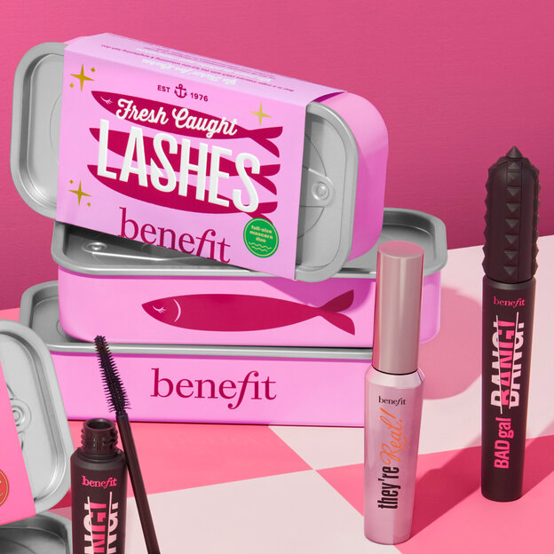
There is something so delightfully appealing about mimetic objects, when products are designed to imitate or resemble something else entirely. Benefit Cosmetics did just that for their 2024 Benemart Holiday pop-up shop which included a fun, retro twist on pantry items. Bright and characterful, it goes against the minimalist, stripped-back aesthetic trend of many contemporary beauty brands. Items were made to look like tins of soup, bars of chocolate and even canned fish.
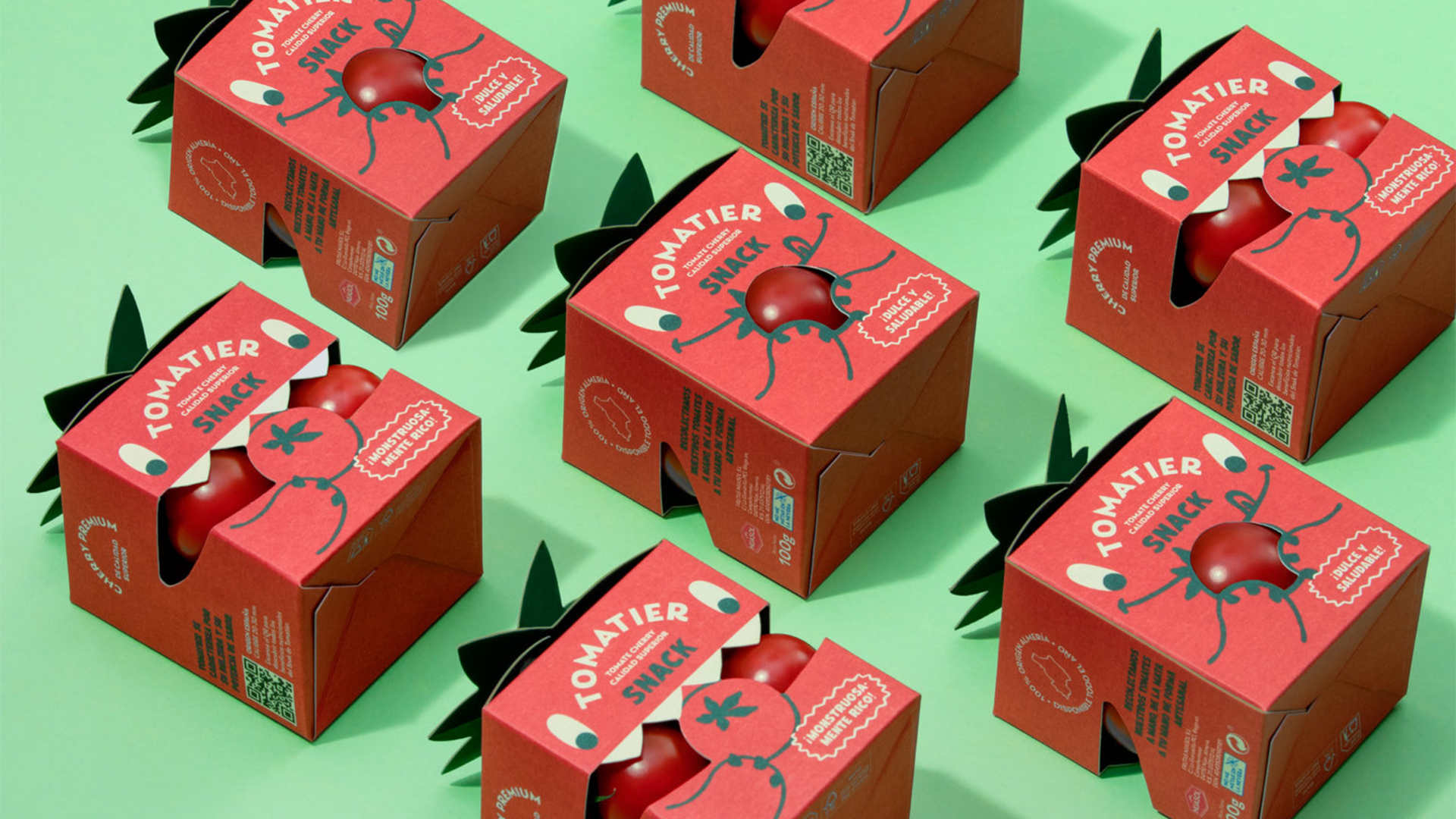
02. Tomatier Snacks
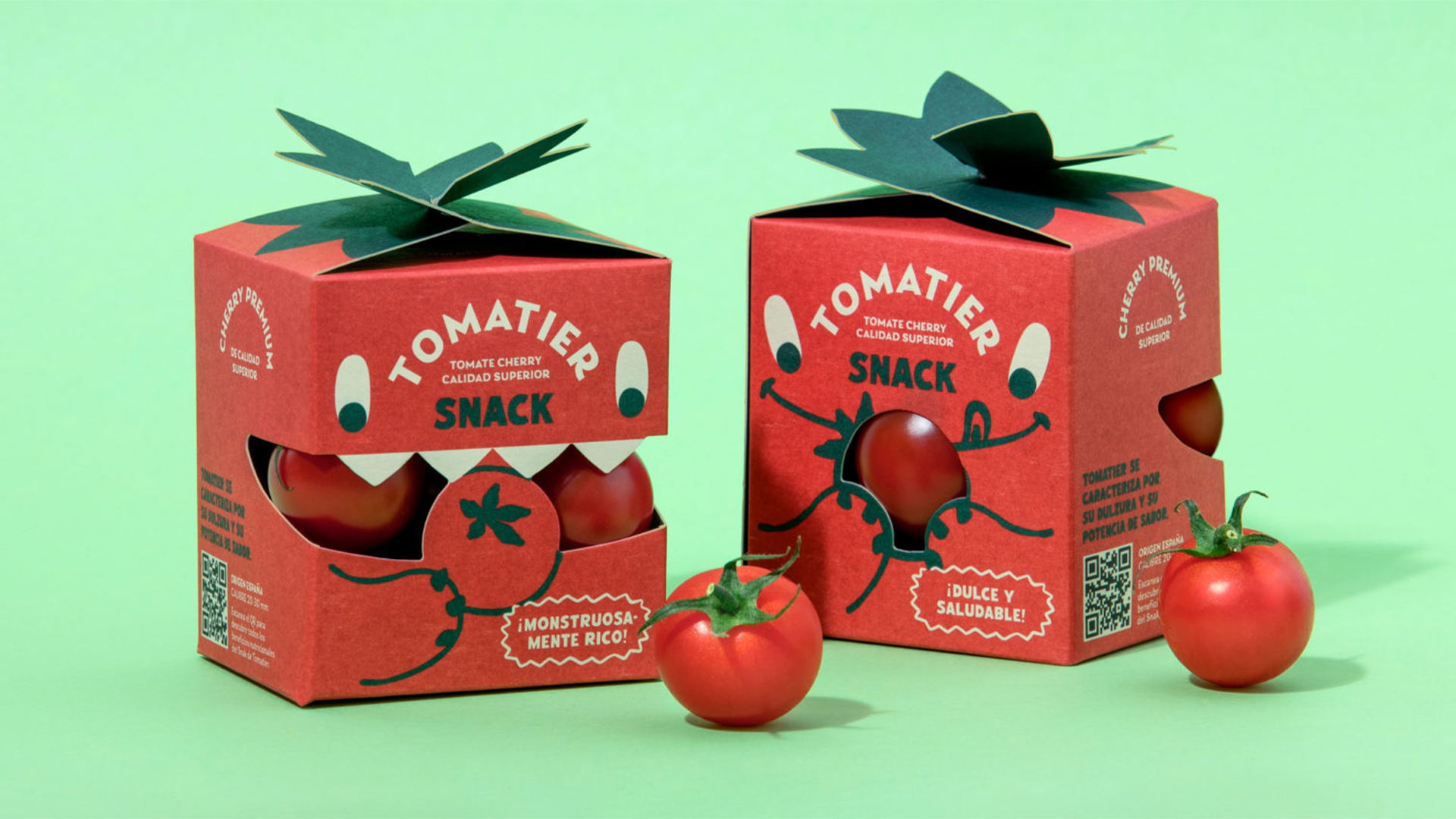
A little bit of joy goes a long way. This cherry tomato packaging project was designed by Valencia studio Meteorito for tomato farmers Nijasol to be sold as a special edition snack in Carrefour. Unique and playful, it's aim was to appeal to children (and their parents), with the packaging appearing as a friendly tomato-like monster that loves to eat tomatoes, using its mouth as a windows to see product inside.
03. FreeWater
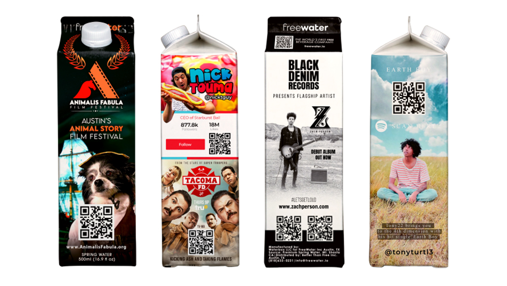
This packaging design may not be particularly beautiful, but it is a revolutionary way of handling product and packaging design and that's why we're including in this list.
It could be argued that the design of many products makes them adverts for themselves, with big-name clothing brands particularly keen on using their products as mobile billboards that people pay to wear. But could they also advertise other brands to cover at least part of the cost of a product?
The US-based startup water brand FreeWater is giving this a shot with a novel proposition. Its paper cartons and aluminium bottles of spring water are free, and the company even donates ten cents from every product it shifts to charities, such as Well Aware. It's even planning to launch a free vending machine to stock the products. Is this a clever way of offering free products or a dystopian advertising nightmare?
04. Who Gives a Crap
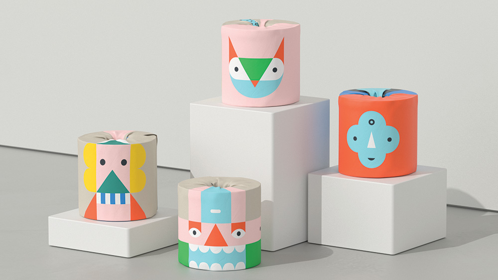
Garbett has created illustrations and packaging for a special edition toilet paper range by Who Gives a Crap, an Australian company that produces environmentally friendly tissues, paper towels and toilet paper and donates half of its profits to build toilets in places that don’t have them. Known as 'The Play Edition', this range was designed to engage people in play.
“The idea for the range was inspired by children’s mix-and-match books – in that they can be stacked in different ways to make whimsical totemic characters,” says Garbett creative director Paul Garbett. For children who may be particularly enthused with this, the outer carton can be recycled and made into a stage.
05. Hardy
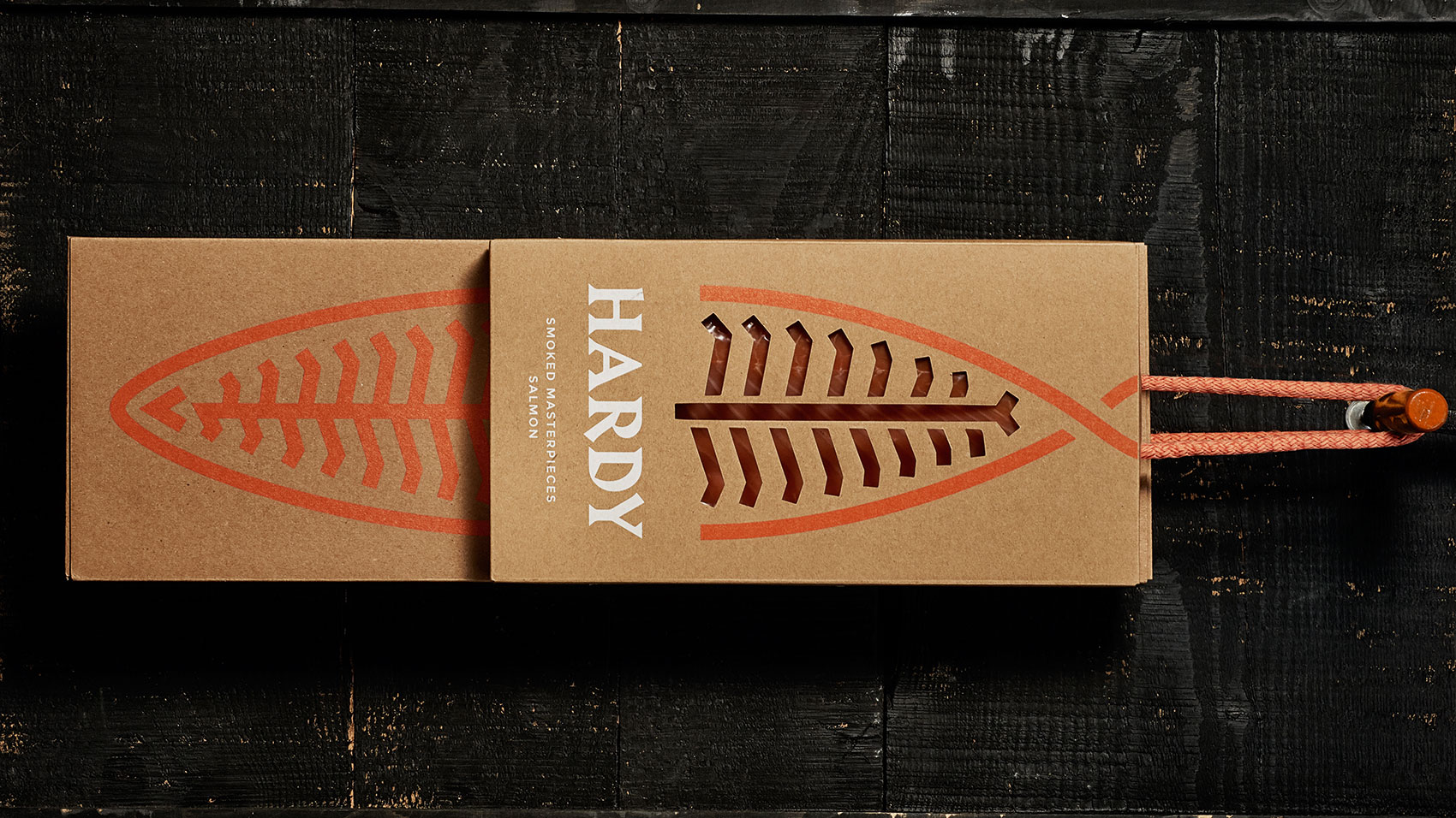
“Third-generation family business Hardy specialises in smoked salmon. The company turned to Portugal-based studio This is Pacifica to design stationery, packaging and a website that would communicate the premium quality of its product. “It’s a long-lasting process that can’t be rushed. From salting to smoking, each stage is executed to perfection. So we created the idea of Hardy ‘Smoked Masterpieces’,” explains creative director Pedro Mesquita.
The identity combines two main elements: an abstract salmon symbol, and a fun, sharp wordmark that could have been cut by a knife. “The packaging was treated as an extension of the brand,” says Mesquita, “and is entirely made of raw micro-corrugated cardboard printed in UV colour.”
06. Stefano Sauces
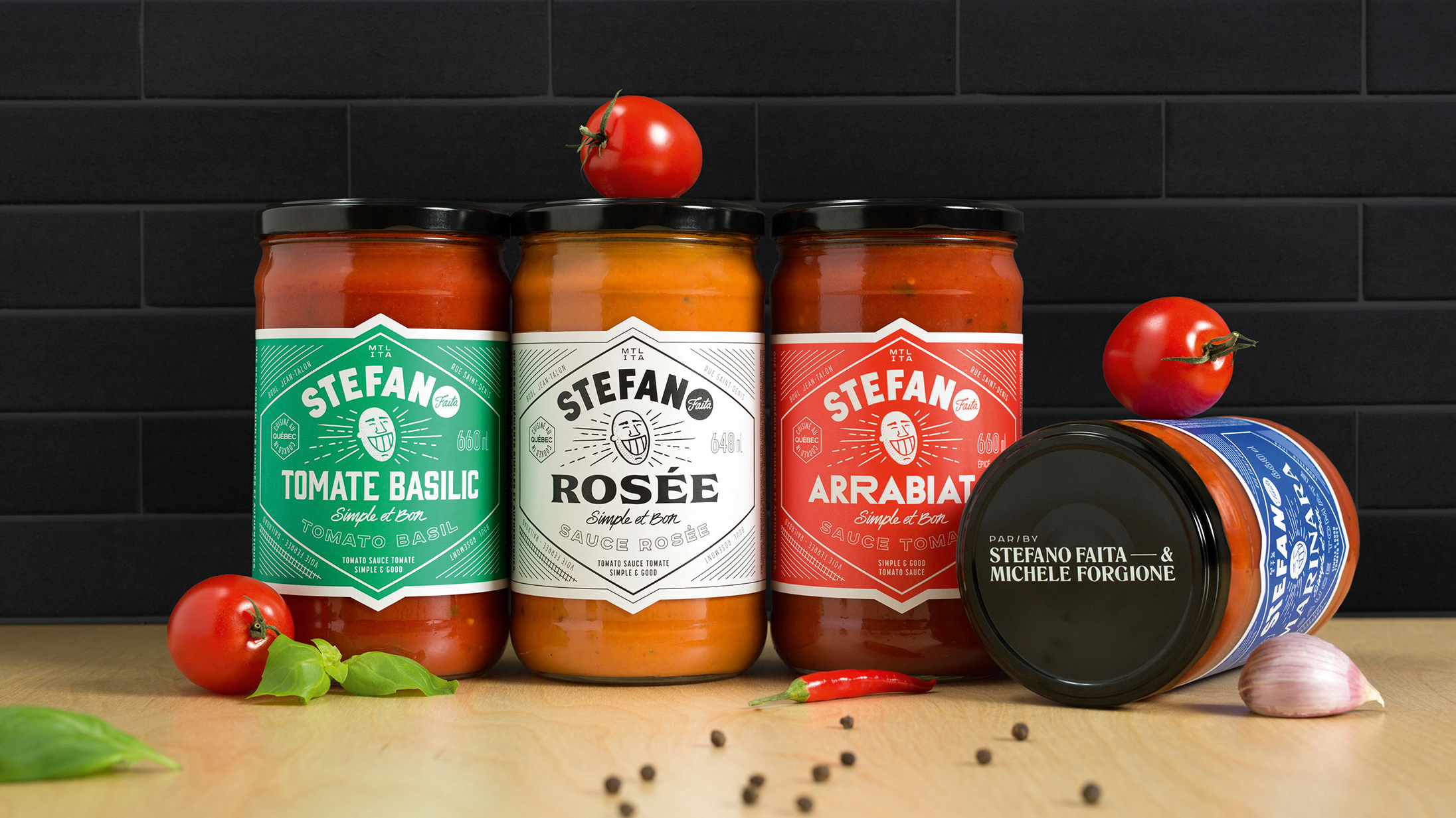
Montreal-based agency lg2 took an original approach to its branding of the first ready-to-eat products from well-known chef Stefano Faita and his partner Michele Forgione. Featuring a jovial, energetic caricature of Faita, the identity gives each sauce a unique typographic treatment – with nutritional and legal information presented in an unusual vertical fashion outside the shape.
“It was a major challenge to differentiate the brand in this type of category, where all brands merge into one,” says David Kessous, creative director at lg2. “The concept’s originality produced a real, appealing identity and packaging that leaps out.”
07. Fierce & Noble
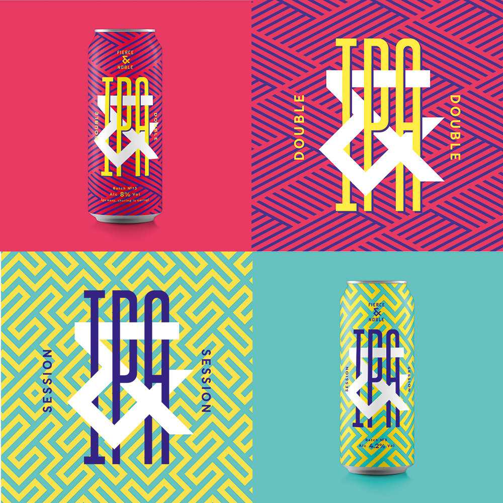
Bristol studio Halo was approached to create a strategy, name, brand identity and packaging for a new craft brewery in St Werburghs, Bristol. The name – Fierce & Noble – represents the brewery team’s fierce independence and respect for the heritage of the craft, while the bold creative, custom type and bespoke patterns reflect the local vibrancy of its location.
“The product needed to jump out on bar and shelf,” explains Halo design director Andy German. “And what with the brewery being in a creative vibrant area of Bristol with other craft breweries in it, it made sense for the building to stand out and be seen. The main pattern for the brand was based around the ampersand we made – my eyes went a bit fuzzy creating this one.”
08. Colors
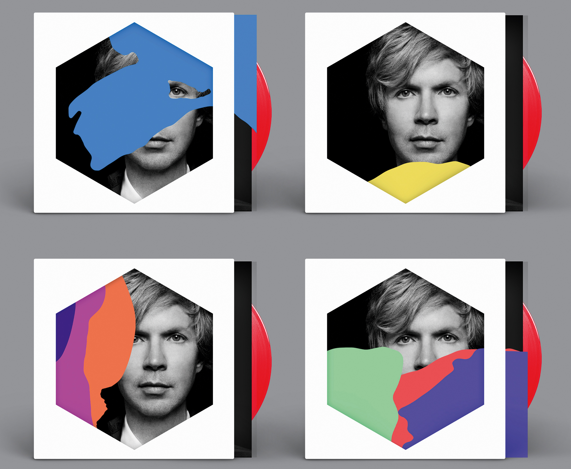
Musician Beck’s latest album Colors sports a customisable record sleeve created by designers Jimmy Turrell and Steve Stacey. Formed from layers of different die-cut coloured transparencies, the cover can be assembled into a bespoke sleeve by listeners.
“We decided on a route of colour and shape – simple and strong,” explains Turrell, who was art director and video director on the project. “We tried not to set too many restrictions on where we went with this in the initial stages. We started looking at a whole range of things for inspiration – childhood games like Ludo and Connect 4, old VHS and cassette packaging, all the way through to artists like Bridget Riley and Piet Mondrian, and Beck was really open to us experimenting. Seeing it all out there – and the positive feedback it’s been getting – is really satisfying.”
09. CS light bulbs
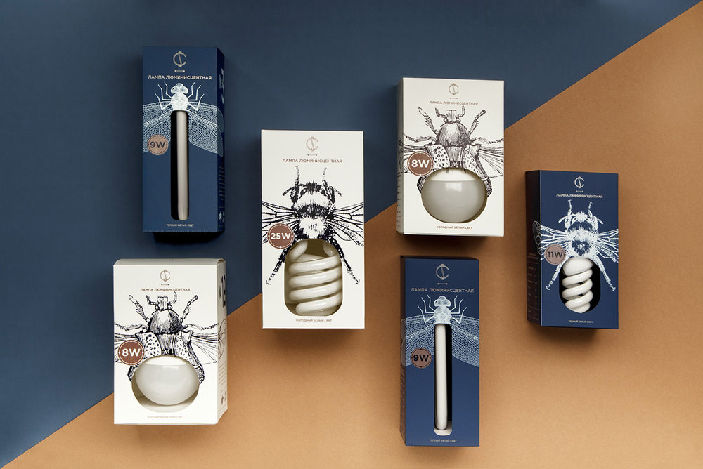
Everyday products such as light bulbs tend to lend themselves to fairly utilitarian packaging, but these, produced by Belarus electrical company CS, boast beautiful boxes that turn the product into an important part of the packaging design.
Designed by Angelina Pischikova, with line illustrations by Anna Orlovskaya, this amazing packaging uses detailed drawings of insects, and the bulbs themselves are paired with certain bugs depending on their shape and size. Long, thin bulbs are stored in dragonfly boxes, while the coiled stripes of an energy saving bulb become the abdomen of a bumble bee.
10. Leafs by Snoop
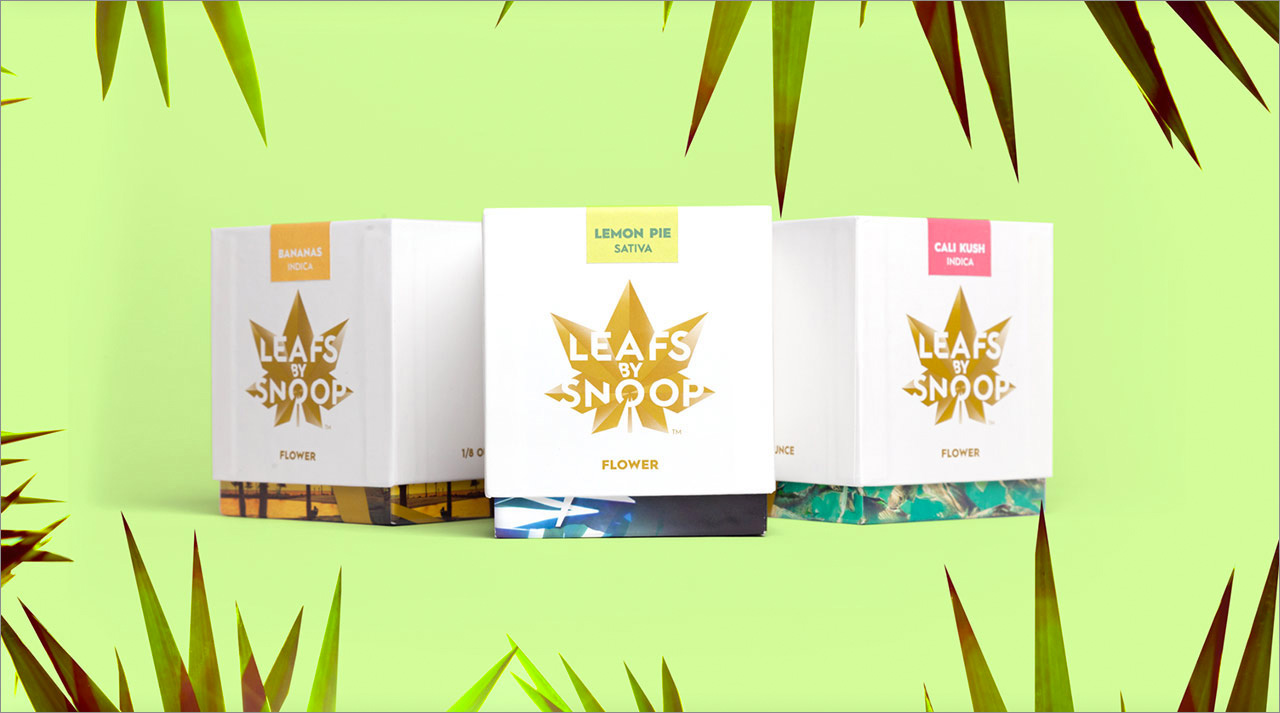
With cannabis slowly becoming less and less illegal in the USA, cannabis branding is increasingly becoming a thing, complete with packaging to match. Snoop Dogg brought in none other than Pentagram to design the brand identity and packaging for his line of cannabis products: Leafs by Snoop.
Stepping far away from the idea of furtively buying a grubby little bag of greenery, Pentagram's designs include a distinctive leaf-based logo (including an animated version), luxurious weed boxes and a range of edibles including six chocolate bars and cannabis sweets called, of course, 'Dogg Treats'.
11. Colour me Blind
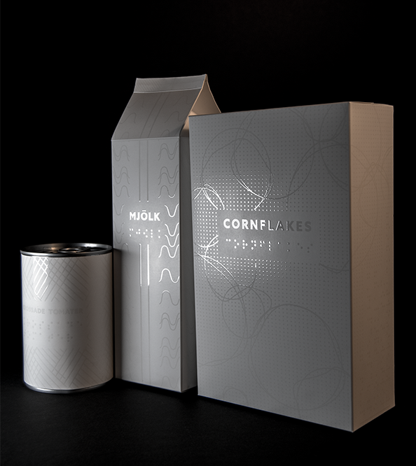
For her graduation project, graphic design student Alexandra Burling wanted to see if it was possible to create an aesthetically appealing packaging design for the visually impaired. Following her research period, she decided to focus on groceries.
“I wanted to give blind people the liberty of doing something so obvious as going down to the supermarket and buying milk,” explains Burling. "The aim was to provoke discussion and pave the way for innovative thinking about how packaging design can appeal to more senses than sight."
12. Nike Air
Nike Air is arguably one of the most popular sneaker designs ever released. Not content with a regular old shoebox, Berlin-based agency Scholz & Friends came up with a brand new, reimagined packaging design for its favourite trainers.
Very much taking the 'Air' aspect into account, the team placed the sneakers in an air-tight plastic bag to give the illusion of floating trainers. Highlighting the Air cushioning of the brand, this design also reduces the risk of damage when shipping.
13. Onuma Honey
This offering from Japanese studio Akaoni Design is a bee-utiful example of 'less is more' when it comes to packaging. It consists of a small jar, simple stickers and classic brown paper, with an array of sweet coloured stamps to finish it all off. Art direction and design was taken care of by Motoki Koitabashi and it's clear he knows what's he doing when it comes to making a striking impact in the aisle.
14. Spine Vodka
German designer Johannes Schulz created this inspirational packaging for Spine Vodka. "It was a private project I started after my graduation of an international communication design school in Hamburg, Germany," he explains. "Spine is a high quality product just like the design, reduced and simple with a consciously 'twist' in his message and a memorable name fitting to the project."
Integrated the spine with the ribcage to communicate a product with a 'backbone', the uniqe 3D design approach sets it aside from its 2D counterparts. "The transparent glass material stands for a product that doesn't have to hide something," Schulz concludes.
15. Allsorts Black and White
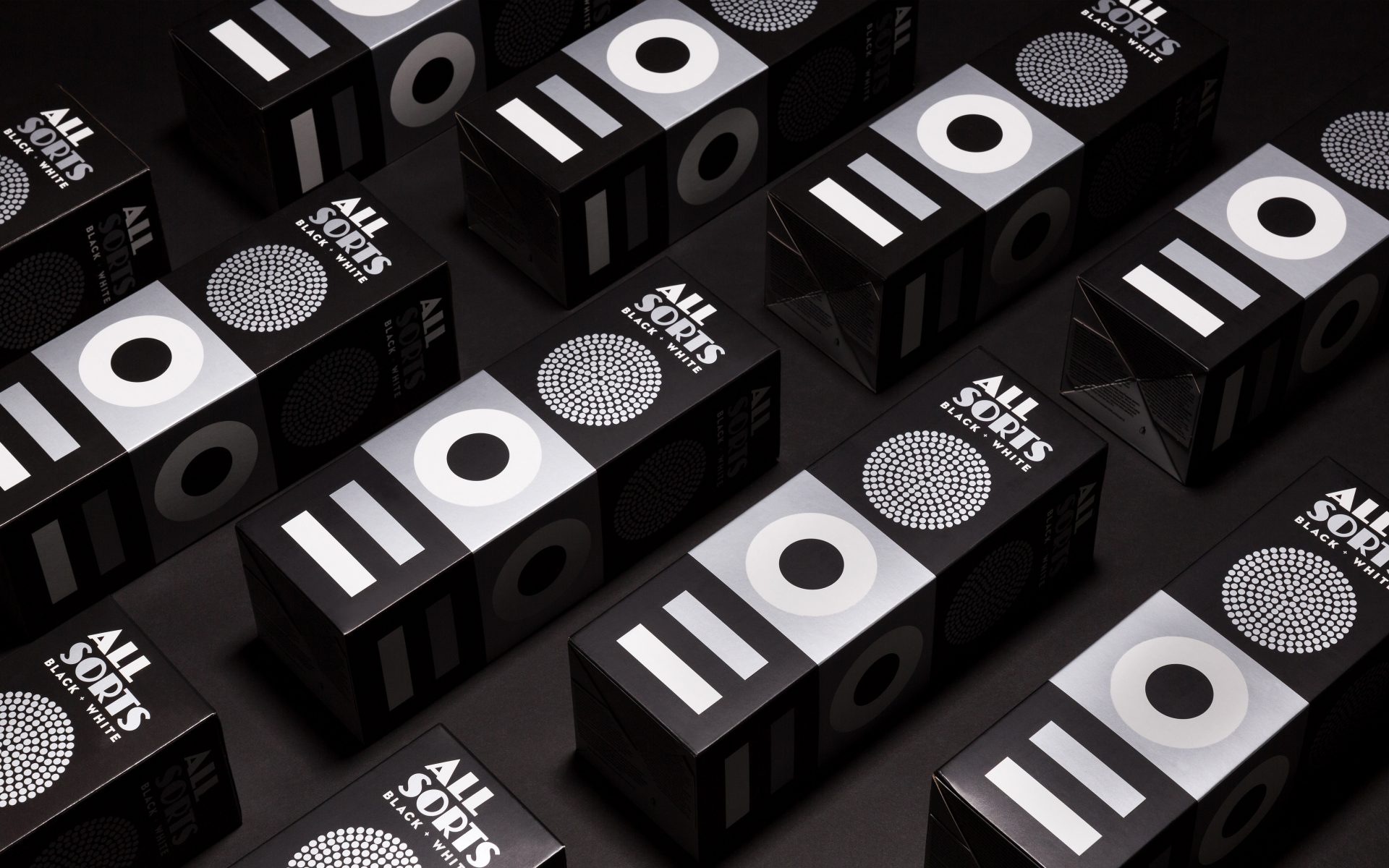
Back in 2014, Liquorice Allsorts had a mini facelift from Bond Creative Agency for Cloetta – a leading confectionary company in the Nordic region. The new packaging took the traditional sweets' distinctive shapes and colours and used them as the basis for a more modern design.
The agency's recent update for Cloetta's Black and White edition follows the same theme, but with the colour stripped away. "The silver print and matt finishing give a tasty touch to the functional cardboard box," says Bond.
16. Stranger & Stranger Spirit No. 13
Beverage bottle branding guru Stranger & Stranger designed this limited edition holiday give-away liquor that features one of the most detailed labels you will ever see. The Spirit No 13 label just screams vintage and consists of over 500 words. To top it all off, the bottle is presented wrapped in a specially printed piece of newspaper that gives it what they call a 'moonshine' feel.
17. TIQLD
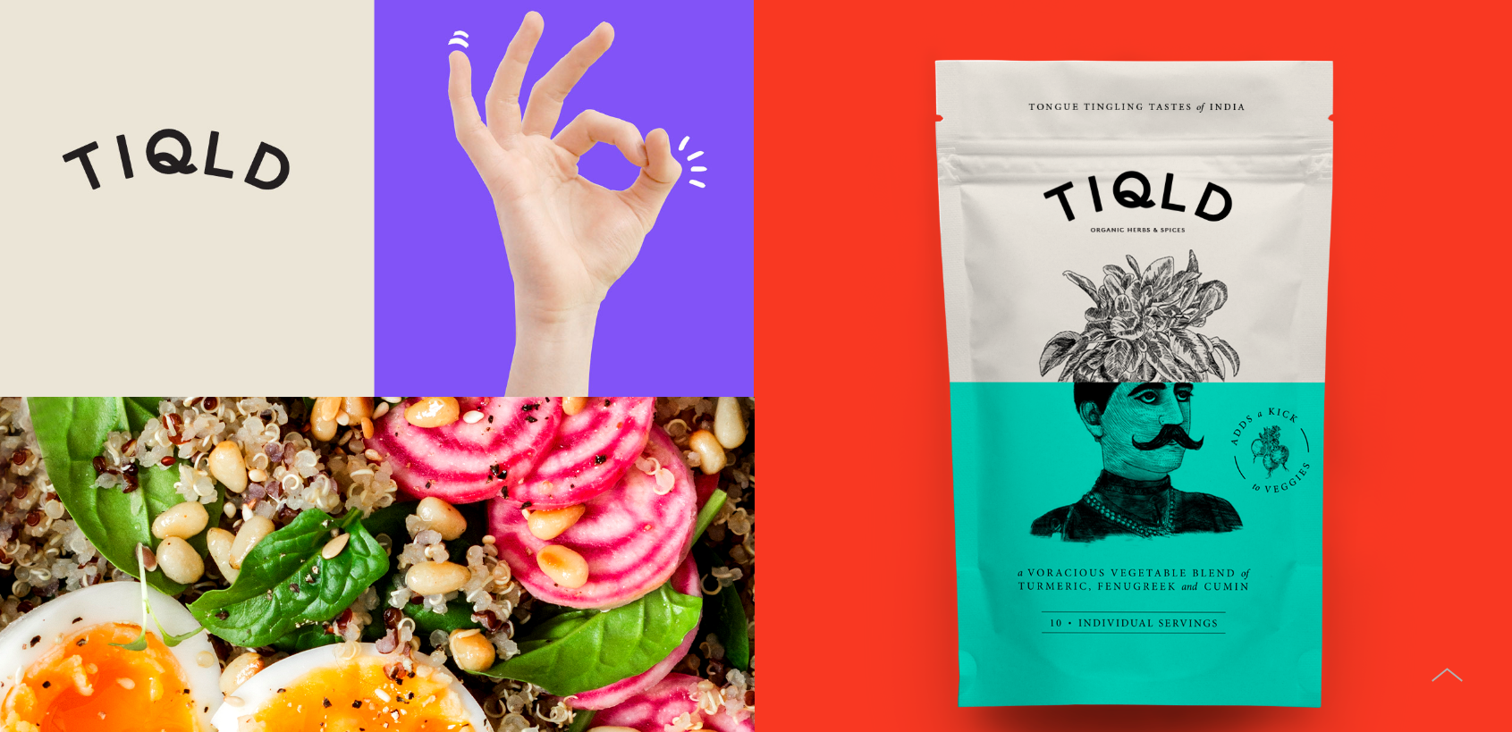
When planning the packaging design for spice blend range TIQLD, Alphabet used humorous illustrations to convey a playful, confident brand identity. The pouches each feature a split design capturing an unexpected combination of objects.
“We wanted to bring the idea of making meals more bold and adventurous into the brand imagery. The structure of the illustrations combines the base ingredient that the spice works with (either meat, fish or veggies) and juxtaposes this with an unexpected abstract element that visualises the story that accompanies the spice blend,” explains Alphabet. “The stories not only represent the bold personality of the brand but also the bold flavours that they create.”
18. Poilu paintbrushes
This excellent example of packaging design comes from Simon Laliberté and offers the function of assembling two paintbrushes together with only one cardboard piece, which is printed on both sides. The natural hairs of some paintbrushes have been dyed to give the illusion of the moustache and beard combos. The font at the top of the handle is also noteworthy.
19. Mighty Nuts
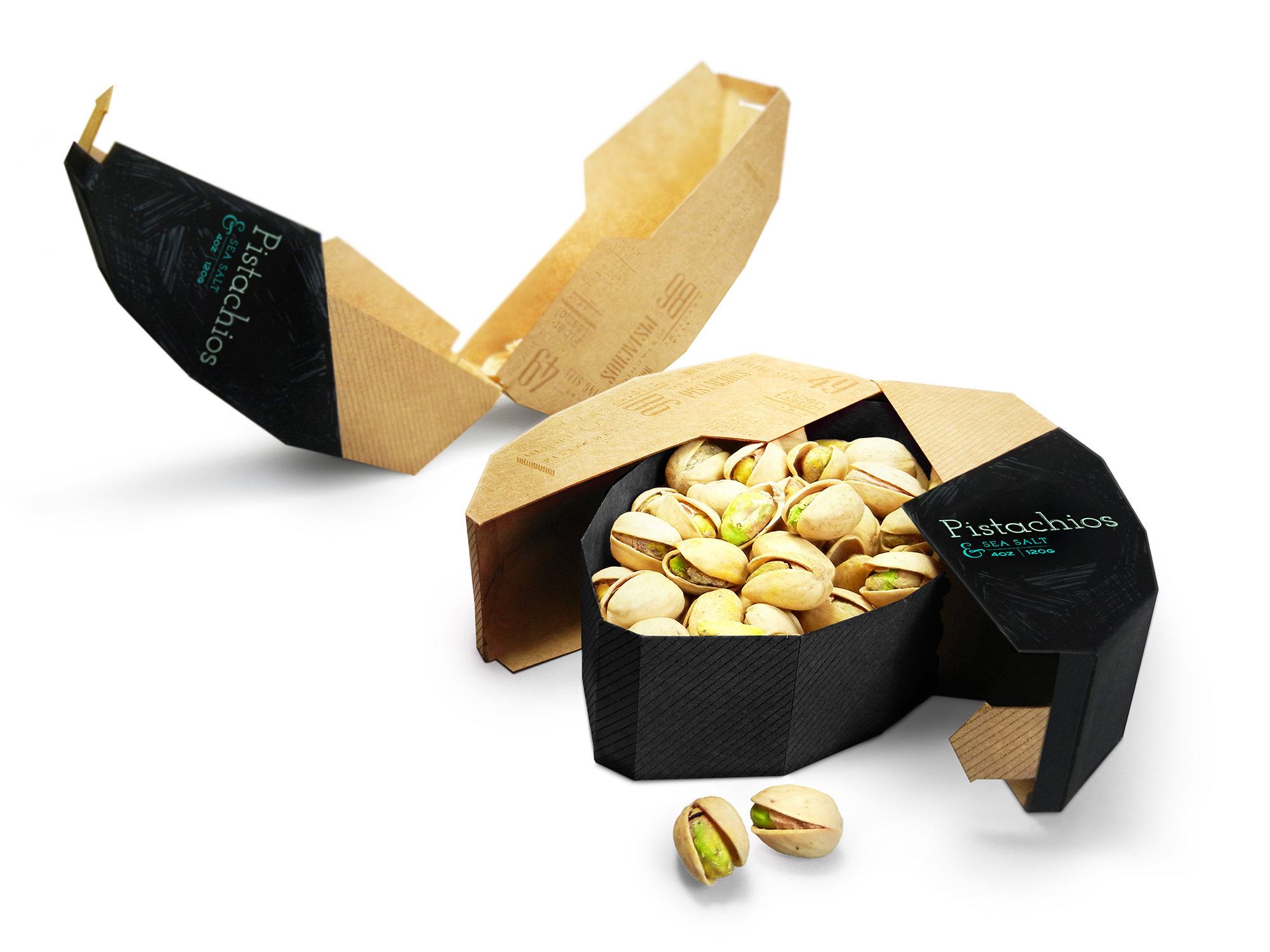
This incredible pistachio packaging design was created by student Maija Rozenfelde, when she was still completing her degree in packaging design at Pratt Institute. She says of the design: "A crucial part of the thought process was to focus on user experience and second function of the package. The main intention was to create graphics that depict the crunchiness of pistachios, that’s where the hand-made type treatment comes in."
20. Helvetimart
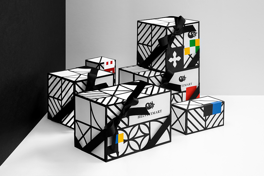
Helvetimart is a Swiss shop that sells specialty food products. For its packaging design, branding heavyweight Anagrama took inspiration from the regional flags of the country's 26 sovereign states.
"We simplified these flags to create a homogeneous language, using representative elements and colours to develop the labels for the brand’s products and the signage within the store to ease its navigation," the agency explains.
Top packaging design resources
The web is a wonderful thing, brimming with resources and inspiration for people interested in packaging design. But, sometimes, too much choice can be confusing, so we've picked out the top online packaging design resources to help you really get to grips with it.
01. Packaging of the World
Packaging of the World is an extensive gallery showcasing the most interesting and creative packaging designs from around the world. This site is really well organised; you can choose to search for projects by category, country, product type, most popular, and so on, to narrow down what you're looking for. This is a brilliant resource in the area of packaging design, and is updated regularly with new examples.
02. The Dieline
If it's information and inspiration on packaging design you're after, then The Dieline is a fantastic place to start. Founded in 2007, the site aims to define and promote the world's best packaging design. As well as news and opinion pieces, this site features a jobs board and a library of packaging designers and suppliers.
03. BP&O
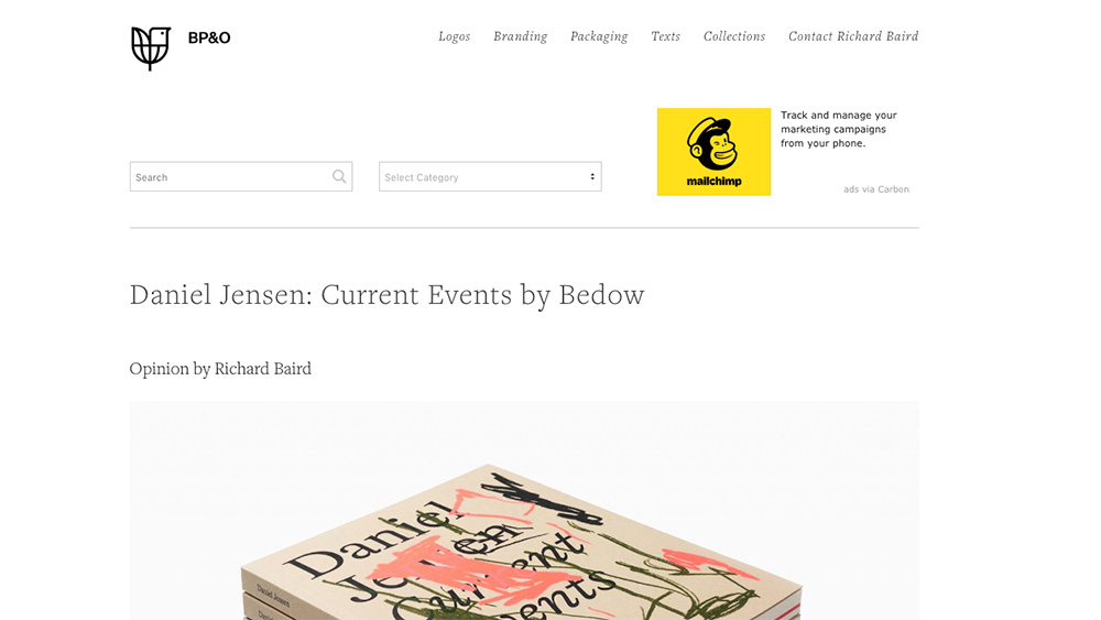
BP&O is a blog run by British freelance designer and former writer for The Dieline, Richard Baird, who specialises in the development of branding and packaging. Baird picks recently developed designs, provides a short background and shares his thoughts and opinions on each. This is a great site for finding new work from around the globe.
04. Dezeen
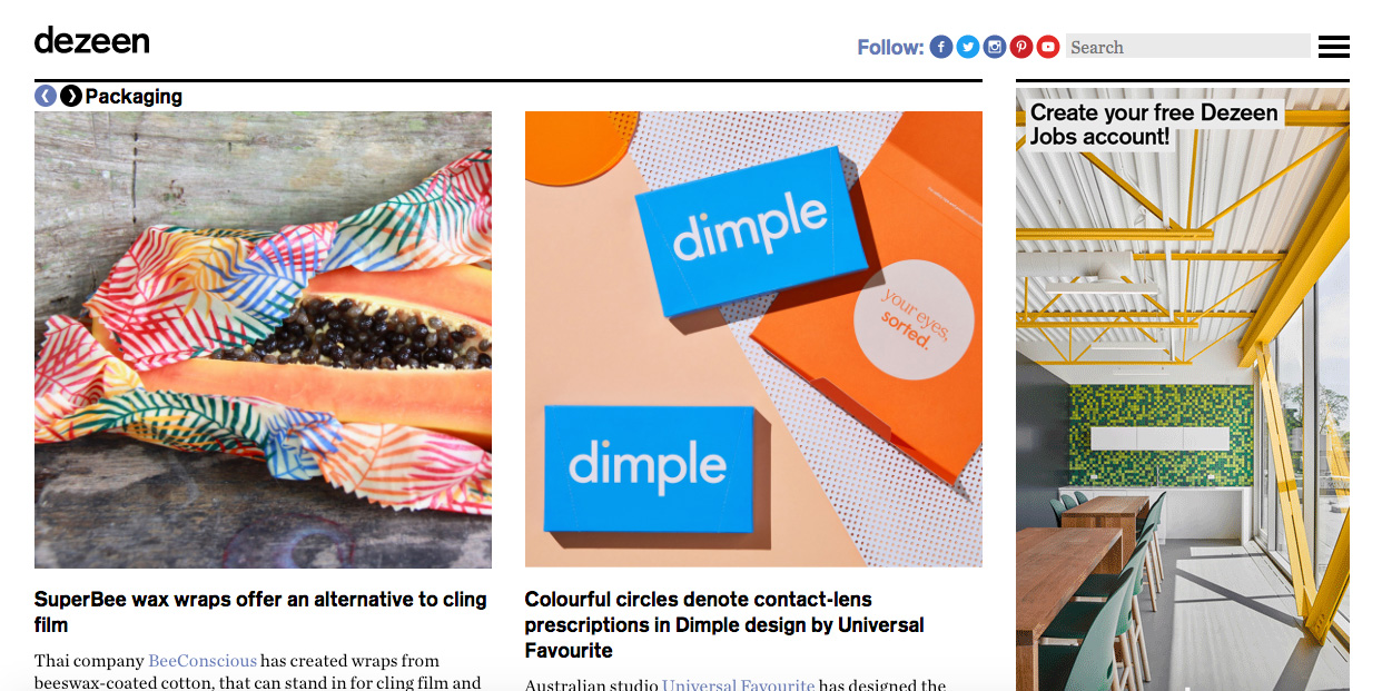
Dezeen primarily explores architecture and interiors, but also offers interesting articles on product design and packaging. The resource is great for staying up to date with the more on the cutting-edge, experimental and innovative news in packaging design, including explorations into environmentally friendly packaging.
05. Behance
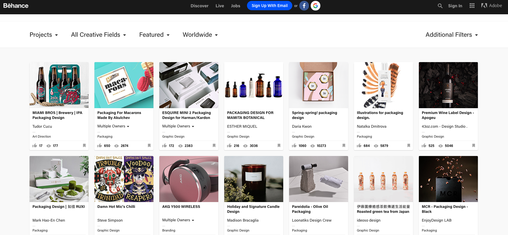
If you're a designer, you'll know Behance – but it's worth including here in case you'd overlooked it. The online portfolio community features all manner of packaging design projects, created by artists of all skill levels, in everything from shoe and pharmaceutical design to alcohol and electrical product designs. And of course, there are new additions being added pretty much constantly.