What you need to know
- YouTube Music's web version now features a fresh, two-column layout for albums and playlists, similar to the Android tablet app.
- The left column displays album art, release year, detailed descriptions, and handy control buttons.
- Meanwhile, the right column lists tracks with play counts, durations, and artist details.
YouTube Music's latest update for its web version features a new look for albums and playlists, adopting a layout similar to its Android tablet app.
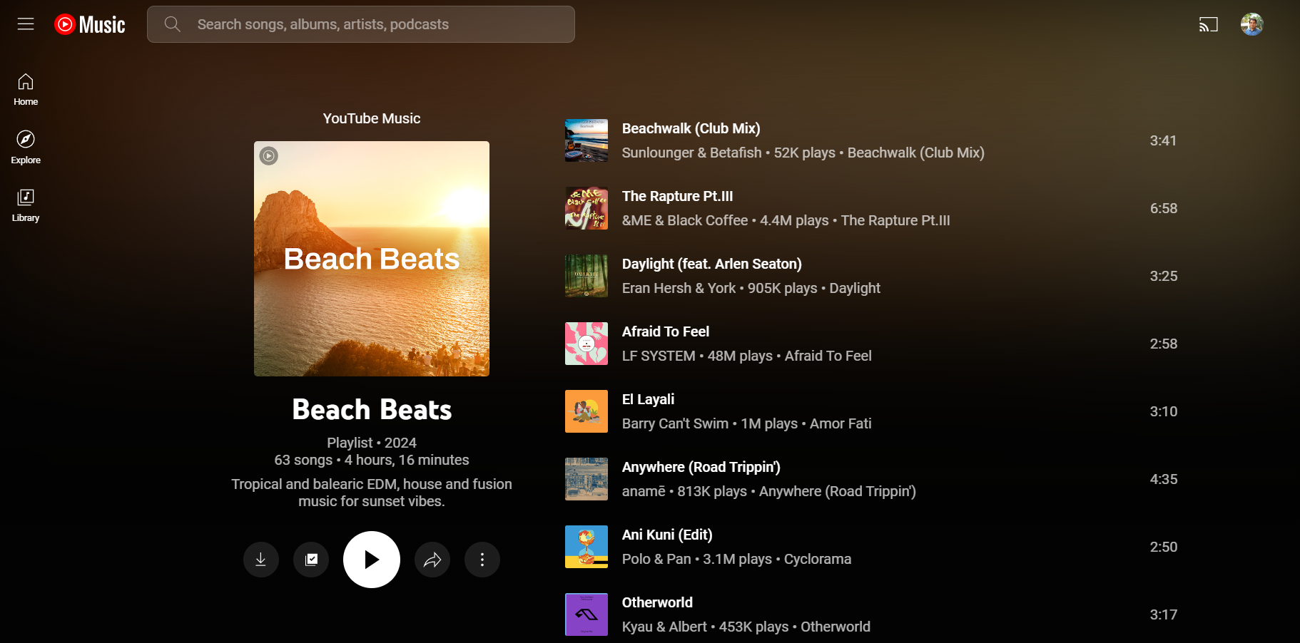
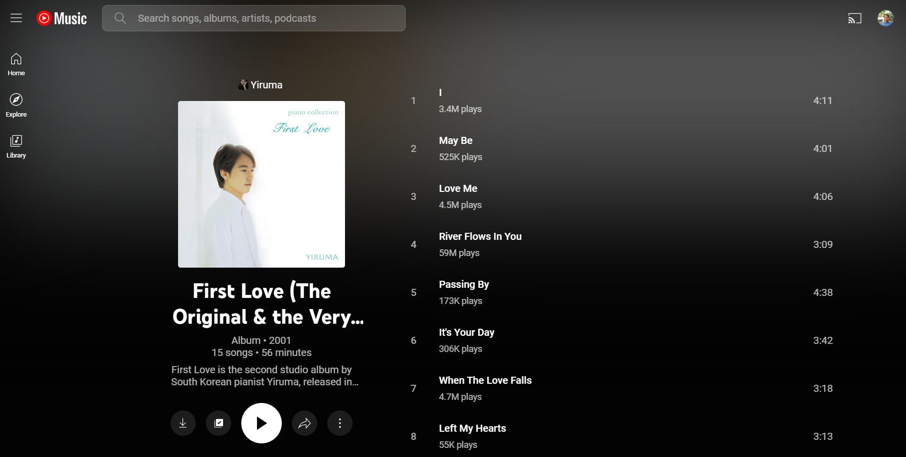
YouTube Music has introduced a two-column interface for albums and playlists on its web version, as spotted by 9to5Google. This fresh design is perfect for bigger screens, displaying album art, release year, and a detailed description in the left column. You'll also find handy control buttons like play, download, and share right there.
Meanwhile, the second column lists all the tracks in the album or playlist, complete with play counts, durations, and artist details. The new layout for albums and playlists first appeared on Android tablets.
Previously, YouTube Music's web layout for albums and playlists was less than ideal. The first column, crammed with album art and details, hogged the entire top section, while the song list sat below in a lone column. This setup left large, empty margins, wasting valuable screen space on desktops and missing the mark for a more user-friendly experience.
The new two-column interface is a big win for using desktop screen space effectively. This smart layout makes the most of your screen, offering a richer user experience. By placing information across two columns, it delivers a lot of content at once while avoiding any clutter.
This new interface is part of the music streaming platform's ongoing effort to improve the user experience. Recent updates include a revamped Cast menu and a redesigned Now Playing UI that matches the mobile app.
While the new, streamlined interface has many benefits, some users have raised concerns. As noted by Android Police, some YouTube Music subscribers find the redesign tricky to navigate. Reddit discussions also highlight worries about a possibly reduced user experience.
Anyway, the update is still in progress, so it might not be available to everyone just yet.