
No, you aren't seeing things. YouTube has been slowly rolling out a new brand palette for a few months now, with the most notable change being a slightly new hue for its iconic logo. Eagle-eyed users have been pointing it out for a while, but YouTube itself has finally acknowledged the change, providing details of the rationale behind the year's most subtle rebrand.
As many have spotted, the YouTube logo is now a slightly pinker (or as YouTube is calling it, cooler) shade of red. And several members of the design team have explained the rationale behind the tweak to one of the most recognisable, if not one of the best logos, in a new interview via the Google Design website.
"Our refresh journey began by pinpointing YouTube’s most outdated elements through research," says Robyn Lee, visual design lead. "Colour ranked in the top three, so we knew that evolving our palette would make an immediate and significant impact. It was a big step forward but not a leap! We wanted an evolution, not a revolution. Red, core to YouTube’s identity, demanded a delicate touch. Rather than reinventing the wheel, we aimed to refine it."
They changed the logo too from r/youtube
"We’ve had many reds during 20 years of YouTube’s existence. The most recent change happened in 2017 and it was pure red in the RGB system, which we knew had problems. For instance, it’s perceived to be too loud when implemented in key UI moments. It rendered orange on certain screens. It caused burn-in issues on TVs, which is when the screen becomes permanently discoloured because pure colours create more burden over time. Those technical issues were easy targets."
"By adjusting to a slightly cooler shade, we resolved the technical issues and added an approachable, vibrant personality. We wanted to honor YouTube’s legacy while modernising it," offers Jessie Zo, senior visual designer. Product manager Linda Hong adds that the company wanted to avoid colours that felt "domineering, cold, or corporate".
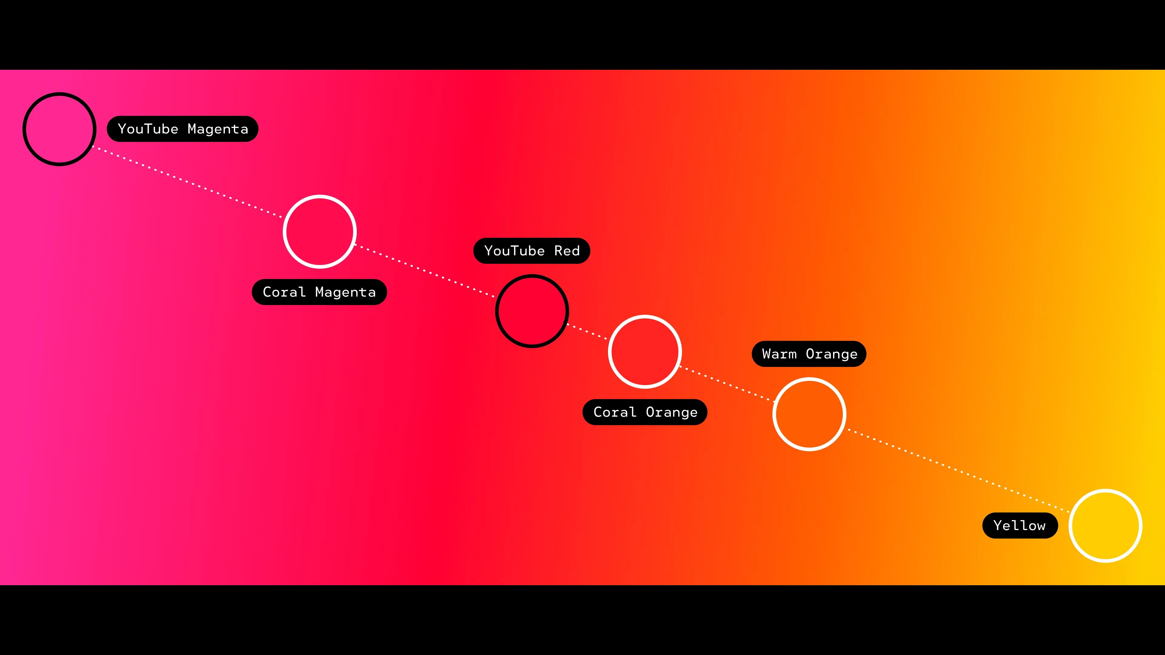
The refresh also includes a new gradient, which users have already spotted adorning the playback bar. "To give YouTube a sense of motion, we created a dynamic red-to-magenta gradient," says Robyn. "For the second colour, orange and yellow were strong contenders, but magenta felt like the most natural pairing with our new red. Interestingly, magenta doesn't often appear in the natural world, so it symbolises the imagination and evolution that YouTube embodies. We also placed the gradient at a 45-degree angle with magenta on the right, signifying forward movement."
While it might be a subtle change to the logo, any tweak to an icon that sits on users' home screens is bound to attract attention - and not everybody has been a fan of the pink (sorry, cool red). For the full lowdown, take a look at our history of the YouTube logo.