As brands evolve and change over the years, it's only natural that their logos do too. A good logo is pivotal to making sure a brand is recognisable, but does newer necessarily mean better?
The below Twitter thread takes a look at old vs new logos, and it's clear not everyone is a fan of the modern direction some companies are taking when it comes to redesigning their look. If you're a fan of brand identity like us, why not take a look at our pick of the best logos of all time to see some of our favourites?
Old VS New logos pic.twitter.com/0jODTyzgBIMay 13, 2023
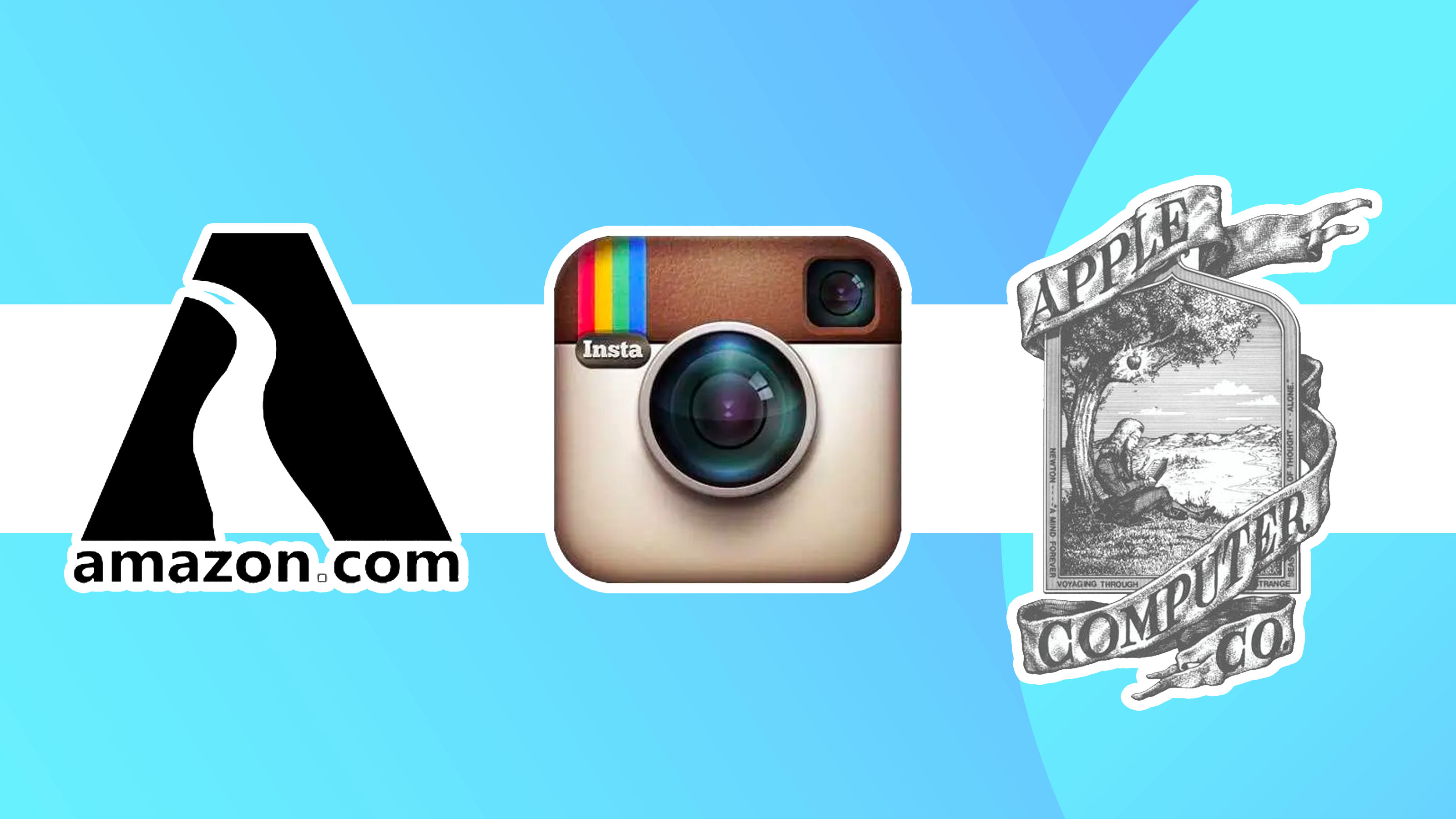
The Twitter video (above) is currently sparking a lot of conversation about how logos have changed over the years, and whether or not we should go back to basics. The video shows the original logos for many of our favourite companies, such as Apple and Instagram, vs the current counterpart. It's an interesting look at how graphic design has evolved over the years according to modern design trends.
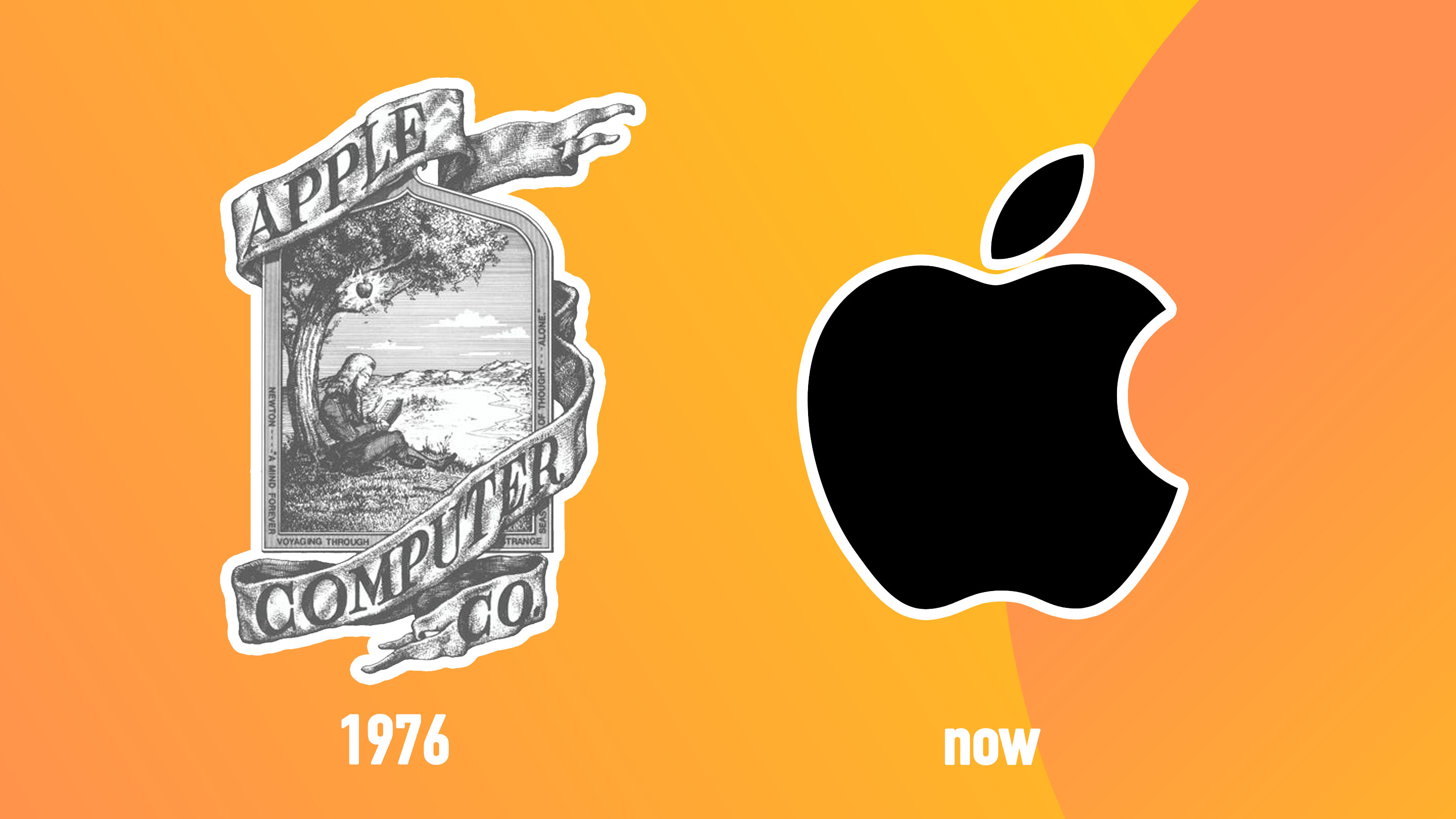
This simplfying process is especially apparent when looking at the likes of the Apple logo – the original 1976 logo shows a detailed illustration of Newton sitting under an Apple tree. But what does the scene represent? Newton figured out the law of gravity as an apple fell on his head whilst sat under a tree, so the logo is meant to represent new and revolutionary ideas from simple beginnings. Nowadays, the Apple logo simply shows... well... an apple. I guess it's to the point and, considering how commonplace the brand now is in our day-to-day lives, it needs to be quickly recognisable. But I must admit that I do love the backstory of the original design, and as an artist I have to respect the work that went into such a detailed illustration.
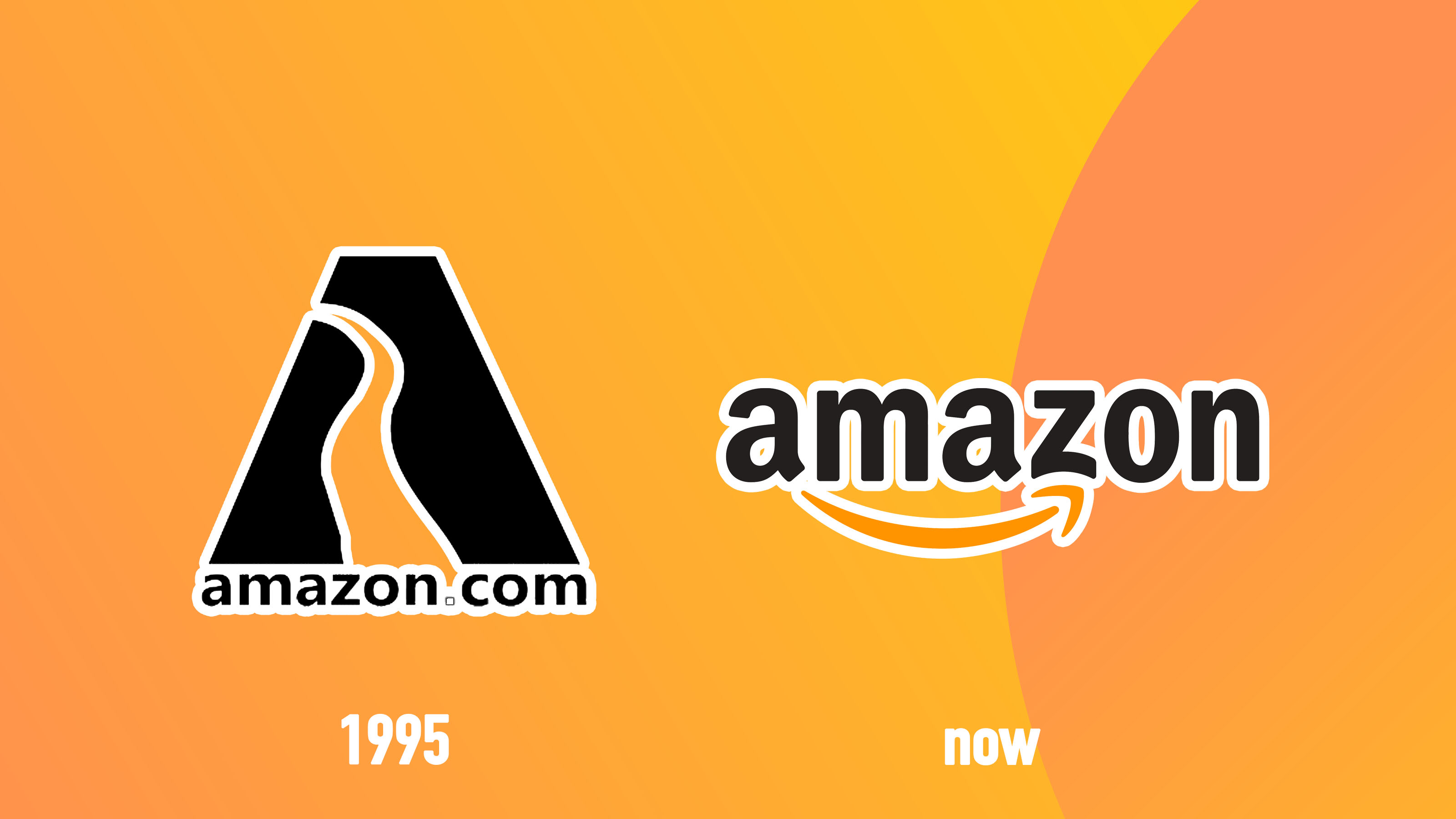
Another interesting comparison is the Amazon logo. The original 1995 iteration shows a simple yet clever shape that resembles both the letter A and a winding river (meant to represent the Amazon river) above the domain name. Nowadays, the logo simply has the company name and that familiar flick that is meant to resemble both a smile and an arrow to depict the delivery of goods to clients. One Twitter user states, "Amazon is the only glow up", and I can definitely agree that the newer version is certainly an improvement on the original in its simplicity.
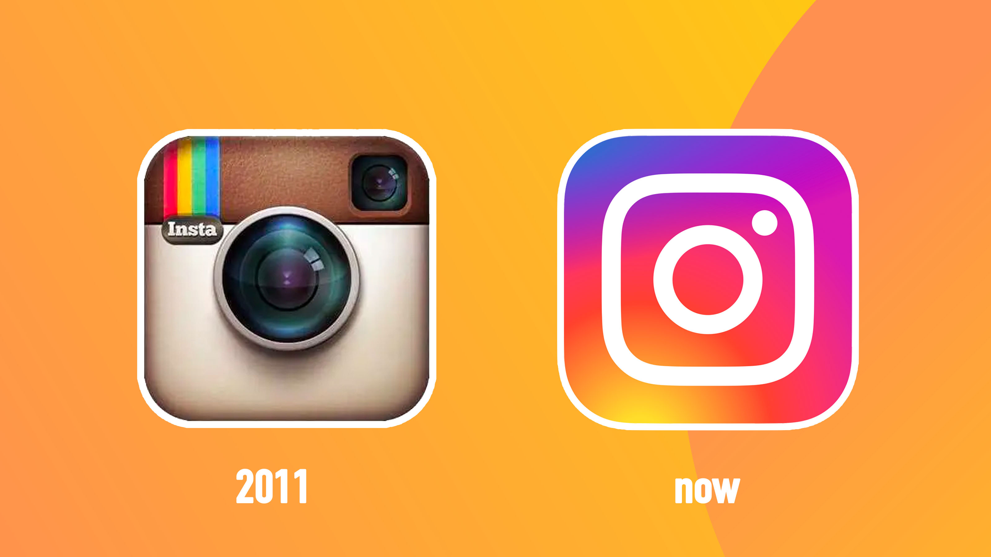
However, one particular logo is causing a bit of a stir on the above Twitter thread. The Instagram logo has been through a variety of design changes over the years, but it seems that fans of the platform aren't fond of the latest redesign. The above video shows the 2011 iteration of the logo vs the current one, and if the comments are anything to go by it didn't quite hit the mark. "Instagram definitely was better before" one comment proclaims, with many other agreeing with similar sentiments such as "the Instagram one was such a bad choice". The older Instagram logo is certainly a winner when it comes to nostalgia factor, but I'll happily admit I love the bold colours of the newer design – so I guess it's down to personal taste more than anything.
Want to make your own iconic branding? Then check out our guide on how to design a logo and where to find logo design inspiration to get you started.