Designer Eva Sonaike is known for her use of bold color and even bolder pattern. She has made an art of playing with her West African heritage to use palettes that are at once vibrant and subtle, too. There is a sense of calm thanks to the clever curation and well-informed color choices she makes.
She is often referred to as a maximalist, but that doesn't really do her take on interior design justice. Instead, she knows the secrets to putting powerful colors together in a way that is joyful - even exuberant - but never overwhelming. In her own words, she explains how.
The trick to perfecting the perfect palette is about getting the temperature right.
Eva Sonaike
How to create the perfect palette
People look at what I do and think that because I use a lot of color I must be a maximalist, but I’m not - I’m a color scientist! Color is just the base of my designs, and if you use strong shades in the right way you can create a room that is balanced, harmonious, warm, even relaxing.
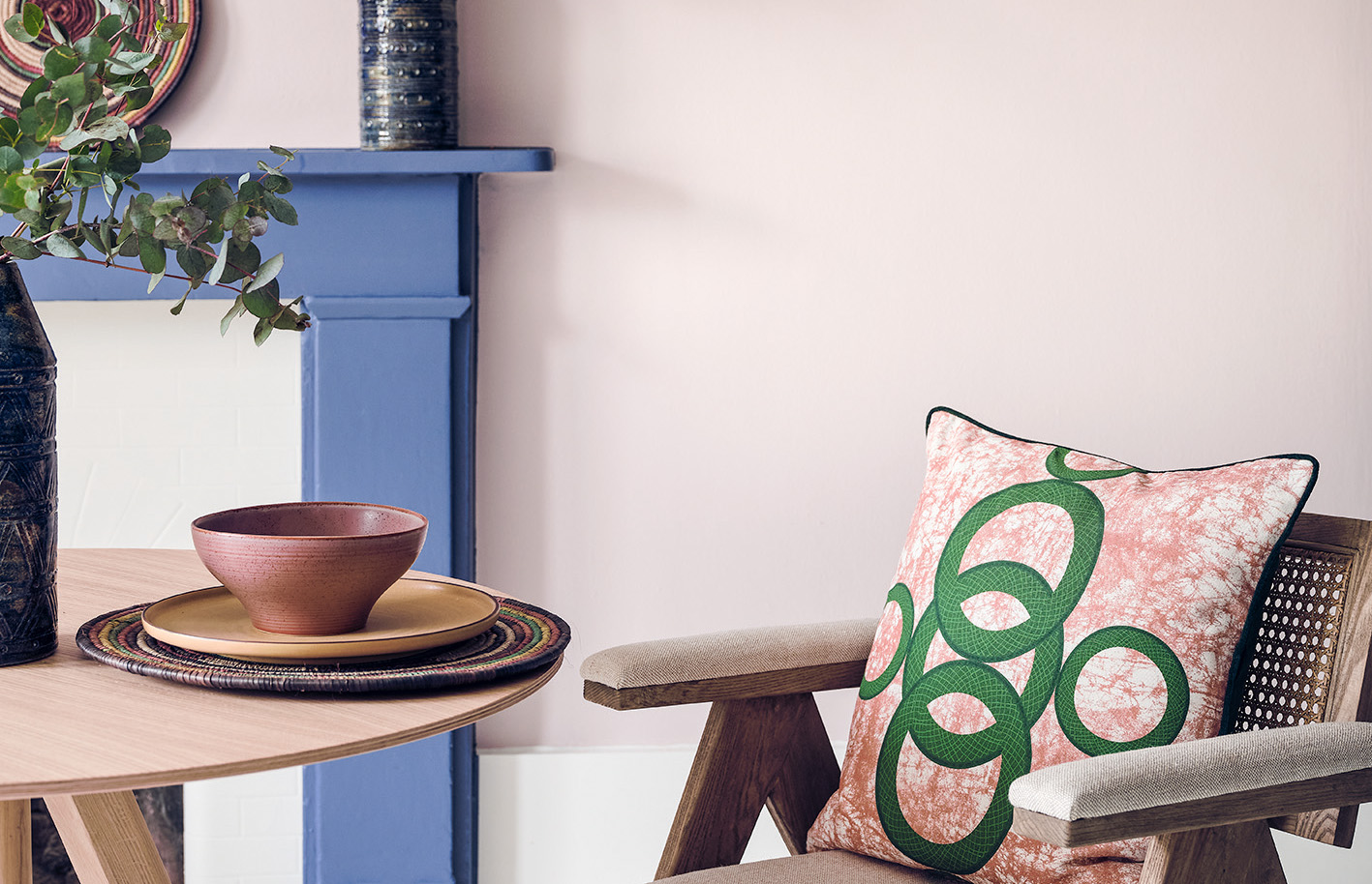
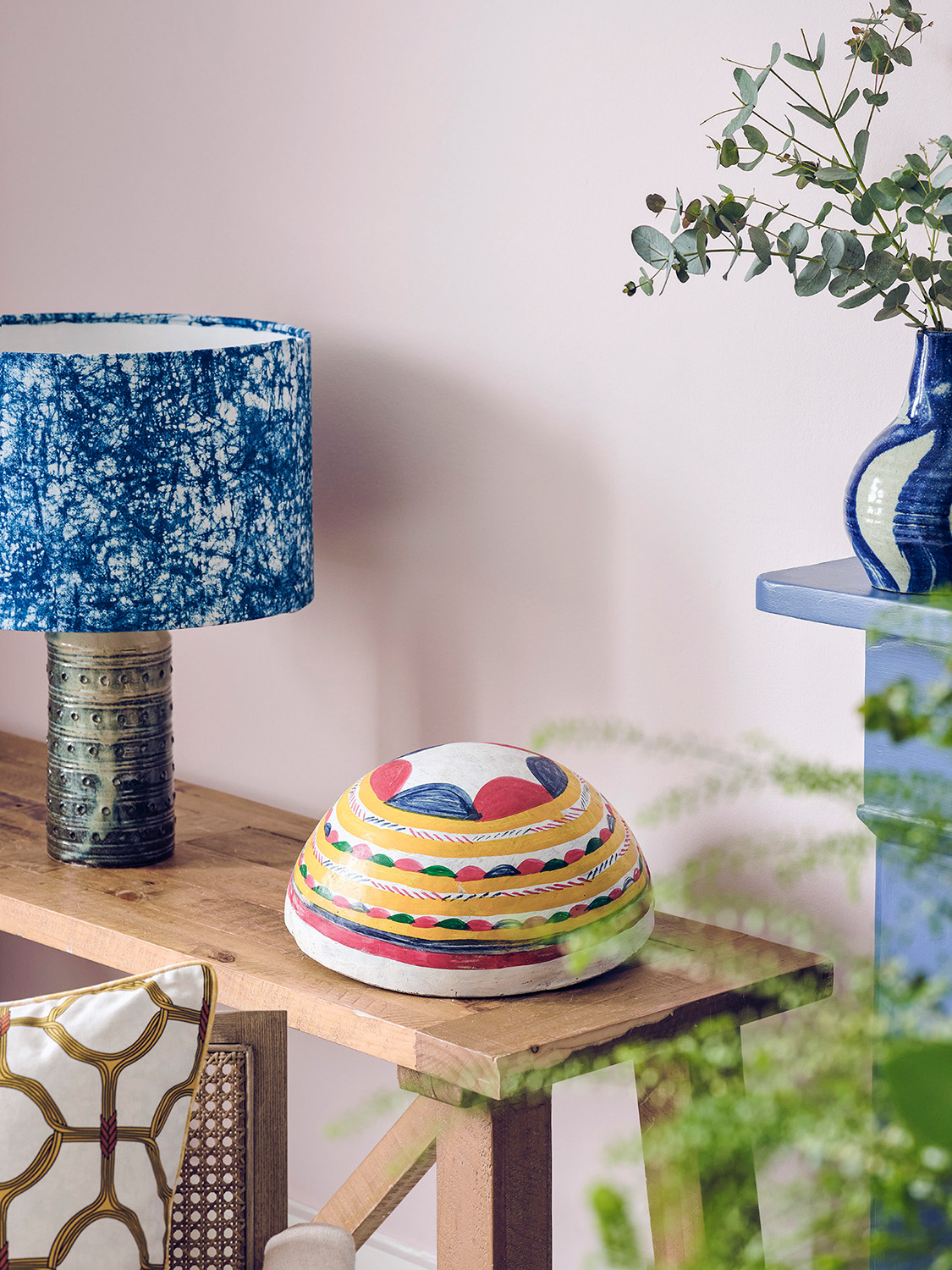
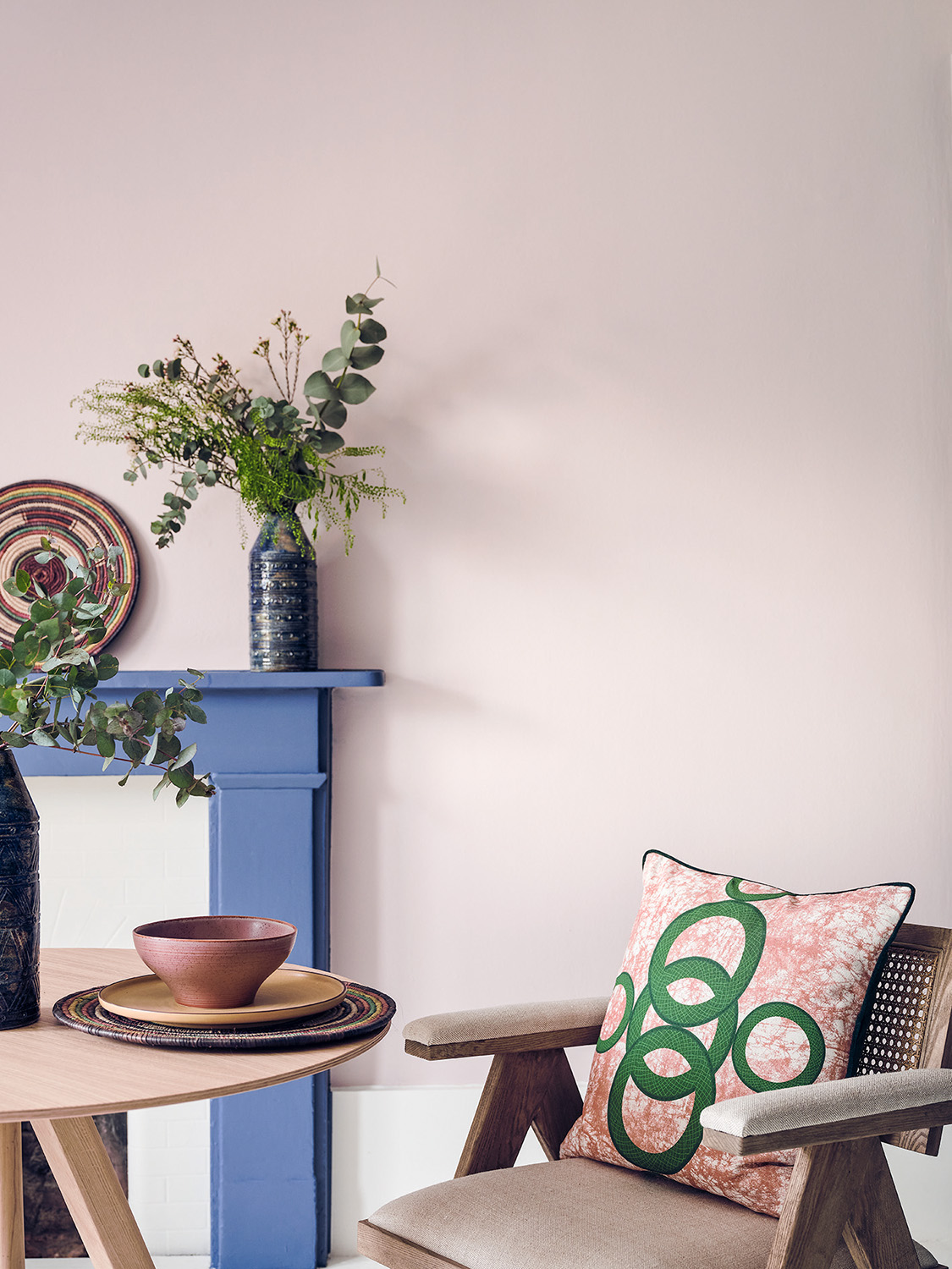
The trick to perfecting the perfect palette is about getting the temperature right. I love pairing blues together but you can’t put a cold blue with a warm blue - it won’t work. You need to be clear about how warm a color is, and by that I mean what undertone is used to make it. A green with a yellow undertone will clash with a green that has a red undertone, but a light green will always work with a darker green if they both have the same base pigments in them. This is the trick, really, and if you follow it you honestly can’t go wrong in putting big colors together.
What to use instead of the color wheel
I think the color wheel [a relatively simple diagram, popular in color theory, which determines which shades complement each other] is great for maximalist schemes because it’s all about contrass. It’s too strong for me. It doesn’t allow for the neutrals I bring in to balance out the boldness, the beiges and lavenders, for example.
You see, bold shades only work with a calm and simplistic base - I love blues and oranges for decor pieces but they only truly sing out if you have a subtle background for them. The eye needs to rest when it comes into a room, it’s important you yourself feel at ease, not distracted.
2024's best colors to work with now
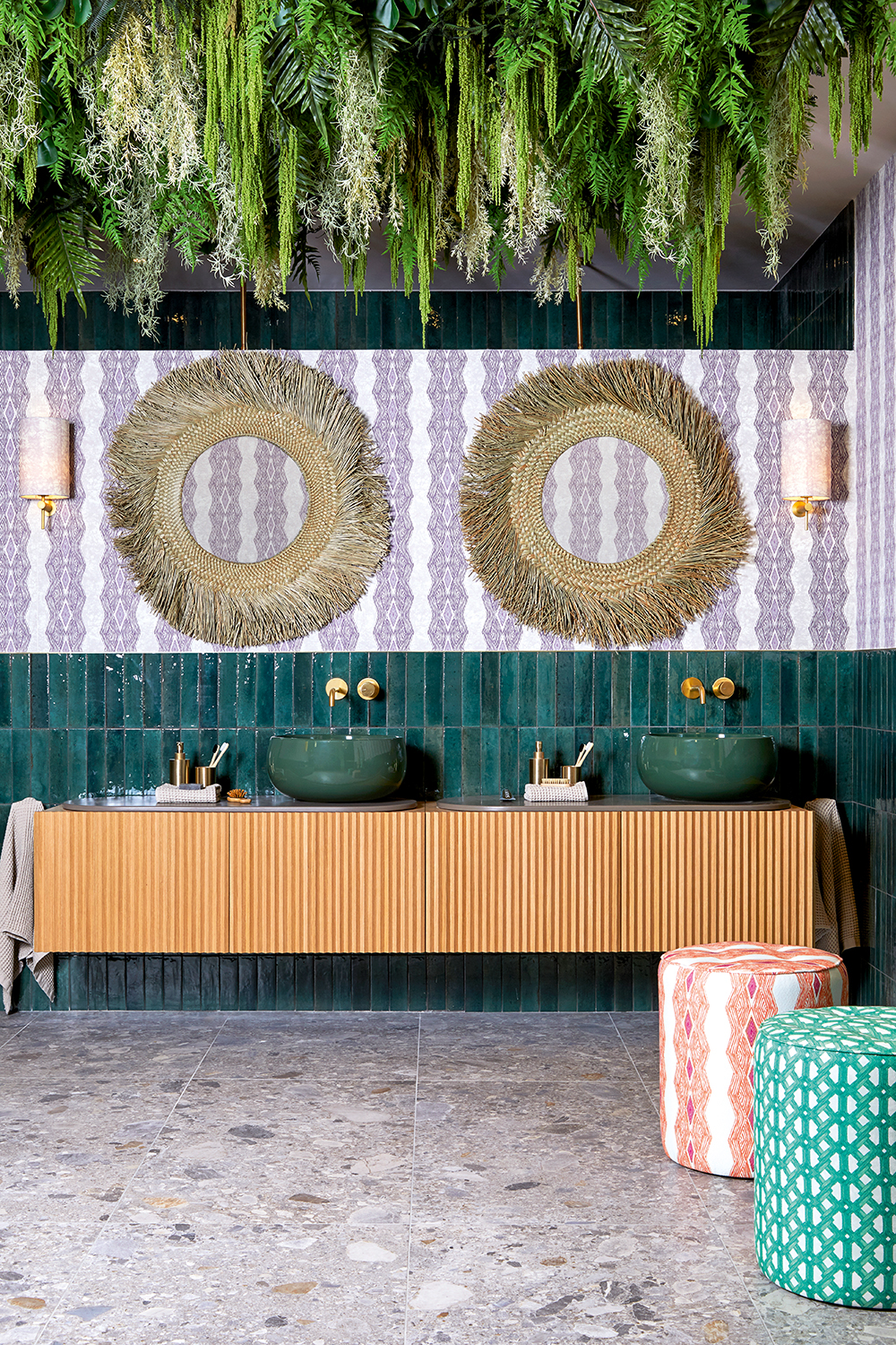
I’m still very into purples and greens together, a palette I used for my collaboration with the bathroom brand C.P. Hart. Think of wisteria and lilac flowers, of the greens of their foliage. It’s such a refreshing and natural combination. Green, for me, is a neutral, and lavender has evolved as long as you find one with a greige undertone so that it has an earthy smoothness to it. Paint and Paper Library’s Marble V is perfect.
And how to make sure bold colors don't overwhelm you
You can still have color and pattern but if you do then you can’t have any clutter and you need to be considerate about the layout of the space. In an open-plan room take some books off the shelves, remove a few of the objets. It’ll feel much more organic this way, more elevated. And bring in texture! Lots of texture.
I like a sleek glass coffee table, but it needs to be softened with something woven like a pillow or an African basket. While color sets the mood and pattern sets the character, texture is what gives you depth, that level of cosiness we all need right now. A boucle fabric can turn a room around.