Google is truly delivering on its intention to rebrand all of its apps in a bamboozling array of multicoloured app icons. The latest Google logo redesign is particularly ripe for mockery since it's the turn of Find My Device, while many people are struggling to find their apps.
Users have been complaining for years that Google's mobile apps are starting to look the same because the logos all use the Google brand colours. If you're one, of those, I'm sorry to say that the Find My Device follows the same direction, taking the colours of the main Google logo.

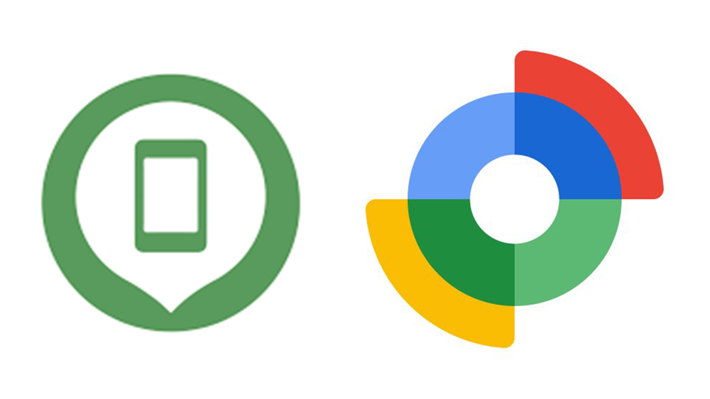
Google's Find My Device app icon got a small tweak last year when the shadows were removed, but it continued to show a green outline of a phone on a white location pin on a green background. That's way too simple for Google's new family of app icons, so it seems we're getting a new multicoloured logo to bring this app into the fold.
As spotted by Mishaal Rahman and Nail Sadykov, editor of the Google News Telegram channel, and reported by 9to5Google, the new logo shows... erm... cross hairs I guess? Or a radar, maybe, although the circular shape also looks a little like a fan or a vault.

For opening Home instead of Drive gang from r/google
In a way, it does make sense for Google to drop the simple phone motif since Find My Device is no longer just for phones but also for tablets, watches and more. But I think we could perhaps have lived with the abstraction.
The new logo is in the usual red, blue, yellow and green and shades thereof, and if you've not yet had time to process the new Google Authenticator logo, the new Google Chat logo or the new Google Fi Wireless logo, you may easily be confused.
What's particularly frustrating with this one is that Find My Device is an app you really want to be able to find in a hurry. Trying to locate a lost device may become even more stressful if you can't find the app needed to trace it.


