It's spring, naturally yellow is a color we associate with this fresh, floral-infused season. However, the love for yellow is going beyond a short-lived crush. It's been slowly on the rise for a while now but looks set to take the crown of that much-overused phrase the 'new neutral.'
Because yellow, especially in some of its palest forms can be used like a neutral. And we think that's why it's gaining so much traction now. Color trends for 2024 are out with the cool and in with the... magnolia. Well, almost. There has been a huge revival in cream this year as it sheds its 90s skin and becomes a color we all want to decorate with again. Yellow is just one step up from cream – warm, welcoming, uplifting.
'Anyone remember how we couldn’t get enough of yellow in the 90s? Well, time to find the love again as yellow, when used in the right room in the right shade, brings nothing but joy,' explains Patrick O'Donnell, International Brand Ambassador at Farrow & Ball.
But where do you start when decorating with yellow? The best yellow paint picked by designers is a good jumping-off point. From barely there buttery yellows, to bolder hues that pack a punch, these are the best shades tried and tested by designers.
1. Yellow Clover, Benjamin Moore
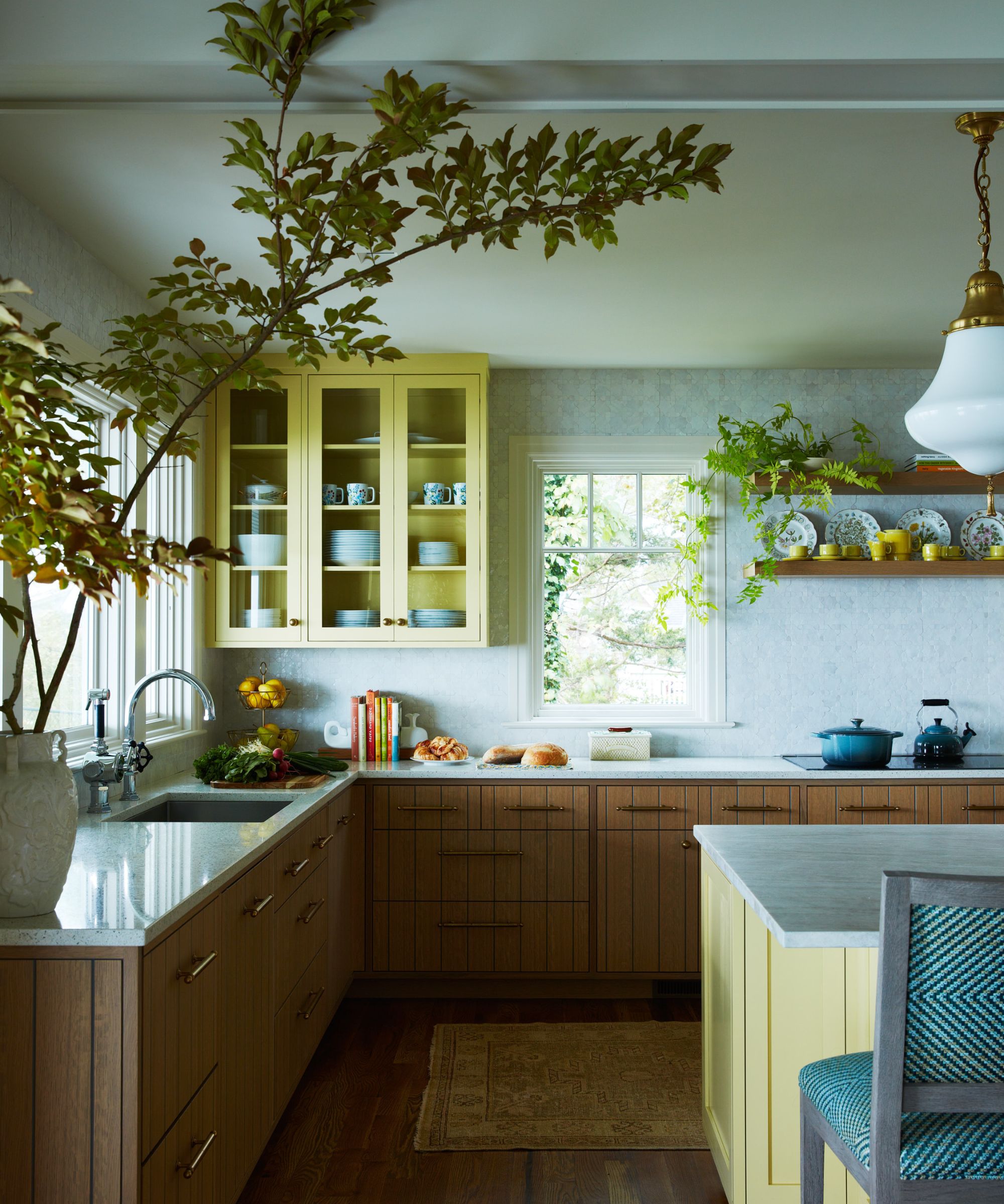
'White kitchens will always be classic but sometimes a pop of color can really give a space the personality it needs. I love painting cabinets a strong color when clients are brave enough to go for it. If they are hesitant, I like to paint upper cabinets alone or even just an island,' explains Gideon Mendelson, Founder and Creative Director of Mendelson Group.
'For this kitchen we designed in the North Fork of Long Island, we stained the lower oak cabinets and painted the upper cabinets and island Benjamin Moore’s Yellow Clover, 375, in a satin finish. I love the warmth it brings into the space and how it connects to some of the elements in the adjacent living space.'
2. Citrona, Farrow & Ball
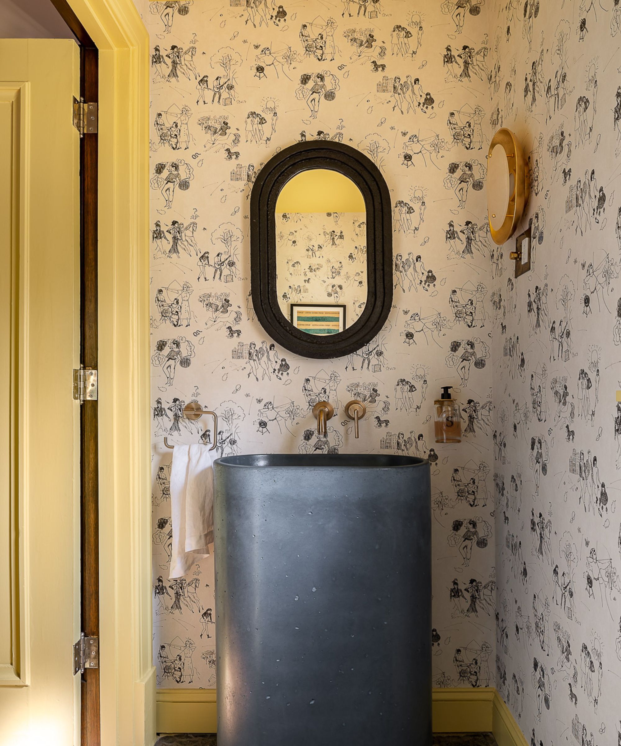
'I love a yellow with a bit of green in it--something that could lean chartreuse in the right light – because it pairs beautifully with blues and lavenders. In this powder room I used Kelly Wearstler's Citrona for Farrow and Ball on the ceiling, door and trim to punch up the neutral sketchiness of Schumacher's "Toile de Femme" wallpaper,' explains designer Bethany Adams.
'Paired with a hand-poured navy concrete basin and rough-hewn slate flooring, the overall effect is edgy and modern, which is not what would typically come to mind when you think "yellow powder room" and I love that about it.'
3. Yellow Pink, Little Greene
'I like my yellows to be warm and bright but not primary,' explains designer Benji Lewis. 'If there’s a hint of gray to a yellow then I’d likely avoid it. Little Greene’s Yellow Pink is great for my purposes because it’s timelessly good.'
'Much as I’d avoid a yellow that goes gray’ish I’d also likely step away from a yellow that’s too pale, it’d make me feel like I’m suffocating in the squidgy middle of a custard cream and no one wants to suffocate in a custard cream.'
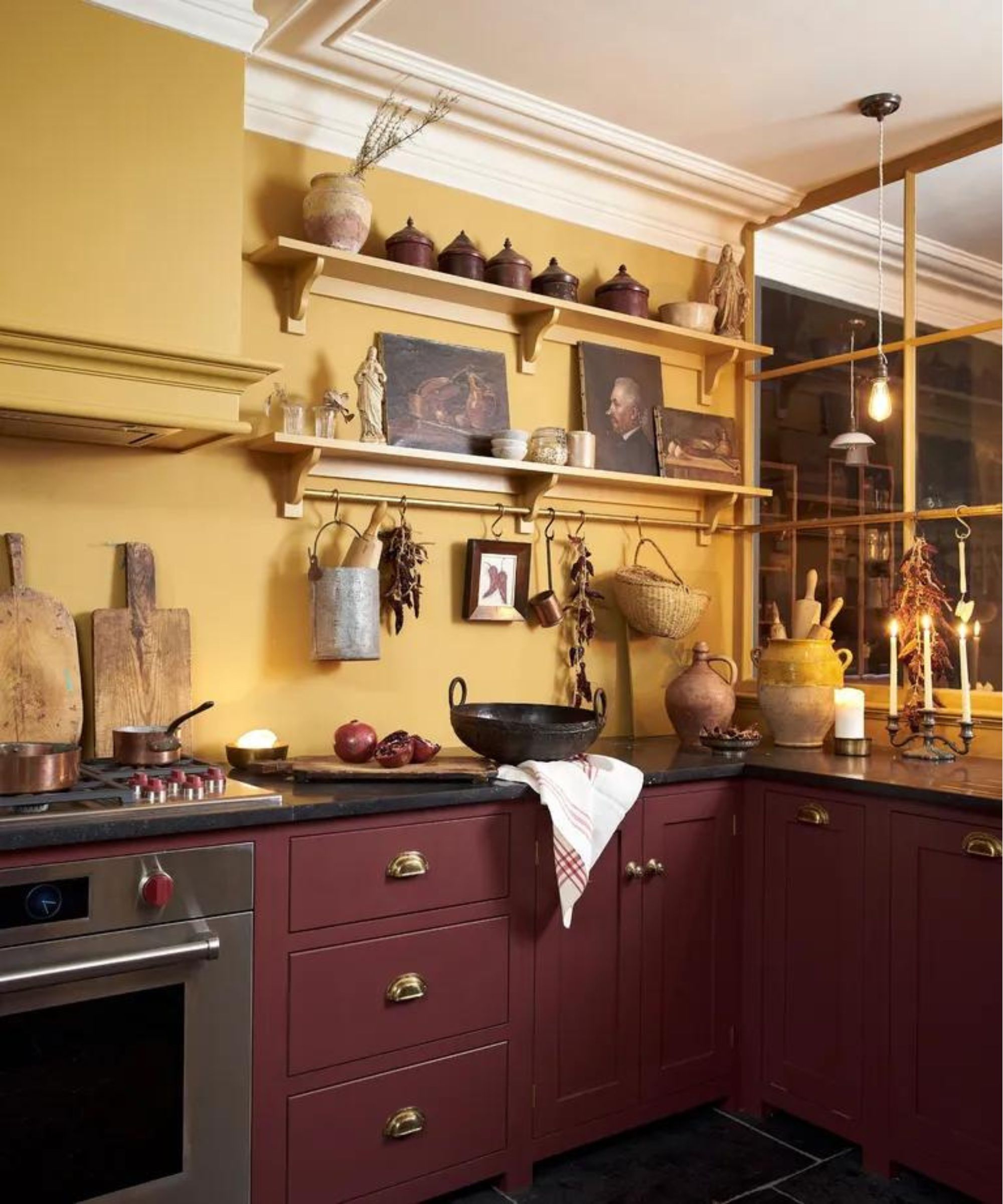
4. Babouche, Farrow & Ball
'Farrow & Ball's Babouche yellow paint adds a burst of sunshine and warmth to any space, This shade of yellow has a depth that avoids the sharpness some yellows can have, instead providing a rich backdrop that complements both light and dark furniture,' explains Kristen Rivoli of Kristen Rivoli Interior Design.
'It also acts as a wonderful canvas for artwork and decorative pieces, allowing them to stand out, while its vibrancy can make a room feel more spacious and illuminated.'
Patrick O'Donnell adds, 'Babouche is the richest and most joyous of our bright yellows and makes for the most wonderful cabinetry color for your kitchen units. If that's not enough drama, introduce a splash of Railings in full gloss to your kitchen island or larder press. Keep everything else super simple with walls and woodwork in our muted Slipper Satin.'
5. Auric, Sherwin Williams
'We love saturated colors that make a bold statement, so when it comes to yellow we tend to go big or go home. A great example of this is Auric by Sherwin Williams. It is a rich marigold color that casts a wonderfully warm glow,' says Sarah Stacey of Sarah Stacey Interior Design.
6. Day Room Yellow, Farrow & Ball
'Dayroom Yellow from Farrow & Ball exudes an irresistible charm. With its bright, invigorating tone reminiscent of a sun-drenched day, it effortlessly revitalizes any space, much like the sun illuminates the day,' says Julie Anne Burch.
7. Antiqued Bronze, Benjamin Moore
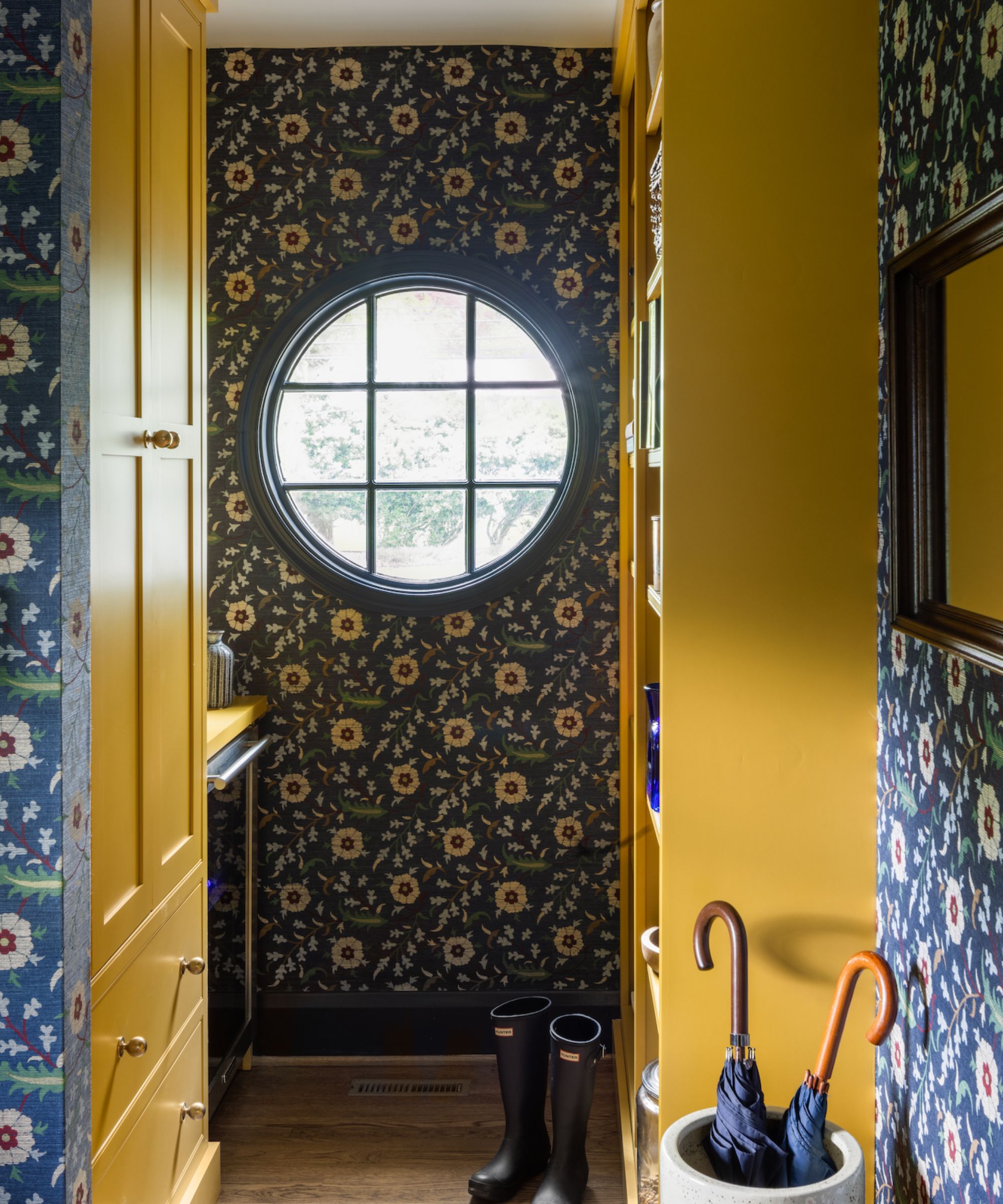
'The golden age of paint is here! Our newest favorites for this season are varying shades of goldish sunflower tones,' says founder of Folding Chair Design, Jennifer Walter. 'Forget the elementary school cinder blocks walls! These deep, moody shades are perfect for smaller spaces like powder rooms, office, nooks, entries, and mudrooms. They are also fabulous contrast colors on cabinetry.'
'My top three are, Benjamin Moore Antique Bronze (used in this boot room), Sherwin Williams Renwick Golden Oak and Sherwin Williams Gallant Gold.'
8. Hay, Farrow & Ball

'Farrow & Ball provides excellent coverage, durability, and aesthetic appeal, making them one of my top choices for interior design projects. They make wonderful yellow paints. These warm, inviting shades add vibrancy and coziness to any room. The rich golden undertones create a cheerful ambiance, perfect for living rooms or bedrooms. I personally like Hay and Pale Hound best,' says designer Nataly Bolshavoka
9. Cotton Tail, Benjamin Moore
'I love Cotton Tail from Benjamin Moore when in search of a subtle touch of yellow warmth. This paint color is very light and airy, but also cheerful with decidedly warm undertones. It's like a sunbeam just barely touching your walls and it's perfect for contrasting with bolder earth tones like terracotta, moss green, teak,' says designer Kathy Kuo.