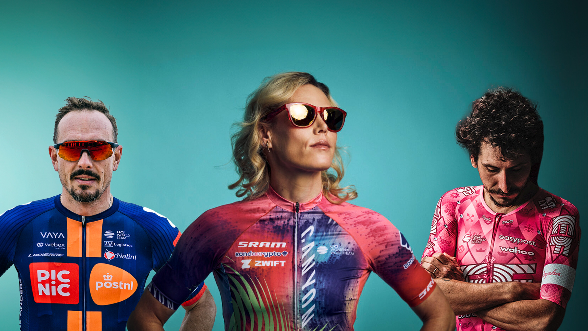
January brings with it the start of a new racing season. The Tour Down Under will soon be in full swing, and we’ve had images of all of the team kits for the upcoming season.
When I joined Cyclingnews many moons ago there was a very democratic system where each member of our wonderful editorial team, both racing and tech, got a vote, which then resulted in a beautifully fair and incredibly time-consuming article. One year I suggested we just get my mum to do it and since then it’s become somewhat of a tradition.
My mum makes her own clothes, so has an eye for pattern matching and design, as well as being a fairweather cycling fan. She’s also prone to some cutting outbursts, which makes for great quotes. To save her time and mental anguish I have decided to rank all the kits myself - this isn’t a democracy I’m afraid, but for those of you unable to form your own opinions please do feel free to pass mine off as your own over a beer with your friends.
To the teams, I hope you’ll take this as a light-hearted bit of fun. I’m sure at some point I’ll have to explain myself to multiple press officers, but for now let’s just dive into it, starting at the bottom and getting progressively better.
30. Cofidis

They’ve got that badly wrong. That’s a big mistake - why have they put maroon and yellow with that nice red? They look like they’re wearing 1930’s strongman bathing suits! That’s such a shame.
Right, I actually do really like this jersey, but two years ago the team promised my mother a team jersey on Twitter. She was very complimentary about that season’s jersey - in stark contrast to the 2025 kit - and has been waiting expectantly ever since. As such, I cannot in good conscience, as a loving son, do anything but stick Cofidis dead last. To the team: You’ve got a full 12 months now to rectify things for next year.
29. SD Worx-Protime
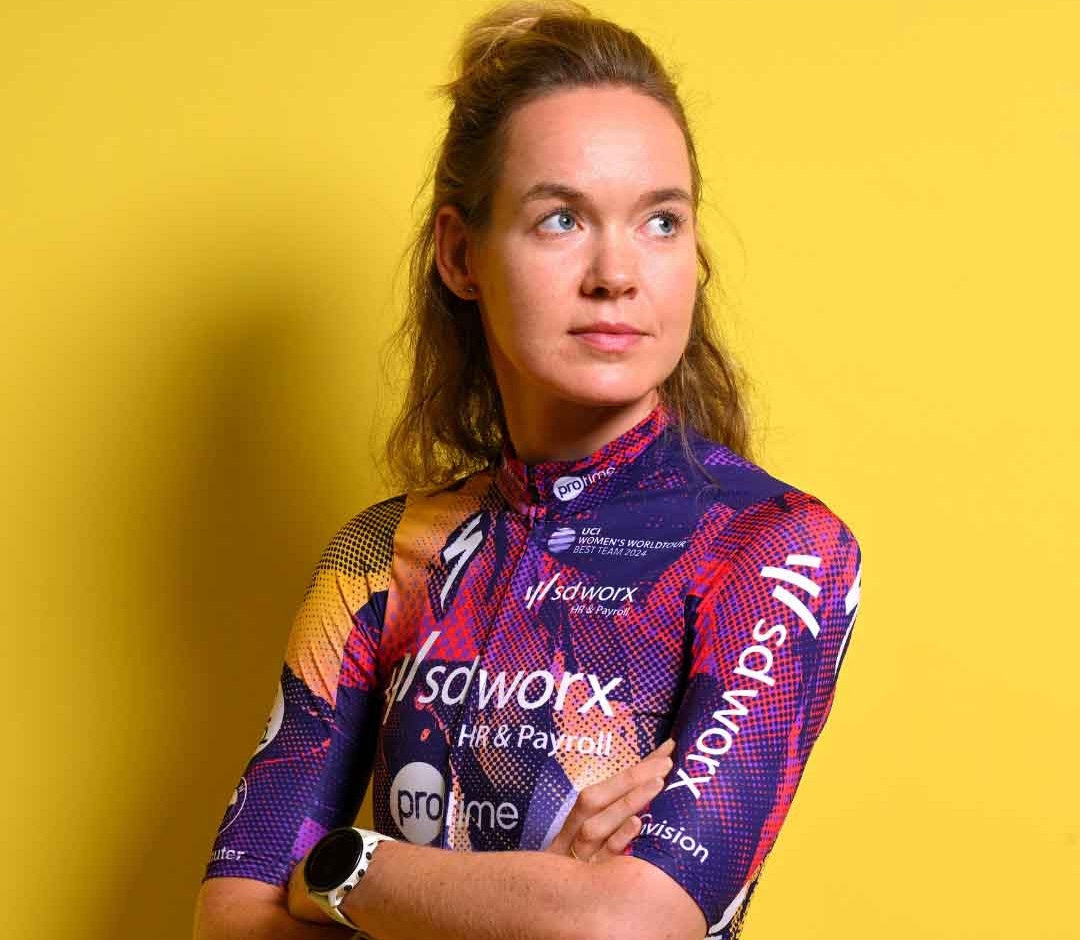
I think there’s more thought given to bus seats. You can’t actually see the sponsors - If I was Specialized I’d be a bit disappointed. It is marginally better than Cofidis but not much. Any jersey with ‘Payroll’ on it puts the fear of God into me.
I think it’s the speckly nature of the jersey, but the combo of patterns and colours really puts me in mind of the seats on British buses and trains, the fabric of which I’m certain is designed to hide all manner of sins. It’s not hideous, but in my head the team is effectively now SD Worx-Routemaster or InterCity 125-Protime.
28. XDS Astana
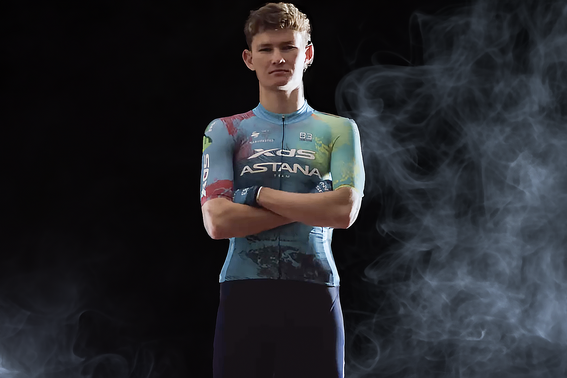
You can’t see it much through the smoke can you? You know when Astana was a nice clear turquoise that was good wasn’t it? At least the red will cover up any mistakes when they fall off… It’s this bloody fade again. This is the problem with the peloton right now, and not enough stripes. Give me a Breton stripe!
Last season’s jersey was good and punchy. It wasn’t classic Astana (RIP blue bibs) but it was still decent. This one is a little insipid for my liking, with the colour patches looking like something ran in the wash rather than creating any visual intrigue.
29. Israel-Premier Tech
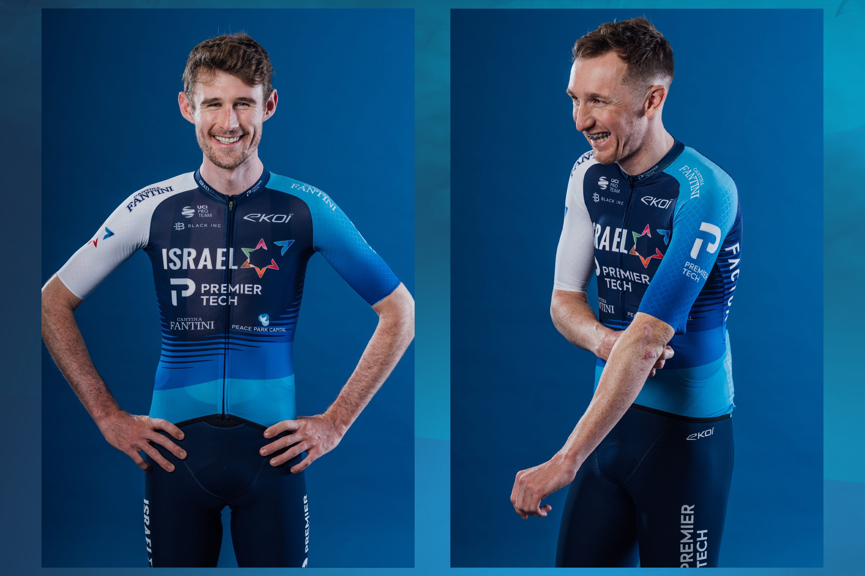
It’s alright. I can’t be any more enthusiastic than that I’m afraid. It doesn’t spark joy. The other problem in the peloton is there’s too much blue.
It’s crisp and neat, but it has the vibe of a consultancy powerpoint presentation. It’s not a jersey that would cut loose at the bar, but choose to work late, eschewing any semblance of work life balance. It needs to cut loose and embrace the euro vibes a bit more and slap some neons in.
26. EF-Easypost and EF-Oatly
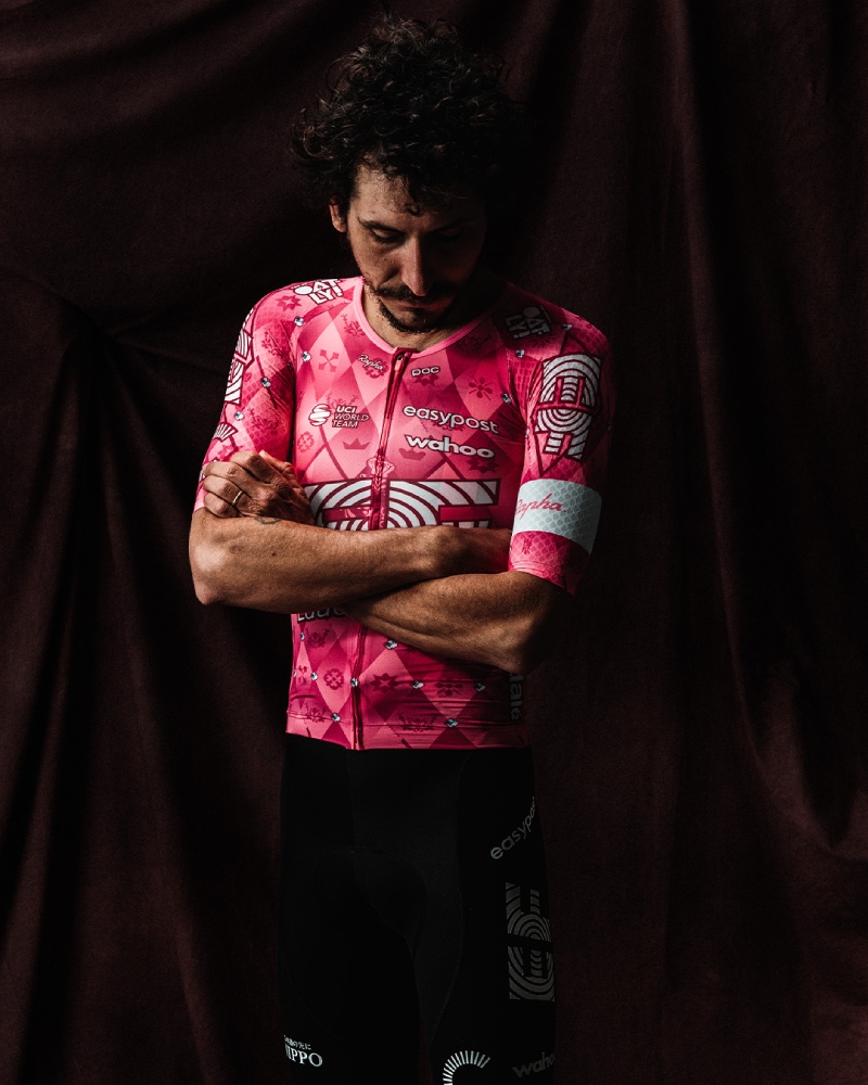
Oh well that’s a nice departure! That’s quite cute, and not because it’s pink… the E on the arms looks like a polar bear. Not bad, and it’s different - I like the diamonds.
Quite the fall from grace in my opinion. I usually love the EF kits, even that one from 2023 that looks a bit like a highlighter that was about to run out. This is too… Louis Vuitton for my liking. It doesn’t scream ‘Oat milk sponsor’ as much as ‘our riders nails are also monogrammed’. Given I’m sure Lachlan Morton will inevitably embark on some mad endeavour like riding to the moon and back it seems like a jersey totally incongruous with solo, mucky endeavours.
25. UAE Team ADQ
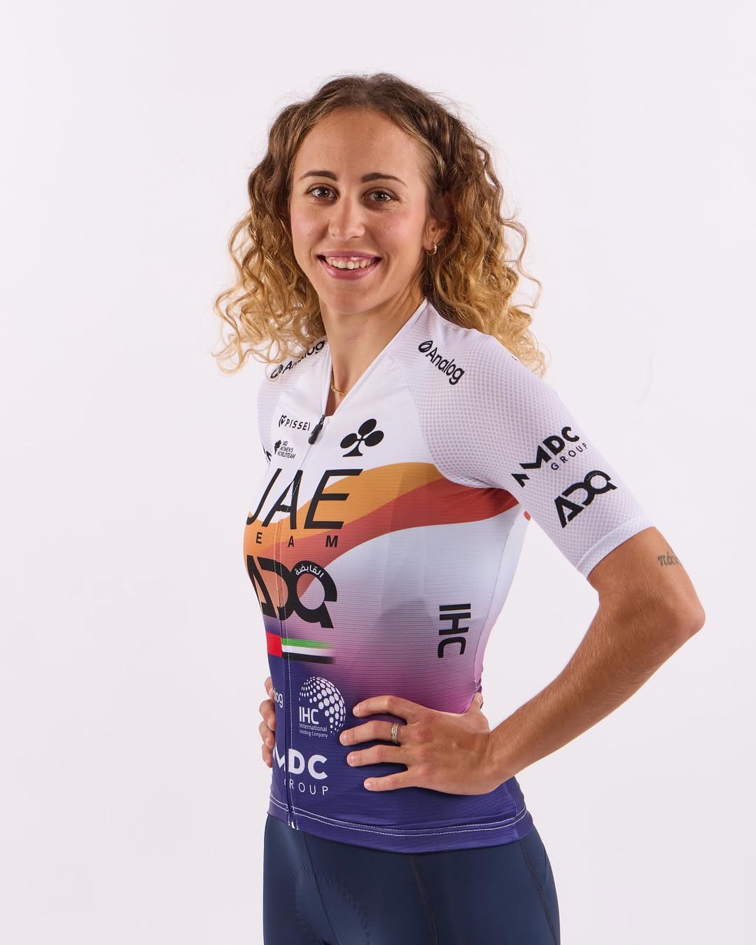
It’s a bit busy down the front but it does have a nice neckline. Bland.
The 2024 UAE Team ADQ kit was a tour de force of pastel shades. For some reason the team has ditched that modern, bright, vibrant aesthetic in favour of a jersey that puts me in mind of pharmaceutical products. Creams, topical ointments and unguents.
24. Decathlon AG2R La Mondiale

They got it spot on two years ago but we have got NHS green. What the hell are the helmets about? They’re trying all the colours, but they need to go back to brown. It’s quite smart but it’s not the brown shorts, and also that green needs to be on both sides to work.
I’m actually pretty sure most of you will like this jersey, but I cannot I’m afraid. It’s a very personal affliction but my parents are both dentists and that pale green is exactly the same colour as waiting room chairs and even worse that hardening putty that’s used to take dental impressions. I can still smell it.
23. Equipo Kern Pharma
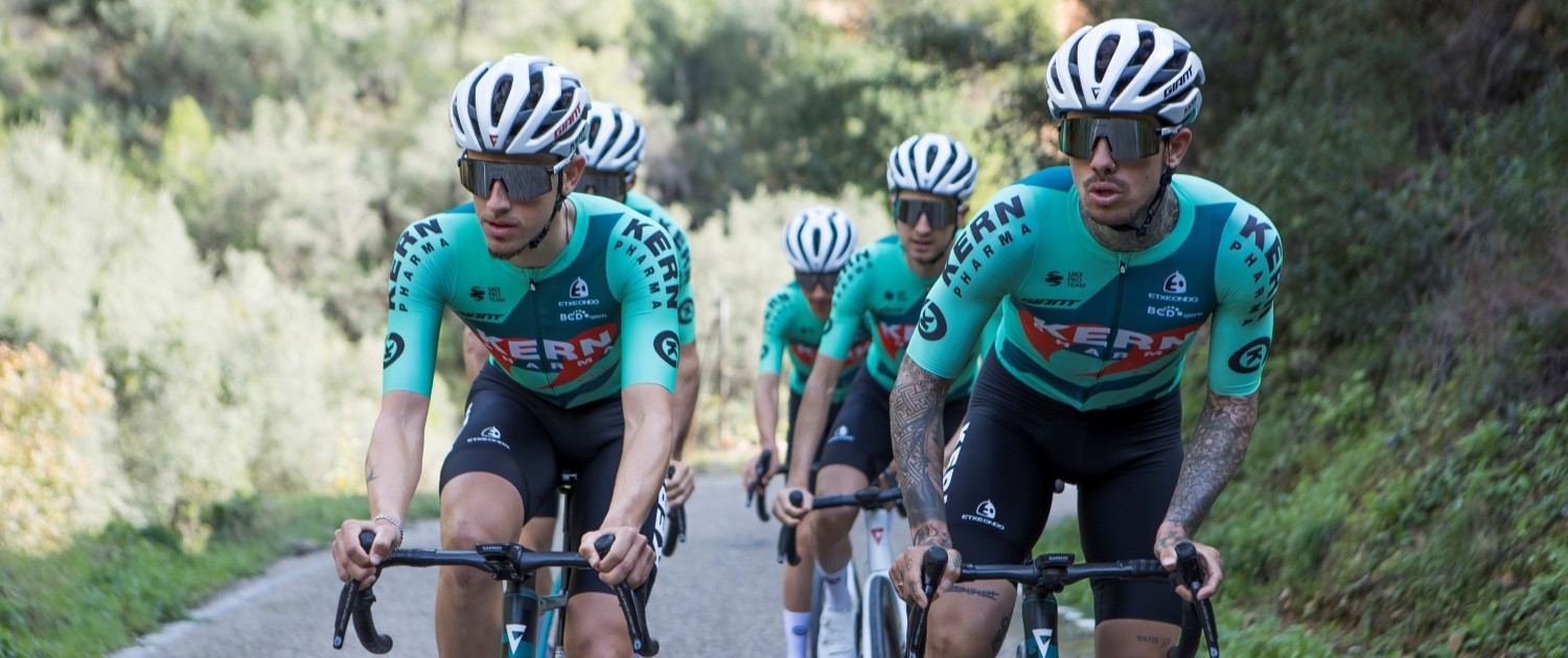
Ooh now that’s better. That’s a bit natty, also it’s teal not blue so it’s classy, and I like a little bit of the red that’s nice. Also Kern is a nice make of cheese isn’t it? Cornish Kern, made by the same people as Yarg, beautiful stuff, from Lynher dairies.
The Kern Pharma bikes from my Vuelta a España tech gallery had my favourite paint scheme of any bike last season, but sadly the team has been afflicted by the same dental goo curse as Decathlon. It only ranks higher as it’s a little more Euro in appearance, and based on good will from last season.
22. Ineos Grenadiers
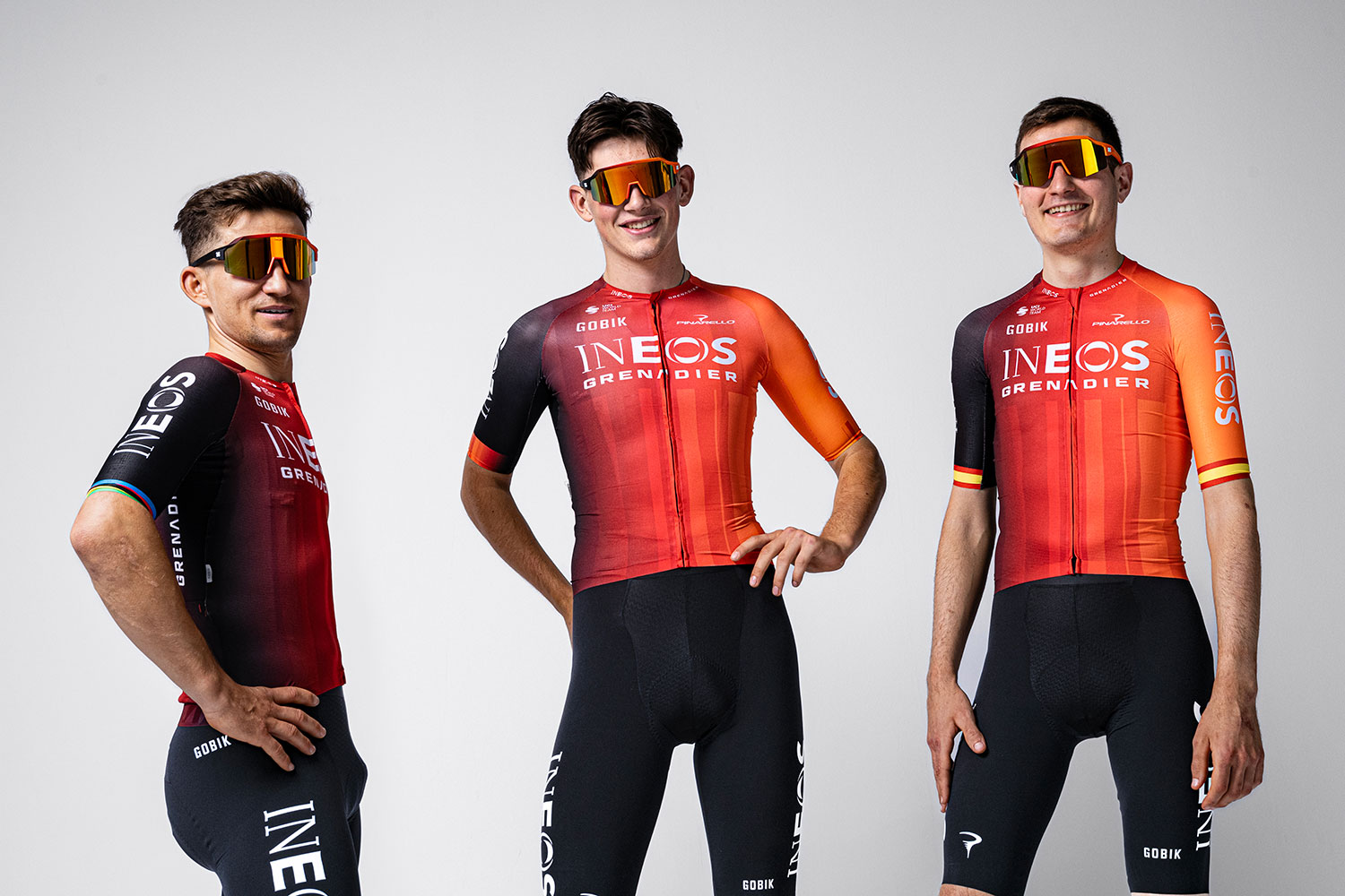
Oh what have they done…Oh OK, well they’re trying to get back to black again aren’t they? Slowly getting there. They’ll get back to all black again. I quite like it but it’s not very striking. If they went back to the central band it’d be better. Probably next year we’ll find them in half red half black.
We’re into the mid-table now. The Ineos jersey is pretty inoffensive, and now Bahrain has changed its own orange and black jersey to white it is at least a little more unique. It doesn’t set my heart aflutter, but neither does it cause me any visual distress.
21. Human Powered Health
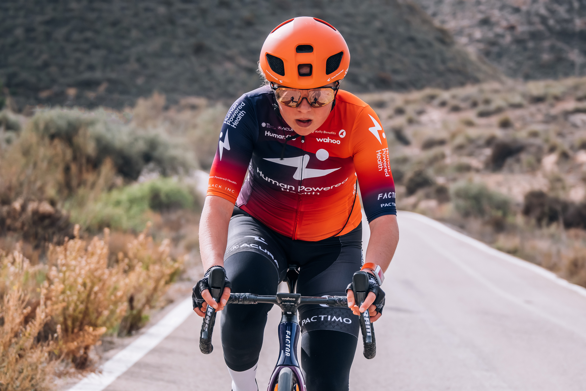
Oh look that’s exactly the same as Ineos Grenadiers!
Essentially everything I said about Ineos is also true for the HPH kit, except here it’s just a little better executed. Less is more is always a valuable lesson to learn.
20. Bahrain Victorious
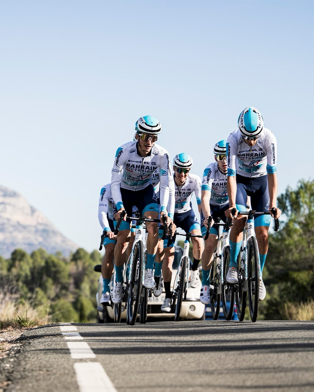
Well they’ve made an effort with the hat; they look like targets don’t they? I think I’ll just put that down as ‘smart’. Smart but dull - It needs a bit of red on it to give it a lift.
As is ever the case in this mid-table area I find it hard to muster up an opinion here. It’s totally inoffensive but equally the Bahrain Victorious 2025 kit is not terribly exciting. So unmoved was I by it that I initially forgot to include it in the rankings at all.
19. Movistar Team Men and Women
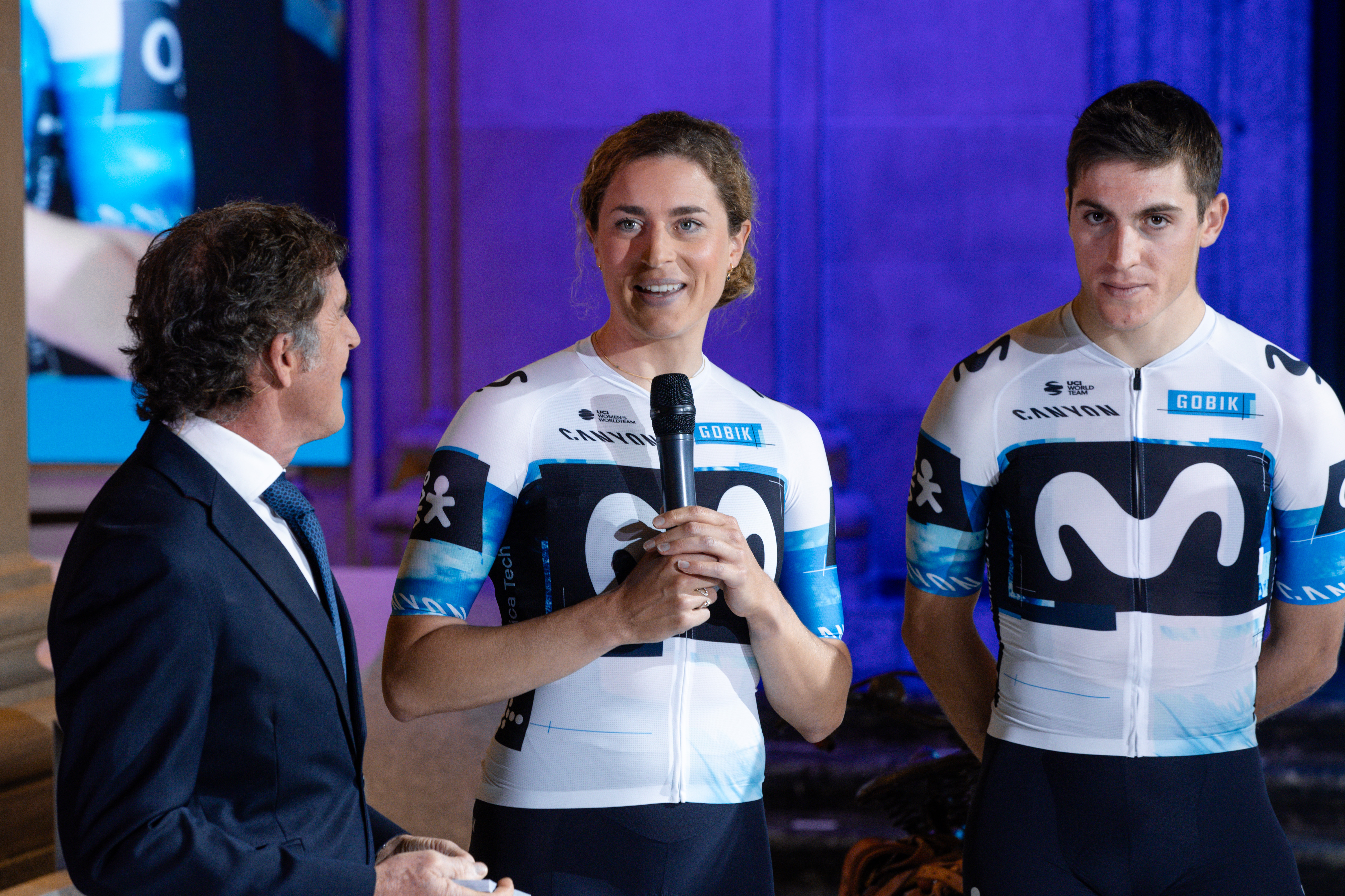
It’s a departure, instead of it being all blue it’s now white. The ‘M’ looks a bit like an amoeba going along, doesn’t it? It’s these fades again - it looks like it’s gone wrong in the wash. It’d be better just plain white.
As with Bahrain, it's just a bit... meh isn't it? How this is allowed given it clearly clashes with the young rider classification jersey at the Tour de France is beyond me.
18. Soudal Quick-Step
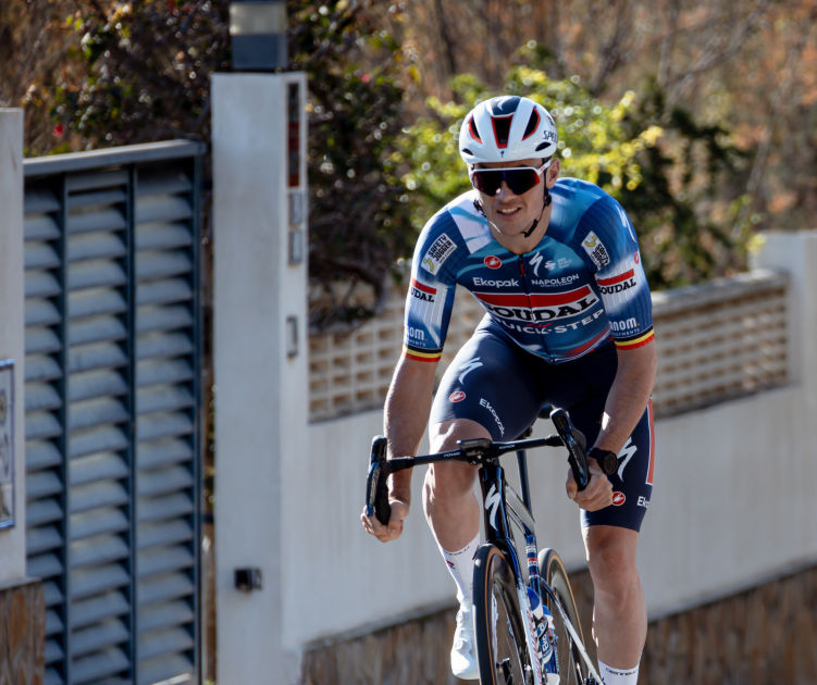
Oh well that’s classic. It’s about as classic as you can get. Nice big stripe, you can see the sponsors, everyone's happy. Classic jersey.
The Soudal jersey isn’t bad in any way, but what gets me is a team with such history producing such a modern looking jersey. The 2019 Deceuninck - Quick-Step jersey was absolute peak for beautiful Euro jersey design. I want just a block colour of that beautiful mid blue. I want blue shorts too, and I want to see Classics riders kicking around the backroads of Belgium in blue tights, not black. Is that too much to ask?
17. AG Insurance Soudal
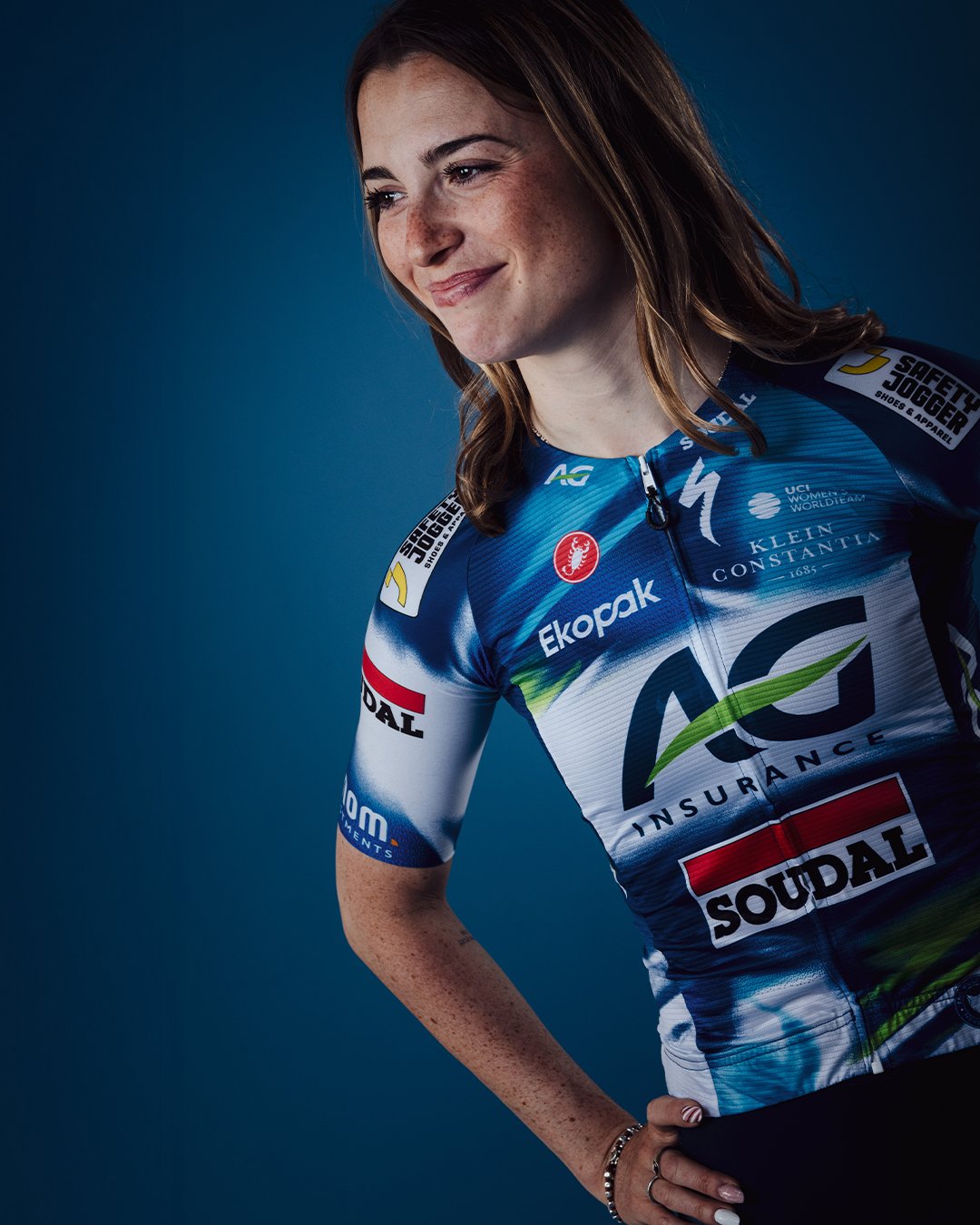
That’s another thing, I think the women’s and men’s team kits should be the same! It doesn’t have as nice a neck line as the UAE Team ADQ. Oh and another thing, if you’ve got Specialized and you have lobsters [Castelli] they should have equal prominence. You can’t see who’s on this one, so when she stands up and says ooh I’ve won you can’t see the sponsors. All the sponsors should go in a nice neat way.
I prefer this jersey to the Soudal Quick-Step option because of the little flash of green, but also because the team isn’t burdened by the weight of some great historic jerseys that it would struggle to live up to.
16. Visma-Lease a Bike Men and Women
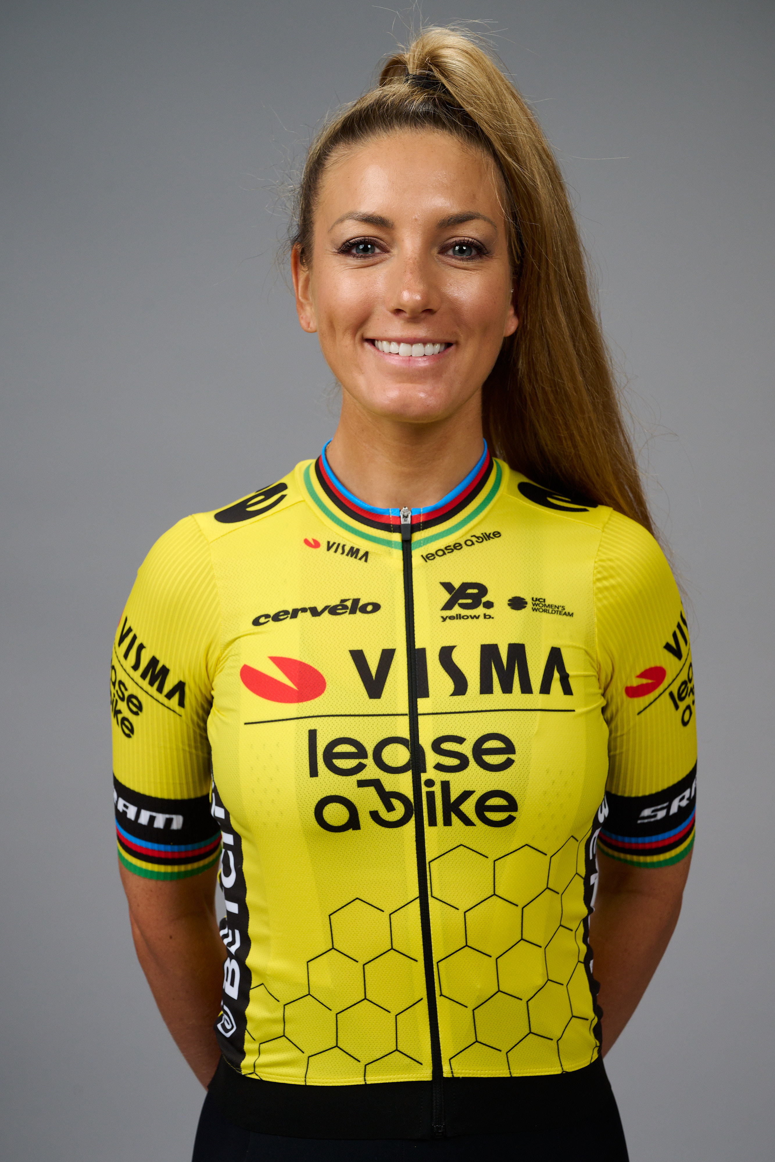
Who are the tyre people, the people who go around handing out tyres? [Mavic neutral service from years ago] This puts me in mind of Mavic. I like yellow and she’s even got tyre treads on the bottom of the jersey.
Given the team has gone from having a kit sponsor to apparently making their own kit for 2025 you can forgive them for not having any real visual design overhaul. It’s neat, crisp, and as a fan of apiarists I do enjoy the honeycomb motif, but it is a little plain for my liking.
15. Arkea-B&B Hotels Men and Women
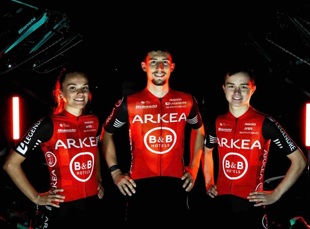
Now last year Arkea had a really nice kit and when they were leaning forwards you could see Arkea down the sides very clearly. And the men’s and women's kits are identical - top marks there.
I think this is the best of the jerseys I don’t actively like. It’s well laid out, with well visible sponsors and it’s been around long enough to have a coherent identity, but it’s never a jersey I’ve particularly warmed to. I think it’s because the red clashes so horrendously with the celeste of the team’s Bianchi bikes to be honest.
14. VF Group-Bardiani-CSF Faizanè
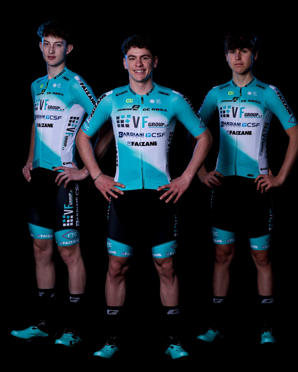
Oh God help us, that's awful. It’s turquoise again!! The shorts are nice… it’s got that bloody nasty dayglow yellow logo [the small Alé logo - ed]. I hate dayglow…it’s that urine colour. No. If they wore black shoes they’d look less tryhard. If they have turquoise bikes as well it’ll be a disaster.
This one really pulled me in two directions. On the one hand it’s fantastically euro, which I love, and on the other hand that colour is absolutely hideous. I think if it had more or brighter sponsor logos to make it more visually arresting then I’d like it more, or colour matching shorts. I know I said ‘less is more’ only a few words ago but I’m a man of contradiction and this really isn’t that serious.
13. Red Bull-Bora-Hansgrohe
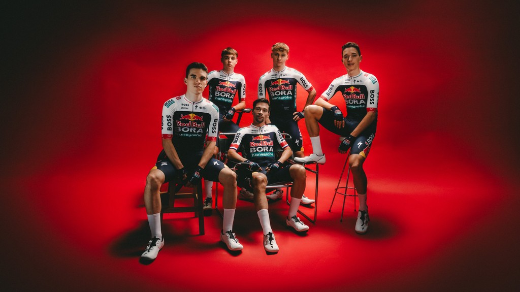
When they were in green it was lovely, wasn’t it? I think we’re seeing too much of Red Bull and it’s a bit Formula1. I think the word ‘inoffensive’ springs to mind. It’s well designed though, with the dark blue going underneath the armpit.
I do like this jersey, but I think it's a bit too motorsport for me. Cycling is already becoming more and more like Formula1 with each passing season, but that doesn't mean we should be pandering to that particular aesthetic. Part of what makes cycling great is brilliantly gross looking kit sometimes, and this is too smart and just a bit busy.
12. UAE Emirates XRG
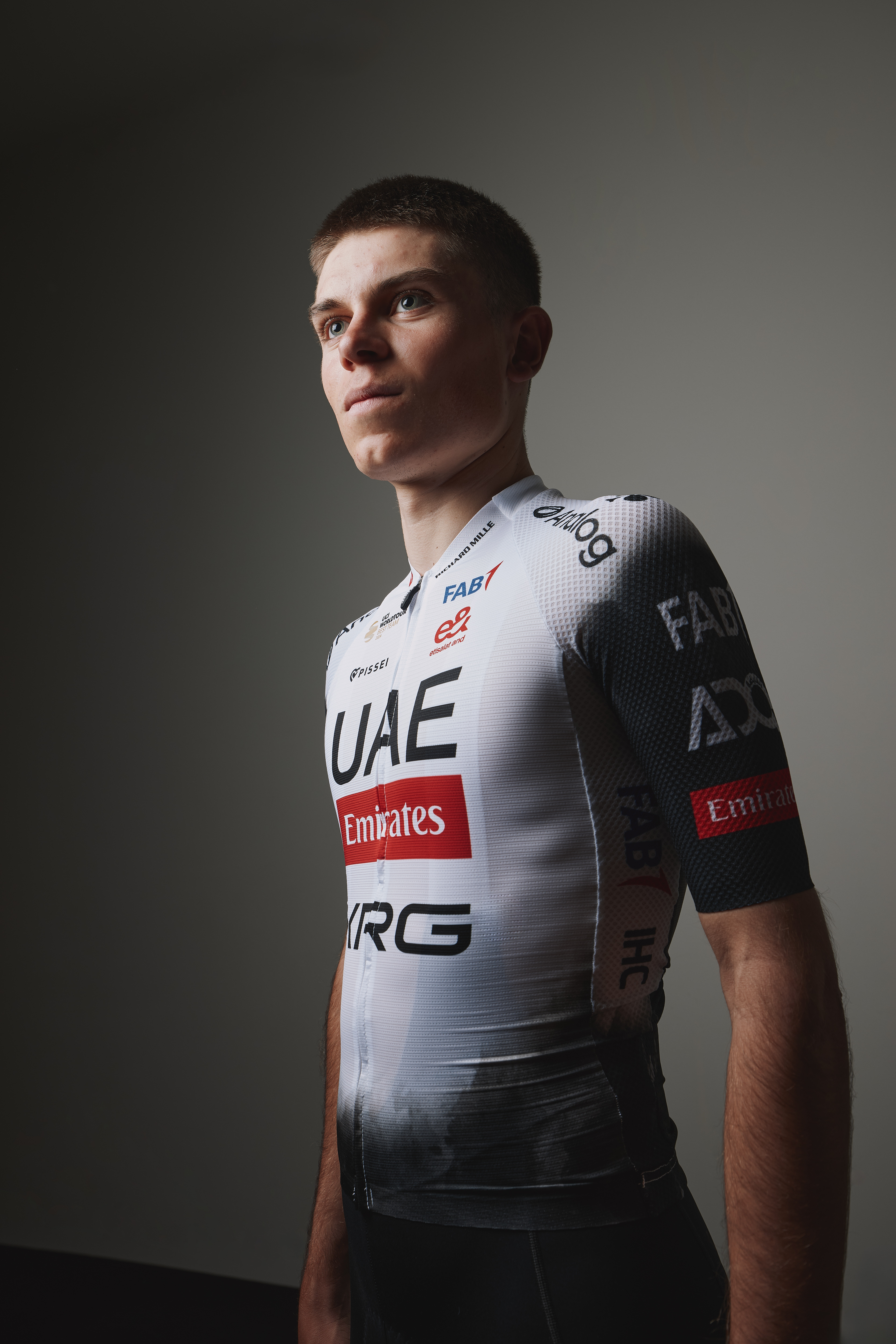
They’ve got so much money these guys and that’s all they can come up with? It’s simple but it fades… why don’t they just have nice stripes? I do like a splash of red and it is clear, and the red is good, but it's fades again.
I really loved the 2024 UAE Team Emirates kit, and while this one is also beautifully neat and monochromatic, I cannot abide this current aesthetic obsession with having smoke effect fades on kit. Up close you can see it well enough, but in the real world, not in a photo studio, it just makes the kit look dirty.
11. Picnic-PostNL

That’s quite smart. I hope the orange stripes go down his back too, it’s fun! I don’t know who Picnic is but I’d remember them. I really like that, it’s great.
I was initially quite down on the DSM jersey of 2024, but it grew on me, and clearly paved the way for this season being a better placement. Crisp, neat, no fades, and stripes. A winning formula.
10. Groupama-FDJ

I like it. I know there’s too much blue in the peloton but there’s a distinct lack of fades here and it has got a stripe down the middle. I like that: Three colours max, no fades, classy.
No real change from last year, which was also very good. If they brought Thibaut Pinot out of retirement just for the photos I think it’d rank better because he’s very handsome and lovely and is kind to animals.
9. Uno-X Mobility
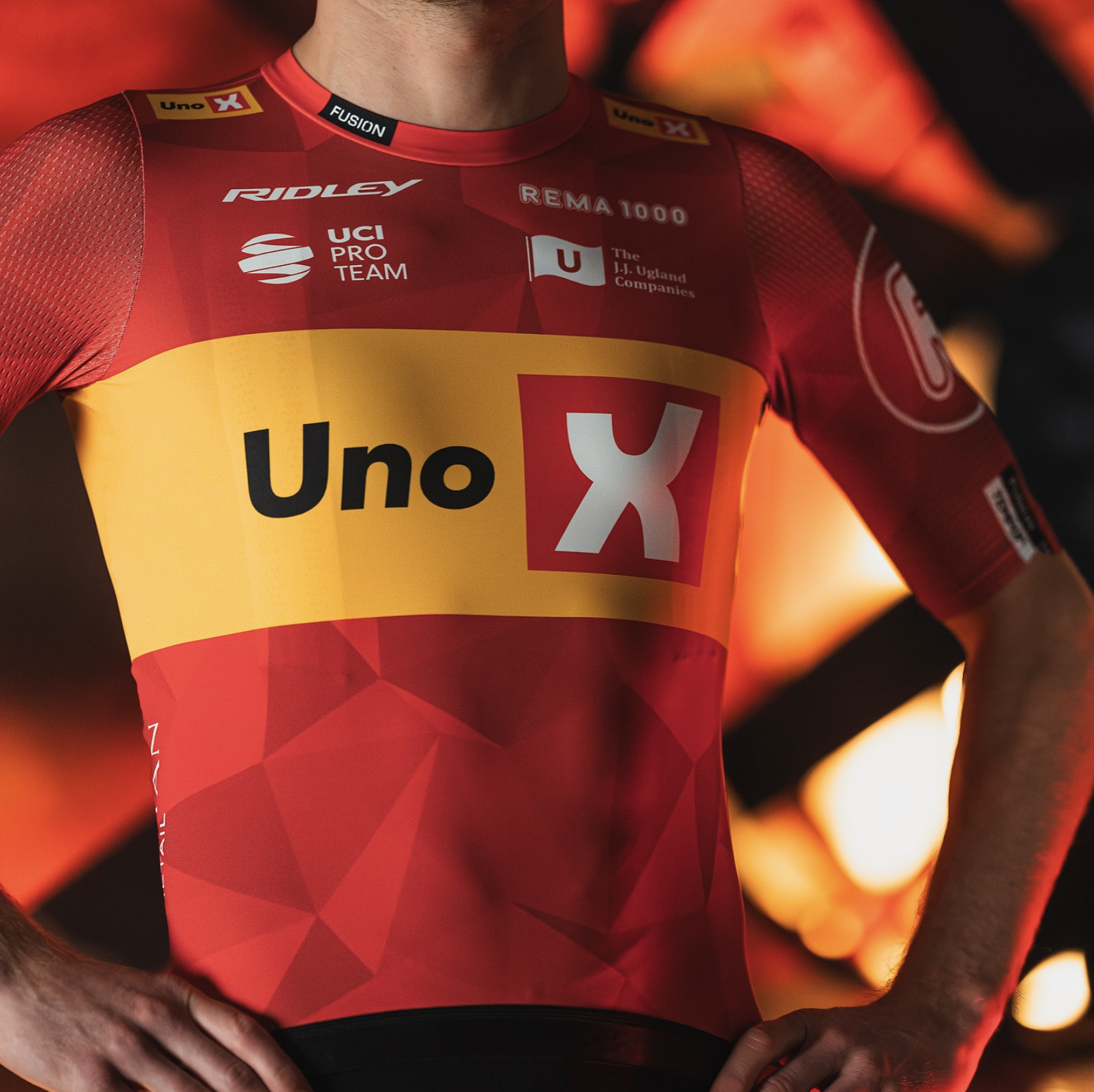
Oh they’ve done it again!! Look it’s not difficult, you put the X UNDERNEATH the Uno. Apart from that the colours are nice. I did have to eat my words last year as it did look good on the bike and I do like that yellow. But poor women, you can’t have them with an ‘X’ on their chests.
Having a kit with no zip is rogue, though the riders will likely just wear a skinsuit. Lovely colours, neat, simple, and the polygons add texture without detracting from things or making it look mucky. A great exercise in neat design and well worthy of a top ten placement.
8. Lotto
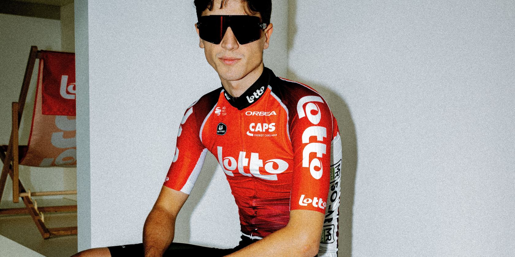
You know, that’s not bad. That’s classy again. I like the white going down the sides, and while there is a fade going on in the tummy department you won’t see it when he’s he’s all hunched over. Puts me in mind of Cofidis when they were sensible.
I love this jersey just because it could quite easily be from 2008. It’s pure nostalgia, total Belgie goodness and I think the team will do far better at the Spring Classics as a result.
7. Jayco-AlUla / Liv-AlUla-Jayco
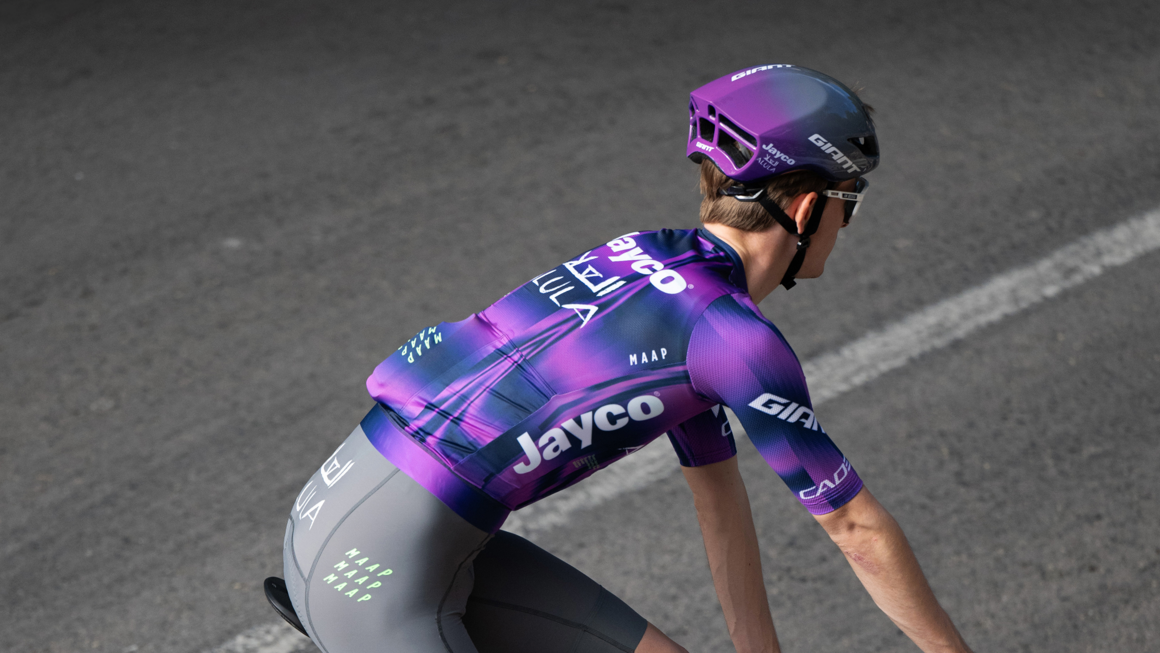
Oh that’s ghastly! That’s cheap purple and grey. Unsaturated dark grey. If someone got the spotty jersey with that it would be an absolute visual disaster. What a shame. Grey shorts?! Why didn’t they have some nice colour shorts? Inspired by Saudi Arabian deserts, you’re kidding me? They’ve drunk too much.
Maap’s debut single for the WorldTour and it’s straight into the top ten. It’s definitely going to split opinions, but as I’m the one writing this I get to put out to the world that I quite like it. Ignore all the fluff about it being inspired by the southern lights and shifting desert sands, just enjoy seeing grey shorts and hot purple flashing past. Maap usually nails the aesthetic brief, and this is no different, and a vast improvement on last season’s option.
6. Intermarché-Wanty
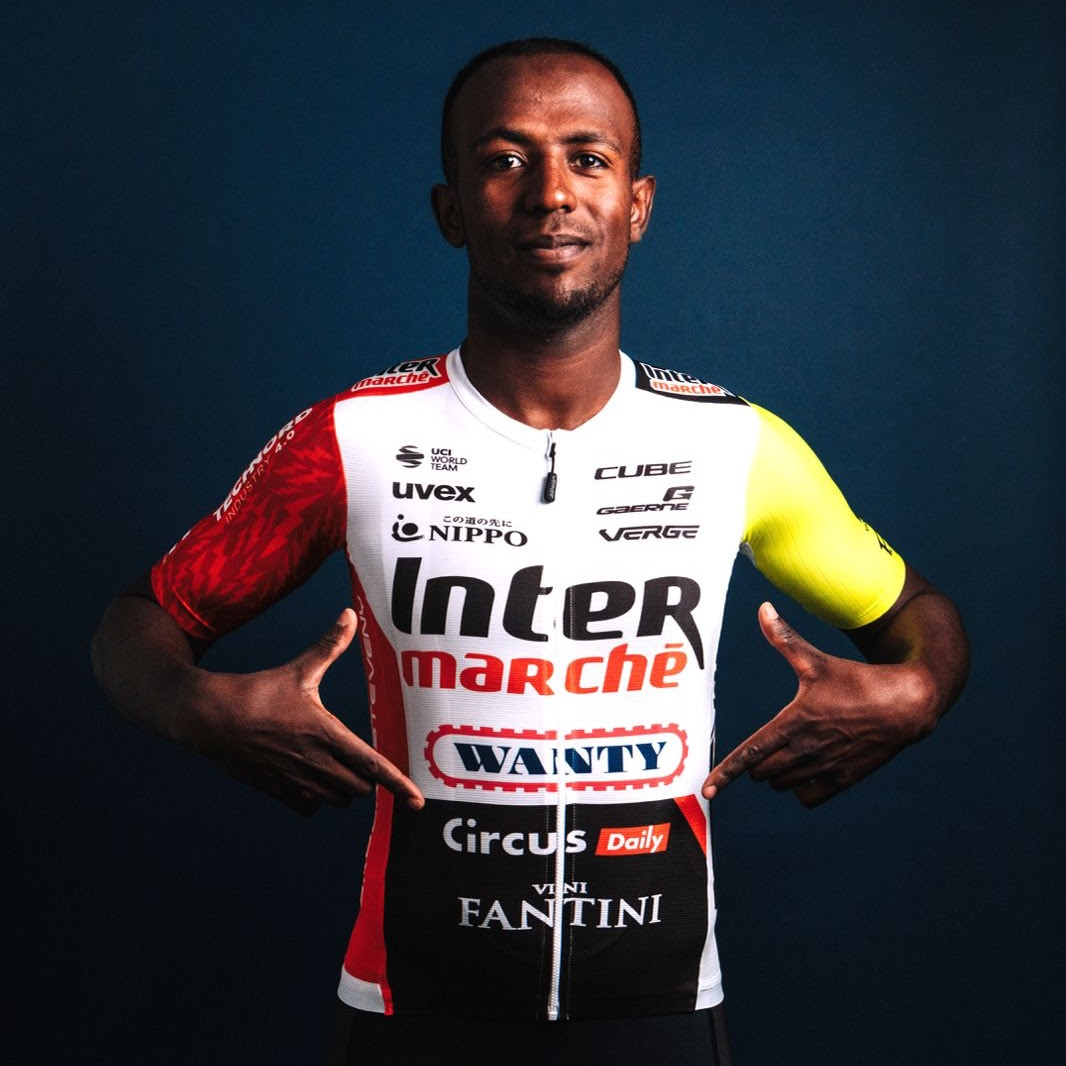
We’re back in the 1980’s. That’s like it says on the tin. That’s a good cycling kit; I wouldn’t wear it myself but it does what it says on the tin. Functional in a nice way.
Slipping a few places compared to last year, mostly because the ultimate beautiful fluoro, euro, sponsor-soup jersey has got a bit too neat for my liking. I want more of that fluoro yellow, and even more sponsors. Chuck some on the sleeves, down the thighs, anywhere there is space. Even so, I still love it, and if you’re a proper cycling fan you will too.
5. Wagner Bazin WB
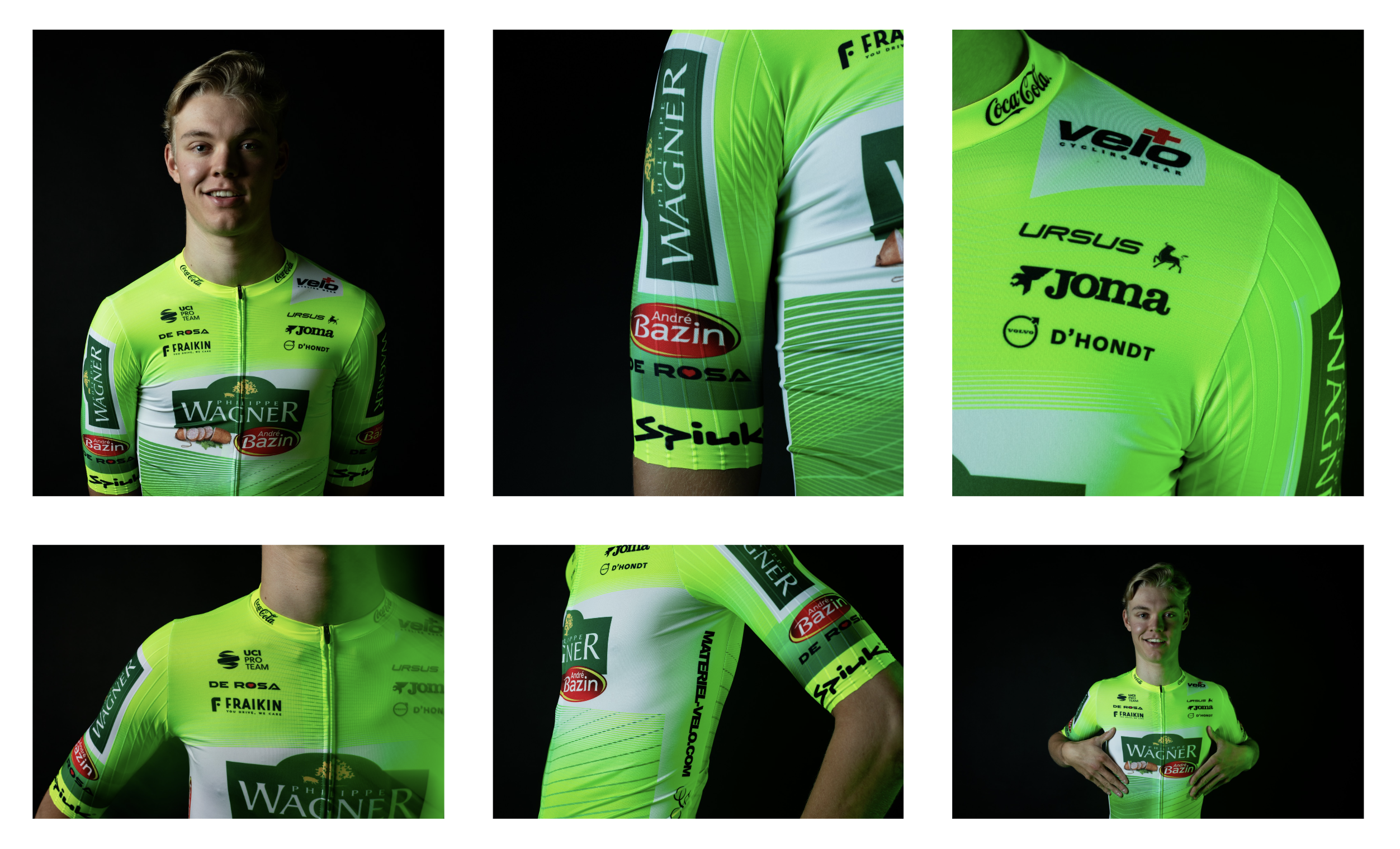
Do they expect to come in last or something when it’s all gone dark, because nobody should be asked to wear that. I’d resign now. You know we’ve just finished off the second bottle of Warnicks Advocaat and someone should make a kit in that colour, not this.
Absolutely sensational work here. Fluorescent, highlighter green used as liberally as possible. Take note: being bold pays off - If you’re going to go lurid at least go all in. Half-arsing it looks cowardly, whereas this is clearly a powerful garment.
4. FDJ-SUEZ

Boring. Smart but boring.
Much like the Groupama-FDJ kit this has a certain je ne sais quoi that I cannot put my finger on, but I like it a lot nonetheless. It also gets bonus points for actually putting sponsors on the french national champs jersey, something that I’m sure Marc Madiot forbade for the Groupama squad and resulted in Arnaud Demare looking a little like an entrant in a sportive.
3. Canyon-Sram Zondacrypto
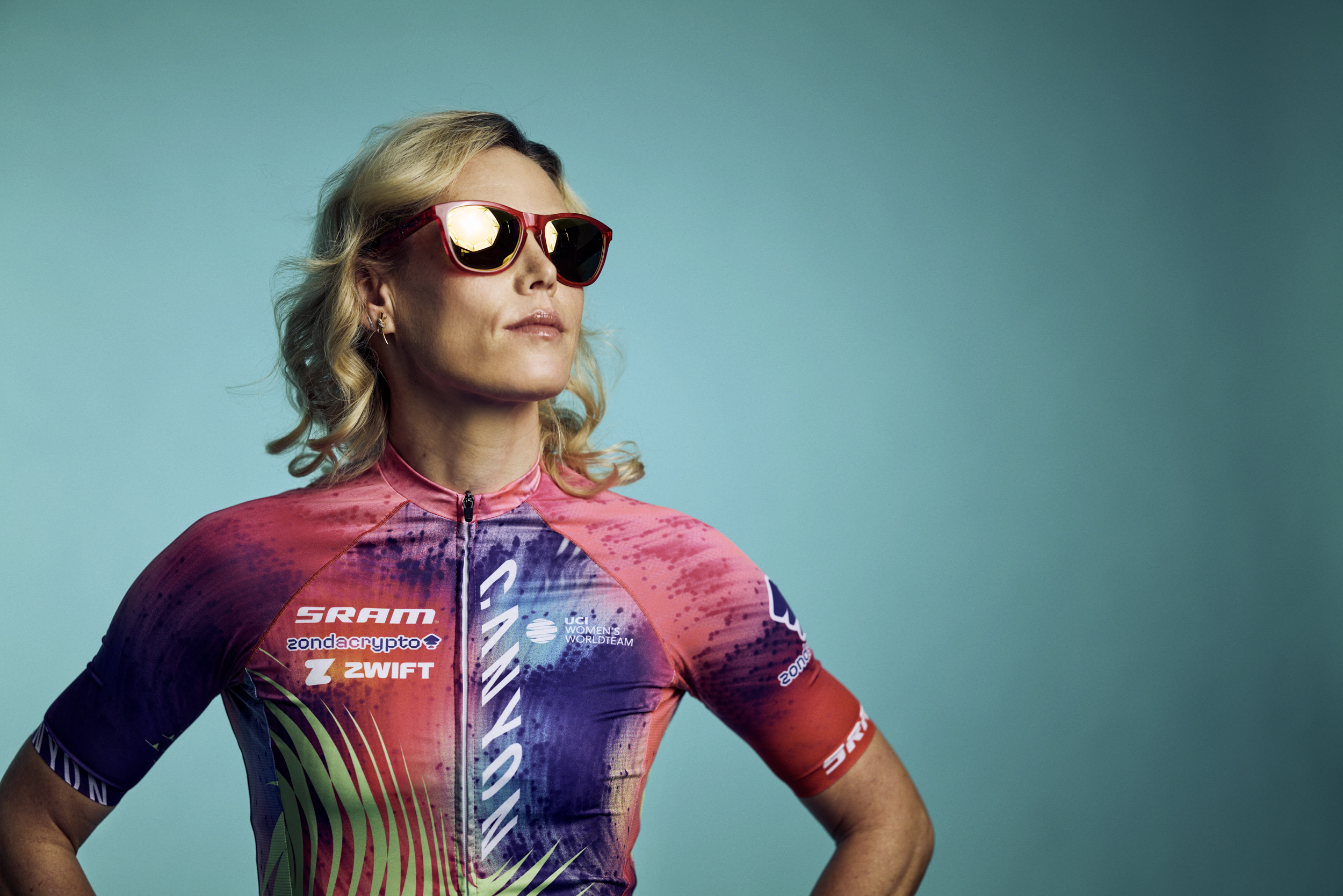
Oh Christ. That is the opposite of the Malta people [Polti-VisitMalta]. Someone has just taken a paintbrush and scribbled haven’t they? It isn’t following the three colour rule. This will not grow on me.
Beautifully chaotic as ever, but beautiful nonetheless. As ever, this is the benchmark jersey against which ‘modern’ looking designs are judged against, and yet again it is a great option.
2. Lidl-Trek Men and Women

It’s second for me after Polti. No fades, it’s just really cool. They look fabulous. Three colour rule works every time. Three colours; no fades.
I didn’t think last year’s option could get better but here we are. I think, of all the kits of the modern era, this one will stand the test of time as an all time great. It’s up there with the 2019 Deceuninck - Quick-Step jersey. It’s crisp, neat, with complimentary primary colours that have a touch of whimsy about them. I really want the team bus to be painted as if it was one of those Little Tykes pushalong cars to match the vibe, but even without matching transport I still think it’s one of the best jersey of the lot.
1. Polti-VisitMalta
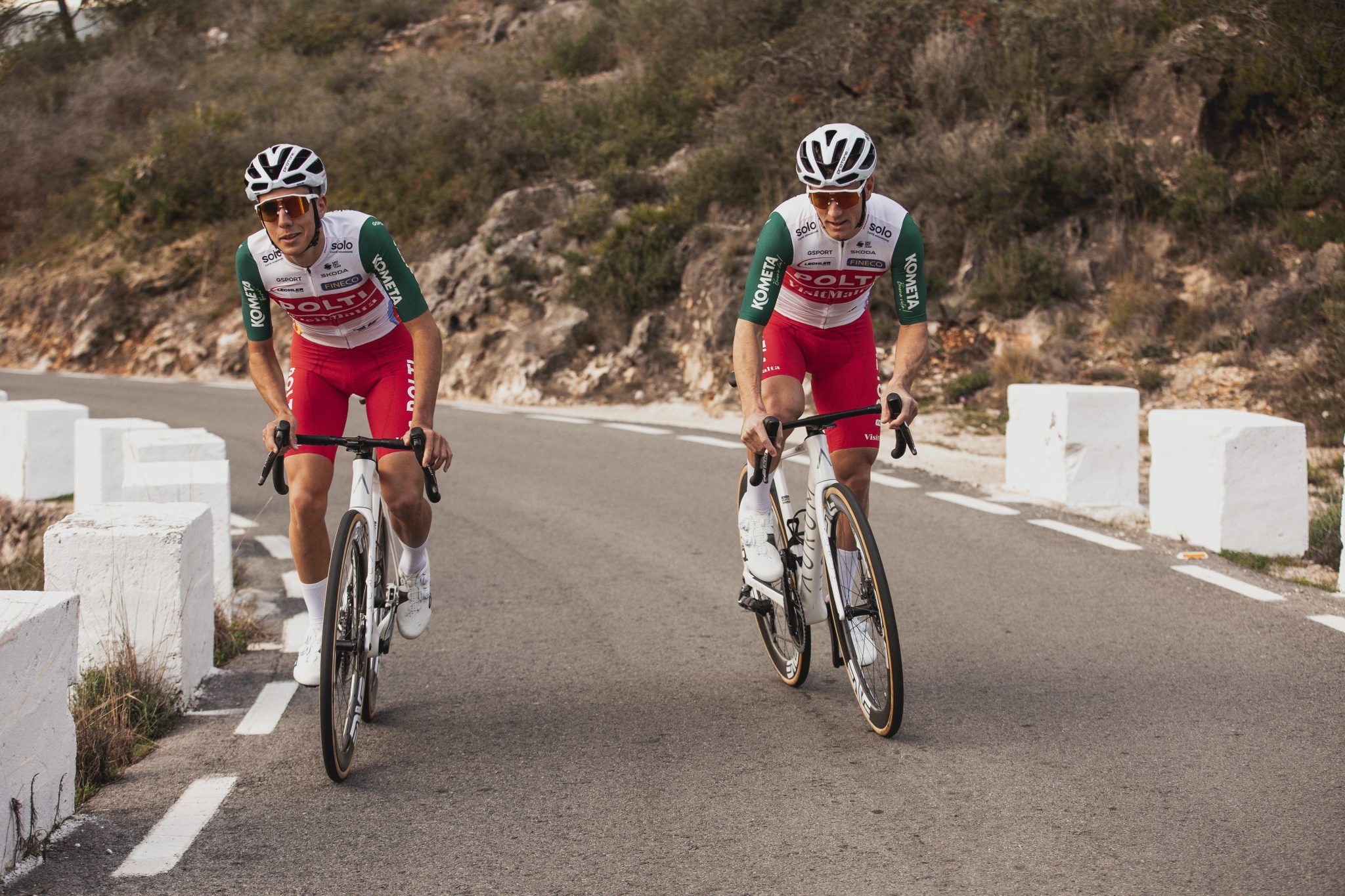
Ooh that’s REALLY lovely. Actually that’s fantastic, love it! That’s a proper 1970’s jersey. Great colour green too, that’s just the best. That’s special, and they’re on white bikes too. This is the first one that’s made me really smile.
Brb, booking a holiday to Malta right now. Somehow the team has managed to weave the three colours of Christmas - red, green and white - and create a jersey that not only doesn’t make its riders look like extremely fast mall santas, but actually looks beautiful. Hats off to the design team here.
.png?w=600)

