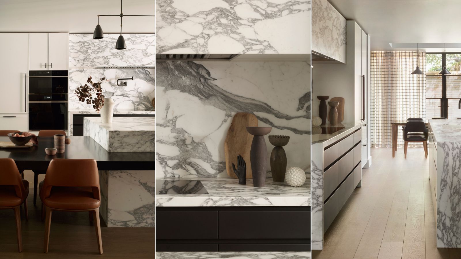
Contemporary kitchen designs can often feel quite cold and sterile, leaning too heavily on simplicity and functionality. But fitting a modern space with characterful details, like lush textures and intricate craftsmanship, is a fast track to design success. In this space, designed by bespoke kitchen brand Roundhouse, this winning combination is seen in full force.
Complete with bold, black-and-white marble and thoughtful details in every direction, this space is a relaxing retreat. To hear more about the design process, and explore the details of the space, H&G spoke with Daniel Lau, senior design consultant at Roundhouse. Here, Daniel shares how the Roundhouse team brought this modern kitchen to life.
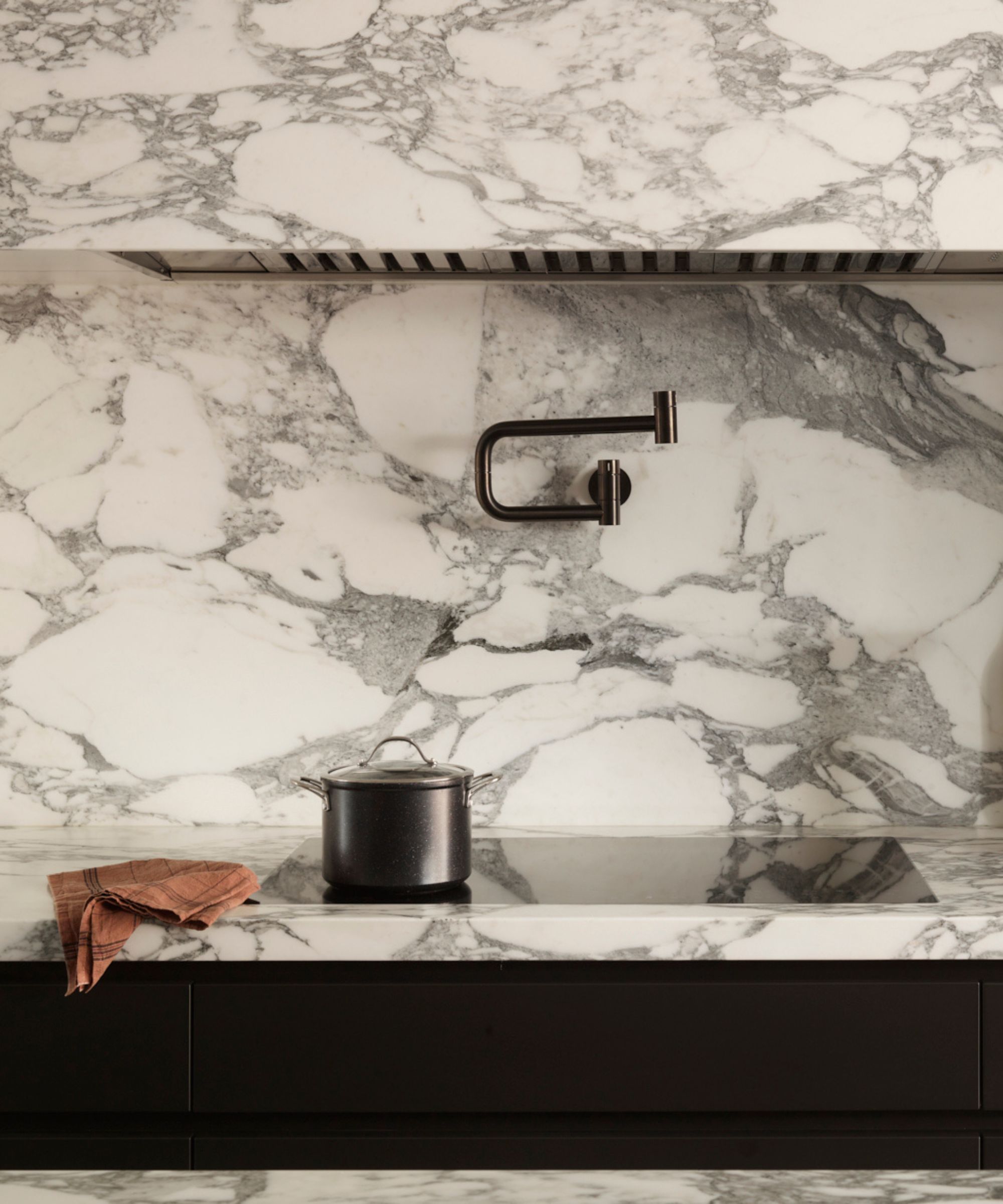
Marble is a trend-defying, high-quality, and timeless material that looks great in any kitchen – and bold veining is one of 2024's standout trends. An eye-catching pattern is unexpected and exciting, making an otherwise pared-back space stand out.
In this marble kitchen by Roundhouse, bold black-and-white countertops and backsplash elevate the entire space, making it feel luxurious and lively. Pairing beautifully with a neutral color palette here, the one-of-a-kind material proves its versatility.
'A marble with this much movement adds character to the space. Every slab or marble is completely unique and we wanted to create a feature, a point of interest, a conversation starter of sorts,' Daniel tells H&G.
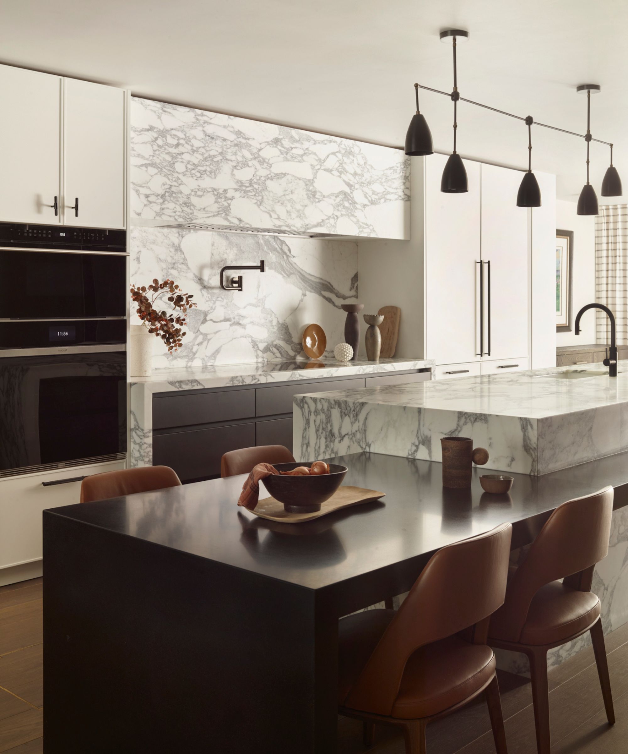
Despite marble's front-and-center role in this design scheme, another statement feature draws the eye: the dark, built-in dining table protruding from the kitchen island. Wrapped around the island and made of natural stone, the table is fully bespoke and formed with functionality in mind.
'The concept behind the dining table element was for a contrasting element to "come out of" the white marble. We chose a custom-stained black granite stone to provide this contrast. Not only that, it’s also an extremely sturdy natural material – perfect for a space as busy as a family kitchen,' says Daniel.
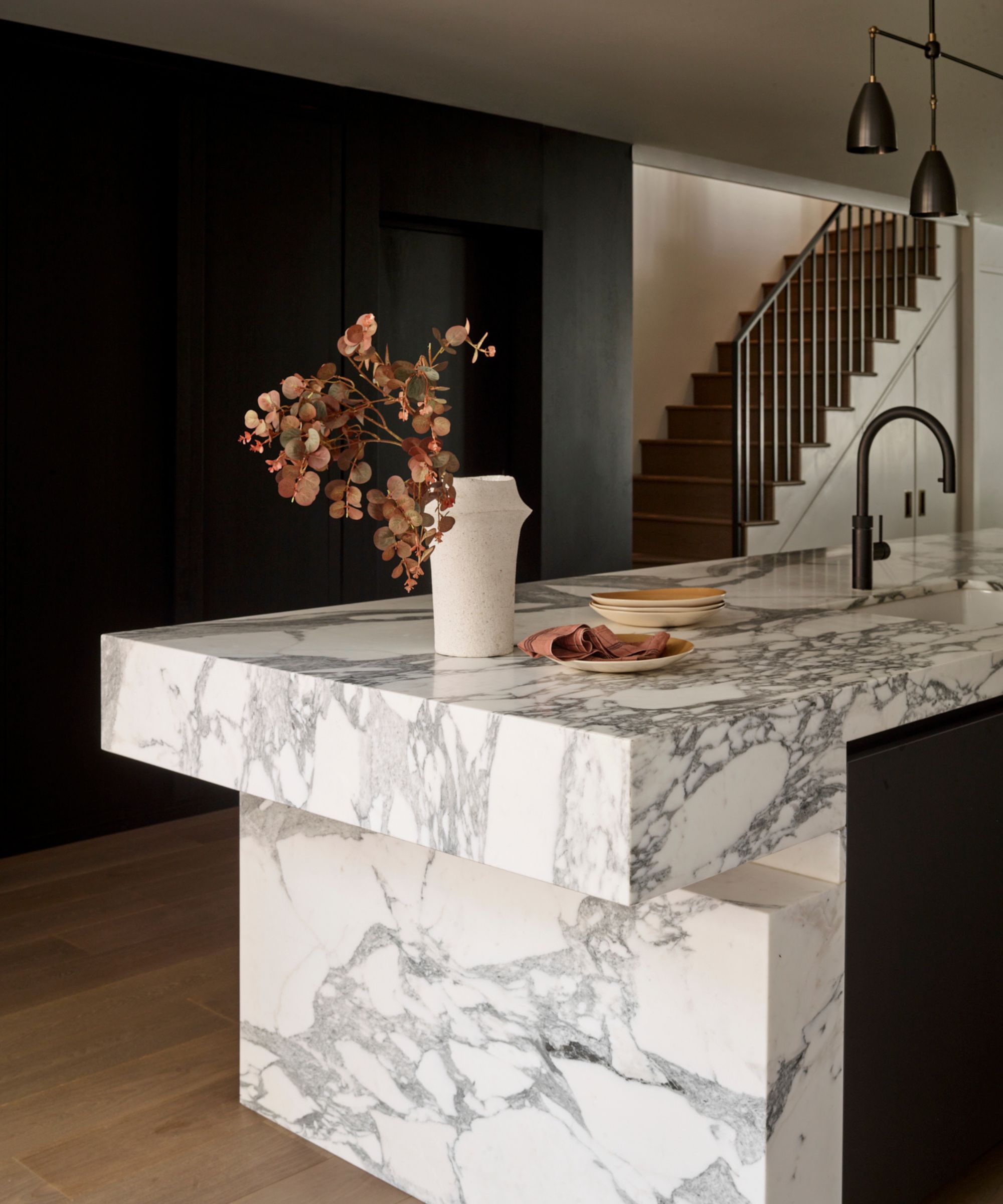
'The sculptural island was the most challenging element in this particular project. I spent many sleepless nights working on the technical aspect of how the island would actually be constructed,' Daniel continues.
But over time – spent working with Roundhouse's technical team, specialist stone fabricators, and the client – Daniel says the design began to come together. Decisions were made on how and where to cut the stone, how the island would blend into the hardwood floor, and 'how it would interact with the semi-cantilevered black granite.'
'All of these details had to be carefully considered and then produced in 3D mock-ups so everyone involved could approve how it would look before a single piece of stone was cut,' says Daniel. Ultimately, the final product is streamlined, unique, and a stunning match with the rest of the space.
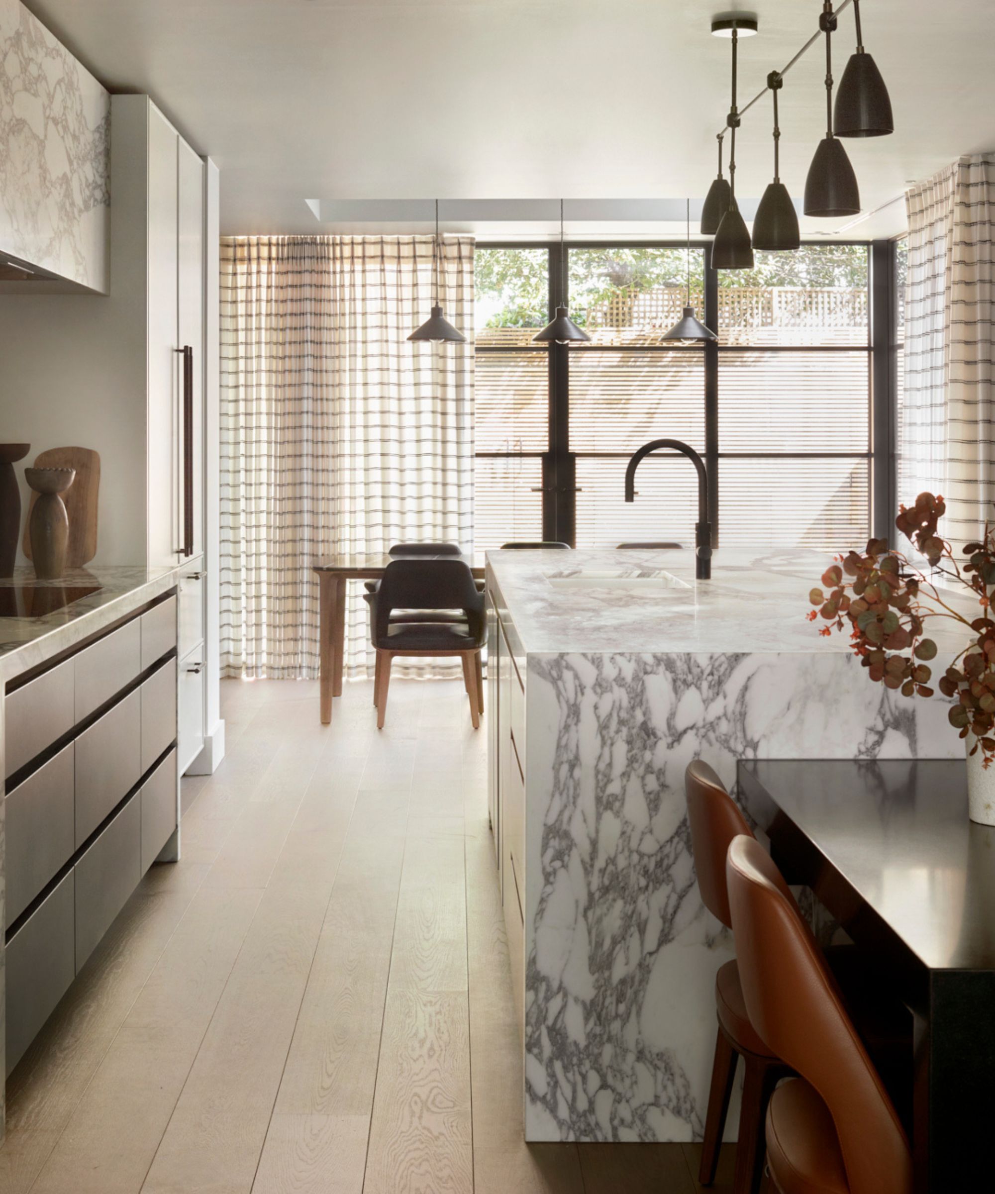
The kitchen space blends seamlessly into a dining room, marked by floor-to-ceiling glass doors and chic checkered curtains. Though the two rooms feel quite distinct, Daniel says the open-plan space's color palette allows them to blend into one another quite easily.
'The monochromatic design language is carried throughout the lower ground floor where the kitchen is, as well as the rest of the property. The client chose black Crittall framed doors leading into the garden, black pendant lights, and of course the black-fronted Wolf ovens. All these elements link the entire space,' says Daniel.
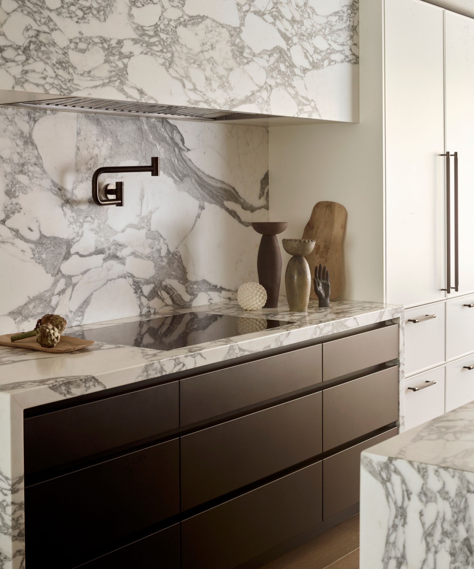
When it comes to using texture in interior design, the kitchen isn't always the first room to spring to mind. But cabinets and countertops offer plenty of opportunity for striking textures and materials, as seen throughout this space.
'Mixing different and sometimes unconventional materials, details and textures is what we do best at Roundhouse. Being in a rather unique position of being able to design bespoke classic and contemporary designs sets us apart from other kitchen design studios and this project is a perfect example of that,' says Daniel.
The combination of Shaker-style, floor-to-ceiling cabinetry and handle-less matte black lower cabinets makes for a dramatic juxtaposition that still blends beautifully.
Shop the look
In true Roundhouse fashion, the finished space is stylish and pure luxury – a blend of contemporary class and characterful charm. Daniel says that despite design standstills along the way, the final look is 'absolutely fantastic.'
'When you see the space in person, you forget about all the challenging moments during the design process. Everyone involved in the project was key to bringing this unique design to life and I’d like to say how much of a privilege it was to be part of such an amazing project,' Daniel concludes.


