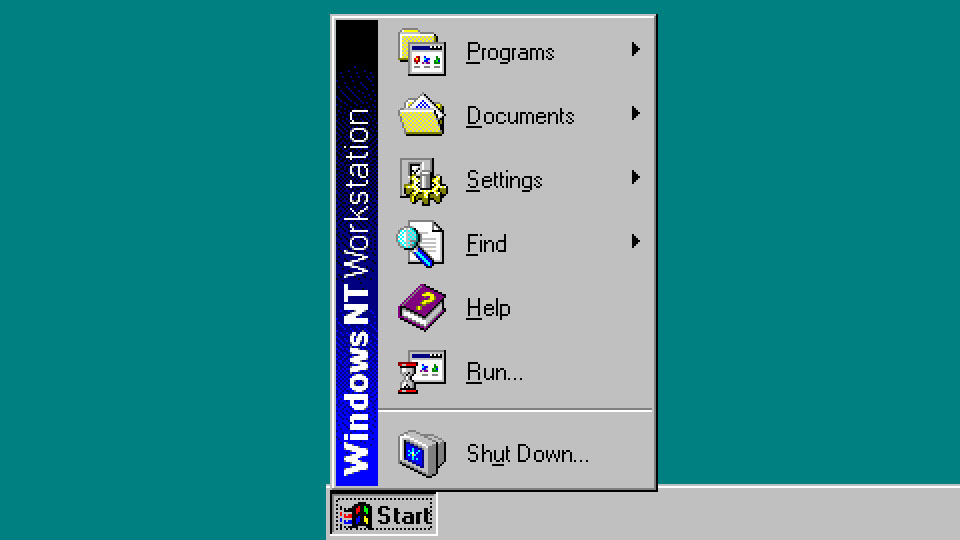
Windows development veteran Dave Plummer recently took to Twitter/X to reveal the story behind the Windows NT Start Menu branding banner. As with many of Plummer’s tales, there are exciting insights and surprises to absorb. One of the significant revelations about this iconic Start Menu is that Plummer worked to “render it live” rather than rely on bitmaps. That’s quite a modern way of doing things, and Plummer shared his reasoning, and we learned the pros and cons behind his choice.
Plummer notes that he was still a Windows rookie when he was tasked with contributing to the code for the Windows NT Start Menu. As quite a few versions of Windows NT required corresponding banner texts, he wanted to eliminate the creation of a multitude of bitmap options and render the text and background gradient live per SKU.
Unlike Windows 9X before it, Windows NT introduced a way to rotate the device context, which made it possible for Plummer to use system fonts to render the Start Menu banner text at 90 degrees. In the example he shares, ‘WindowsNTWorkstation’ is overlaid on a blue-to-black gradient, matching the Windows NT setup and startup screens and other key visuals. The matching gradient was also created live using “standard GDI calls,” explains Plummer.
If I had a LinkedIn bio, I'd definitely mention that I wrote the Windows Start Menu.Well, the non-resume version is that I wrote the code that custom-paints the Start menu, draws the sideways text, background gradient, and so on. It had been done with a Bitmap in Windows 95,… pic.twitter.com/QgQqhSFi8wJuly 14, 2024
So, in a nutshell, Plummer adds later in his Tweet thread that Windows designers produced the look and feel of the OS, but starting with Windows NT, “I was just replicating that programmatically.”
The Tweet thread also surfaced some interesting pros and cons of coding instead of graphically creating this little vertical strip alongside the classic Start Menu. Of course, Plummer decided to code instead of design the banner as an efficiency or labor-saving measure. Someone responds in the thread with the opinion that the rendered type (presumably using vector TrueType font sources) and gradient seemed to deliver a new level of sharpness to the Windows NT menu. We also reckon it was an early step to a modern resolution-independent UI, though mainstream desktop OS users are still on that journey.
Not many drawbacks to Plummer’s vector / code-based approach came to light in the conversation about his Windows NT Start Menu development. Only one humorous grumble emerged as someone recalled they used to be able to swap out the Windows banner bitmap with any similar proportioned design of their choosing. Plummer remembered that “tall, skinny porn” used to be quite popular for customizing the Start Menu back in the day...


