Wow, was Apple’s WWDC 2022 really a month ago? Feels like forever. Anyway, after three developer beta releases for iOS 16, iPadOS 16, macOS Ventura, and watchOS 9, Apple has released the public betas for anybody who wants to try out the new software ahead of its official release in the fall.
How to download and install the public betas —
This is pretty simple. Simply go to Apple’s Public Beta Software Program site, sign in to your Apple account, enroll a compatible iPhone, iPad, or Mac, and then download the respective profile (for iPhone and iPad) or the Public Beta Access Utility (for Macs). Follow any on-screen prompts to install the software and once it’s finished doing its thing; congrats, you’re living in the future. (Make sure you’ve backed up your data before, either to iCloud or locally just in case anything goes wrong and you lose stuff.)
I’ve been test driving the developer betas for iOS 16, iPadOS 16, macOS Ventura, and watchOS 9 with every release, and as expected, they’re betas. I’ve experienced daily bugginess here and there in all of the software — nothing crippling — but they’re reminders that this is unfinished software. There are still a few months to go for Apple to polish up the software and make refinements.
Unless you absolutely must try out features like iOS 16’s new customizable lock screen for iPhone, iPadOS 16’s Stage Manager, or macOS Ventura’s upgraded Camera Continuity features that let you use an iPhone as a webcam or in Desk View to show a top-down view, I would hold off, especially if you don’t have spare devices to test these betas. I can promise you that you don’t want your iPhone, iPad, or Mac to go sideways during something important, like a work meeting.
Betas
First thoughts
iOS 16 —
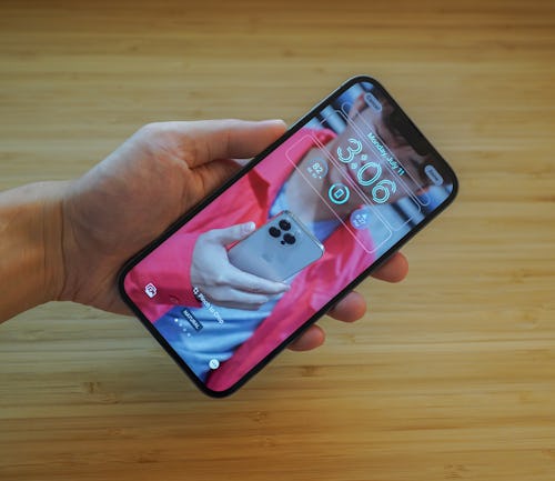
If you follow me on Twitter, you already know how excited I was by the new customizable lock screen. Android users will chuckle at how long it has taken Apple to catch up, but as always, Apple is late, but more refined. Long pressing on your lock screen brings up an interface clearly inspired by the Apple Watch’s watchOS where you choose your wallpaper, select fonts for the time, and add complications-like widgets. And, of course, you can pick from an endless array of colors. You can also tie customized lock screens to different Focus Modes, so you can have different versions for, say, personal and work. In the background, there’s a bunch of machine learning to help do easily-missable things like select good-looking colors that match wallpapers and even place the time in the background of things like hair in photos. It’s really cool stuff.

I love the way notifications have moved to the bottom of an iPhone screen; they’re easier to literally thumb through on larger devices like the iPhone 13 Pro Max.
You guys already know I’m obsessed with Visual Look Up, which lets you basically Photoshop the background off any image in your camera roll. It still feels like magic every time I convert an image and send it in Messages.
Surprisingly, the two features I thought I’d greatly care about — edit and undo send — in Messages, didn’t really make much of an impression on me. I know other people are really excited for these, though.
The addition of vibrations/haptic feedback to the keyboard when you tap is a welcome option, and one that feels like a finally since Android’s had it since forever.
iPadOS 16 —
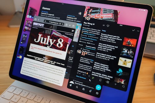
Stage Manager is the highlight on iPadOS 16. The new multitasking experience is supposed to be a solution to iPadOS’s limited app management (Split View for two side-by-side apps or Slide Over for three). But as somebody who actually has little to complain about iPadOS’s current multitasking, I found Stage Manager somewhat confusing to operate.
There’s the side panel on the left where apps are grouped together and tapping on them shuffles between them with the apps opening in windows to the right. Stage Manager isn’t quite a desktop-like experience — some apps can be resized, others can’t — and selecting and moving an app window isn’t super intuitive. For example, sometimes when I want to move an app to a specific spot on the screen, it bounces towards the center. Other times, I’m not sure why apps move to the foreground or a certain position on my iPad screen. Stage Manager makes me have to think way more about the input than I should have to. I’m super curious to hear what non-iPad power users think about Stage Manager.

Oh, I can’t forget the Apple-made Weather app. Another finally.
One thing I don’t understand: Why are iOS 16 and iPadOS 16 not in step? It’s strange to me that iPadOS 16 doesn’t have the new customizable lock screen features on iOS 16. This is not a new thing, either. iOS was first to get the App Library in iOS 14 before iPadOS got it in iPadOS 15.
macOS Ventura —
Stage Manager feels even more unnecessary on macOS, where there are myriad ways to manage apps like Mission Control and multiple desktop spaces. It just doesn’t fit in and feels like a dummies mode.
My favorite macOS Ventura features are ones Apple highlighted during its WWDC keynote. The new features addded to Camera Continuity are particularly impressive. I had my doubts about the reliability of using an iPhone running iOS 16 as a wireless webcam on a MacBook, but those disappeared the second I selected it within FaceTime on macOS Ventura. You need either a clip or a mini tripod and clamp, but the results speak more than words can. Just take a look at the image quality between an iPhone 13 Pro Max and the webcam on a MacBook Air. Both are with Portrait mode turned to blur out the background. The detail from an iPhone camera is just stunning. RIP Camo.


Less impressive is Desk View, which uses an iPhone’s ultrawide camera to display a top-down view of your desk. This is handy for a presentation, but because of the software-based deskewing, image quality leaves a lot to be desired, especially without ample light. Still, it’s a cool trick in a pinch.


watchOS 9 —
Of all Apple’s public betas, I’ve spent the least amount of time with watchOS 9. It’s a sizable update with more details for tracking running, swimming, and triathlons, to name a few. I’ve not been running much lately so I can’t speak to the tracking over weeks of consistently hitting the pavement, but from what I’ve seen the heart rate zones and the ability to run against your best times or last run put the Apple Watch within spitting distance of the advanced tracking that Garmin smartwatches s are capable of.
I’m fortunate to not have to take medications so the new Medications app is lost on me. I do, however, really like to track my sleep. I’ve said before that the Apple Watch’s sleep tracking has been pretty limited to essentially a schedule. Fortunately, Apple’s added sleep insights to track REM, Core, or Deep Sleep, as well as heart rate and respiratory rate. I’m used to sleeping with my Oura 3 smart ring.
More to explore
These impressions are by no means exhaustive. There’s tons to dig into for iOS 16, iPadOS 16, macOS Ventura, watchOS 9, and even tvOS 16. I’ll save the deeper dive for a review this fall. For now, the public betas are finally out for anybody who wants to try them out. There’s nothing groundbreaking in any of the betas except maybe the customizable lock screen on iOS 16 and all of the public beta software is mostly stable, but there are still bugs.
If you’re the type to share feedback with companies when they release their beta software, now’s your chance to do so. Apple does seem to be listening these days. Last year, when everyone was rioting over the redesigned tab design for Safari on iOS 15, iPadOS 15, and macOS Monterey, Apple reverted to the old design and added options for the final releases.


