For people of a certain age, there’s nothing like an old Ladybird book to take you back in time. Whether it’s King Alfred in battle, Peter and Jane grooming Pat the dog, or a bunch of shiny happy children at a birthday party, for many of us, there’s a Ladybird picture to stir up our childhood selves, along with a swell of nostalgia for that sure, safe world of endless summer.
The Ladybird logo was registered in 1915 and the centenary is to be marked this summer by an exhibition of original Ladybird illustrations at the House of Illustration in King’s Cross, central London. Lawrence Zeegen, professor of illustration at University of the Arts London, has been instrumental in pulling it together, having first produced the centenary book Ladybird by Design.
“When you view the artwork in the flesh, the quality of craftsmanship is amazing,” says Zeegen. “You can look at a Ladybird image, come back the next day, and the next, and still see something new – it’s the level of detail, the perfectly captured moment. The iconic Ladybird world we remember probably stretched from the 50s through to the 70s. By the 80s, when Britain was changing and Ladybird wasn’t changing at the same pace, there was a feeling that those books were naive and a bit naff. Now, we can re-evaluate. Ladybirds were the first children’s books designed entirely with the child in mind.”
The Ladybird format never changed – 56 pocket-sized pages, text on the left (with age-appropriate language, font and spacing) and, crucially, a full-page colour illustration on the right, always carefully designed to hold the gaze of a child.
“Until then, children’s books typically had a colour illustration on the cover and the odd black and white drawing inside,” says Zeegen. “It was partly production costs, but also that no one had stopped to think about what children wanted. Ladybird was the first to see through a child’s eyes.”
The key person here was Douglas Keen, who joined the company in 1936 as a salesman before leaving to serve in the second world war. At this point, Ladybird was a sideline produced by a Loughborough publishing company, Wills & Hepworth, better known for its glossy motoring brochures. Paper shortages and government rationing of all literature except children’s books led them to create the Ladybird imprint: pocket-sized books (usually about fluffy woodland creatures) made from one sheet of paper folded in a particular way.
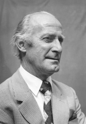
Keen was a socialist from a modest, single-parent background. Committed to the education of all children, when he rejoined the firm after the war, he set about transforming Ladybird. He investigated themes of astonishing breadth and depth, finding writers and educationists, and commissioning artists. He became company director in 1957 and by his retirement in 1973, Ladybird sales averaged 20m a year.
Keen’s wife and mother-in-law were trained artists. Perhaps this, together with his early experience in advertising and sales, made him acutely aware of the power of pictures. “This was the golden era for illustration,” says Zeegen. “The cost of reproducing photography meant that most magazines, catalogues and ad campaigns were illustrated.”
The best artists were extremely technically accomplished, able to create pictures that, for children especially, seemed utterly true. Despite the enormous number of series – from Historical to How it Works and Hobbies and Interests to Prayers and Hymns – Ladybird’s distinctive look was created by a relatively small number of artists. Keen used only the best, providing some 20 or 25 artists with hundreds of commissions and years of work. If an artist was given a book to illustrate – that’s 24 pictures – he was usually given the whole series and maybe more after that. “The key Ladybird artists were British men who had lived through the war and were in middle age,” says Zeegen. “They included war artists, portrait artists, comic illustrators. The country had been bombed to smithereens but there was optimism, a positivity about Britain’s future which shows in the images.”
As Keen worked from home, many artists would arrive for meetings, stay for lunch and become close family friends. Keen’s two daughters, Caroline and Jenny, were sometimes used as models. Jenny’s wedding featured in In a Hotel from the People at Work series. Caroline is the girl stripping batteries in Junior Science and also kneeling by her bed in The Lord’s Prayer.
“The consistency running through the images is partly because my father was the only one making the main conceptual and creative decisions,” says Jenny.
“He didn’t consider highly stylised, vague, imaginative or fanciful illustration appropriate, even for fiction like the fairytale series, Well-Loved Tales.”
According to Caroline, her father’s skill was choosing the right artist for the job. John Kenney, who illustrated many historical titles such as King Alfred the Great, had served in the war and recorded the D-Day landings with drawings on the spot, images that clearly informed his Ladybird work. Charles Tunnicliffe, the renowned artist who specialised in birds and natural history (and had been made famous by his wood engravings for Tarka the Otter), illustrated Ladybird’s The Farm, and Nature series What to Look For.
“The People At Work series was illustrated by John Berry, the portrait artist who later painted Princess Diana,” says Caroline. “I don’t think children’s literature had given credit to ordinary working people before – a postman, a miner, a builder. John Berry’s perfect realism and focus brought those people to life.”
Martin Aitchison, now 95, illustrated more than 100 Ladybirds between 1963 and 1987, including the Key Word series – the Peter and Jane books, which he largely shared with artist Harry Wingfield.
“After 10 years illustrating the Luck of the Legion strip for Eagle comic, the Eagle went bust so I was suddenly out of work,” Aitchison recalls. “My father met Douglas Keen at art classes in Stratford where they both lived and he mentioned me to Douglas.”
Some say Ladybird created a utopian, squeaky clean world where the sky was always blue, but Aitchison says: “I just illustrated the script, set in everyday life around me – north London suburbia in my case. “If the sky was always blue, it was probably because we waited for a fine day to take reference photos. After years of illustrating the French Foreign Legion going into battle, drawing children eating ice-cream took a little getting used to!”
• Ladybird by Design is at the House of Illustration, King’s Cross, London from 10 July to 17 September, houseofillustration.org.uk
The boy in The Party: ‘That was was my sixth birthday party in 1959’
The Party, published in 1960, was part of the Learning to Read series. Harry Wingfield, the illustrator, used his nephew Andy Dickens as the model. Now a musician, Dickens lives near Winchester.
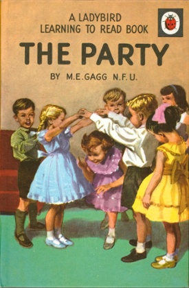
“That was my sixth birthday party – March 1959. Those pictures weren’t staged. I know the names of every one of those children. Harry came along beforehand and took photos and sketched as it happened. To be honest, I was unaware of his presence. As far as I know, there wasn’t a single child there who knew they were in that book. Harry did make some changes – he made it look as if I was going to the party when actually it took place in our home in Solihull. I also don’t recognise the girl who’s my sister – I used to tell my real sister she must have been too ugly to be included!
Harry was my uncle, married to Ethel, my dad’s sister. He had a pronounced stammer but spoke with his eyes, his smile and his pictures. His work showed how he saw the world, the detail and intensity with which he saw it. I can’t tell you how faithful they are – the candlewick cover on my parent’s bed, the pictures on the wall, the bookcase my dad built. I was horrified by the picture of me getting dressed in my room – I certainly didn’t want to take my trousers off – but the realism is incredible. That clock and the aluminium torch were very much part of my childhood.
I was also the boy in the Junior Science books. Harry would come round and set up experiments. It was fun, I enjoyed them. I didn’t meet the girl model until recently – Douglas Keen’s daughter – as Harry did them separately. I had the books on my bookshelf but didn’t spend much time thinking about it. There was no “wow factor”. The adults around at that time – some had been fighter pilots, some had commandeered U-boats. There was a general acceptance that people did what they did and we were equally respectful of the milkman.
Did we really dress like that? Yes! I had that red tie until recently and the little camel coat haunted me for years. Even then, I had a suspicion it wasn’t cool. We were a very valued generation. My father was very working class – he left school at 14 – but there was a great optimism for us, because of education, because of the possibilities. Birthday parties really were simple, happy occasions. In Harry’s obituaries, it was said that he created a fantasy world. No he didn’t. That was my world – and a very, very real childhood.”
House of Illustration is holding a private view of Ladybird by Design on Tuesday 14 July, exclusively for Guardian Members. Book your tickets at membership.theguardian.com
• This article was amended on 4 July 2015 to correct spelling errors in the names of Lawrence Zeegen and John Kenney. It was further amended on 6 July 2015 to correct the attribution of quotes from Douglas Keen’s daughters.
