Apple's logo is one of the most iconic out there – but there's confusion over why exactly the fruit has a bite taken out of it. Is there a hidden meaning within this seemingly minimalist logo, or is something else going on?
Some think the apple is steeped with symbolism, and that the 'bite' mark represents the 'byte' of a computer. This would make for quite the 'logo secret' article. But alas, the designer Rob Janoff has clarified otherwise in the past.
The Apple logo has a bite taken out of it to make sure it looks like an Apple from far away, and not a cherry, he said. This awareness of legibility is one of the reasons why the logo has become so iconic, and is one of the best logos out there today. So how did it come to be?
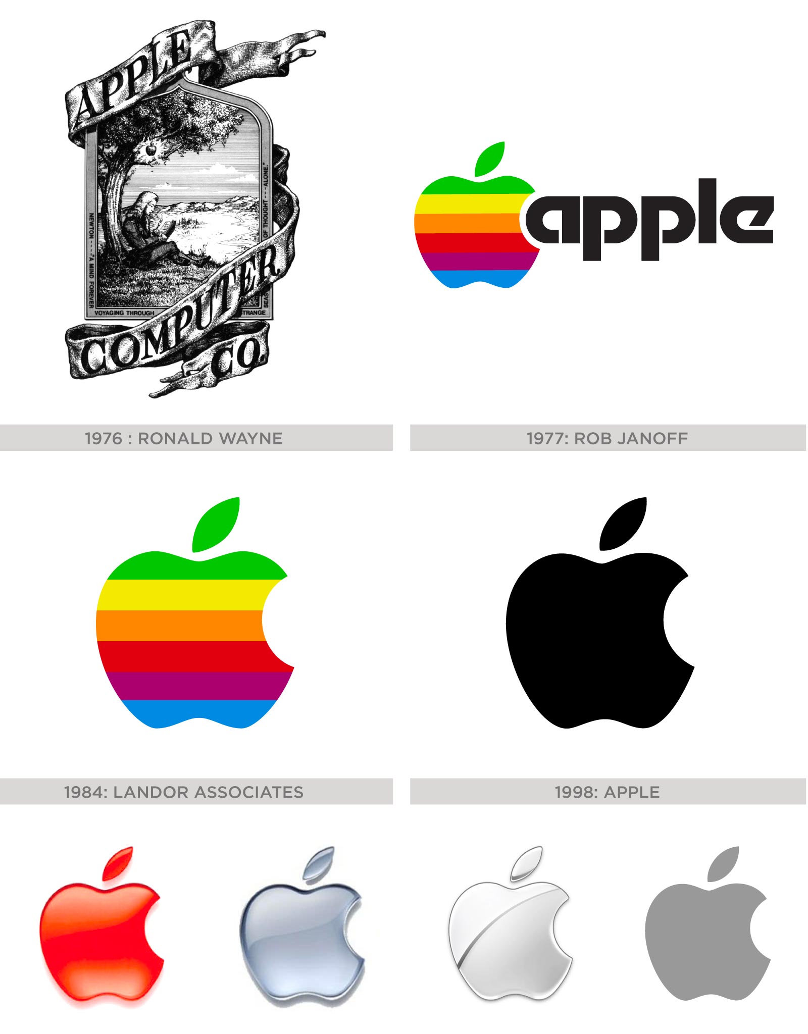
As discussed in our Apple logo history, the tech giant's visual identity has been through many iterations over the years, starting off with a beautiful hand drawn illustration of Isaac Newton under a tree (the inspiration for the brand name), and moving forward to the shape we know today with that well-known bite mark – but with rainbow stripes running through it.
As you can see from below, a nod to the bite mark started in 1977 when the logo first changes, but this time it's because of the 'apple' wordmark eating into the side of the design. In the next iteration the design stands without the wordmark, and that bite has got even bigger. Now it is more minimalist and comes in black, white or grey.
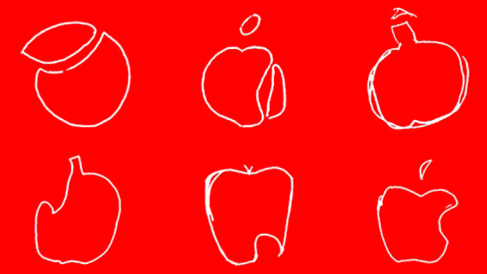
The design been fiercely protected by Apple (as evidenced by the many lawsuits the company has launched against companies 'copying' their mark – remember that pear?). But however well protected and however iconic the logo is, people still seem to have problems remembering where the bite mark is. A memory test showed that people overwhelmingly put it in the wrong place, which is often the case with logos with distinctive elements – even if they are one of the most famous brandmarks.
It's a shame we can't report on an Apple logo hidden meaning, but as a design-first company it's not surprising its key element upholds one of the major design principles. For a logo with a genuine hidden meaning, find out all about the Audi logo.