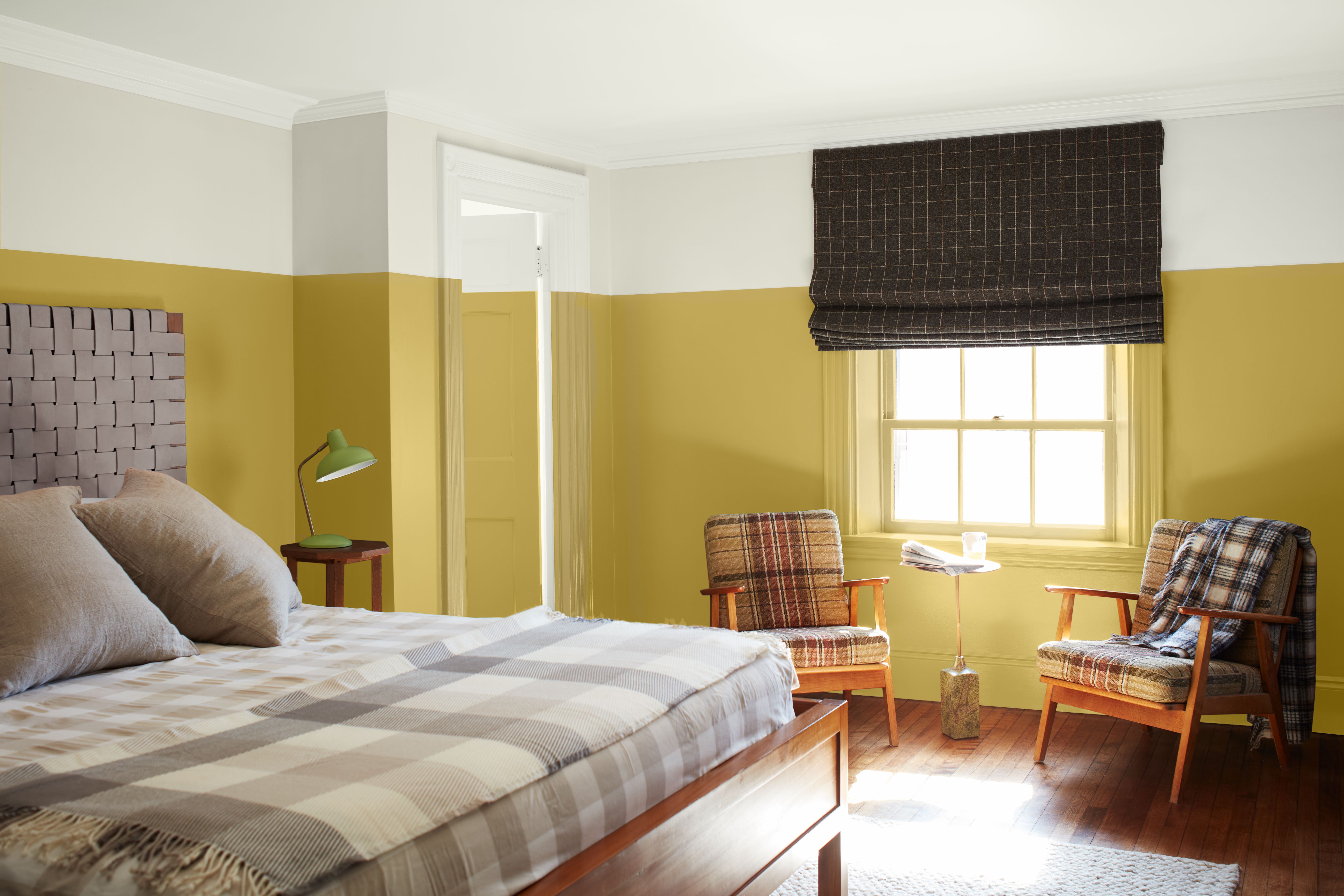
You might have noticed that white-painted ceilings have been falling out of favor in recent years, as we lean towards either more experimental color schemes, or simpler spaces where visual harmony is key. That said, a classic white ceiling still undoubtedly has its place; the trick is knowing how it will alter the light, proportions, and general aesthetic of the room in question.
One handy thing to know about a white ceiling is that it can help to increase the sense of height in a space. This effect works best when part of a pale, neutral palette, so the contrast between walls and ceiling remains subtle. When combined with a stronger shade on the walls, a white ceiling creates a sharp horizontal line where the two colors meet, which can actually detract from the height of your space. It’s worth noting that painting the cornicing and coving in the same hue as the walls will also help to make the ceiling feel higher. And, if white doesn’t appeal, try painting the ceiling in a complementary shade that’s a lighter than the walls for a similar effect.
Unsurprisingly, choosing dark paint ideas for your ceiling will make it feel lower and can help to create coziness and intimacy in spaces large and small. This can work particularly well in narrow rooms where the proportions feel a little bit unbalanced. You can take this a step further by extending the ceiling paint a little way down the walls, and pairing with a lighter shade to enhance the contrast.
If you’re finding picking paint a little overwhelming, or just prefer the look of an unbroken color scheme, then opt for a single color to cover both walls, trim, and ceiling. It’s a look that feels unequivocally modern, and can have a transformative effect on your space. For example, a dark or strong shade will engulf a room in color, whereas a white-on-white scheme can enhance space and light.
'When getting to final paint selections, whether it be for your ceiling or anywhere for that matter, always start with laying out a room's various elements together and see how your paint swatches sit with everything,’ advises interior designer Becky Shea. ‘From there, it's important to sample the color in the space to see how it looks once dry. Colors can look drastically different from one room to the next once applied.’
If you're debating whether a white-painted ceiling is right for your space, the following ideas might help you make up your mind.
1. CONSIDER COLOR DRENCHING FOR COMFORT
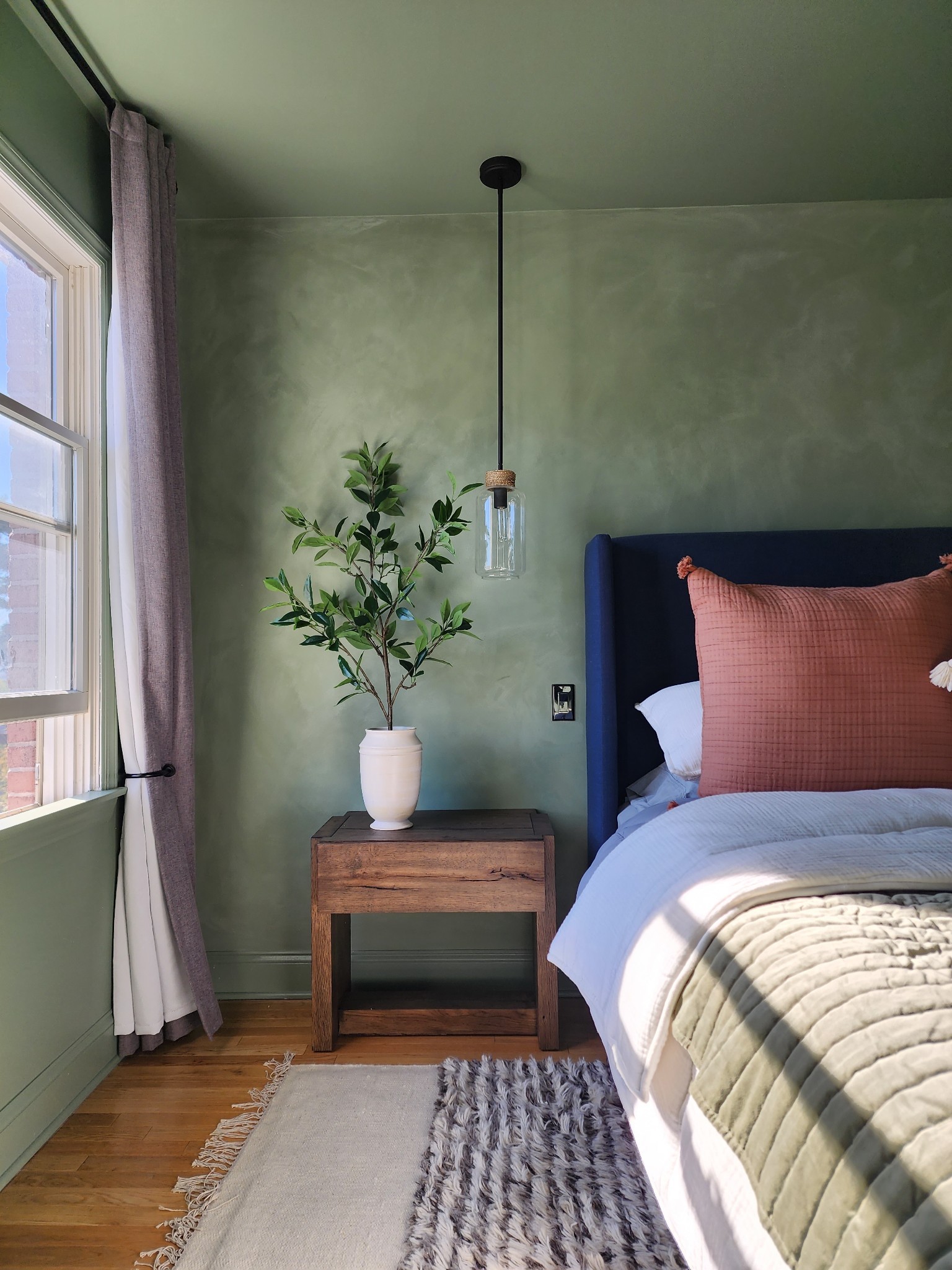
When interior design studio Storie embarked on the redesign of this New Jersey abode, principal designer Sarah Kruse chose a soft-green hue — Jade Dragon by Sherwin Williams — for both the walls and the ceiling of the master bedroom.
‘We selected one color for all the walls, trim, doors, and ceilings to make the space feel cozy and warm,’ says Sarah, who created subtle visual contrast by using a limewash paint effect on the wall behind the bed. ‘Using one color throughout can actually make a room feel larger, and yet it also has a cocooning effect that’s very soothing.’
2. CHOOSE A WHITE CEILING FOR A CLASSIC SCHEME
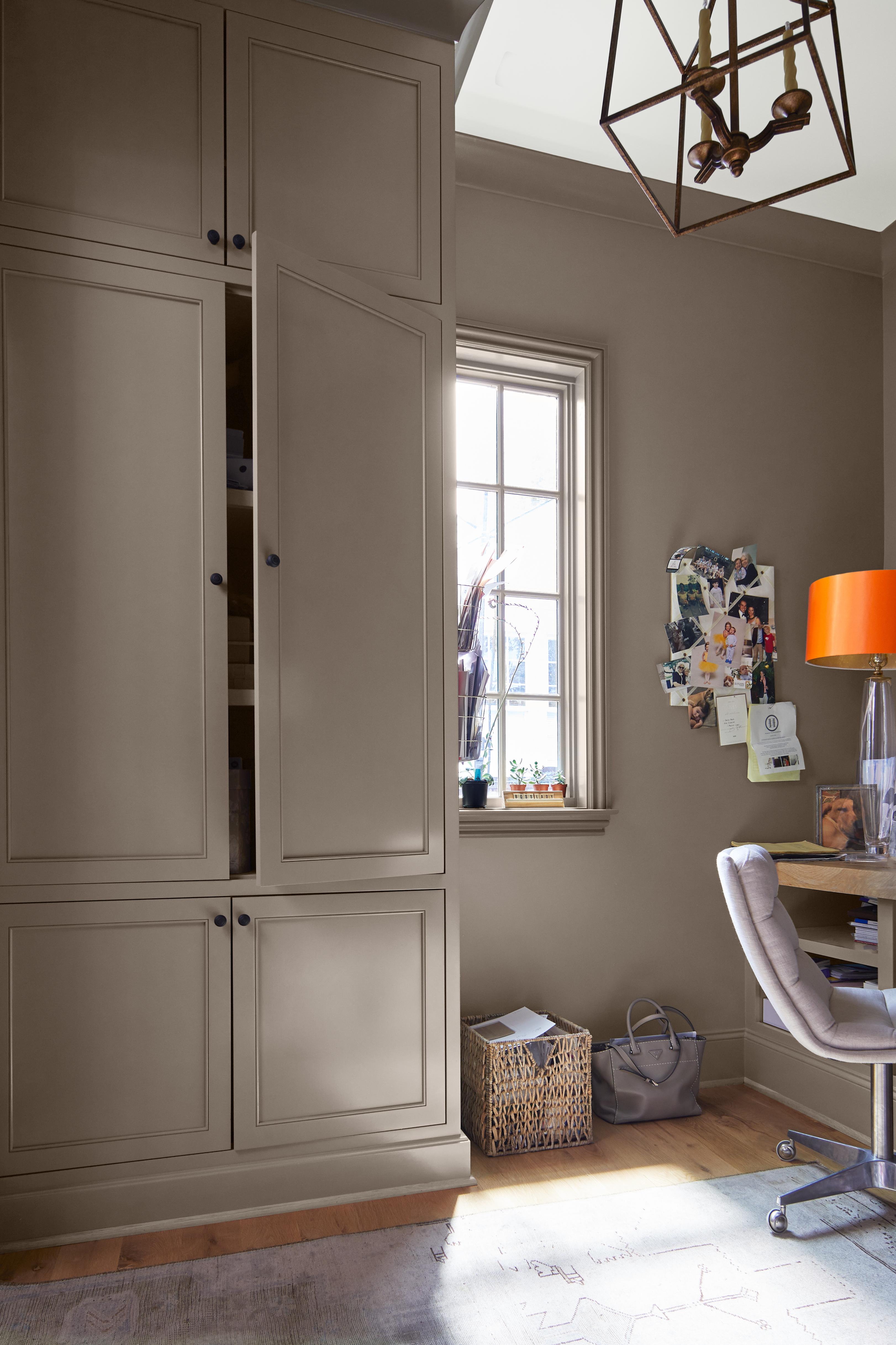
While a colour-painted ceiling can seriously up the cozy factor, you might prefer the timeless appeal of crisp and classic white. ‘The ceiling is a hugely underestimated feature and can dramatically alter the whole appearance of the room,’ says Benjamin Moore’s director of marketing, Helen Shaw.
‘Contrasting your ceiling and walls is definitely seen as a more traditional approach. Fresh-white paint works beautifully with all colors, including taupe,’ says Helen, referencing this study space, the walls of which are painted in the brand’s Ashley Gray shade. ‘The clean contrast between the elegant, warm grey and a bright white creates the perfect balance. Consider a semi-gloss or high-gloss finish to lift slightly darker spaces.'
3. GO DARK TO GIVE CHARACTER TO A SMALL SPACE
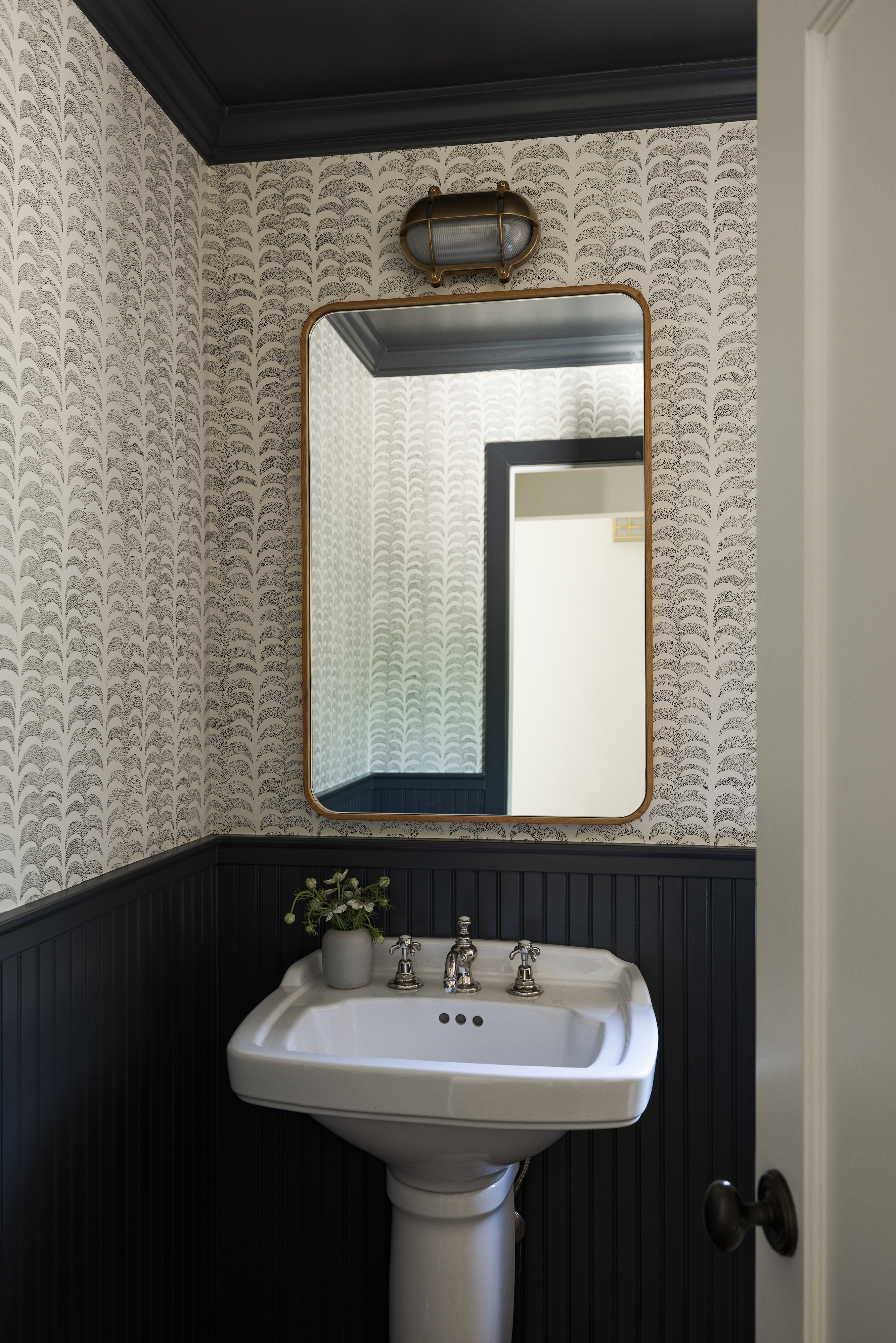
Colored ceilings can be a really effective way to create atmosphere in more compact rooms, such as powder rooms, playrooms, studies, and snugs. San Francisco interior designer Katie Monkhouse used a dark-painted ceiling to give this petite powder room a dramatic edge that complements the monochrome wallpaper and matching half-height wooden paneling.
‘We love wrapping small rooms in color as it creates a feeling of being fully enveloped,’ says Katie. ‘In this case, the charcoal ceiling matches the wainscotting and frames the wallpaper, which makes the space feel complete.’ A darker color will also visually lower your ceiling height, which can help a narrow space to feel more in proportion.
4. CHOOSE WHITE FOR A DAY-TO-NIGHT VERSATILITY
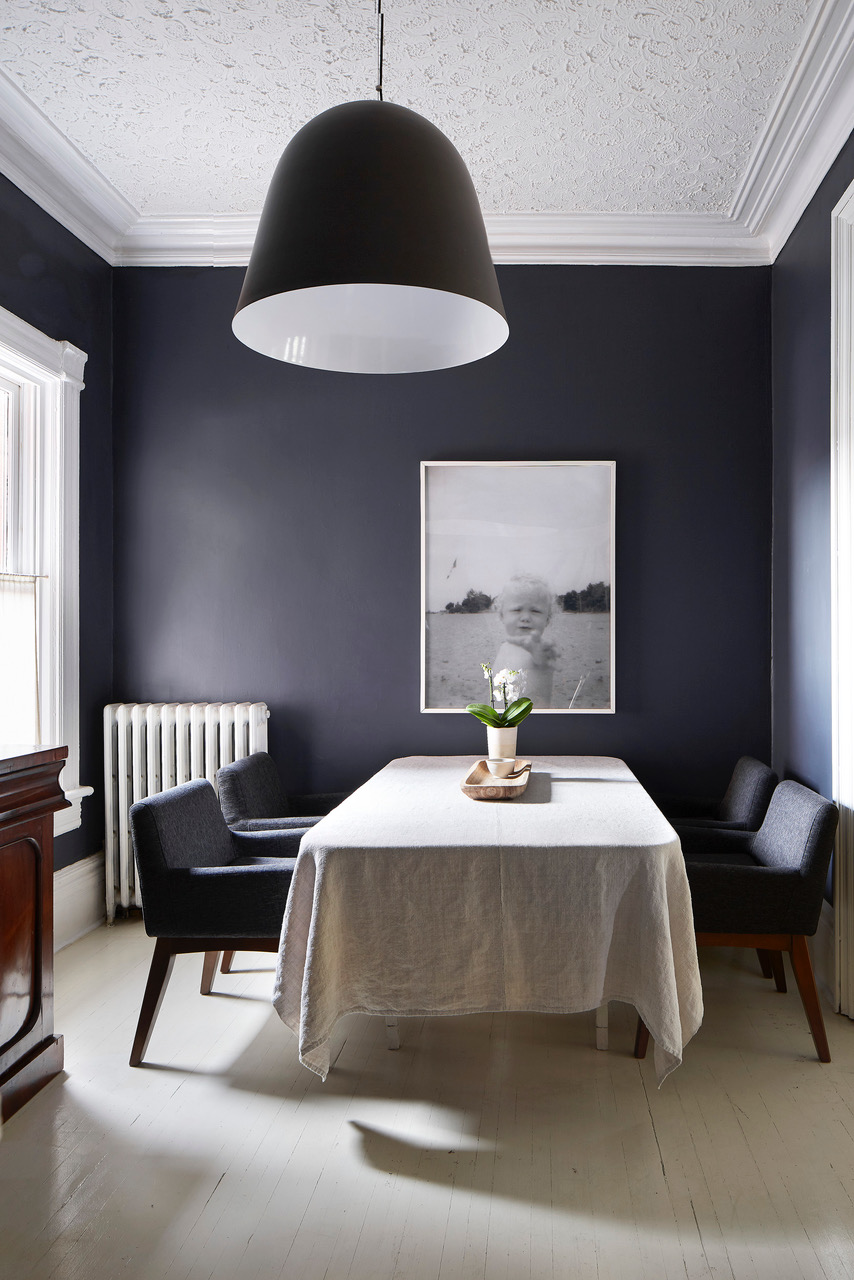
‘I love when the walls, trim, and ceiling are painted the same color, especially in dark rooms, but the white looked so good against this black color when we painted that we kept it,’ says Toronto artist Heather Shaw, owner of homeware store Pi’lo.
‘The crown moldings took on more of a presence than they had and, in a way, we ended up with one room that has two different identities,’ Heather continues. ‘In the day, the light bounces off the ceiling and brightens the space, while at night, the ceiling seems to recede and moody lighting draws the eye lower down, so that the attention is drawn to what’s going on around the dining table.’
5. AVOID STARK CONTRAST WITH A SLOPING CEILING

Sloped ceilings normally meet the walls at a much lower point than a conventional ceiling, which is why it’s often wise to paint the entire space in the same shade. When interior designer Becky Shea decorated the bedroom of her Catskills home, she chose Ashwood Moss by Benjamin Moore for the walls and sloping ceiling. ‘There’s an abundance of natural light, so we went with a moodier color that spoke to the forest's palette,’ says Becky, who drew inspiration for the home's interior scheme while walking in the surrounding woods.
‘I decided to paint the ceiling the same as the walls and base molding to help enhance the sense of space and cohesion by removing visual boundaries,’ she adds. ‘It’s a particularly effective trick when paired with a moodier color selection, such as Ashwood Moss.’
6. UPDATE DARK-WOOD CEILINGS WITH WHITE
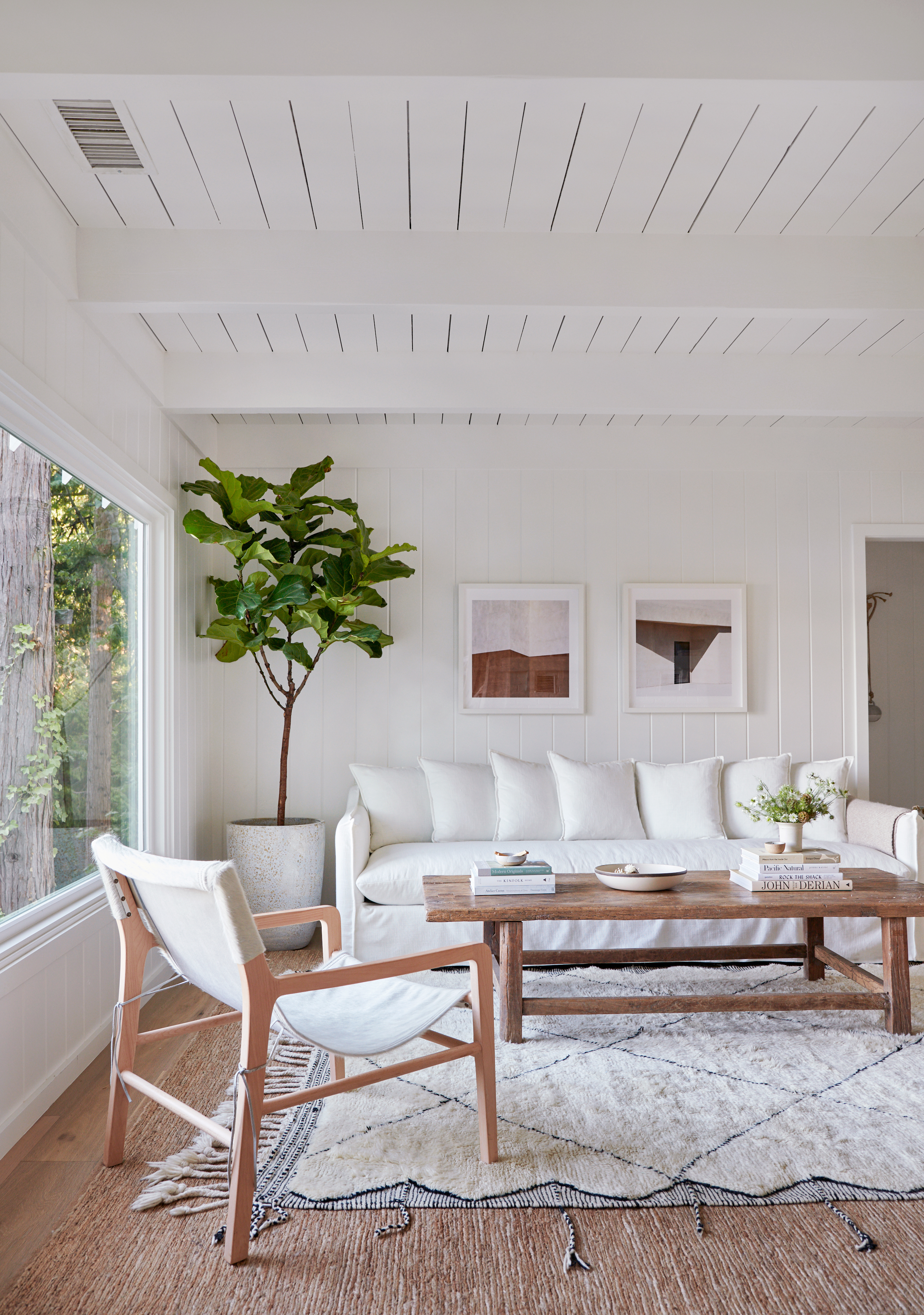
When Californian lifestyle designer Jenni Kayne embarked on the renovation of this waterside home on Lake Arrowhead, she knew that a white-on-white scheme was the key to modernizing the feel of its dark-wood ceilings and interior wall paneling.
‘Beyond the incredible location, what made me fall in love with the house initially was the charm of the woodwork, but I also recognized that the interior called for a blank slate,’ says Jenni, who covered the ceilings, interior walls and woodwork in the same shade of white for an airy feel. ‘We wanted to base the space in neutrals to really let the outdoors shine. A bright white is an easy way to breathe new life into a space and in this instance, it helped to elevate the existing design elements.’
7. GO TONAL FOR SUBTLE CONTRAST
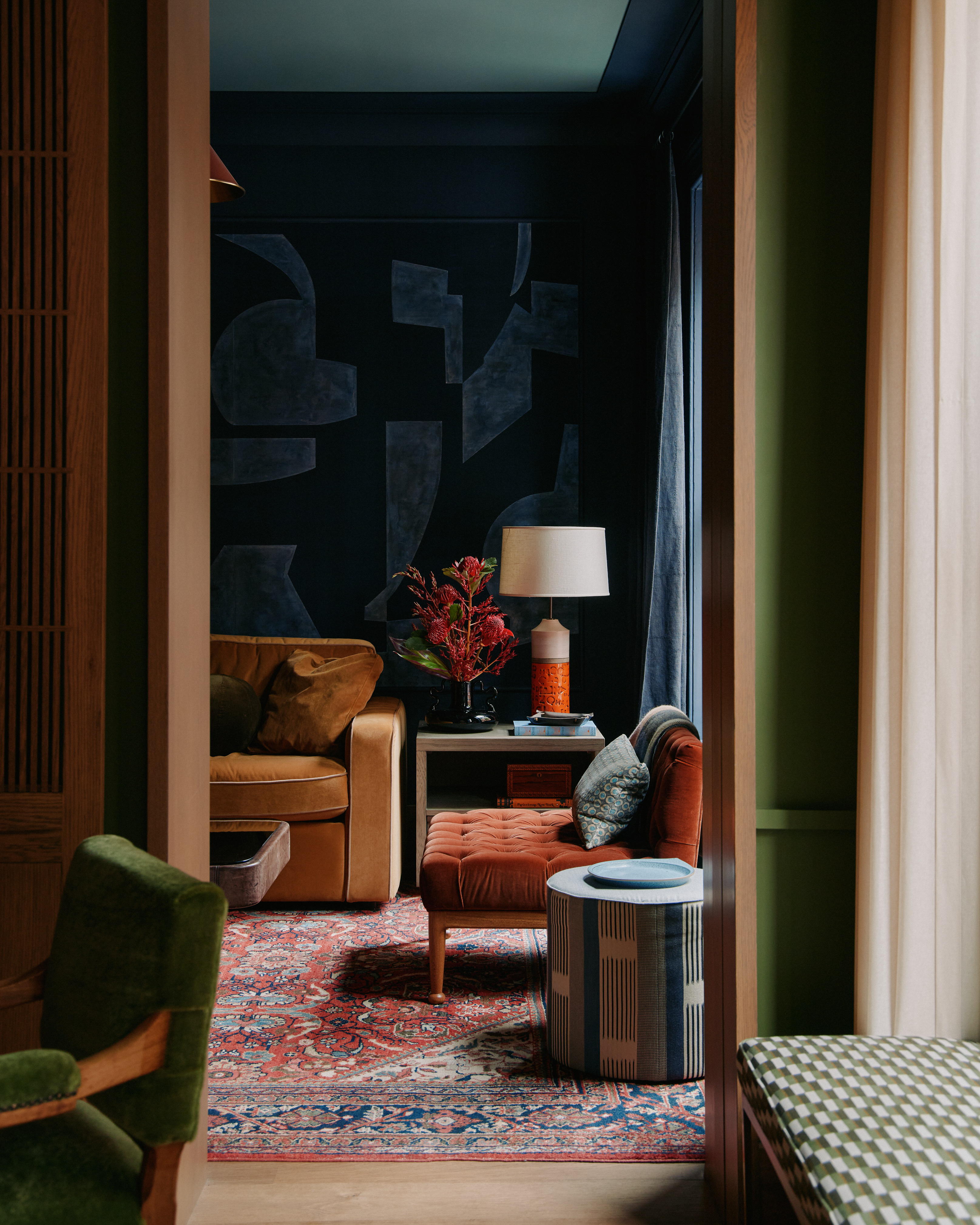
We love the palette that General Assembly implemented in the living room of this Manhattan apartment, the design of which was inspired by that of a university social club. A large panel of De Gournay silk wallpaper acts as an abstract artwork, injecting the space with the dark-blue hue that continues across the walls and coving.
Rather than painting the ceiling in the same shade, the designers opted for a lighter blue, which elevates the height of the space without detracting from the harmonious scheme. The intention was to create a space with ‘immense personality and an undeniable sense of substance and depth,’ according to co-founder Colin Stief, who advocated the rich and moody scheme.
8. PAIR A DARK CEILING WITH WHITE WALLS
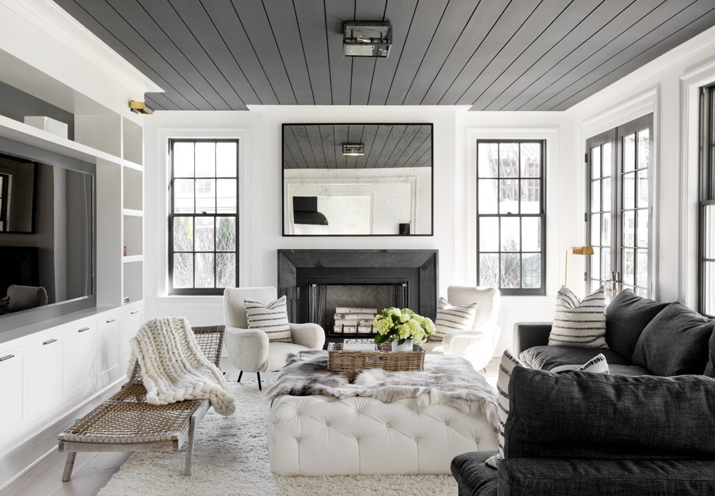
The living room in this light-filled Hamptons family home is the only space in the house to feature a dark-painted ceiling, which interior designer Tamara Magel devised as a way to mark out the space as a place to kick back and relax. An unexpected touch, the contrast is particularly dramatic when combined with the white walls.
‘This is the primary family room, which leads off a white kitchen, so we wanted it to feel cohesive but also cozy and intimate,’ explains Tamara. ‘A dark ceiling can create that effect, and I also love using shiplap to add some casual character to a space and make it feel less formal.’


