It’s hard to believe it’s been thirteen years since the iPad debuted, and that makes iPadOS one of Apple’s most mature platforms ahead of iPadOS 17.
And yet, it always feels a little like an afterthought – WWDC 2023 is coming, but last year’s event focused on the iPad for around 15 minutes at the tail-end of things. Sure, it started life as a larger version of its iPhone counterpart, but Apple still hasn’t quite found out how to make its tablet updates particularly sexy.
That may not change in 2023, either, with reports suggesting a lot of resources have been devoted to the long-rumored Apple AR/VR headset. So, what could iPadOS bring with iPadOS 17?
Here’s our wishlist for what we want to see from iPadOS 17.
New Home and Lock Screens
This is likely to lowest-hanging fruit for Apple, and we’d be very surprised if we didn’t see the lock screen features from iOS 16 follow a similar trajectory to the rollout of widgets in years prior. Expect to see them make the hop, skip, and jump to the iPad in some form (but please, let us switch out that camera shortcut for something more useful on an almost 13-inch tablet).
Aside from the new customization options, here’s hoping for the refined notification setup found in iOS 16 in iPadOS 17. It took some time to adjust, but now the iPad home screen can quickly become an anxiety-inducing hellscape.
Widgets are great, but even with the changes to the home screen layout in iPadOS 16 (which added a new zoom option), there’s a huge amount of space between Home Screen icons. Surely we can squeeze things in a little closer if we’d like, just like they are on the Dock.
We’re actually a little nostalgic for the Today view, which while replicable with widgets, was a nice slide-over look at the day ahead with some key information. It’s unlikely, but we’d love to see Apple bring something like that back.
Commit to multitasking

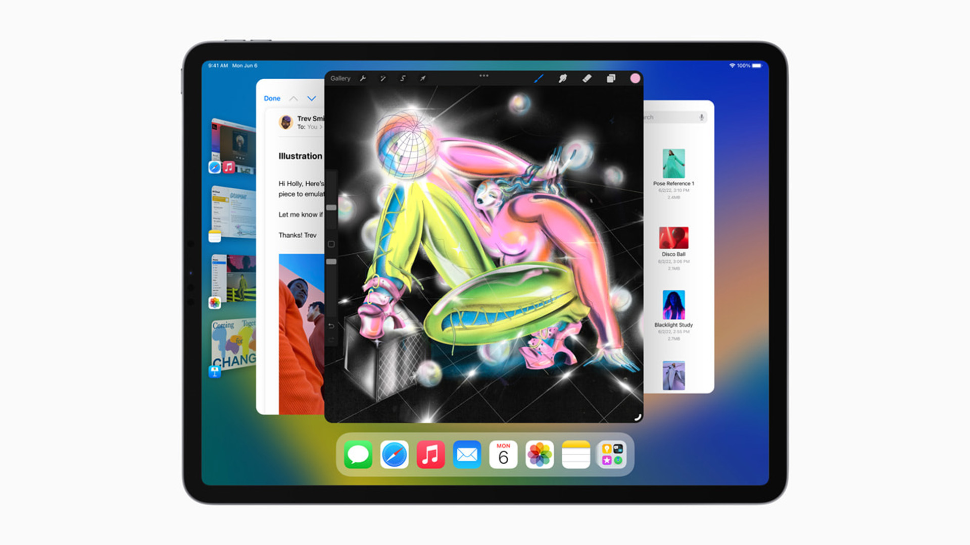
Oh boy, this is the big one. There’s no denying the iPad needed a new multitasking paradigm, because as handy as the small “...” button is at the top of apps, larger displays are much more flexible by their very nature.
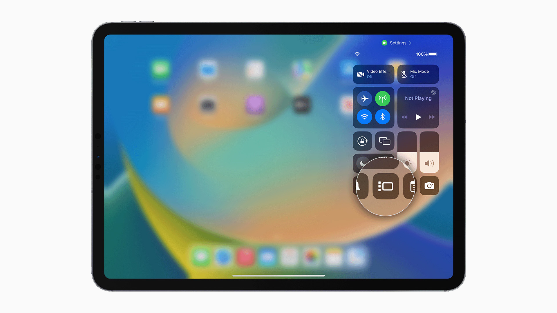
And yet, Stage Manager’s grand debut was rushed, rough, and lacking in a lot of the fundamentals of modern computing. In a lot of ways, tucking it into Control Center felt like a tacit admission from Apple it wasn’t ready for its big debut.
Think about it this way – if you open a window on your Mac or PC, it’ll pop over whatever you have open already. With Stage Manager, it throws everything to the side, meaning you’re left spending more time managing than you are using the apps you have open. In Mail and want to fire off an email while referencing another? The new email window can throw the inbox screen onto the sidebar.
That sidebar in itself is a flawed solution because it’s way too big – even on a 12.9-inch display. That, plus a bizarre focus on regimented window structure, makes things much more difficult than just using a MacBook.
So, how to fix things? We’d like to see some sort of Mission Control, with access to Spaces – these could be mapped to a gesture on the touchscreen or with a connected peripheral like a trackpad or mouse.
You could even link those spaces and open apps to Focus Modes, which still feel half-baked on the best iPads compared to their iPhone counterparts.
Multi-user support
We’ve been banging this drum for many an iPadOS update, but it’s still almost impressive how Apple doesn’t seem keen to turn your iPad into a family device.
Ok, there’s an argument you won’t buy a second iPad for your spouse or kids if you’re all sharing one, but the same can be said of a laptop. In this writer’s case, I’d love to set up a child profile for my almost four-year-old, but as it stands, I’ve purchased a cheap Amazon tablet for long journeys instead.
The real winner, though, would be schools. Growing up with desktop PCs in classrooms was great, but multi-user support could make the iPad the kind of device that forms the basis of education in Apple’s apps like Swift Playgrounds to promote coding opportunities to a wider audience.
Given how long multi-user support has been on the Mac, and how it still works well with potential privacy-focused apps like iCloud Keychain and iMessage, it seems so bizarre it hasn’t made the jump to the iPad.
More of a reason for the iPad Pro to exist

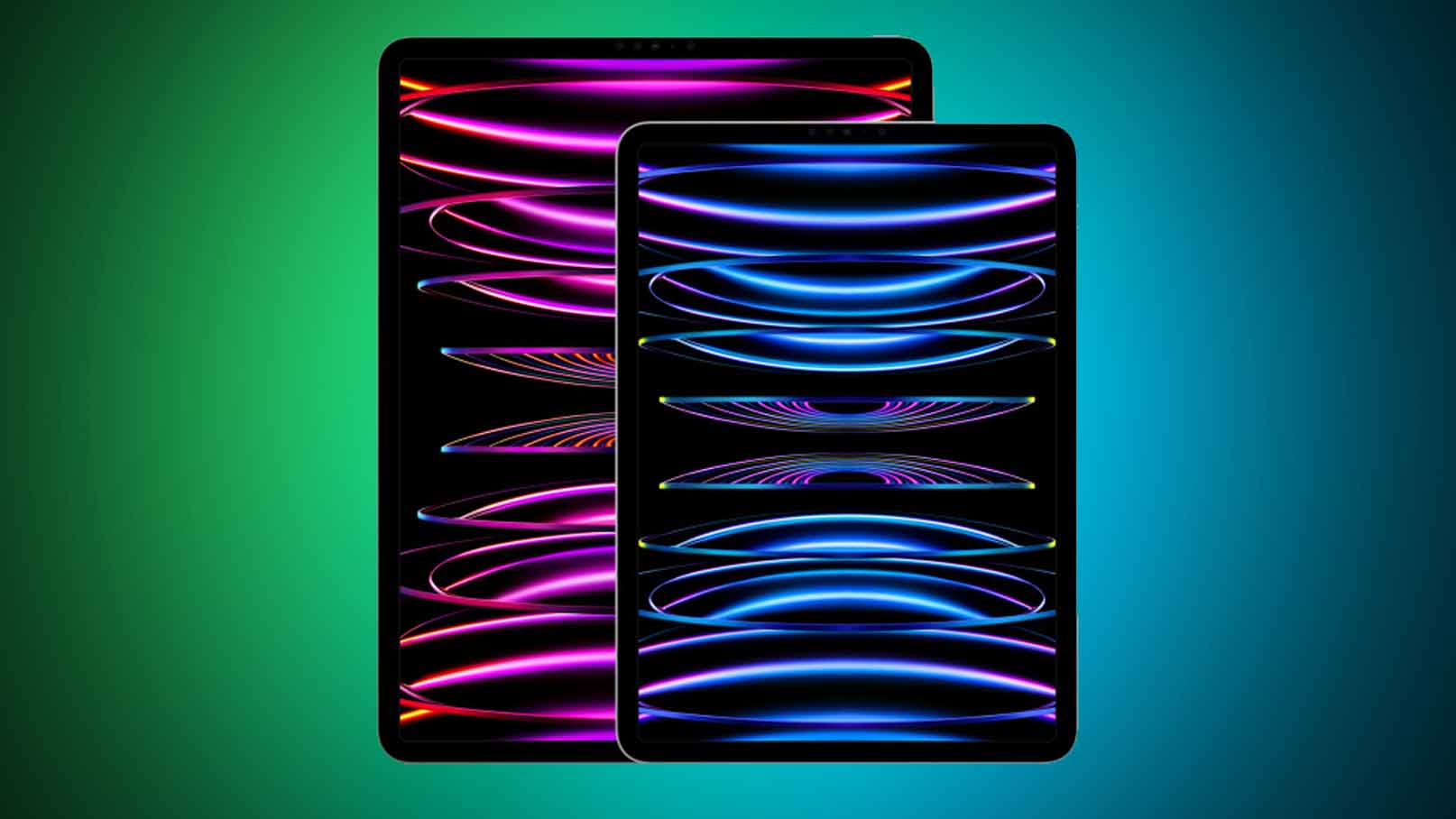
This writer is the owner of an M2 iPad Pro, but couldn’t really tell you why other than it was a “justifiable work expense”.
The iPad Pro with M2 doesn’t do much that the M1 version can’t, but much of the same could be said about the A-series 2020 version, too. It’s full of power and rips through benchmarks, but in terms of tangible upgrades, it’s tough to spot the difference.
The M2 iPad Pro did add the new Apple Pencil Hover functionality, but that feels like a testing ground for some sort of context-specific menu to come later.
The truth is that, until the rumored iPad Pro overhaul in 2023 or 2024, an iPad Pro costs more (factoring in a keyboard and Apple Pencil) than a MacBook, but is much harder to recommend.
To fix that, we’d love to see Apple bring its own heavy-hitting ‘Pro’ apps to iPadOS 17. Final Cut, Logic, and even Xcode can run on M2, so why not?
Improve media creation options
The iPad remains a great media consumption device, but it’s still some way off a creative powerhouse – despite Apple’s assurances that the latest iPad Pro is essentially a portable movie studio.
Aside from introducing the professional-grade apps we mentioned earlier, the iPad lineup could do with more useful tools for content creation.
For one, USB-C should open up a host of peripherals and docks, but it can often feel like you need the latest iPad models to get the best file transfer speeds for external storage.
iPadOS could improve a lot with file management, too – it’s improved in recent years, but it always feels clunky to use, even with a mouse, and there’s no way to safely eject storage that’s connected, either.
Then there’s a big one – external display clamshell mode, so we don’t have to use both displays if we’d rather use the iPad as a more traditional computer.
iPad OS 17 – what we want
So that's our list of what we want from the latest version of iPadOS. The iPad remains one of the best choices if you're looking for a tablet, and easily outperforms almost every other large touch-screened device out there.
That just makes us want all these changes that bit more. Now we just have to wait and see what fresh iPadOS goodies come from WWDC.


