
You've decided to go with carpet for your living room, but now you have the dilemma of what is the best carpet colour for a living room – we hear you! It's a tough choice so we've asked carpet experts what they recommend for your living room flooring ideas.
'Flooring can dramatically change the tone of a room, so it’s important to choose the colour that best fits the space and consider the environment you are wanting to achieve,' advises Sarah Jenkinson, product manager, Kingsmead Carpets.
Colour in all aspects of interior design is back big time, so if you do love colour then now is the perfect time to add it to your scheme. If the very idea feels overwhelming, then remember you can go for light tones over bright.
'It all depends on your family circumstances,' says Rupert Anton, spokesperson for the Carpet Foundation, the UK association that promotes carpet and independent retailers to consumers. 'If you have a young family, then steer clear of beige as it will show all the marks. Patterned carpet is an excellent idea as it hides a multitude of sins and gives you options to pick out colours to use in other soft furnishings.'
What's the best carpet colour for a living room?
Sometimes carpet colours can jar with the rest of your interior scheme, now bold living room colour schemes are back on the agenda you can have fun with it and make it a more significant aspect, rather like colour drenching, you can match it to your walls.
'Whether you're going for a colour or neutral carpet, consider how you use your living room and how much footfall it will receive, a denser pile will cope with higher footfall, and choosing a carpet that can be easily cleaned will keep colours or neutrals looking fresh for longer,' Charlotte Coop, marketing manager at Abingdon Flooring.
Our guide on the best carpet colour for a living room will give you plenty of options for this key space.
1. Off white
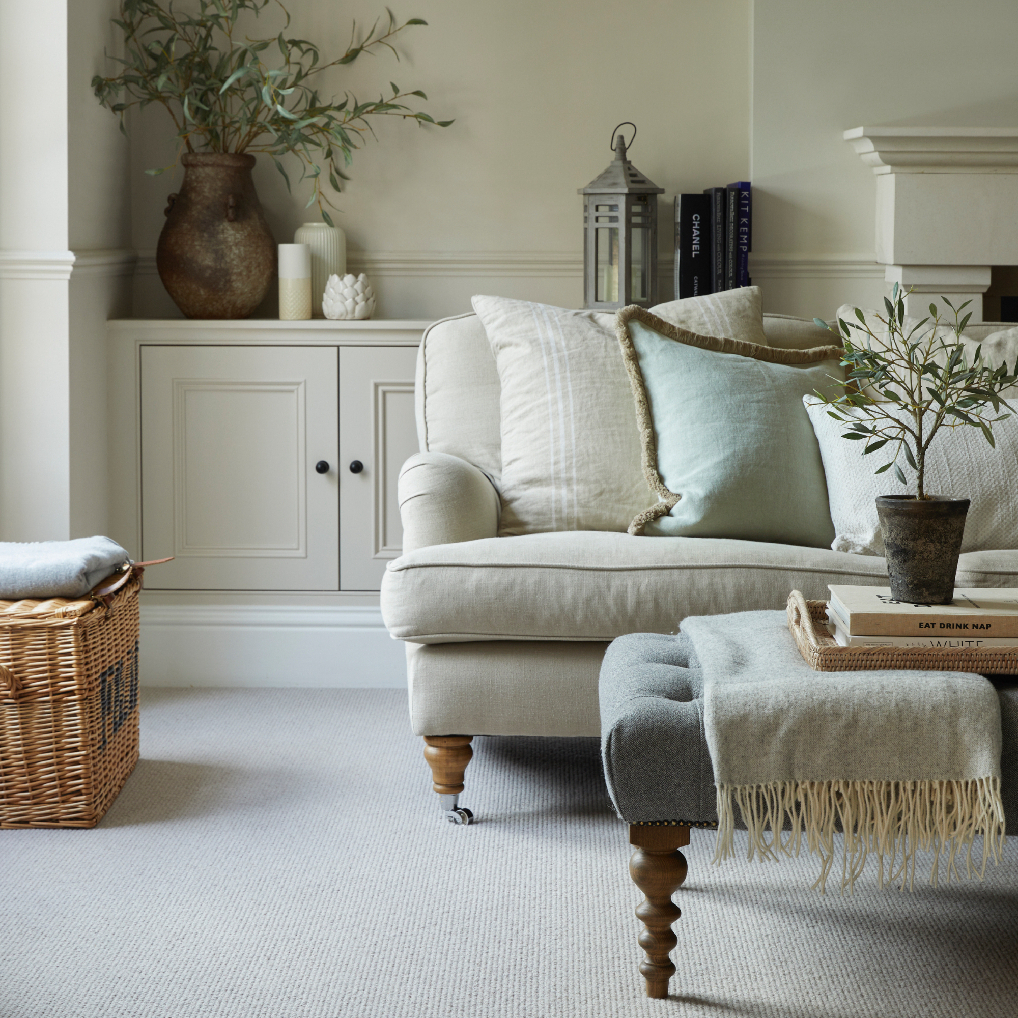
For a smart finish – it's possible with carpet, we promise – an off-white is a good option. It will go with everything and if you team it with other neutrals you'll get a very sophisticated and calming space.
Alexandra Hindle, marketing manager, Cormar Carpetadvises:
'Choosing the right colour carpet is so important as it sets the tone for your whole home. Selecting an off white colour carpet for your living room is a great idea as it will allow you to be more adventurous with colours elsewhere.
'Whether that is on your walls, your sofa or styling accessories, a muted colour carpet is a great foundation to begin your interior scheme. Our wool loop Malabar Two-Fold range has a brilliant selection of comforting neutrals, allowing your living space to feel instantly fresh and uplifted.'
2. Pink
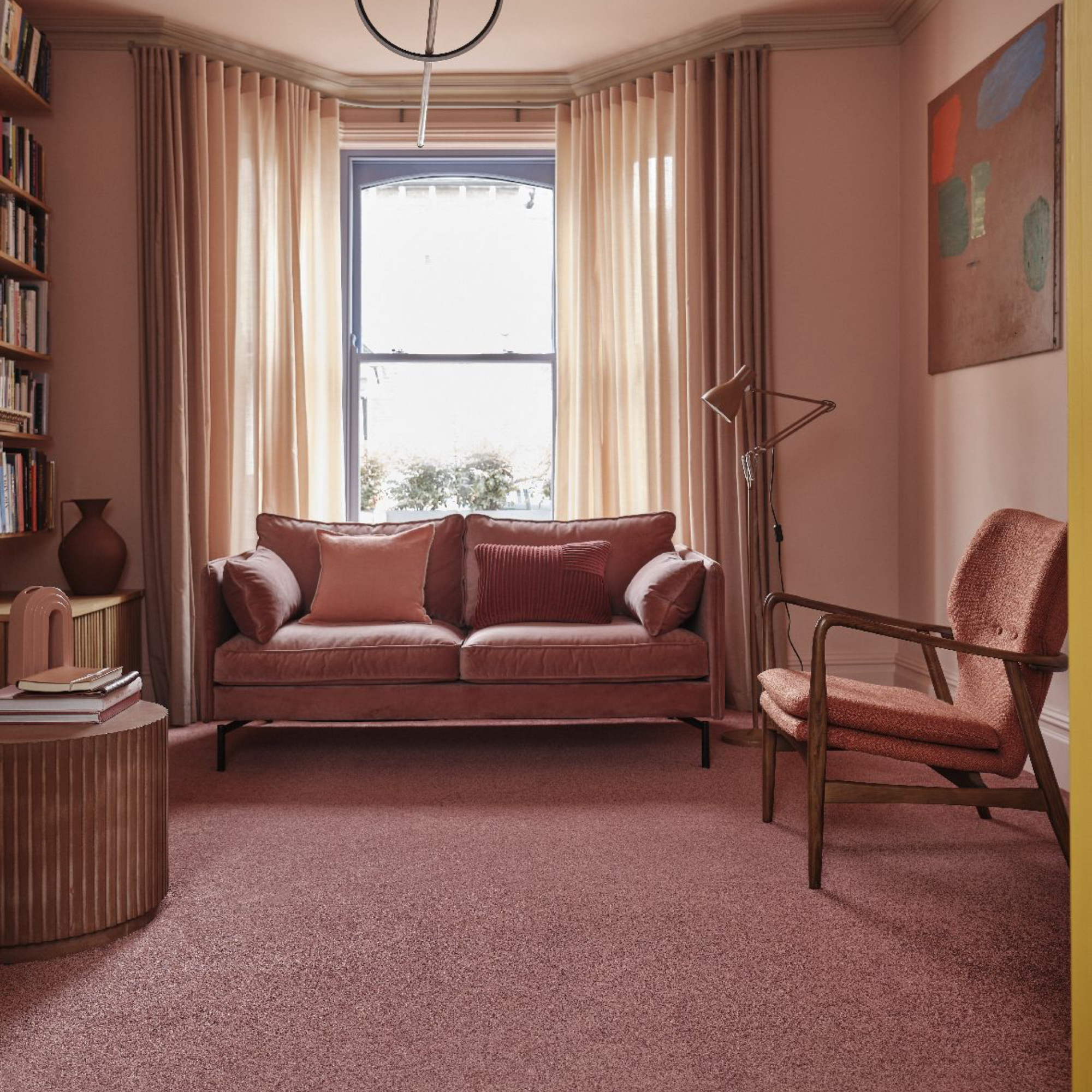
Feeling brave? Colour drenching is one of the biggest paint trends this year and it means you need to match your walls to your floors. This can be done with carpet perfectly. Pink is a good place to start – choose a pale shade if you want to keep it subtle.
'The living room is the best room in the house to express your interior style and create a colour scheme that echoes your taste,' advises Punam Chada, carpet buyer at Carpetright.
'Pink has become a popular alternative ‘new neutral’, offering a more contemporary finish. When used in a tonal scheme, it provides a serene and calming feeling. Using a carpet in a complimentary shade helps to create a luxurious look and feel, from floor through to ceiling, helping to ground the room and create harmony. To create a cohesive look, try to stick to a palette of shades in similar tones, for example, rose, powder, and blush.'
3. Neutrals
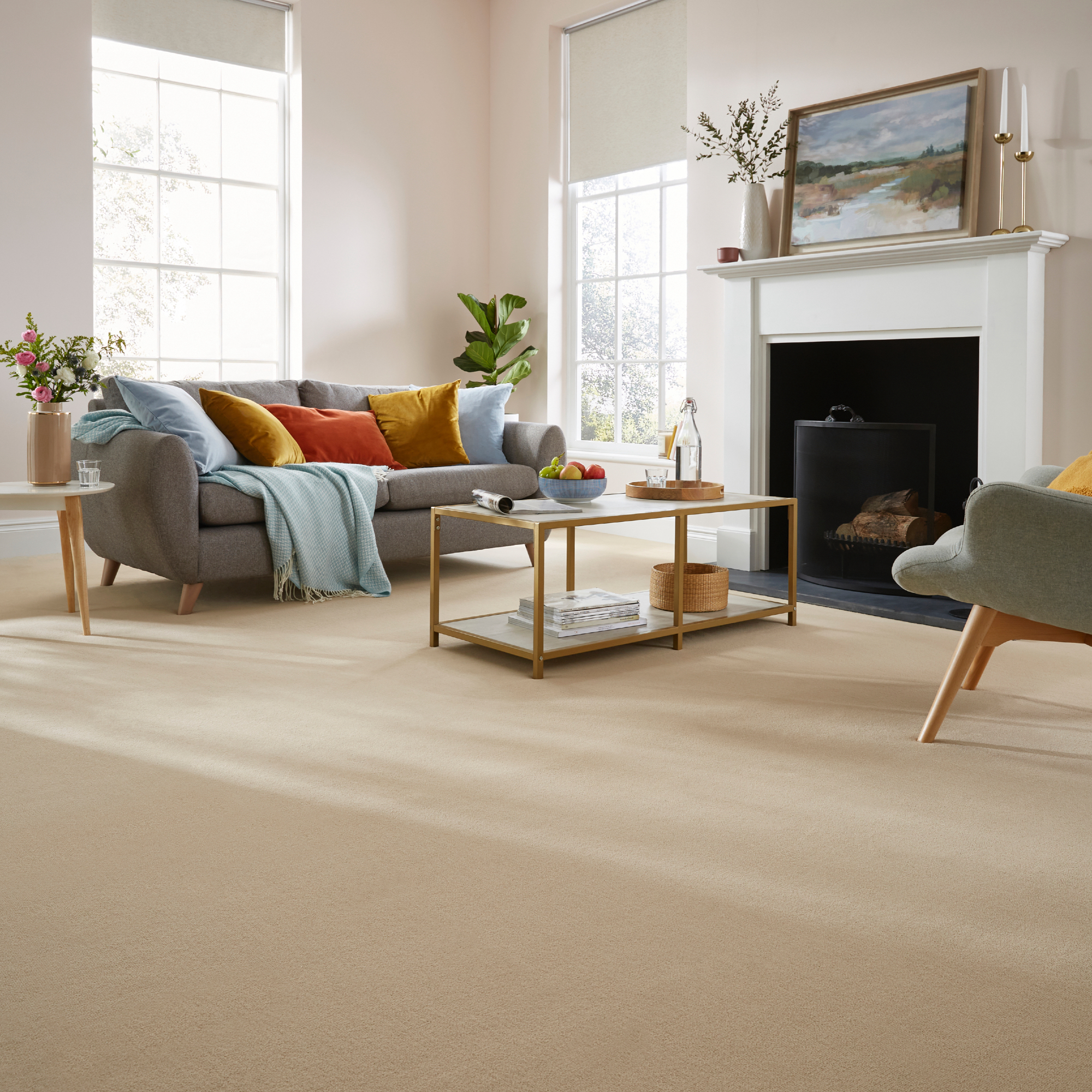
Forever popular for the easy of use, neutral shades are one of the best carpet colour ideas for a living room.
'Natural coloured carpets remain the most sought after, with their versatile qualities and varying shades they can work within a number of different schemes whilst still creating an inviting and welcoming feel,' Sarah Jenkinson, product manager at Kingsmead Carpets.
'They can also provide the perfect foundation for homeowners to experiment with colour and pattern, particularly with soft furnishings and wallcoverings.'
4. Blue

For something that can add depth and a focal point, consider blue. There's a wide range to choose from, and similar to paint shades, a paler colour will make a living room feel more spacious.
'Blue carpets can work beautifully as an alternative to beige and creams,' says Charlotte Coop, marketing manager at Abingdon Flooring. 'For calming interior schemes, consider partnering with pale neutrals or for a bold look, consider rich caramels and chocolate tones. When choosing a blue carpet, consider practicality, and ensure that it is easily cleanable and will stand up to your home's footfall.'
5. Terracotta
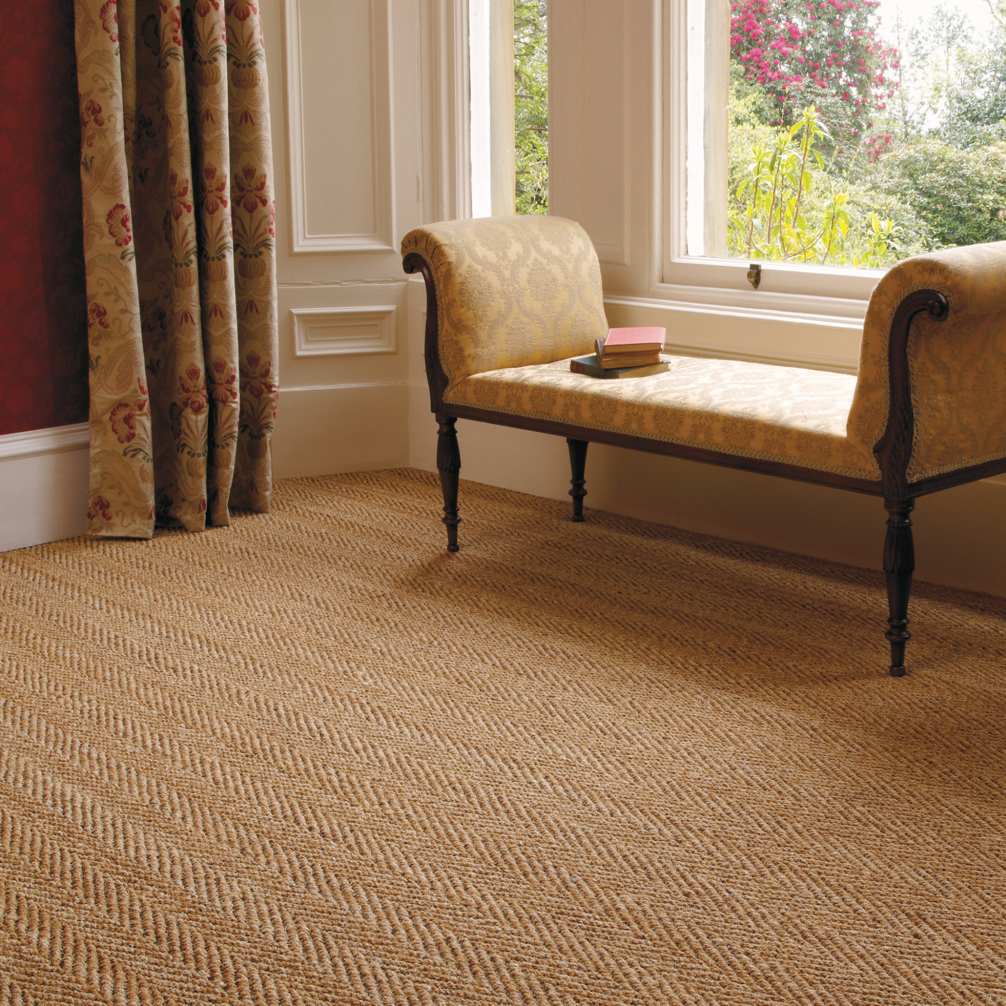
Warm and embracing, nothing beats the feel good factor you get from a biscuity terracotta. It's a colour that makes you feel safe and it will help a large room feel cosier.
'Sandy tones and soft terracotta naturally transport us to the Mediterranean and Morocco,' says Jon Flannigan, product manager at Kersaint Cobb. 'Being a colour of nature, and with its rich and earthy qualities is best paired with natural materials. Using natural raw materials such as sisal and coir in your flooring will really create that outdoor feel inside your home and create a warm and inviting space to relax and unwind.'
6. Charcoal
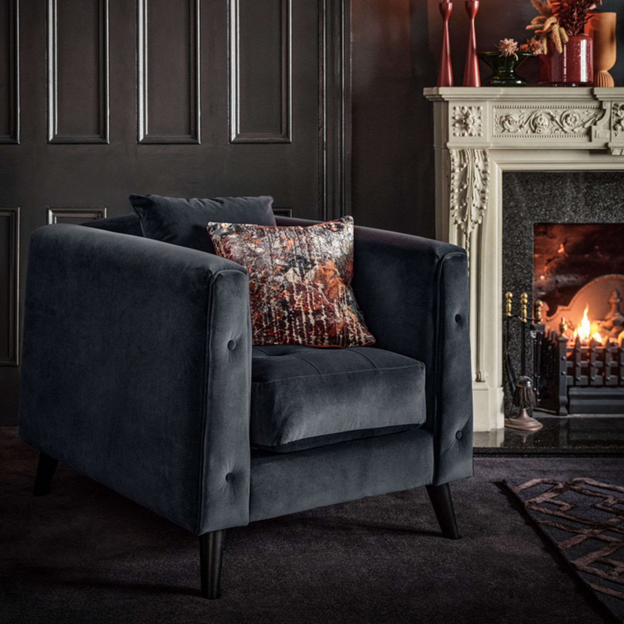
Create a moody haven with a charcoal/nearly black coloured carpet. It's a dramatic choice, yes, but if you love dark inky colours over brights then give it a go.
Team it with other dark greys for impact, this kind of look is best when you layer colours. Then accessorise with a few brighter shades – like red, aubergine, emerald and rust. A rug with key accent colours in will add a welcome splash of colour to this kind of scheme.
7. Orange

Feel like making a statement? Go bold and beautiful with a rich orange, and it can work fabulously well if you balance the rest of the scheme well.
The key is to keep the walls white and for secondary shades to be subtle, like pale yellow and blush.
Punam Chada, carpet buyer for Carpetright explains why this shade is a winner if you love colour:
'Often imagined as a bright, bold shade, orange can bring a host of different looks and feels to your decorating scheme and is versatile enough to look good in most rooms in the house, working best in rooms which have a bright light aspect.
'Bold without overpowering, deep, earthy tones offer a sense of grounding and add depth to a scheme. They’re also versatile enough to work across a diverse range of styles; from Scandi and Mid Century through to Mediterranean-inspired schemes.'
8. Green
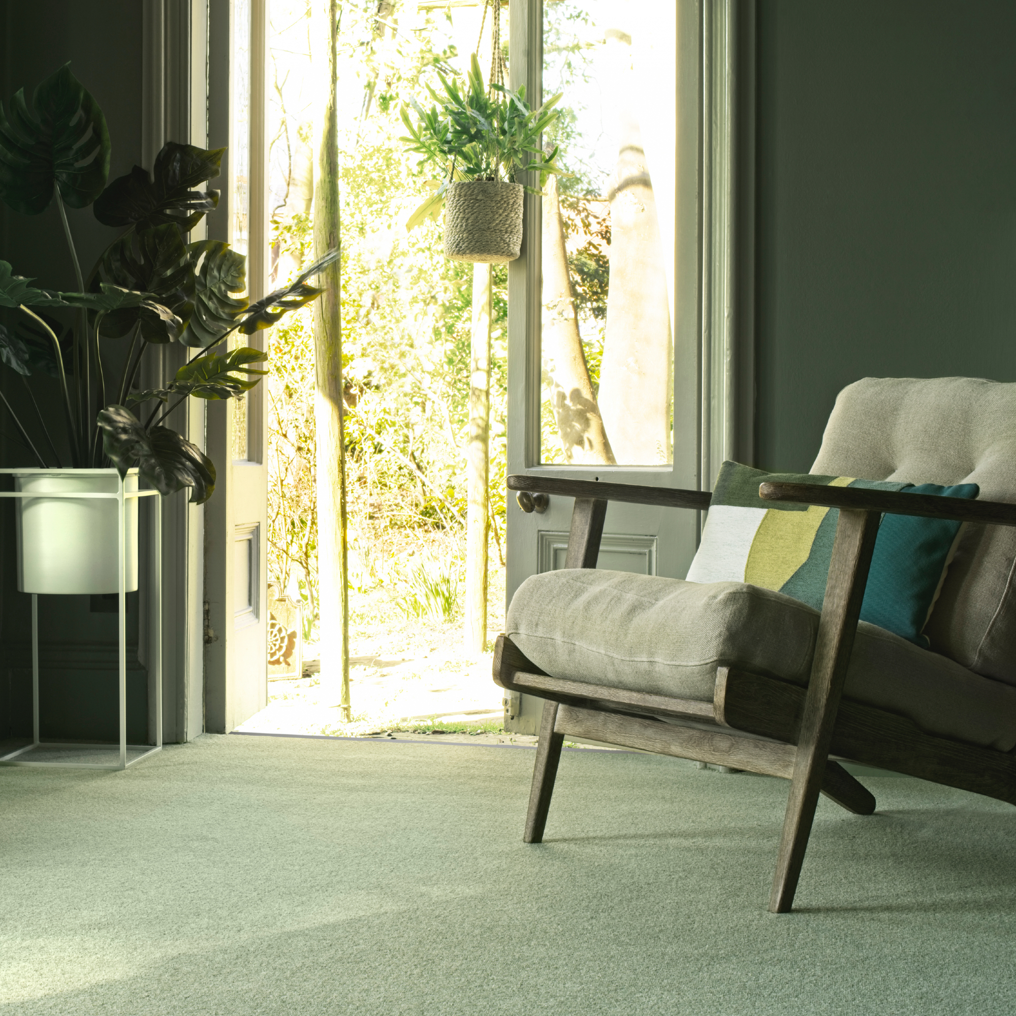
Green is an excellent choice, it's calming and will bring nature inside more than any other colour.
'Green is very strong as a colour – from botanicals to blue greens – as nature is now such an intrinsic part of people’s lives and, again due to the pandemic, consumers are influenced by and love the countryside,' says Rupert Anton.
'This key colour is also visible in paint and wallpapers etc. Furthermore, green is a very soothing colour that creates a tranquil yet stylish environment.'
9. Grey
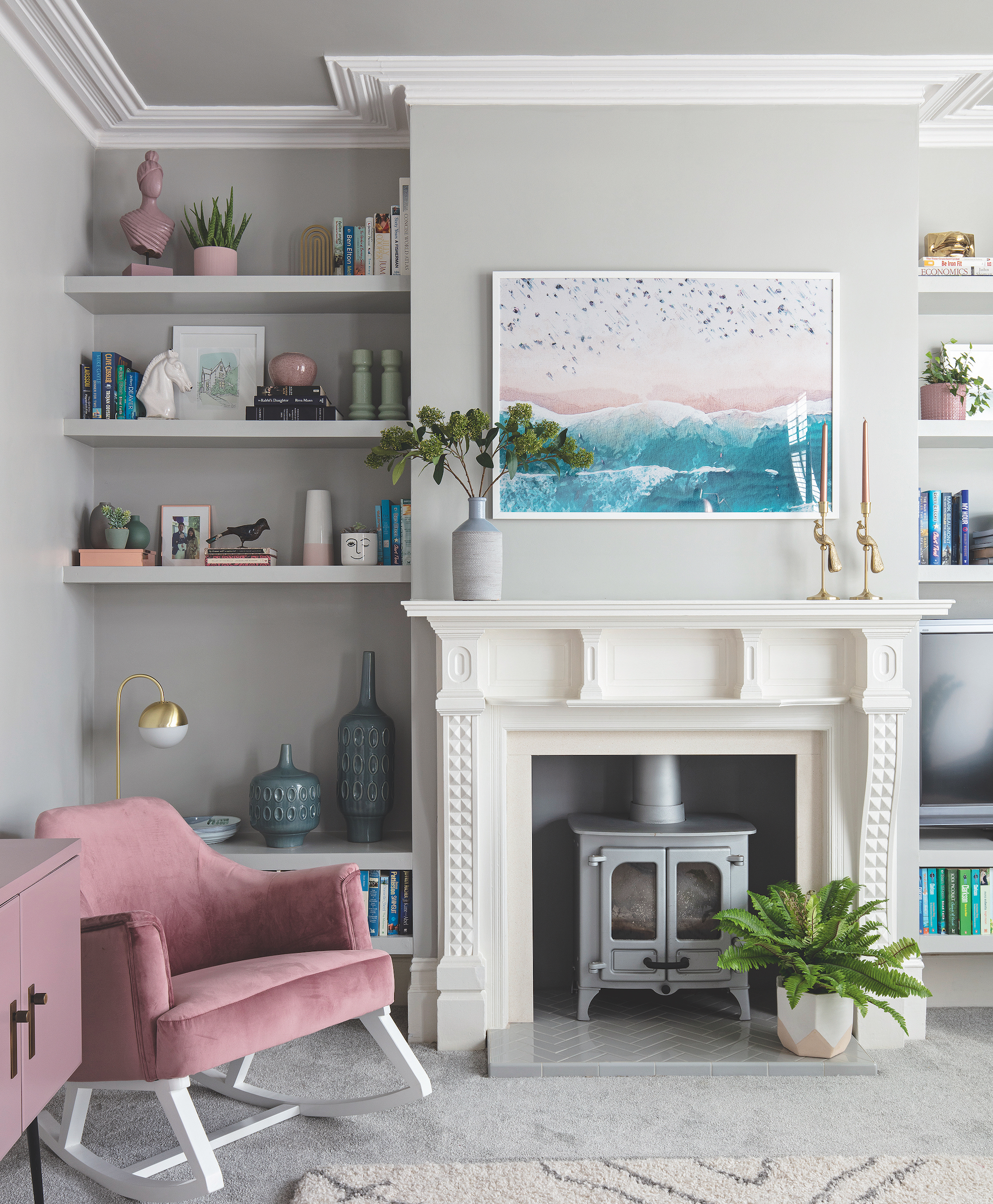
Alongside neutrals like stone and oatmeal, grey has become a perennial favourite in most aspects of interior design over the last 5 years.
Easy on the eye and goes with most other colours, it's a versatile choice you can't go wrong with. The big question though is what shade to choose, this will depend on how dominate you want it to be – a deeper shade will be more of a focal point than a pale colour. Mid-tones are a good safe bet, like a dove or gunmetal grey.
10. Multicoloured
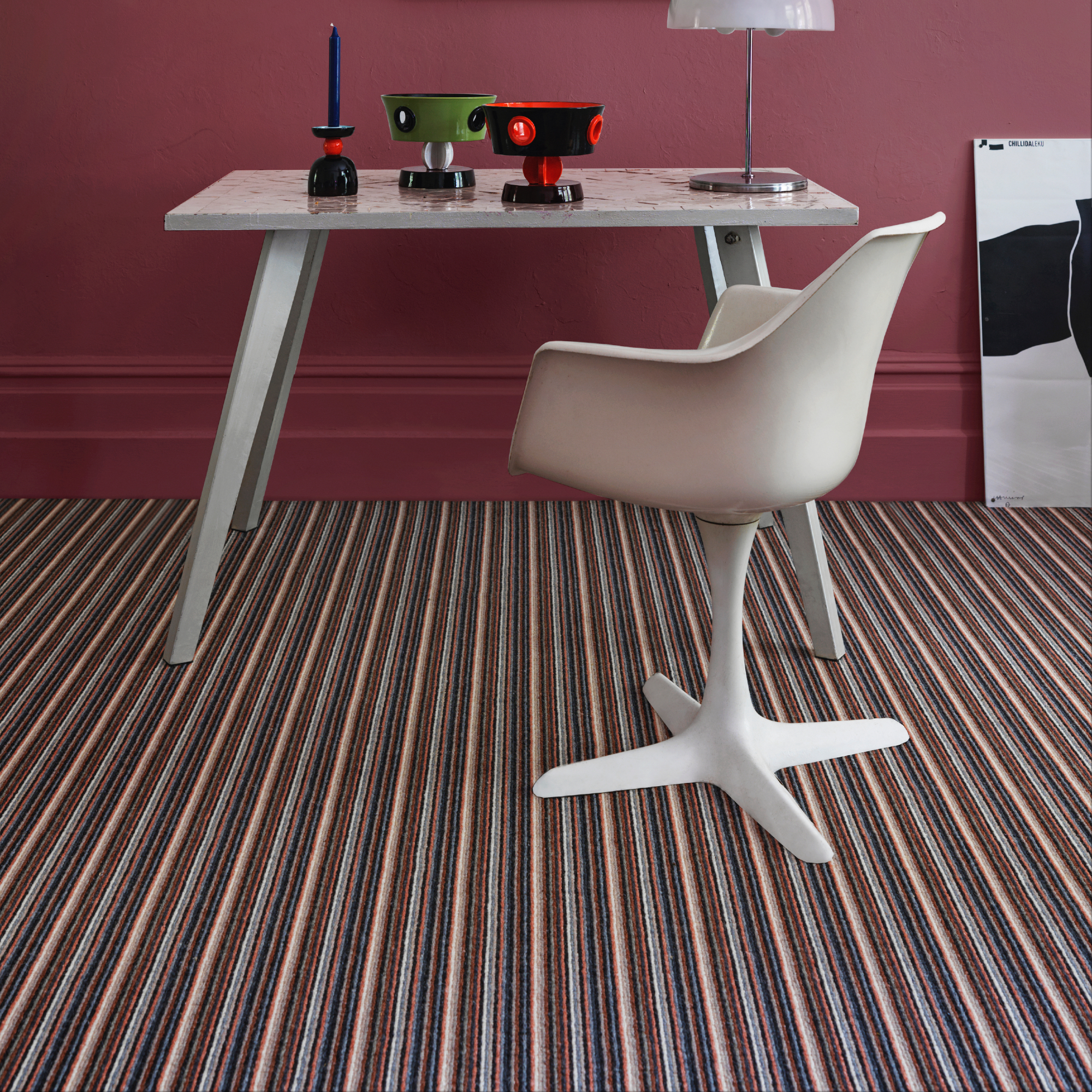
If you can't decide on a single colour scheme then stripes could be your answer. You could opt for a wide stripe to create the illusion of space, or, if your room is large then opt for a thin stripe with two or three colours.
'We apply colour combinations that sing together, relationship building within the palette, living together with ease, non-compromised but always simple in their presence,' says Claire Kimble, senior design manager for Crucial Trading.
'I am excited to see colour becoming warmer and more complex, multiple shades and tones within one design, with spaced dyed colour applications, unexpected tonal placement, and carefree pattern.'
Another bonus of stripes is that they give you more colour options for the rest of your scheme – for example, you can pick a single colour for your walls.
What is the most popular colour for a living room carpet?
'It's no surprise that neutral beige, cream and greys remain a popular choice due to their easy pairing with various colour palettes and design schemes,' says Charlotte Coop, marketing manager, Abingdon Flooring.
'However, the growing popularity of bright and bold carpets has allowed homeowners to play and combine carpets with walls, surfaces and accessories for a more bespoke look.'
Rupert Anton, director of The Carpet Foundation says:
'Grey too here I’m afraid! There is, however, more interest in texture, so loop piles (carpet that replicates coir/sisal) are very popular here and there is also a move to herringbone patterns in loop piles in a bid to replicate the parquet flooring look in carpet. They make a subtle statement on the floor and give either give the ‘modern country’ look or ‘understated minimalism’ or ‘timeless elegance’.
What colour carpet goes with everything?
'It has to be beige,' says Rupert. 'It is hugely versatile and works with any style and design. Plain carpets generally allow you more scope with your design in other furnishings. They are flexible, blending with both existing and new colour schemes.'
The other bonus of beige is that it goes with cool and warm spaces, offering textures galore as well as many tones. For example, there's also 'greige' – a combination of grey and beige. With cooler grey tones it works well with blues, and if it has more beige you can use with blush and corals. There's also golden beige which will warm up a North facing living room – like caramel and syrup tones.


