Move over rich navy tones, it seems there is a new blue shade on the block. This season powder blue is taking over as the season's hottest blue shade and we’re obsessed with its fresh, airy feel.
Soft blues such as baby and powder blue have risen to the top of this year’s colour palette as a key paint trend for 2025. Powder blue is a light pastel shade that we've seen taking over from the moodier navy hues in bedrooms, living rooms and even kitchens.
While navy will also be a timeless colour for the home, powder blue is leading the way as the next big trending blue.
Why is powder blue replacing navy?
‘Powder blue has become a standout colour this year, reflecting a broader shift towards soft, uplifting tones that help to bring a sense of calm and openness to the home. Unlike navy, powder blue provides a lighter, more refreshing alternative that introduces colour without dominating a space,’ explains Anna Hill, Brand Director and Colour Consultant at Fenwick & Tilbrook.
Navy has a timeless appeal due to its mature and calming tone - take navy bedroom ideas, for example, they are perfect for creating a relaxing environment. However, powder blue offers the same relaxing qualities with a fresher and more playful twist.
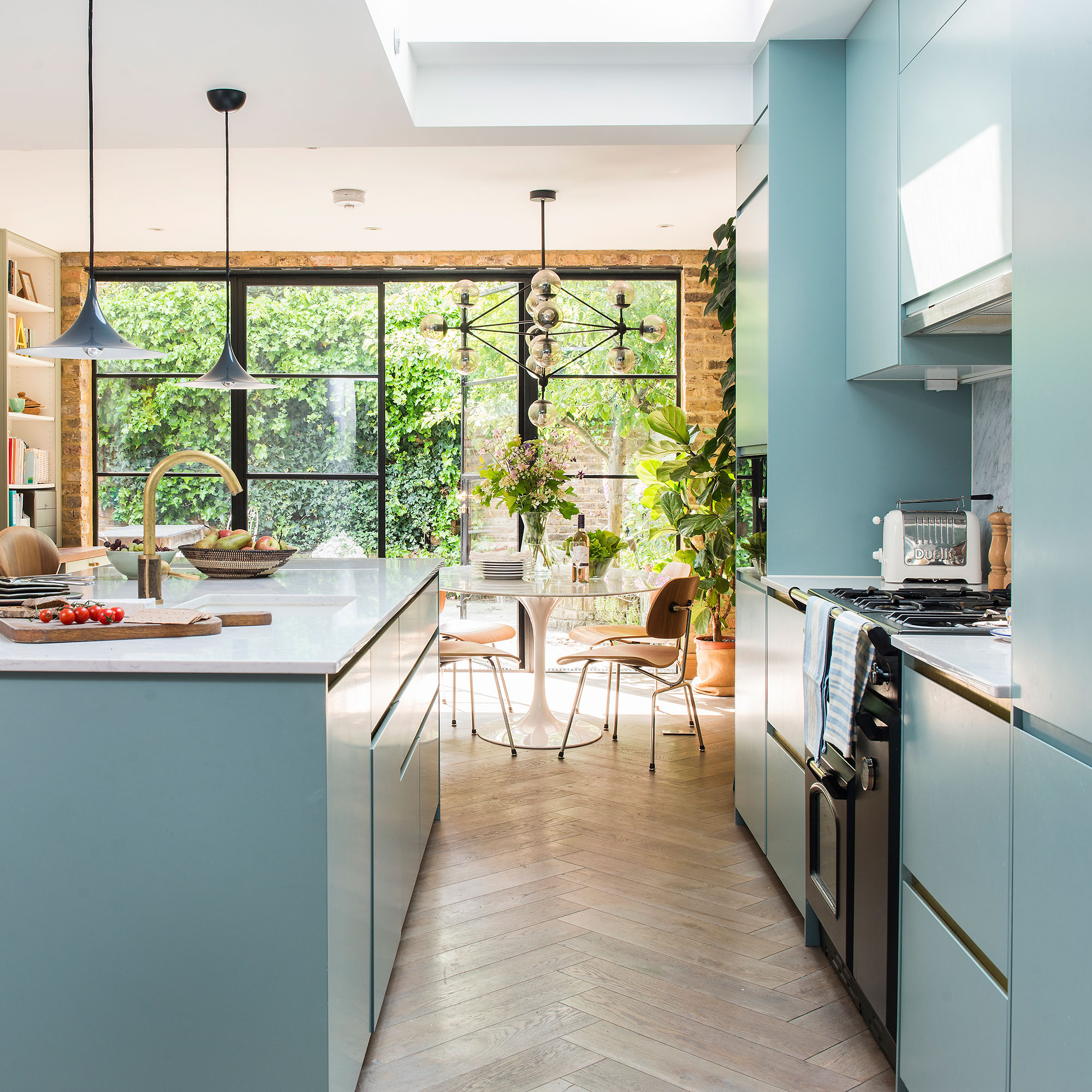
This is not to say light blue shades can’t look sophisticated either. Binky Felstead’s blue kitchen is a brilliant example of pale blue being used to elevate a space. Her use of blue creates a striking family kitchen that adds character and brightens up the space.
‘Powder blue aligns perfectly with the rise of dopamine décor, where soft, mood-boosting colours take centre stage. While navy remains a classic interior choice, the richness of the hue feels heavier compared to a light powder blue which offers a fresher, more contemporary take on blue interior,’ says James Mellan-Matulewicz, CEO and Creative Director at Bobbi Beck.
How to style powder blue
It may feel a little daunting to tackle lighter blue shades, but the benefit of powder blue is that it can act as a colourful neutral. The shade pairs with most colours on the colour wheel and is light enough to avoid overwhelming a room. It pairs well with soft, warm neutrals, creating a refined and elegant look.
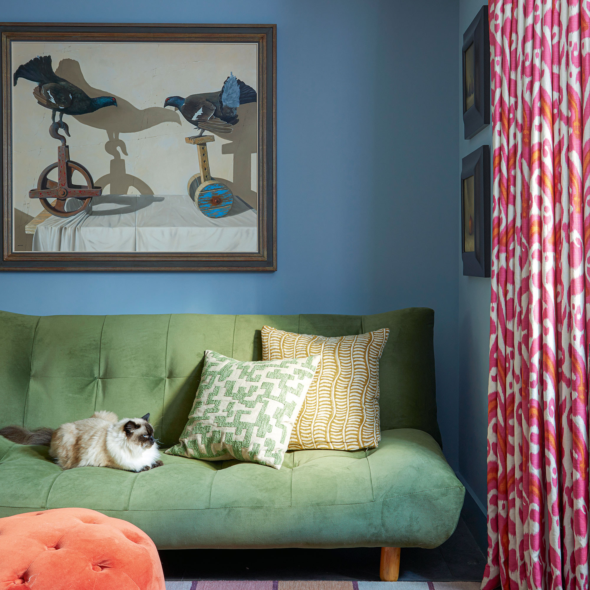
‘For a bolder, more contemporary take, try contrasting it with corals, rusts, olive greens or even charcoal greys,’ says Anna.
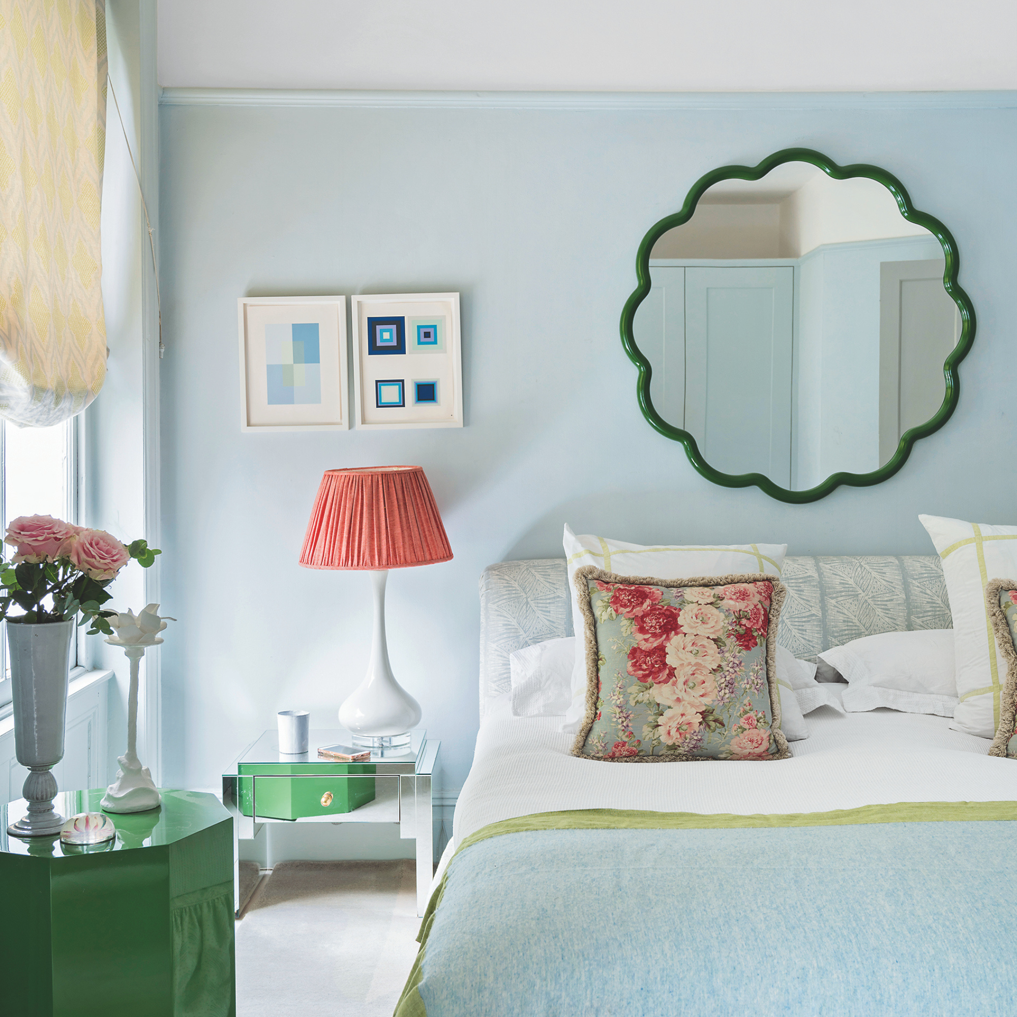
‘You can drench it on all the walls and ceiling for a cocoon-like feel, or use it as an accent on cabinetry, panelling and woodwork for a subtle, yet eye-catching finish.
‘It's also great for open-plan spaces too, serving as the perfect transition shade to connect different areas in a balanced and harmonious way. Whichever way you go, powder blue will transform any room into an inviting and sophisticated retreat.’
Colour match
This blue shade has undertones of optimistic sunshine yellow and soft cloud grey making it a balanced and harmonious shade. Pair with creamy neutrals to create a completely relaxing space.
Whilst still a pastel blue, Friendly Blue is an energetic take on the trend. Why not be daring and brighten your kitchen cabinets with this fresh shade.
Little Greene describes this shade as a pretty powder blue paint alternate. It's rich hue, gives the trend the sophistication you may be missing from navy blues.
How renters can get the look
If you’re renting or not willing to repaint your walls, you can still achieve a beautiful effect with powder blue in your home.
‘Smaller decorative elements with intricate powder blue details can elevate your home. Consider powder blue prints in ornate gilded frames or displaying vases filled with dried cornflowers or fresh hydrangeas for a charming touch,’ recommends James.
With an eye-catching twist stem, this side table makes a stylsih addition to any room - drenched in a gorgeous powder blue, of course.
Add a pop of powder blue to your living space with this stunning metal table lamp.
The red trim on this cushion proves just how well powder blues works with bold colours.
If you’re a firm fan of navy paint ideas we’re not asking you to say goodbye forever. But I’d be lying if I said we weren’t already feeling a shift towards powder bue. It’s refreshing, and calming and works with any space. Have you been won over to the powder blue side?